Got a compelling architectural drawing to share? Register for updates about the next One Drawing Challenge, the drawing competition with 2 Grand Prizes of $2,500!
Art and architecture begin with curiosity. To redefine disciplinary boundaries, designers reimagine the context of daily life and accepted paradigms of practice. Few artists or designers have shaped contemporary practice like James Wines. As the founder of SITE, an architecture and environmental arts studio, Wines has created a critical body of work spanning five decades. With designs as controversial as they are inspiring, the studio became widely-known for its seminal BEST stores in the 1970s. With universal appeal, Wines creates architecture that constantly reinvents itself, and as a result, has reshaped how buildings are perceived and what they represent.
In the following interview, Wines touches on early inspirations in studio art and sculpture, his more recent work, as well as the iconic Highrise of Homes project. The interview surveys the work of SITE since its founding in New York City in 1970, exploring 50 years of design and practice with an emphasize on drawing and its relationship to art, architecture and design.
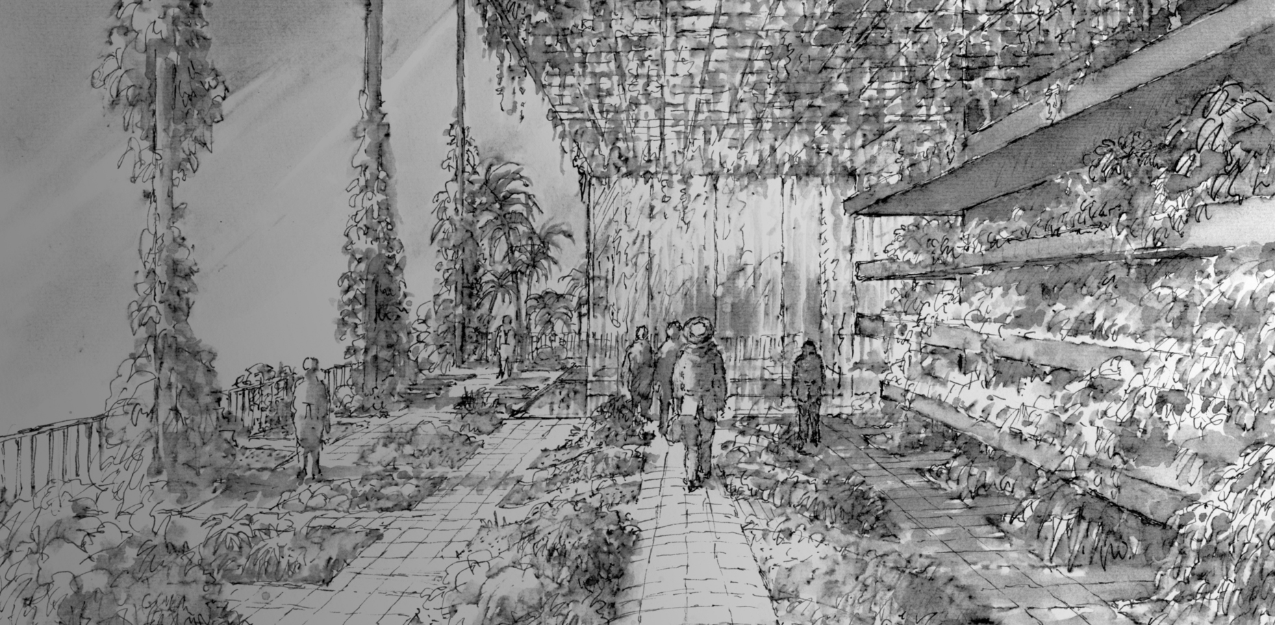
Antilia “Vertiscape” Tower proposal, Lower Levels, 2003, Image © SITE
Eric Baldwin: Why did you choose to study studio art and sculpture?
James Wines: I was always involved with visual art since childhood; it was simply an inevitable choice to end up attending art school at Syracuse University. I focused on art history and sculpture, but, I also hung out a lot with students in the architecture department. I think my interest in buildings was based on my experience as a teenager, when my father (an engineer) persuaded his three sons to become involved with a good deal of hands-on construction. We worked with him on summer houses in northern Michigan. As a result, even after I started my initial career as a sculptor, I continued to be attracted to structural challenges and innovation with materials.
My sculptures, during the 1960s, were architectonic assemblages, made of concrete and steel. For a young artist, I was fortunate to find dealer representation in the beginning – Marlborough Gallery in New York – and this association helped launch an early career in public art. I was working in architectural situations for five or six years; but soon began to tire of plunking down isolated sculptures in front of buildings. After 1967, I became increasingly involved with site-specific art; then developing a series of ‘Landsite’ sculptures, integrating various steel configurations with ground surfaces and regional topography.
During the late 60s, Frederick Kiesler became a close friend. From this period, I responded to his prophetic visions for a future of integrative arts. He became a valuable critic and influential advisor for my aesthetic progress. To sum up this important dialogue, I contributed an essay to a recent book on his work, entitled; ‘Frederick Kiesler – Face to Face with the Avant Garde.’ In the text I observed; “At the time of our meeting, I was a rather conservative, Constructivist-influenced sculptor.
Most of my efforts were spent wrenching iron, steel, bronze and concrete into contorted abstract shapes and participating in the ubiquitous ‘art in public places’ initiative that pock-marked civic plazas with a plethora of (often unwelcome) cityscape intrusions. At the moment of my first encounter with Kiesler, I had already become increasingly uncomfortable with the whole tradition of object making – or what I had facetiously begun to call ‘plop art’ and ‘turd in the plaza … phrases that have now become an institutionalized way of describing randomly installed public sculpture.
In this period of restlessness, I looked to Kiesler as a mentor who might help guide me toward more fertile territory. His impact was so great that I basically abandoned my entire sculpture career and ventured into experimental architecture. In retrospect, this proved to be a dubious decision from an economic perspective; but it was also an artistic and intellectual epiphany. Kiesler’s encouragement gave me the motivational support to make a quantum leap from which I never retreated.”
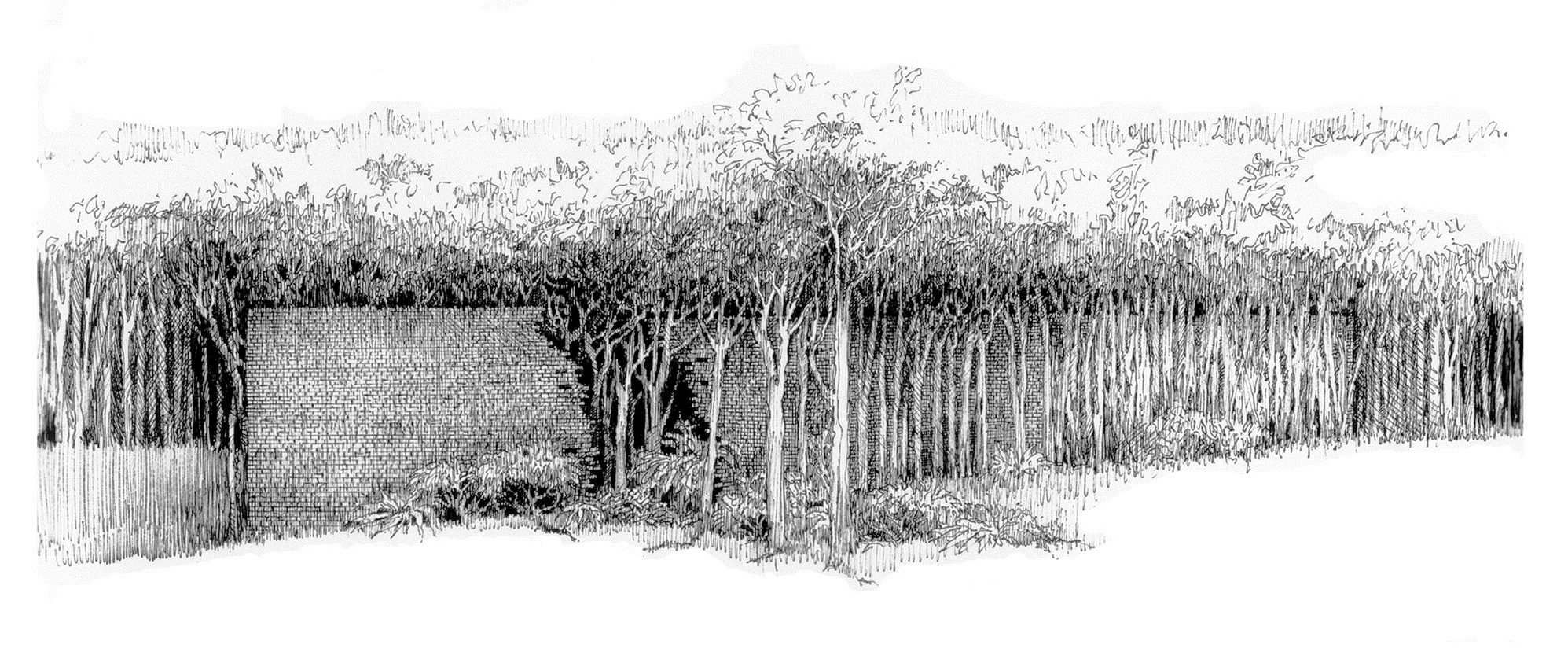
Elevation of BEST Products Forest Building, 1979, Image © SITE
Both you and your practice SITE have a long history of work that combines art, sculpture and architecture. Can you tell us more about why you started the practice, and how your interests have evolved over the last 50 years?
Sadly, Kiesler died in 1965, before I launched SITE in 1969; so, he never witnessed his impact on my shift from sculpture to environmental art and architecture. While he appreciated my studio work, he also recognized its architectonic implications. One day he simply advised; “James, you should just dump all of that old-fashioned sculpture – especially since abstract art and Constructivism are ancient history – then you’ll be free to go into architecture.”
Kiesler’s observations also amplified that wise counsel from Duchamp; “To be truly creative in life, you have to clean off your desk at least three times.” From my own ‘desk cleaning’ perspective, I had already dismissed all of the academic baggage from college education, rejected my early art works, and questioned the relevance of public sculpture; I was liberated enough to plunge into architecture.
In the first few years of having an organized studio, the SITE team worked mainly on environmental art projects and a few public performance pieces. These were mostly created for special events and not intended as permanent installations. Geographically, since SITE was situated on Greene Street in SoHo, we were surrounded by ‘anti-gallery’ artists, who had made the decision to liberate themselves from conventional showcase situations and move their visions into the streets and landscapes.
These colleagues included Gordon Matta-Clark, Robert Smithson, Nancy Holt, Mary Miss, Agnes Denes, Alice Aycock, Dennis Oppenheim and a number of others who had abandoned the conventions of framed paintings and pedestal sculptures. Since the dialogues and aesthetic productions during that early period were revolutionary, I began making notes on all of these environmentally-oriented artists, including the Radical Architecture scene in Europe. I wanted to credit the inadequately explored relationships between art and buildings and solidify SITE’s own mission as part of an unfolding shift to integrative thinking.
These observations developed into my 1987 book, entitled ‘De-architecture.’ In this publication, I described the SITE mission as follows; “When I ventured into between-the-arts territories during the late 1960’s, I began to use the connections linking art and architecture as a hybrid middle ground, which I referred to as ‘arch-art.’ By being neither, I saw it as both.
Since my main creative focus was on buildings and public spaces, this meant that all my ideas for content derived from an absorption of context . . . referring to location, topography, materiality, people interaction and psychology of situation. These sources became my raw material for communication. In other words, I interpreted architecture itself as the subject matter of art, rather than the product of a traditional design process.”
In trying to summarize this theoretical perspective, I came up with the definition; “De-architecture is a way of dissecting, shattering, dissolving, inverting and transforming certain fixed prejudices about buildings, in the interest of discovering revelations among the fragments.” Over the years, colleagues and students have continued to ask me what this means. In an effort to explain, I point out that, whereas formalist designers are mainly concerned with abstract shape-making as an end in itself, their work is derived from abstract art and the conventions of form, space and structure. By investigating and absorbing sources of content from outside of architecture, SITE’s work is about idea, attitude and context.
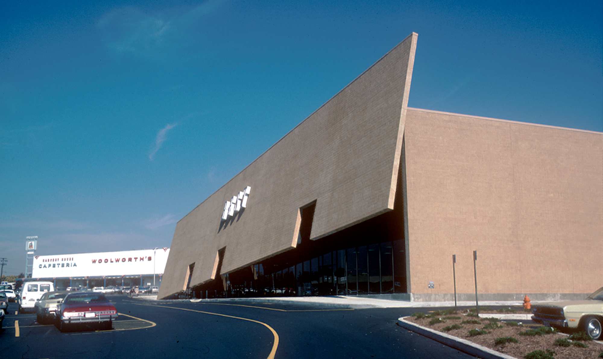
BEST Products Tilt Building, 1976, Image © SITE
EB: SITE has created some of the most widely recognized, and often controversial, buildings in the United States. How do you approach pushing the boundaries of disciplines to create new work?
JW: When working on architectural projects, this integrative viewpoint has freed me from those Modernist traditions, which are typically driven by expressions of function, or design conventions derived from Modernism and Constructivism. To the contrary, I tend to treat the whole notion of ‘use’ – including its relationship to the surrounding environment – as a liberating source of interpretation, rather than some kind of obligatory determinant in the shaping of form. Since the earliest days of SITE, these alternative sources have included:
- Critical commentary on architecture
- Incorporating ‘psychology of situation’ and humor
- Fusing buildings with existing landscape
- Questioning overused paradigms
- Playing with notions of stability versus instability
- Inverting the relationships between inside and outside
- Introducing non-architectural materials
- Expanding means of adaptive re-use
- Exploring the process of moving parts in buildings
- Treating interaction as an essential ingredient – as much as brick, concrete, steel and glass – in the development of a design concept
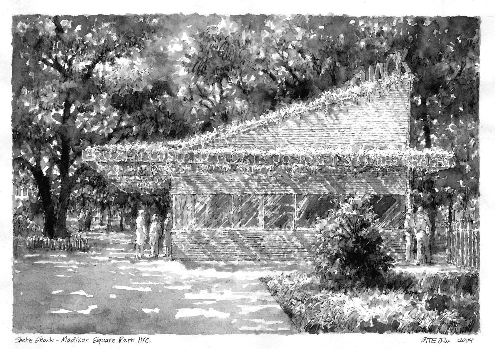
Drawing of Shake Shack Kiosk, 2004, Image © SITE
The creative initiatives behind these options are usually spontaneous and receptive to existing conditions during the beginning stages of a project. Personally, I don’t start with some cumbersome theoretical premise; but, instead, just try to keep all source-of-idea possibilities open. Denise Scott-Brown offered an astute and cautionary summary of this evolutionary process by observing that it is usually better to create a design concept, without literary rationales; then, when the building is finished, take a long look and decide whether it deserves a theory. I have always felt that the most interesting art and design results are generally motivated by the author’s state of boredom with doing things in the same old way. For me, this has often been a kind of rebellion against colleagues or architectural critics insistence on prescriptive definitions for so-called ‘REAL architecture.’
During the early and most controversial years of SITE’s work, I was constantly confronted by dogmatic professionals and conservative journalists who were intent on declaring our studio’s projects as unqualified for the pantheon of authenticity. This presumptive validation always inferred that the evaluator was somehow endowed with supreme credentials for deciding what is and isn’t architecture. In my view, the consequences of such arrogance inevitably became a kind of ‘bestowal-of-pedigree,’ conceit … proclaiming there is some indisputable paragon for good design. To escape the mind-numbing consequences of such restrictions, I have always looked for external sources of content that might shape my choices of interpretation.
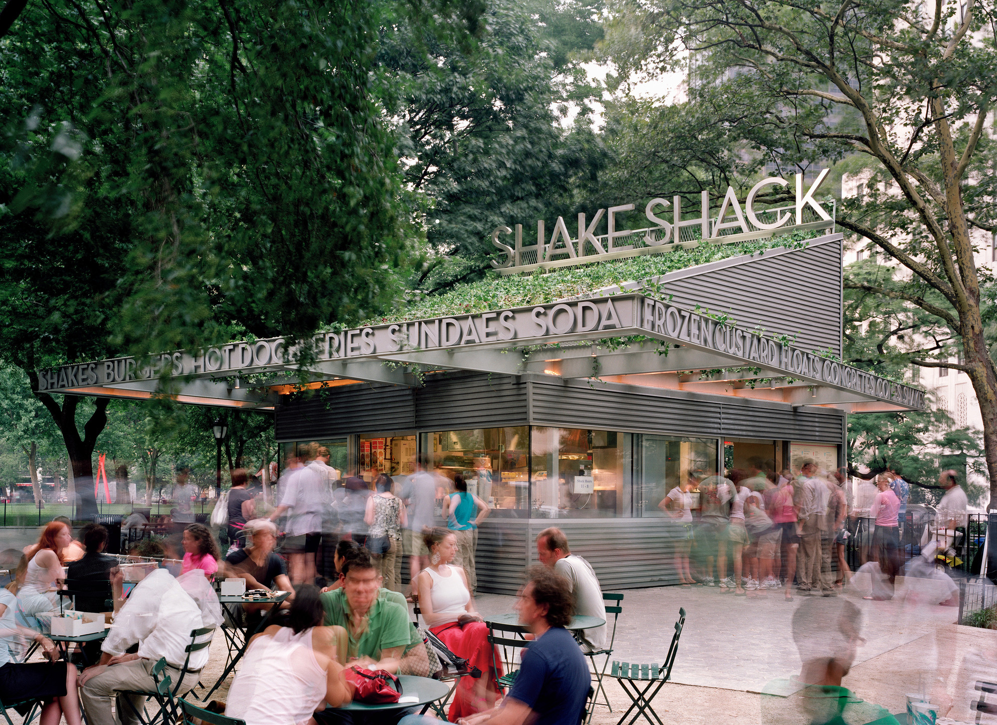
Shake Shack kiosk, 2004, Image © SITE
EB: What are some recent projects you’ve been working on?
JW: Over the past year almost all of our projects have been either cancelled or postponed, due to the pandemic. Also, as result of these difficult times, I had to move the studio to my apartment, which has caused a great deal of confusion and a need to reorganize my creative habits. Among the few endeavors that have continued, SITE is working on a desert house in the Cupertino region of California and stores for fashion designer Virgil Abloh’s ‘Off-White’ expansion in Korea and Japan. Also, I have been helping the Tchoban Museum in Berlin prepare for the opening of a 50th anniversary retrospective of my drawings for SITE.
The residential design in Temecula, for an engineer named Larry Towles, is especially intriguing, because the imagery is intended to totally integrate with its arid, mountain/desert environment. For this project, my daughter, Suzan, and I developed a stucco and mud-brick wall system that flows into its surroundings by means of fragmented profiles that respond to the regional landscape and local topography. For Off-White, we finished an intentionally invisible retail environment, completely constructed out of various scrim, lathe and welded wire materials. As a visual benefit, Virgil’s lively and colorful fashions seems to be floating in space.
Another recent project, SITE’s installation for the Willi Smith fashion retrospective at Cooper Hewitt Museum, was supposed to open in March of 2020 and the actual date hasn’t been rescheduled. For me, this has been a particularly interesting challenge, because it is based on a resurrection of my 1980’s collaborative relationship with Willi. SITE designed a number of his showrooms, as well as clothing ideas, performance works and the company offices. His innovative garments – actually, the beginning of a hip-hop sensibility in the fashion world – were specifically designed as streetwear; so, he wanted his showcase situations to reflect a rough and tumble ambiance. In response, all of the WilliWear interiors were constructed out of salvaged raw materials from the streets and waterfronts of New York.
During those early days, everything Willi and I worked on together was centered on ‘people interaction’ – in stark contrast to the Covid 19 demands for social distancing today. There is a sad irony in the fact that the Willi Smith exhibition is celebrating his integrative vision during a time of obligatory isolation, massive community unrest, environmental destruction and a neo-fascist administration in Washington . . . the antithesis of everything his philosophy and creativity was about. Willi and I shared interests in the public domain, fusions of the arts, recycled materials and the adaptive re-use of existing spaces. In a post-pandemic environment, I believe all of these concerns will become more essential for a new ‘economy of means’ awareness.
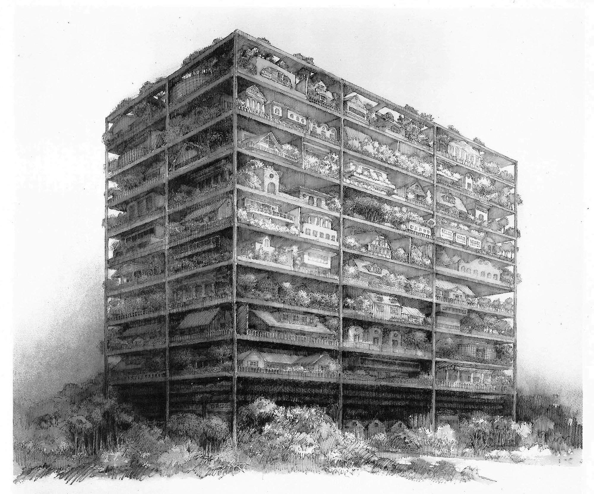
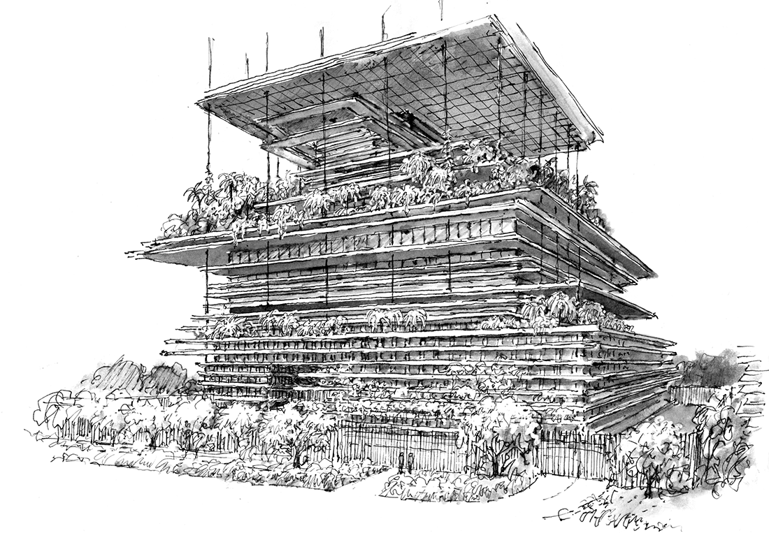
Highrise of Homes, © 2020 James Wines
Your Highrise of Homes project has influenced many subsequent housing projects over the last 40 years, yet many miss the fundamental idea of “canned chance”. How do you think architects and designers can better create housing projects that reflect residents’ personal choices?
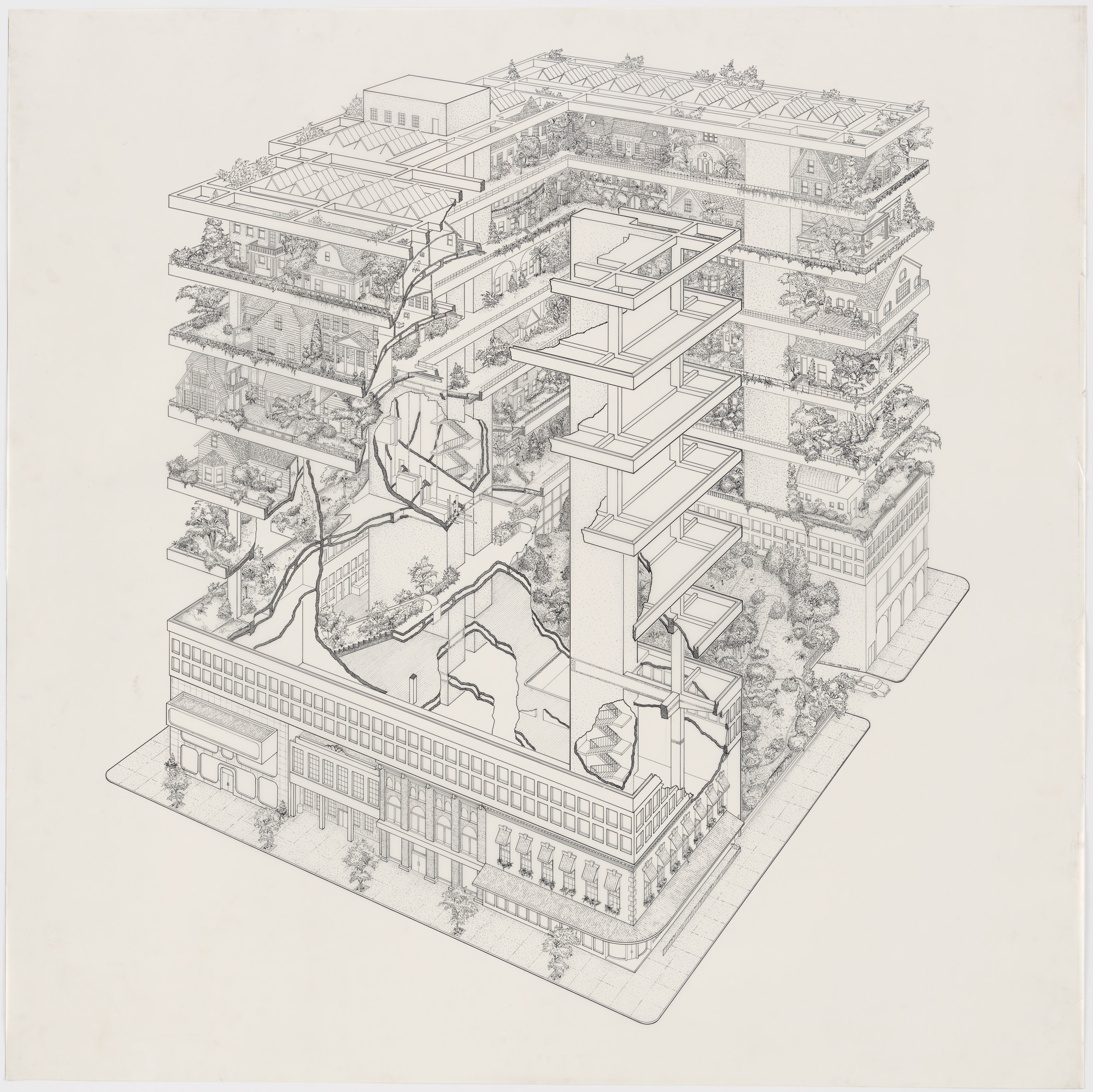
I think, of all SITE’s proposals, this Highrise of Homes project has probably exerted the most influence on subsequent housing design. On one hand, this has been a welcome result; but, on the other hand, the concept’s basic propositions have been generally misunderstood. Most multi-story residential buildings continue to show no evidence of inhabitants’ personal identity and certainly no sign of such liberating qualities as idiosyncrasy, indeterminacy and chance.
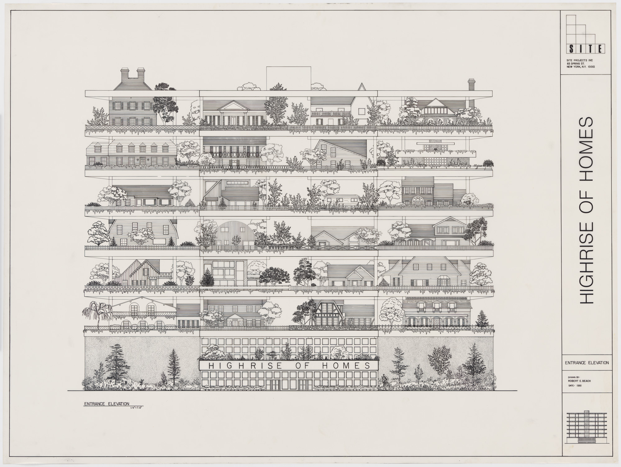
The Highrise of Homes imagery has continued to be interpreted as formalist designed veneers that simply illustrate the idea of ‘houses in the sky’ (the usual title of many such spinoffs). These versions are paste-on, designer-controlled, façade treatments – versus the HoH proposal to encourage a random collage of dwellings, based on the residents’ individual choices.
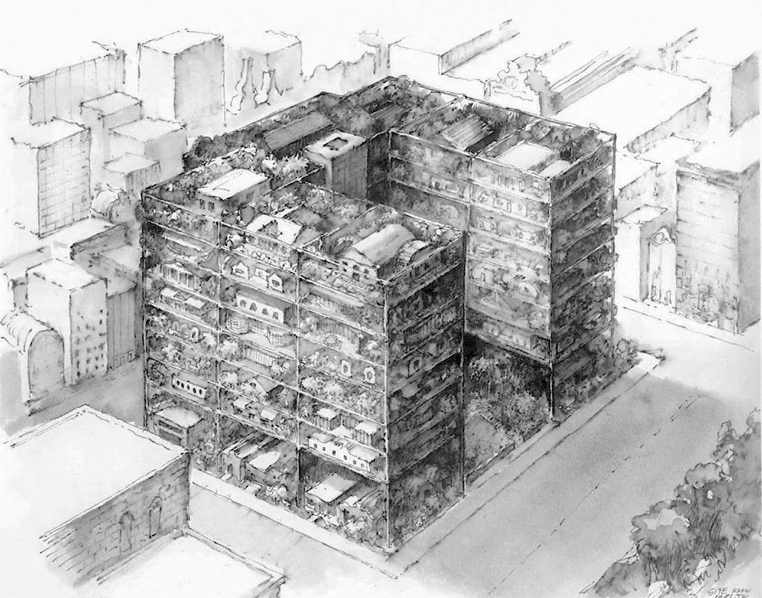
As a partial (and definitely theoretical) proposal for looking at this ‘identity in density’ issue, I introduced the Highrise of Homes concept in 1981. Admittedly, this is another architecturally elitist idea that, if actually built, would most likely be affordable to only affluent residents. The reason this proposal seems to have gained another round of relevance now is because the project offers this special focus on people’s psychological need for evidence of their personal presence in the cityscape.
My basic descriptive summary is: “The Highrise of Homes is a condominium vision, composed of ten to twenty-five stories, located in a densely populated urban center. It is intended as the sociological/aesthetic equivalent for habitat of a condition that Marcel Duchamp once referred to in art as ‘canned chance.’
Highrise of Homes, © 2020 James Wines
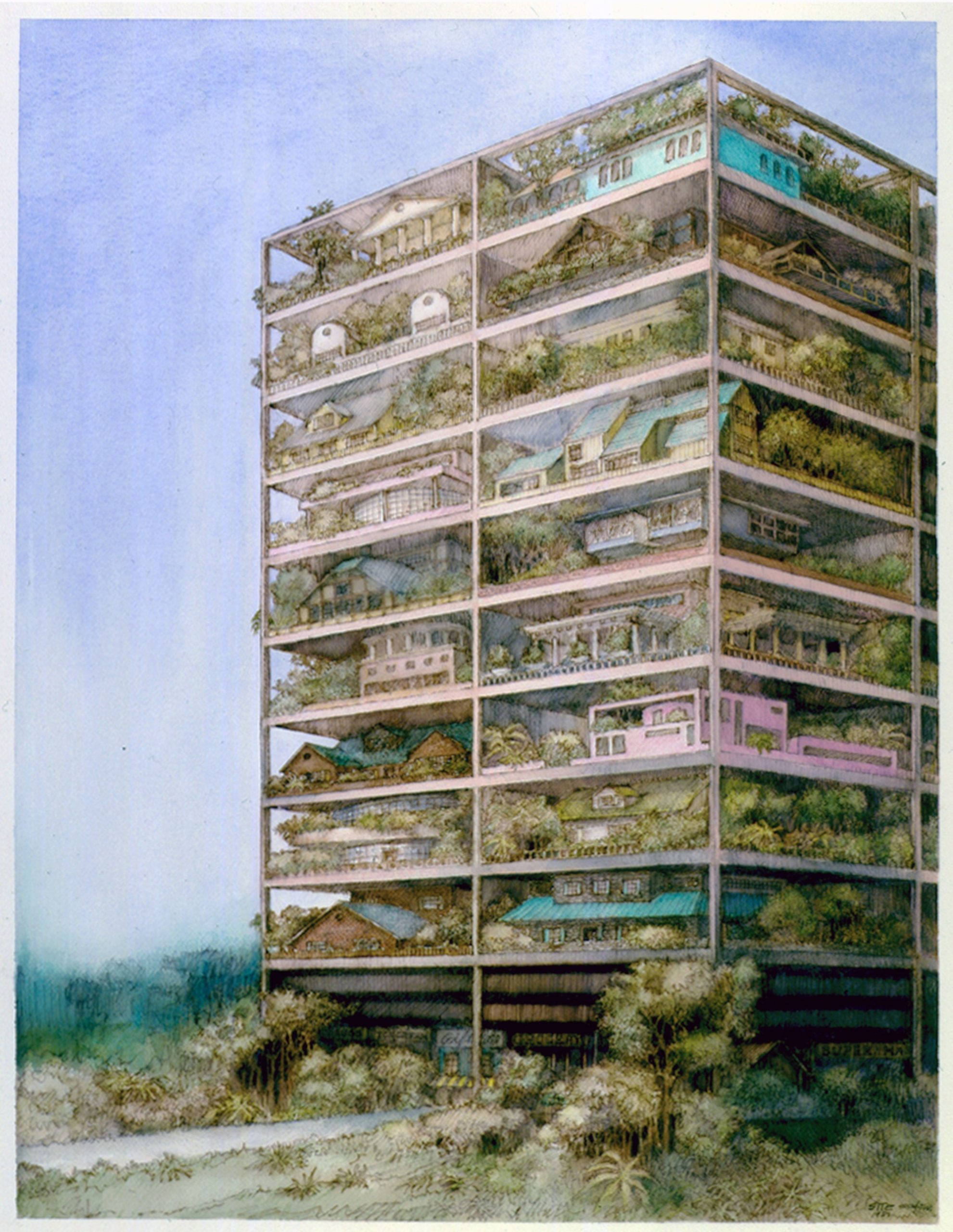
The structural configuration is a steel and concrete matrix that supports a vertical community of houses, clustered into village-like communities on every floor. Each level provides flexible platforms that can be purchased as separate real estate parcels. A central elevator and mechanical core provide services to the individual homes, gardens, and street-like walkways.
The philosophical motivation behind this concept is based on a critique of the 20th Century tradition of homogenized and faceless multistory buildings, which eliminate the possibility for inhabitants to achieve any evidence of their own identity. The objective is to shift the premises for design evaluation and residential lifestyle in tall buildings away from formulaic Modernist and Constructivist influences, in favor of the inherent vitality of collage-like choices. While the Highrise of Homes still remains theoretical, it continues to challenge the shortcomings of architecture’s familiar paradigms.
Mainly, it offers humanizing alternatives for people living in overly prescriptive and visually unimaginative buildings. The original concept proposed a variation of the early 1900’s Sears Roebuck mail-order dwelling, by offering inhabitants an opportunity to select their façade, patio and interior style preferences from a catalog. Today, with the rapid advancements in 3D modeling, this entire kit-of-parts production has been amplified to an extent where, soon, the economic advantages and possibilities for infinite choice may increase the viability of an actually built example of Highrise of Homes.
Highrise of Homes, © 2020 James Wines
Your drawings have established cultural and environmental imperatives in their own right. For you, what is the relationship between drawing and architecture?
My enthusiasm for hand drawing has been partially based on my belief that a total dependence on the computer – especially during the conceptual stages of a project – kills creativity. These digital limitations are always controlled by whatever graphic parameters the programmer has provided. The reality is that I feel uncomfortable with some unseen technician breathing down my neck. In an article for London’s Blueprint Magazine in 2009, I wrote the following critique: “I have been a long-standing supporter of dual skills, encouraging young designers to maintain equal graphic abilities on paper surfaces and computer desktops.
This advocacy is based on a deeply felt conviction that, by focusing exclusively on computer generated illustration, something conceptually profound is forfeited in the design process. When electronic response mechanisms replace the filtration of idea development through tactile means and guiding fingertips, the fertile territory of ‘subliminal accident’ is lost. This refers to marginal calligraphy that dribbles off the edge of the paper, the inadvertent congestion of squiggly lines with no apparent meaning, the unwelcome blobs of ink that drop off a pen tip, or the inclusion of seemingly irrelevant references that have nothing to do with initial intentions.
On innumerable occasions over the years I have been the creative beneficiary of my own graphic musings and the chaotic trail of ambiguities left behind by random charcoal smudges and watercolor washes. In other words, this pictorial detritus inscribed on paper, without any pre-determined architectonic mission, has often become the spring board for new ideas.”
Highrise of Homes, © 2020 James Wines
When I was teaching, one of my most popular courses was hand drawing. I still feel confident that sketching increases one’s mental agility to sort out ideas by means of random searching and continuous testing during the development process. I also used to show my students science-based statistics, explaining the vast differences between the human brain’s capacity to gather and evaluate information, versus the computer’s more limited capabilities. For example, while both the brain and computer function by similar means of circuitry, the non-linear human mind is one thousand times more powerful than a laptop.
The brain’s one-hundred trillion, neuron-activated connections make it possible to think vertically and horizontally at the same time. In praising the merits of hand drawing, I pointed out to students that, with a gradual increase of graphic skills, they can infuse visual statements with their own personal sensibility – including expressive, evocative and atmospheric qualities that go far beyond the tech-driven frigidity associated with software’s photo-fidelity and its overly illustrative format.
For me, ‘mind-to-hand’ drawing has always been much faster than attempting to conceptualize on a computer. When my studio starts a project, I can usually cover a few pages with preliminary sketches before other team members have powered up their laptops. From the outset, this unfettered search helps clarify my initial reactions to a site area and galvanize the instincts that lead to a solution. I tend to start a project with quick ink and wash scribbles, because of this speed of exploration and the illustrative clarification of light and shadow. Most importantly, this instant graphic access to a combination of linear and tonal values gives me a sense of how sunlight will play a major role in the final concept.
Highrise of Homes, © 2020 James Wines
From my years of living in Rome, I became vastly appreciative of the capacity of historic architectural facades to engage the public in a continuing dialogue, based on readable iconography and Renaissance/Baroque designers’ masterful control of light and shadow. These evocative surfaces meant that I talked with buildings and they talked to me.
Constant exposure to this kind of interaction became part of the reason I grew disenchanted with cranking out large sculptural volumes for their own sake. When I returned from Italy – between Kiesler’s influence and an increased boredom with shape-making – I shifted my energies toward finding contemporary and communicative means for investing architecture with narrative and critical content. My drawing skills definitely helped advance this objective.
Your upcoming Berlin retrospective explores drawing over the span of your career. Can you tell us more about the exhibition and the work that will be included?
The Tchoban Museum retrospective was supposed to open at the end of November, as a celebration of SITE’s fiftieth anniversary; but, now, as a consequence of coronavirus-related shutdowns in Germany, it has been re-scheduled to open at the end of December. Since most of my drawings over the past fifty years describe some aspect of ‘integrative thinking,’ this absorptive process is both the focus of the show and an organizational strategy for placing works on exhibit. The drawings themselves represent various stages of the creative process; from quick-search sketches for idea exploration, to more conclusive renderings, which are closer to final intent.
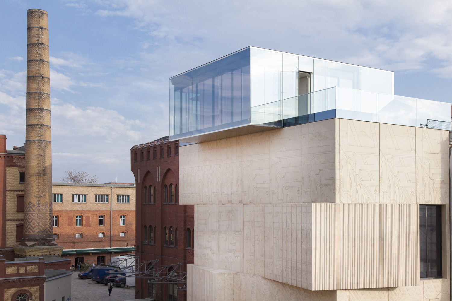
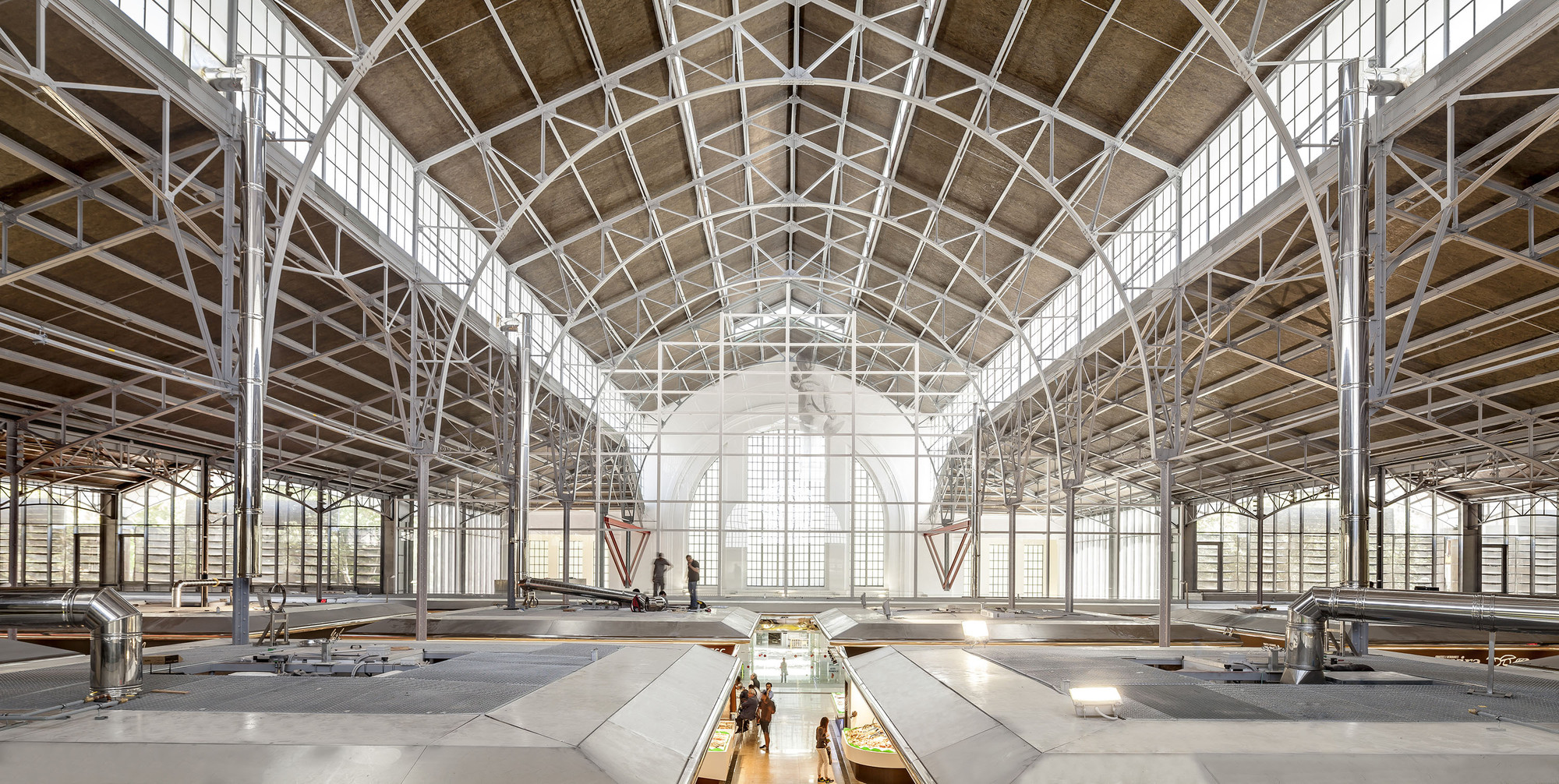
The Museum for Architectural Drawing in Berlin, Designed by Sergei Tchoban, Courtesy Patricia Parinejad
Over the decades, many colleagues have asked why I make such ‘fuzzy’ and indeterminate looking drawings, instead of the more precise graphic representations that are typical of professional practice. In reality, I do both; still, I prefer to use hand drawing to describe the atmospheric and connective ingredients that merge buildings with their environments.
I am generally trying to describe a fusion of ingredients, more than illustrate distinctly separate forms and functions. Naturally, as with all designers, I have a period of focus on purely service related and technical solutions; yet, my starting point is always an investigative overview of context. While, in the end, I select some kind of organizational matrix to define a building or public space, my initial ideas come from that wide range of sources I cited earlier in our discussion of mind-to-hand preferences.
On the assumption that Tchoban Museum will eventually open its doors, I am hoping this show will help illuminate the reasons for my drawing techniques, with their indistinct edges and shadowy veils of ink washes and charcoal rubbings. The three most misunderstood and least credited aspects of my work have continued to be my use of architecture as a subject matter for art, the absorption of context as content and my seemingly amorphous ways of delineating these intentions through graphic choices. I am depending on this show to clarify these objectives.
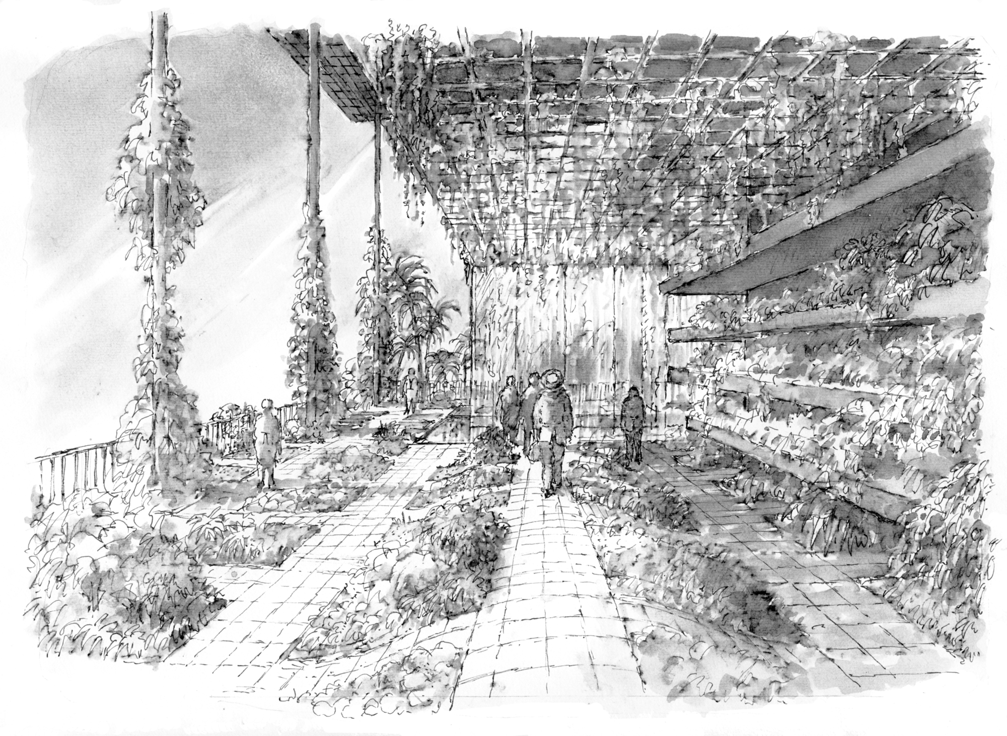
Antilia “Vertiscape” Tower proposal, 2003, Image © SITE
You’ve built a body of work that also prioritizes sustainable architecture for the future. Are there any ideas you think should be front and center in the minds of architects and designers?
As part of a recent request to contribute to Ken Yeang’s forthcoming book, entitled ‘Tips From the Top’ – a compendium of advice to young designers from older practitioners – I started with a brief summary of the challenges facing a post-covid 19 architecture. I proposed that: “The pandemic’s impact has left the design scene in a state of unique ambivalence, where all of the qualifying rituals for success appear to be in head-on collision with reality.
As an artist/architect, dedicated to conceptual, theoretical and aesthetic priorities, it makes me feel a little like the proprietor of a pricey restaurant, with closely spaced tables, forced to operate in a world of social distancing. The urgency of my services seems problematic, to say the least. This (no end in sight) global scenario of health threats, economic peril and political conflict has decimated all of those career-based assumptions that a seasoned practitioner can responsibly impart to the younger generation. It is especially perplexing to try to deliver wise counsel when every hypothesis is under scrutiny . . . basically, questioning all of the routinely endorsed criteria for commercial development, energy consumption, housing standards, construction economics and public space planning.”
From this confused perspective, I am currently reassessing the priorities I have traditionally believed were aesthetically desirable and environmentally responsible during my sixty-year career. Among my studio’s past contributions that seem most applicable to a post-pandemic version of the future, there are SITE’s advocacy of projects based on low costs and re-cycled materials, the absorption of regional sources of content, an adaptive re-use of existing structures and finding new applications for green design principles.
Probably the most relevant of all, in terms of expanding the horizons of visual art, has been escaping gallery/museum confinement and hitting the streets. In a social distancing world, this is where the largest (and virus shielded) audience exists. My creative challenges also include trying to reevaluate the archetypes, paradigms, political strategies, patronage options, economic models and habitation game plans at their most fundamental levels. For example, when designing public spaces, I have continuously tried to emphasize what I call ‘trigger elements’ that attract participants to relate to their environments on more engagingly psychological and physically participatory levels. I have always assumed that the more people interact, the more successful the project.
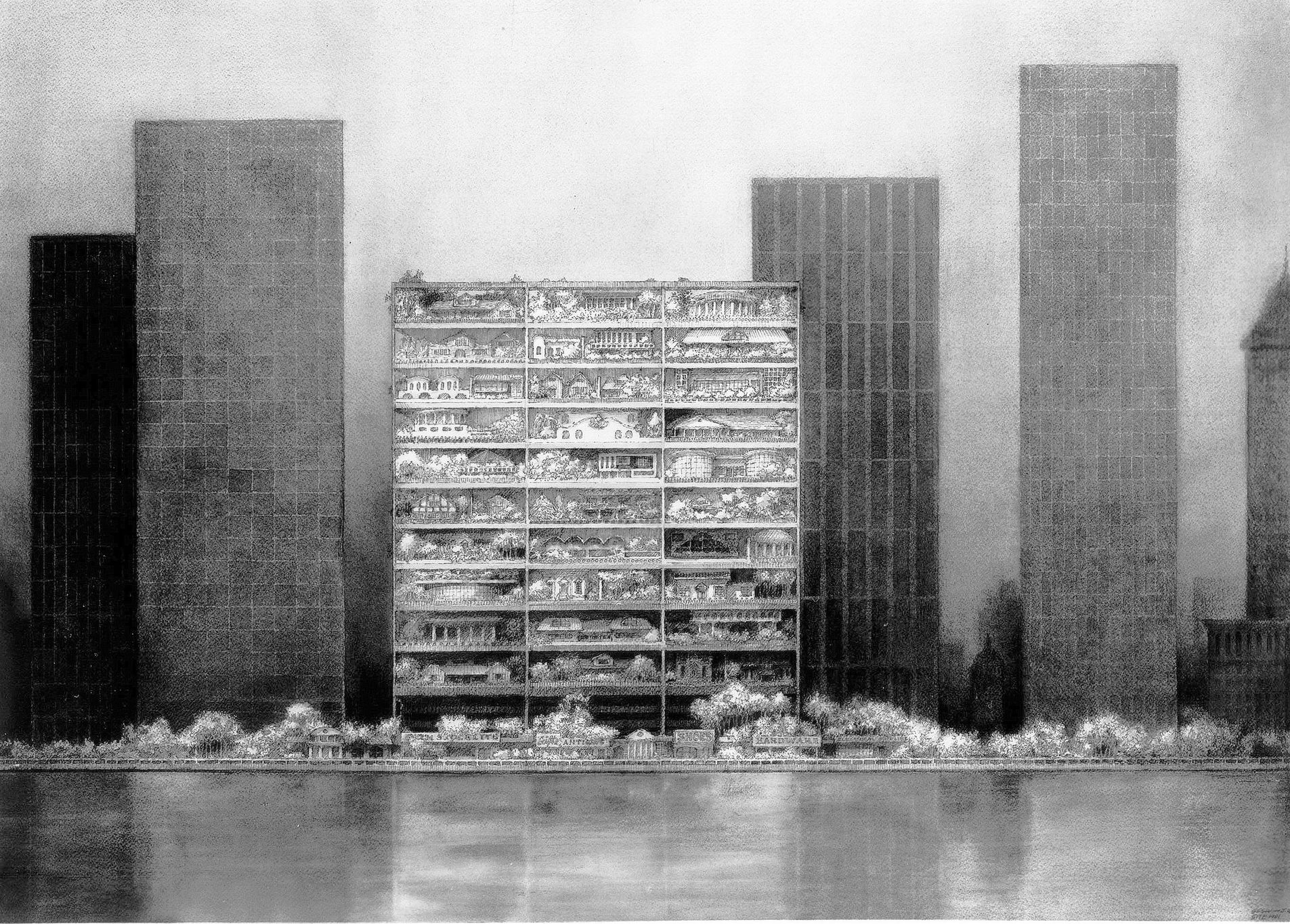
Highrise of Homes, © 2020 James Wines
In today’s global crisis, with scientists predicting an escalation of contagions in the future, there will be a percentage of apprehensive people who prefer to continue social distancing, while an opposing population will demand ever-greater community clustering. How does an architect and planner create spaces for these conflicting dualities in the same locations? To continue this juggling of oppositions — and with respect to an obligatory economy of means — how does the architect design modestly scaled habitat for the reality of exploding populations? How can the essential need for a global reduction of energy consumption succeed, while technology and industry relentlessly impose their escalating demands?
And finally, in view of the vast gaps between poverty and affluence, how can economic injustice be rectified when, as the Oxfam World Economic Reports declares; “Billionaires have more wealth than the four and a half billion people who make up sixty percent of the planet’s population.” I want to avoid a resignation to hopelessness as the conclusion of our dialogue. Therefore, I declare my continuing optimism and faith in the capacity of artists and designers to help change the status quo and provide a re-thinking of everything detrimental to post-pandemic progress. I just hope this confidence doesn’t fall into the category of naïve and hopeless idealism.
While the past controversies surrounding SITE’s work in architectural circles have swirled around the haute design scene’s view that there is no room in building design for humor, social commentary, invasions of new content, absorption of context and built critiques of architecture itself, I still feel compelled to explore these polemical territories. The main difference now is the fact that there are some genuinely new and reinforcing reasons to continue.
For a chance to have your work reviewed by James Wines and other creative thought leaders, submit a drawing to Architizer’s One Drawing Challenge — click here to find out more.
