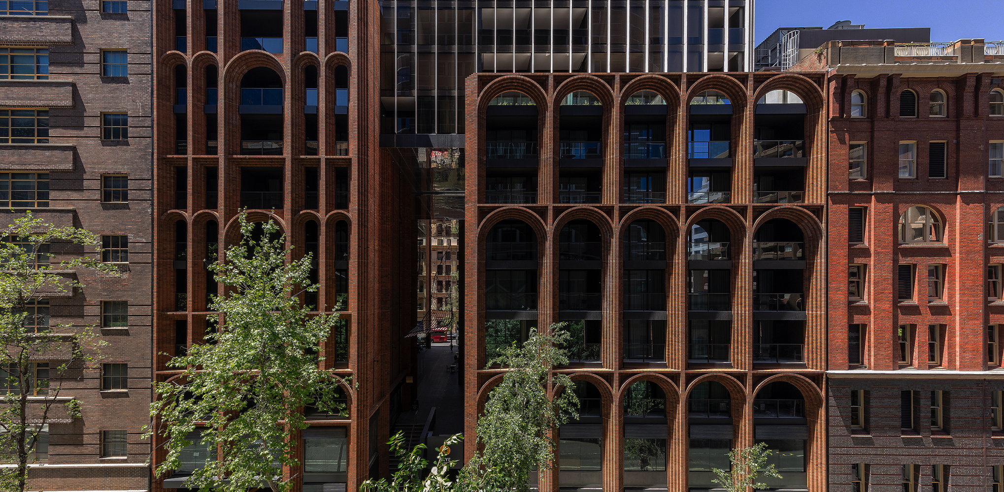
Scooping virtually every accolade available in the 7th Annual A+Awards, Koichi Takada Architects’ Arc is nothing short of magnificent. It took home both the Jury and Popular Choice awards in the High-rise Multi Unit Housing category, and is one of five buildings honored with the 2019 A+ Awards Project of the Year title. Located in Sydney, Australia, this elegant mixed-use residential tower comprises 26 floors of apartments, boutique hotel rooms and retail spaces spanning the width of an entire city block.
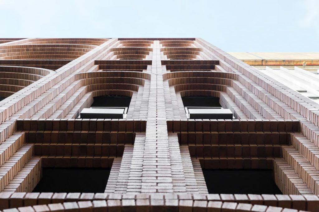
What sets Arc apart is how it employs innovative contemporary design while paying homage to the heritage of its environment. The structure was informed by the materials historically used in this part o the city, as well as the proportions of arches along the street front. A traditional, handcrafted brickwork façade at the base of the building mirrors the composition of neighboring heritage buildings.
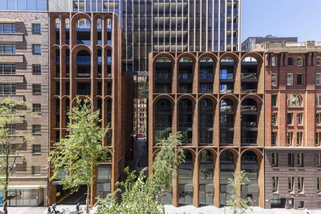
Moving upwards, the tower transitions into a finer, lighter materiality and is crowned by an open rooftop that overlooks the city. This duality of contrasting aesthetics allows Arc to blend into the historical complexion of the region and set itself apart in a city dominated by flat rooftops and glass and metal façades. Arc’s design is brilliantly mindful of its environment and those that inhabit its space, explaining why it left such a massive impression on this year’s A+Awards competition.
Architizer spoke with Firm Principal Koichi Takada about the project’s standout qualities and how it feels to have been named a Special Honoree this year.
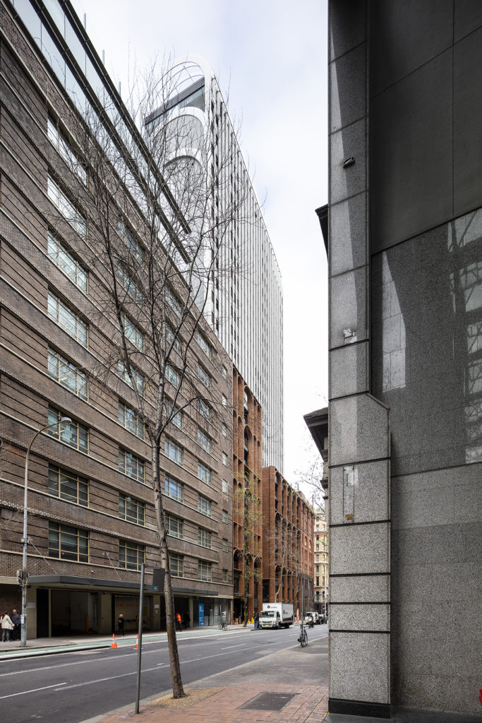
Perhaps the most striking aspect of Arc is its front facade, defined by a series of elegant brick arches. How did Koichi Takada Architects decide on brick as the primary material, and how does it relate to the surrounding context?
During the competition, we went to study the existing site and were struck by the neighborhood’s delicate heritage with heavy masonry characters. Initially, we were torn if we should go with old or new materiality. The contemporary glass and metal materiality, for example, may have looked sexier. It was particularly tempting to stand out as a contrast for the competition against the traditional brick masonry character of the existing neighborhood. Respecting or relating to the neighbors could have had many design risks of blending into the context and making our design ‘invisible’ or even unnoticed.
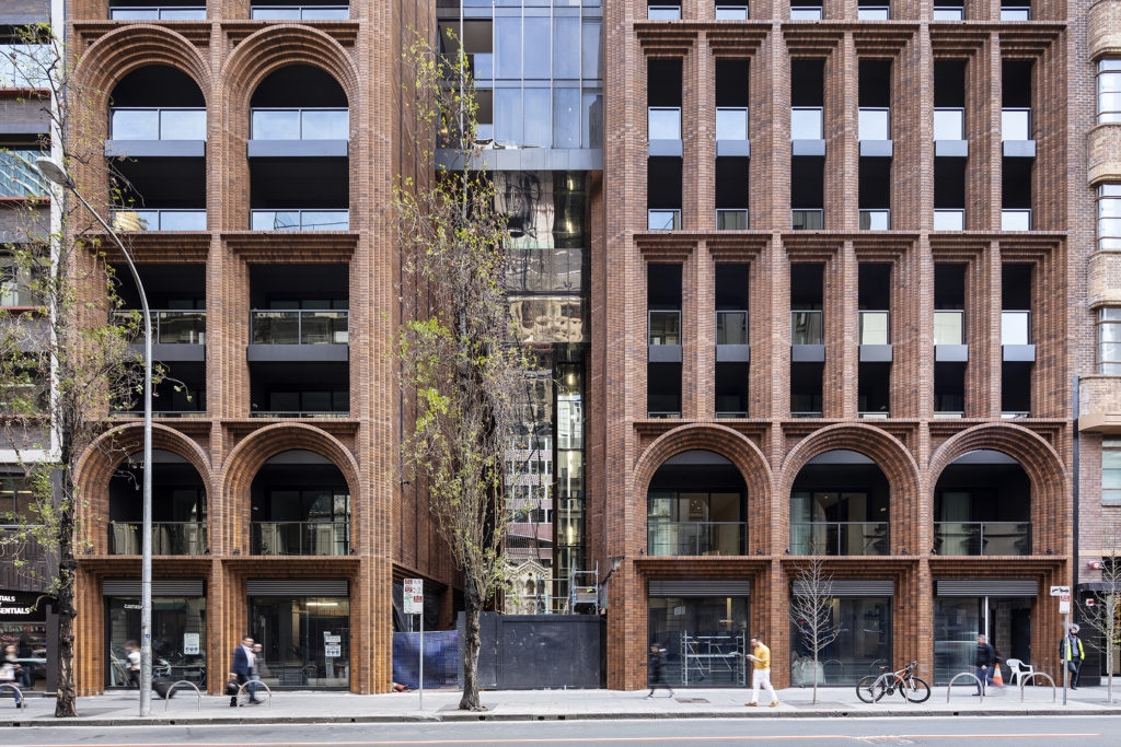
This brick elevation is beautifully detailed – how did the design team work with contractors / brick layers to ensure such great quality here?
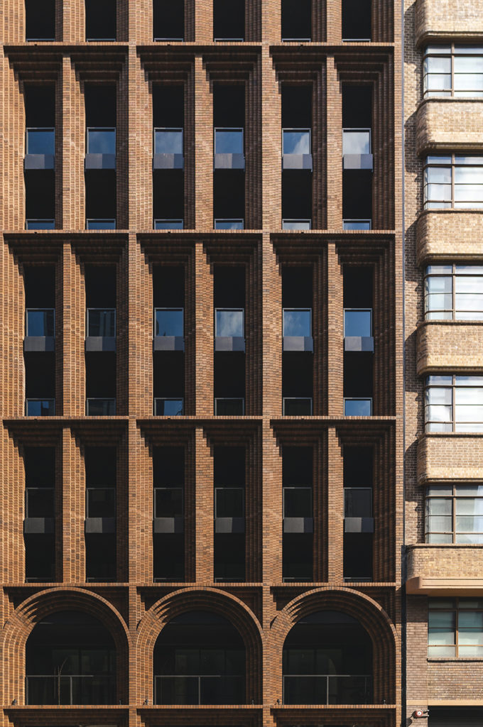
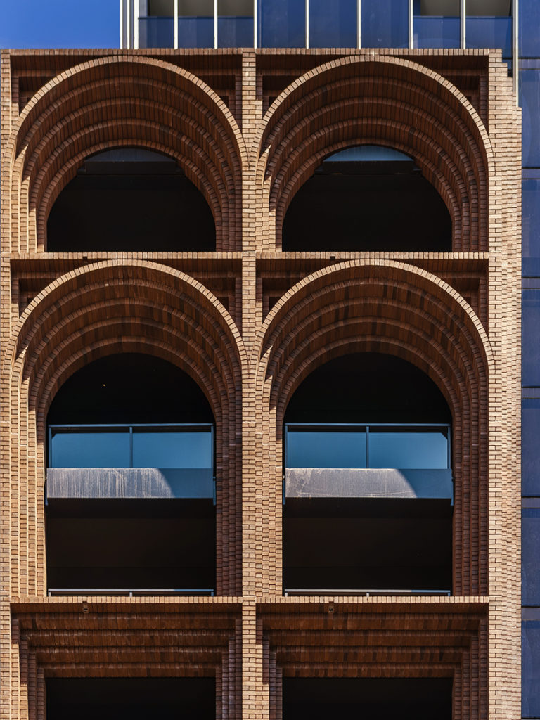
We worked hard on 1:1 mock ups and tried to perfect them with the contractors before they finally executed on site. Having said that, there were still more challenges to overcome on site. Because not all arches were identical, we had to see how each junction of two geometries of arches met, for example.
We also worked with brick coursing dimensions but the construction tolerance and movement within the high-rise façade is something that bricks were not flexible to adjust with, so we had to think on site and experiment the expansion joints as we were building up.
It was such a pleasure talking to the bricklayers and working out 300,000+ hand-laid bricks on site together. Brick is a traditional material that requires good communication [to build with] and is the perfect demonstration of wonderful craftsmanship.
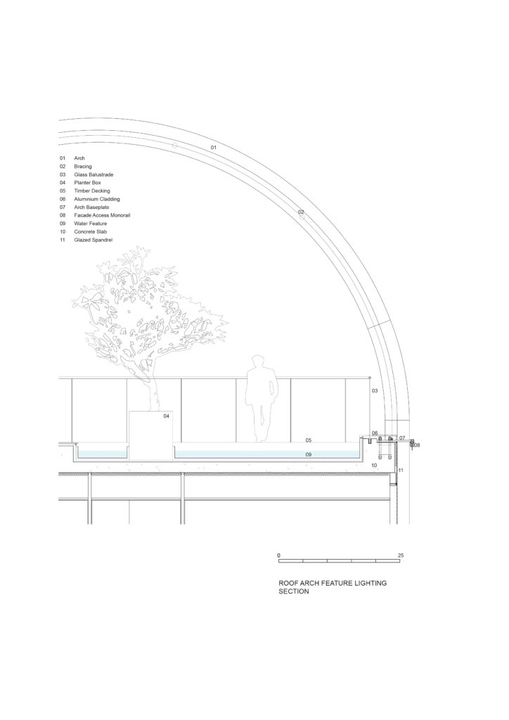
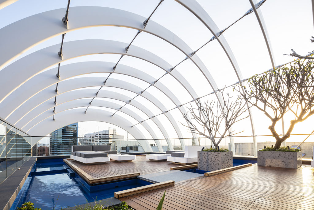
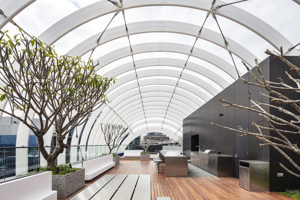
Another standout feature is the inhabitable rooftop. Can you tell me more about the design process behind this part of the project?
We chose to design the building with two teams of architects, one starting from the bottom up and the other from the top down. The rooftops in the city are a way to open up to the sky, but they’re often neglected and such a missed opportunity.
We wanted to lead by example and show what could be achieved. We explored the idea of an “architectural roof / crown feature”, and managed to increase the height while at the same time opening up the rooftop to people. It is a democratic way to celebrate the building’s great location at the heart of Sydney, connecting to the nature of such a beautiful harbor city.
What has the public reaction to the project been like?
We have been overwhelmed with positive messages about the use of traditional brickwork and masonry characters. Arc seems to resonate with people through an emotional connection to the human-scale and tactile qualities of the brickwork. The brick arches invite the city in; people immediately connect to the honest and natural use of materials and traditional construction processes.

What does winning an A+Awards Building of the Year Award mean to you?
Firstly, thank you so much for all who voted for our project! It is such a great honor to receive the 2019 A+Award Building of the Year Award and be placed amongst many great architects that have won it in the past.
It is also a reflection of how much people crave honest and tactile materiality. It highlights a shift in our cities away from glass and metal and invites a historical connection back to the cultural heritage of a locality. The appreciation of the hand-laid individual bricks adds a welcome appreciation of the human element that can sometimes be lost with modern machinery and automation.
Hit the button below to see every A+Award winner and finalist in this year’s incredible competition:
