The judging process for Architizer's 14th A+Awards is now underway. Subscribe to our Awards Newsletter to receive updates about Public Voting, and stay tuned — winners will be announced later this spring.
Tokyo-based French architect and artist Emmanuelle Moureaux first found inspiration in color when she experienced Tokyo as a student. The experience was so profound that she decided to move to the city. 25 years later, this multi-dimensional colorful urban landscape continues to inspire her.
The A+Award-winning architect’s emotional experience also gave birth to her philosophy of “shikari”, which means dividing the space using colors. This idea is a key element in all her work, may it be small installations or larger buildings. She said, “I use colors as three-dimensional elements, like layers, in order to create spaces, not as a finishing touch applied to surfaces.”
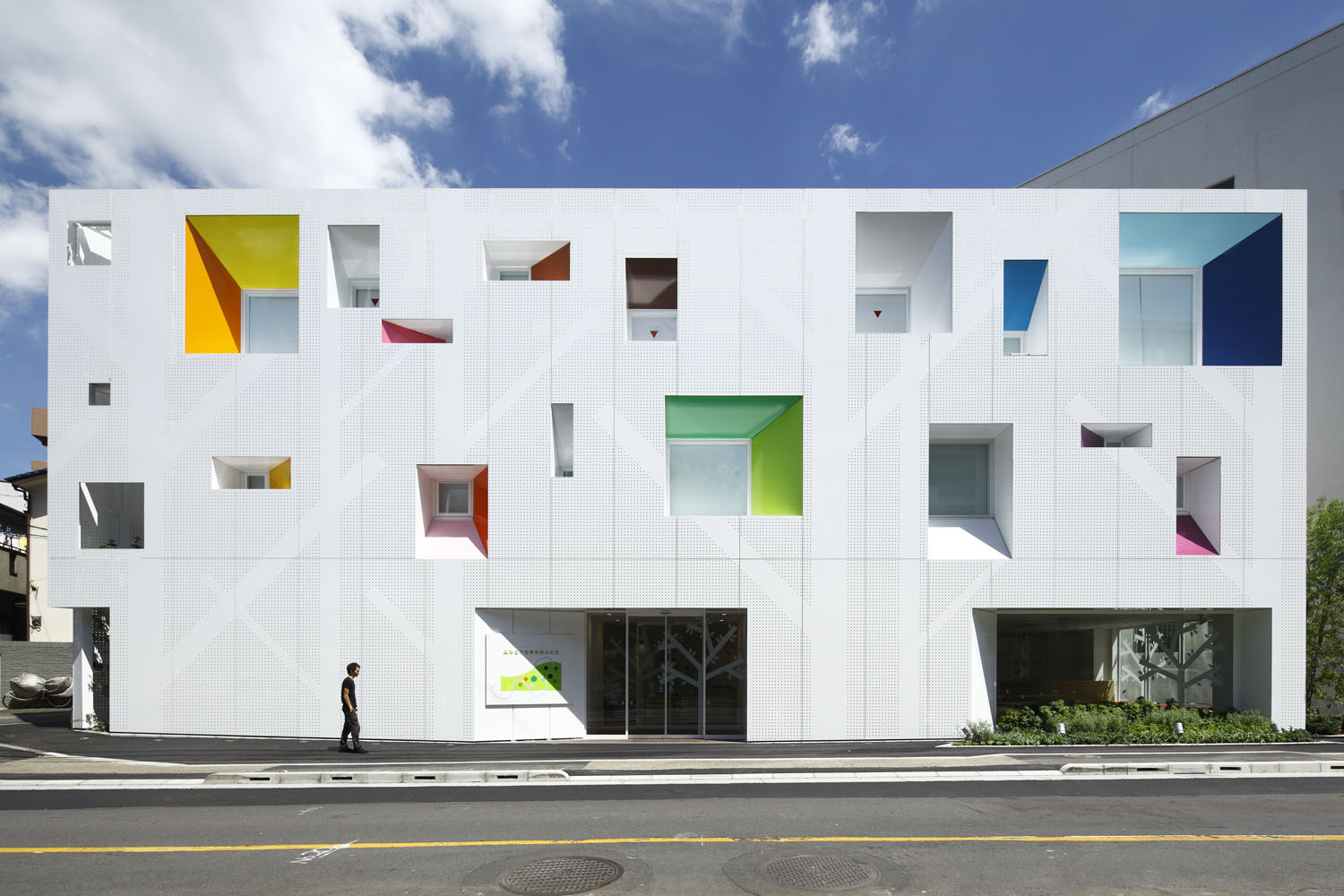
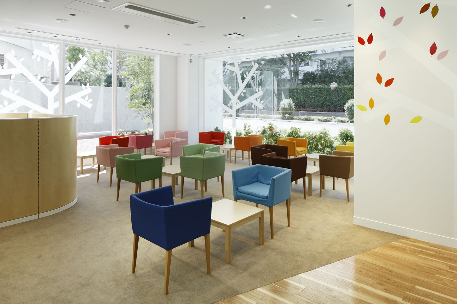
The design for the Tokiwadai branch of the Sugamo Shinkin Bank features an interplay of blank white surfaces with colored planes. Having drawn on flora for inspiration, leaf cutouts and tree silhouettes are found throughout the design. These design elements overlap with the natural foliage outside when seen from the interior spaces. The building has several wall patterns that are covered in shades of orange, blue, red and green, and these tones are also continued in the furniture within.
Mama Smile by emmanuelle moureaux architecture + design, Mito, Japan | Photos by Nacasa & Partners inc.
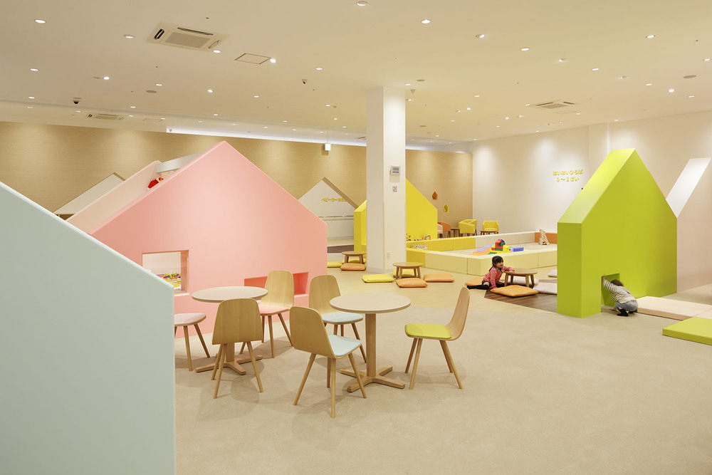
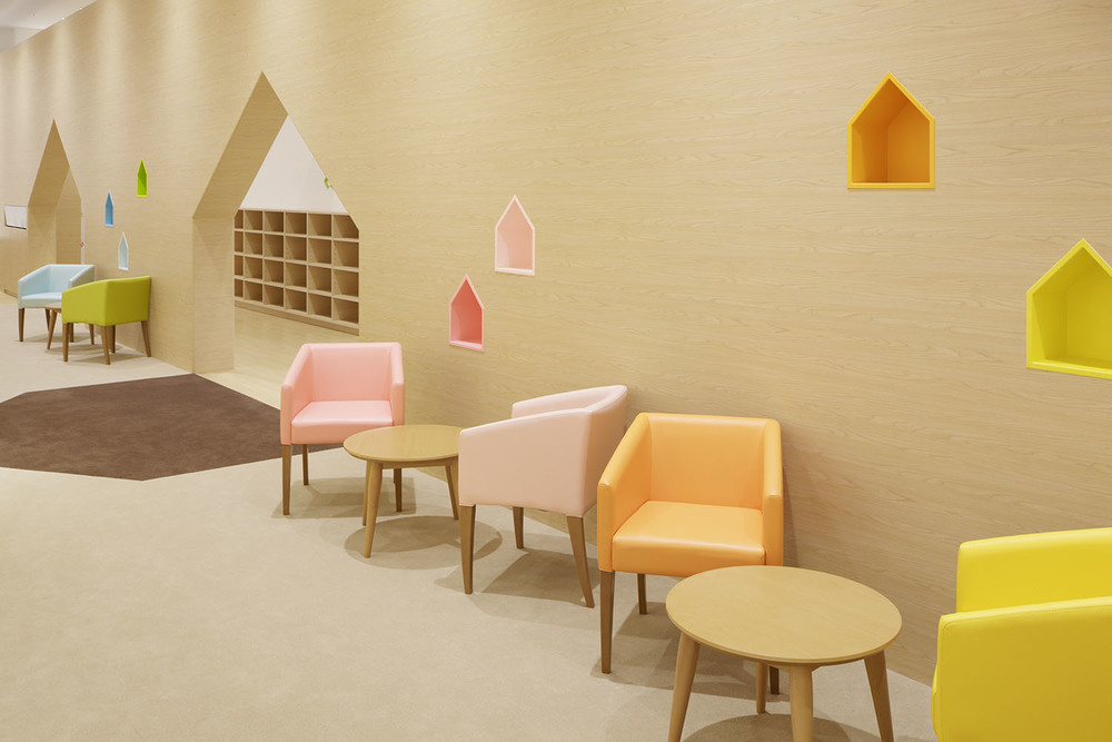
Mama Smile, an indoor play space in a shopping mall in Mito, Japan, showcases a more subtle color palette that is just as effective in bringing joy to its users. The entire space is imagined as a small town with house-shaped partitions, open spaces and alleys to encourage movement and exploration. These elements are painted in pastel tones of pinks, blues, yellows and greens to create a sense of comfort and also promote imagination.
Moureaux’s design process starts with determining how many colors she wants to use in the project, which depends on the function and site. She then goes on to study the form of the color — elements like surfaces, spheres, flowers and numbers, among others. This concept is then translated to a 3D state and then tested in real scale models in the studio to understand the experience using all senses.
Across these projects, color is more than just a design element. Although the vast majority of people filter their daily lives in color, not many actually pause and consider each hue carefully. “For me, color is a medium to create space and emotion,” Moureaux says. “With colors, I try to give emotions to people. Color can make people smile, give energy, joy, and most importantly they make people happy. Color is emotion. Color is universal and eternal, borderless and infinite.”
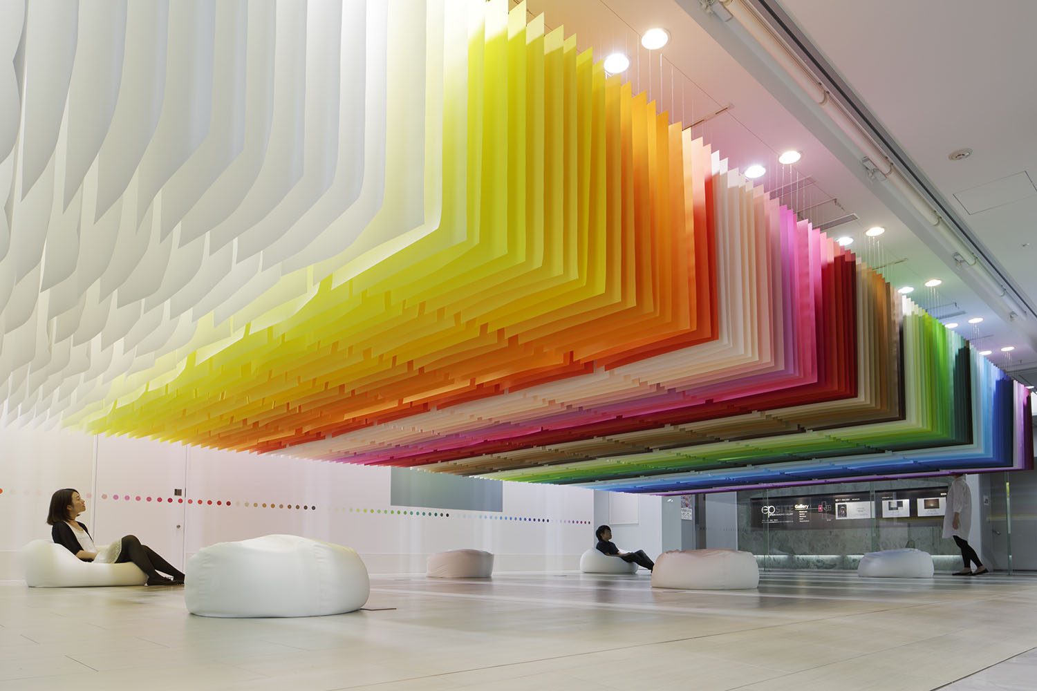
100 colors no.1 / Shinjuku Mitsui Building by emmanuelle moureaux architecture + design, Tokyo, Japan | Photos by Daisuke Shima
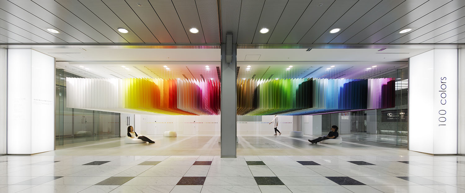
100 colors is an installation series that Moureaux started in 2013. The idea was to design spaces using a palette of 100 colors that were most appealing to her in a way where all of them are visible at one glance. It was also an attempt to make people more conscious of the colors that exist around us. The studio is now on its 36th project in the series.
An installation for the Shinjuku Mitsui Building is what launched the series. The large floating volume is made up of 840 papers suspended from the ceiling. The visitors are encouraged to spend time below this installation and identify their favorite color. They are then asked to make a note of it on the wall behind by picking the circle that corresponds to the shade they have picked. Apart from making it more interactive, this task also helps gain insight into trends and the preferences of the citizens.
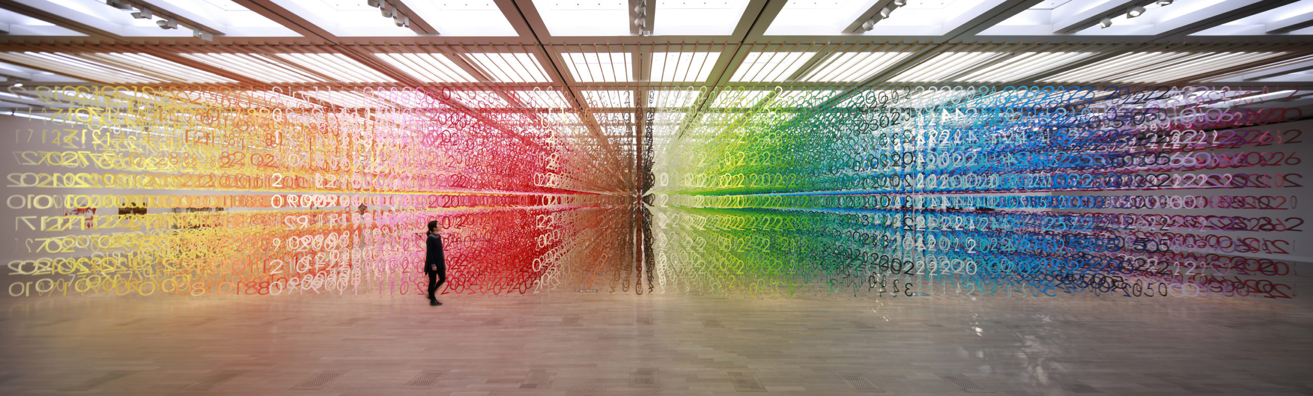
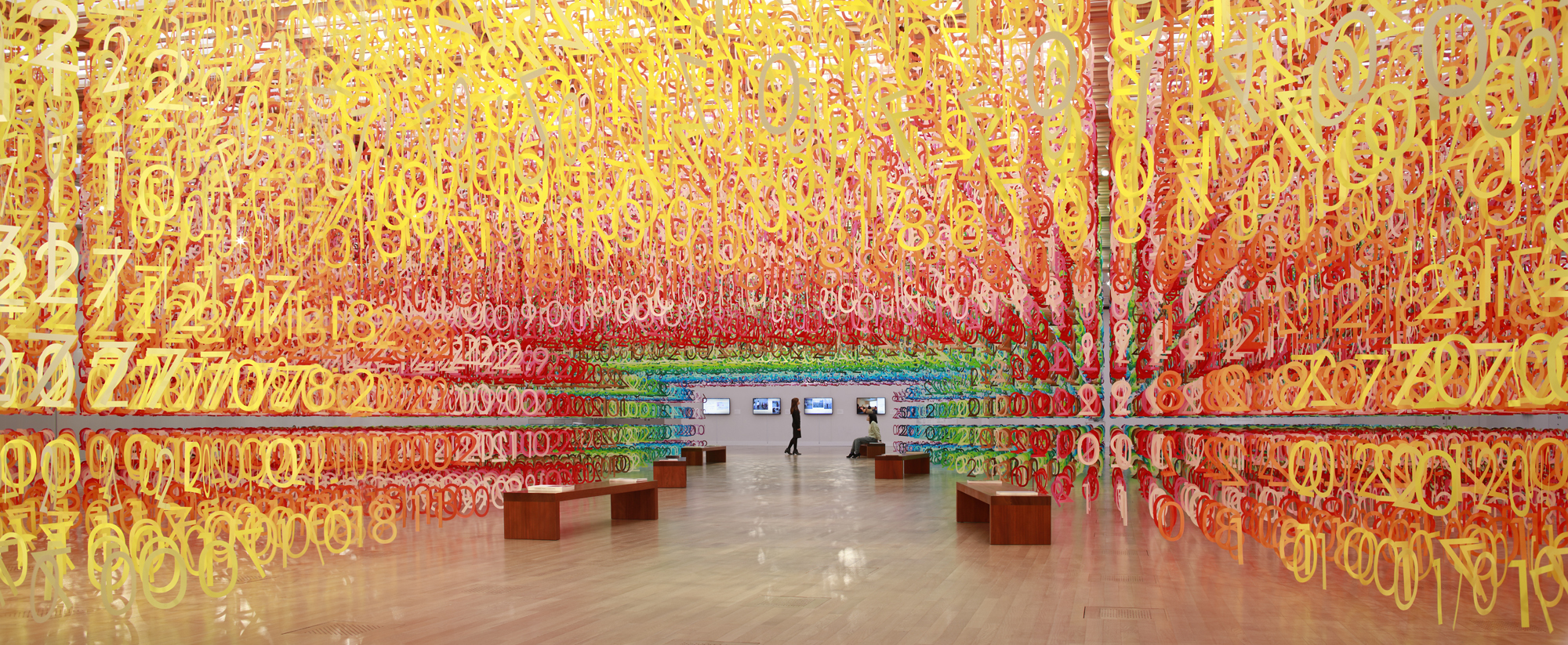
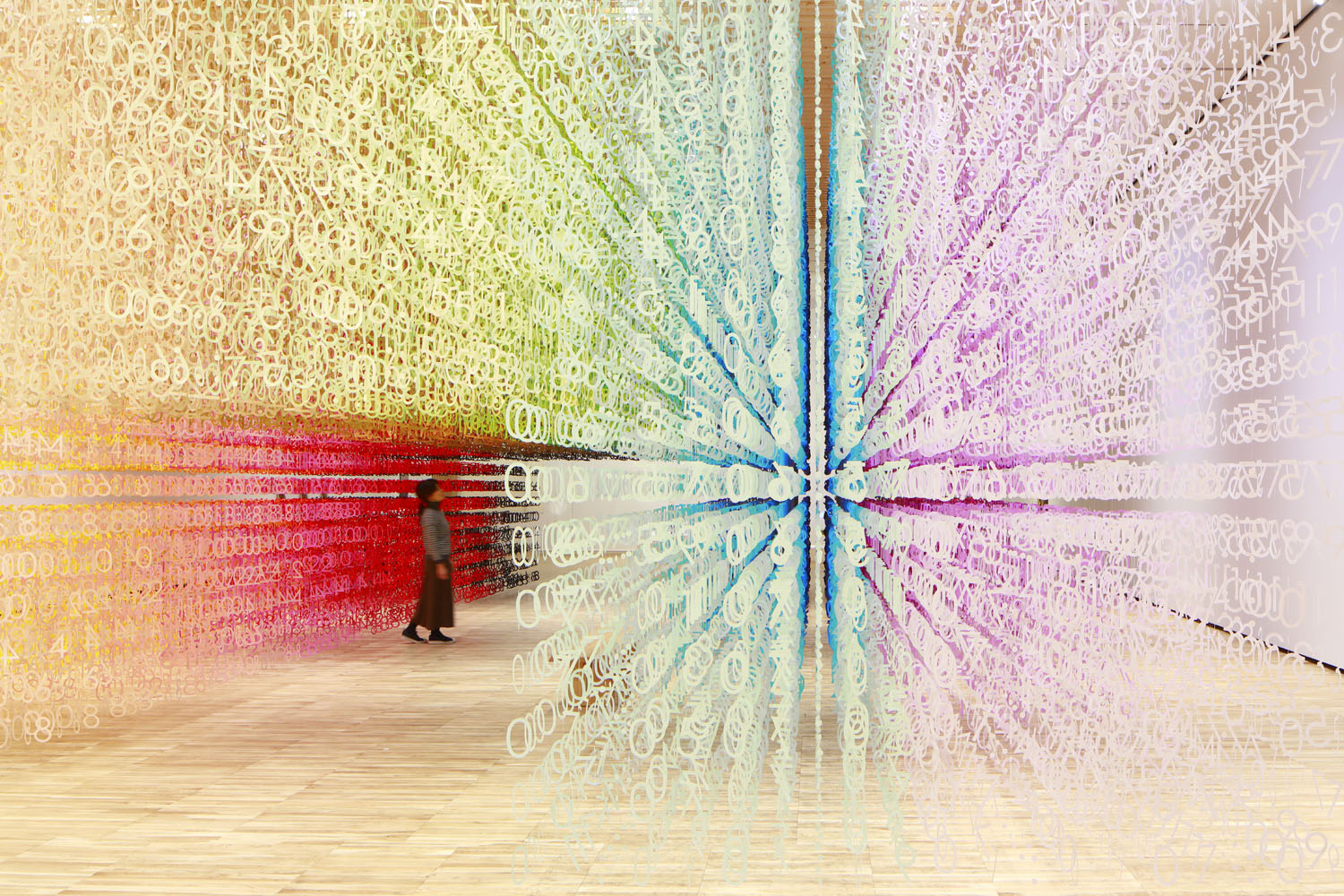
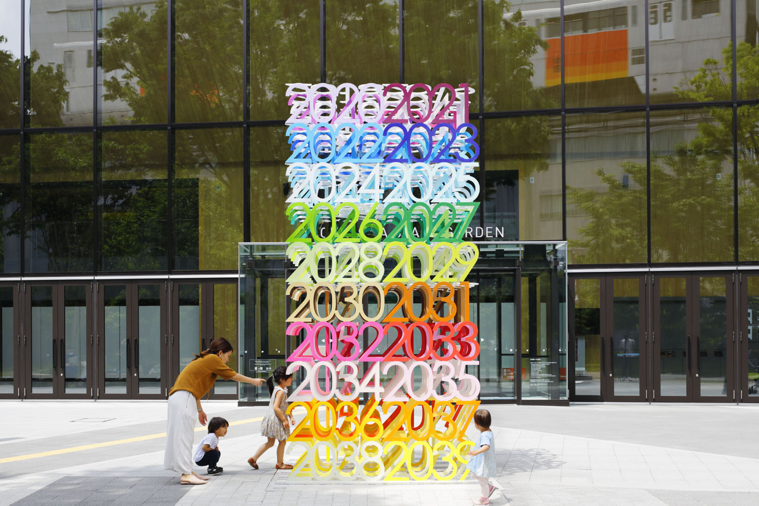
Forest of Numbers by emmanuelle moureaux architecture + design, Tokyo, Japan
2020 A+Awards Jury Winner, Architecture+Color
Another addition to the series is COLOR OF TIME. The installation transitions from pale tones to total darkness, as one would from day to night. The abstract concept of time is hence given a tangible form through this transition of color and users can experience this change as they walk through the tunnel within. It comprises about 120,000 numerical figures put together in a 3D grid. There are 100 layers where time indicators are arranged from left to right and also in the perpendicular direction. This installation marked the first time Moureaux used black in her designs.
One of the most recent in the series is Forest of Numbers, an installation that fills the 21500 sq ft White Cube exhibition room with 100 colors. Conceived to celebrate the tenth anniversary of the National Arts Center in Tokyo, the fabric of the space is laden with symbolism. More than 60,000 pieces of suspended numeral figures from 0 to 9 are regularly aligned in three-dimensional grids to visualize the coming decade.
The ten layers of the installation represent ten years; each layer consists of 4 digits that express the corresponding year, such as 2, 0, 1, and 7 for 2017, randomly positioned on the grids. A pathway cuts through the center of the room, inviting visitors to enter the numerical forest and to see, touch, and feel colors with their senses; the scenographic environment heightens their awareness of the emotive power of color in their lives.
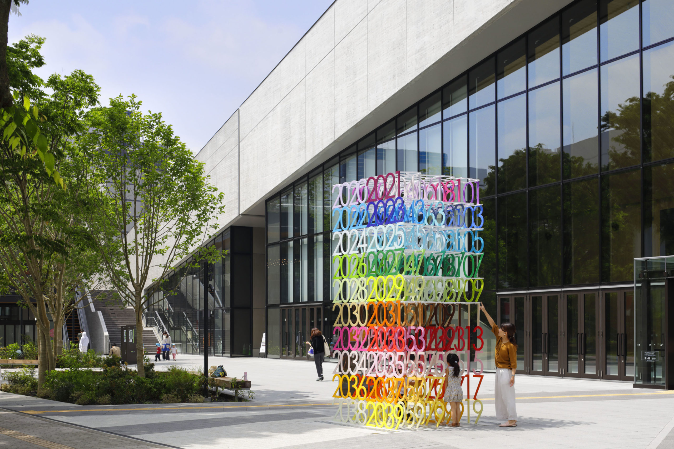
Mirai by emmanuelle moureaux architecture + design, Tokyo, Japan | Photos by Daisuke Shima
The word mirai means “future” in Japanese. That is also the name of her first public art sculpture as part of the series. It represents the next 100 years by using the same number of colors to showcase all values from 2020 to 2119. Moureaux does not use digital technology for her color selection process. All her picks emerge from her collection of thousands in the studio. These come from cutouts of magazines to other objects found in nature. The cutouts are then given to manufacturers to reproduce as paint or dye.
It is easy for new designers and architects to avoid using several colors in one design for the fear of having spaces become overwhelming or even garish. But getting the balance right is often about finding the right tone, and if not available on a shade card, creating it.
“First, collect as many colors as possible. From magazines, packages, or what you want in the way you want. Focus one day on yellow. This day, look only at yellows and collect yellows. Then another day, focus on green. It is important to have as many colors as possible in order to be free when you design,” she said. “When you design using colors, trust only your eyes and heart. Don’t only look, but feel with your entire body.”
The judging process for Architizer's 14th A+Awards is now underway. Subscribe to our Awards Newsletter to receive updates about Public Voting, and stay tuned — winners will be announced later this spring.
 100 colors no.1 / Shinjuku Mitsui Building
  COLOR OF TIME
 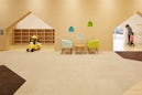 Mama Smile
  Mirai
Mirai 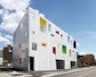 Sugamo Shinkin Bank / Tokiwadai Branch