The jury is deliberating... stay tuned for the winners of Architizer's A+Product Awards! Register for the A+Product Awards Newsletter to receive future program updates.
Checking in for a well-deserved holiday, laughing with friends over a cup of coffee, or choosing the perfect gift for a loved one — these moments, these vibrant snapshots of life, unfold countless times each week. Despite their differences, they all have one thing in common: a counter.
Whether you’re perched on a stool catching up on the latest news, swiping your credit card at a department store, or cooking up a storm in the kitchen, the humble counter is always there, supporting us both literally and metaphorically. But why? Why, in an age brimming with cutting-edge technology, do we remain so enamored with these large, often imposing structures? What is it about these steadfast surfaces that captures our hearts and allows them to endure?
The journey of the shop counter begins, like many things, in the ancient marketplaces of Mesopotamia, Egypt and Greece. Merchants displayed their goods on simple tables, and these rudimentary counters served the basic purpose of facilitating trade. As society evolved, so did the counter. The Renaissance period brought a surge in consumerism, leading to more permanent and elaborate counter designs. These counters were not just functional but also symbols of status and prosperity.
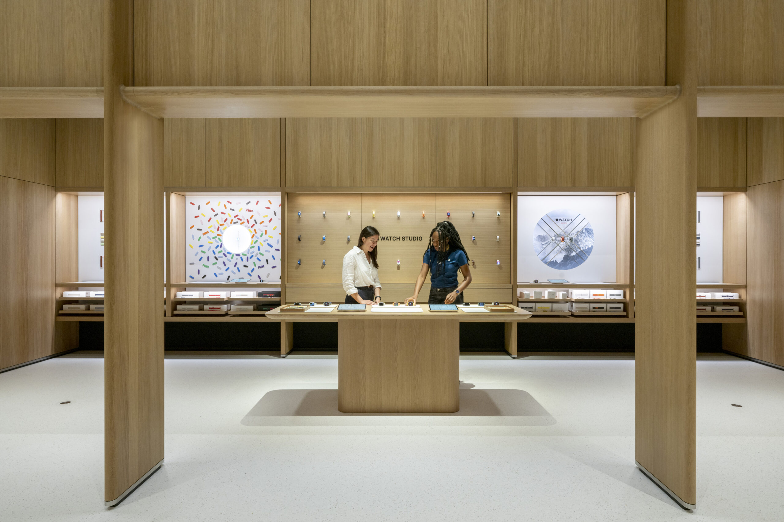
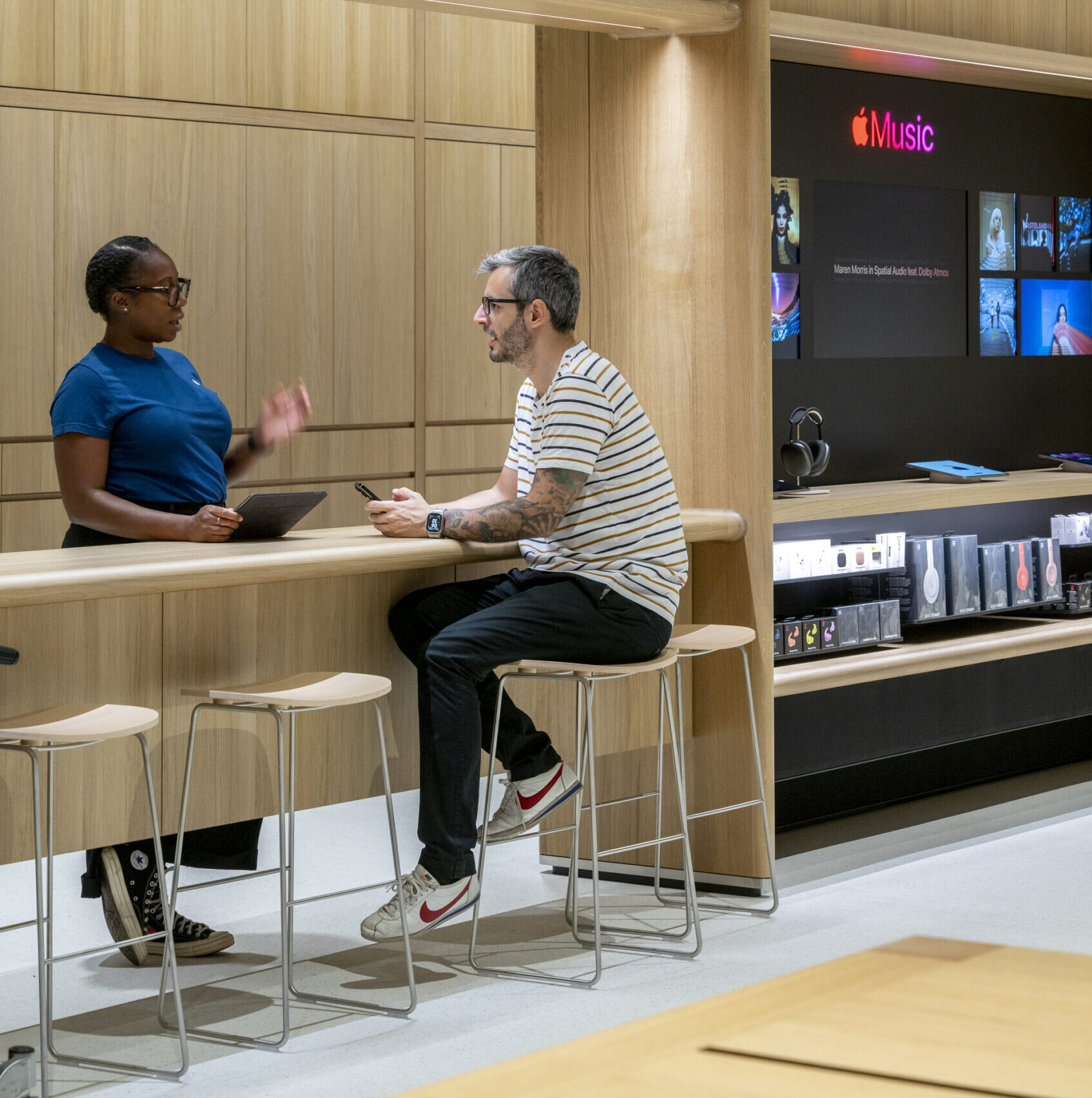
Apple Battersea by Foster + Partners, Battersea, Greater London, United Kingdom | Jury Winner, 12th Annual A+Awards, Commercial Retail | Photos by Nigel Young
The 20th century marked a significant shift, as the design of shop counters began to reflect advancements in ergonomics and customer psychology. Counters moved on from simply being seen as a base for in-store retail transactions to becoming something much more valuable when strategized properly.
Today much of our retail trade has shifted online, and so some brands have ingeniously reimagined the traditional counter, transforming it into an essential part of the in-store experience. This innovation showcases the unique value of physical retail spaces. A prime example of this evolution is the Apple Store. While these stores eschew typical retail counters in favor of handheld, satellite payment systems, they have preserved the counter’s importance through the Genius Bar, which plays a pivotal role in their store design and function. Like it or not, Apple has turned the counter into an integral part of its brand experience.
The transformation of counters from mere transactional points to centers of meaningful interaction involves meticulous attention to detail in their design. Counter heights, functionality and materials are no longer afterthoughts but critical elements that undergo significant scrutiny. This evolution reflects a broader understanding that a one-size-fits-all approach is insufficient. Designers now prioritize adaptability and a keen understanding of user demographics to ensure that counters meet the diverse needs of both customers and employees.
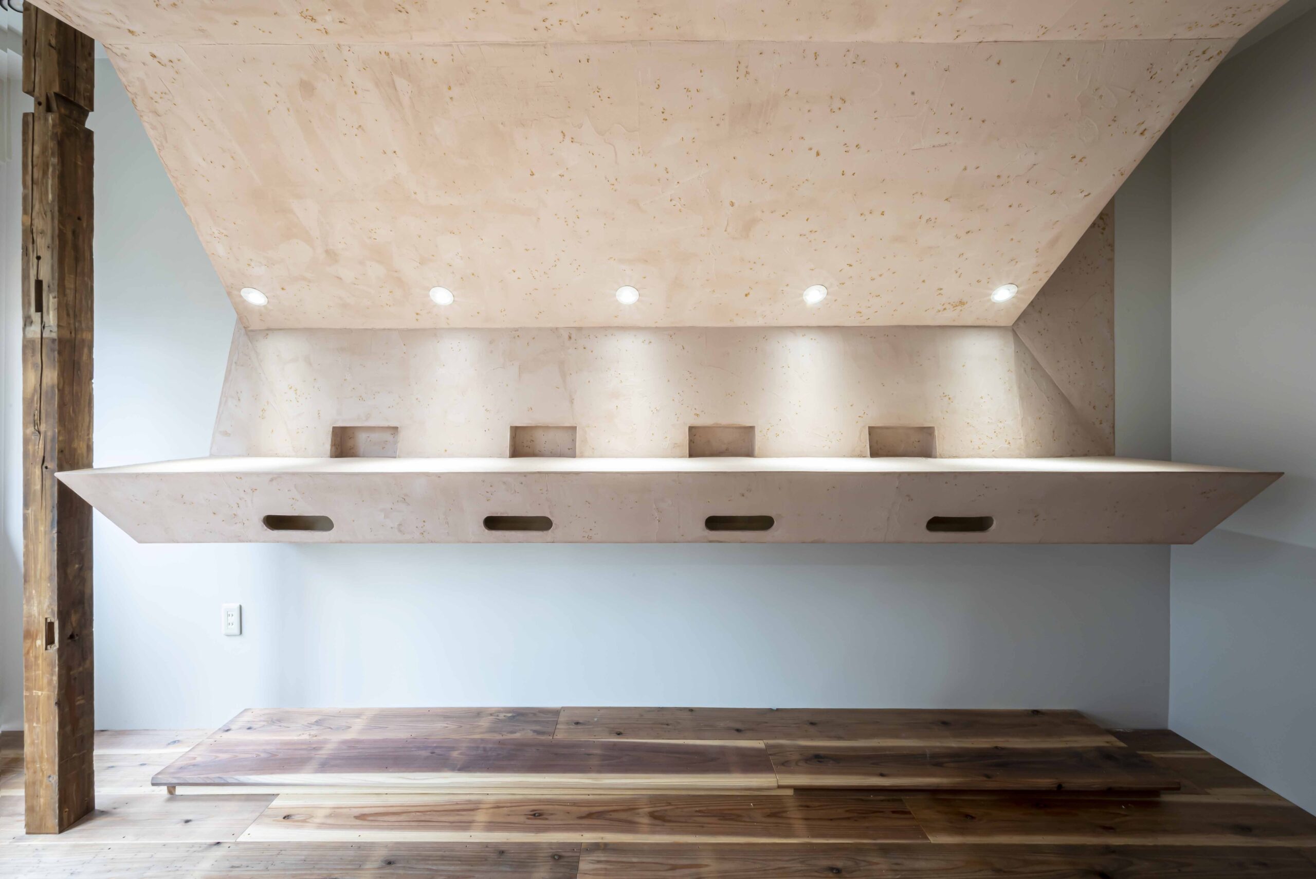
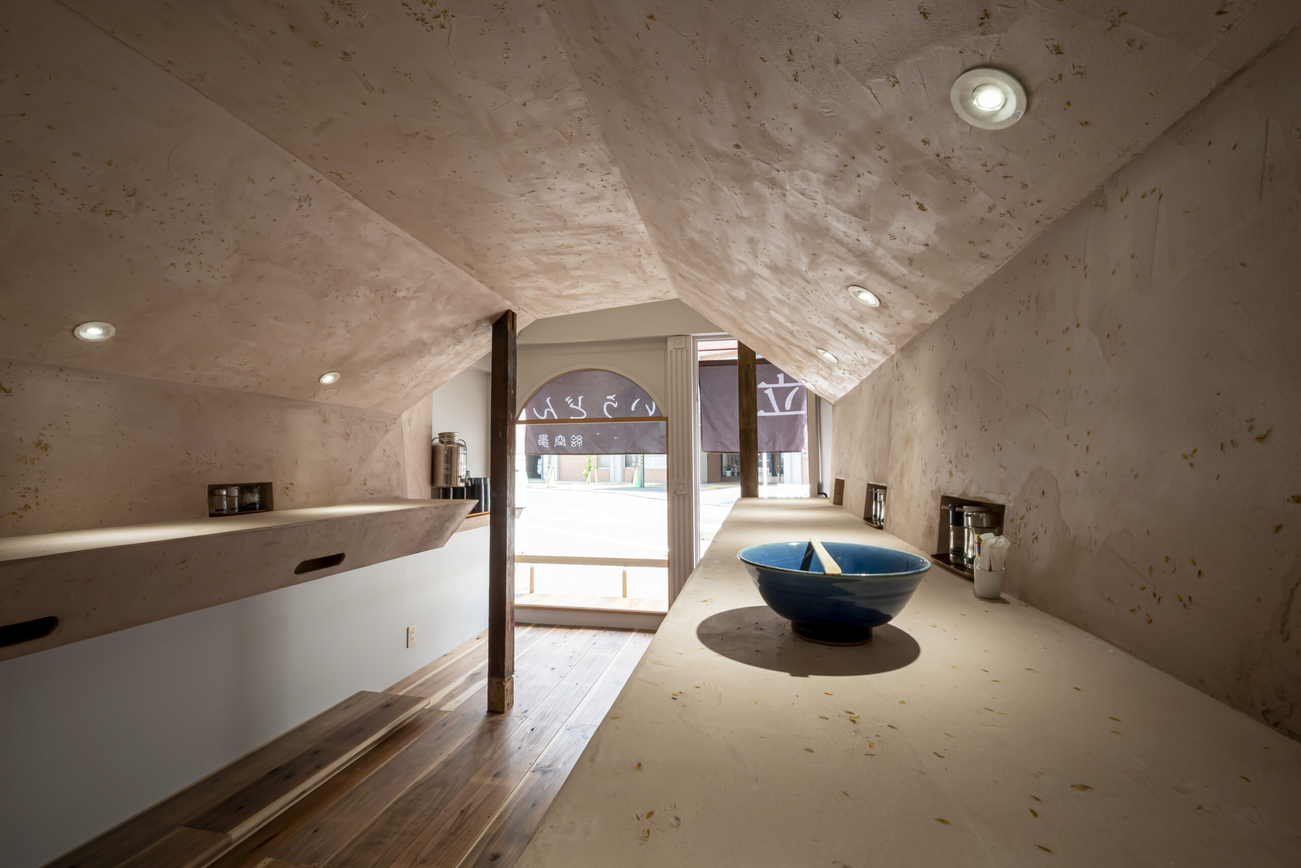
Stand Up Udon Noodel by sawa architects, Jingumae, Shibuya City, Japan | Jury Winner, 12th Annual A+Awards, Restaurant (S <1000 sq ft).
One key aspect of modern counter design is adaptability. Counters with adjustable heights can accommodate people of varying statures, thereby promoting inclusivity and acknowledging that, in fact, one size certainly does not fit all. Integrated steps or movable sections further enhance this adaptability, allowing counters to serve multiple functions and facilitating ease of interaction. Being thoughtful in design ensures that everyone can comfortably engage with the counter, creating a more inclusive and welcoming environment.
Moreover, the choice of materials can play a critical role in enhancing the counter’s appeal. Surfaces now need to be not only durable but also pleasant to touch and experience. Soft-touch surfaces and anti-fatigue mats are examples of innovations that prioritize comfort and well-being — these considerate design choices encourage longer and more meaningful interactions. The counter becomes a place where customers linger, engage in conversations and build connections while capturing the broader desire for human-centered design. By making counters more accessible and comfortable, designers create an inviting atmosphere that enhances customer satisfaction as well as employee efficiency.
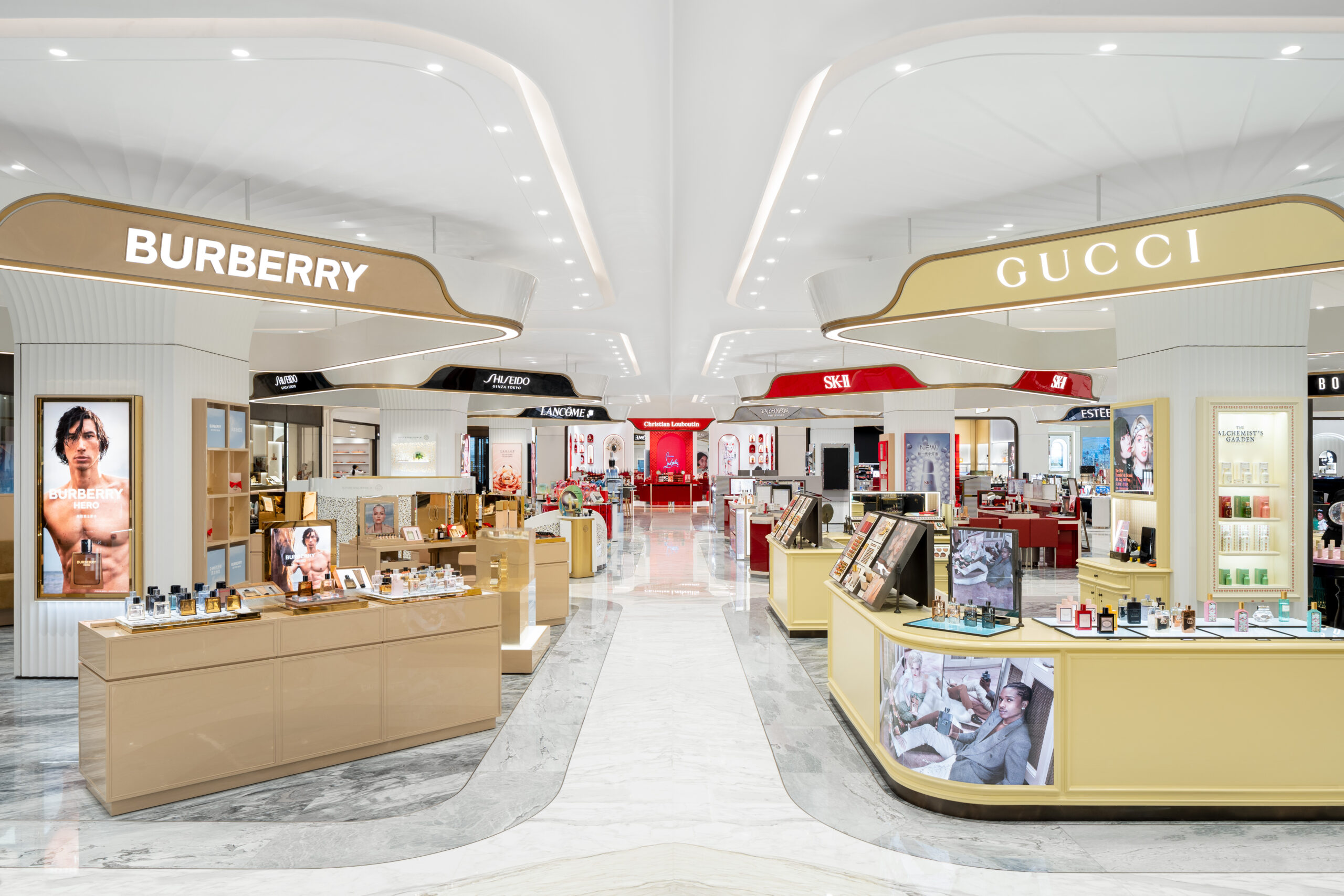
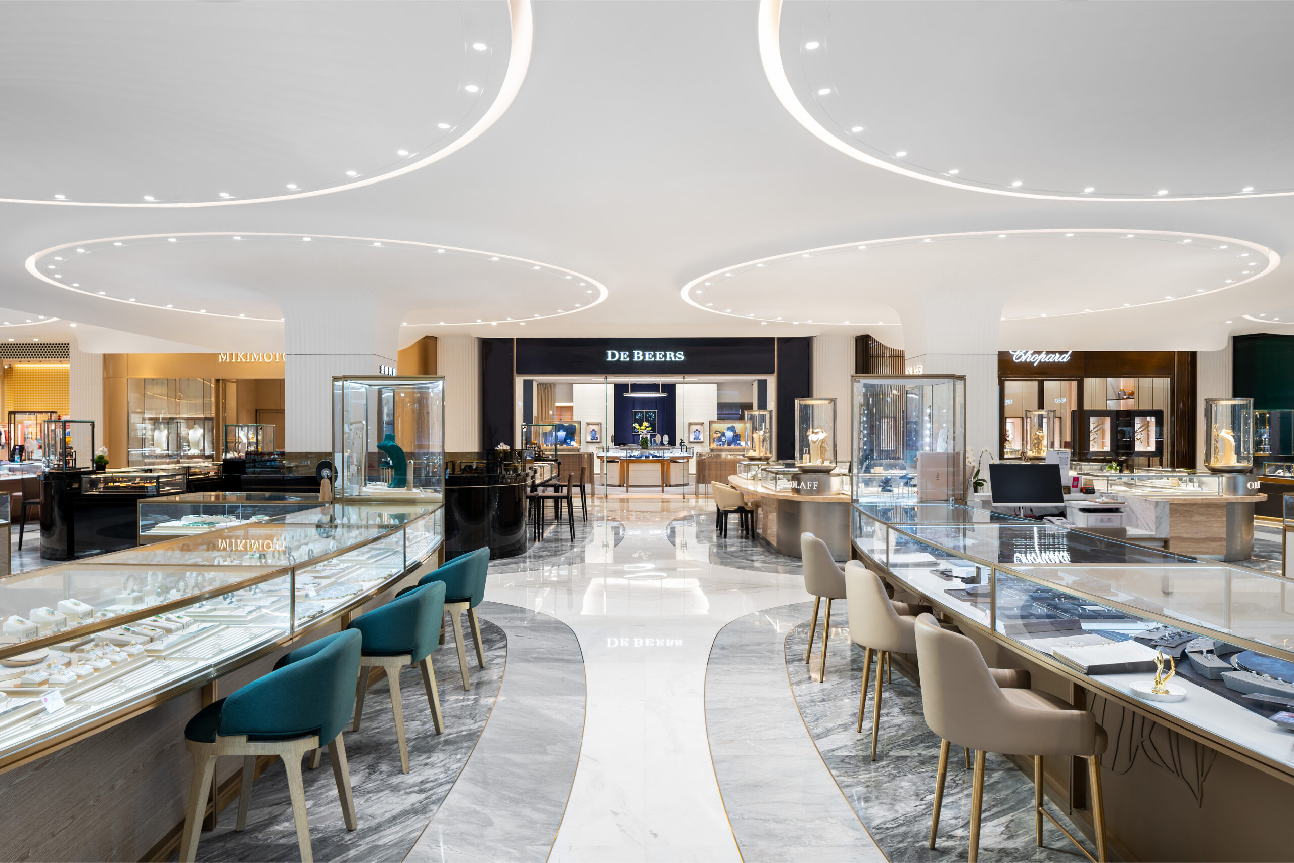
SKP Chengdu by SYBARITE, Chengdu, China | Jury Winner, 12th Annual A+Awards, Commercial, Shopping Center | Photos by Nick Kuratnik
If you’ve ever wandered around a store for ten minutes looking for the checkout, you’ll understand that the positioning of counters is a critical factor. One that can dramatically influence the flow and efficiency of various environments and is often cited as one of the arguments for their removal. To be well seen, they have to be too big, too bulky. Nowhere nearly as simple as a wandering salesperson with a tablet. However, by optimizing counter placement with meticulous planning to ensure clear signage, unobstructed pathways and strategic locations, and ensuring these elements successfully work together, the counter can actually aid in facilitating smooth traffic flow, enhancing interactions and better service delivery.
In retail environments, strategically placed counters help customers navigate the store with ease, allowing them to find what they need quickly and comfortably. Logical placement of counters streamlines the shopping experience, making it more enjoyable and efficient. You might not know it, but because of a quick and easy visit, a correctly positioned counter could be the reason you return to a particular store over another.
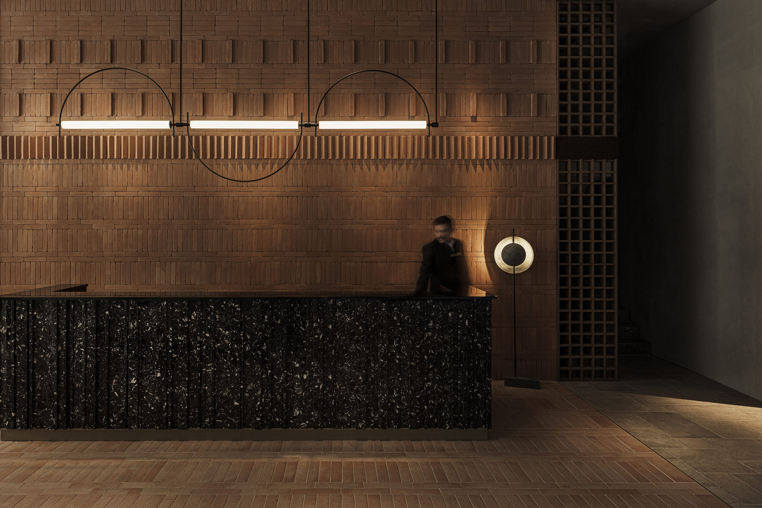
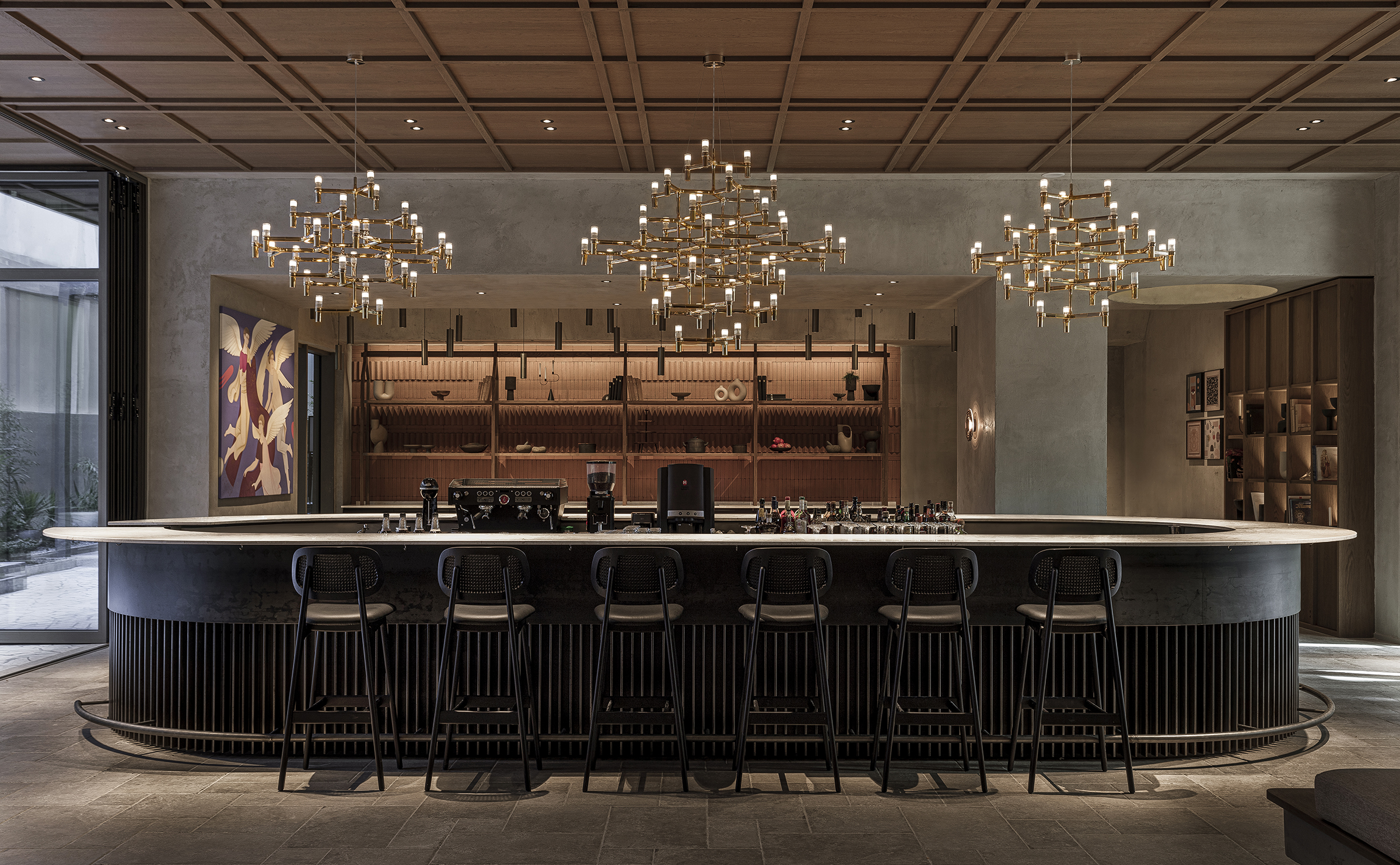
Monasty by Not a Number Architects, Thessaloniki, Greece | Jury Winner, 12th Annual A+Awards, Commercial Interiors (>25,000 sq ft) | Photos by Yiorgos Kordakis
In hospitality settings such as hotels and event venues, the strategic placement of check-in counters plays a huge role in guaranteeing a smooth and pleasant arrival experience. These counters are designed to handle high volumes of traffic efficiently while maintaining a welcoming ambiance. Thoughtful layout designs that can include multiple counters with varying functions in different positions allow designers to respect natural human movements and behaviors, making the environment more intuitive and user-friendly.
While the physical design and placement of counters are part of what makes them such useful tools in the designing of public spaces, the psychological impact of counter design cannot be overstated. Like early traders who embellished their counters to project an image of wealth and trustworthiness, modern retailers understand the power of visual engagement. Counters are often a focal point, making them prime spots for branding and marketing, transforming them from functional surfaces into dynamic sales tools.
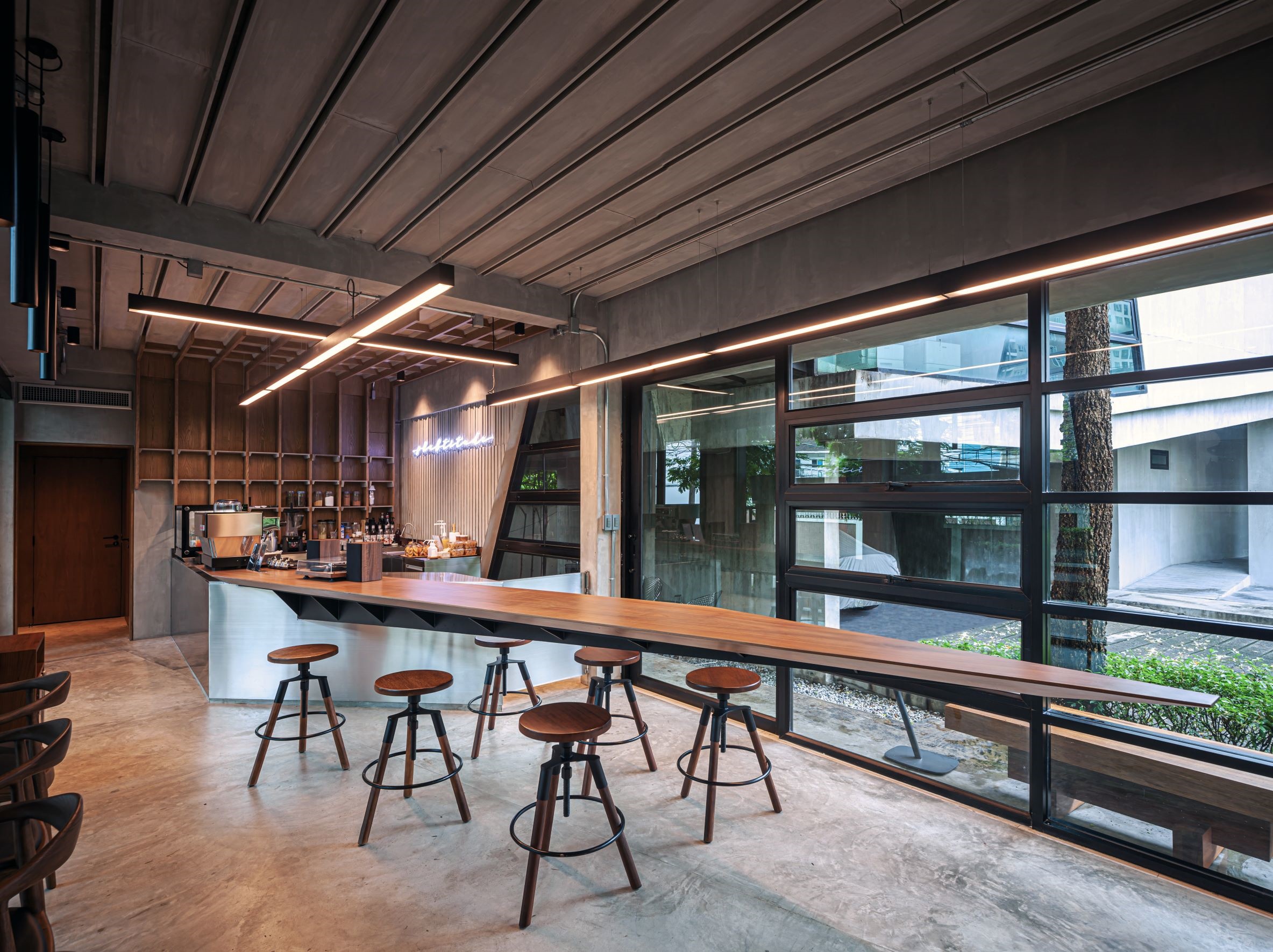
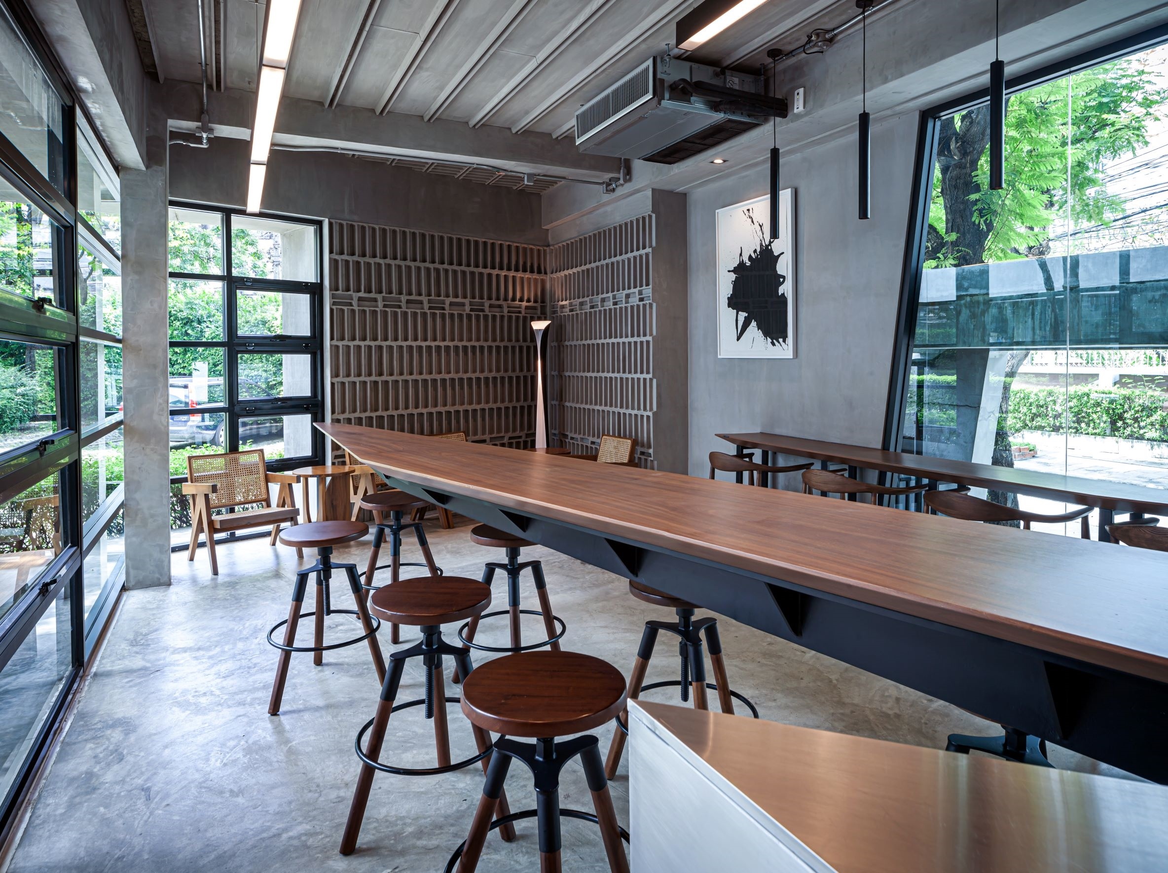
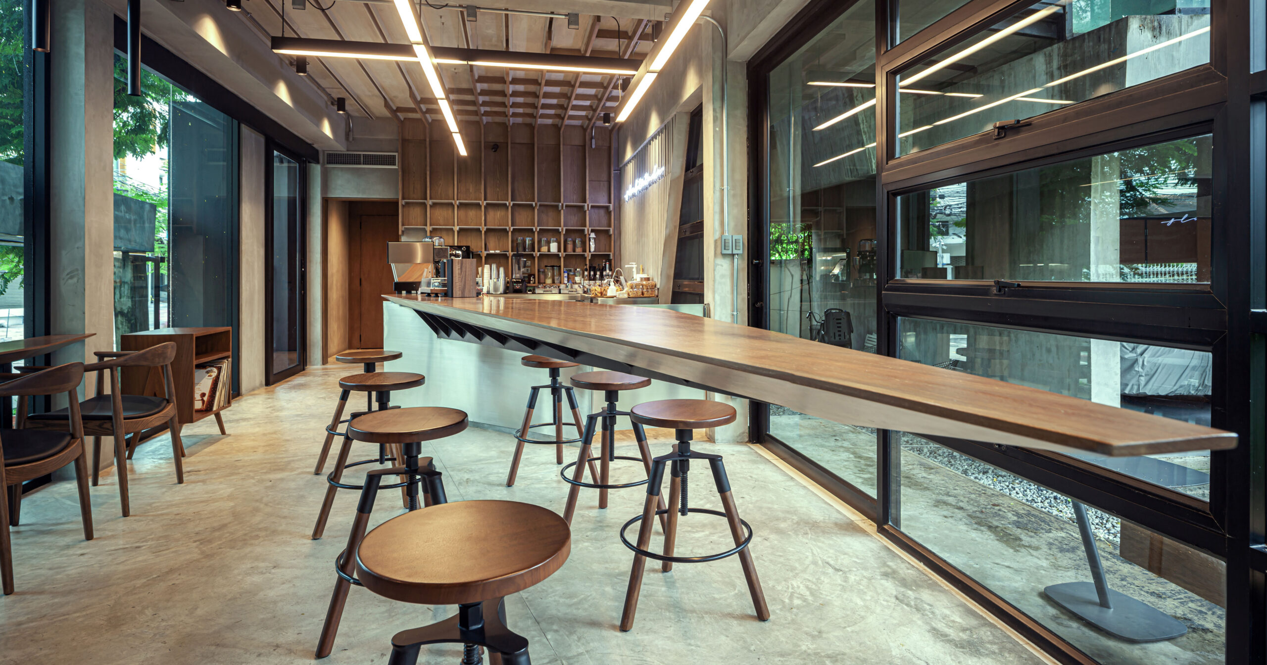
Slabtitude by Vaslab Architecture, Bangkok, Thailand | Popular Winner, 12th Annual A+Awards, Restaurant (S <1000 sq ft) | Photos by Spaceshift Studio
Interactive elements are now a cornerstone of counter design. Touchscreens, product samples and interactive displays keep customers engaged while they wait, providing information and encouraging purchases. These features turn waiting time into valuable marketing opportunities, enhancing the customer experience and subtly influencing purchasing decisions. Incorporating technology has transformed counters from places for transactions to vibrant, engaging spaces that drive sales and foster brand loyalty. Thus, counters have become crucial components of modern retail and service environments.
As we continue to evolve, the humble counter remains — an enduring value of thoughtful design in our everyday environments. Despite the advances in technology and changes in retail landscapes, the counter reflects our ongoing desire for spaces that facilitate interaction, provide comfort and enhance our experiences.
The jury is deliberating... stay tuned for the winners of Architizer's A+Product Awards! Register for the A+Product Awards Newsletter to receive future program updates.
