With 90+ categories and 300+ jurors, the Architizer A+Awards is the world’s definitive architectural awards program. Following the Awards Gala and Phaidon book launch on May 14, we are pleased to take a closer look at some of the winners of the 2015 Awards program — see all of them here.
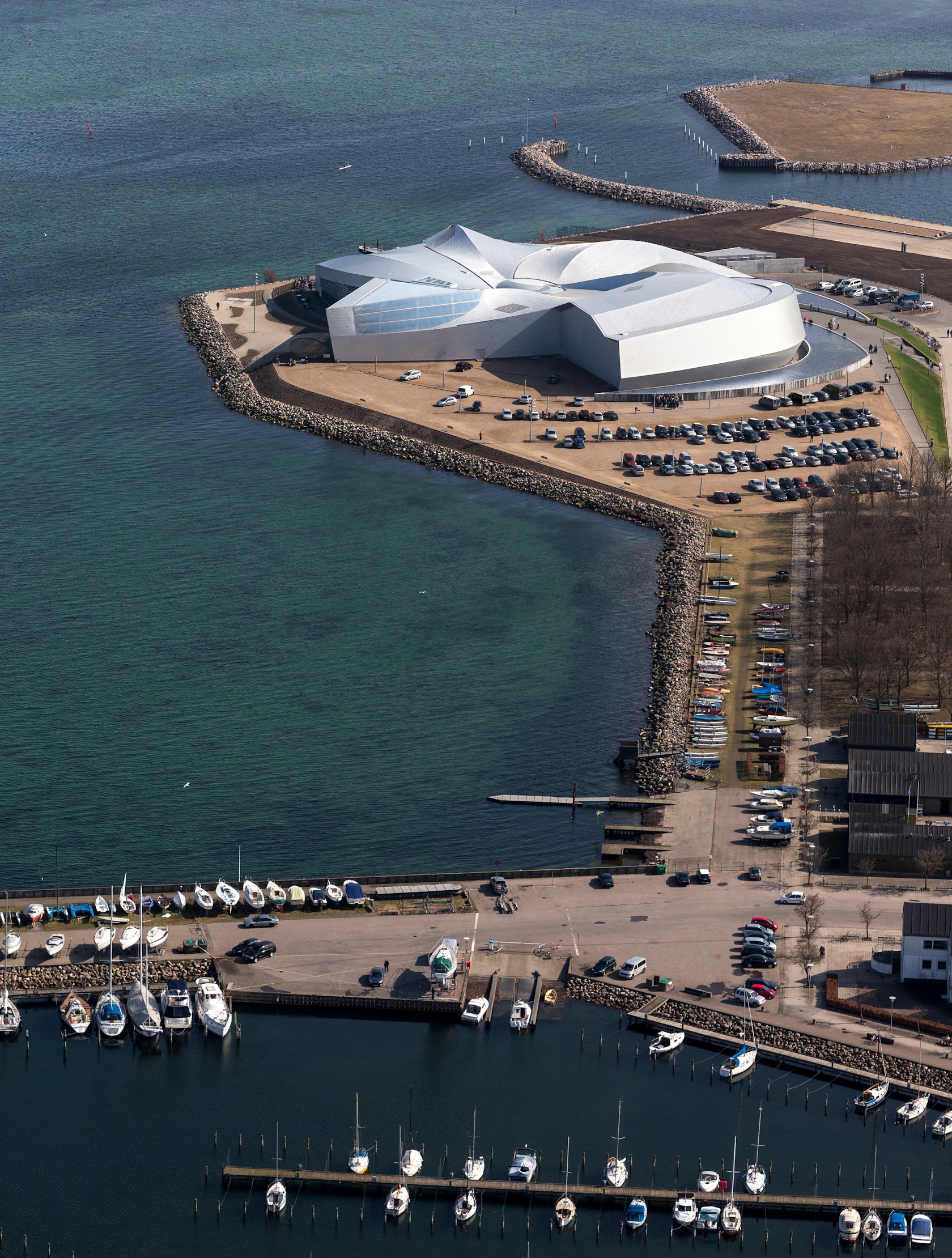
The largest aquarium in Northern Europe makes little distinction between the structure and the sea. The Blue Planet, as it’s called, is located along the shores of Kastrup, not far from 3XN’s hometown of Copenhagen. The Danish architecture firm designed a whirlpool-shaped building that tied the surrounding natural waterway to the manmade waterways inside the aquarium. This seamless tie between the natural environment and the built one secured 3XN as the Popular Choice winner of this year’s Architizer A+Award for the Culture: Museum category.

© 3XN
The history of the Denmark Aquarium goes back to World War II, nearly three-quarters of a century earlier than the opening of the Blue Planet building in 2013. The aquarium was established in 1939 in Charlottenlund, just four months before the breakout of the war and seven months before the occupation of Denmark. Amazingly, the aquarium stayed open through the war, but started to fall into disrepair by its conclusion. Despite upgrades and expansions, it had become clear by the mid-90s that the building couldn’t accommodate a modern, state-of-the-art aquarium. A new site and a new building would be needed, and the Denmark Aquarium launched an international design competition to find the project architect. 3XN’s Blue Planet design was selected as the winner in 2008.

© Adam Mørk
For both the exterior and interior, the architects drew inspiration from a certain natural phenomenon. “The idea of the whirlpool came from our thought behind the water’s shape,” said Kim Herforth Nielsen, principal of 3XN. “We wanted to tell a story outside of what was inside the building.” The design process was challenging — 3XN abandoned an original proposal to build the aquarium on level with the water, opting for a more expensive foundation was required instead. 3XN spent a year in the planning phase, trying to work within the strict budget.
The end result is a stunning structural embodiment of the surrounding landscape. Viewed from above, the building has a rounded center surrounded by silvery arms of the whirlpool; the overhead design was important to 3XN, as the aquarium is located close to the Copenhagen Airport. From ground level, the curves are more subtle, with the whirlpool “arms” fading into the surrounding land. Water pools surrounding the structure give the appearance that the aquarium is emerging from the water itself.

© Adam Mørk
3XN covered the façade of the whirlpool with 33,000 identical aluminum shingles. Herforth Nielsen said they selected the shingles with the idea that the façade would reflect its surrounding environment, changing color depending on the time of day. As Herforth Nielsen said, “the reflection is like water.” The shingles also resemble fish scales, an appropriate design choice for an aquarium.
Given the aquarium’s whirlpool-shaped exterior, 3XN wanted visitors to feel, upon entering, that they were diving underneath the waves. Visitors enter through the longest of the whirlpool’s arms. 3XN worked with lighting artists to help create a flickering underwater environment. (It doesn’t hurt that the building holds 1.8 million gallons of water inside.)

© 3XN
The entryway leads to a circular foyer, which is the crux of the interior design. From here, visitors can choose whether to visit river, lake, or ocean habitats. The foyer is considered “home base,” where visitors walk into different compartments within the whirlpool’s arms and then return. “I visited a number of aquariums through this process,” said Herforth Nielsen. “And in Sydney, I got stuck in the shark area with the temperature at 40 degrees celsius.” He wanted to create a better design to minimize crowding and make it easier to regroup if visitors got separated or lost.
Throughout the interior, 3XN played with ideas of large and small, creating both grand and intimate settings. “We carved out big and small shapes to reflect the huge and really small waves,” Herforth Nielsen said. In the African Great Lakes section, for example, the firm designed with smaller, calmer waves in mind. In another exhibit, a towering curved ceiling looks like the underbelly of a baleen whale. The design is accompanied by state-of-the-art AV technology, projections, film, graphics, and illustrations.

© Adam Mørk
“It had to be a big experience,” Herforth Nielsen said of the final result. In its first year of opening, the Blue Planet drew 1.3 million visitors, twice as many as expected. It’s now considered one of the foremost tourist attractions in Denmark. “It’s very seldom an architect gets the chance to do this,” said Herforth Nielsen. “It’s lucky to have this opportunity to use architecture for such storytelling.”

© 3XN
See all of the 2015 A+Award Winners here, and order the book from Phaidon here!


