Architizer’s newest print publication is available for pre-order! How to Visualize Architecture is an educational guide designed to help you master the craft of architectural storytelling and visual communication. Secure your copy today.
Drawings are their own form of architecture. In an age where renderings and photo-realistic images reign supreme, Zean Macfarlane takes a different approach. As an independent architectural designer working across the fields of art, architecture and education, Macfarlane’s work explores drawing as a way of building. Macfarlane’s interests move between sketches and digital work, lines and patterns. There’s a beauty in that diversity, as seen in the archive of his work. The drawings are exercises in understanding the possibilities of plans, sections and elevations.
Taking a survey of Zean’s work, the following 10 images explore the relationship between architecture and drawing. In his own words, “Being able to inspire people is a blessing and that’s why I do it. I’m interested in seeing how others connect with the work.” These ten drawings are all rendered in color, and the selection of patterned plans and elevations come from a larger range of sketches, axons, and artistic explorations over the last five years.
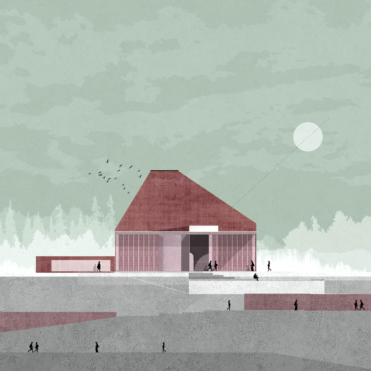 Outcrop
As seen in Outcrop, Zean’s elevations share a range of characteristics. Implying light through shadow, they are usually oriented to a sun, often with a direct dashed line connecting the architecture to the sky. Here, architecture is set in a context. Through gradient and opacity, different elements like forests, mountains or desert landscapes ground each structure.
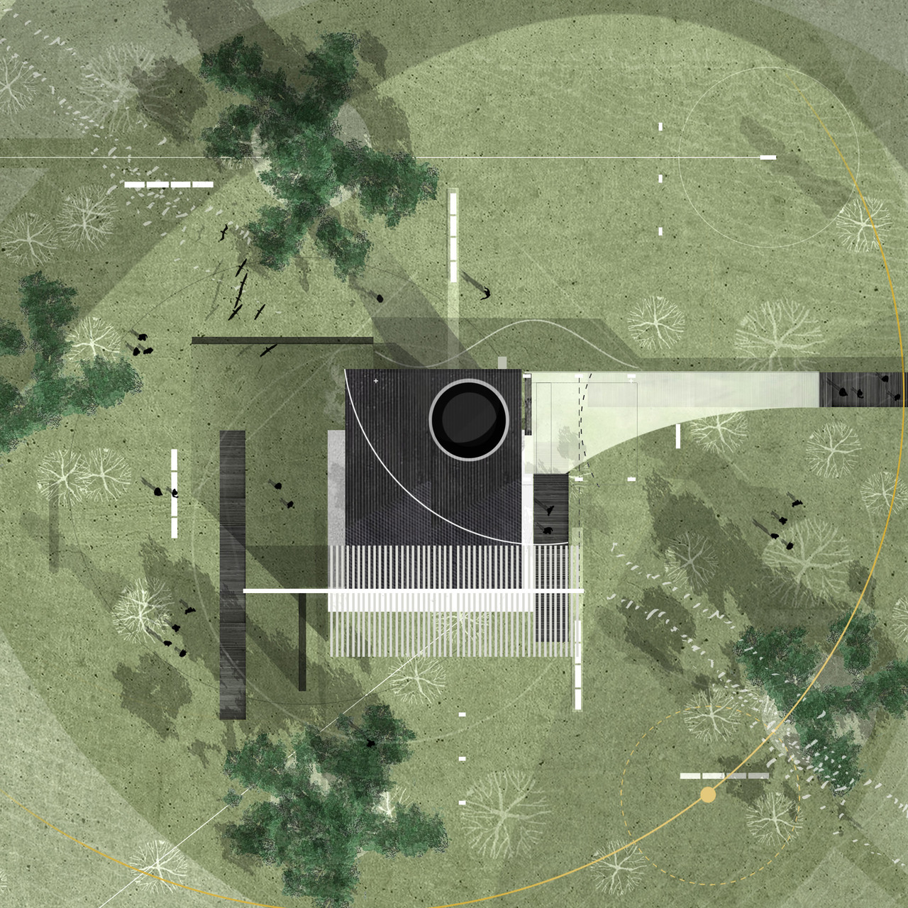 Park Café
In a more recent work, Park Café also follows an interest in context. Providing a subtle celestial connection, lines across the plan can be read as the sun or movement across the site. Upon a second read, this is further understood as trees and structures have their own shadows. Even more so than the elevations, the plan drawings leave room for interpretation through abstract elements.
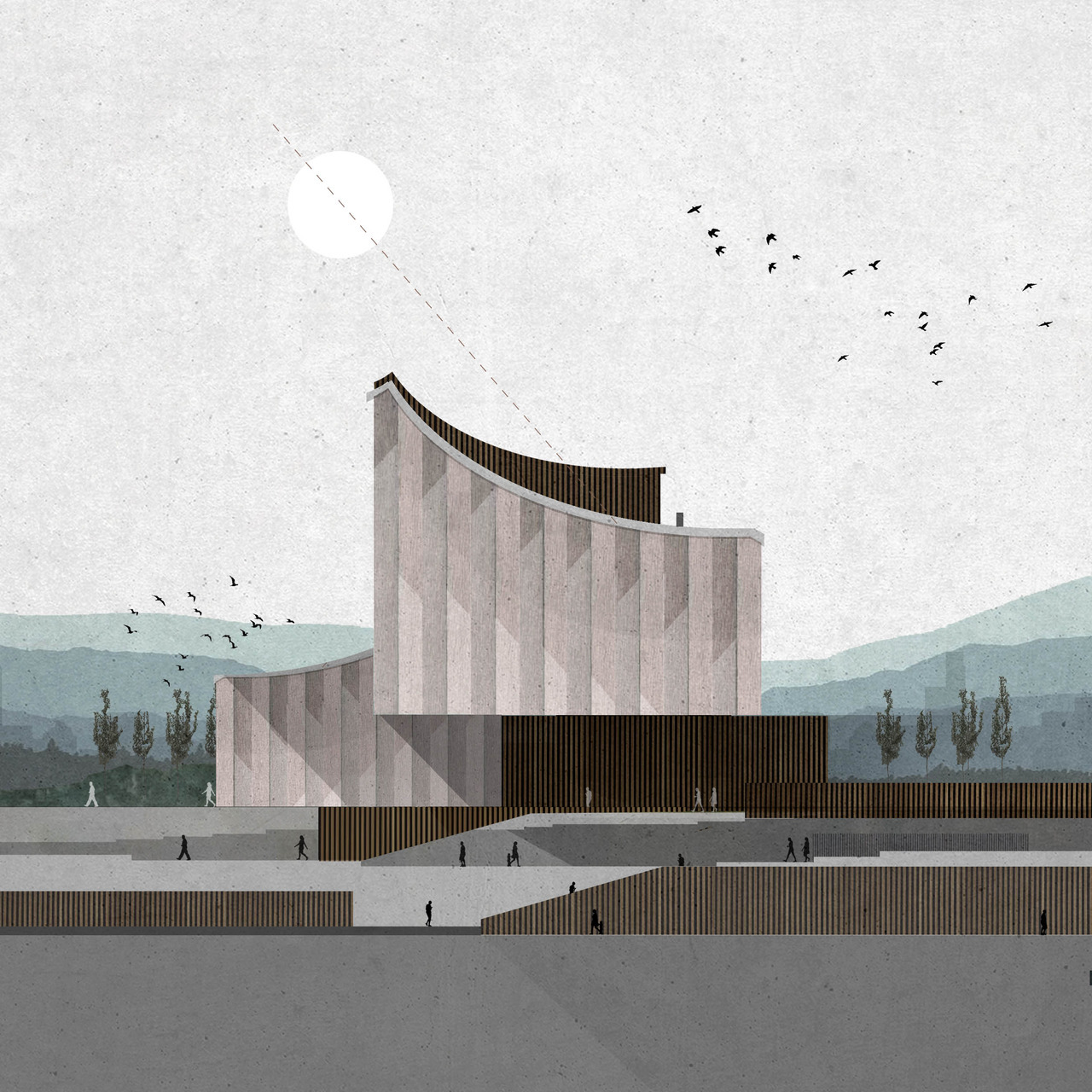 Keynote
Keynote brings together reoccurring elements in Zean’s drawings: light, shadow, pattern, scale figures, landscape, structure and different levels of opacity. The work explores layering as spatial culture, not unlike Japanese paintings and prints where space is represent in a seemingly flat way. This mode of representation leaves space for the viewer to uncover the work for themselves.
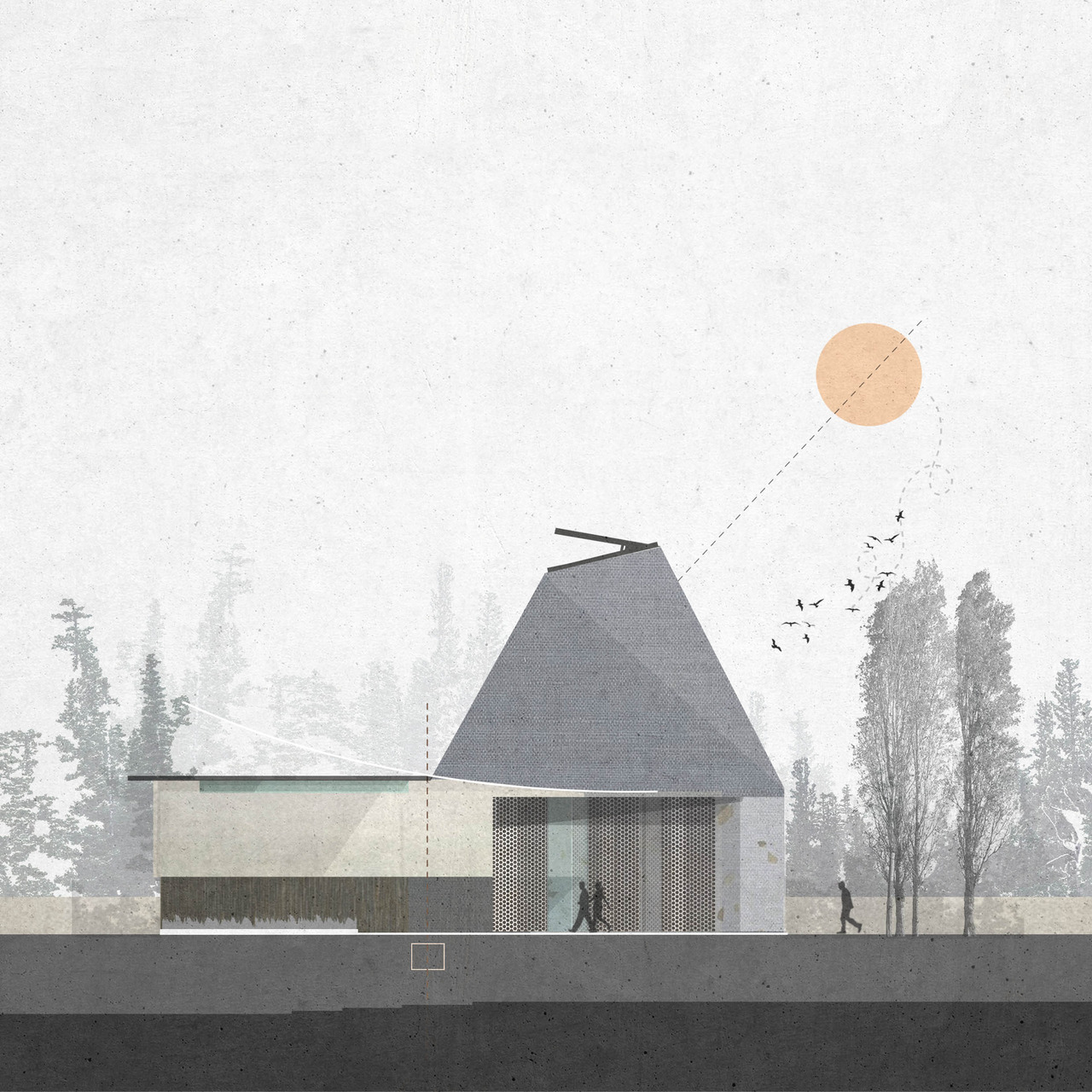 Crease
Crease plays with form, angles and texture. The weight of Zean’s work really comes to life in drawings like this, where our associations with the built environment engender multiple readings of materials, fenestration or cladding. At a smaller scale, the structure’s ambiguity in program also allows multiple readings through the way the drawing is composed.
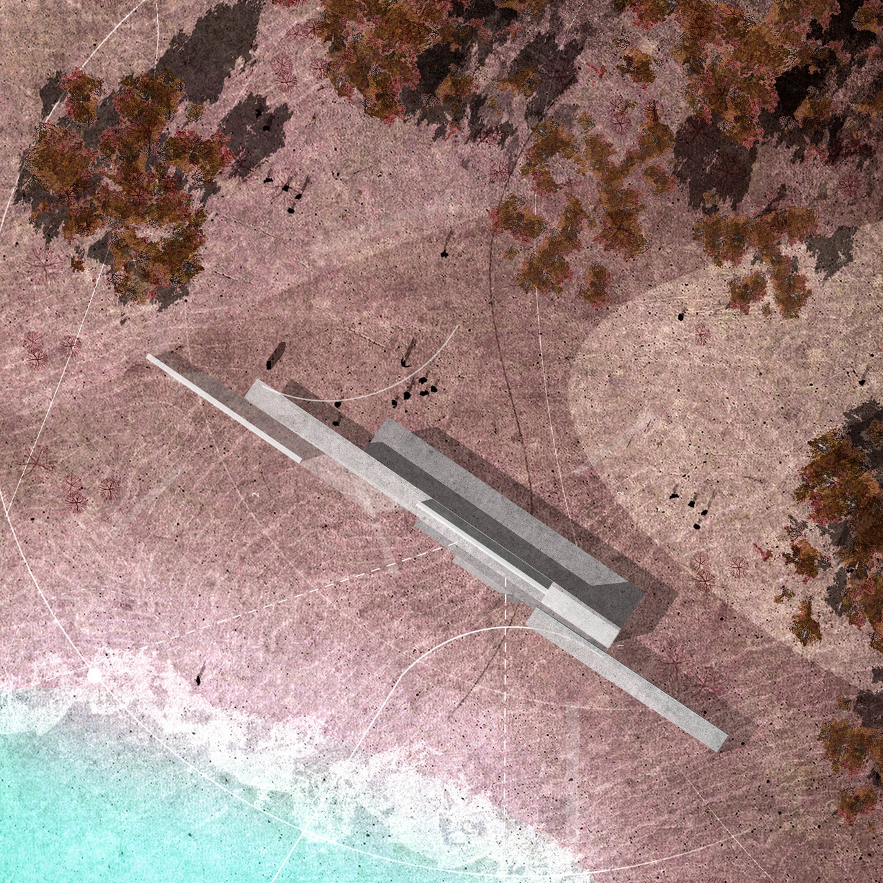 Views Beyond
Stretching architecture out at the boundary between water and land, Views Beyond uses linework to imply connections and orientation outside architecture. Sited in an in-between space, the image can also be read with feint lines of suggested topography. The drawing becomes a source for inspiration simply through the act of different readings, while at the same time, the plan inherently shows a sense of organization.
 Hark
Hark
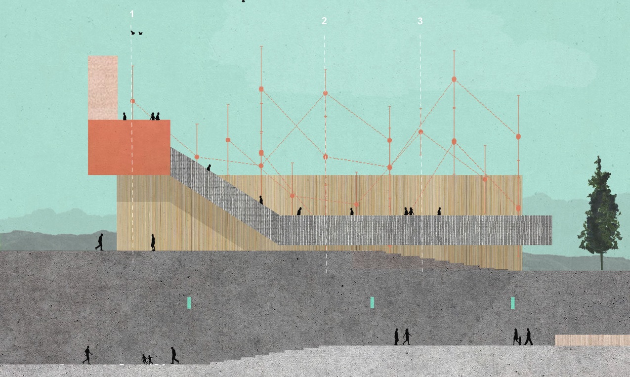
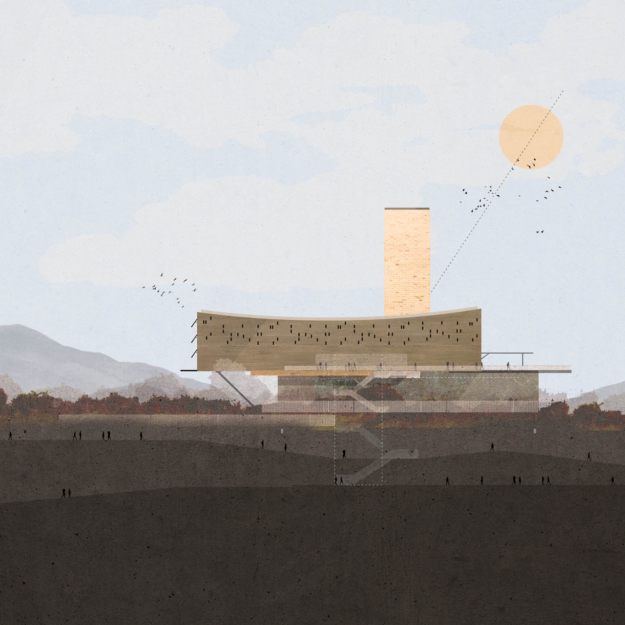
In Hark, Zean draws back in scale while adding a layer of movement across multiple levels. Façade elements can simultaneously be read as fenestration or ornamentation, while a reoccurring theme of offset forms combines with more distinct or singular elements like the bright tower. Because we are only shown a single face, it’s up to the reader to imagine the depth and expanse of space.
 Finding
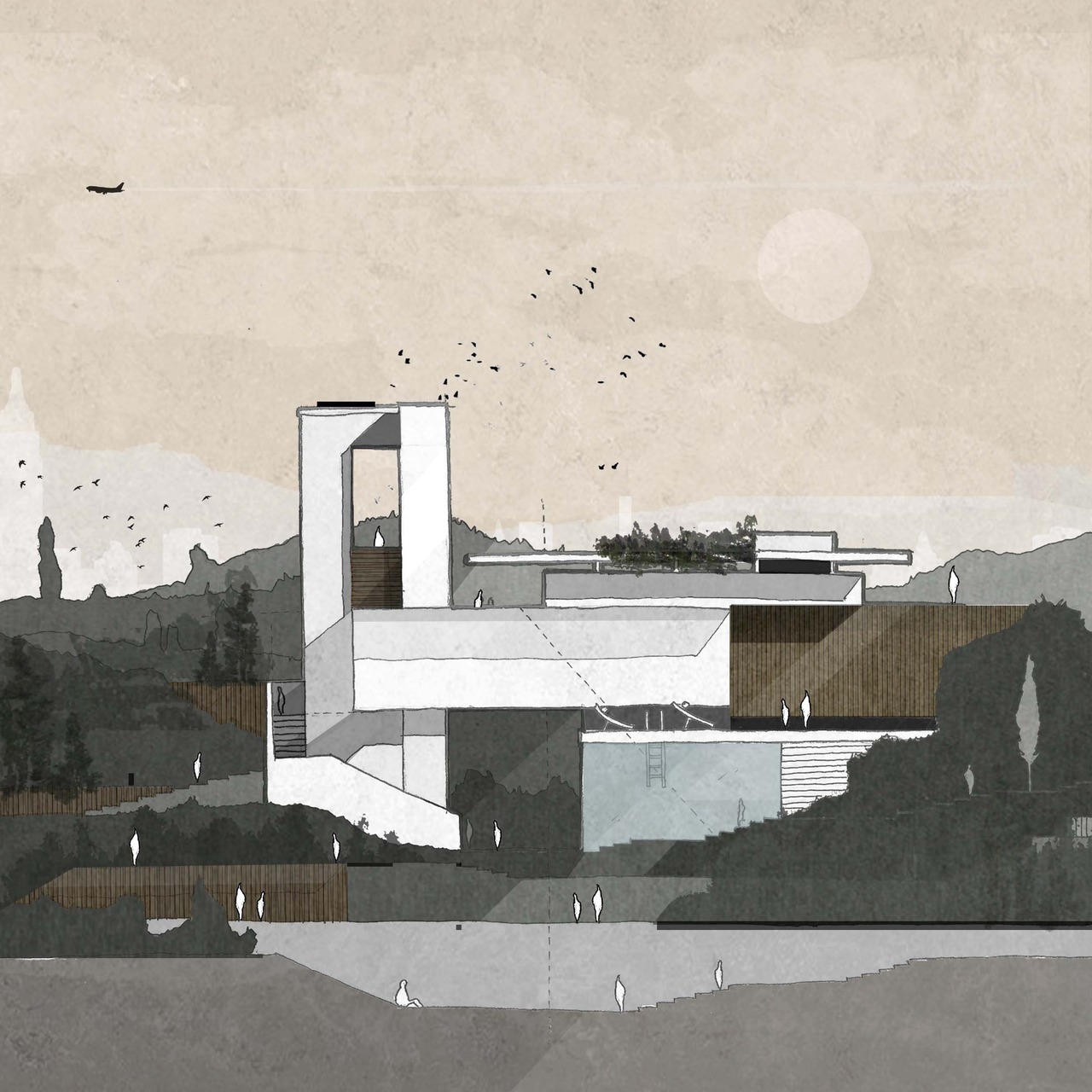
Though it’s a bit older, finding stands out among Zean’s work. Both the scale figures and the structure contrast with the landscape, drawing attention to the architecture through color. A familiar element like an airplane is baked into the sky, while we are left to imagine whether the work is public or private space through scale and the number of figures on site.
 Puzzle Pieces
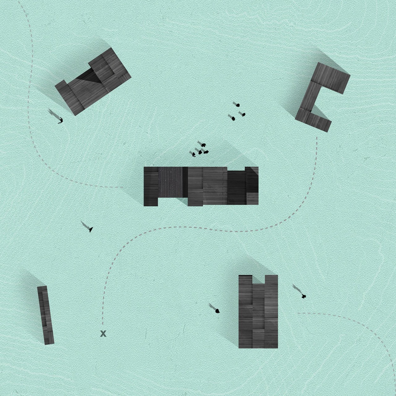
Using color to subvert expectation, puzzle pieces turns the ground plane into a bright blue surface and topography upon which a series of patterned black structures rest. The simple act of using texture without other spatial or symbolic cues allows the shapes in plan to bcomee sculpture or architecture alike.
 Entail
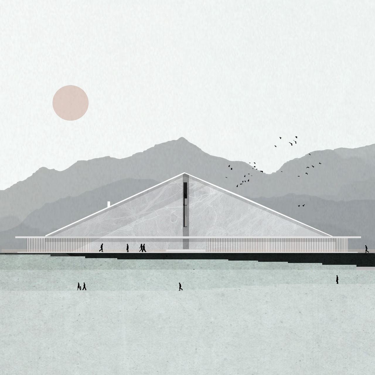
As a drawing that symbolizes why Zean’s work is significant, Entail is an exercise in reading and imagination. Taking those elements that are familiar, they are placed in such a way that the composition can be read as bridge, monument, or large scale civic space in equal measure. Here too, elements like the sky remain lighter than the ground to continue building upon our associations
 Eco City
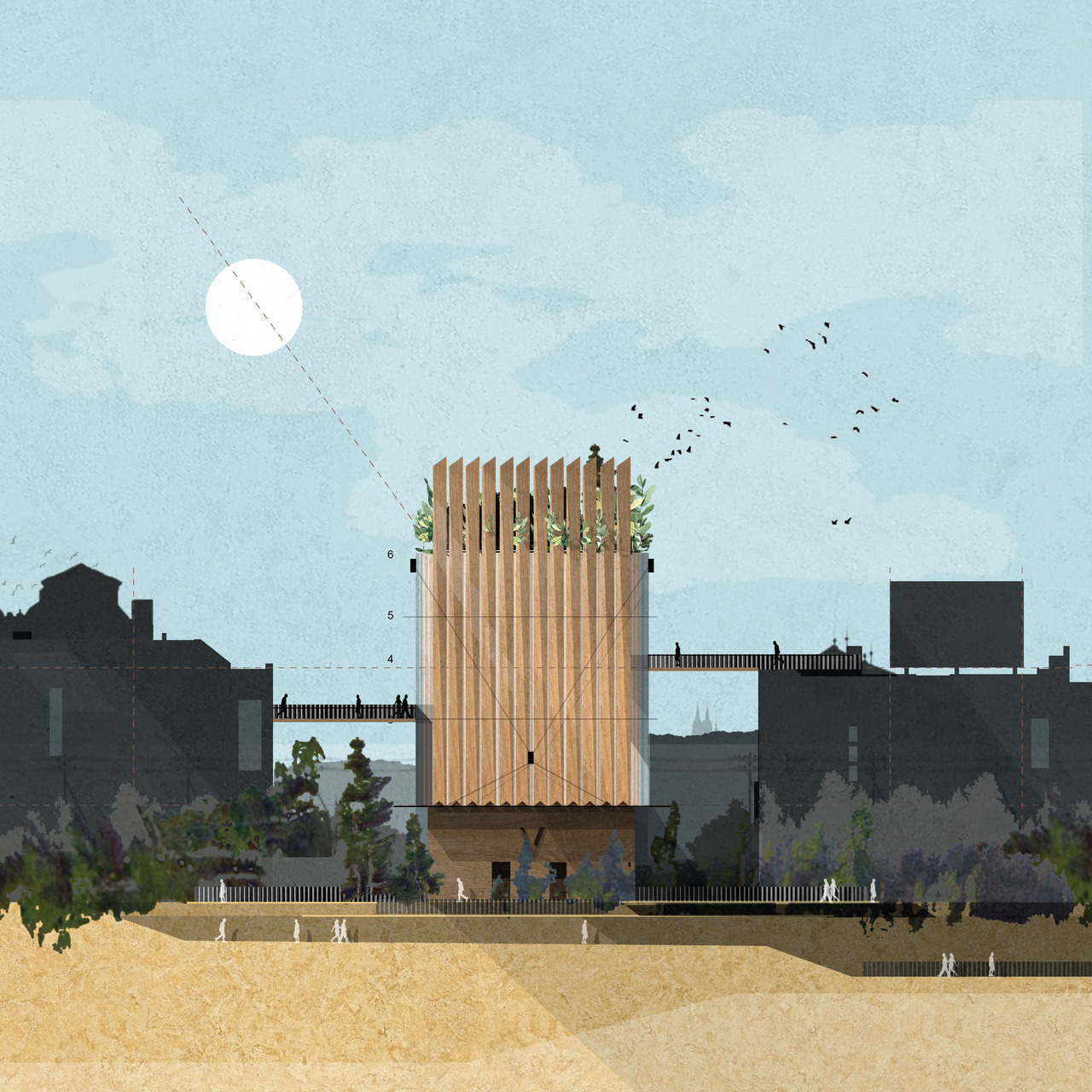
Eco City is a work that moves away from the object in isolation. It’s not simply a sole work in the landscape, but a project that’s part of a city and other structures. Connected but contrasted, the seemingly “new” architecture emerges from a quite literal gray context. The joyful addition is complete with a bit of greenery as it stands out from its neighbors.
Find out more about Zean’s work through his Tumblr archive, and check out his ebook for 100 helpful architecture tips.
Architizer’s newest print publication is available for pre-order! How to Visualize Architecture is an educational guide designed to help you master the craft of architectural storytelling and visual communication. Secure your copy today.
