Architects: Want to have your project featured? Showcase your work by uploading projects to Architizer and sign up for our inspirational newsletters.
Architizer’s journal is fueled by the creative energy of the thousands of architects from around the world who upload and showcase their incredible work. From conceptual designs to projects under construction to completed buildings, we are proud to serve as a platform for showcasing global architectural talent and the brilliance of visualizers, engineers, manufacturers, and photographers who are crucial members of the industry. A stellar drawing, rendering or photo, as well as a detailed project description, can go a long way in making a project stand out, as does indicate the stellar contributors on a project.
Firms who upload to Architizer share their work with professionals and design enthusiasts through our Firm Directory and Projects database. They also gain exposure by having their projects shared on our Facebook, Instagram, and Twitter pages, as well as in our Journal feature articles. Indeed, through these various channels, hundreds of thousands of people in the global design community have come to rely on Architizer as their architectural reference and source of inspiration. In 2022, we’re rounding up our database’s top 10 most-viewed, user-uploaded architecture projects at the end of each month.
10. Third Line Villa
By Boed Architecture Center, Tabriz, Iran
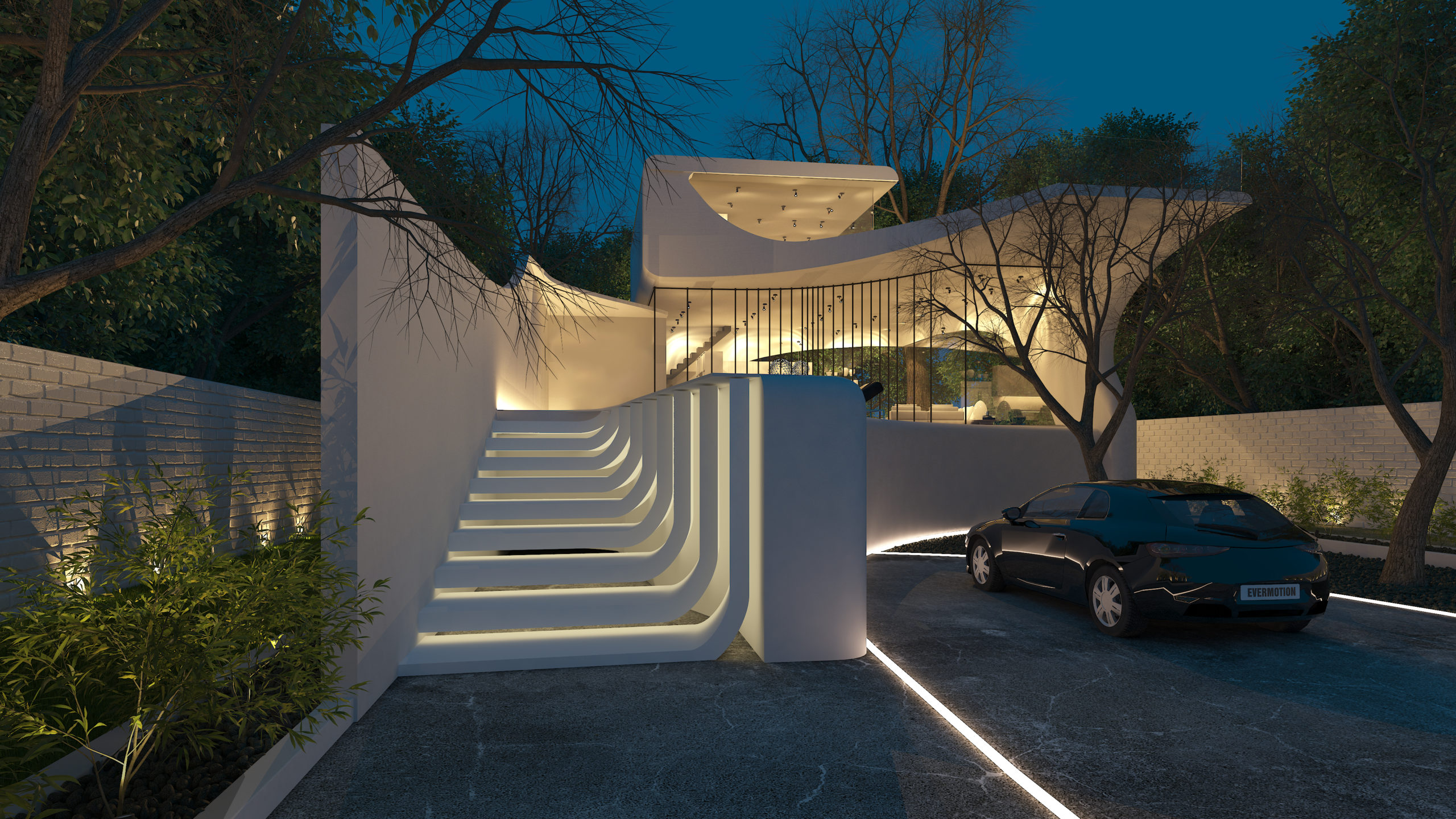
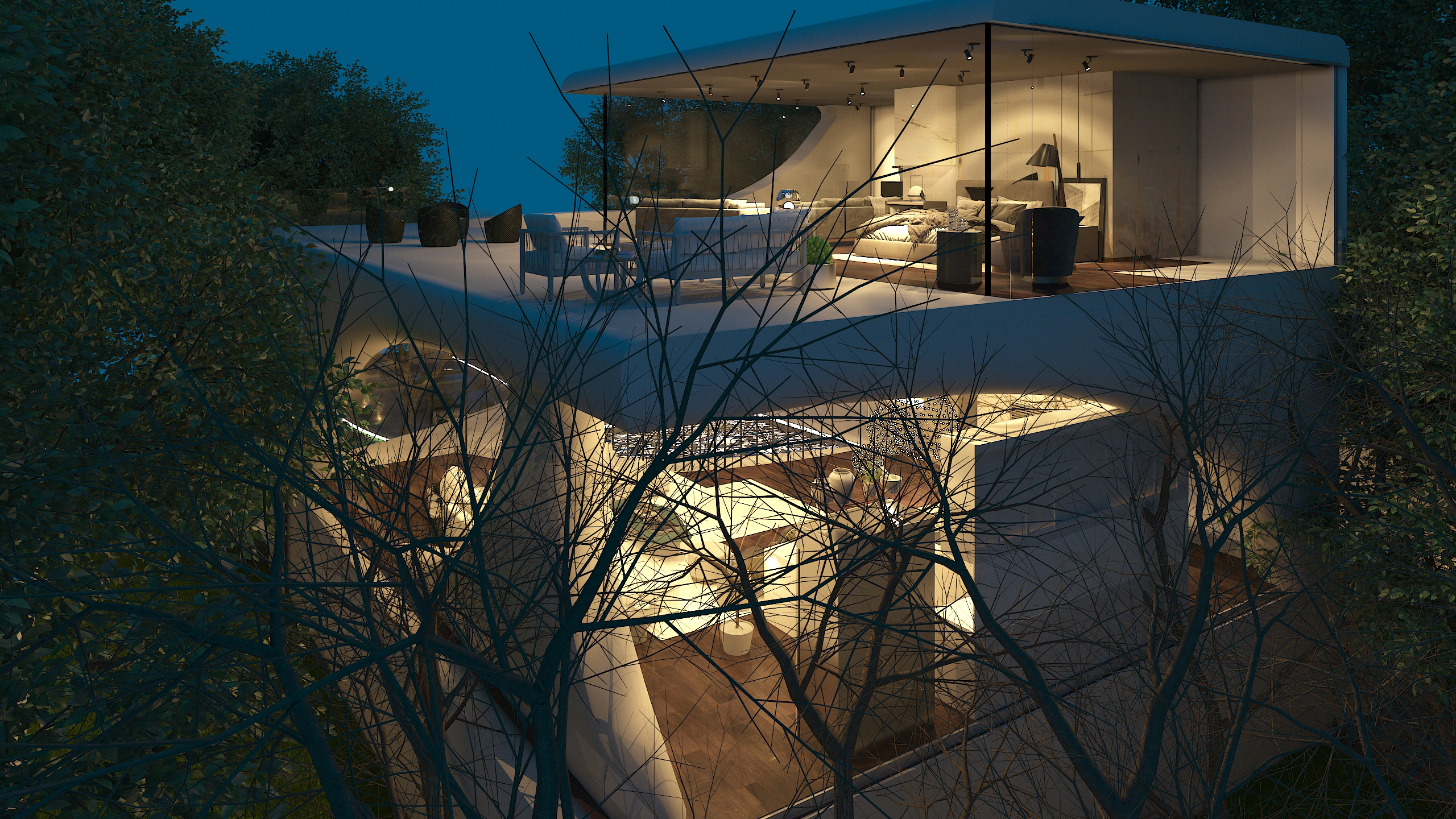
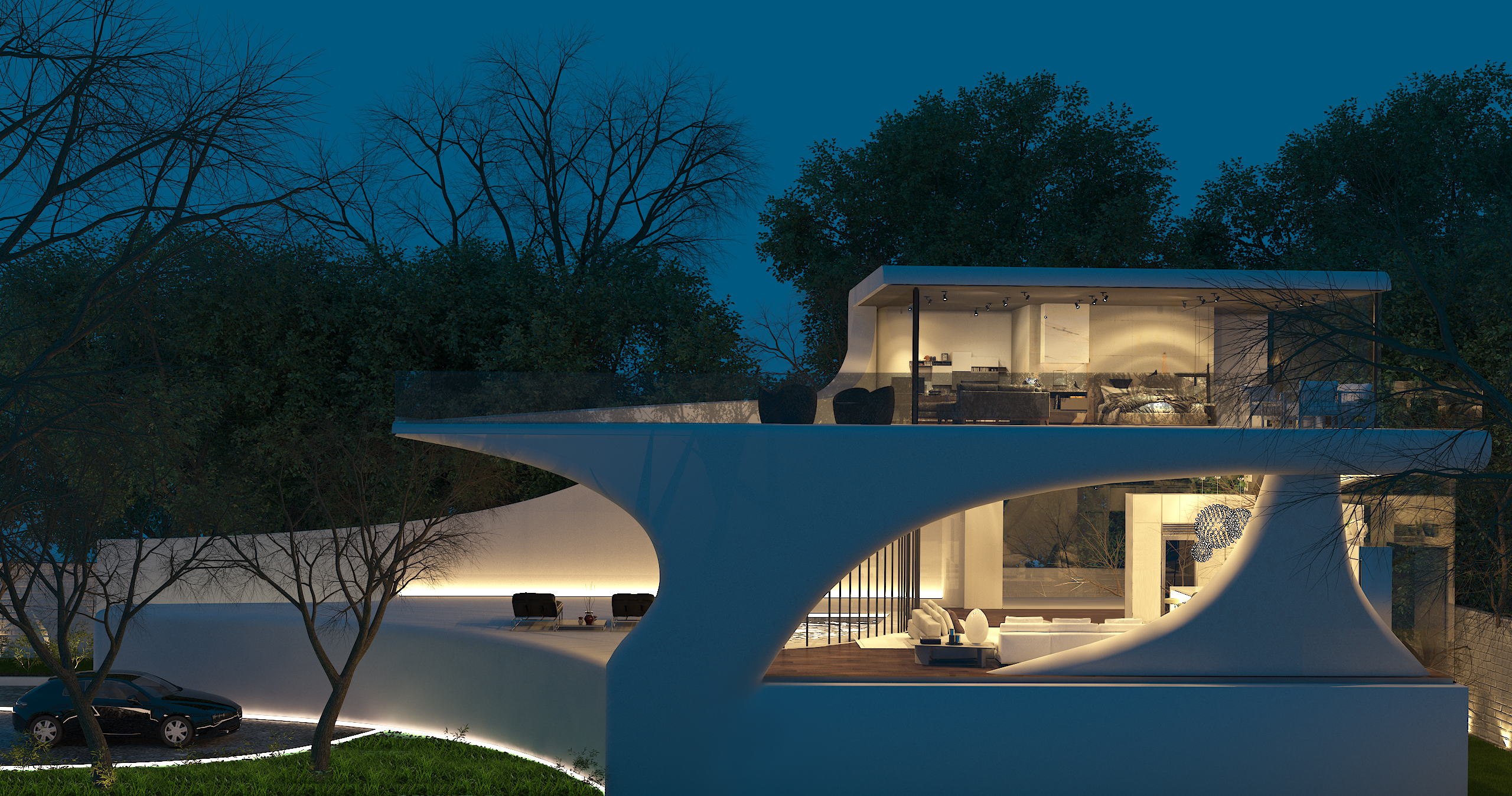 East Azerbaijan is a cold region, and this climate served as a key informant for Boed Architecture Center‘s residential design. The project’s site was is high and exposed, but the architects sought to elaborate a project that wouldn’t require any excavation and without changing the height codes. With strong winds coming from the west, it was necessary to strategically cover and protect Third Line Villa. At the same time, an all-glass wall on the south opens the home to the outer world. The distinctive windbreaks were inspired by Azeri style arches, the ancient style of the region, which are expressed in modern styles.
9. Stone House
By Taller ADG, Monterrey, Mexico
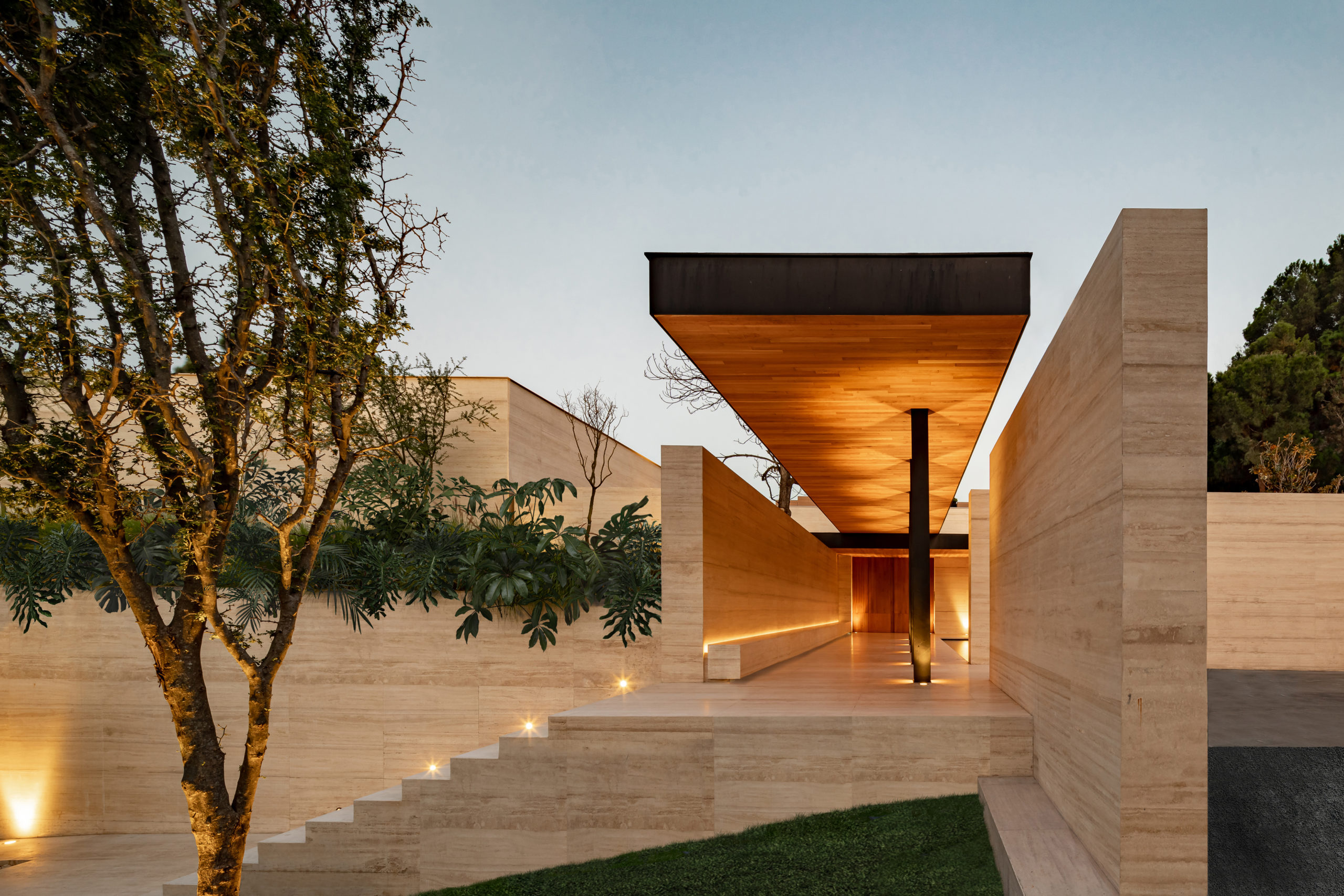
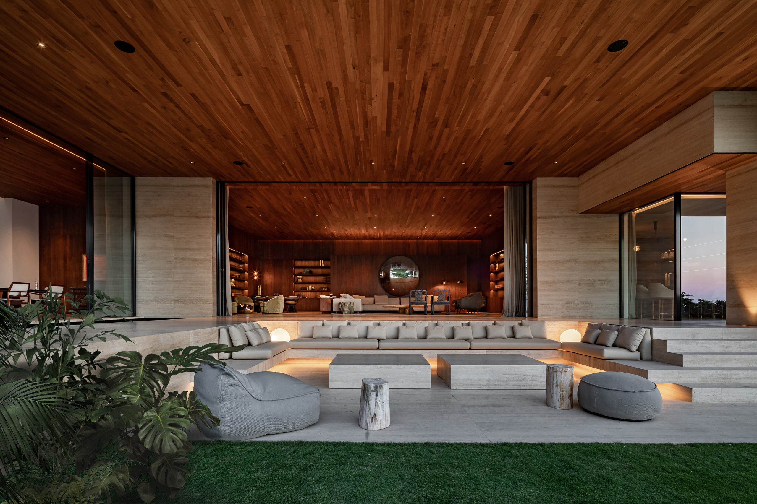 Designed in collaboration with Micaela de Bernardí, Stone House is a study in creating rhythm through spatial overlap and transitions between volumes. Perched high upon a hill, the single-story home by Taller ADG creates a procession through large spaces with varying ceiling heights, skylights, floodlights and reflective bodies of water. The architectural program offers sweeping visas over city, drawing inspiration from elements of the work of architect Luis Barragán.
8. Llana House
By Hector Navarro Architects, Lamadrid, Spain
Photos by Imagen Subliminal
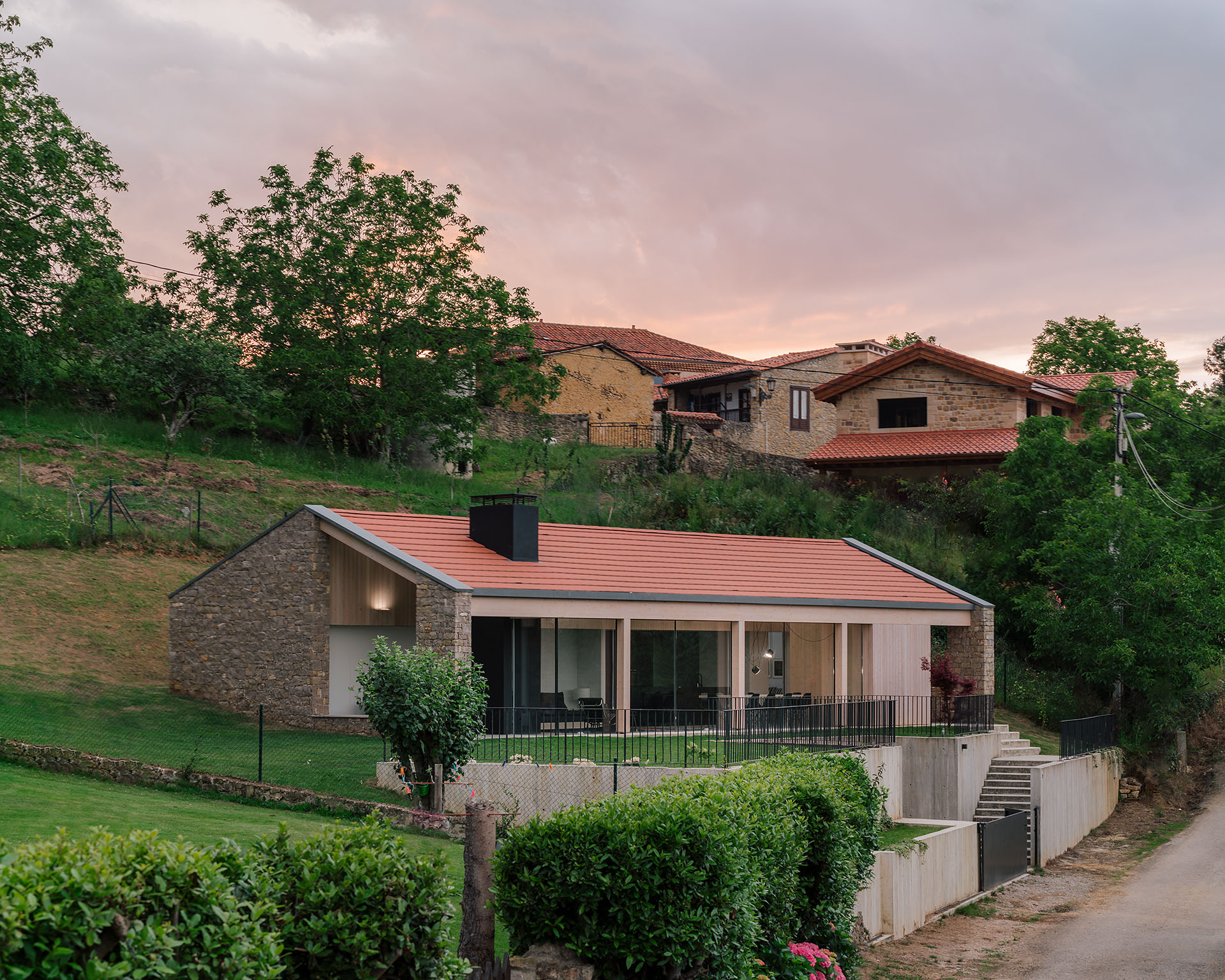
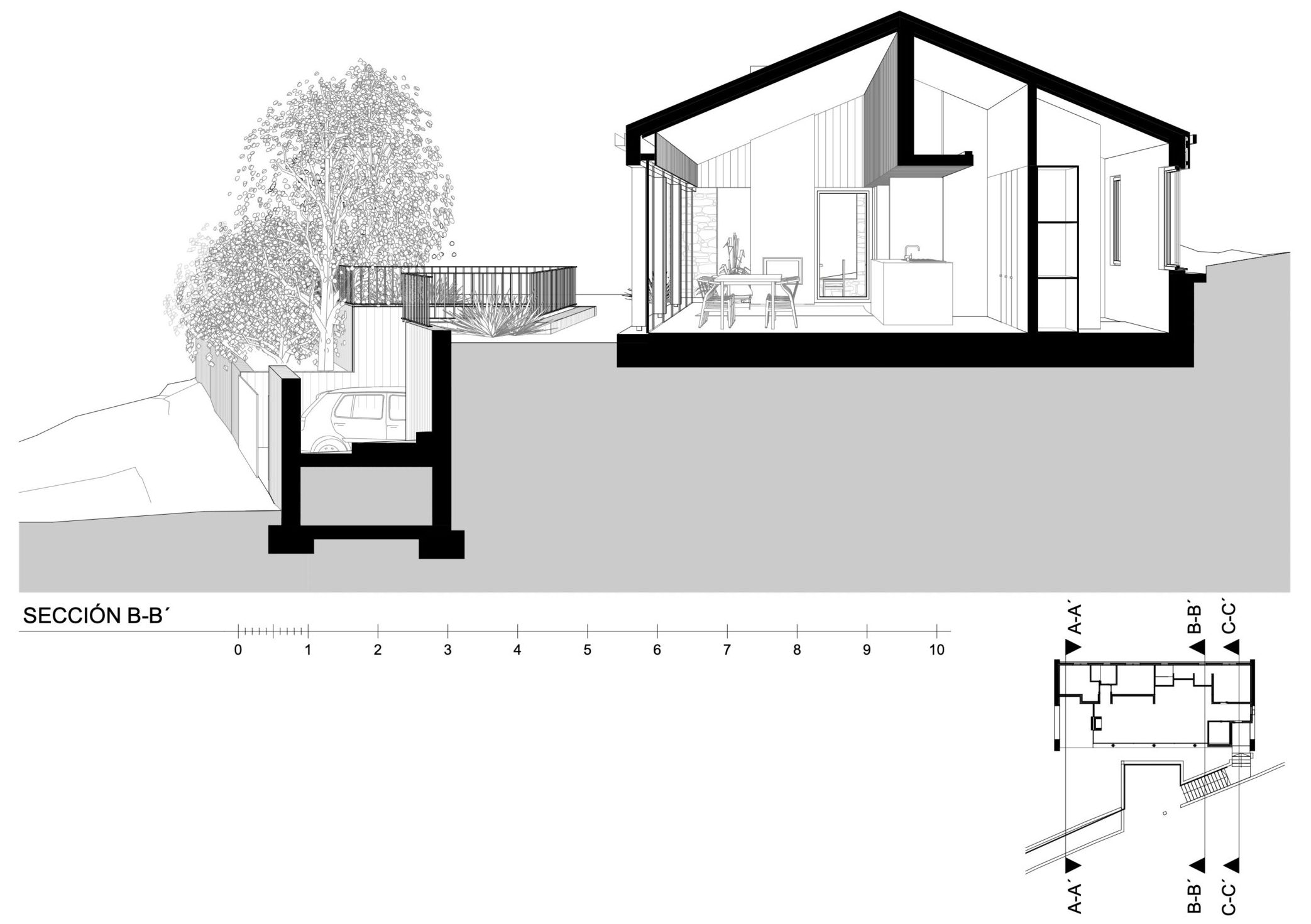
The vernacular architecture rural Cantabria consists of stone, wood and sloping red ceramic tile roofs. This traditional typology was a jumping point for Hector Navarro Architects’ elaboration of Llana House, which aims to be a sustainable proposal where traditional and contemporary construction systems merge. Of all the features, the solana stands out: as a covered space located in the sunniest area. In fact, the entire house was sited after an orientation study. Coupled with the high degree of insulation and the compact nature of the construction, the home clocks in almost zero consumption.
7. Velenjak Residential
By Farshad MehdiZadeh Design | FMZD, Tehran, Iran
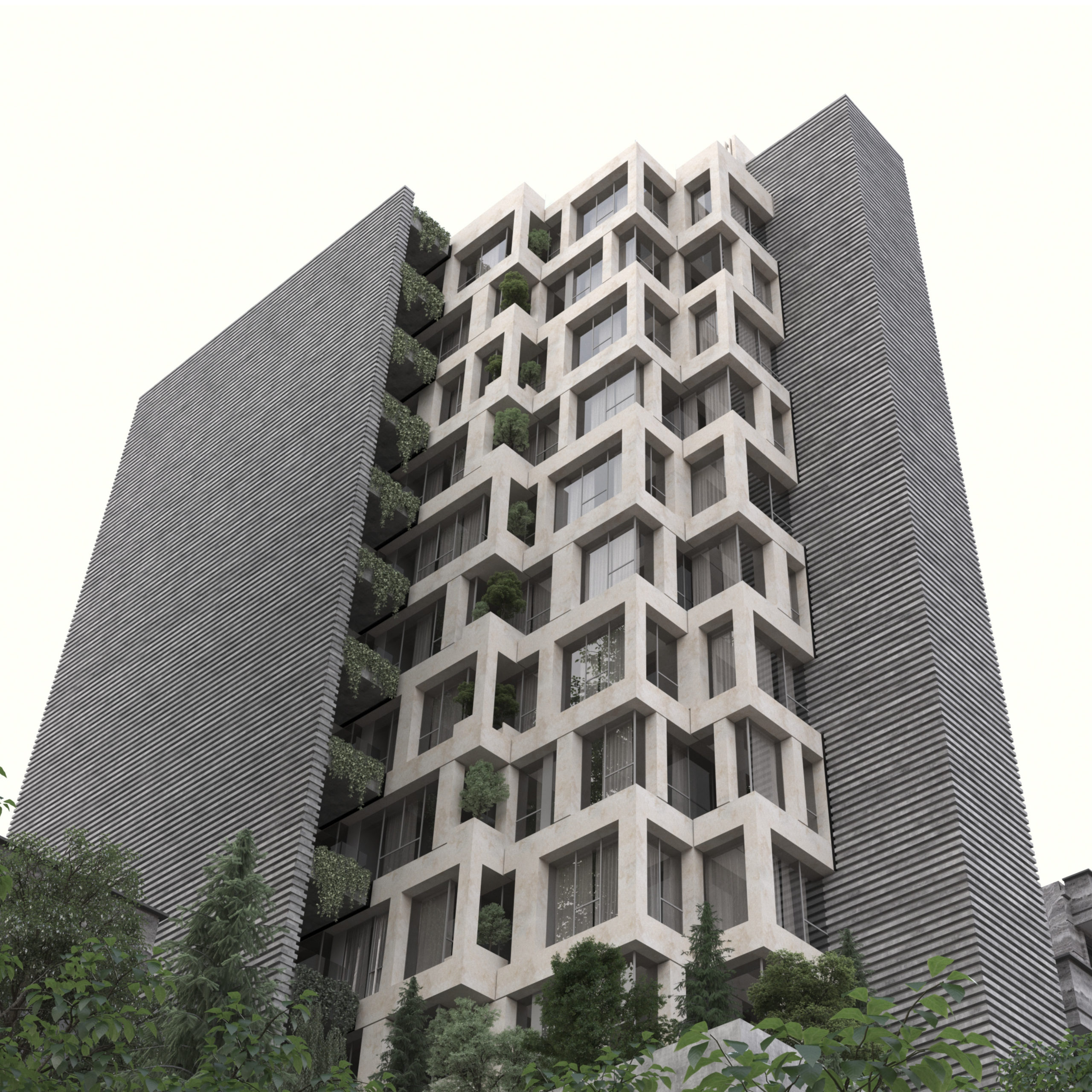
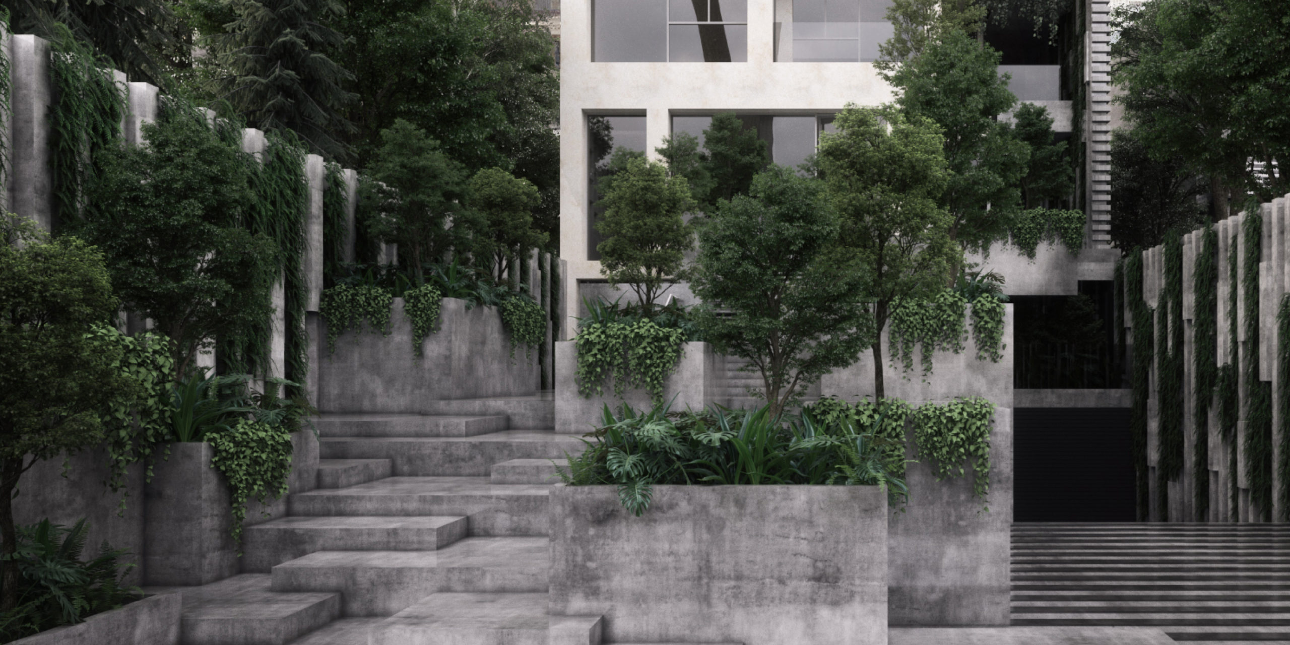
From the street, this residential building appears a multi-layered, dynamic and tactile façade system. In fact, the architects sought a subtle expression for the internal spatial hierarchy: the tower is designed as a system of sliding and self-organizing villas. Indeed, Farshad MehdiZadeh Design | FMZD sought to bring aspects of the suburban living experience to the reality of high-density urban living. This result is a vertical village wherein every resident equally has access to sufficient daylight and green space, while maintaining their privacy.
6. Casa H1
By Bruno H Gomes Arquitectura, Portugal
Photos by Ivo Tavares Studio
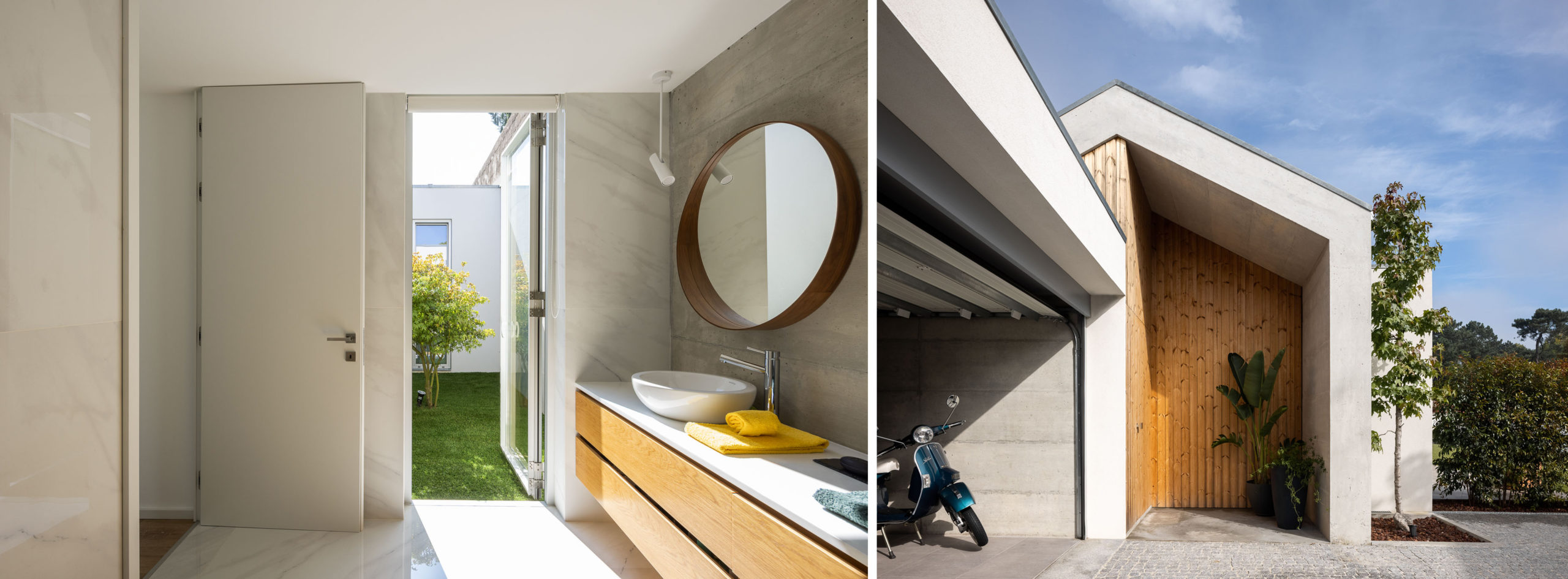
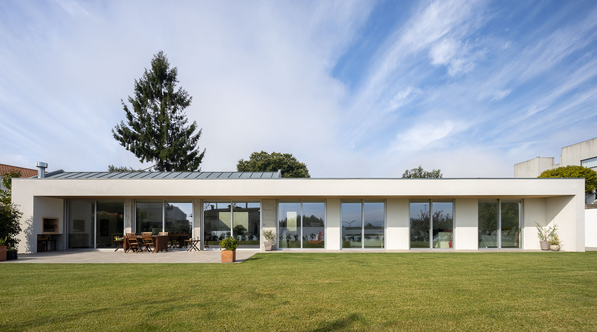
Many projects set atop steeply sloping sites choose see the topography as a plinth to showcase an architectural beacon. Taking a more introverted approach, this Portuguese project sinks the house’s ground floor beneath street level, opting for a gabled volume to announce the entryway way. Bruno H Gomes Arquitectura also use this volume as a technique to differentiate the more social areas of the program, expressing them visually to the outer realm. The building gravitates towards the western end of the land, opening up to an expansive outdoor space in the east, which is visually accessible through the band of floor-to-ceiling windows on that side of the building.
5. Residential House in Vilnius
By Architectural bureau G.Natkevicius and partners, Vilnius, Lithuania
Photos by Leonas Garbacauskas
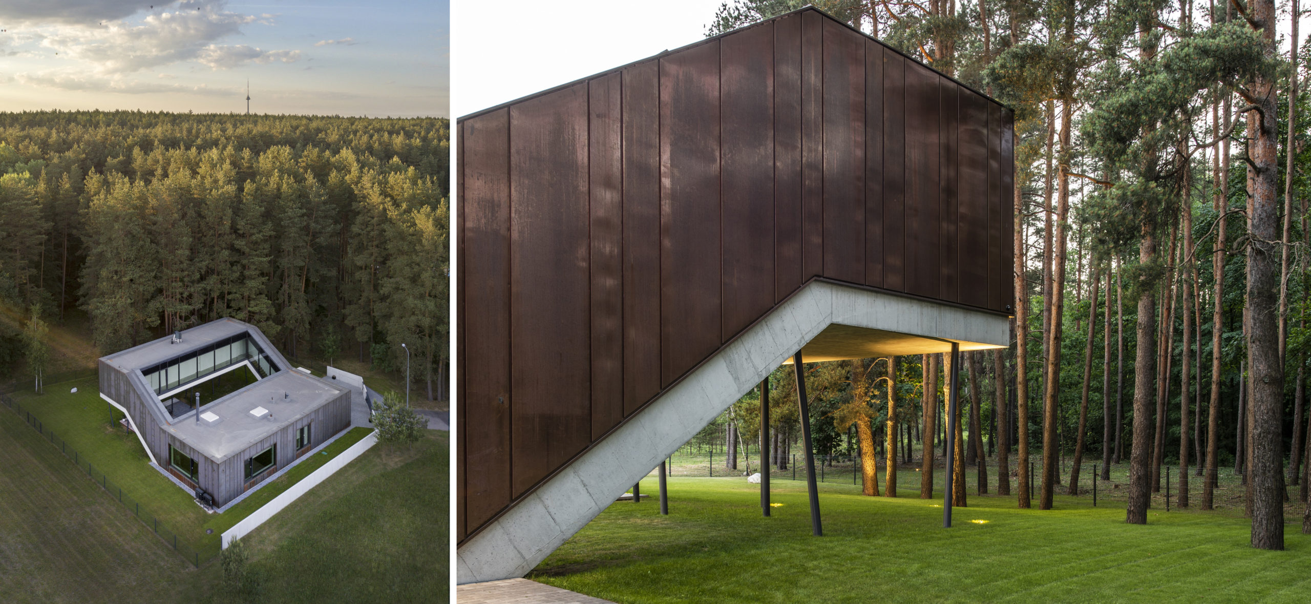
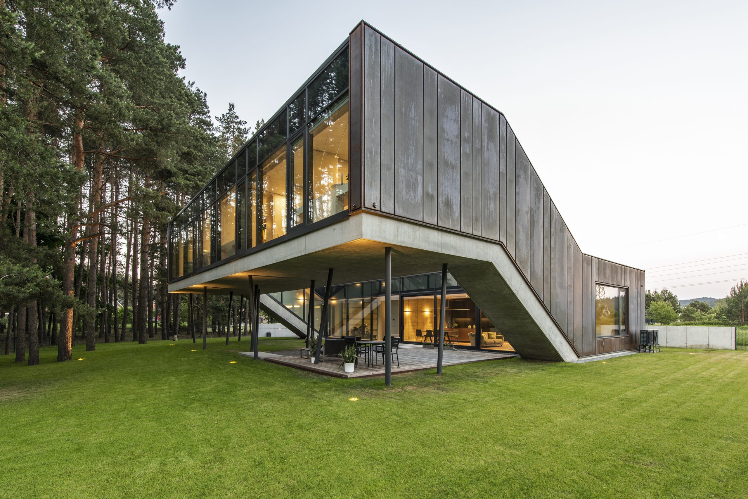
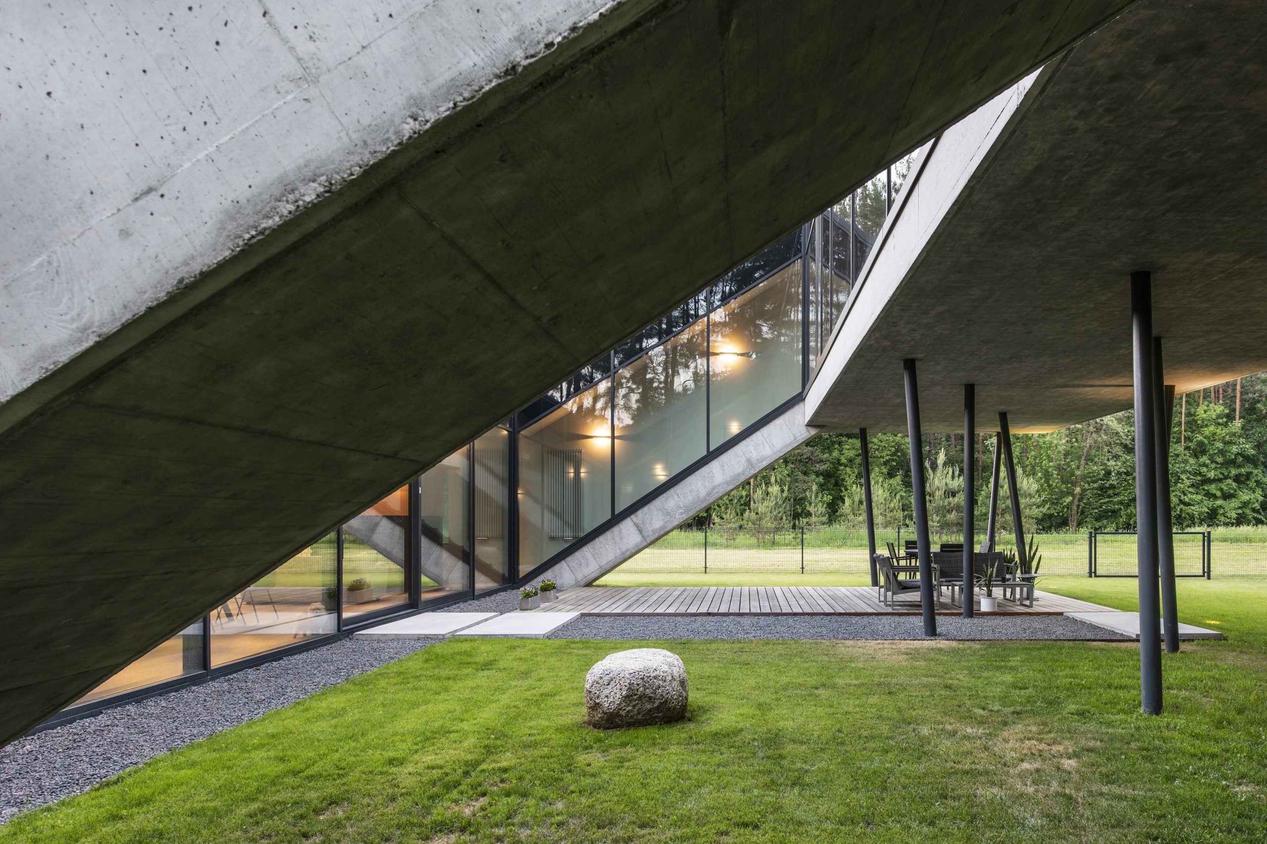
Where to begin with this home? Nestled amongst a sprawling pine forest, the provision of privacy wasn’t paramount, yet the design oscillates between openness and closure with good reason. Simply put, the home is formed around an inner courtyard, which is surrounded by a square-shaped volume. Yet, the design is not as simple: the home itself actually consists of two rectangular volumes connected by staircases. Of the two, one is raised from the ground and supported on smattering of thin, sporadically arranged pilotis that formally evoke the surrounding pine forest while opening views to it. These small details at once call to mind Le Corbusier and Alvar Aalto, while also presenting entirely new architectural ideas. The copper façade, which blends with the natural environment, is also a refreshing choice for a private dwelling.
4. Songdo Learning Hub – A New Library for an International City
By DJC design, Design Competition Entry
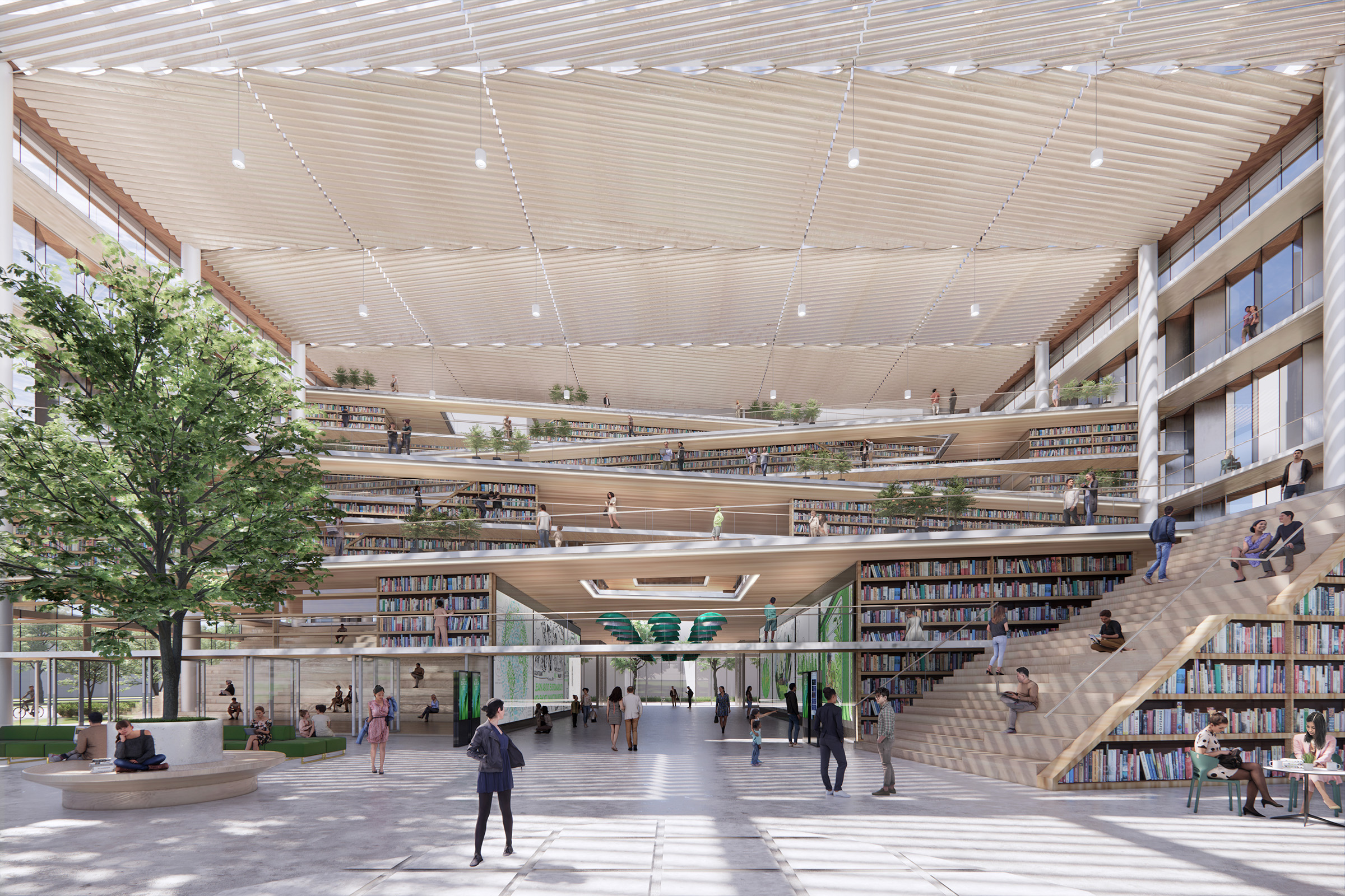
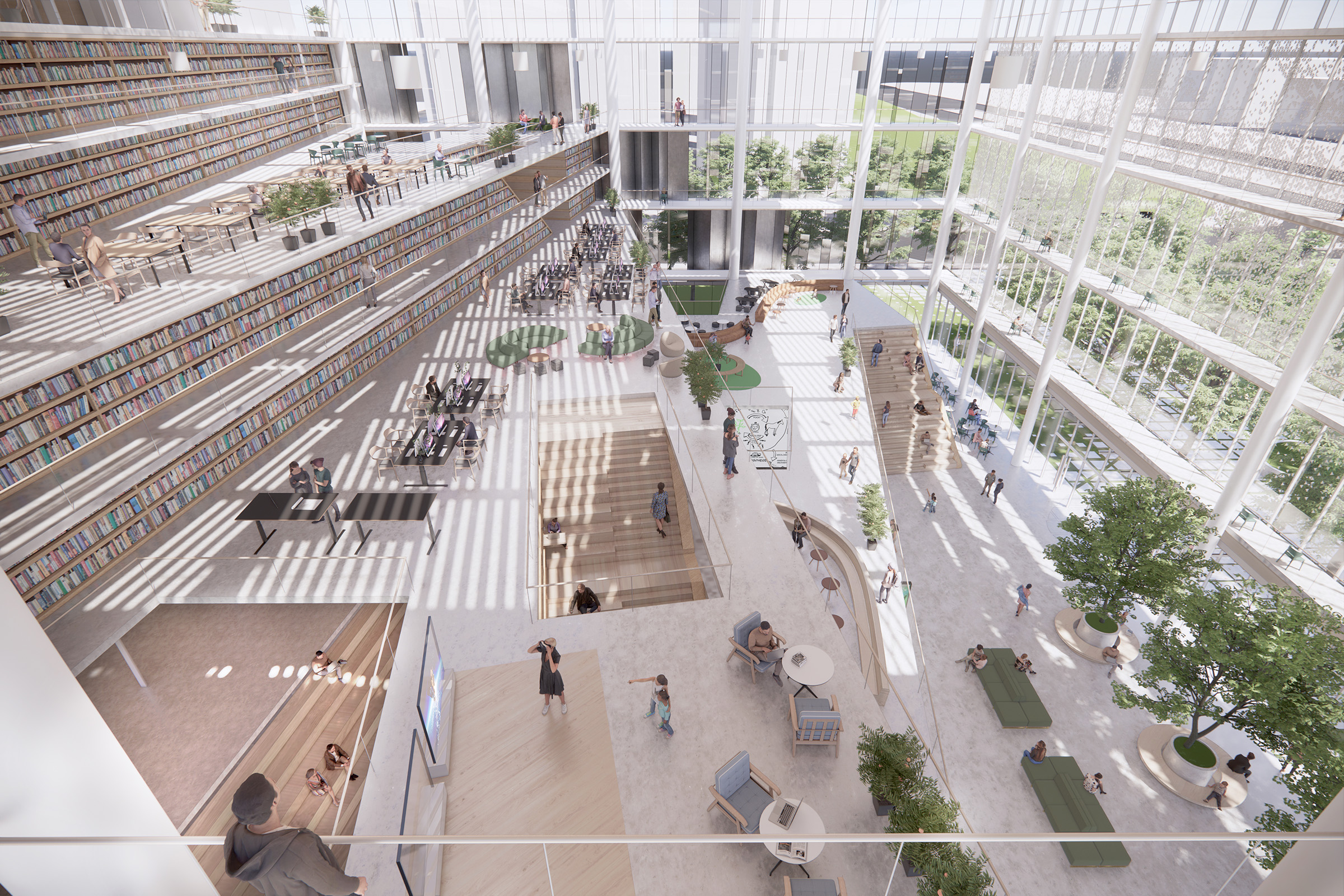
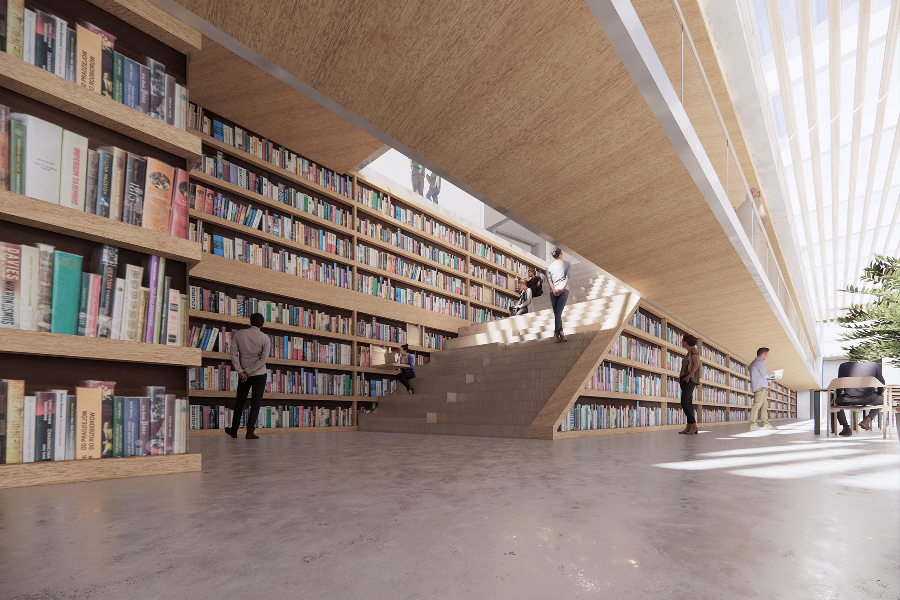 Reading outside always sounds like a good idea, but as most bookworms can attest, relaxing afternoons with a book under a tree can often be marred by bright sunshine, heat, rain or snow. DJC design imagines a library that offers the feeling of reading in a green space by creating an indoor library landscape. Every floor in the design is visually connected to the outdoors, brilliantly lit with natural sunlight. The stacks are staggered in modules, like a pile of stacked books, that funnel circulation upwards. The façade’s pleated glass and recycled aluminum panel system mimics a shelf of books in a subtle nod to the function of the space within.
3. AVENUE & SON
By Various Associates, Shanghai, China
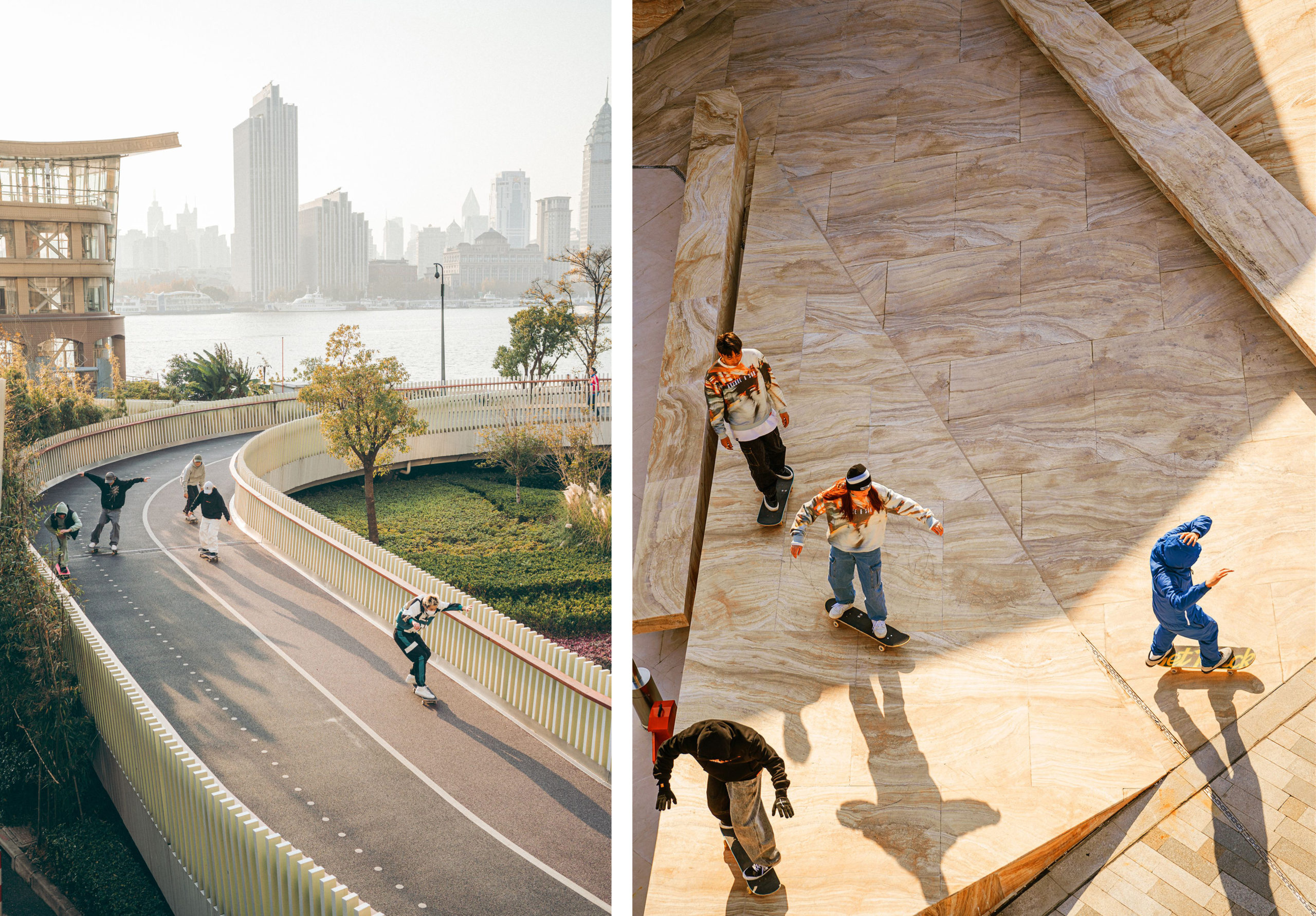
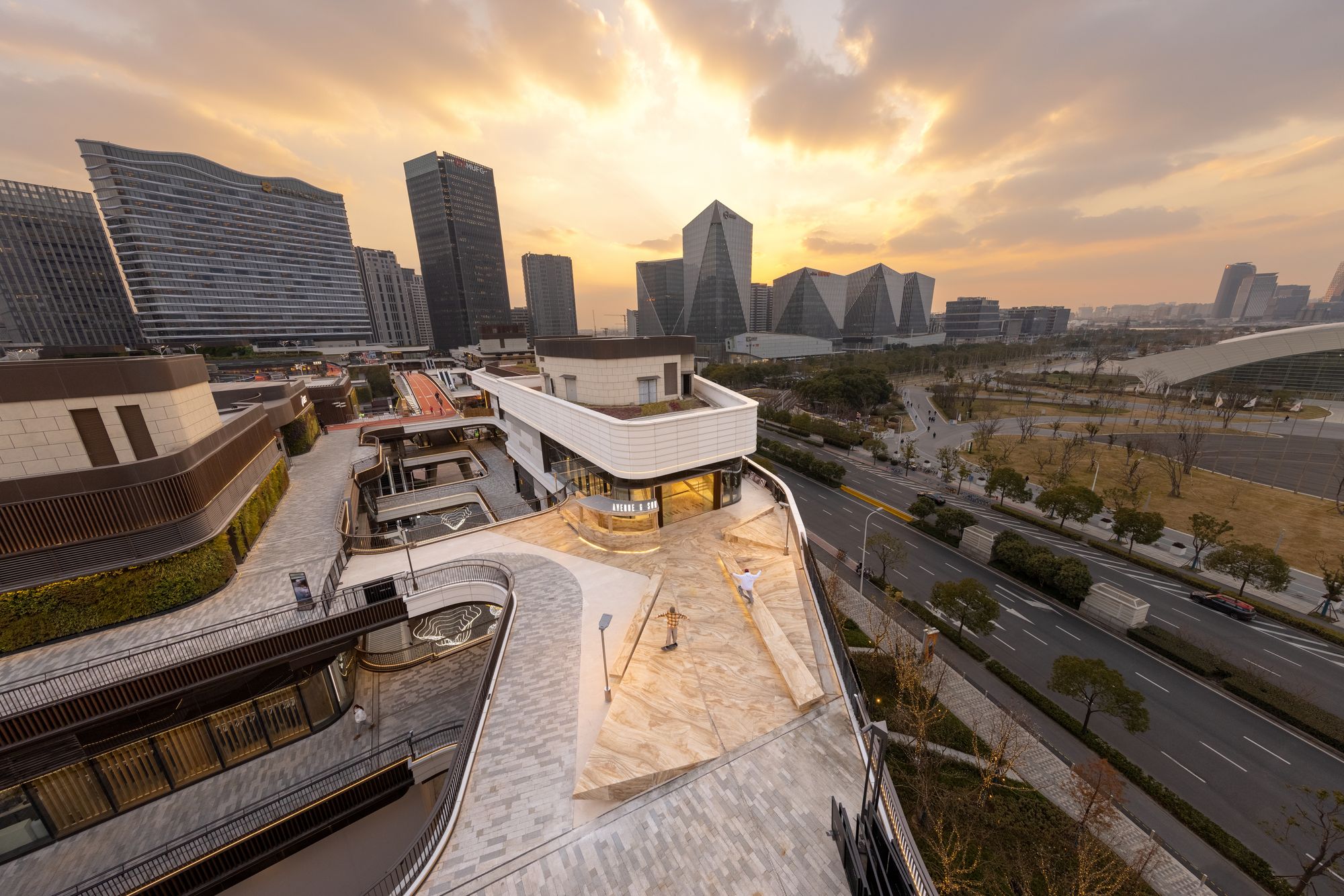 Designing the flagship store for a global skateboard brand is a dream commission for many. Co-founded by four professional skaters, the brand’s concept “from street to avenue” is reflected in the project, which, as the world’s first marble skate park, integrates sports, lifestyle, fashion and art in a playful and memorable manner. The materiality is part of the message: the idea that skateboarding is no longer counterculture (ie. something that is surreptitiously done in empty pools and paved parking lots). Various Associates’ ideas emphasize the way that street and mainstream culture is blurred, and that skateboarding culture has its own identifiable — and sought after – aesthetic.
2. Shiiba House
By Mandai Architects, Kyoto, Japan
![]()
![]()
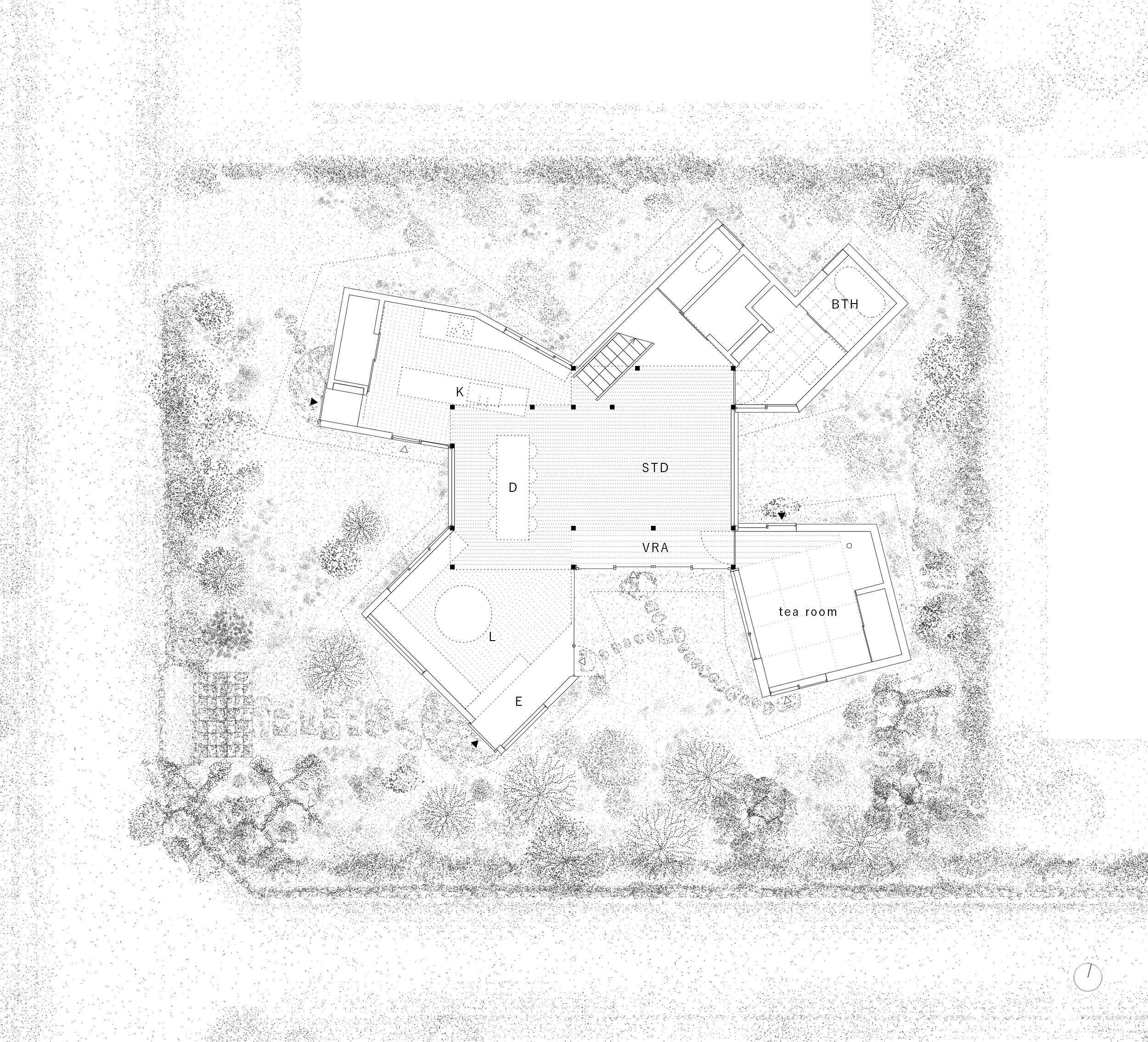
![]() How best to renovate a beloved century-old family home that has been inherited and inhabited over generations? The two-story Japanese home sits in the center of a private garden and surrounded by osmanthus trees in Kyoto. Over the years, it became something of a community hub — a private space that felt more like a public place. The building’s open design contributed to this, and Mandai Architects‘ renovation therefore sought to maintain it by introducing a a variety of subtle schemes that would further dissolve the structure.
How best to renovate a beloved century-old family home that has been inherited and inhabited over generations? The two-story Japanese home sits in the center of a private garden and surrounded by osmanthus trees in Kyoto. Over the years, it became something of a community hub — a private space that felt more like a public place. The building’s open design contributed to this, and Mandai Architects‘ renovation therefore sought to maintain it by introducing a a variety of subtle schemes that would further dissolve the structure.
1. 6 St George’s Terrace
By Coste Beno, London, United Kingdom
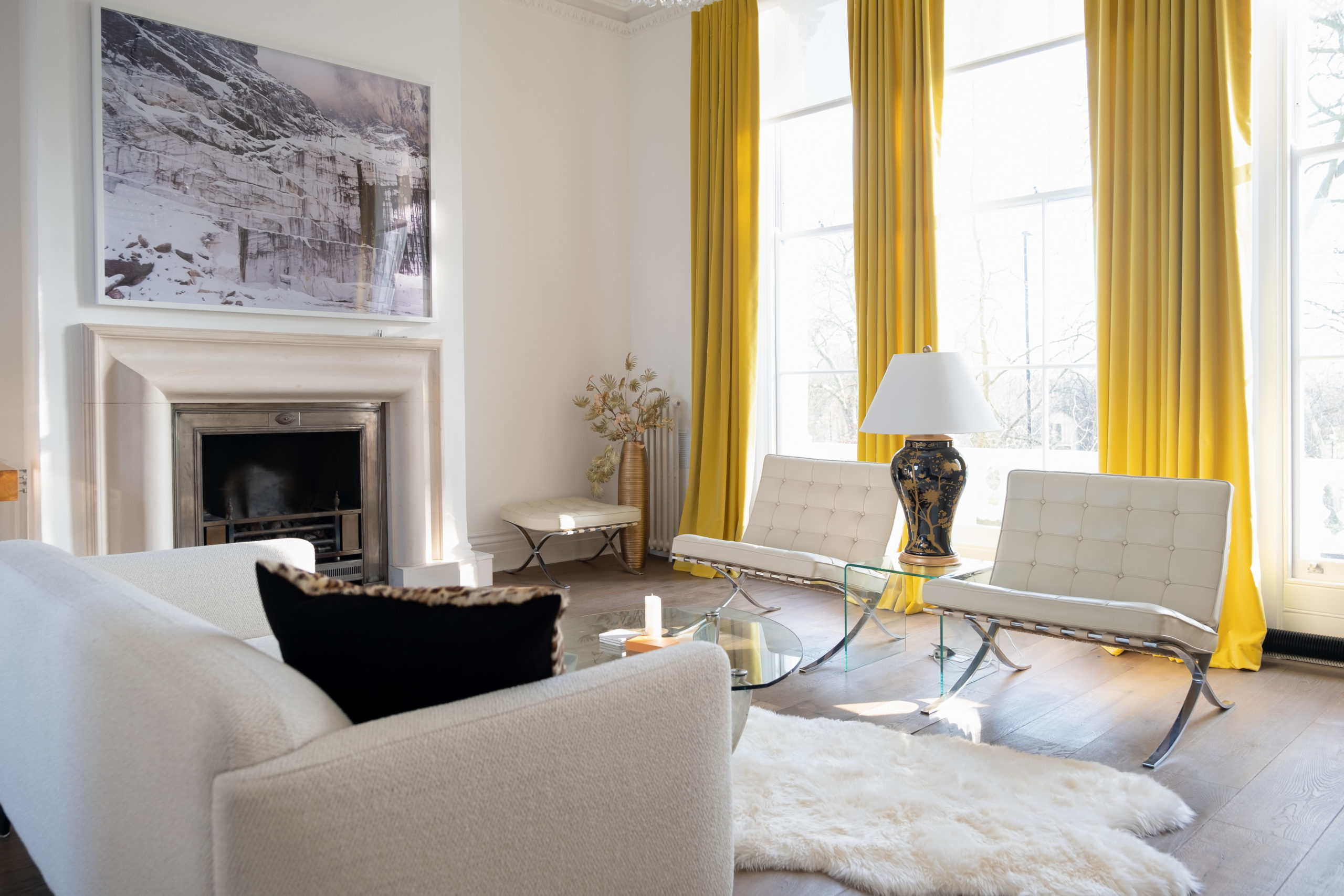
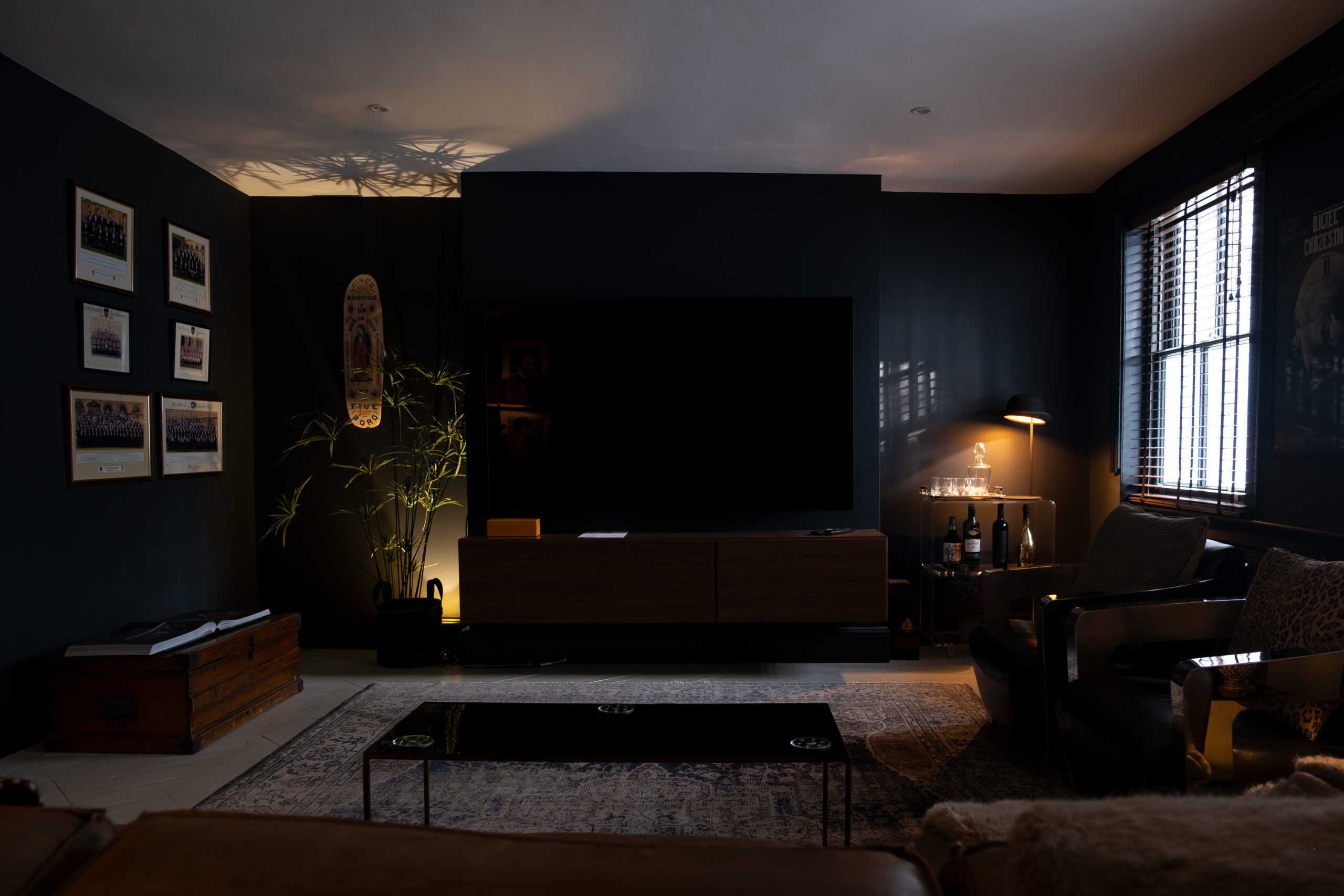 Sitting across from the beloved Primrose Hill park, the refurbishment of this Grade II listed London home represented an exciting opportunity for Coste + Beno to rethink the traditional layout. One key goal of the design was expanding the use possibilities of the ground floor space. The architects achieved this by relocating the kitchen; the result also created a better connection with the rear garden. In addition to such changes, the design also restored original details such as the limestone stairs. Coste + Beno find the perfect balance between respecting a stunning historic building while updating the space to accomodate a modern life style.
Architects: Want to have your project featured? Showcase your work by uploading projects to Architizer and sign up for our inspirational newsletters.

