Browse the Architizer Jobs Board and apply for architecture and design positions at some of the world’s best firms. Click here to sign up for our Jobs Newsletter.
Given the physical nature of the built environment, it would be easy to assume that the visual qualities of spaces dominate our our perception of a building. However, many artists and architects have experimented with specific sensory devices over the years, proving that every sense can be significant in transforming the experiential qualities of architecture. Here are five spaces designed to heighten your awareness in very unexpected ways. Step inside and leave your preconceptions at the door.

Via Motherboard
Sound: Anechoic Chamber, South Bank University, London
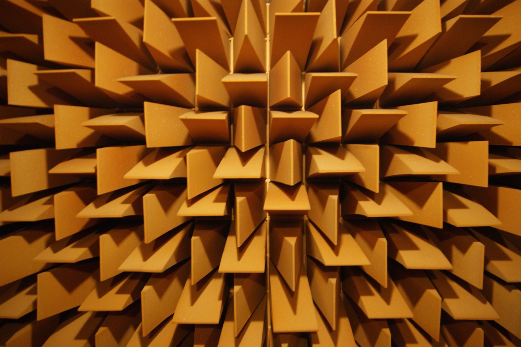
When considering the significance of sound in architecture, it may seem a little perverse to select a room designed to harness total silence. However, this would be to over-simplify matters: spend a few hours in an anechoic chamber, and all manner of previously unperceived sounds become apparent.

Via Motherboard
The crackling of your sinuses, the movement of blood around your head, the thudding of your beating heart… the walls of foam blades absorb almost every sound, leaving you hyper-aware of your own body and its existence within the space.

Via Japan Two
Sight: Backside Of The Moon, Naoshima
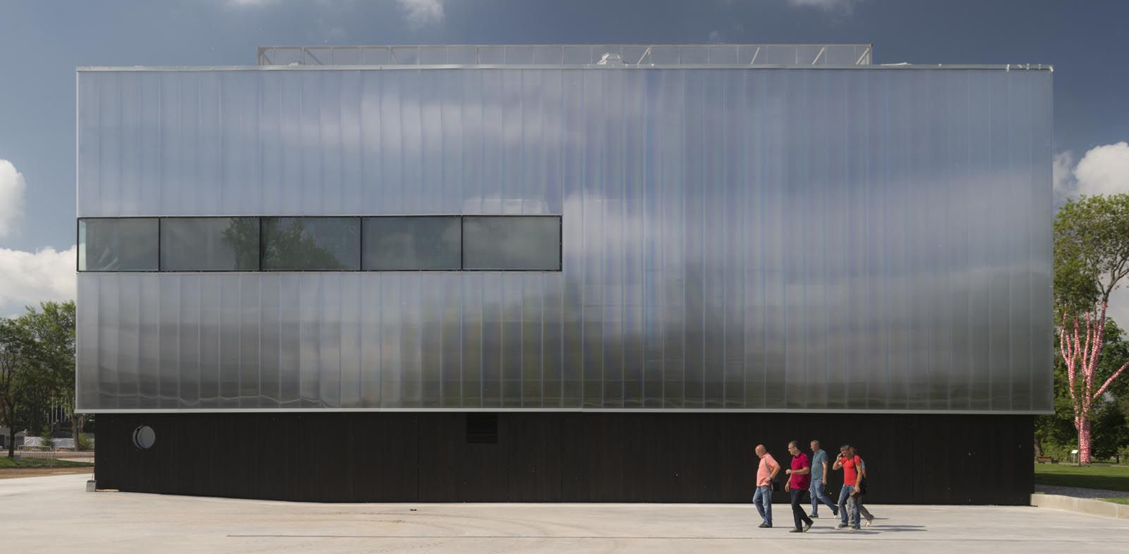
Amongst countless other architectural treasures, Japan’s “Art Island” is home to a timber-clad building that stretches the sense we take for granted most: sight. James Turrell’s “Backside Of The Moon” contains a pitch-black space that renders you blind for what might seem like forever.

Via Memory Imprint
Eventually, your eyes adjust – only then can the eerie gray light installation be observed, and the space you are sitting in begins to make coherent sense. The brilliant Tadao Ando painstakingly detailed this installation, and it shows: This structure represents the essence of how light and darkness can be harnessed to create truly powerful experiences.

Via Domus
Smell: The Art of Scent, Museum of Art and Design, New York City
When they weren’t busy working on the High Line, Diller Scofidio + Renfro adventured into the realms of sensory design in New York. Their installation at the Museum of Art and Design launched as the first major exhibition to focus on fragrance as an artistic medium rather than just a consumer product controlled by luxury brands.

Via Domus
Smell is the sense most associated with reminiscence, and each of the invisible artworks aimed to evoke memories and affect thought patterns of visitors. The minimalist architecture employed by DS+R framed this experience beautifully, with fragrances emanating from a series of subtle dimples and pleats within the gallery walls.

Via Spike Art
Taste: Chocolate Room, American Pavilion, Venice
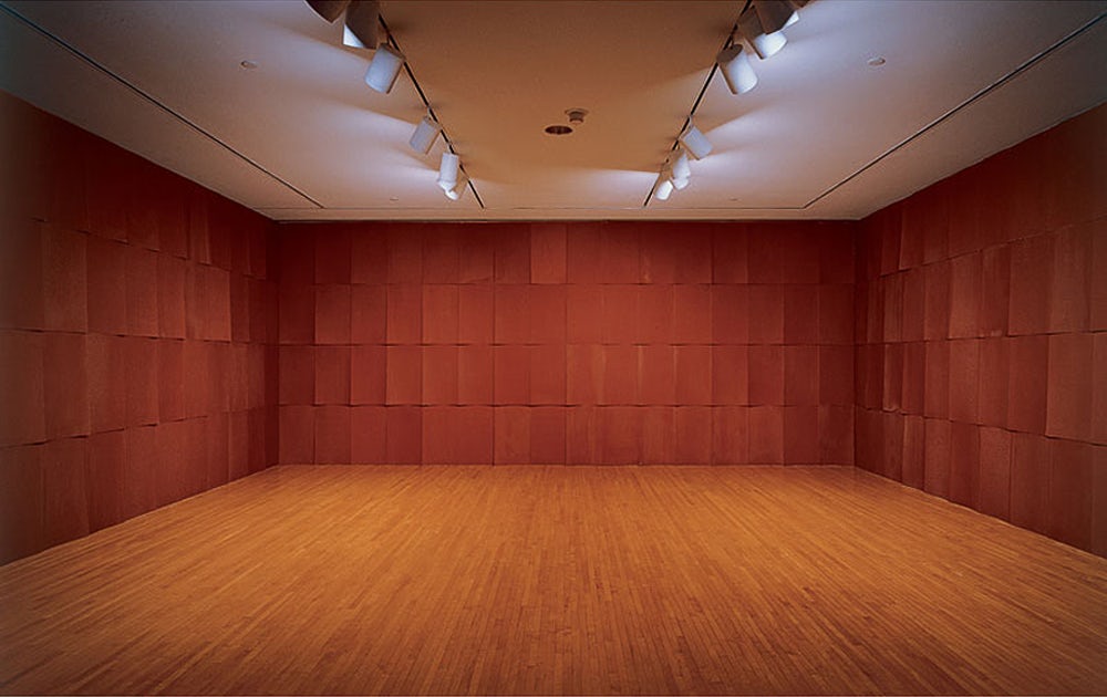
Originally created for the 35th Venice Biennale in 1970, American artist Edward Ruscha created the ‘wallpaper’ of this room by silk-screen printing 360 sheets with Nestlé chocolate. The oppressive room forces inhabitants to question their preconceptions about the relationship between taste and euphoria, forming physical proof of that age-old proverb: too much of anything is a bad thing.

While we typically associate chocolate with its euphoric effect on our taste-buds, the sense of smell was particularly overpowering in this case: the walls began to melt in the hot summer temperatures, attracting swarms of Venetian ants that ate away at the artwork.

Touch: Hazelwood School, Glasgow
Hazelwood School was designed specifically for children who are “dual sensory impaired” – they are both blind and deaf – meaning the sense of touch was infinitely more crucial in fostering their independence and aiding their orientation around the building.

Architect Alan Dunlop developed a meandering plan that allows children to follow a linear route through the building, avoiding maze-like conditions. Furthermore, the interior walls are clad with multiple textured materials, which pupils can follow with their hands to make sense of their whereabouts within the school. This means that they can make their way from classroom to classroom with minimal help, increasing the children’s confidence despite the challenges they face.
Browse the Architizer Jobs Board and apply for architecture and design positions at some of the world’s best firms. Click here to sign up for our Jobs Newsletter.


