Architizer's 14th A+Awards judging is live! Subscribe to our Awards Newsletter for updates on Public Voting and the big winner reveal later this spring.
Coming out of WWII, Americans were welcomed by a renewed sense of optimism. The rebuilding effort saw the expansion of economies all over the world, and Americans wanted to be rewarded with new designs and greater choice. Following the frugal years of rationing and deprivation, Americans wanted to see what they fought for. Designers responded with schemes to address the pent-up material desires of a population recovering from nearly two decades of economic hardship.

Storage Wall by George Nelson for Herman Miller illustrated in Time, 1945. Image via Parsons The New School for Design.
George Nelson’s Storage Wall is a perfect example of furniture designed to suit the new middle-class lifestyle. Conceived before the war ended, the storage wall could be accessed from both sides, constructed between two rooms that provided storage without sacrificing space in small-scale postwar housing. It became the basis for domestic and institutional environments to organize all of the newly available domestic goods of the era.
Architects and designers have looked to Nelson’s Storage Wall for some 70 years now. Here are 11 projects that adapt his original concept in a contemporary context.


Living Cube by Till Könneker, Bern, Switzerland
Furniture by Living Cube Furniture
The Living Cube is a multifunctional space for things you’d like to display and also for things you’d prefer to say out of sight.


platform(1×2) by openUU, Hong Kong
platform(1×2) is a readily deployable space! The multifunctional storage wall functions as a flexible space for an art gallery, living space, workspace, and storage space.


Unfolding Apartment by MKCA // Michael K Chen Architecture, New York
Hardware by Blum and Hafele
Furniture by Modernica
Shelving and bookcases by Rakks
Paints & coatings by Benjamin Moore
Bigger than furniture, smaller than architecture: this storage wall incorporates all aspects of a studio space for work, living, and entertaining, including a bed, a home office, a nightstand, a closet, a library, and kitchen storage.


Apartment in Paris by SCHEMAA, Paris, France
This small, square apartment features integrated storage on opposite walls, one of which is a kitchenette. The other wall forms a staircase to the lofted bed.


The Cabin French Alps by H2O Architectes, Saint-Martin-de-Belleville, France
Why stop at storage when you can build beds into the walls? Instead of making the furniture fit this cramped cabin in the French Alps, the apartment was made to fit the furniture, such that the curved wooden storage wall holds all of the room’s functions.

© Bean Buro

© Bean Buro
Boathouse Home Office by Bean Buro, Hong Kong
Rather than using two partition walls, this storage wall that fluidly connects all of the areas in the apartment while also providing a stretch of space for storing and displaying personal things.


Writer’s Shed by Weston Surman and Deane Architecture, London, United Kingdom
Created for artists/illustrators, this project brings to life the illusion of a fairytale hut at the end of a garden. Inside, the storage wall meanders around the wood-burning stove providing a centerpiece to store a library of books.


Constant Motion by Alex Bykov, Kiev, Ukraine
“Constant motion” is the concept behind the main vector of planning the design and stylistic solutions in this Ukrainian apartment interior. The storage wall is part of the spatial design that permits inhabitants to move from one room to another in an uninterrupted circle, allowing the spaces to smoothly flow into each other.


© NL Architects
NS Stations by NL Architects, Utrecht, Netherlands
Built on top of the biggest railroad station in the Netherlands, Utrecht Centraal, this office interior is based on the dimensions of the railroad tracks below. The perpendicular storage walls serve as both storage space and work areas.

© Karin Matz Arkitekt

HB6B – One Home by Karin Matz Arkitekt, Stockholm, Sweden
Thanks to the built-in storage wall, this apartment maximizes the available space by combining different possible outcomes to move through the layers of space: the apartment functions are squeezed in on top of, in between, underneath, and inside each other.


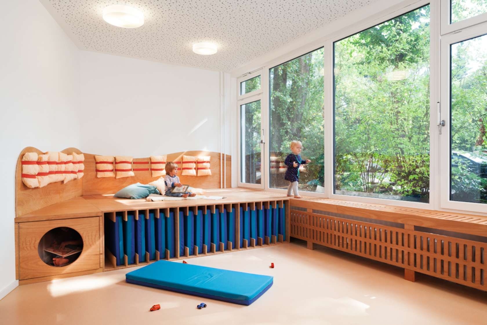
KITA Hisa by baukind, Berlin, Germany
Formerly a retail store, this kindergarten utilizes a built-in storage wall to divide different zones instead of actual borders that would break the harmony of the space.
Architizer's 14th A+Awards judging is live! Subscribe to our Awards Newsletter for updates on Public Voting and the big winner reveal later this spring.


