Architizer's diverse jury of global experts is currently reviewing submissions to the 14th A+Awards! Sign up to receive updates on Public Voting and spring winner announcements.
Shops can provide impressive shopping experiences even with limited floor areas. Instead of using shiny and luxurious materials that crowd the space, wood can easily bring intimacy and coziness to compact spaces. This collection includes six examples of retail designs that smartly employ wood in small store spaces. They demonstrate the possibility of timber-clad interiors, revealing how wood can evoke a range of atmospheres from quiet calmness to bright warmth to intimate mystery and more.
Mi Pan
By Concentrico, Mexico City, Mexico
Popular Choice Winner, 10th Annual A+Awards, Retail
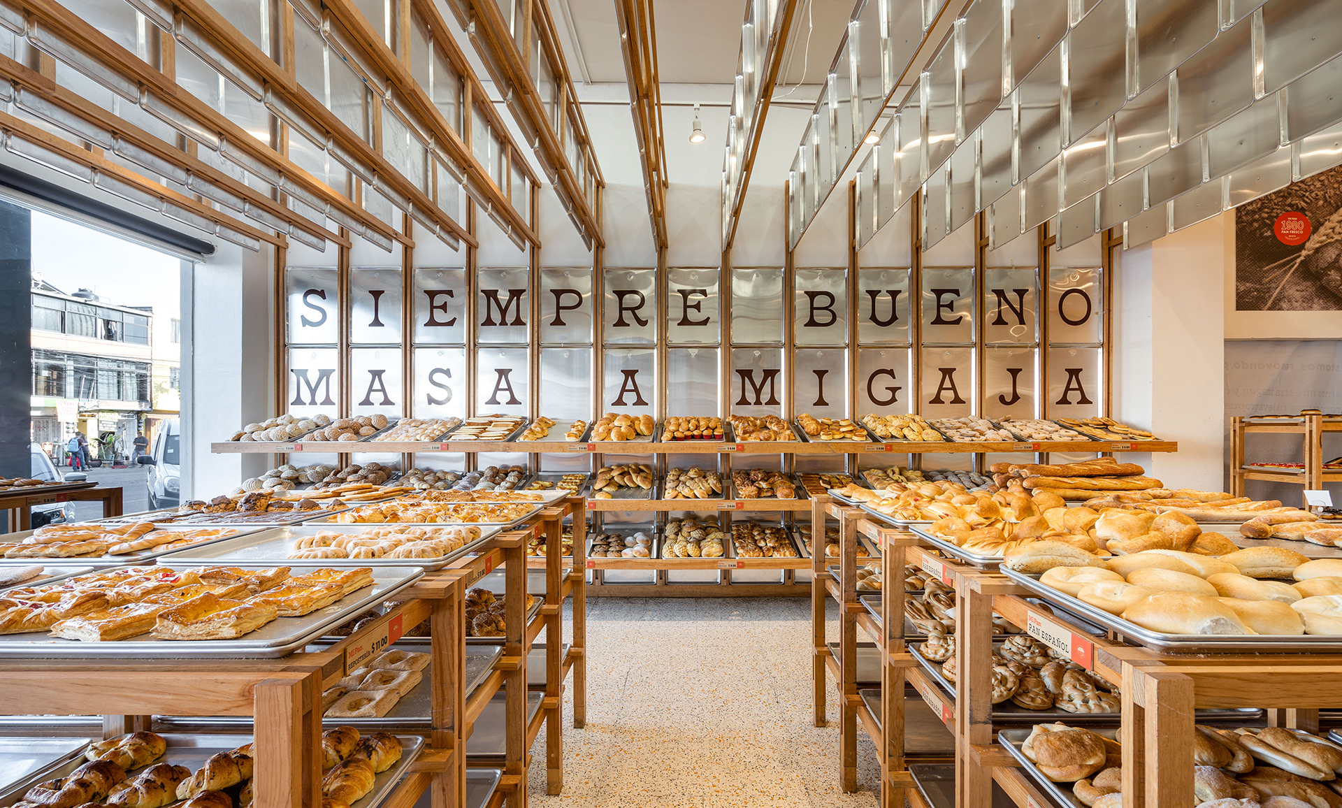
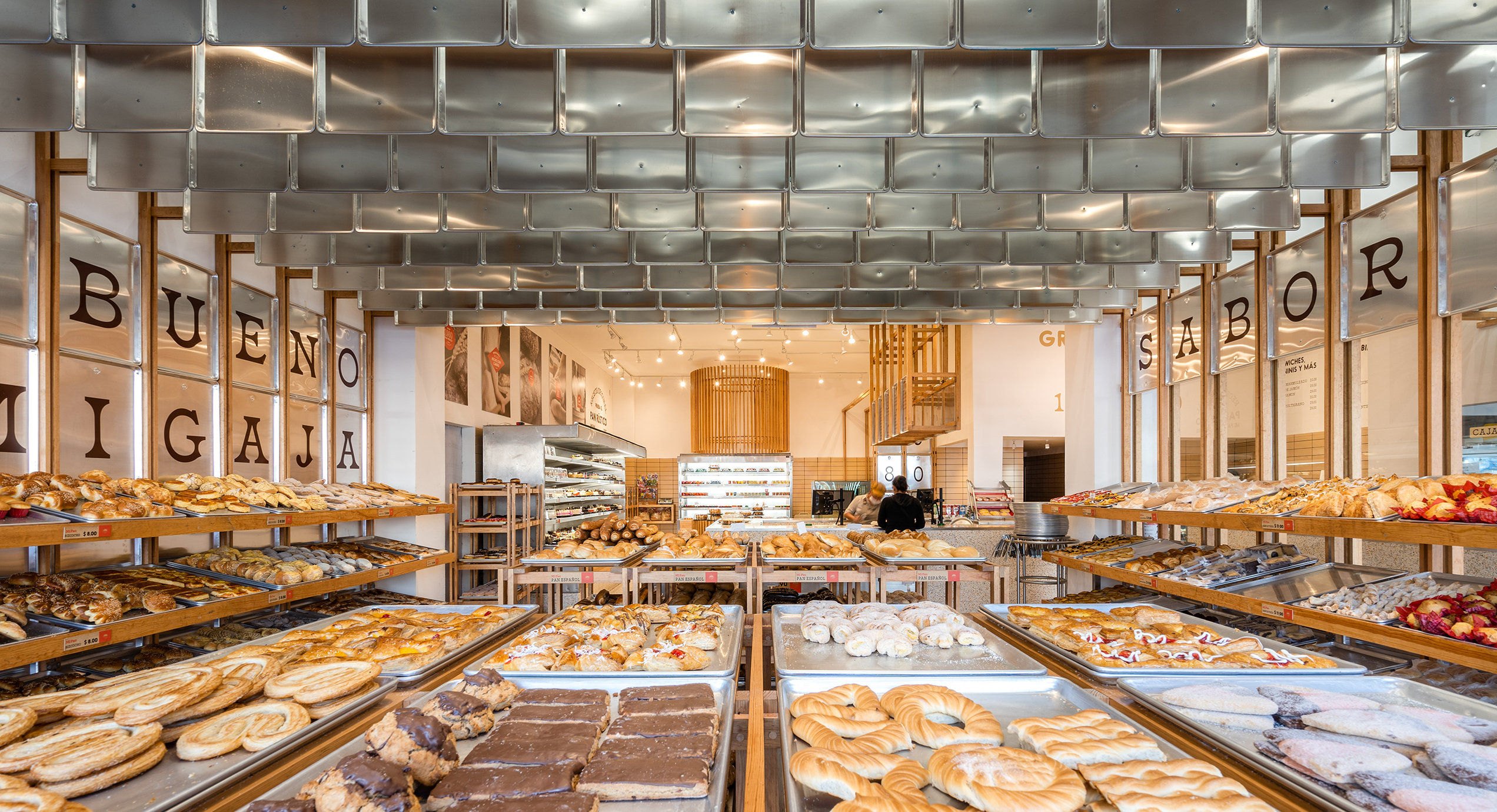 The bakery Mi Pan celebrates bakers’ hard work in making delicious bread. Metal trays reoccur on the shelves, wall cladding and ceiling decorations. These are the same type of tray used for bread production, reminding people of the heart of Mi Pan – the kitchen.
Instead of regular shelves, the design team uses trays and timber frames to hold freshly-baked bread. The trays emphasize the fact that the bread comes straight out of the kitchen as they are ready. Timber frames extend onto the walls and ceiling, breaking the boxy space into rhythmic fragments. The trays that hang from the ceiling hide cables from customers’ sight while making the bakery cozier by lowering the space.
Haregino Marusho
By Tsutsumi And Associates, Yokohama, Japan
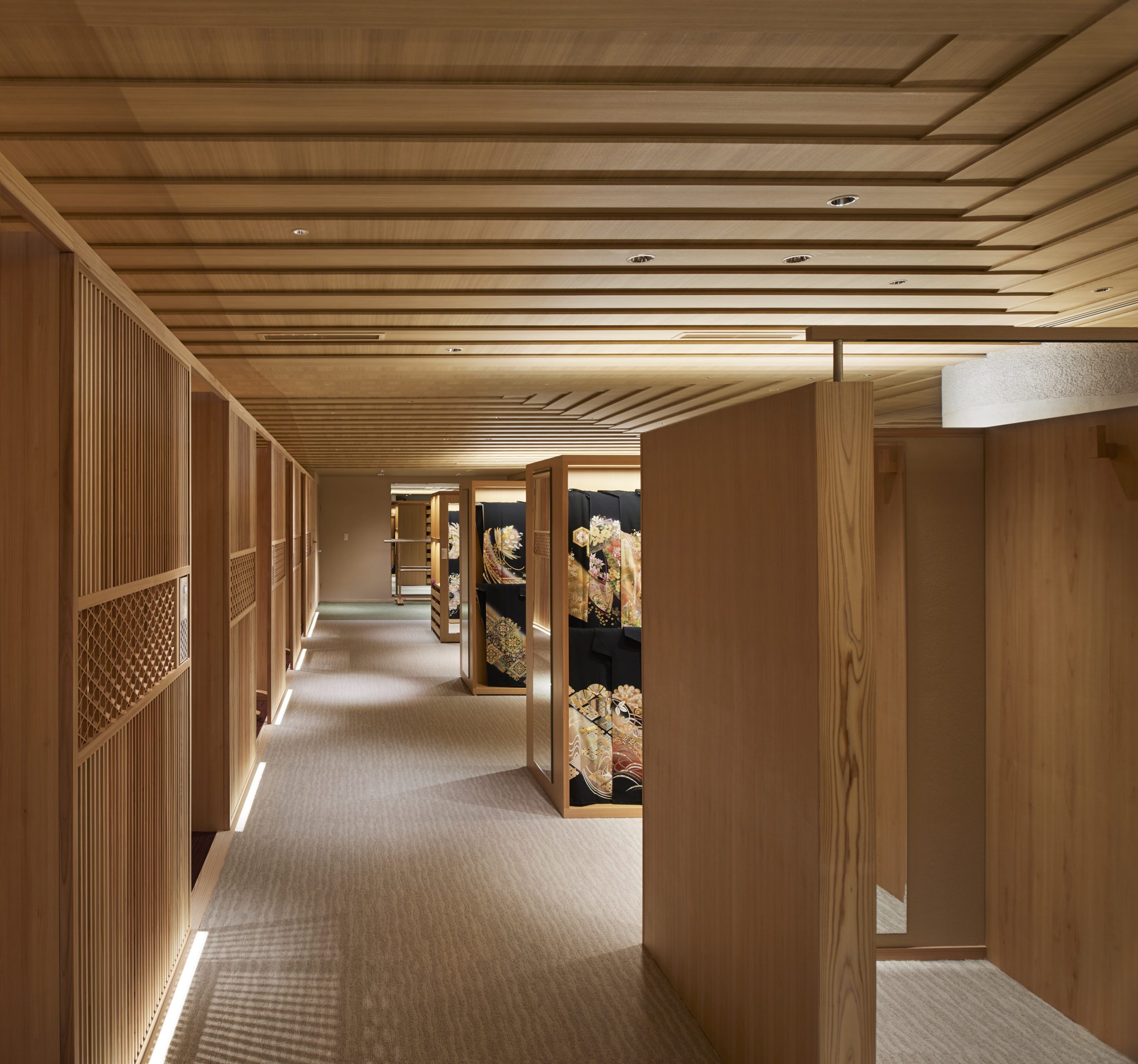
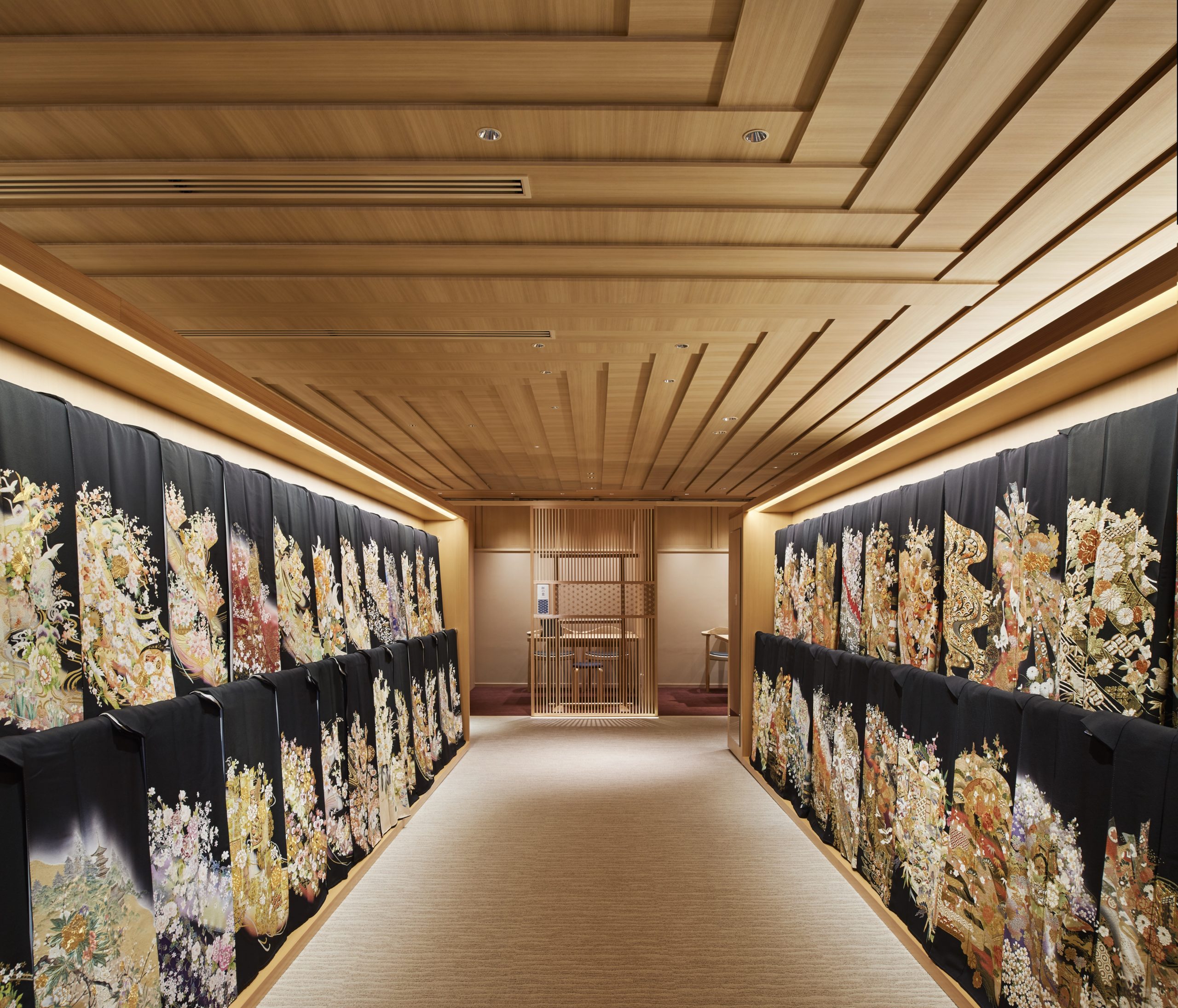 The design team refurbished the floor of the wedding Kimono in the traditional Japanese clothing shop Haregino Marusho and themed it with wood. Many spatial components, including display shelves, partitions and the ceiling, are in warm-color wood of similarly soft patterns. The space becomes an elegant wooden display box that does not take any spotlight from the kimono fabrics.
The ceiling panels are cut strategically to create a layering effect that resembles the Kasane (layering) of the Kimono. They also bring subtle changes in the ceiling height, making the monochromatic space more interesting to wander through.
Blackhills Cafe
By Mora + Suksumek, Lat Phrao, Bangkok, Thailand
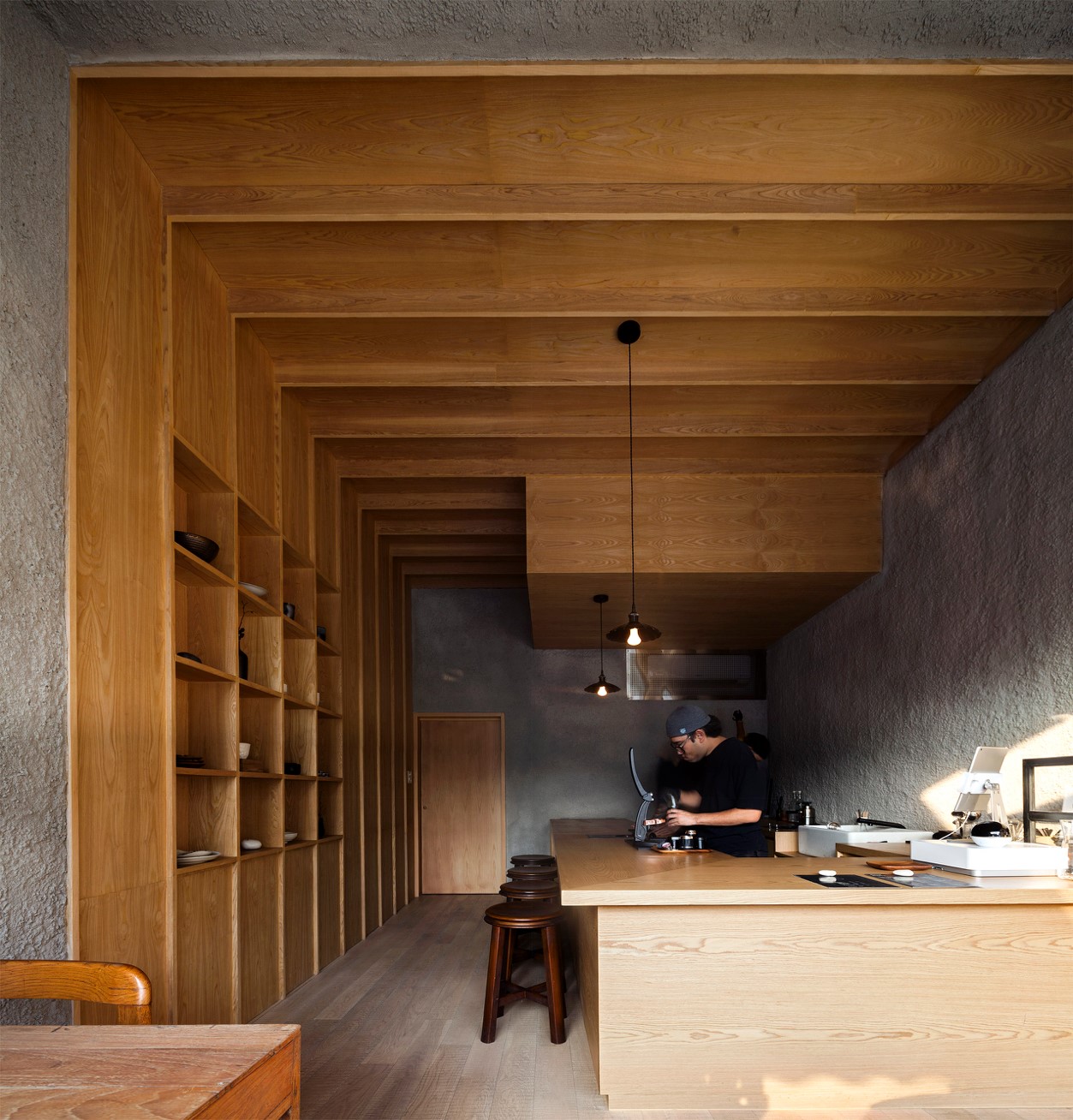
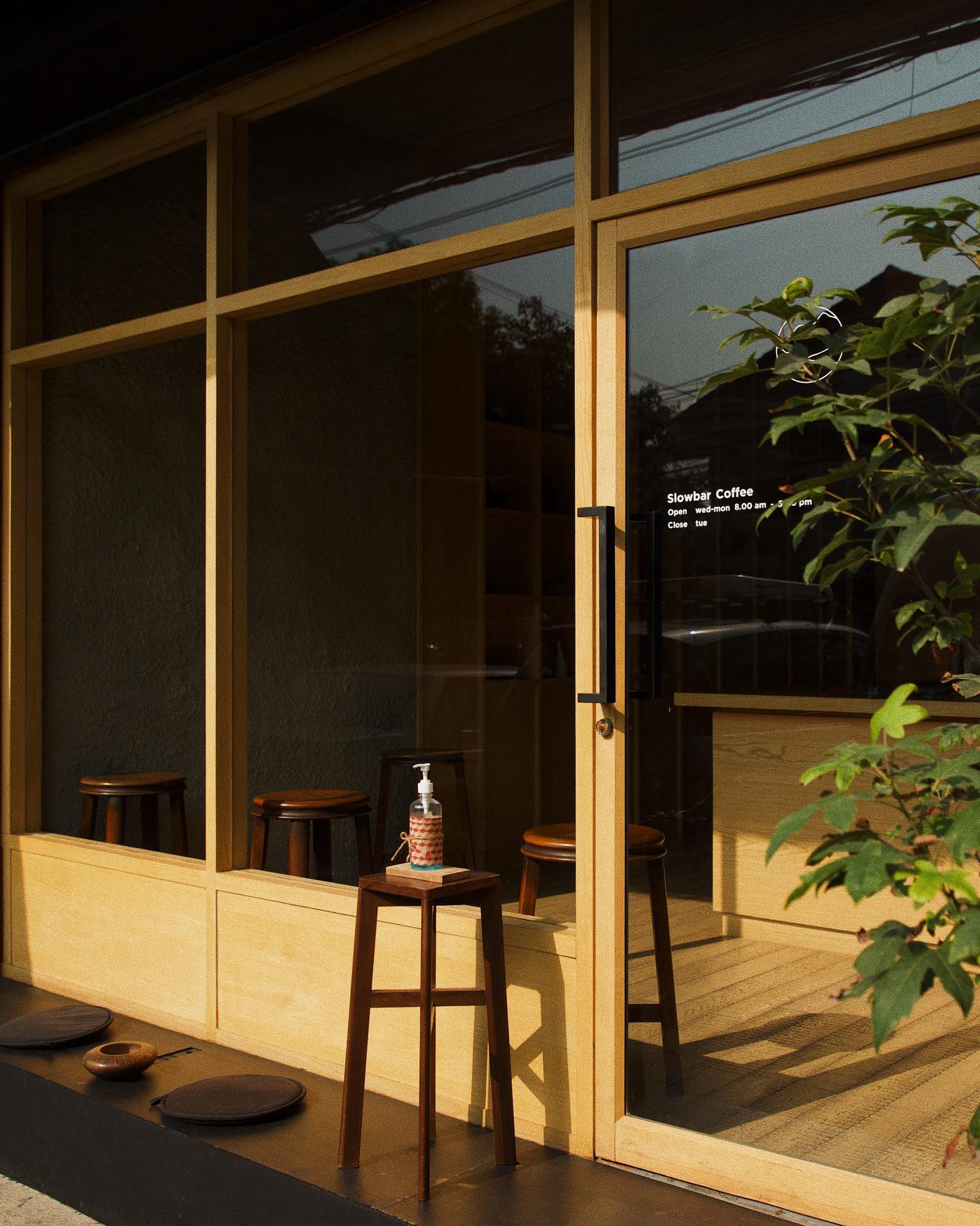 In the coffee bar Blackhill, smooth wooden surfaces are put in conjunction with rough concrete surfaces. They together create a zen space for enjoying a moment away from the busy central Bangkok. In contrast to the colorful urban environment outside, the materials used in the coffee shop are limited to only wood and concrete. The simplicity of the design makes it almost a meditative space.
The coffee shop has a large, glazed front that welcomes late afternoon sunlight into the shop. Natural light gets through the open-plan interior. A few seats are available by the window and by the counter. Sunset, the visual and smelling experience of coffee-making are presented all at once.
Tsubomi House (Tokyo Bud House)
By FLAT HOUSE, Tokyo, Japan
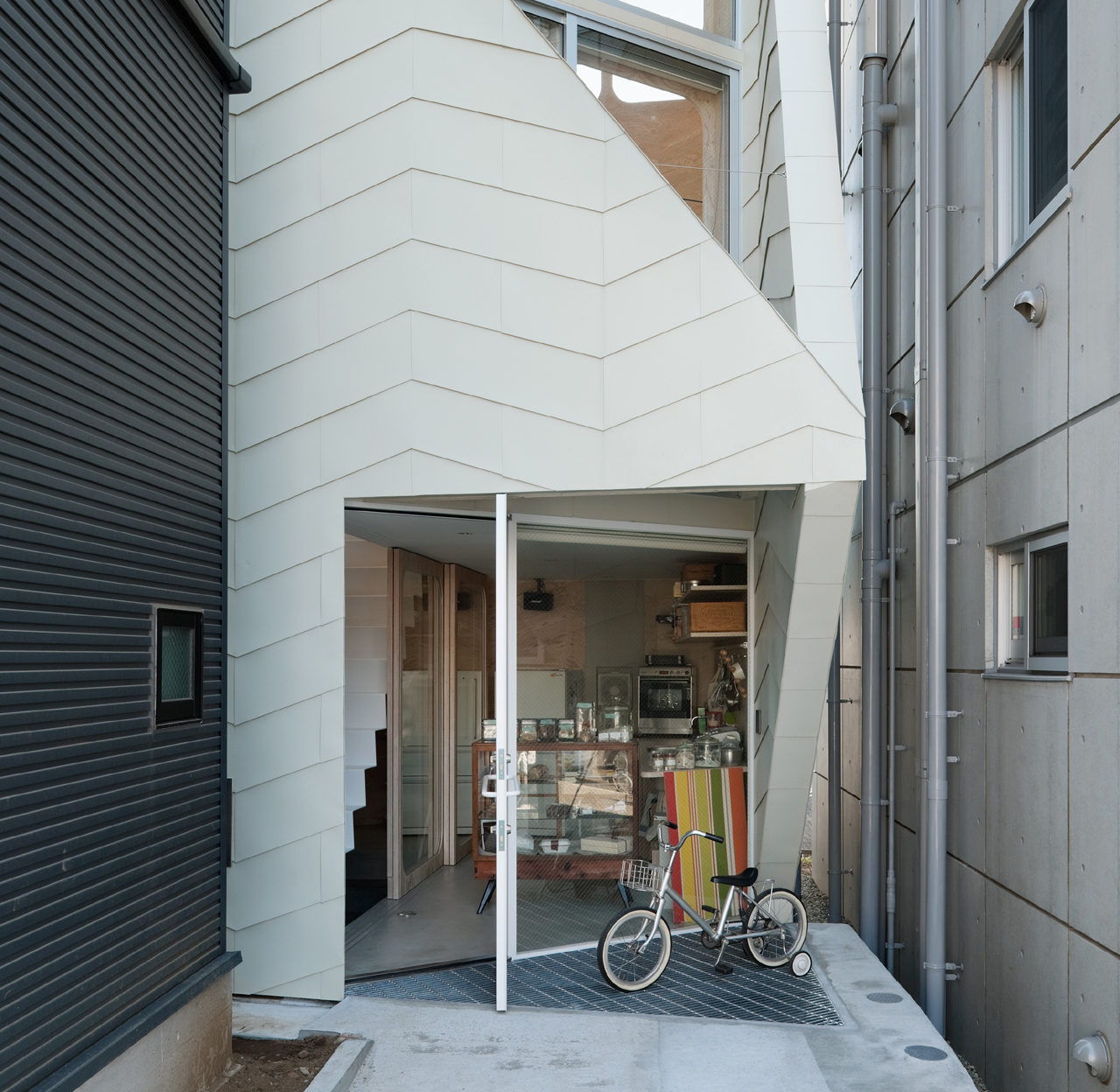
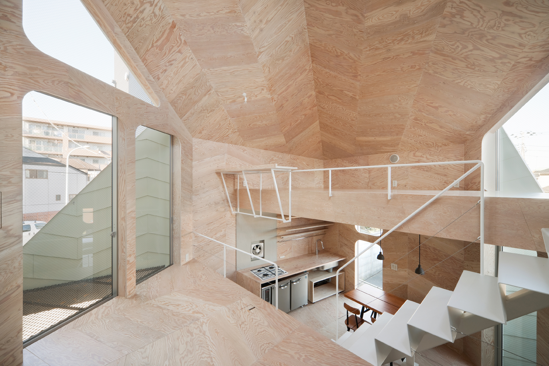 This small house has a footprint of only 280 square feet, yet it accommodates a biscuit shop and the shop owner’s family. Tsubomi House has seven different levels with no solid partitions between them. Each level is half a story higher/lower than the next one. Without walls separating each functional area, residents can move quickly from one space to another.
The interior finishing is largely in plywood which produces a gentle reflection of light. Natural light, therefore, comes in through openings on different levels and travels in the whole space. Paired with ivory steel, the light-color plywood makes the compact interior bright and continuous.
Sandra Weil Store
By Zeller & Moye, Mexico City, Mexico
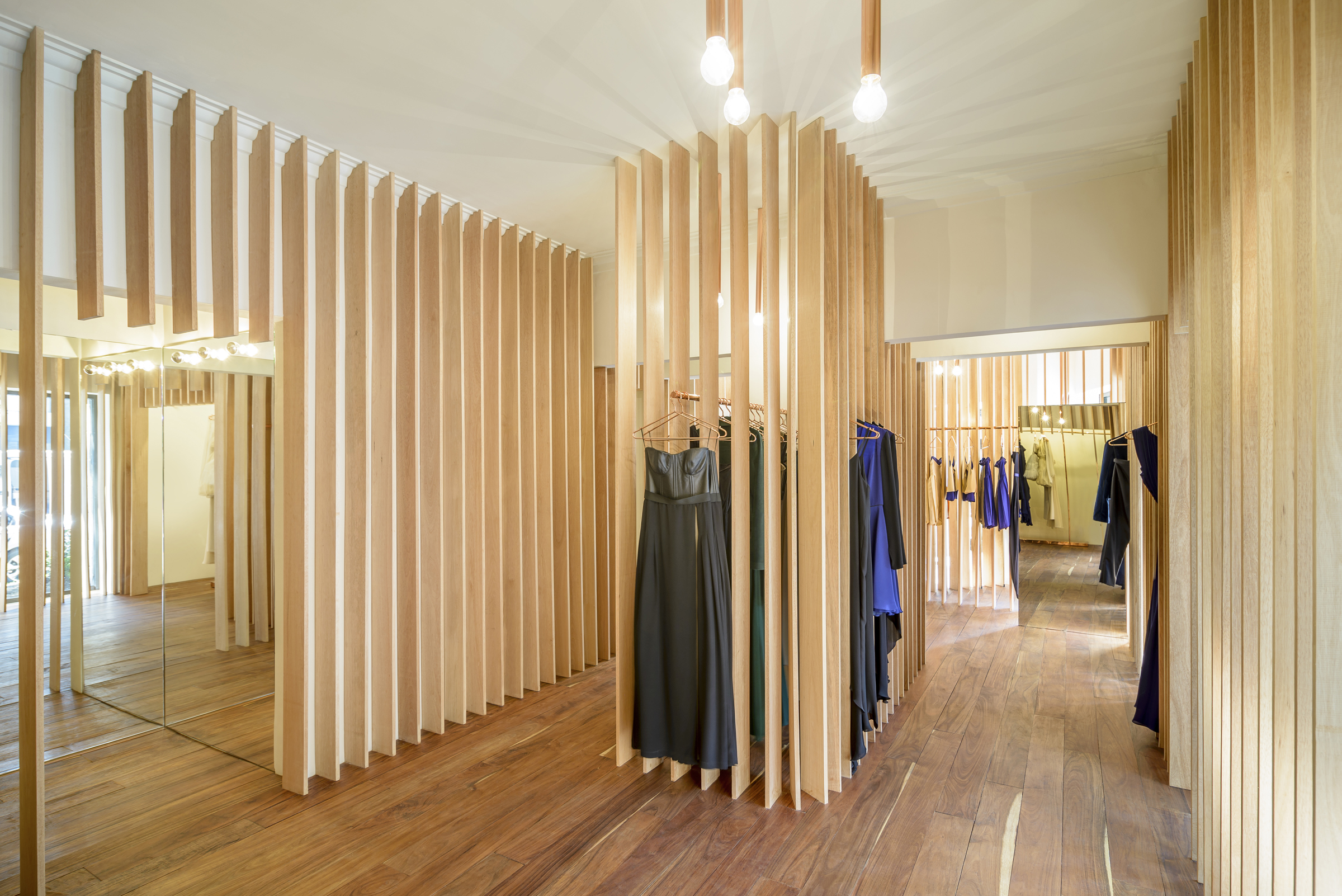
 Instead of presenting the garments all at once, Sandra Weil Store’s design gradually reveals the collections as customers walk around. Floor-to-ceiling slats made of local tropical wood stand in line with equal intervals between them. They form rhythmic partitions that are visually permeable only from certain angles. This allows a comfortable level of privacy in the shop without cutting the small store space into tiny fragments.
Garments hide between the slats, not showing themselves fully until the customer is in front of them. Meanwhile, the light and view change as well from one rack to another. The shopping experience in Sandra Weil is all about exploration.
RE x SUGAR
By CHINA ONDO Studio, Nanjing, China
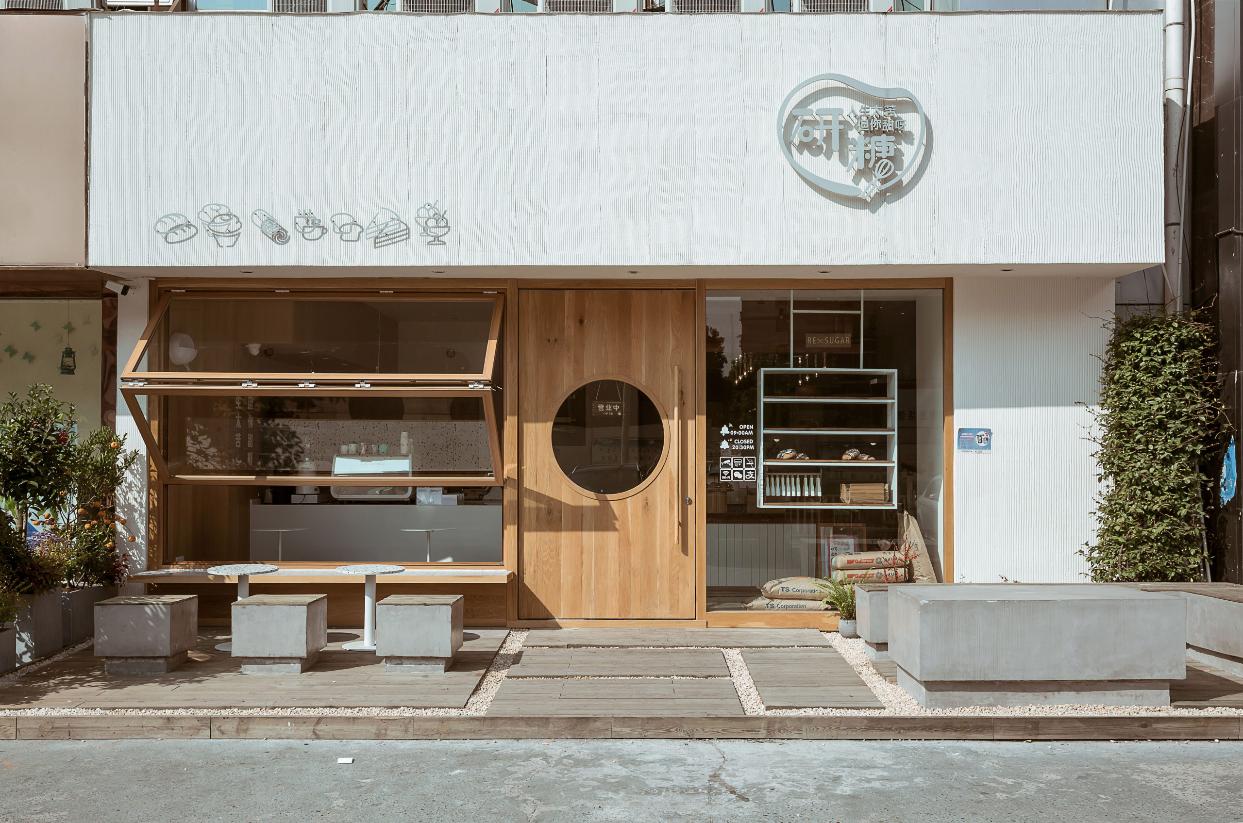
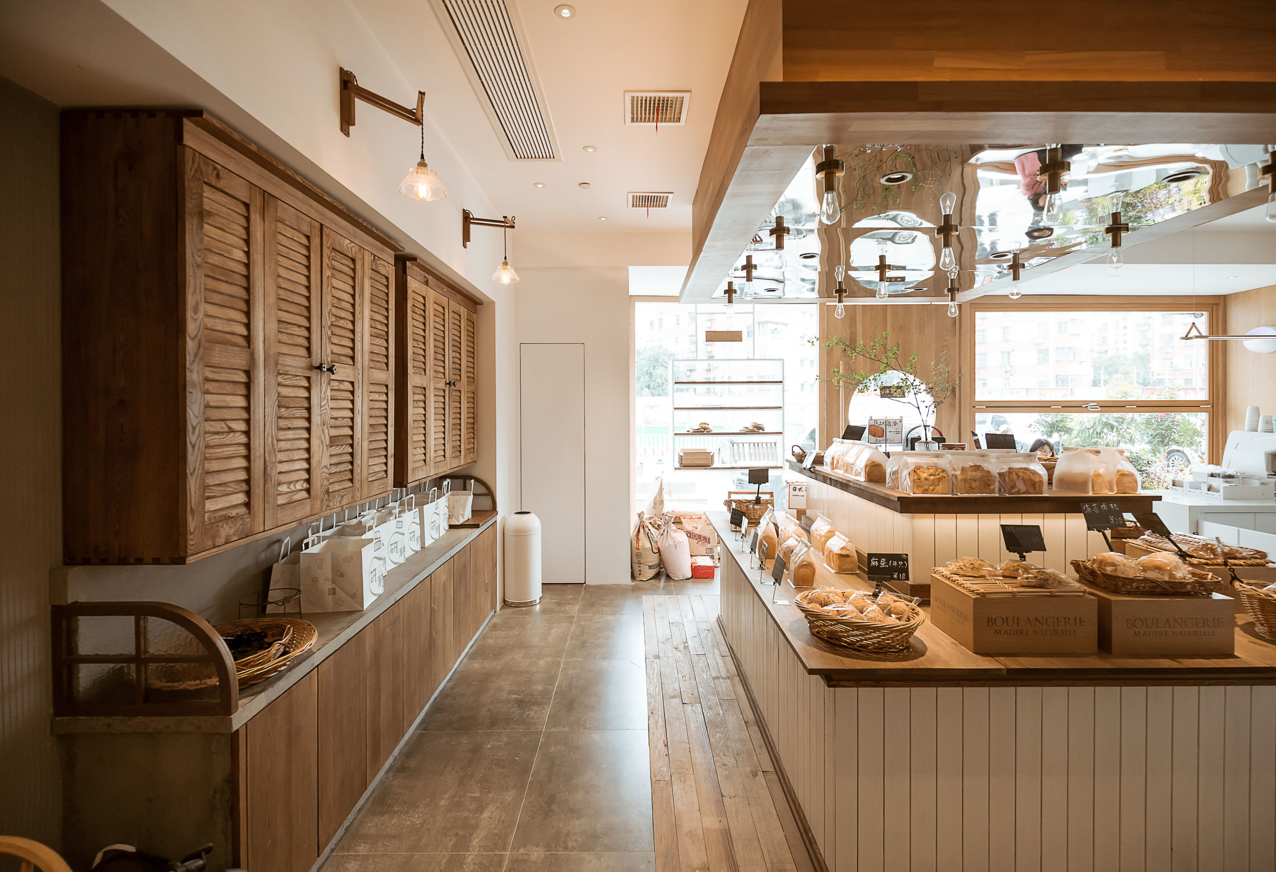 This community bakery uses large areas of warm-color timber to create a relaxing atmosphere. Like Blackhills Café, RE x SUGAR also has a transparent shop front that embraces the sunlight. A large folding window connects indoors and outdoors while the window sills become seats.
Woods of different textures create a harmonic yet interesting space. Some wooden surfaces are smooth, for example, the front door, walls, window frames and chairs. Cupboards, the display area of bread and the floor around it are covered in rather rough and pattern-intensive wood.
Architizer's diverse jury of global experts is currently reviewing submissions to the 14th A+Awards! Sign up to receive updates on Public Voting and spring winner announcements.
