Architizer's 14th A+Awards judging is live! Subscribe to our Awards Newsletter for updates on Public Voting and the big winner reveal later this spring.
The commercial landscape has long been a barometer for economic prosperity. Throughout history, we’ve been inclined to build bigger, bolder, brasher. However, the modern demands of our buildings of commerce have become increasingly nuanced. Our experiences of space, as workers and consumers, have been put under the microscope, while commitments to sustainability and inclusivity have set new standards for design.
It’s the role of architects to negotiate this complex dance between form and function to create engaging environments of transaction and productivity. Whether structures of retail, production or business operation, discover how these outstanding winning projects from the 10th Annual A+Awards are reimagining commercial typologies and instigating wider change across our global skylines.
1. Revising Historic Archetypes
Ghost Hangar by John Grable Architects, Texas Hill Country, Texas
Popular Choice Winner, 10th Annual A+Awards, Showrooms
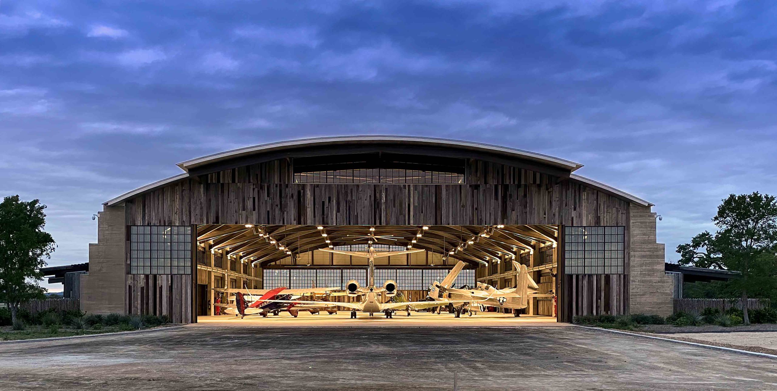
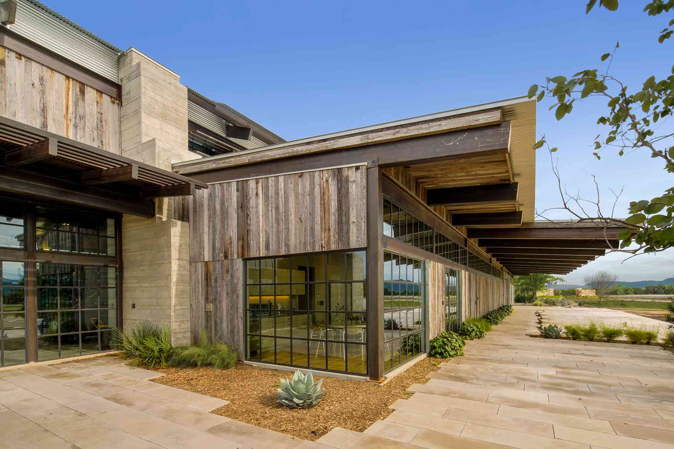 Architecture is in constant communion with the past. However, navigating a commercial project that pays homage to history while creating something innovative and forward-thinking, can be a daunting prospect. John Grable Architects took this challenge in their stride when they designed this remarkable living museum of Second World War aircraft.
Inspired by the iconic structure of a Quonset hut, a historic archetype from the era, the Ghost Hangar sees the surprising convergence of the spheres of aviation and Texas ranching. The domed silhouette offers a window to the past and the necessary height to house an impressive aeronautic collection, while also sitting unobtrusively within the rural landscape. Reclaimed and weathered surfaces, the material language of the ranch, clad the exterior, bridging the gap between the two typologies.
2. Articulating Unusual Apertures
CarmoCoffees by Gustavo Penna Arquiteto & Asssociados, Carmo de Minas, Brazil
Jury Winner and Popular Choice Winner, 10th Annual A+Awards, Factories & Warehouses
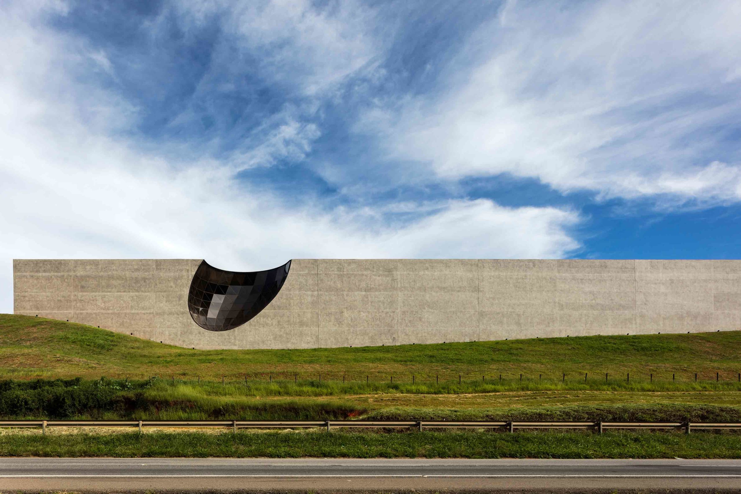
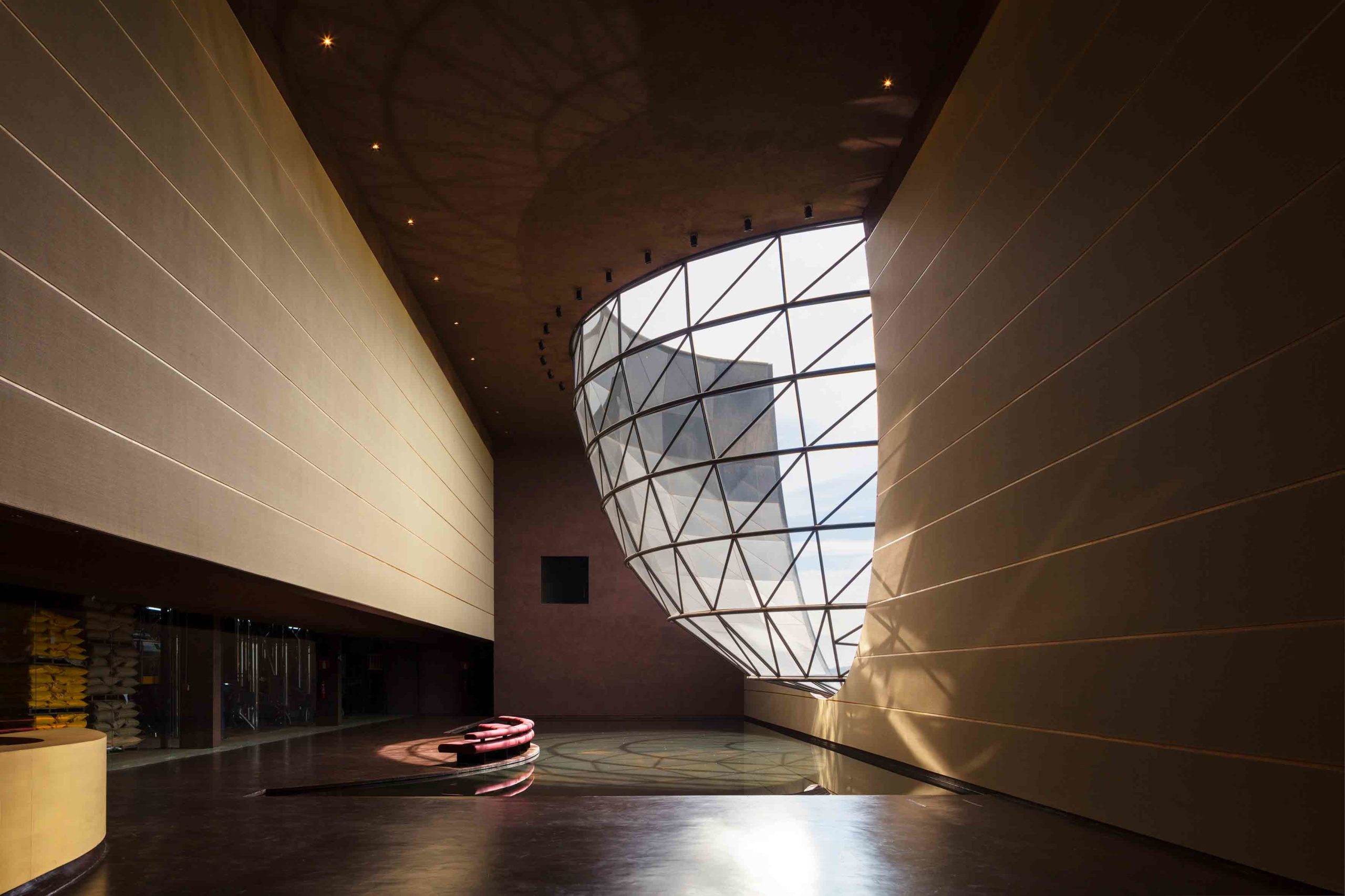 Voids can be a dramatic architectural statement — sometimes an absence can articulate more than material presence, as shown by this extraordinary coffee factory in Brazil. Its vast, monolithic exterior is indented with a glass-lined aperture, as though left behind by a giant coffee scoop. The effect is at once arresting and playful, elevating the building from utilitarian production facility into a symbolic landmark.
Inside, the concave glazing protrudes into a reception space, the natural light magnified by the glistening reflecting pool beneath it. This is a marked departure from traditional warehouse schematics: instead, this striking project shrugs off the suggestion that a space of production cannot also be one of architectural brilliance.
3. Incorporating Nature
Hongkong Land’s Yorkville – The Ring by PH Alpha Design, Chongqing, China
Jury Winner, 10th Annual A+Awards, Shopping Center
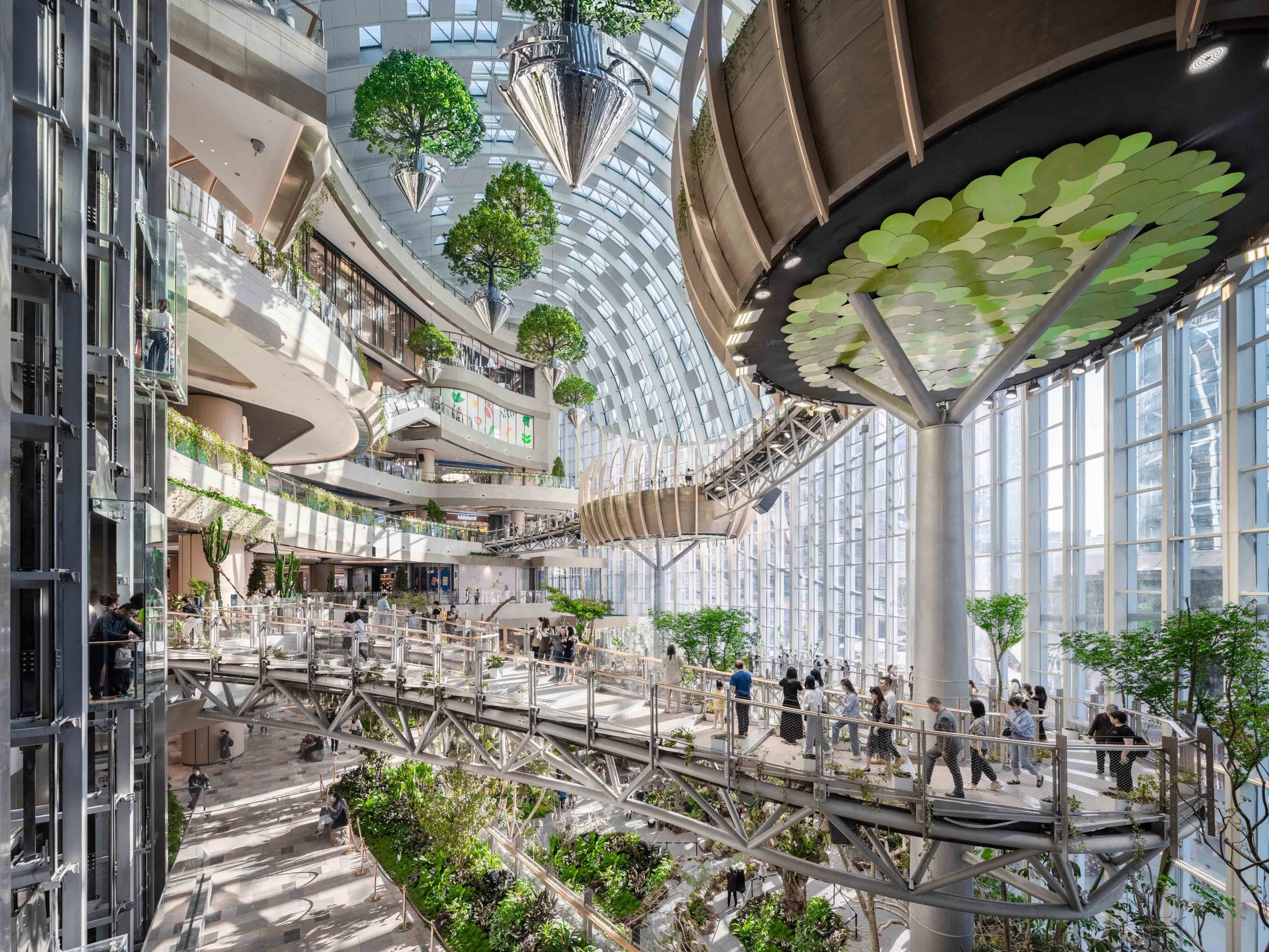
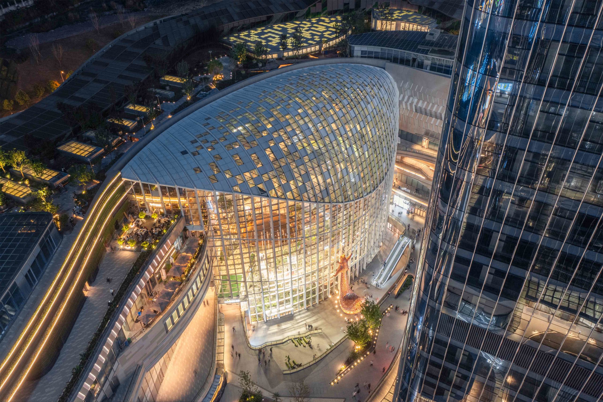 The benefits of integrating the natural world with commercial spaces are well-documented. As well as helping to improve air quality in urban areas, greenery can also aid wellness and relaxation.
This next project artfully combines the built environment with the organic landscape to create a retail experience quite unlike any other. The work of PH Alpha Design, the shopping mall incorporates a vast indoor botanical garden amid its myriad of shops. Dubbed the Twilight Forest, the pioneering centerpiece spans seven floors, encompassing whimsical floating trees, cascading waterfalls and verdant plant installations. Tranquil roof gardens crown the structure, while the undulating façade takes design cues from natural elements, including clouds, wind and forests.
4. Evoking Nostalgia
Mi Pan by Concentrico, Mexico City, Mexico
Popular Choice Winner, 10th Annual A+Awards, Retail
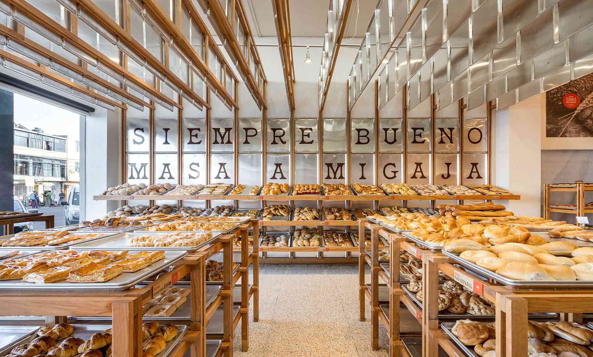
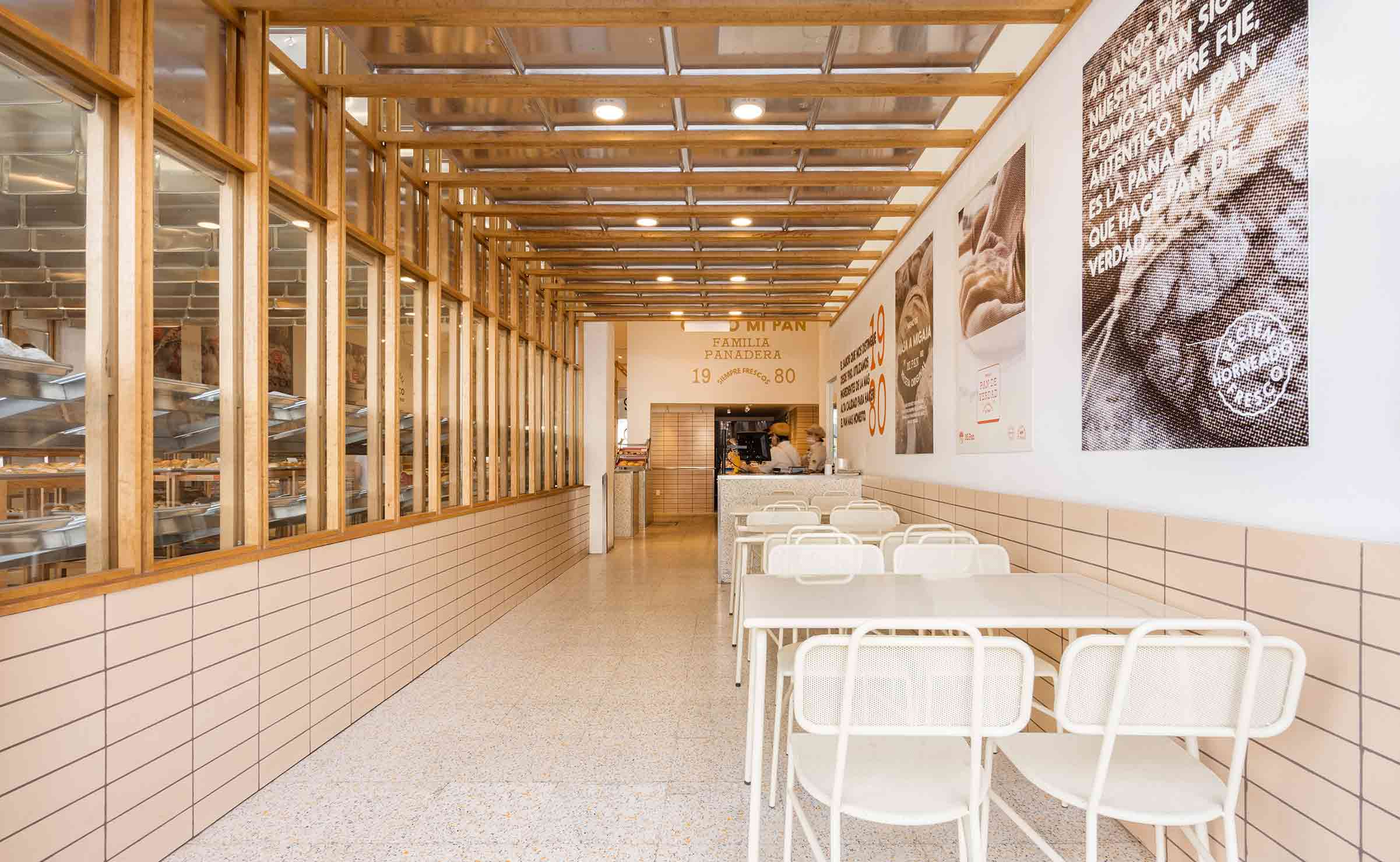 Nostalgia is among the most powerful tools in commercial design. This immersive bakery in Mexico City charts a passage to the past by evoking familiar cultural signifiers — in particular, the humble metal tray. A fond fixture in traditional Mexican bakeries, architecture firm Concentrico utilizes this simple rectangular sheet to serve up a world of comfort and sentimentality.
Trays are used artfully throughout Mi Pan, from embellished paneling across the walls to a unique ceiling installation and of course, for displaying produce. In the adjacent eating zone, the metal-clad ceiling creates a visual connection with the shop floor, mirroring the direct journey of the bread from the oven to the table. The result is a deeply enveloping retail space, rich in sensory delights.
5. Playing With Permeable Materials
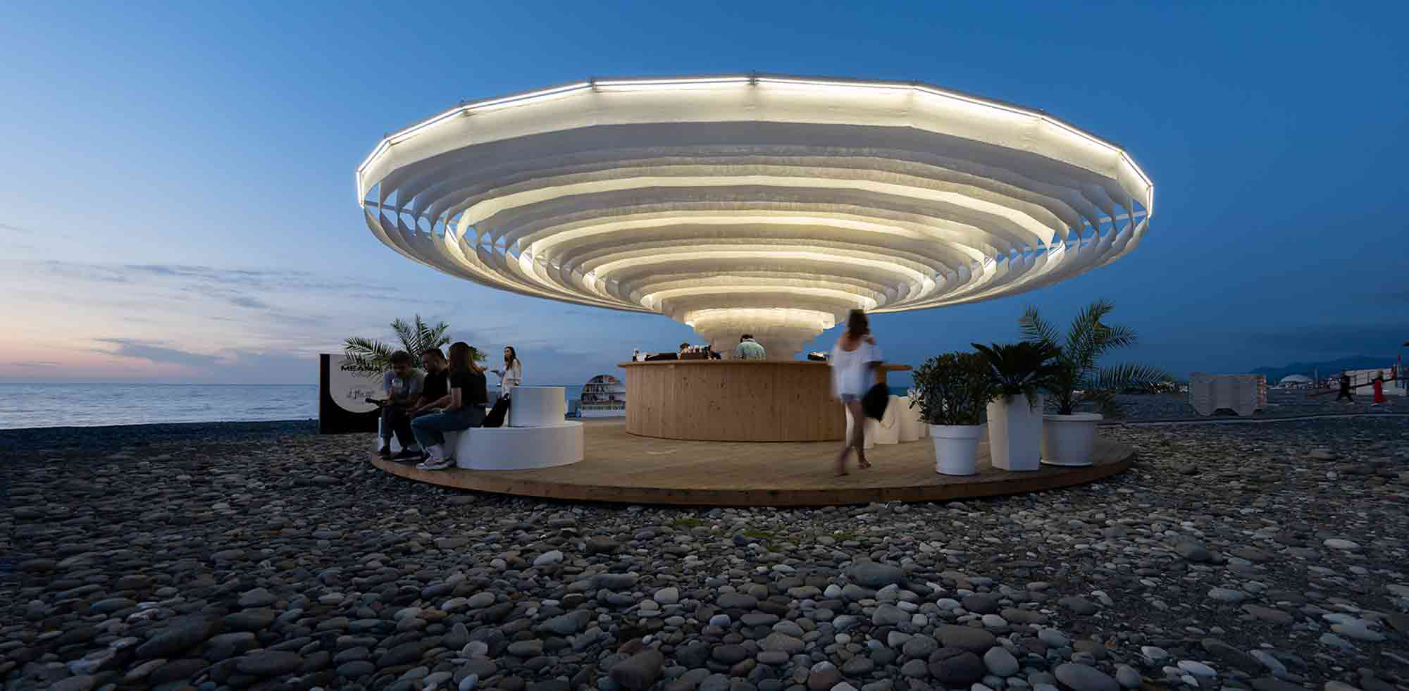
Meama Collect – Beach by Khmaladze Architects, Batumi, Georgia
Jury Winner and Popular Choice Winner, 10th Annual A+Awards, Pop-Ups & Temporary
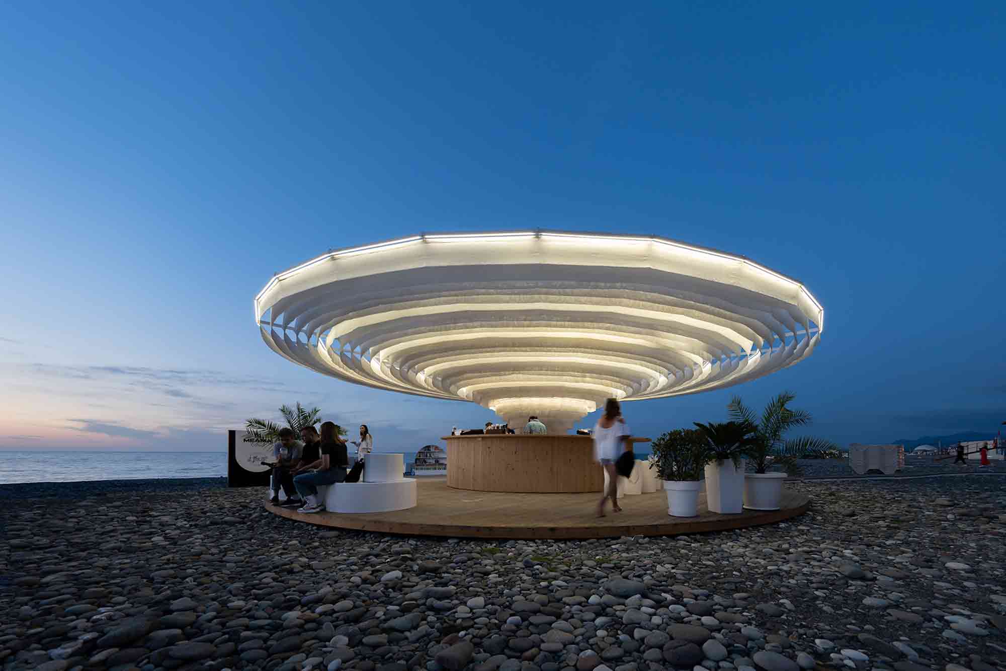
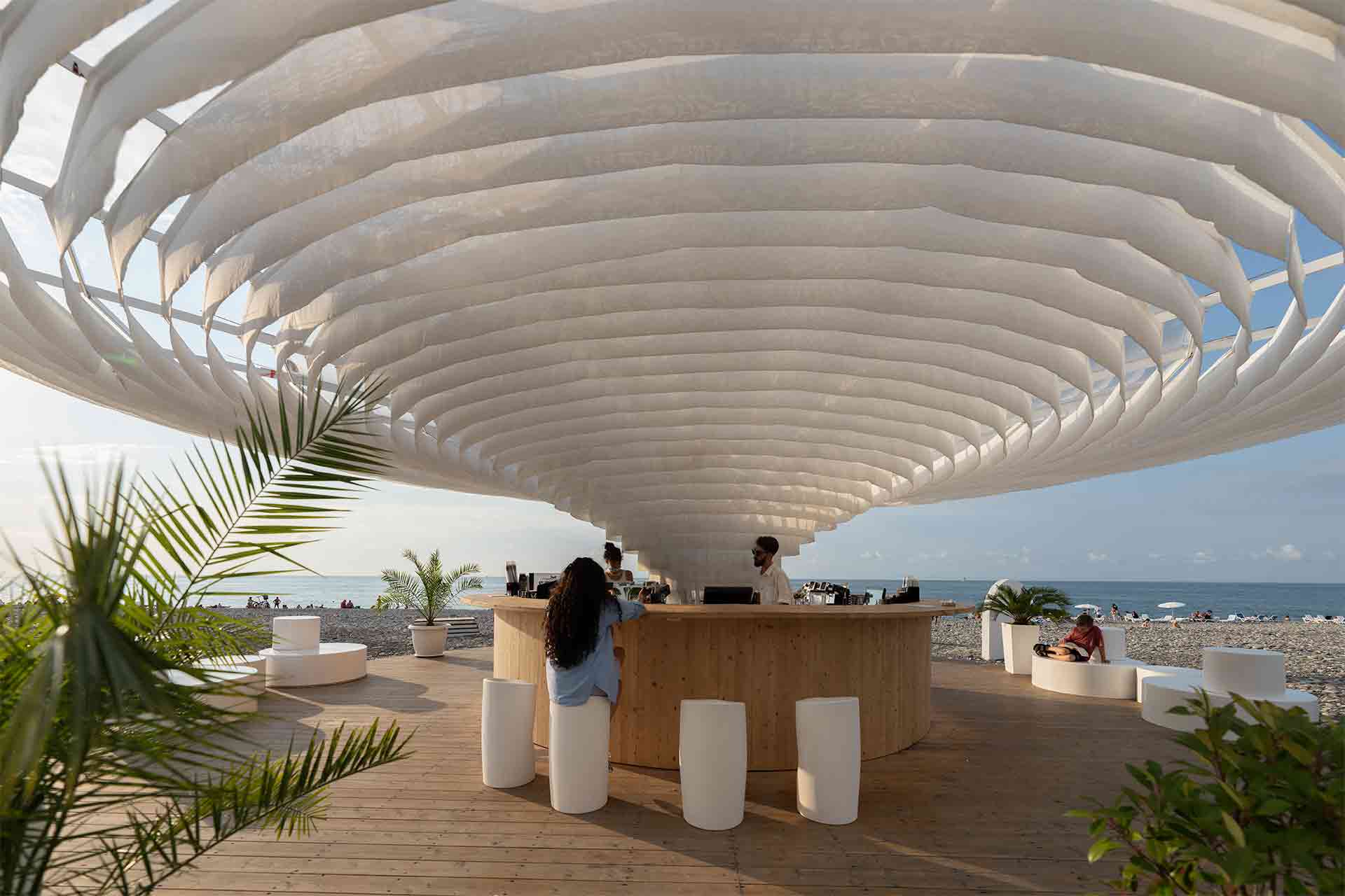 Temporary commercial structures pose a unique set of challenges for architects. Ease of assembly must be balanced with durability to ensure an installation is resilient enough for its environment, while still offering an immersive experience.
This seasonal bar structure on Georgia’s Batumi coast meets every architectural demand. Situated on a wooden platform, a dramatic cloud-like canopy frames the hospitality space, rising from the center to extend some 100 square meters (1075 square feet) in width. In a stroke of architectural ingenuity, the awning comprises rows of concentric fabric circles. In the heat of the day, they offer shade and ventilation for patrons, while come nightfall, built-in lighting illuminates the permeable material, creating a beacon to draw in custom.
6. Embracing Organic Terrain
Furla Headquarters & Production Complex by GEZA Architettura, Florence, Italy
Popular Choice Winner, 10th Annual A+Awards, Mixed Use (L >25,000 sq ft)
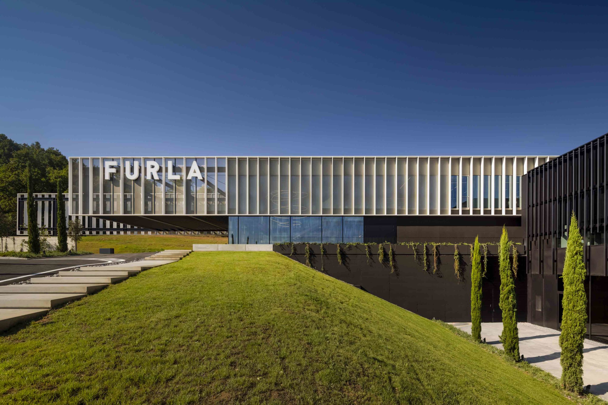
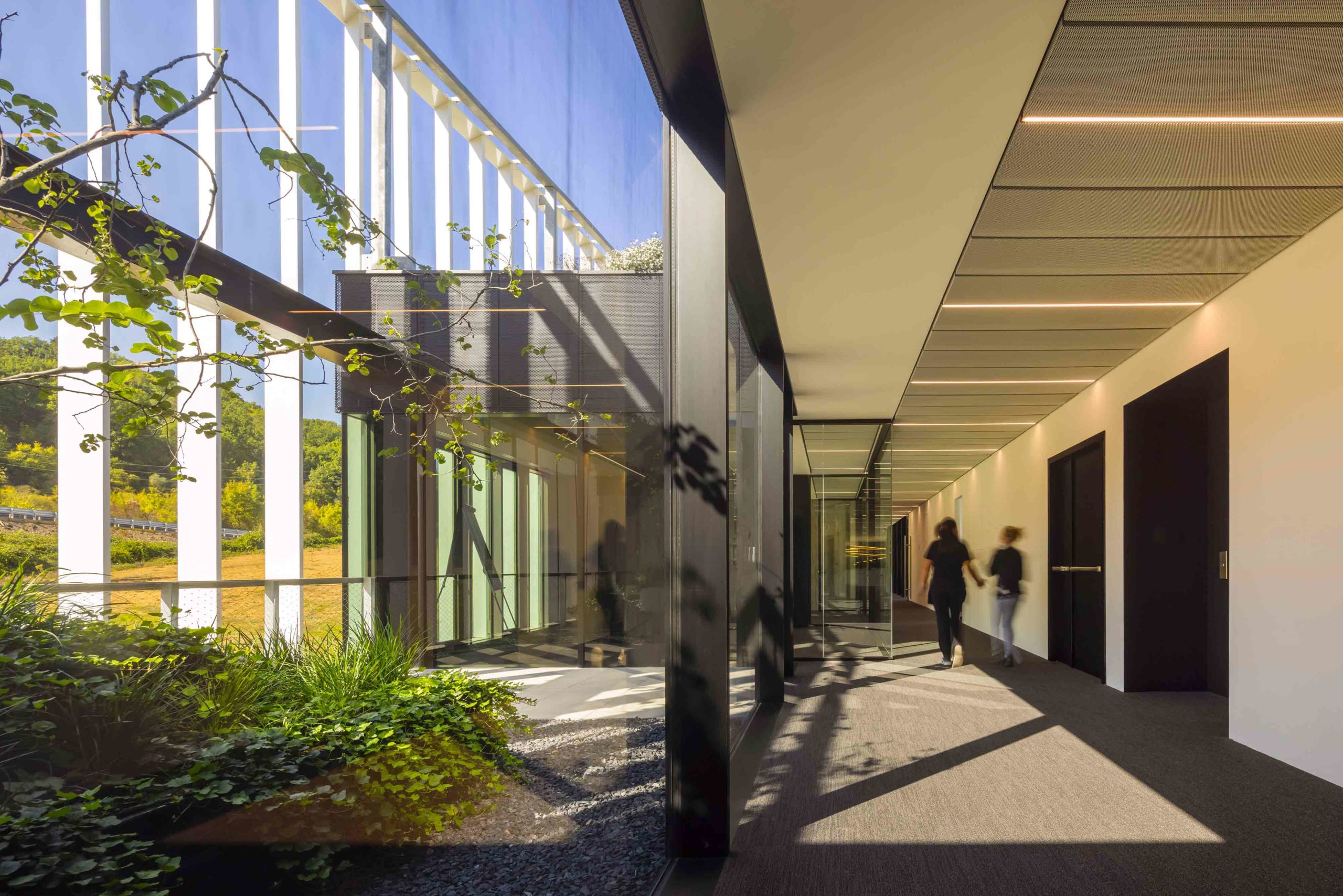 This factory and office complex is encircled by the rolling hills of Italy’s Chianti region. While the striking design features cantilevering volumes and sleek, contemporary lines, the surrounding landscape is treated with remarkable reverence. Devised to harmoniously coexist with the terrain, points of intersection blur the line between the built environment and the organic world, while a series of terraces and living roofs place nature at the heart of this ground-breaking scheme.
The project’s commitment to the ecosystem is more than just aesthetic. Sustainable design is imbued in the fabric of the structures, which are powered by a photovoltaic system and thermal solar panels, while rainwater is recycled and used to irrigate the gardens. A particularly masterful addition, the façade of the production building is coated in an inorganic mineral powder that reacts with the light to help reduce air pollutants.
7. Prioritizing Wellness
Taikoo Li Qiantan by 5+design, Shanghai, China
Popular Choice Winner, 10th Annual A+Awards, Shopping Center
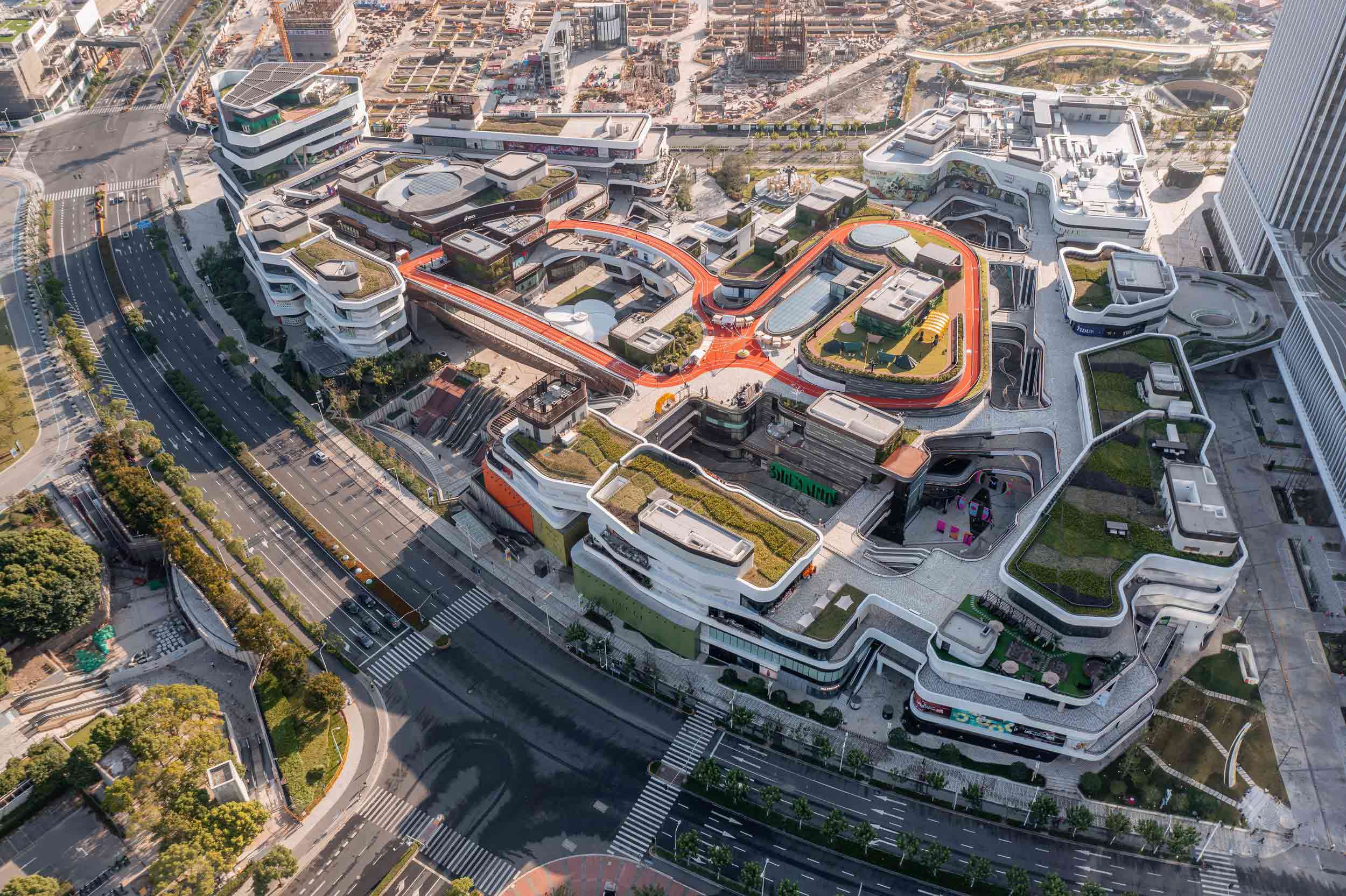
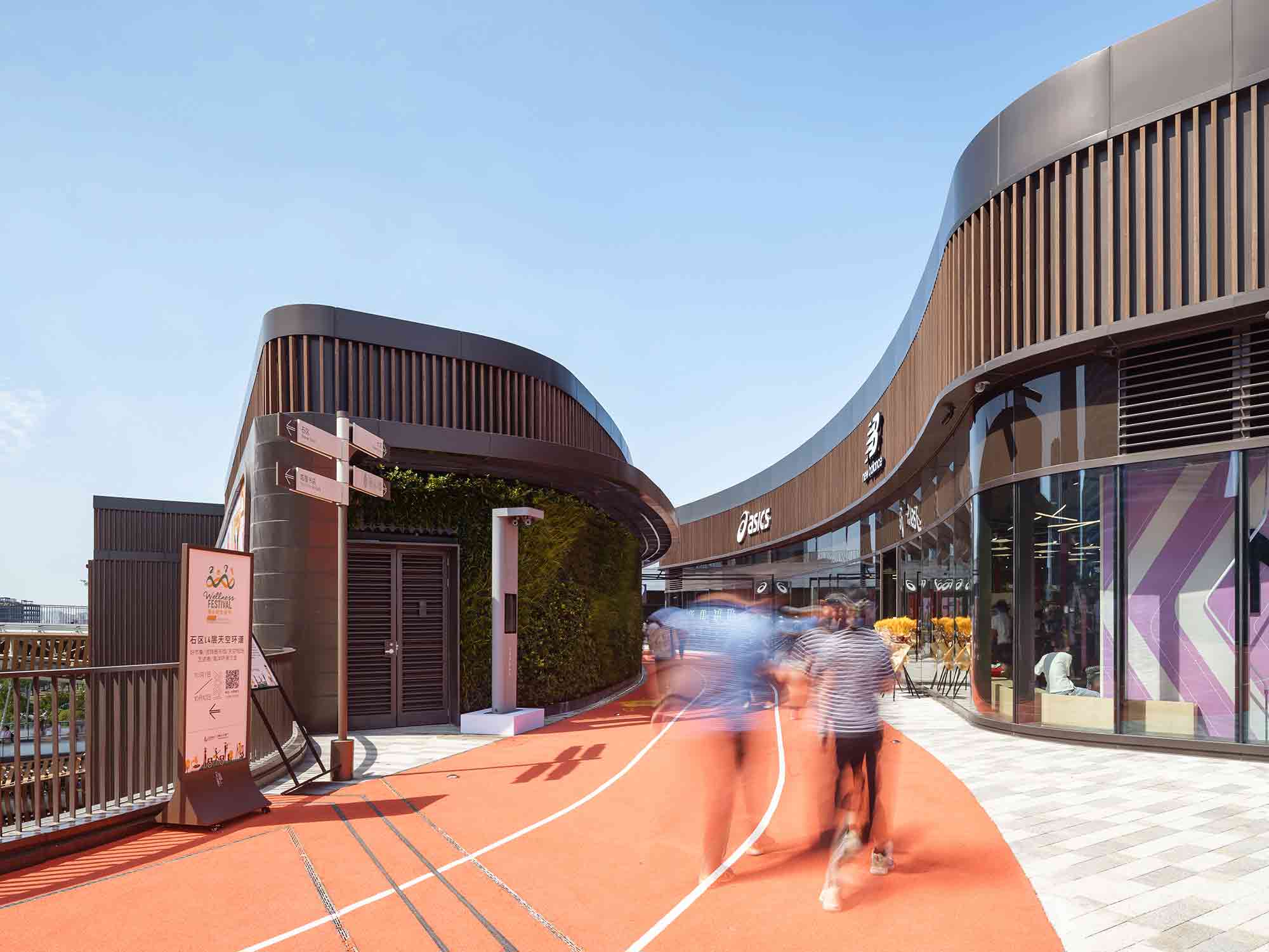 Shopping malls aren’t widely regarded as spaces that support wellness. However, this unexpected project by 5+design reimagines conventional models of retail centers to create a scheme that promotes its users’ health.
The precinct’s fluid, meandering form takes inspiration from the nearby Huangpu River, however this curving topography also gives rise to an altogether more surprising feature. Situated on the upper roof level, the pedestrian pathway doubles up as an outdoor running track, framed by the towering skyline of Shanghai. The circuit weaves between shopfronts and green areas, offering 450 meters of exercise space. Here, the retail sphere diversifies, rebalancing its emphasis on commerce with a thoughtful and refreshing focus on wellbeing.
8. Experimenting With Exoskeletons
Caisse d’Epargne Bourgogne-Franche-Comté Headquarter by GRAAM, Dijon, France
Jury Winner, 10th Annual A+Awards, Office – Mid Rise (5-15 Floors)
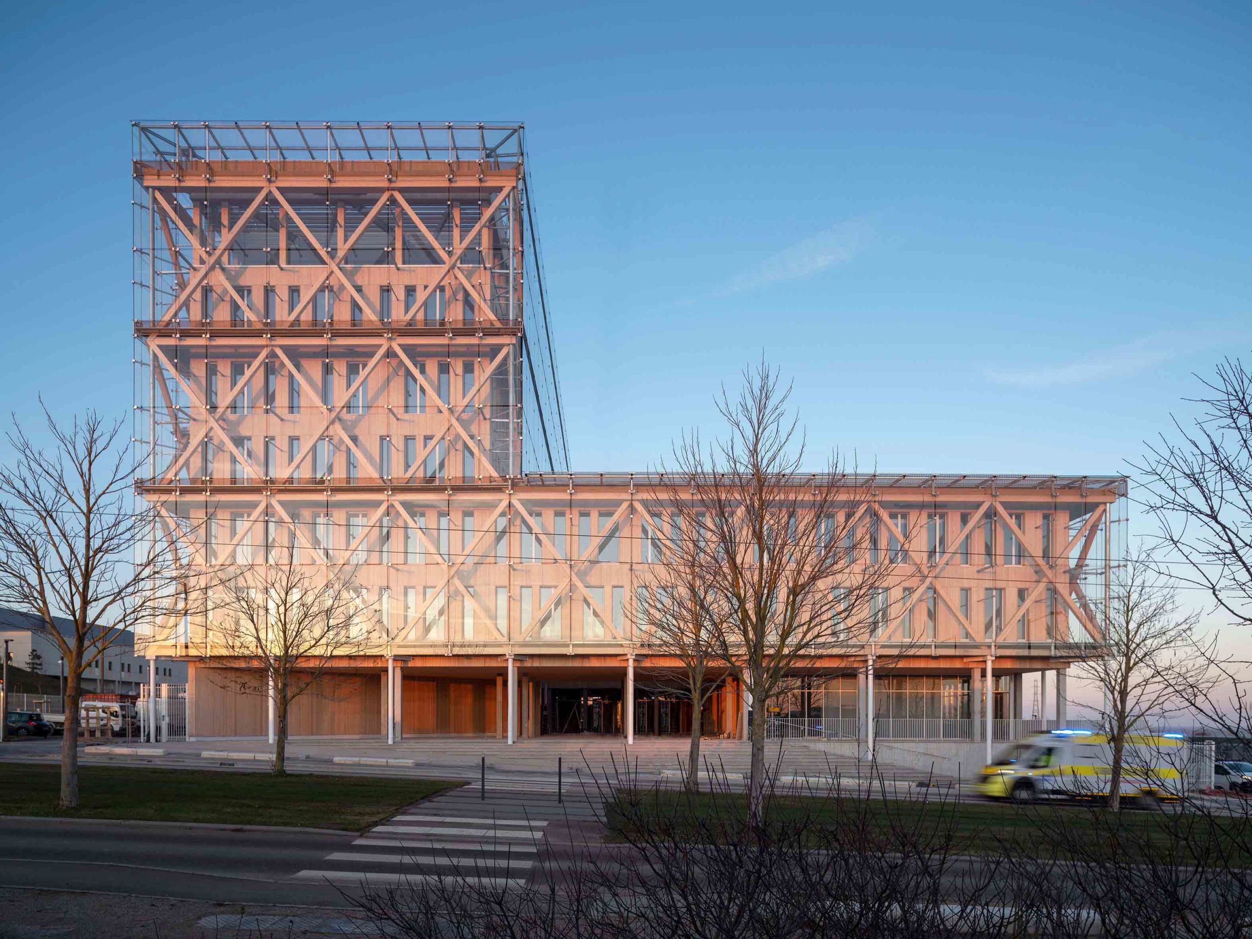
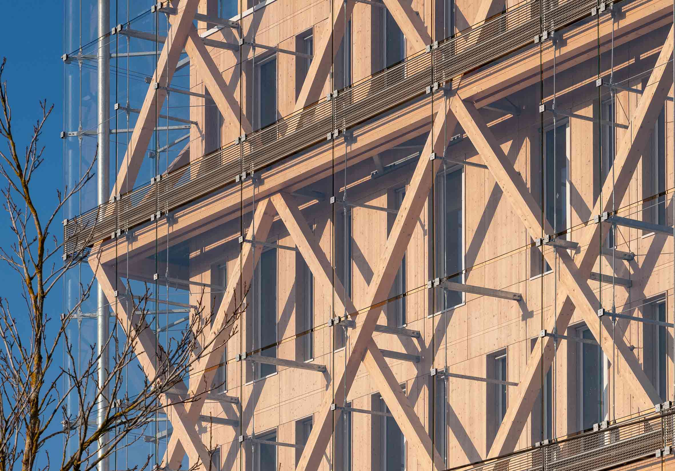 Prefabricated offsite, this seven-story office building in the French city of Dijon is innovative in both form and function. The structure comprises an intricate wooden exoskeleton encased in a skin of suspended glass panels. A void between these layers helps to regulate the structure’s internal temperature, creating a highly thermally efficient building constructed to passive standards.
The ultra-clear glazing has a profound effect on the interior workspaces too, allowing natural light to pour into each of the meeting areas and offices. As the weather shifts and light levels ebb, the reflective façade reveals and obscures the underlying wooden framework, and in certain conditions, the structure appears to melt into the surrounding landscape.
Architizer's 14th A+Awards judging is live! Subscribe to our Awards Newsletter for updates on Public Voting and the big winner reveal later this spring.
