Architects: Want to have your project featured? Showcase your work by uploading projects to Architizer and sign up for our inspirational newsletters.
Basketball facilities have undergone remarkable transformations over time. Evolving from simple gymnasiums to expansive complexes, these structures blend form, function and innovation. Originally, basketball was played in modest, multipurpose halls, where the primary focus was on utility rather than design. However, as the sport gained popularity, the need for new spaces grew, prompting architects to rethink the design of dedicated structures. Now, modern basketball venues are characterized by bold engineering and how they enhance training, as well as the ways they shape the spectator experience.
Basketball architecture is incredibly varied and often showcases the latest trends and technologies. The design evolution has been driven by the need to accommodate large crowds and provide a multi-sensory experience. Arenas like the Staples Center in Los Angeles and the Barclays Center in Brooklyn are not only sports venues but also cultural hubs that host concerts, events and community activities. These structures often feature new materials, sustainable practices, and innovative designs that prioritize both the athletes’ performance and the spectators’ comfort. The following projects showcase how new facilities are being designed for both players and fans.
Ostin Basketball Center at UCLA
By Kevin Daly Architects, Los Angeles, California
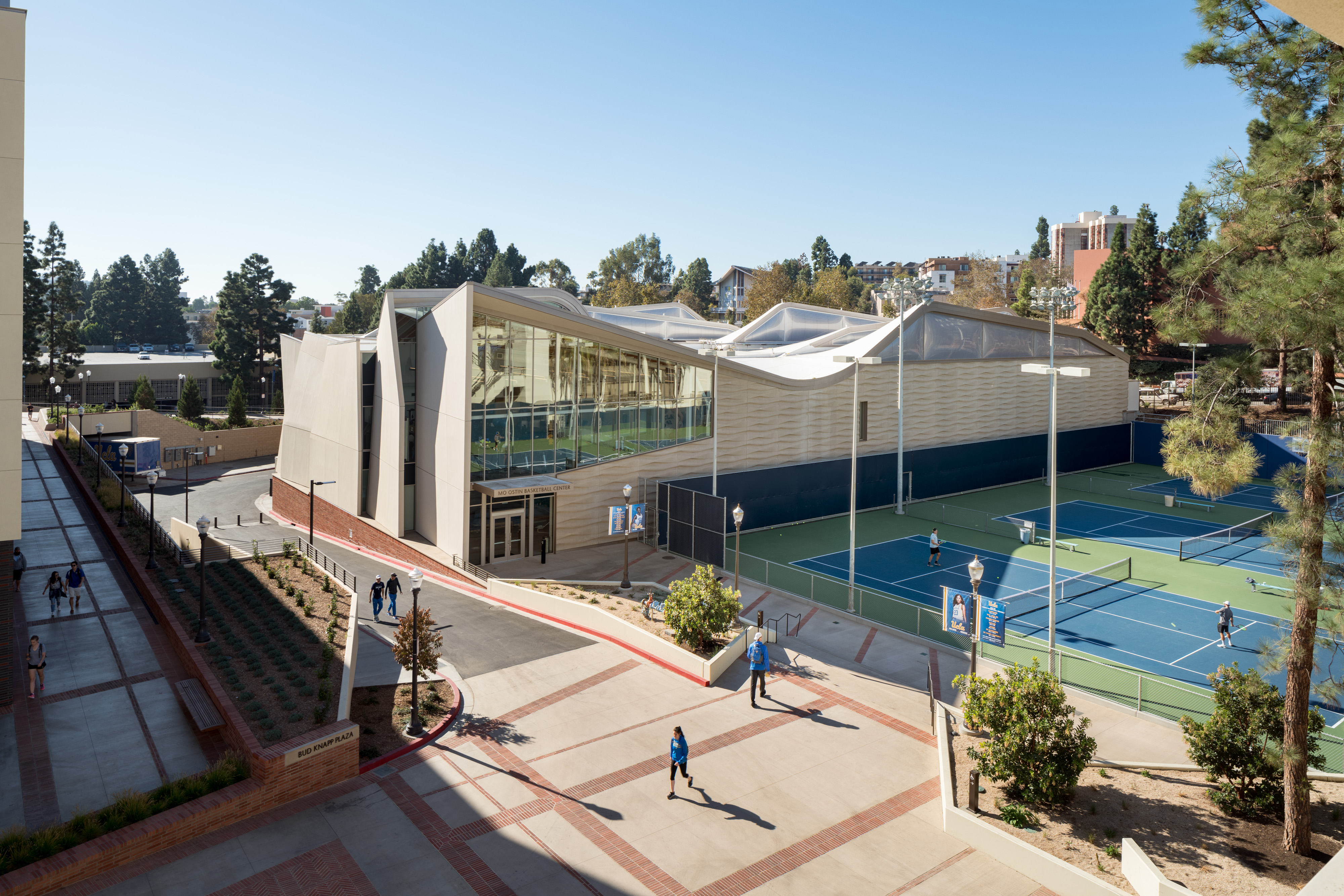
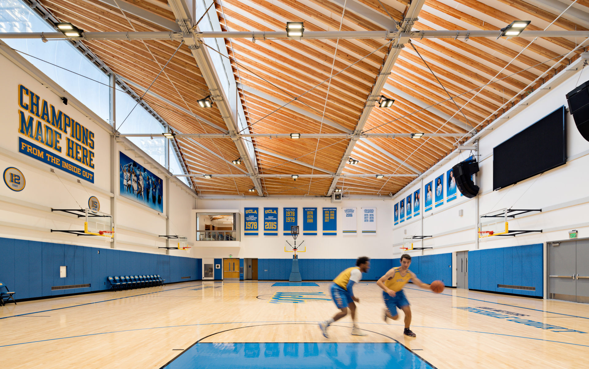
 As UCLA’s basketball program grew, it required dedicated support spaces for training, wellness and education. The new state-of-the-art joint basketball practice facility for the university’s top-ranked women’s and men’s teams anchors the growing athletics precinct in the heart of campus. Covering approximately 35,000 square feet (3,250 square meters), the practice facility is conveniently located near the basketball stadium.
Both practice courts are on the ground level, keeping costs in check, and energy demand is minimized through custom north-facing skylights that provide glare-free, indirect daylight for daytime practices. The exterior features custom molded thin panels of glass fiber reinforced concrete, prefabricated off-site to reduce costs while creating a warm, undulating pattern. Inside, ETFE skylights offer recyclable and long-lasting benefits. The main entry features a specialized weight room flooded with natural light, glowing as a beacon in the evening.
Moody Center Basketball and Events Arena
By Gensler, Austin, Texas

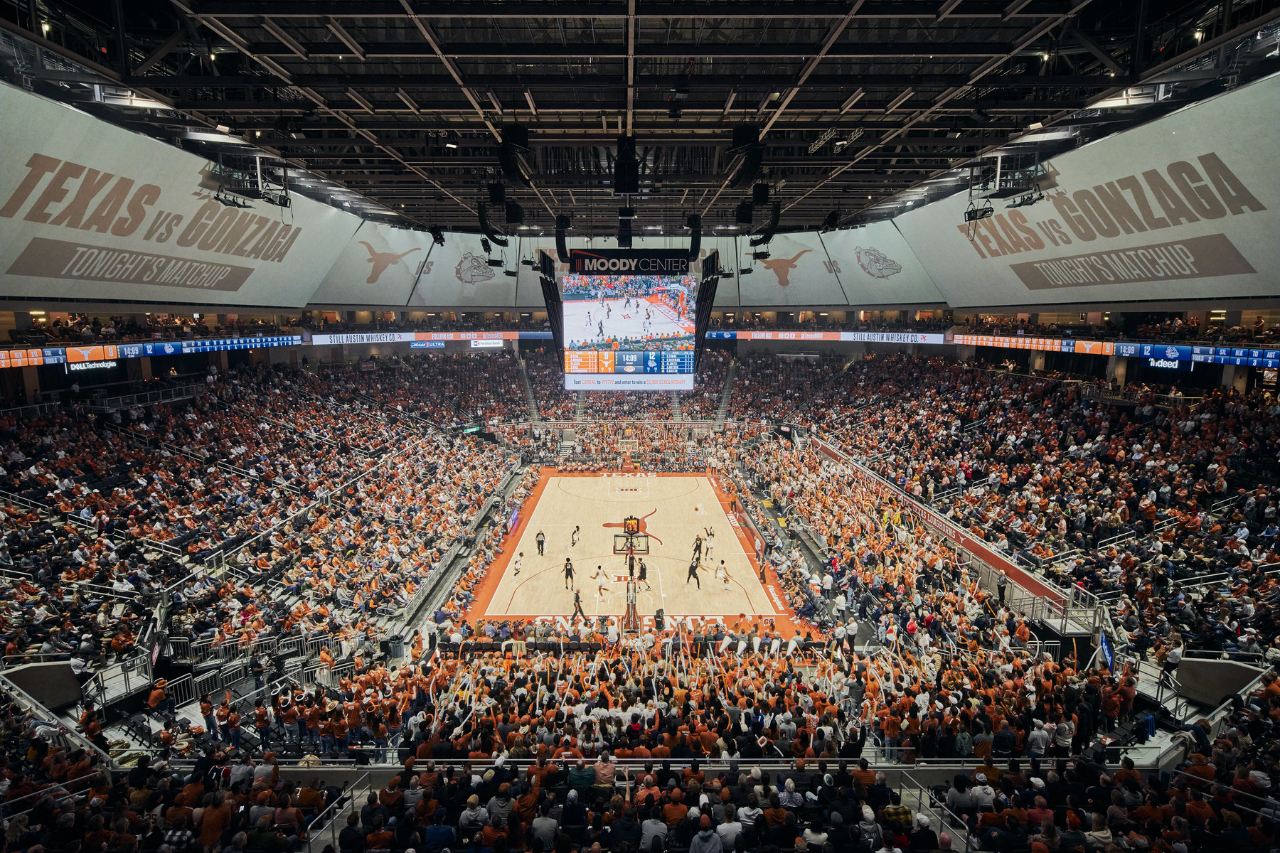 The Moody Center creates an immersive experience from the moment fans arrive at the interactive plaza until they reach their seats. This 15,000+ seating facility completes the master plan by establishing a game day plaza that ties together all of the university’s athletic facilities. The plaza acts as a vibrant gathering space for fans, the public, and athletes, fostering a sense of community and excitement. Engagement drives the design, blending indoor and outdoor spaces into a cohesive, brand-forward experience.
The arena was designed to stand out while not overshadowing other UT athletic buildings, respecting campus materiality while introducing a modern approach to systems and details. This thoughtful integration ensures that the Moody Center not only serves as a premier sports venue but also as a central hub that enhances the overall campus experience.
Olympic Basketball Arena
By WilkinsonEyre, London, United Kingdom
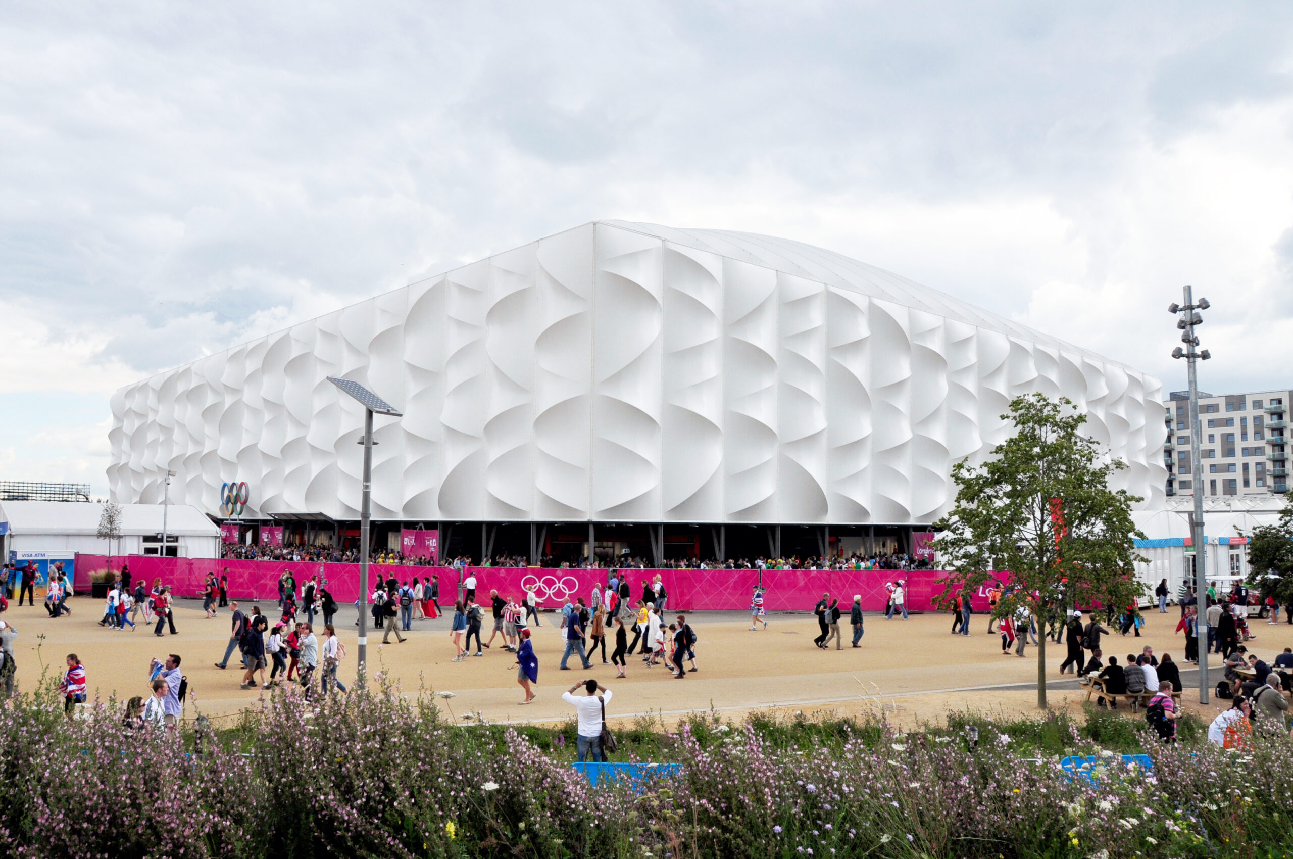
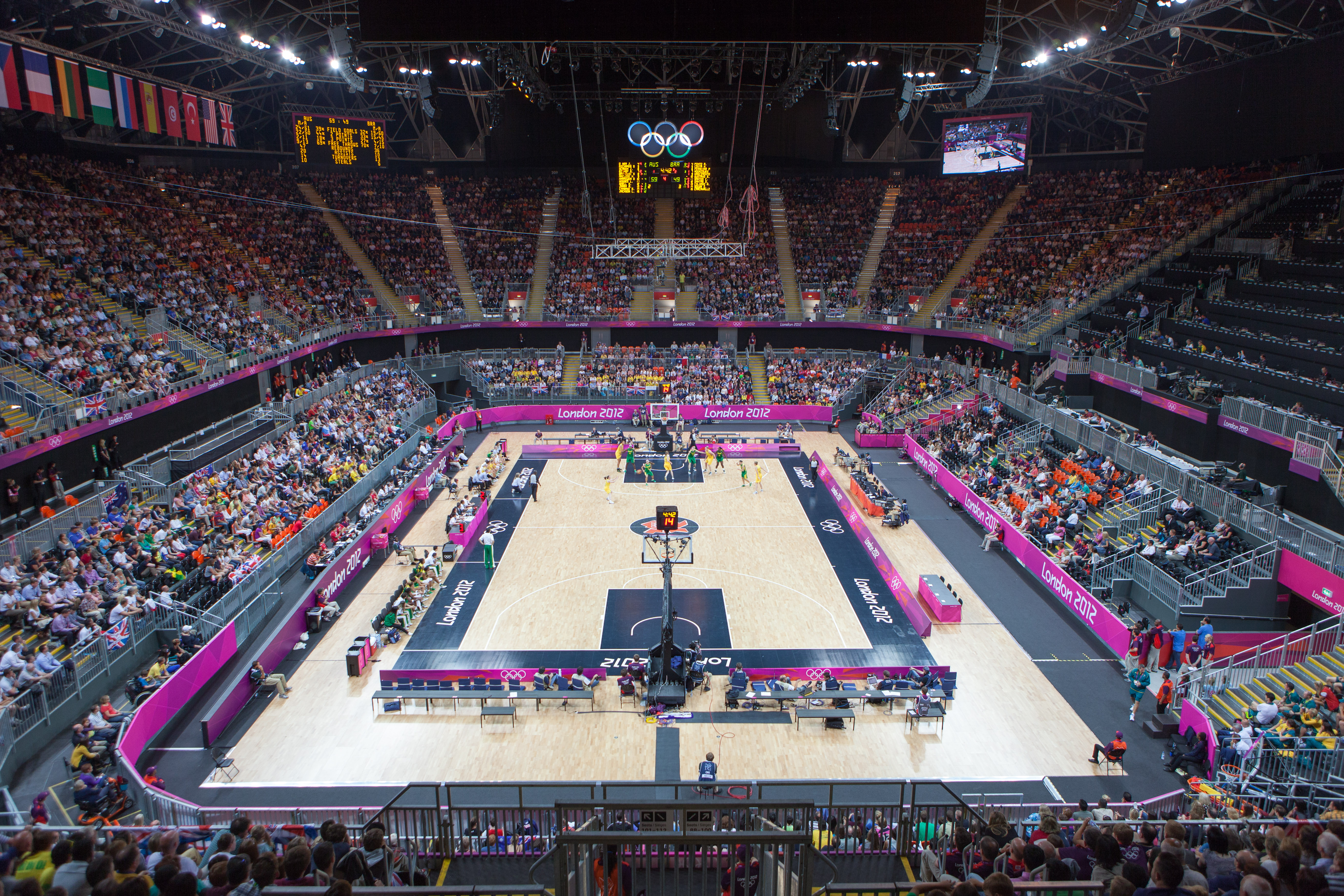 The London 2012 Olympic Games, billed as the most sustainable ever, featured WilkinsonEyre’s innovative design of the basketball arena as a key component. The challenge was to create a temporary building that was simple to erect, sustainable in its legacy, and a world-class sporting venue. The team devised a solution where two-thirds of the materials and elements could be reused or recycled after the Games. The arena seated 12,000 for basketball and handball competitions, reducing to 10,000 for wheelchair basketball and rugby during the Paralympic Games.
To achieve this, the team employed a lightweight steel frame and fabric cladding, allowing construction in just six weeks. The 30 meter-high rectangular structure, equivalent to a seven-story building, was composed of portal frames connected by lightweight steel members. Wrapped in translucent PVC stretched across arched steel framing modules, the façade featured an undulating, three-dimensional texture.
Harmonie Hall in Kobe
By Takenaka Corporation, Kobe, Japan
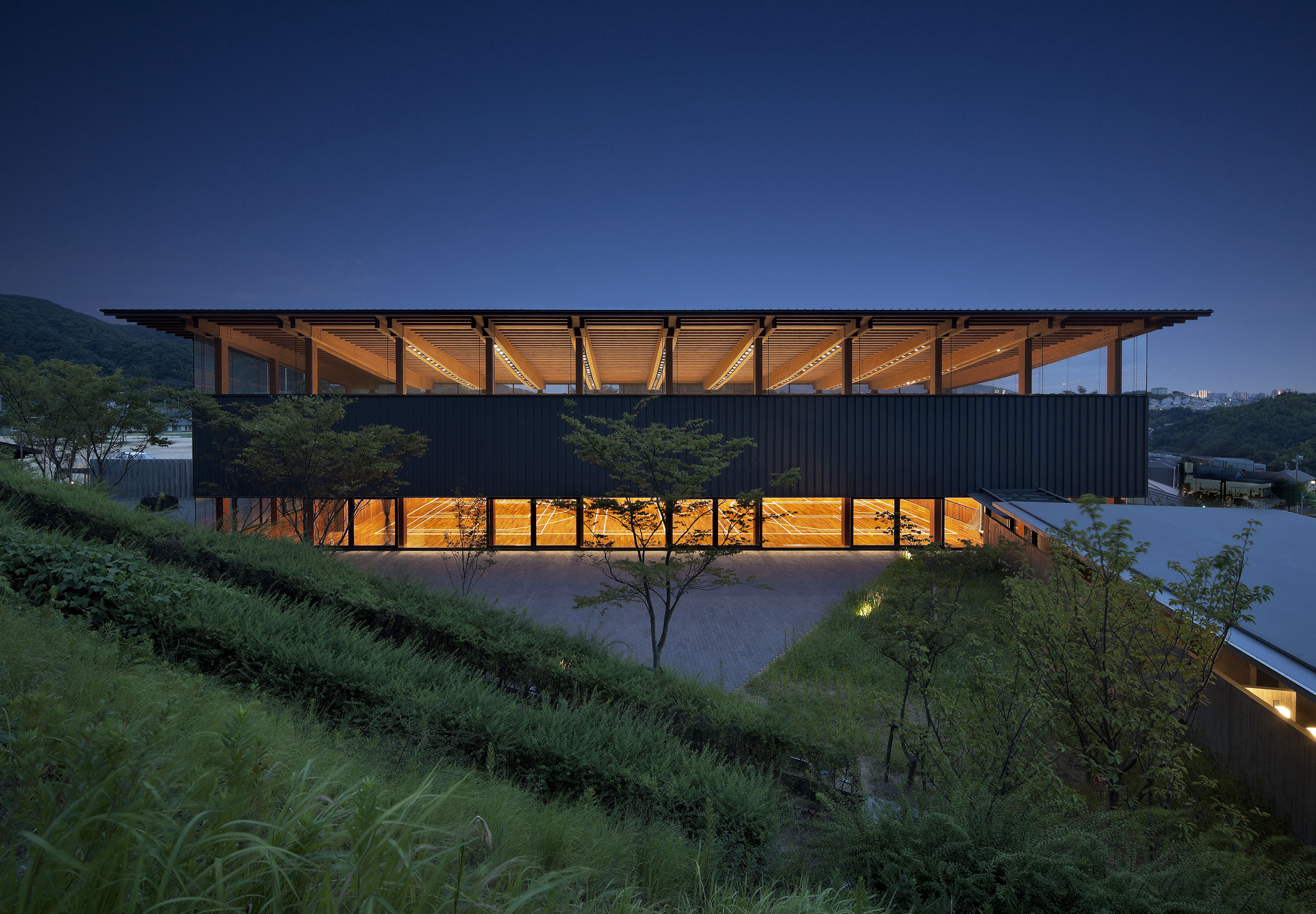
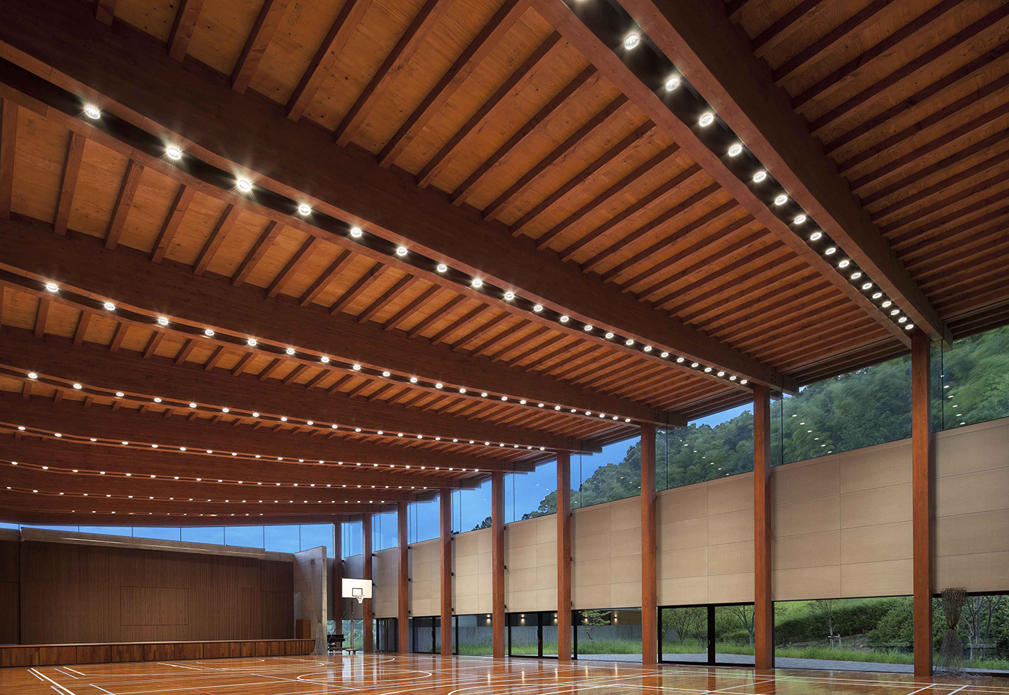 Harmonie Hall was designed with a clear and open axial plan utilizing concrete and wood, responding to the campus’s history while creating a new relationship with the natural landscape. Unlike typical enclosed gym spaces, Harmonie Hall integrates with the vibrant local environment using a wood structural frame, capturing the rich surrounding landscape and the campus’s formal language.
The south side of the building connects to an existing structure and features a wood structural span with views of the woodlands. The north side opens to the lush ecosystem of the campus, creating a natural configuration. Concrete walls on three sides support the horizontal force, while the north side remains open, allowing the structural roof frame to transfer vertical loads to the wooden poles on the north façade.
Kent Denver School: Yates Pavilion
By Semple Brown Design, Englewood, Colorado
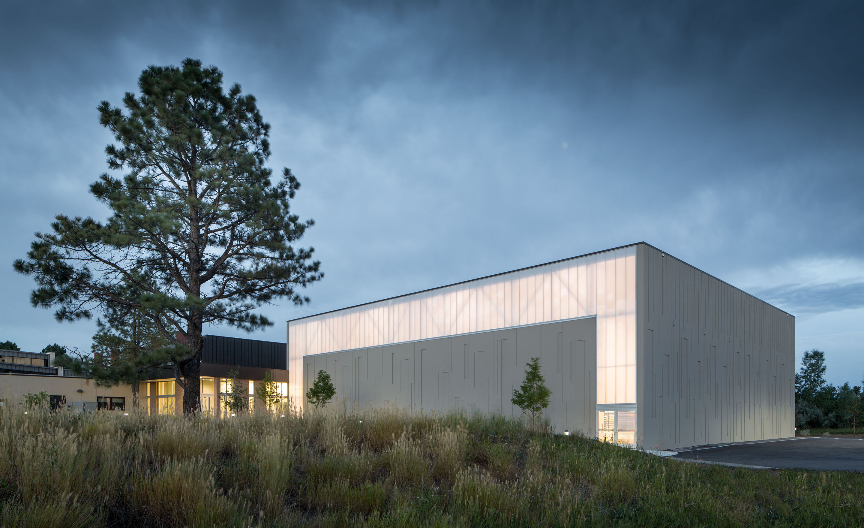
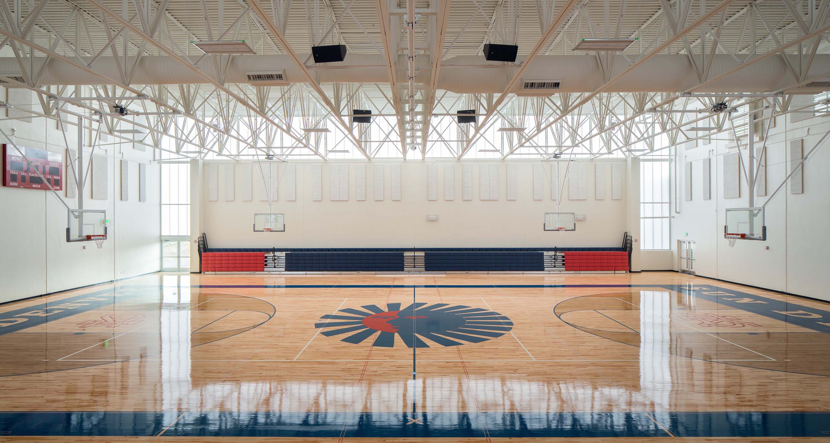 This gym addition connects existing team rooms and lobby spaces to the new facility, which features competition basketball and volleyball courts, two full-size practice courts, and greater seating capacity. The pavilion includes a lobby gathering space, locker rooms, officiating facilities and a new concessions area. The project is organized into two major components: one for sport/assembly and the other for circulation and support spaces.
A smaller volume was inserted between the existing gym and the new gym to break up the mass and allow the pavilion a unique expression while maintaining harmony with the original structure. Exterior gestures relate to the original 1960s-era gym, reinterpreting brick entry elements and canopies. The building explores symmetry through athletic program requirements and budget constraints, using tilt-up concrete panels for cost effectiveness and speed.
NMMI Cahoon Armory Renovation
By NPSR Architects, Roswell, New Mexi
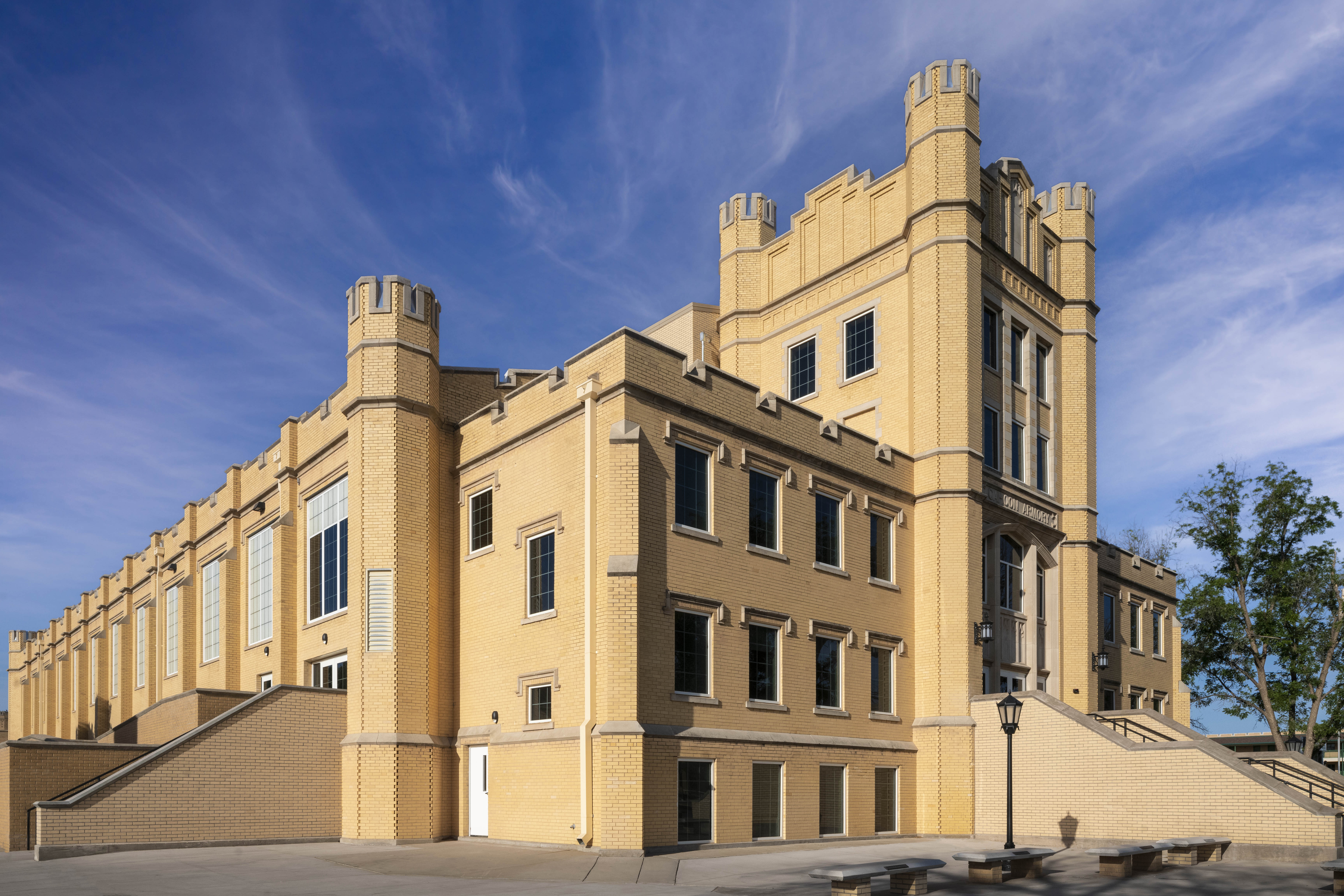
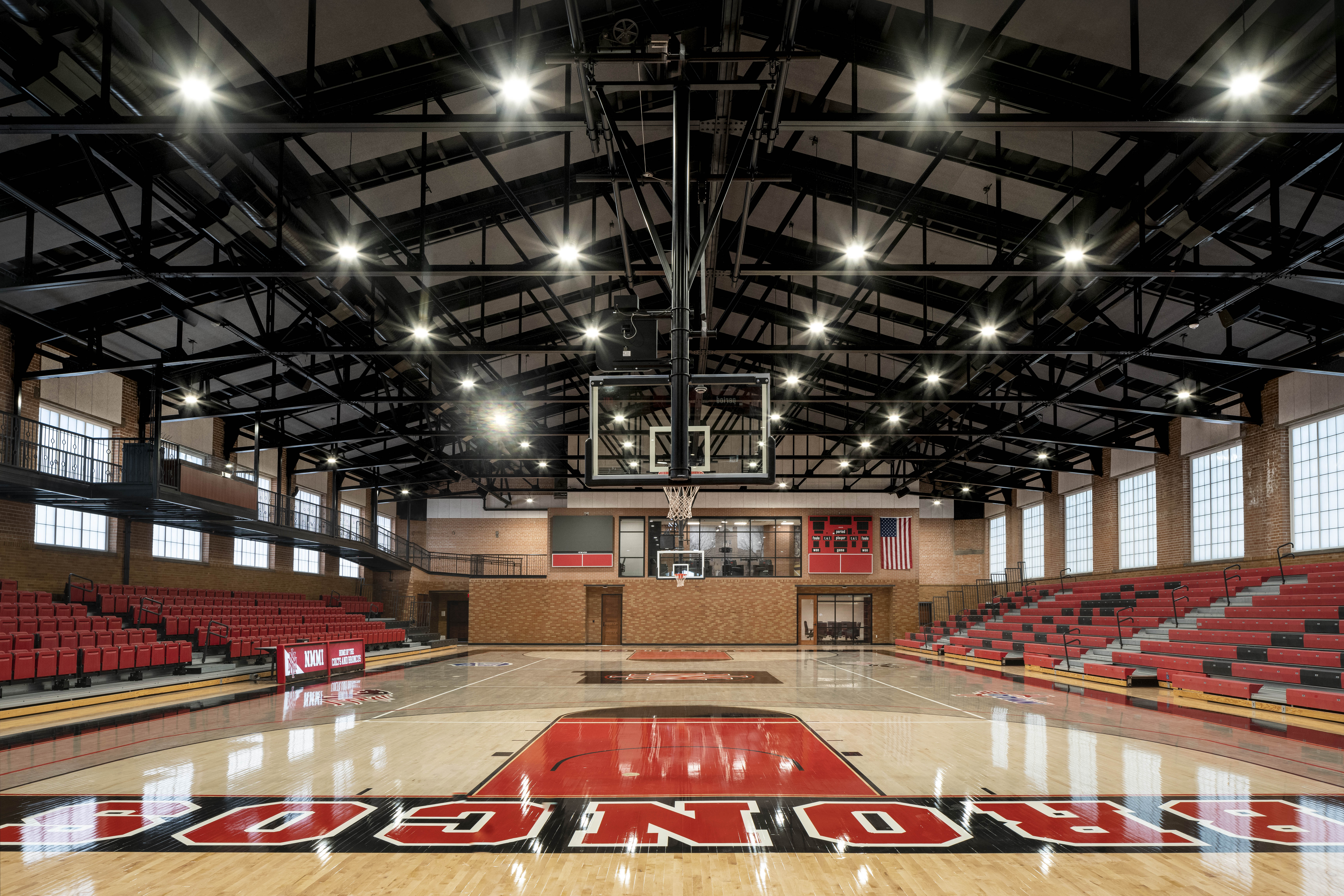 Originally constructed in 1927, the 5-story Cahoon Armory exemplifies New Mexico Military Institute’s (NMMI) iconic gothic revival architectural style. As a contributing building to the Institute’s Historic District and listed on the National Register of Historic Places, the renovation design needed to respect its aesthetics. The renovation included new spaces for the Athletic Department administration, refurbished gymnasium, public restrooms, weight training room, training staff offices, equipment storage, and coaches’ offices.
Low structural members and ceiling heights presented challenges, but exposed ceiling spaces highlight the historic 95-year-old steel trusses, wood joists, and brick structure. Historical elements like the main entrance’s exterior wall sconces were restored, and salvaged 1920s-era gothic chandeliers were installed in the west basement addition.
PEGS Gymnasium
By McBride Charles Ryan, Keilor East, Australia

 For several years, McBride Charles Ryan (MCR) has been developing projects for the Penleigh and Essendon Grammar School (PEGS) senior campus. The latest addition, the “Palazzo della Regione,” combines flexibility, utilitarian function, and a civic presence, seamlessly integrating with the adjacent gymnasium and enhancing the overall campus environment.
The new facility includes significant upgrades to the existing gymnasium’s structure, floors, and finishes, with a full-height operable wall connecting the two buildings to double the area for performance and competition. The natural topography is utilized for tiered seating, reducing excavation costs and providing flexible space for gatherings and informal teaching. The building houses two full-length basketball courts, tiered seating, a fitness center, student amenities, offices, classrooms, and multipurpose rooms.
Architects: Want to have your project featured? Showcase your work by uploading projects to Architizer and sign up for our inspirational newsletters.
 Harmonie Hall in Kobe
  Kent Denver School: Yates Pavilion
  Olympic Basketball Arena
  Ostin Basketball Center at UCLA