Architects: Want to have your project featured? Showcase your work by uploading projects to Architizer and sign up for our inspirational newsletters.
Tiles are one of the most efficient ways to add color, texture and dimension to a flat surface. Whether used internally or externally, tiles can dramatically change how a space feels. Beyond being a decorative element, they can even be used to create dynamic surfaces that control the passage of light and wind. Here are nine ways that designers have used tiles to control thermal conditions, make walls more interactive and create movement on smooth planes.
Images by Anand Jaju
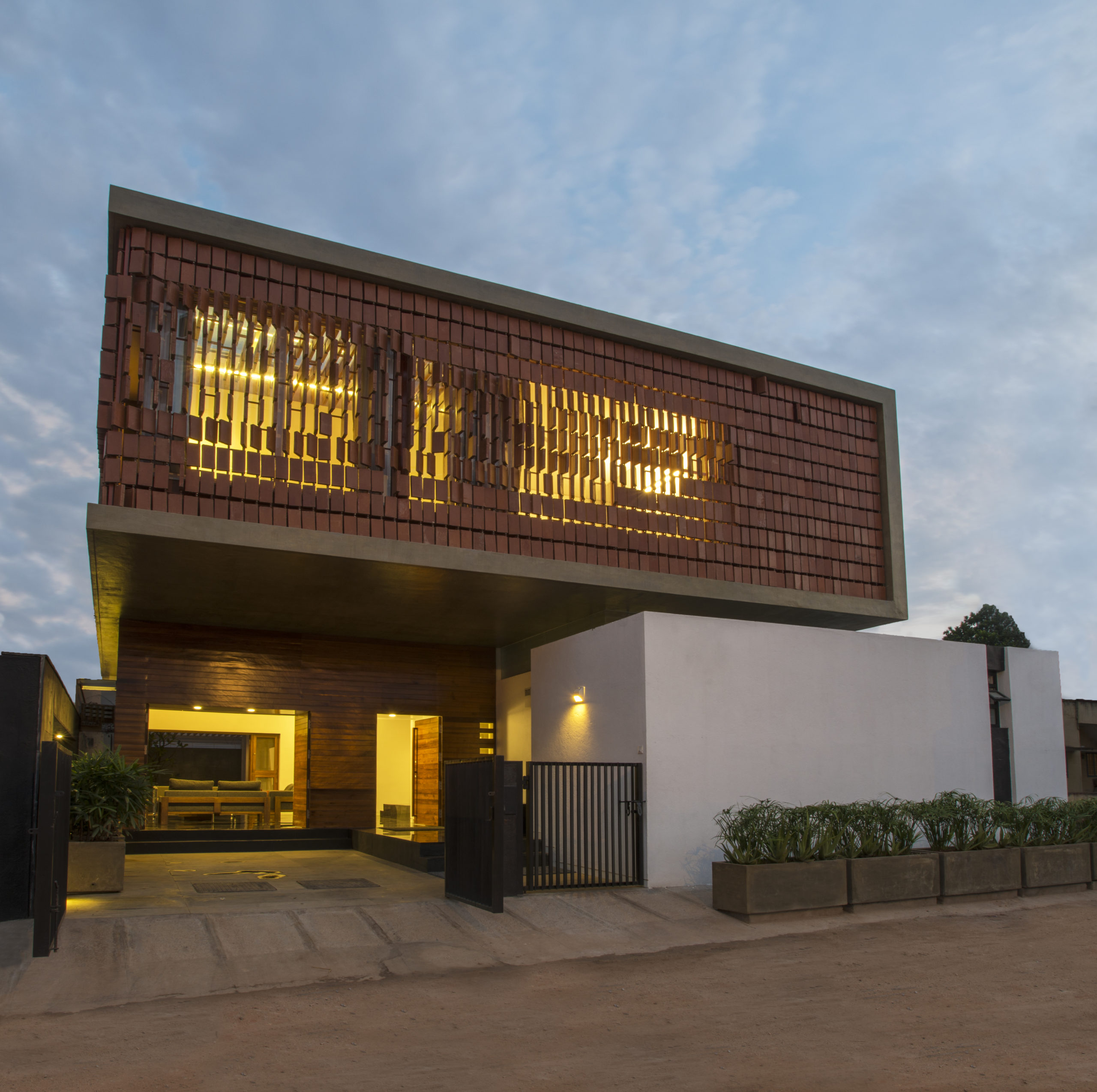
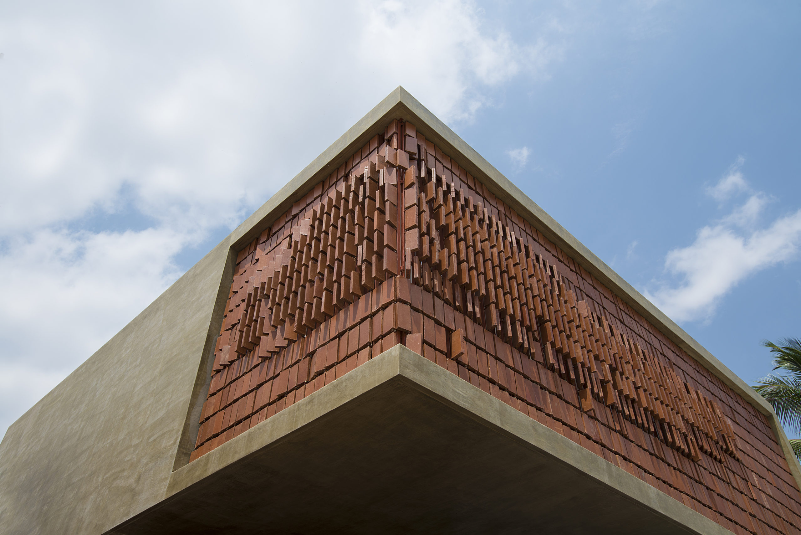
Pete Mane, Gundlupet Residence by Architecture Paradigm, Mysore, India
This two-level home takes inspiration from the surrounding rural landscape; the studio wanted to reinterpret the rural language of the nearby town in a modern way. The flow of natural light in the upper floors is controlled by the dynamic weatherproof clay tiles that can be opened and closed as required. This pattern allows light to pour in while also ensuring the privacy of the residents.
Images by Eiichi Kano
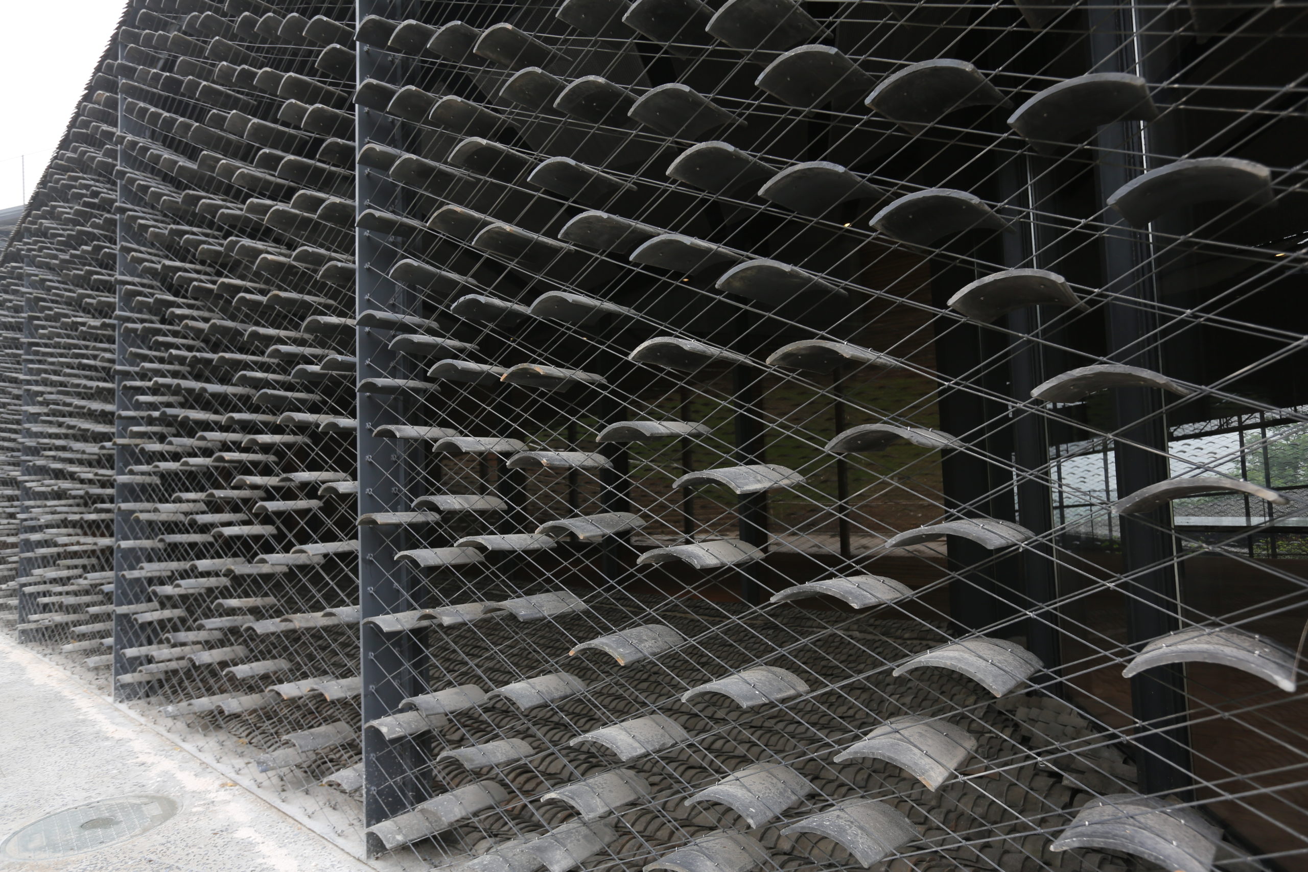
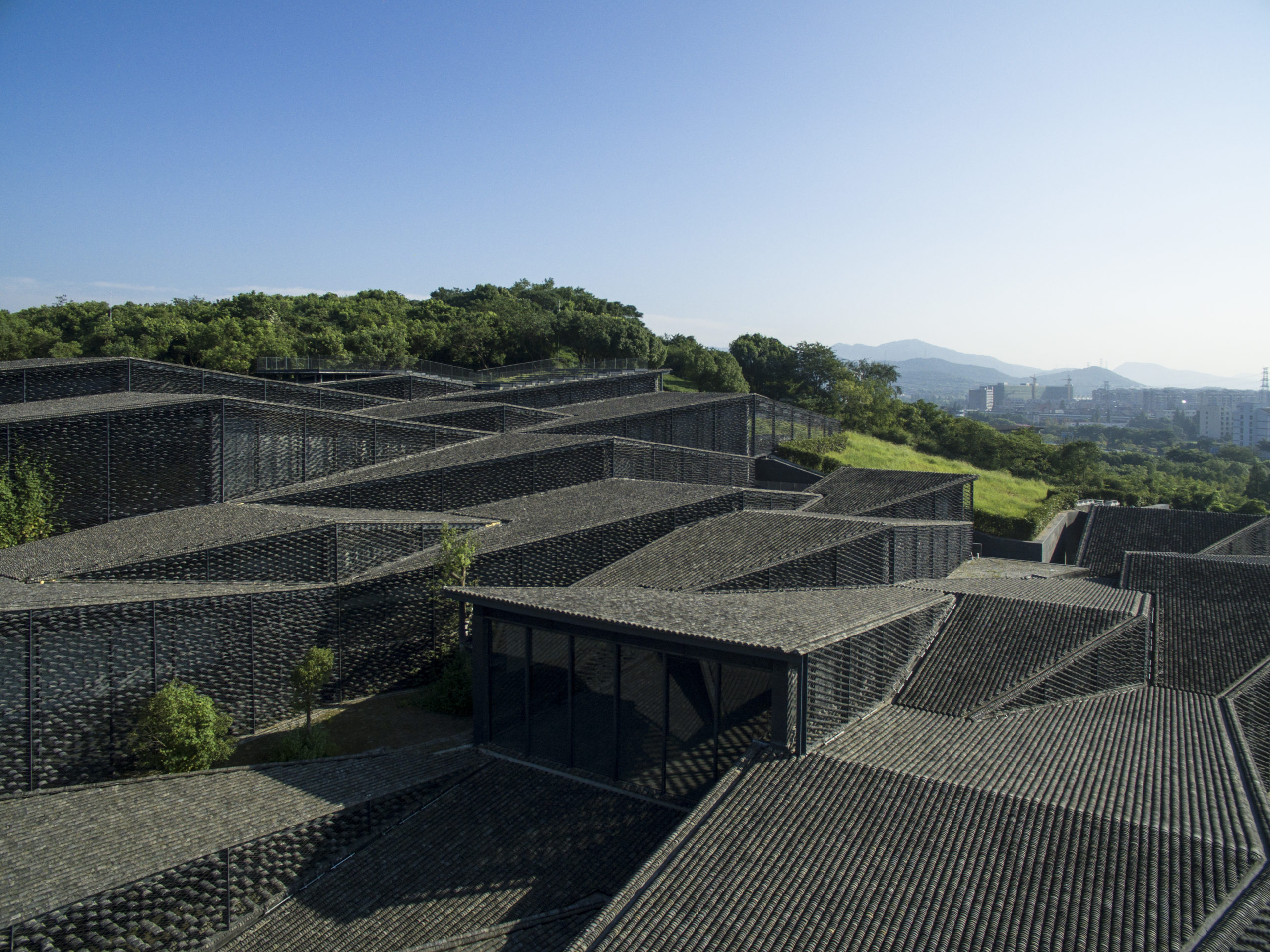
China Academy of Art’s Folk Art Museum by Kengo Kuma and Associates, Hangzhou, China
Located on the campus of the China Academy of Arts on what was once a hilly tea field, this project was built to ensure that visitors could experience the slope of the land as they move through it. The external walls of this structure are formed using curved tiles and stainless steel wire meshes. This filters the sunlight coming in and makes the structure feel open and light. The tiles for the continuous roof and the façade both came from local houses. This not only gives the structure more character but also helps it to blend with the surrounding landscape.
Images by Jon Holloway
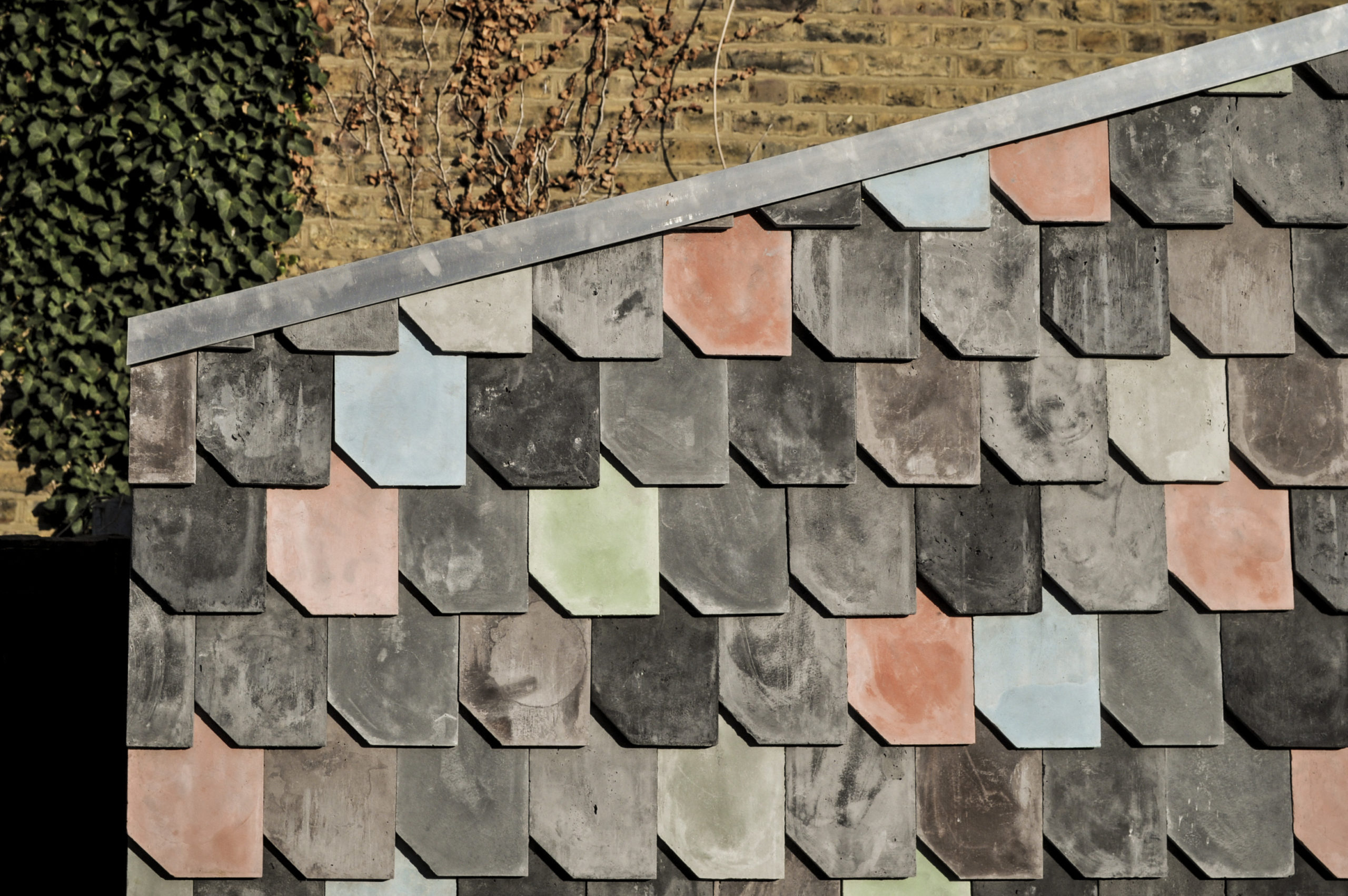
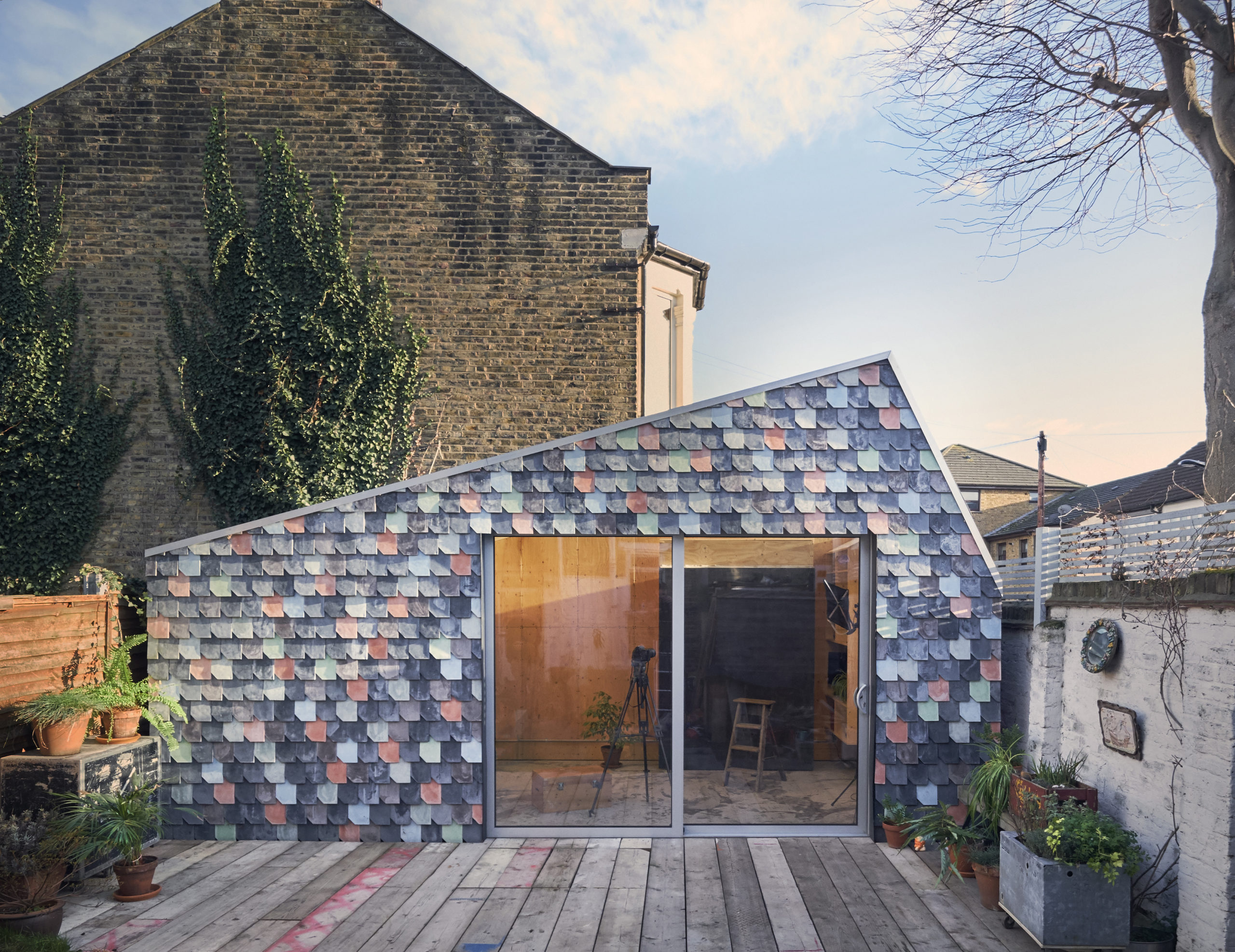
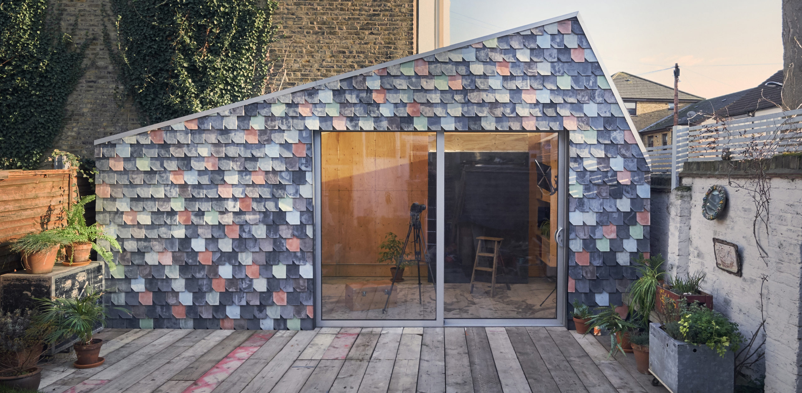
Holloway Lightbox by Studio Bark, United Kingdom
Over 1, 200 sustainable tiles made from waste timber fibers scale the façade of this photography studio. The design team proposed this as an alternative to concrete or cement tiles that tend to have a higher carbon footprint. Each of these pieces was made by hand over a three-week period during which numerous experiments with forms, mixes and pigments took place to find the right fit.
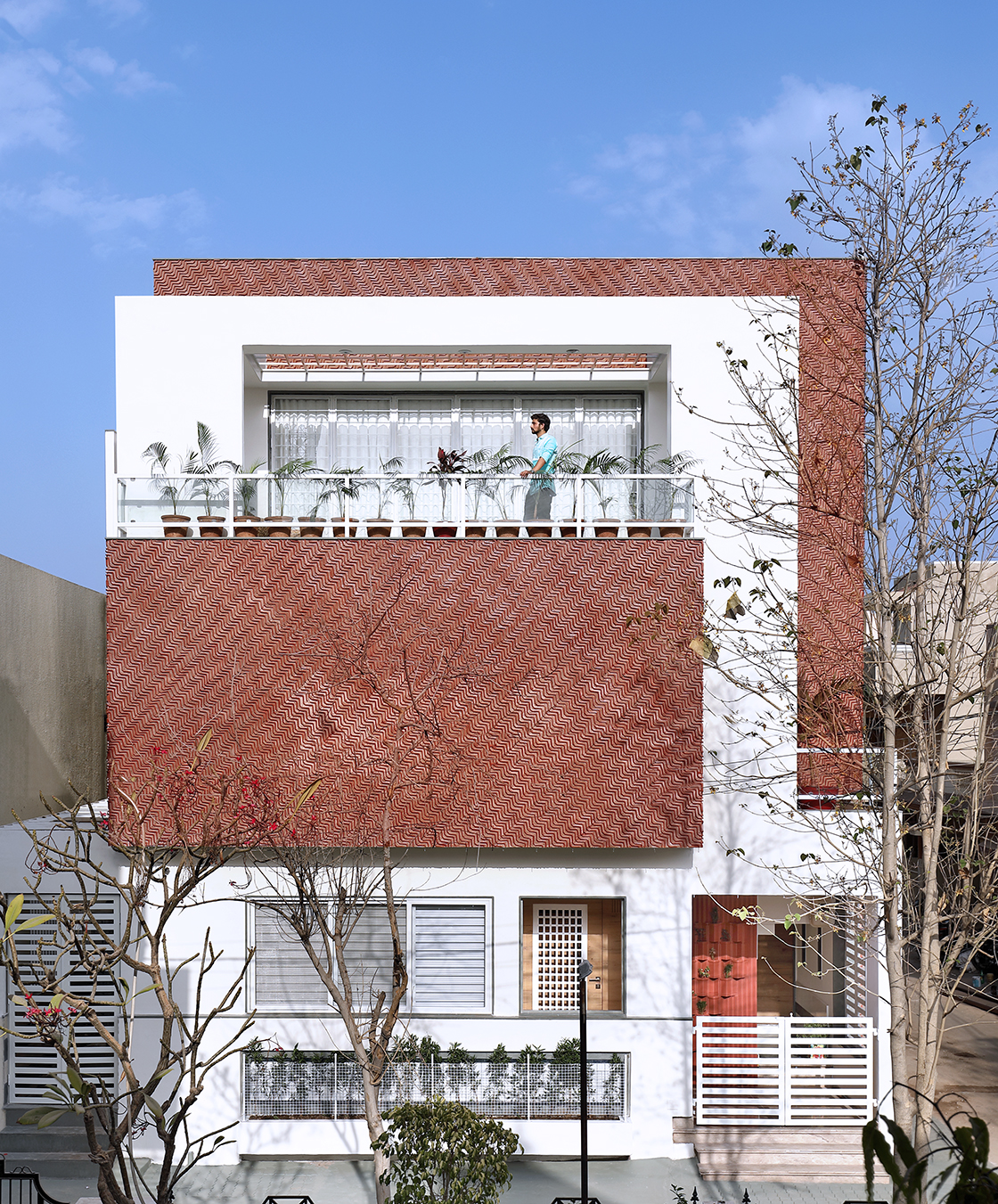
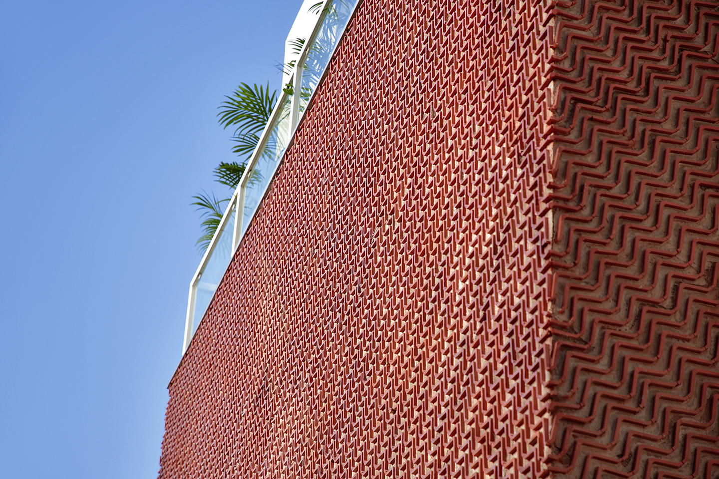 Earthy Red Colored Wavy Clay Tiles Facade Cladding by Manoj Patel Design Studio, Vadodara, India
Several blocks intertwined at different levels come together to form the overall geometry of this home. Stark white walls are placed next to textured red walls to create contrast. These red walls are created using wave-shaped clay tiles that are arranged in opposite orientations on different facades based on the sun’s path. This idea was chosen because of its sustainability, affordability and ability to create local jobs.
Images by Hisao Suzuki and Ramon Prat
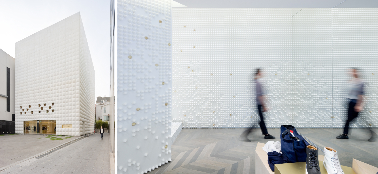
3.1 Phillip Lim Seoul Flagship by LEONG LEONG, Seoul, South Korea
This apparel store is covered in pillowy white tiles on all sides. These soft and fabric-like tiles not only elevate the look of the structure but also tie in with the contents of the store. A similar tile pattern is repeated inside the store to tie the whole design together.
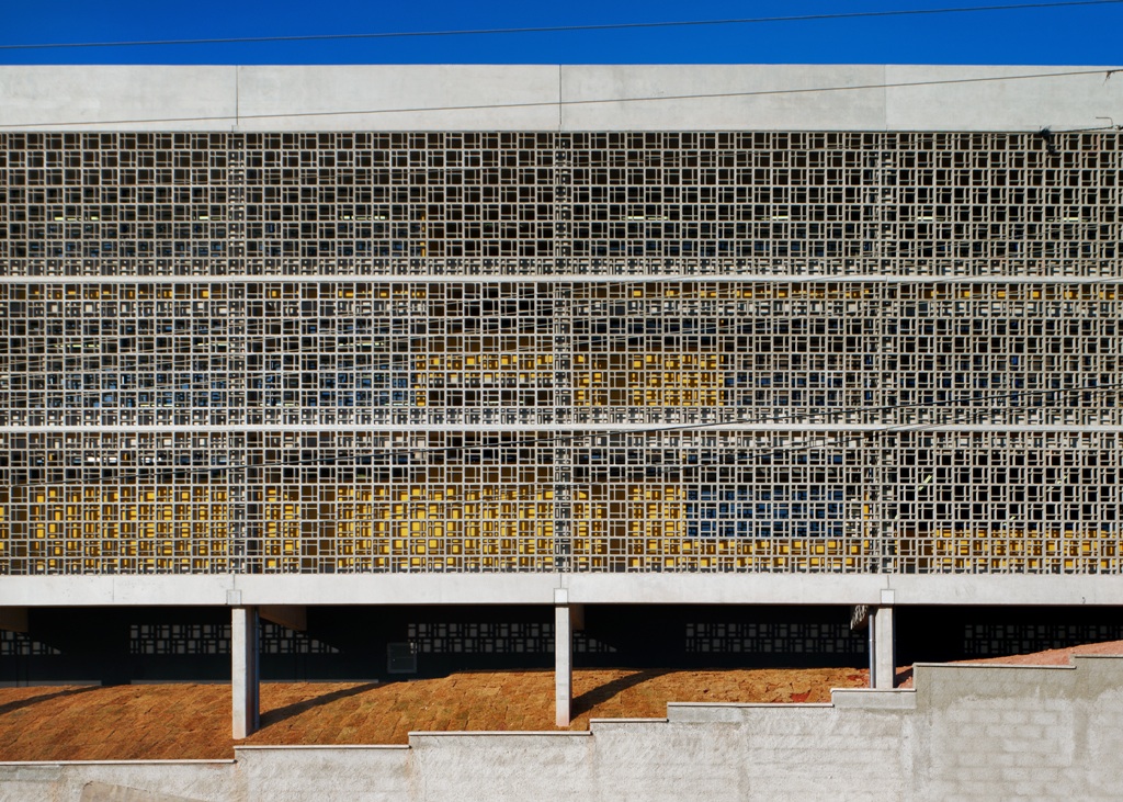
Image by Nelson Kon
Várzea Paulista School by Forte, Gimenes & Marcondes Ferraz, Várzea Paulista, Brazil
The main feature of this school building is the concrete brise soleil. Small blocks with irregular openings are put together to create a larger mosaic pattern that covers the façade on the front side. The openings often create beautiful shadow patterns inside the spaces. The back elevation is coated with perforated aluminum tiles to allow light in a way that the screen almost appears transparent, blurring the boundaries between the indoors and outdoors.
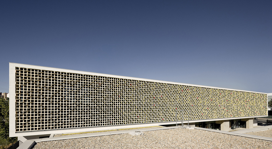
 Martinet Primary School by Mestura Arquitectes, Cornellà de Llobregat, Spain
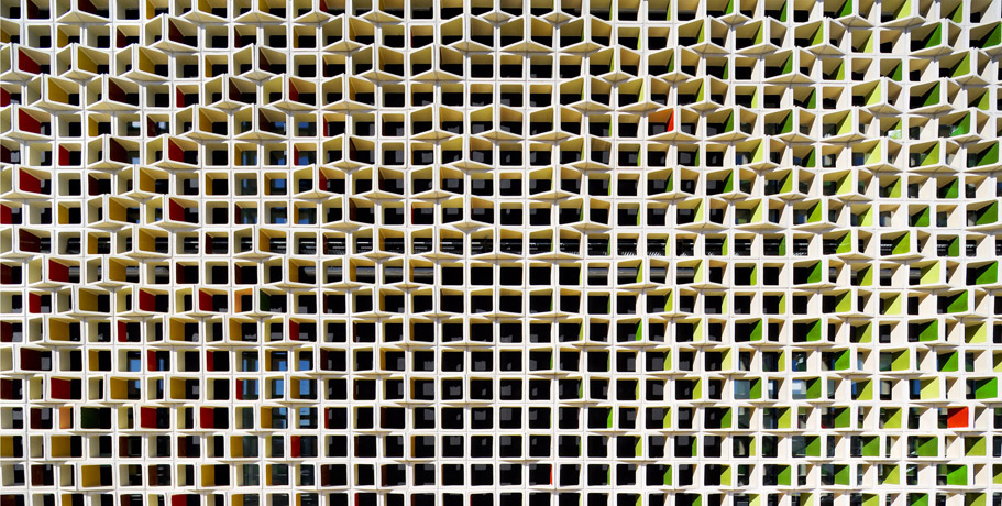
This institution is designed in a U shape with a playground at its core. Its façade is covered in tiles that are placed against each other at a 90° angle. There are two sets of tiles, each set comprising three colors. The ones facing the west are glazed in lush greens, representing spring. The ones facing the east are in rich warm tones that represent autumn. This allows passersby to see different colors as they walk along the street.
 Condominium Trnovski Pristan by SADAR + VUGA, Ljubljana, Slovenia
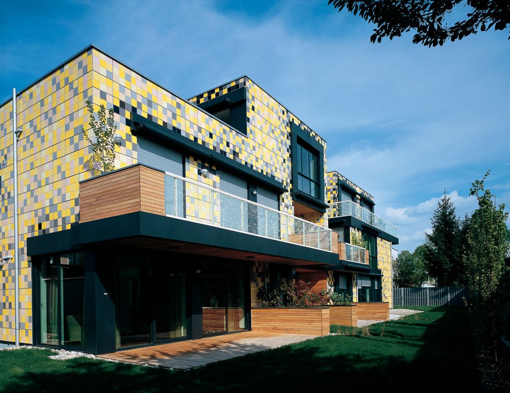
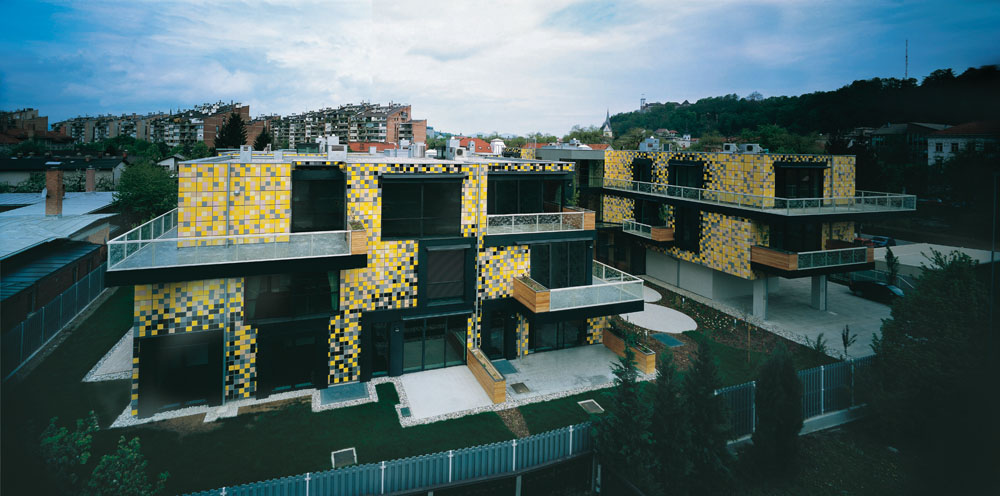
This graphic apartment building aimed to be something beyond one’s imagination. Its façade is made up of ceramic tiles in shades like yellow, black, white, grey and beige to create a pixelated effect. This pattern is further enhanced by the use of thick black metal frames around the fenestrations.
Images by H Lin Ho
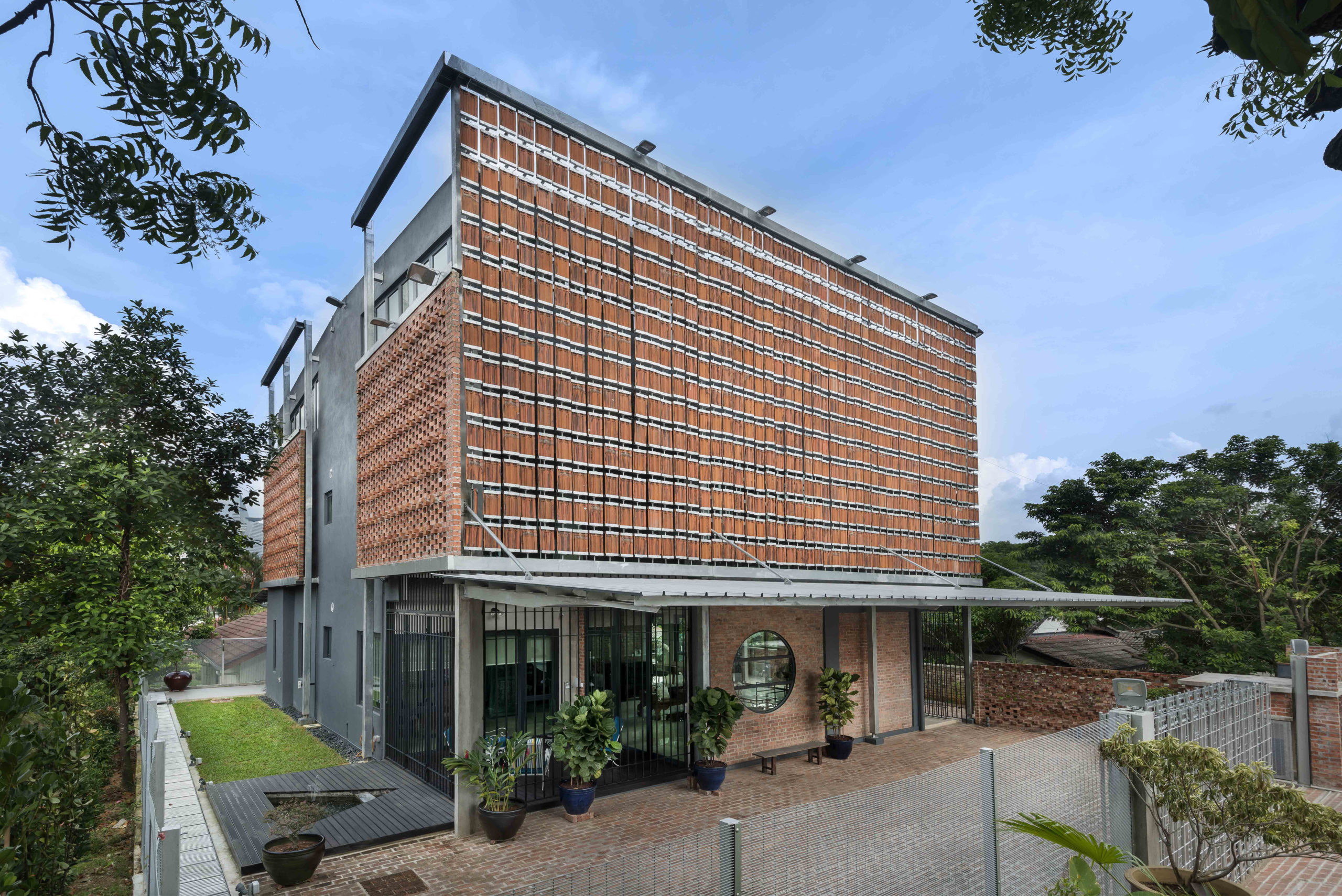
Clay Roof House by DRTAN LM Architect, Petaling Jaya, Malaysia
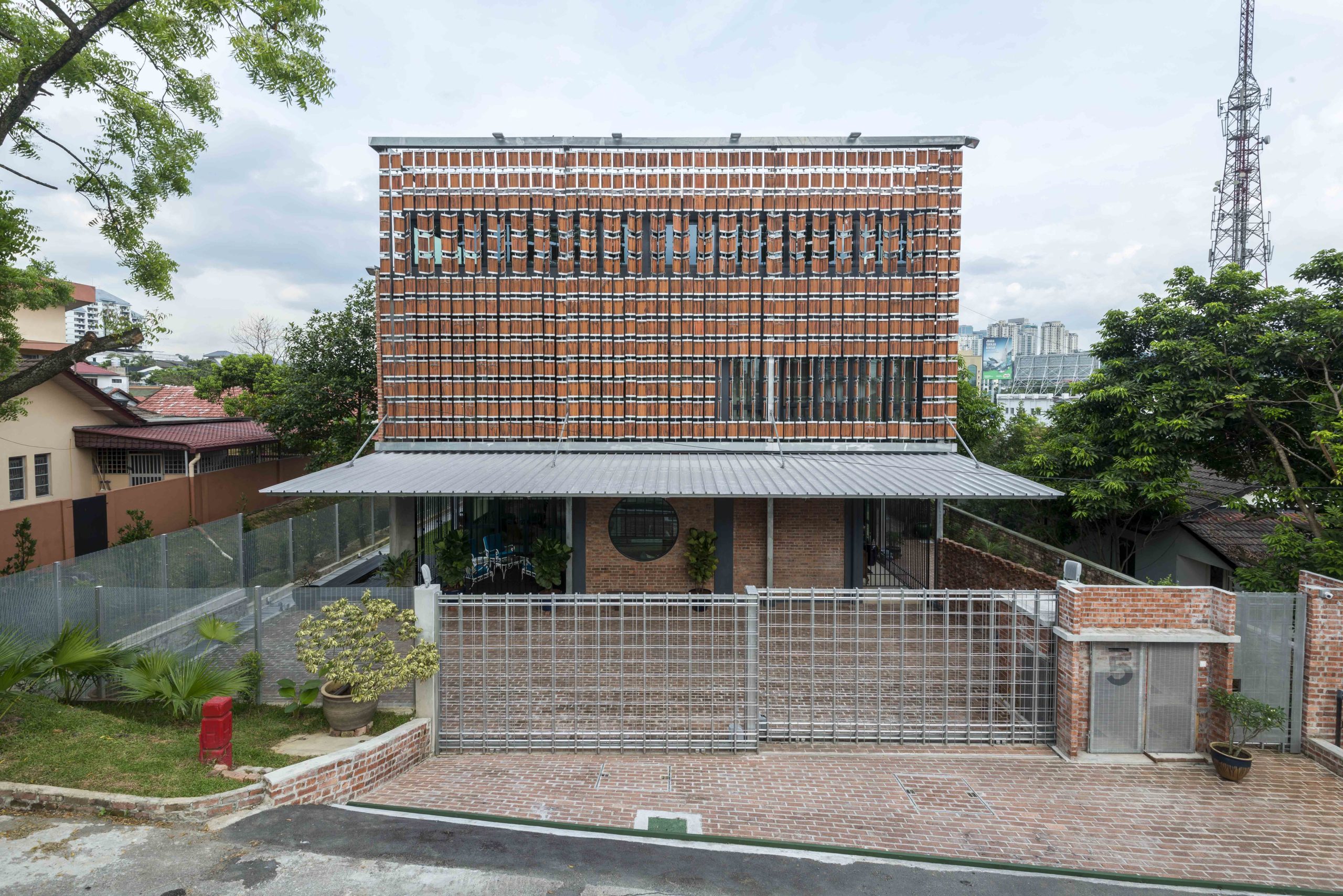
While attempting to turn a dilapidated home into a new house, the designers found that its clay tiles were still in good condition. That is what became the statement feature of this project. A rotating mechanism was created using the tiles and steel rods to create windows. They also prevent the house from heating up and create an incandescent orange glow when the sun hits the walls.
Architects: Want to have your project featured? Showcase your work by uploading projects to Architizer and sign up for our inspirational newsletters.
 China Academy of Art’s Folk Art Museum
  Clay Roof House
  Condominium Trnovski Pristan
  EARTHY RED COLORED WAVY CLAY TILES FACADE CLADDING
  Holloway Lightbox
  Martinet Primary School
  Pete Mane, Gundlupet Residence
  Várzea Paulista School