Architects: Want to have your project featured? Showcase your work by uploading projects to Architizer and sign up for our inspirational newsletters.
Have you ever been called to a meeting room only to arrive in an underwhelming cube, where you immediately begin to shuffle chairs around like bumper cars? And after all that kerfuffle, there still remains one isolated worker standing in the corner, without a car of their own to park around the table. While not disastrous on any scale, these repetitive and sometimes awkward encounters are avoidable, and largely delineated by an unsuitably executed built environment. Such situations — whether similarly inconsequential or more cataclysmic — are simple indications that good architectural and design interventions, are essential in our everyday work environments.
Today, flexible gathering spaces with the ability to facilitate diverse working contexts have become paramount features of dynamic and productive spaces. By providing such arenas, it is increasingly within reach to create nurturing spaces that consider a diverse set of workers and approaches to completing tasks. Throughout the following projects, these enigmatic terraced staircases act as the magnetic hearts of each design, and provide unique areas for alternate approaches to meeting, co-working and carrying out the work day. Finally, they allow individuals to gather, create self-driven narrative scenes and produce a strong unified image of what collaboration can look like.

© IwamotoScott Architecture

© IwamotoScott Architecture

© IwamotoScott Architecture
Pinterest HQ by IwamotoScott Architecture, San Francisco, Calif., United States
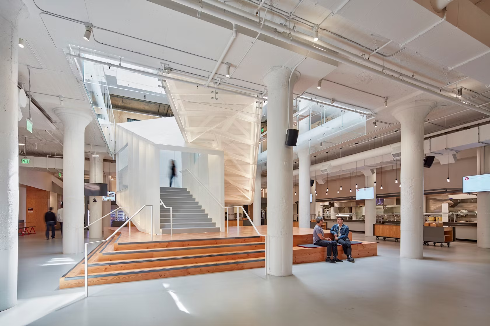
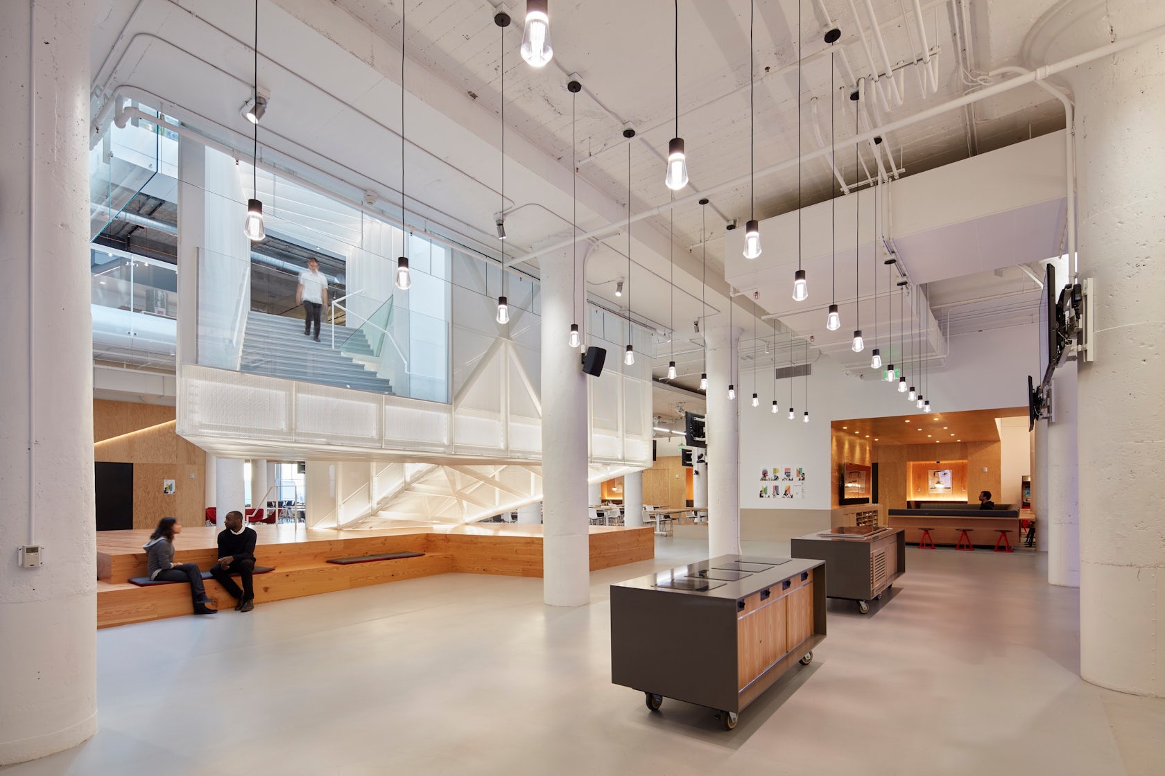
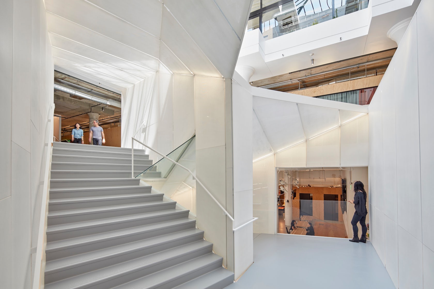
Clean, simple and intuitive, the design for Pinterest’s new headquarters was inspired by the company’s ethos of knitting ideas together. The porous design is formed around a central staircase that not only visually connects all four floors, but also acts as the core and primary gathering place within the building.

© Studio Sarah Willmer, Architecture

© Studio Sarah Willmer, Architecture

© Studio Sarah Willmer, Architecture
Atlassian II Offices by Studio Sarah Willmer, San Francisco, Calif., United States
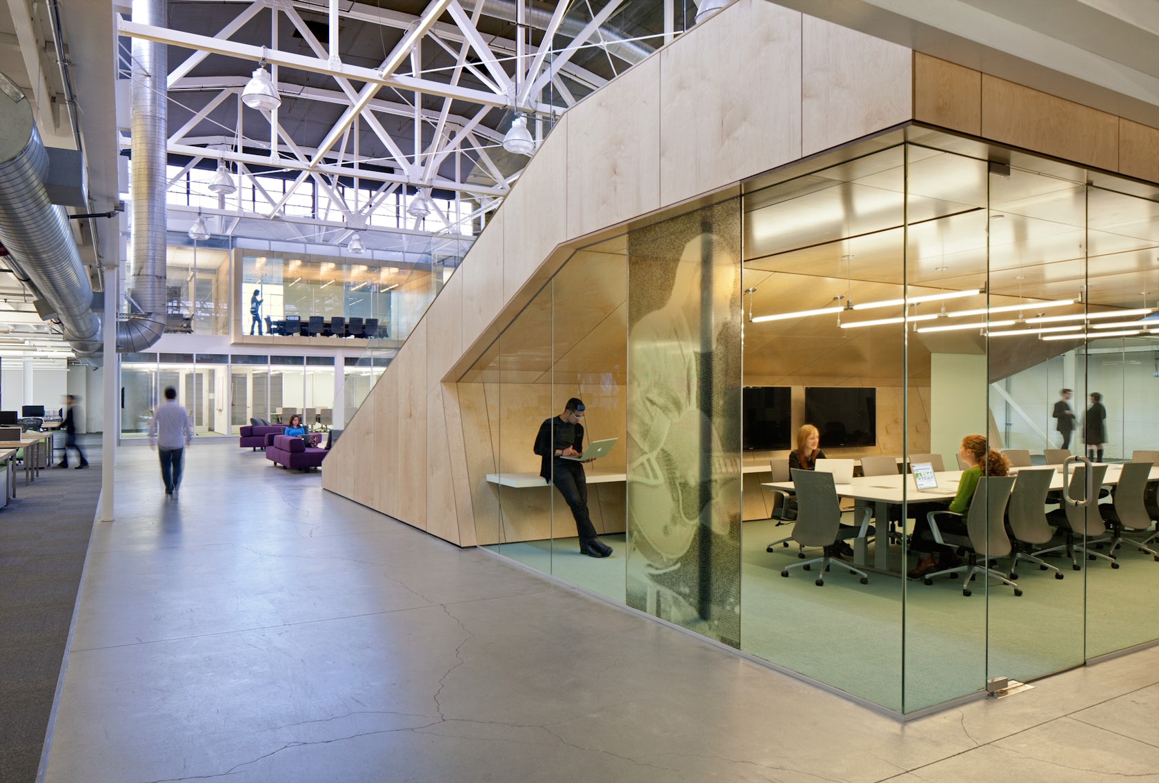
In the past, this site has been home to a church, disco and print shop. Adding software company to the building’s elaborate legacy, Studio Sarah Wilmer created an unexpected oasis for Atlassian’s office, housed within the existing warehouse exterior. The wood terraced amphitheater seating, which encloses a primary conference room with frameless glass, quickly became the visual and social focus of the new design.

© Jing-Rui Lin (Usual Studio)

© Jing-Rui Lin (Usual Studio)

© Jing-Rui Lin (Usual Studio)
Rope Wave Office by Jing-Rui Lin (Atelier Ten), Shanghai, China
For this project, the owner sought to create a low budget space, where startups could co-exist in both an innovative and attractive environment. Highlighting natural material beauty, the office is composed of low price and eco-friendly rope, steel and wood. The space is intentionally decorated with warm colors and elaborate lighting, in order to create a comfortable and friendly space in which to work.

© LTL Architects

© LTL Architects

© LTL Architects
Claremont University Consortium Administrative Campus Center by LTL Architects, Claremont, United States
For this project, LTL Architects wanted to create an environmentally sensitive and vibrant area that could act as a collective gathering place for the surrounding community. The interior design exploits both the high ceiling and large spans of the steel structure, resulting in an open space which is used by more than 100 employees. Located in the center is a wide staircase with a red carpet, providing bleacher-like seating for large meetings and gatherings.

© CPLUS

© CPLUS

© CPLUS
Jingyuan No.22 Transformationby C+ Architects, Beijing, China
Located in an old cotton warehouse, C+ Architects created a design that could facilitate diverse, non-linear working contexts for the employees of two internet finance companies in China. In this space, the grand OSB staircase acts as an additional meeting room, which can be adapted for group discussion or a small-scale teamwork area for programmers.

© Edward Ogosta Architecture

© Edward Ogosta Architecture

© Edward Ogosta Architecture
Hybrid Office by Edward Ogosta Architecture, Los Angeles, Calif., United States
Designed for a creative media agency of 30 workers, Hybrid Office contains flexible typologies, which together engender a unique interior world. Constructed from simple veneered plywood and white-painted fiberboard, the creative space embodies the idiosyncratic spirit of the company. At one end, a stepped set of bookshelves forms a dual-functioning storage and seating area that is frequently used for office-wide meetings.

© Dirk Weiblen

© AIM Architecture

© AIM Architecture
SOHO Guanghua Rd 3Qby AIM ARCHITECTURE, Beijing, China
SOHO approached AIM with a challenge: To transform an already existing retail space into a unique office. The architects used strong colors and patterns to add life to the often-drab mall setting. In order to provide a sense of community to the companies, they unified the space with an oversized oak staircase that is used as a venue for lectures and events.
Architects: Want to have your project featured? Showcase your work by uploading projects to Architizer and sign up for our inspirational newsletters.


