Architizer’s newest print publication is available for pre-order! How to Visualize Architecture is an educational guide designed to help you master the craft of architectural storytelling and visual communication. Secure your copy today.
Architecture is defined by materials. The way a building feels, how it opens to light and its environmental impact are linked to what it is made of. One of the most significant designers in contemporary architecture, Kengo Kuma’s work builds upon a legacy of Japanese craftsmanship while rethinking how we use materials. His Tokyo-based architecture firm has created a diverse portfolio of projects that feel light, balanced, and fluid. Not only is the practice of making materials feel monumental in their own right, but they also reinterpret tradition and local context.
While Kengo Kuma and Associates is known for projects in Japan’s countryside, the firm has projects worldwide. Their approach includes applying diverse materials, from stone and shingles to timber; theirs is an architecture grounded in transience, weathering and the Japanese concept of omotenashi. As the firm states, they are creating architecture that opens up new relationships between nature, technology and human beings. The following projects showcase the firm’s breadth and depth of material investigations, and together, they represent how the practice looks to the future of architecture and design.
China Academy of Art’s Folk Art Museum
Hangzhou, China
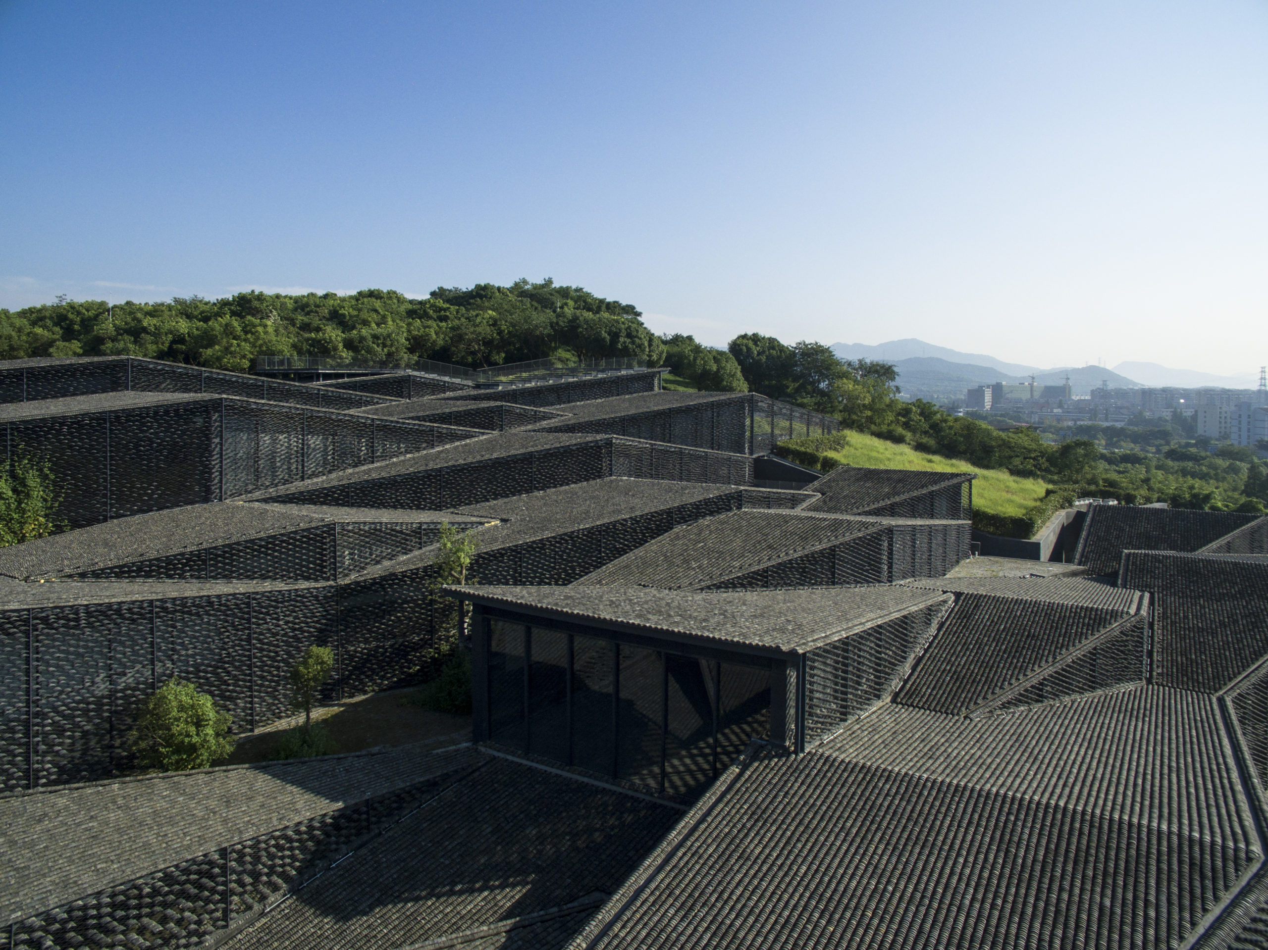
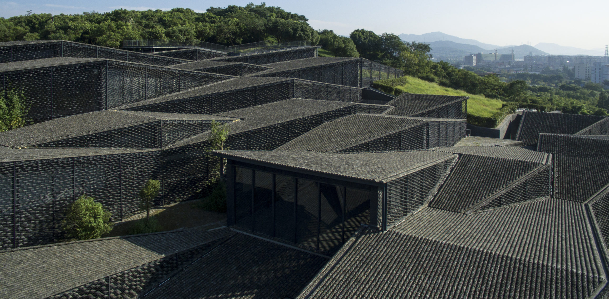
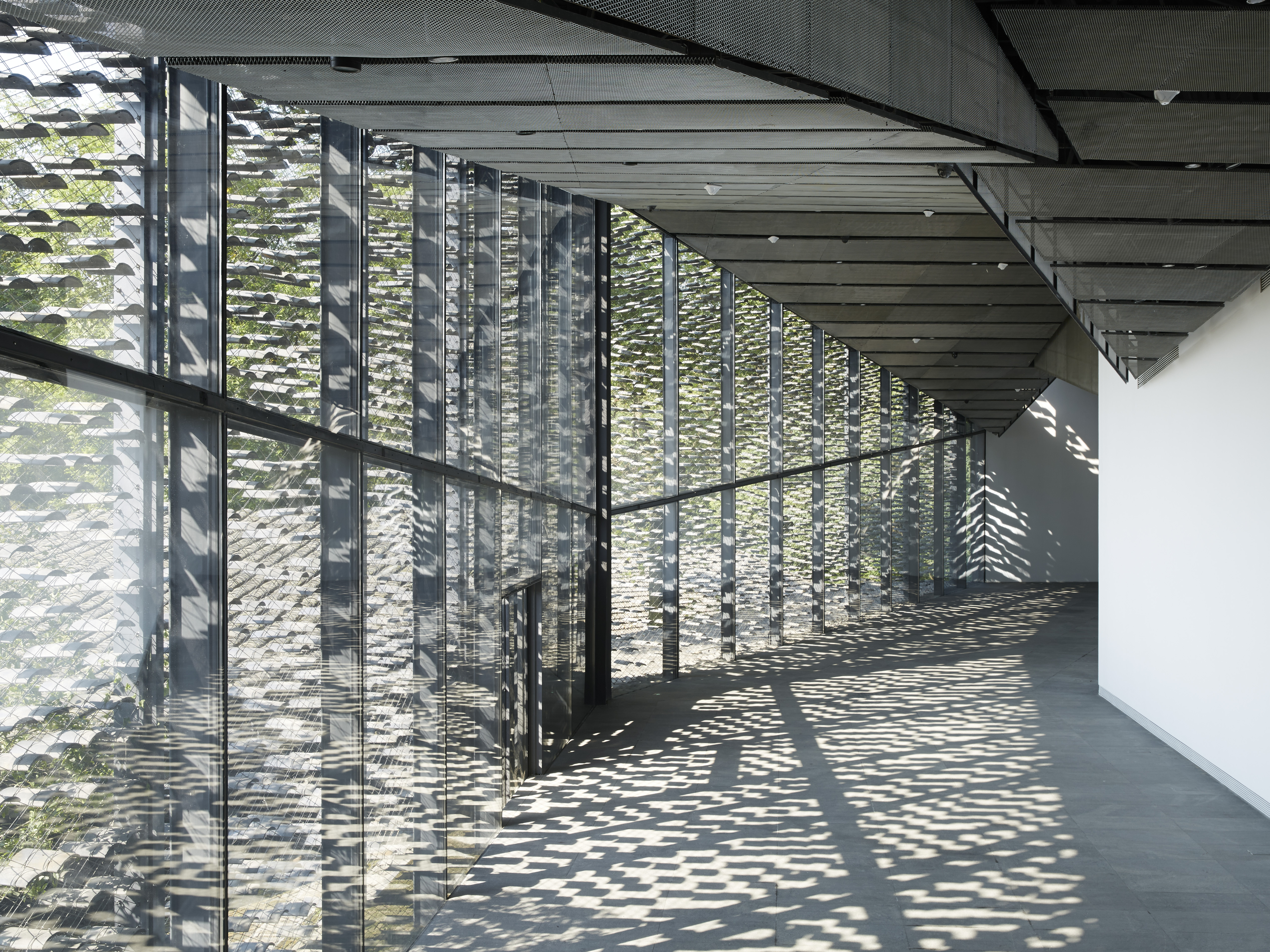 This folk art museum stands in the campus of China Academy of Arts in Hangzhou. The site was formerly a tea field that formed a hillside. The design team’s point was to create a museum from which the ground below can be felt by continuing the building’s floors that follow the ups and downs of the slope. Planning is based on geometric division in the units of parallelogram to deal with the intricate topography.
Each unit has a small individual roof, so the outlook became like a village that evokes a view of extending tiled roofs, while the outer wall is covered with a screen of tiles hung up by stainless wires. It controls the volume of sunlight coming into the rooms inside. Old tiles for both the screen and the roof came from local houses. Their sizes are all different, and that helps the architecture merge into the ground naturally.
Daiwa Ubiquitous Computing Research Building
Tokyo, Japan
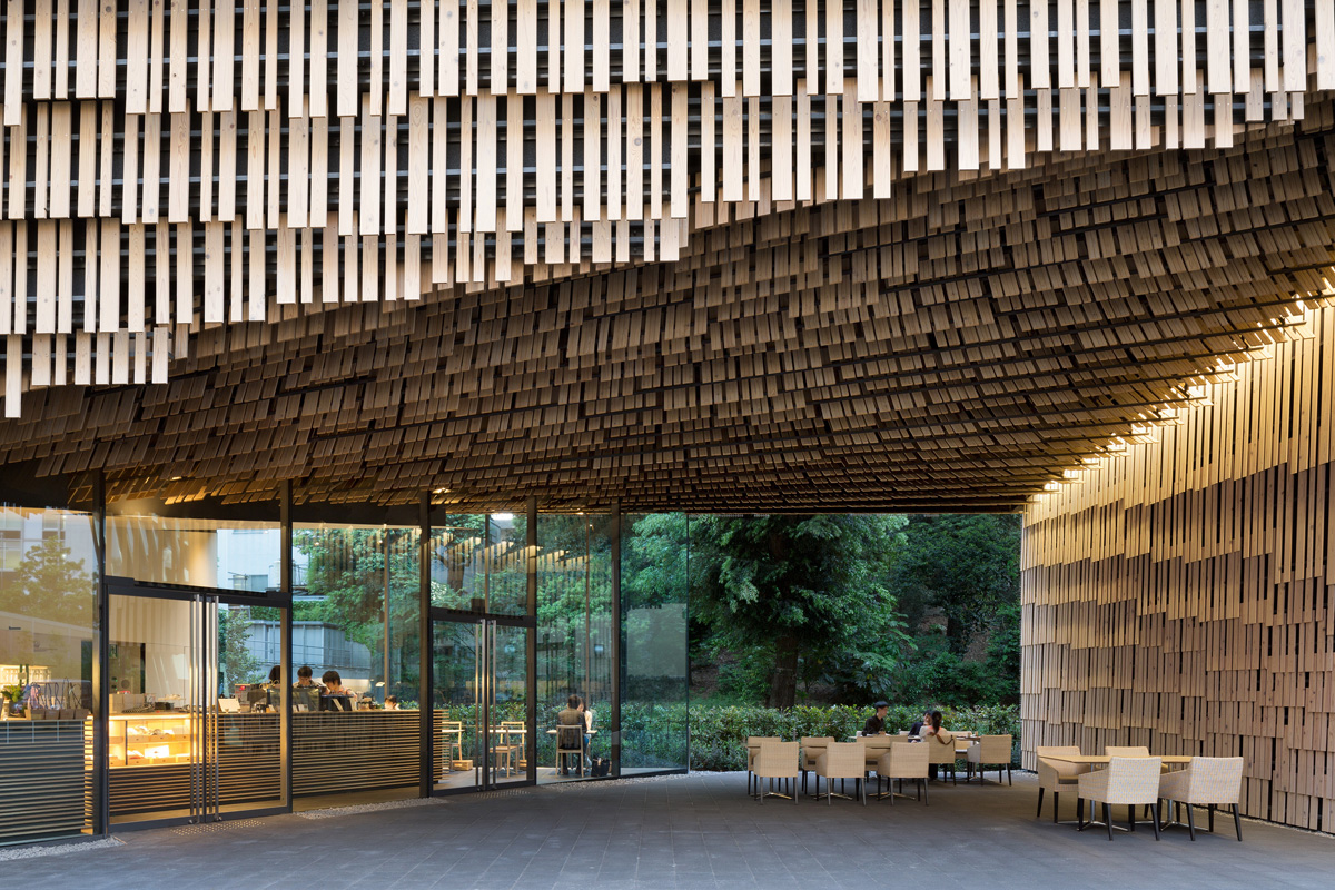
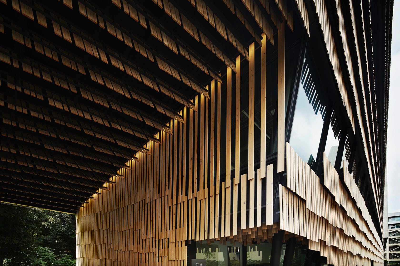 Designed for the university’s new field of research on ubiquitous computing, the Daiwa Research Building breaks away from convention to create a “soft building” made with wood and earth. A series of scale-like cedar wood panels were formed to create a gently undulating façade that’s both organic and smooth. The facility comprises galleries and lecture rooms, as well as indoor and outdoor areas of recreation. Space is freed up on the ground floor to form a covered walk to the garden behind the building.
Striking a contrast with the other buildings making up the University of Tokyo, the research center’s rhythmic elevations are interrupted at various points where glazing allows natural light to enter. The façade’s cedar planks are arranged in groups of five or ten, and then staggered diagonally across the building’s three-story exterior. The building also utilizes ground-breaking technology with hundreds of sensors to monitor and regulate the interior environment.
V&A Dundee
Dundee, United Kingdom
Popular Choice Winner, 2019 A+Awards, Museum
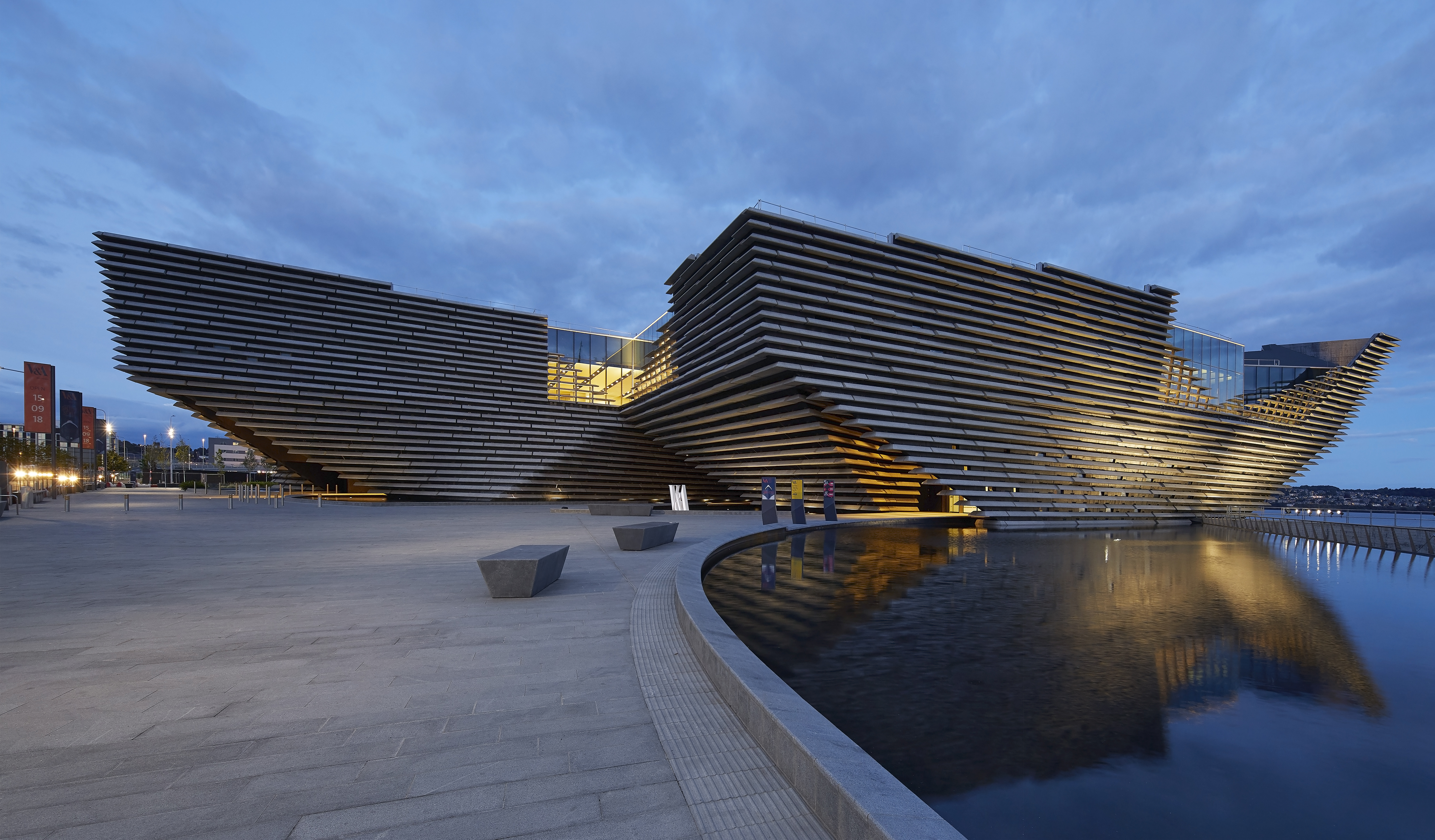
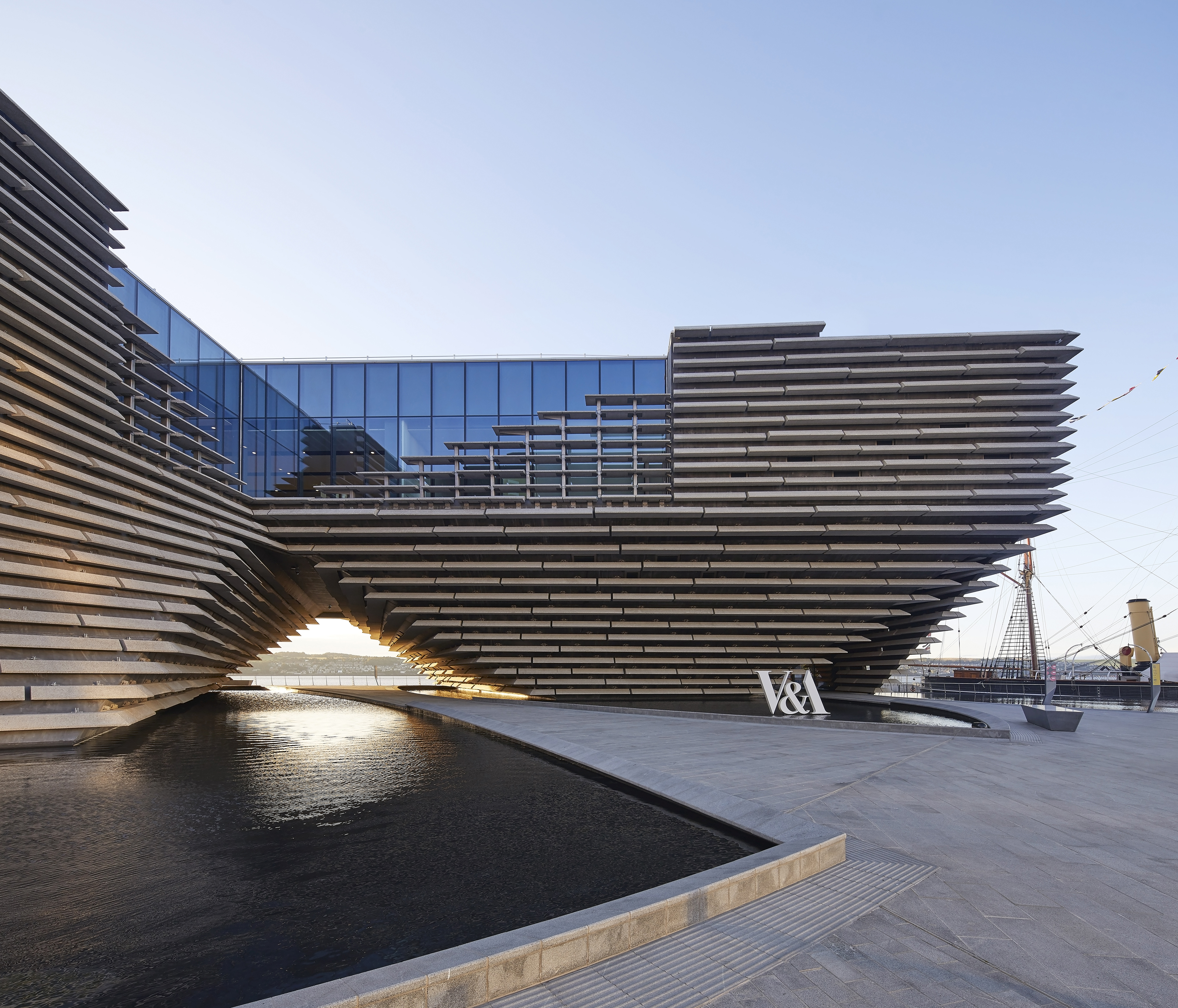 Exemplifying the possibilities of precast façades and assemblies, the new V&A Dundee in Scotland was made to evoke a Scottish cliff face. The concrete and glass building is part of a transformation of the Dundee waterfront, and is the first Victoria & Albert museum in the world outside of London. The central focus of the museum is the Scottish design galleries, which includes over 300 pieces from the V&A in London and across Scotland. The museum was designed to integrate with the environment as a “living room” for the city. Along with exhibition spaces, the museum is home to a large public hall for concerts and workshops, a shop, cafe and restaurant.
As the signature element of the V&A Dundee, the project’s façade is made of long panels of precast concrete formed with a mix of stone, cement and reinforcement mesh. The exterior walls include 2,500 cast stone panels hung on gently sloped walls curving vertically and horizontally. Featuring both the precast concrete panels and glazing, the façade forms one of the most iconic structures to open so far in 2018.
Portland Japanese Garden
Portland, OR, United States
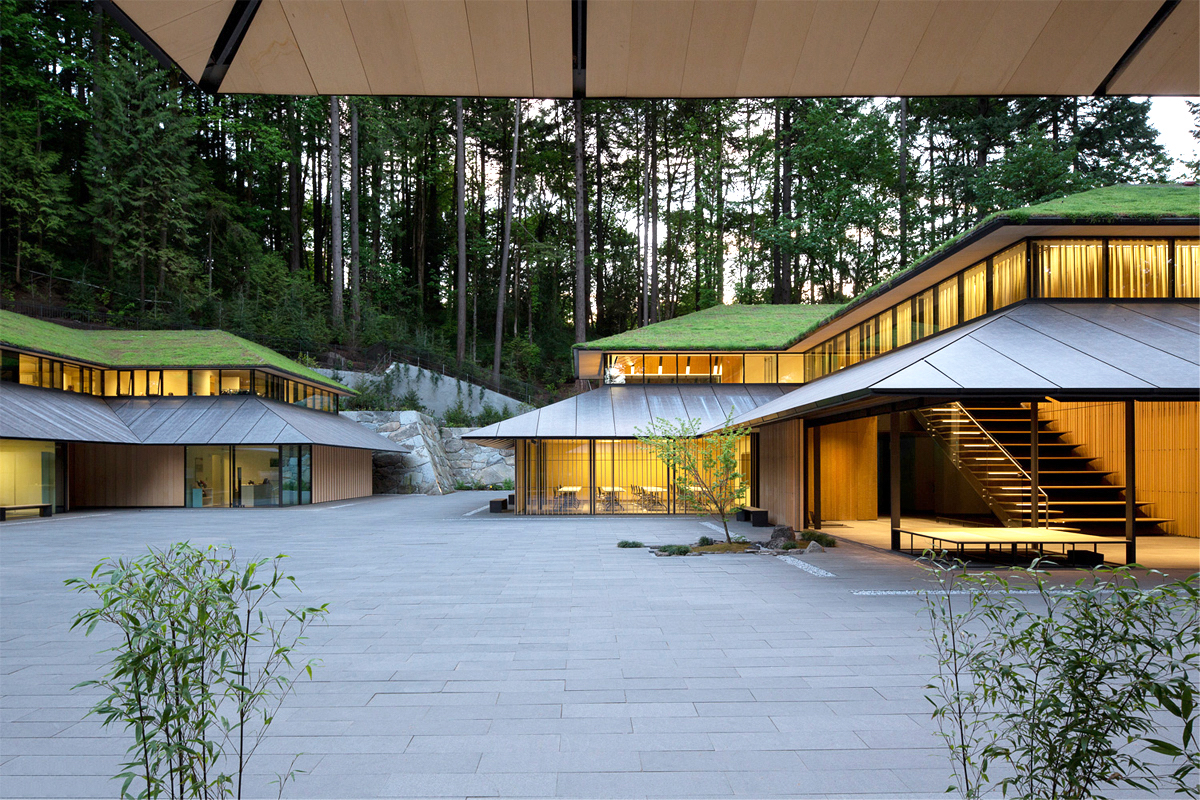
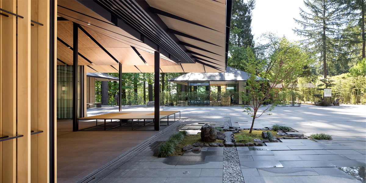 Based on the Japanese tradition of monzenmachi (gate-front towns), where activity exists outside the gates of shrines and cultural sites, the Portland Japanese Garden design was created with a free-flowing courtyard for events and educational activities. Kuma’s first public commission in America, the project utilized existing space within the garden to create a new Cultural Village with four buildings. The buildings are wrapped with wood battens and topped with overhanging, tiered roofs.
Kuma chose Oregon-grown Port Orford Cedar for the refined interior surfaces, from furnishings to ceiling panels. Alaskan yellow cedar forms the soffits, louvers, and the yamatobari lapped exterior walls. Made to be deferential to the landscape, all of the structures are LEED-certified and built to ensure that nature remains the site’s focal point. The result is a richly textured material palette and formal language that shows how contemporary design can reinterpret the past.
Odunpazari Modern Museum
Eskişehir, Turkey
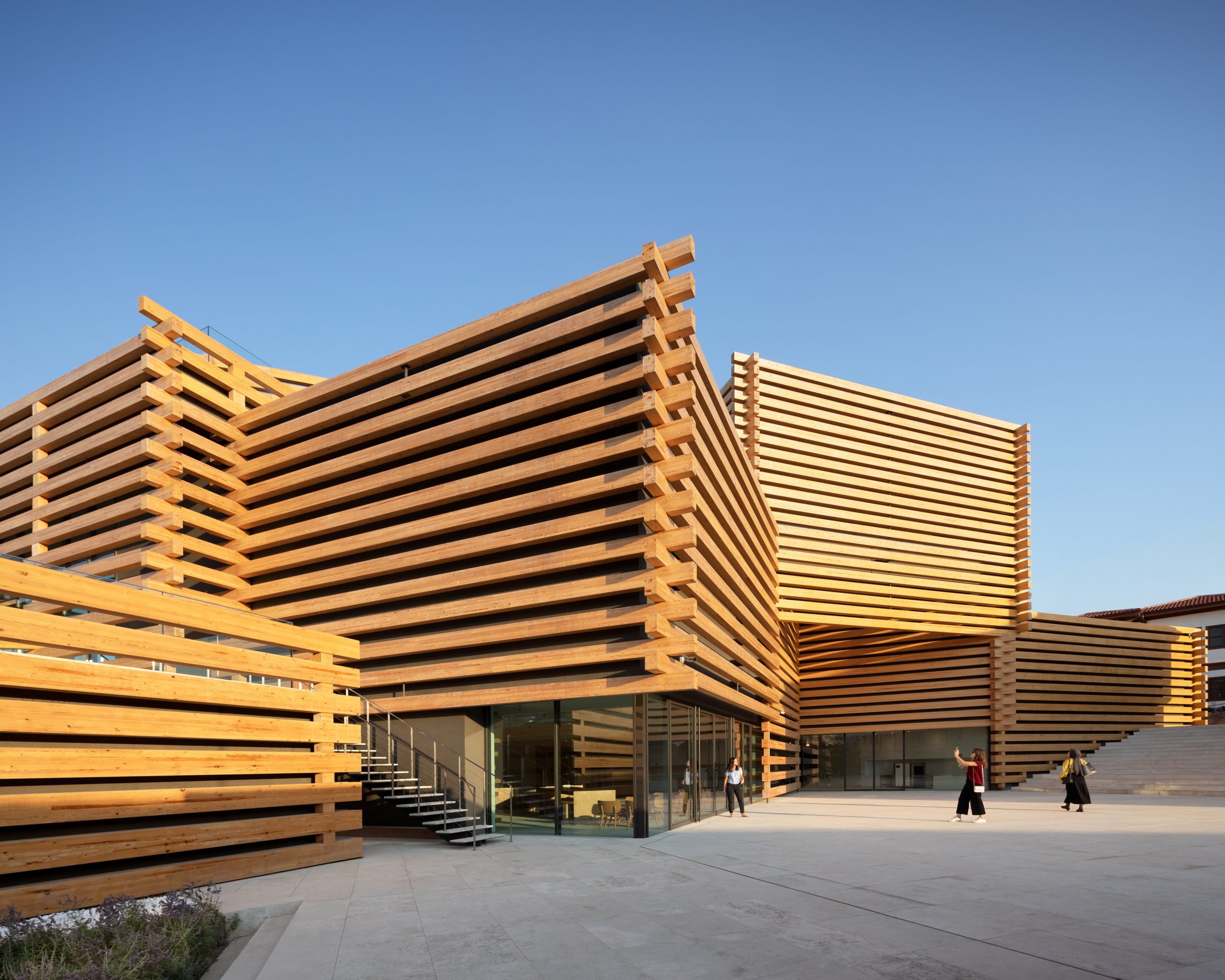
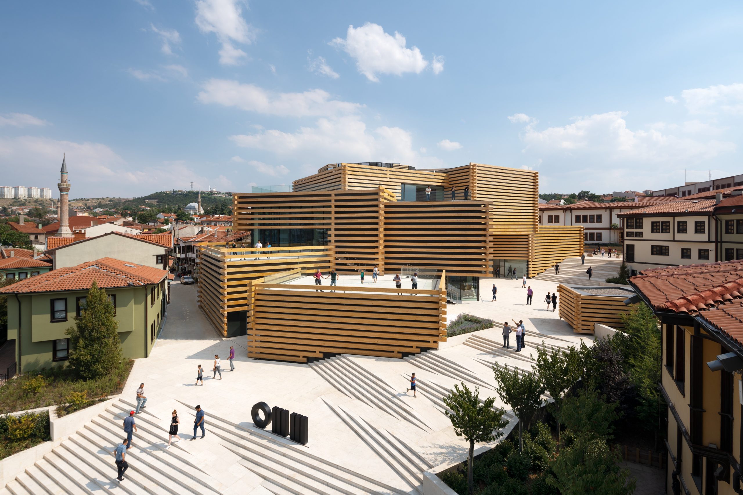 In the design of the OMM building, the team reinterprets the historic fabric of the Odunpazarı district from a contemporary perspective. Drawing from the local architecture of Odunpazarı, Ottoman dome architecture, and traditional Japanese architecture, OMM’s design is highlighted by four major components: geometry, light, stacking, and timber. In terms of materials, Kuma took a similar approach, opting for natural materials such as timber, stone, and paper for similar reasons.
The architectural stacking and the timber construction system defines the spatial experience of the museum, which combines laminated timber pine, glass and limestone. The exterior envelop of the museum features timber as a way to signify the history and memory of Odunpazari that used to function as a market in trading wood. The design strategy was to make the volume in aggregation; stacking small boxes to create the urban scale architecture. The solid timber material provides both façade and structural material. The larger exterior of the site features a tiered, cascading staircase that runs diagonally across OMM, providing access to all levels.
Yusuhara Marche
Takaoka District, Japan
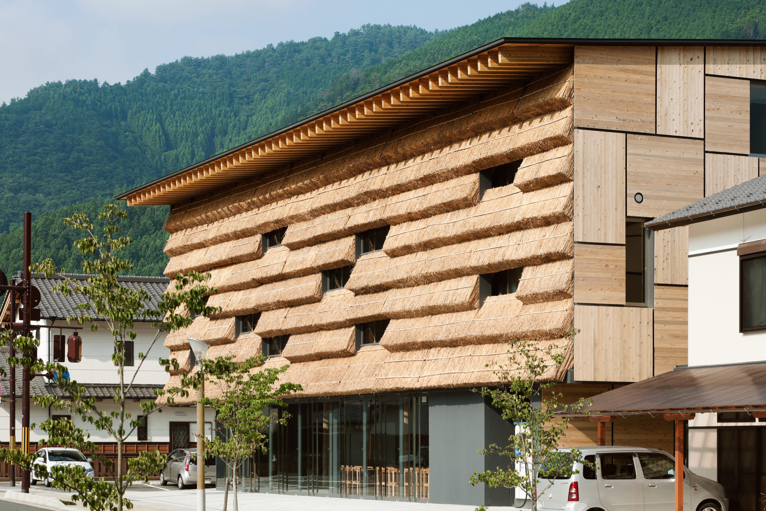
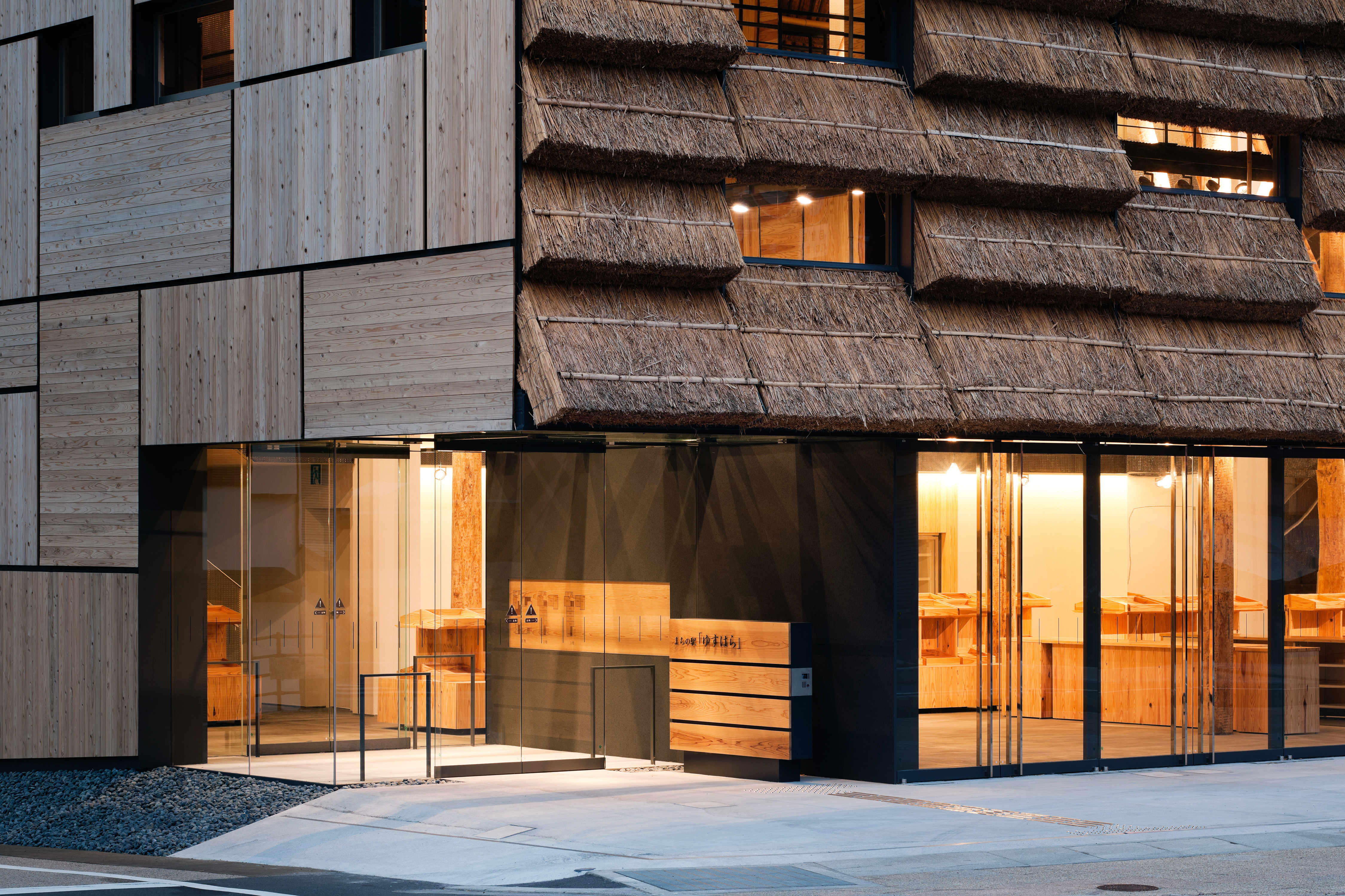 Materials in Kuma’s work are widely diverse. Yusuhara Machino-eki is a complex of a market selling local products and a small hotel with fifteen rooms. Combining the two different functions via atrium, a new core facility was born for the town of 3,900 in the mountains. As an attempt to respect this history, the team used thatch as the material, which is deeply related to “Cha Do,” which worked as a medium to connect the past with the present. Glass fittings are used for the lower part of the building, including the market’s entrance facing the front road, which can be open at any hour of the day, and on top of it come piles of the straw.
This straw unit created an unprecedented form for a curtain wall. Normally in a thatched roofing, thatch is fixed vertically against the foundation, in which its cut ends face towards outside. In this building, however, the bunch of thatch is bound horizontally to the foundation, with which the cut end won’t be exposed to rainfalls, and will last long. As another device, pivots are set on the steel mullion at the both ends of each thatch unit, so that it can rotate and take in fresh air from outside, which will the maintenance of the thatch easier.
Beijing Qianmen
Beijing, China
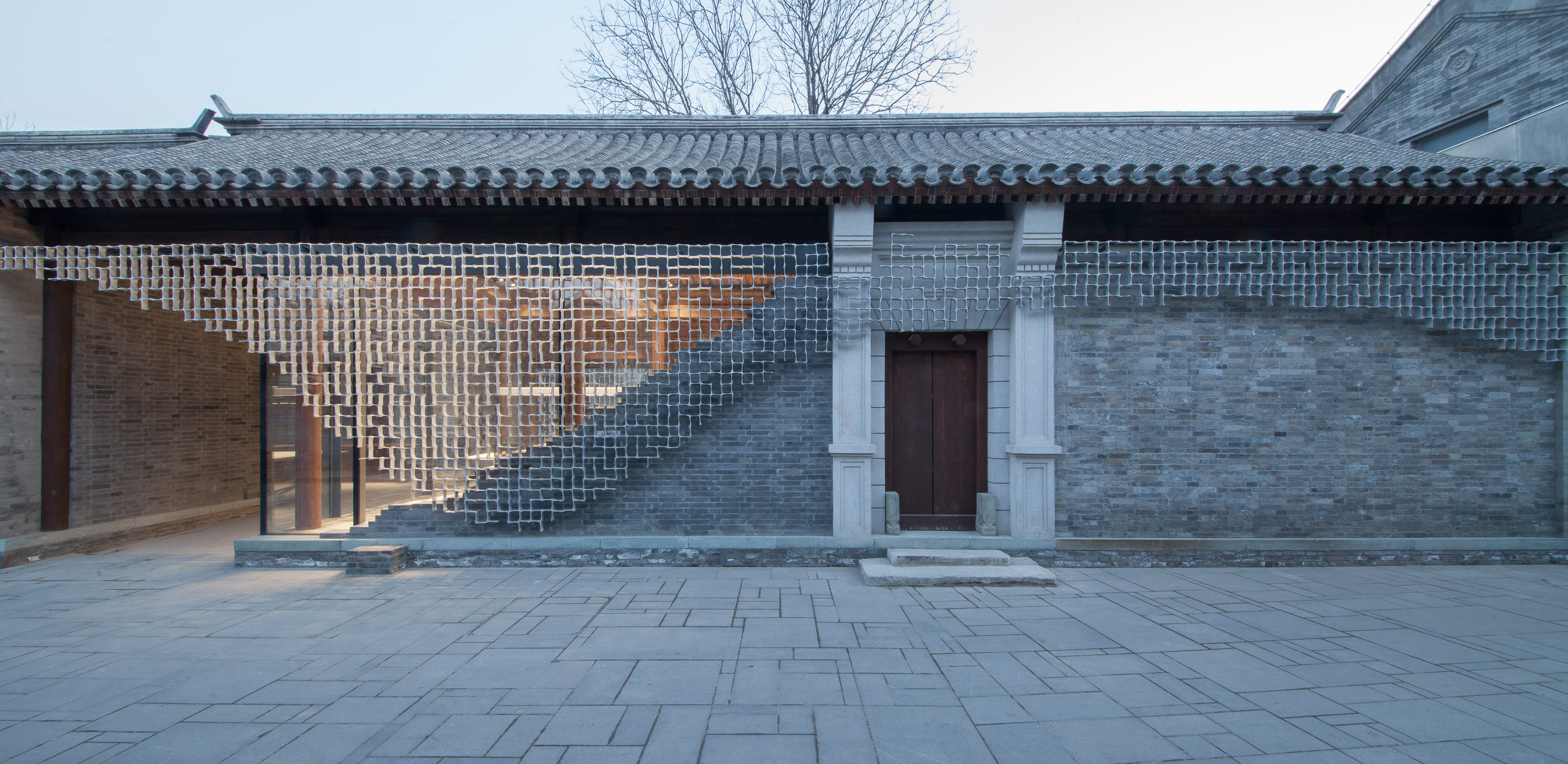
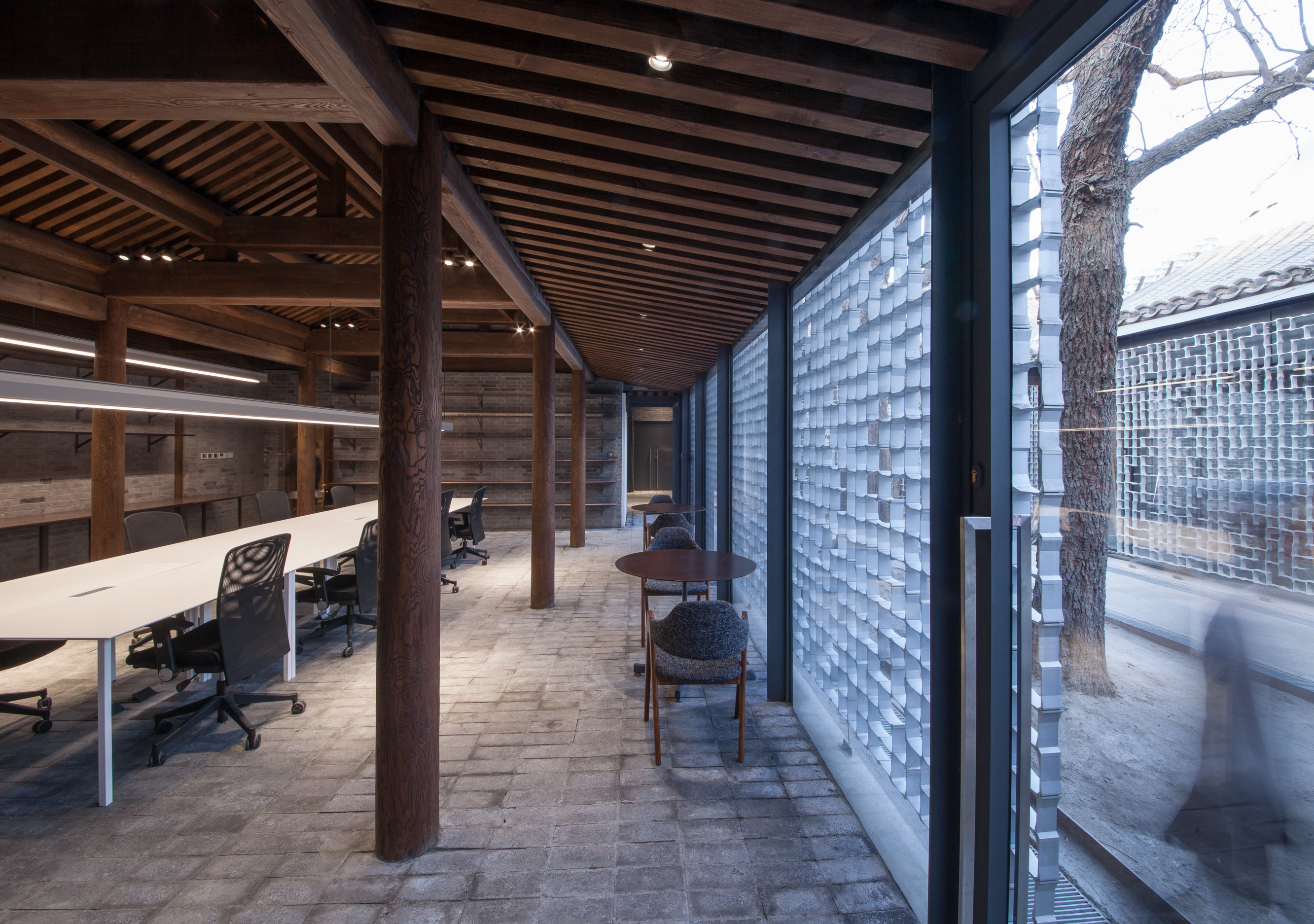 Kuma’s work combines both attention to detail with larger conceptual approaches. This project is located close to Tian’anmen Square and Chang’an Avenue. The team undertook the renovation of this area called Qianmen East. It used to be a district in which classical Qing/Ming-styled courtyard houses concentrated. However, with the explosive growth of population in big cities, these houses began to be occupied by people who were strangers to each other. As a result, the historical Siheyuan (courtyard houses) became like a slums, and was even called Da-zayuan (messy dwellings).
The team’s aim was to rejuvenate the entire place as an open community, by transforming it to a townscape that contains mixed programs. They designed the exterior as a combination of brick wall and glass curtain wall with extruded aluminum screen. Their version of Siheyuan came to open up to the street, bringing in free atmosphere and well-controlled transparency. The parts that consist of the aluminum extrusion are in simple 2 types. By assembling them as one might do for jigsaw-puzzle, they formed an organic pattern that respect the design called “Huagechuang” (Chinese lattice pattern, often applied to windows and doors in traditional buildings).
Architizer’s newest print publication is available for pre-order! How to Visualize Architecture is an educational guide designed to help you master the craft of architectural storytelling and visual communication. Secure your copy today.
 Beijing Qianmen
  China Academy of Art’s Folk Art Museum
  Daiwa Ubiquitous Computing Research Building
  Odunpazari Modern Museum
  Portland Japanese Garden
  Yusuhara Marche
