Architizer's 14th A+Awards judging is live! Subscribe to our Awards Newsletter for updates on Public Voting and the big winner reveal later this spring.
Today, our lives are no longer compartmentalized into rigid schedules, nor is the line separating work from leisure as clear-cut as before. When the global pandemic hit in 2020, everyone was forced to work from home, bringing their meetings and busy agendas to the middle of their living rooms, changing much of what we know about the workplace and further blurring the line between the office and the home. That shift later promoted many businesses to uphold the “working from home” setup, at least in a hybrid format with some in-office days, having realized its environmental, financial and social benefits for many.
Following these trends, many businesses are now adopting a comfortable home-like environment — sometimes prioritizing comfort over formality and other times upping their interior decor game to lure employees back to work. These office designs, of course, come without the challenges of WFH policies, such as unexpected family cameos in Zoom meetings and the difficulty of unplugging at the end of a day in the home office. The following trailblazing honorees from the 11th Annual A+Awards awards showcase examples of offices that are so comfortable that employees will feel right at home.
Bay Area Research Company
By SkB Architects, CA, United States
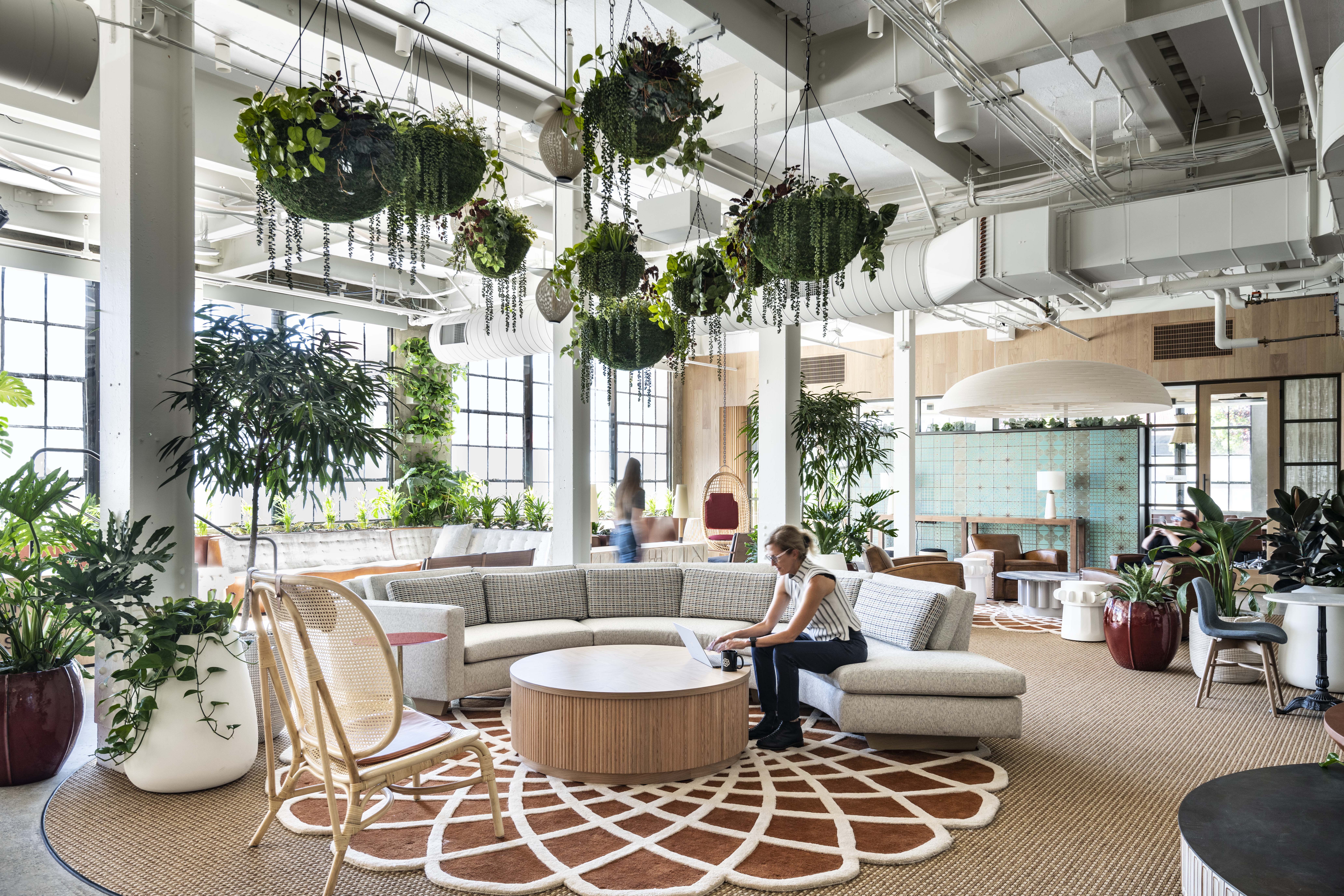
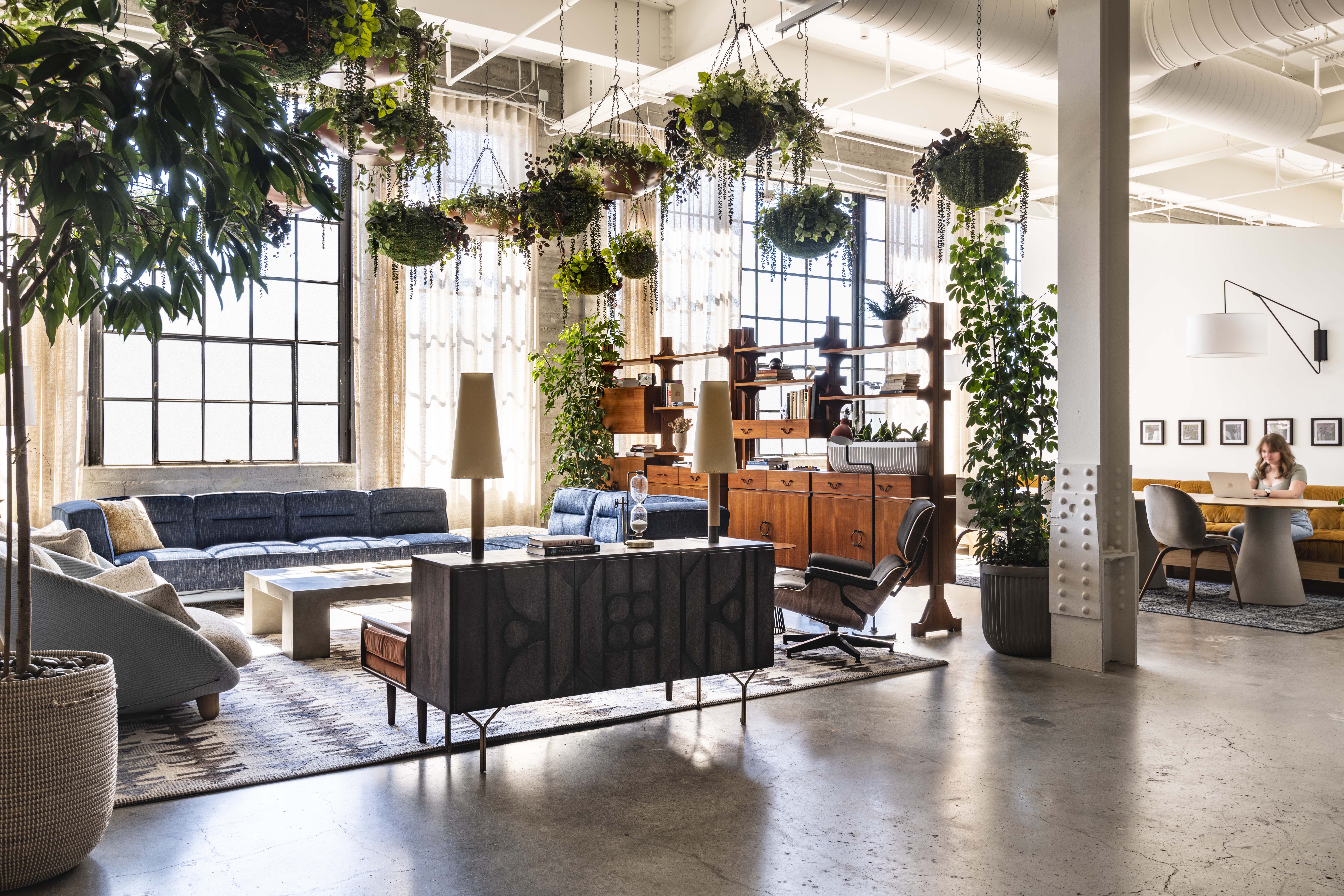
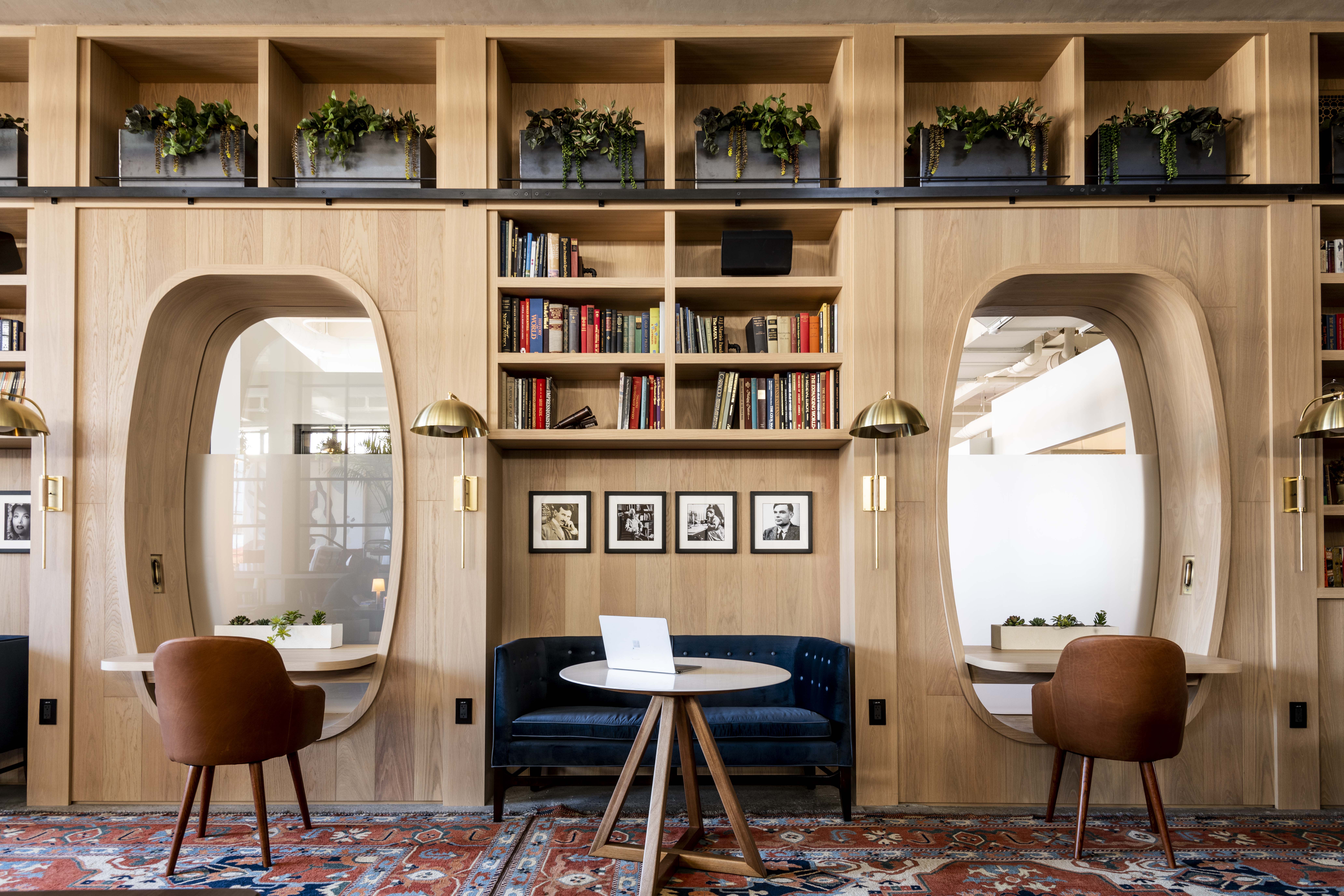 Entering this think tank feels like entering someone’s living room, you almost feel like you need to knock first. Designed as an engaging and emotion provoking workplace that seamlessly flows between what used to be two warehouses in the Bay Area in California, this design research company adopts what the designers termed as a “better-than-home” concept, achieved through the selection of furniture, carpets, plants and materials that have contributed to producing a very relaxing and tranquil work environment. The workspaces are distributed over a wide variety of smaller spaces anchored in the open floor plan and staggered vertically across a number of split levels that together enrich the user experience for the employees, guests and collaborators.
EDGE Suedkreuz Berlin
By TCHOBAN VOSS Architekten GmbH,
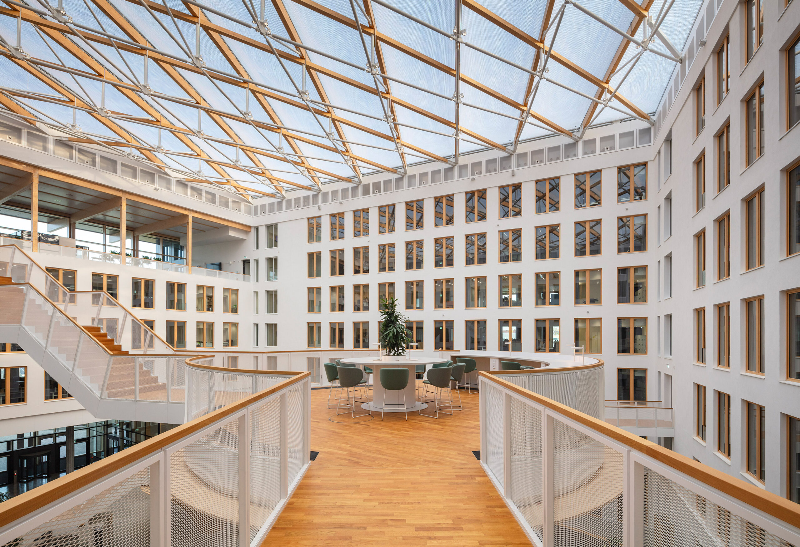
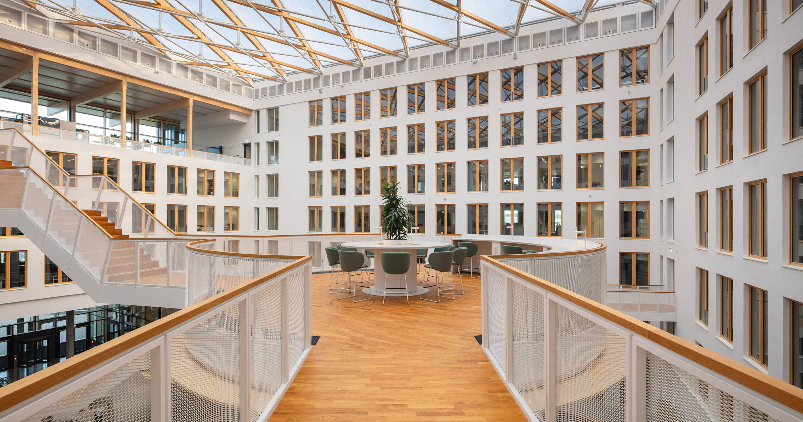
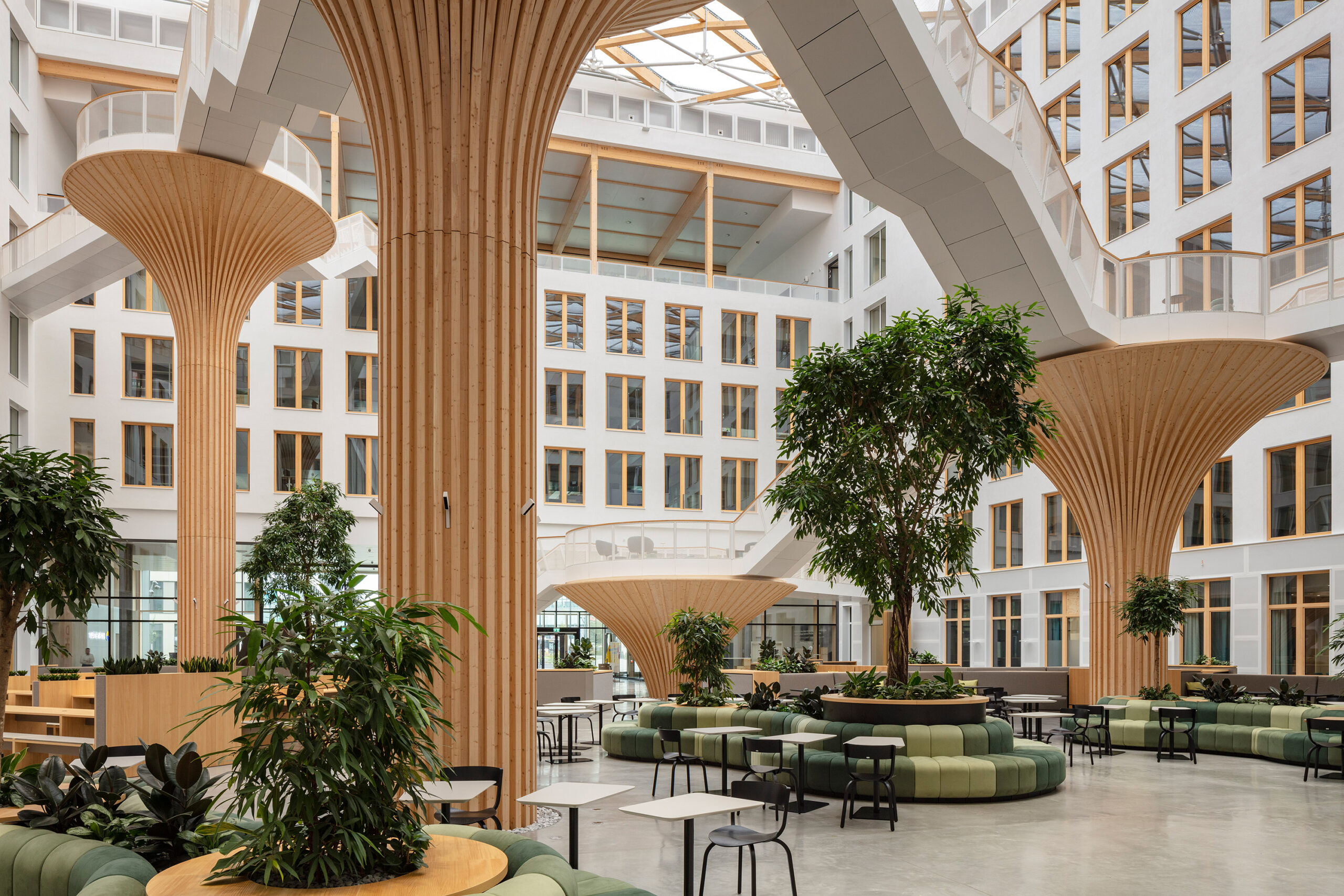 From the outside, the two newly designed EDGE office buildings facing Hedwig-Dohm-Strasse in Berlin give no hint of what their insides look like, presenting employees a pleasant surprise once they enter. Inside the “Carré” building, the larger of the two buildings, a generously naturally lit atrium almost looks like a play area for adults, with its design blurring the boundary between the inside and the outside.
This atrium is playfully furnished with a web of tree like wooden structures that offer a variety of platforms for recreation and communication, connected by a network of by filigree steps that facilitate circulation across the building’s different parts. The sustainable state of the art design of both the buildings, which won the project the DGNB Platinum and DGNB Diamond awards, produces a healthy and vibrant work environment for employees and ensures the longevity of the buildings and the reusability of its materials.
DB55 Amsterdam
By D/DOCK, Amsterdam, Netherlands
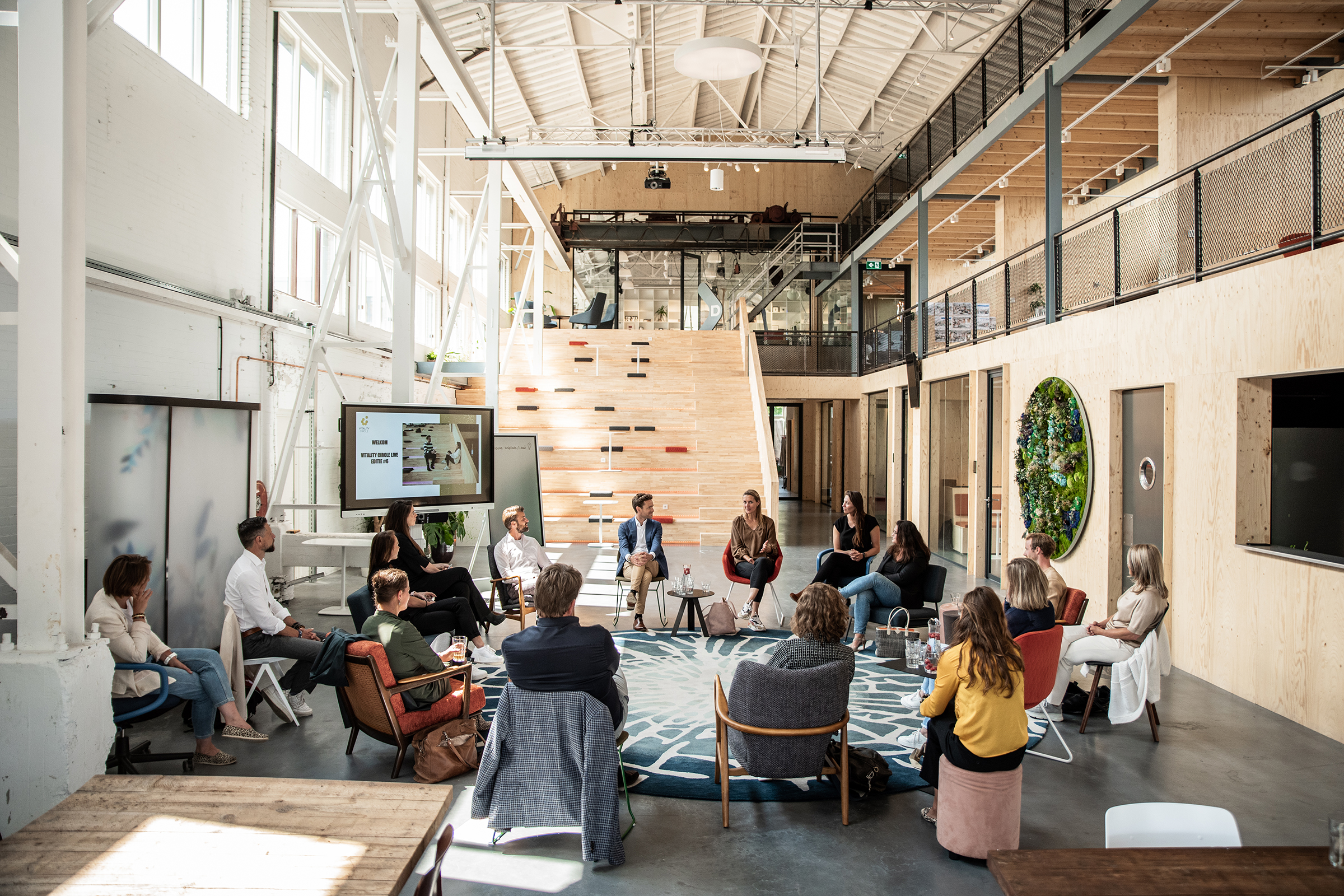
Photo by Sherine Zwaga
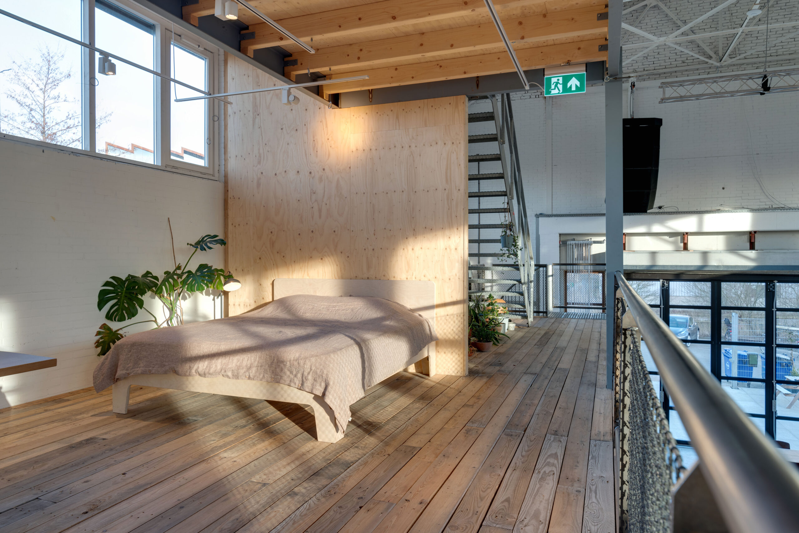
Photo by Niels Vlug
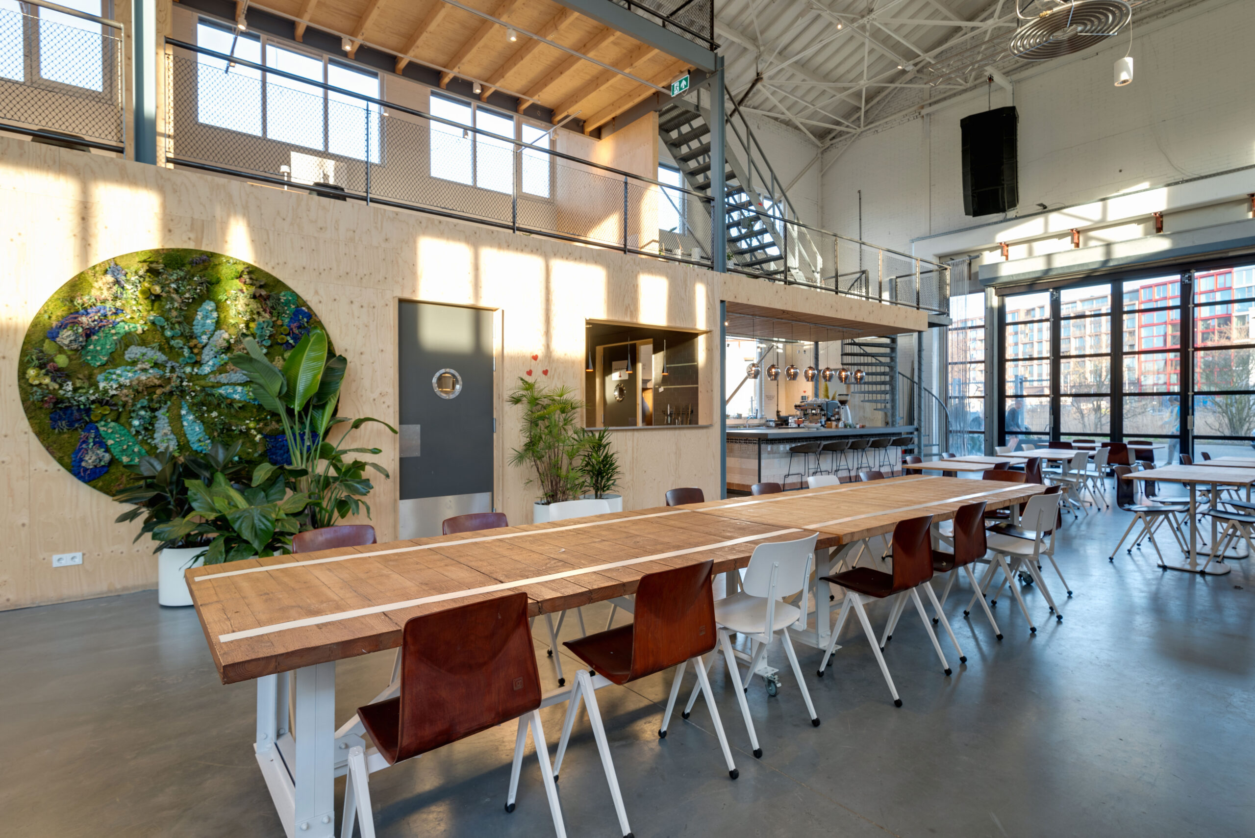
Photo by Niels Vlug
It is hard to tell what this place is for at first glance, given the variety of activities taking place around the miscellaneous furniture spread out across this building’s different sections. From a bed to a huge dining table and an abdunance of plants, the open floor plan contains a variety of levels where so much is going on at the same time. For those reasons, it comes as no surprise that this building, which used to be a timber warehouse, has a program that combines work and leisure, giving space to different events and even making room for a children’s playground. The array of windows on the top of the building connect the building with the outside and create a pleasant indoor experience, flooding the central open space with its double volume with natural sunlight, while the natural wood that is used in various elements of the interior give a soft and tranquil work ambiance.
Kabelovna Studios
By B² Architecture ,Praha, Czechia
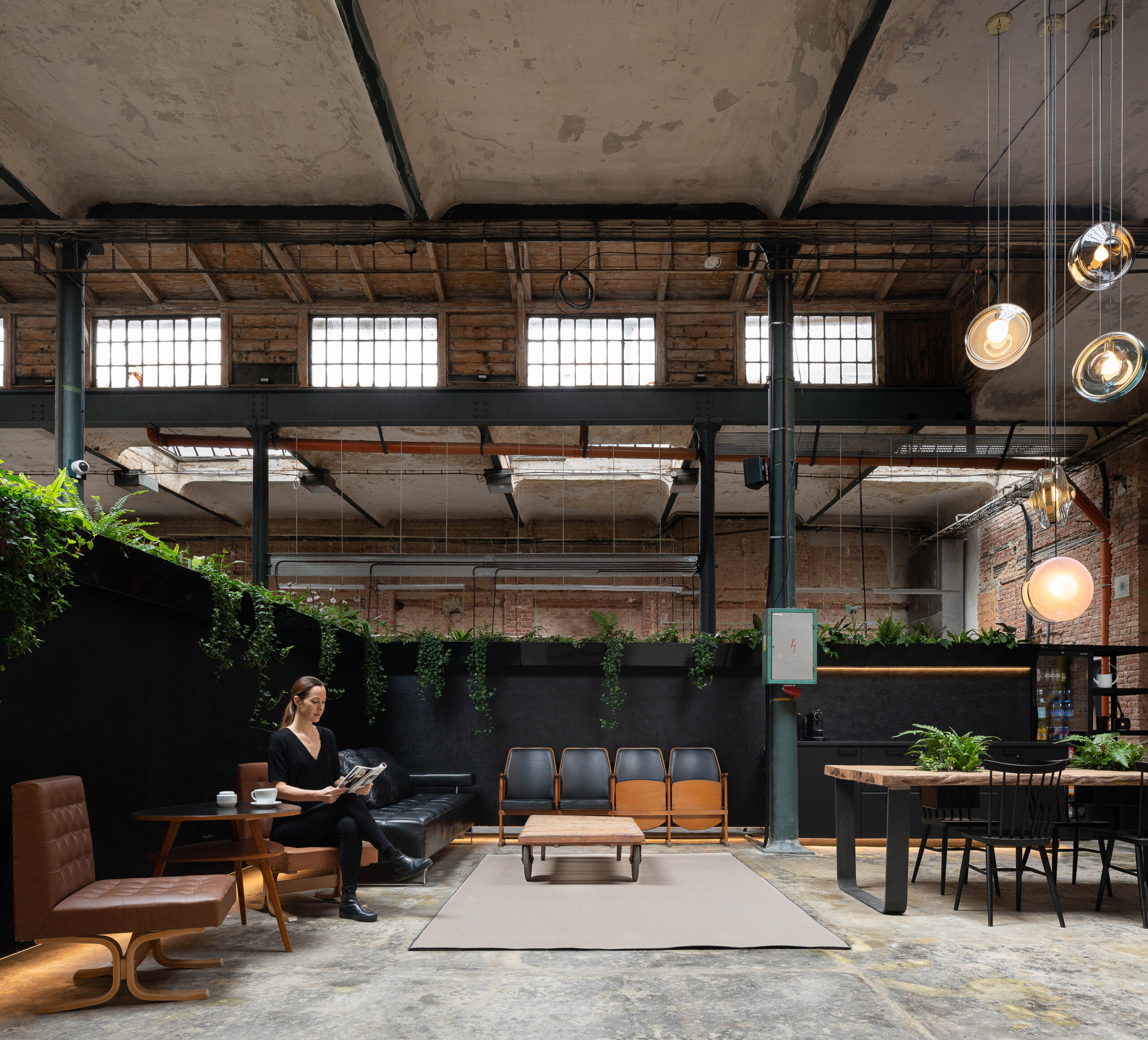
Photo by Alex Shoots Buildings
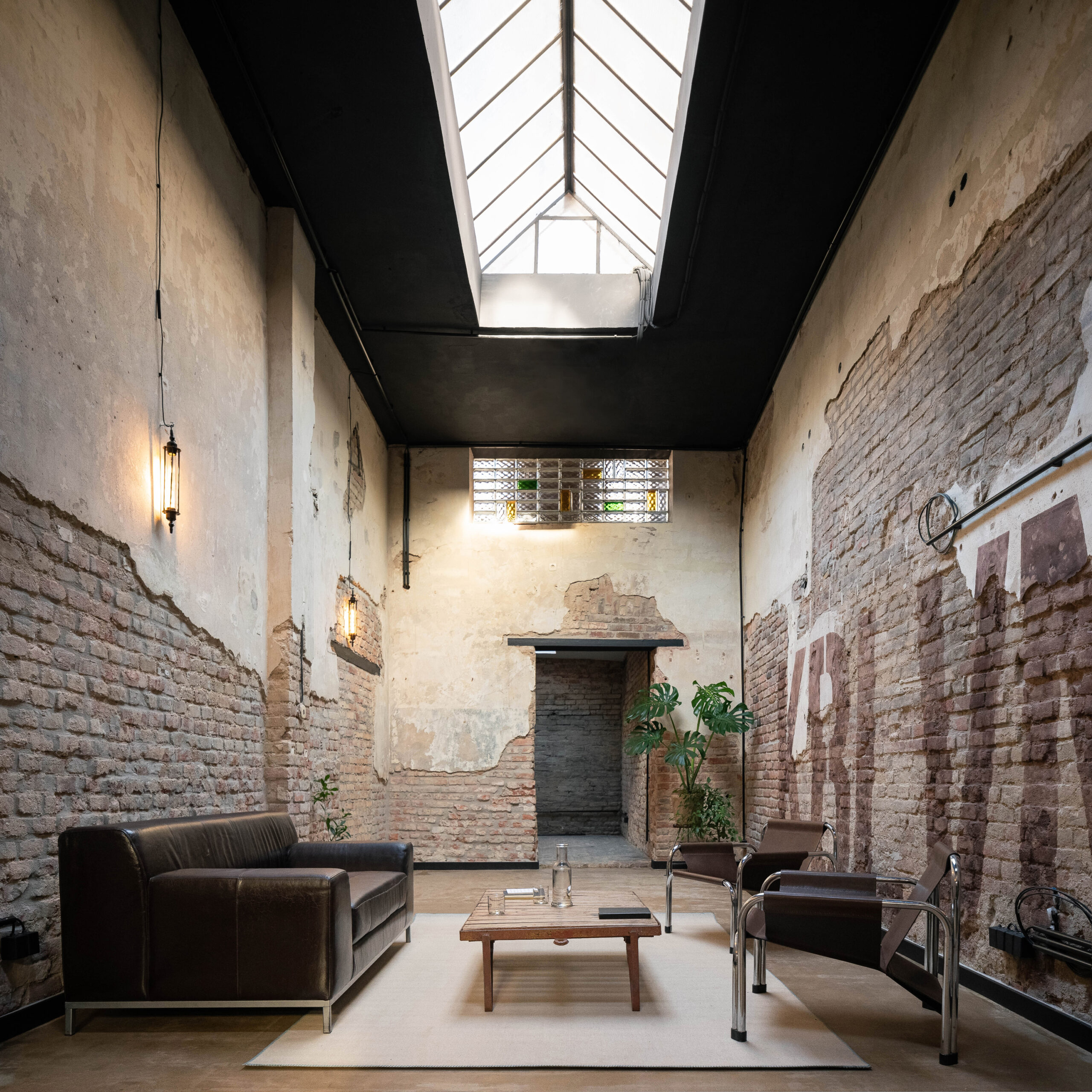
Photo by Alex Shoots Buildings
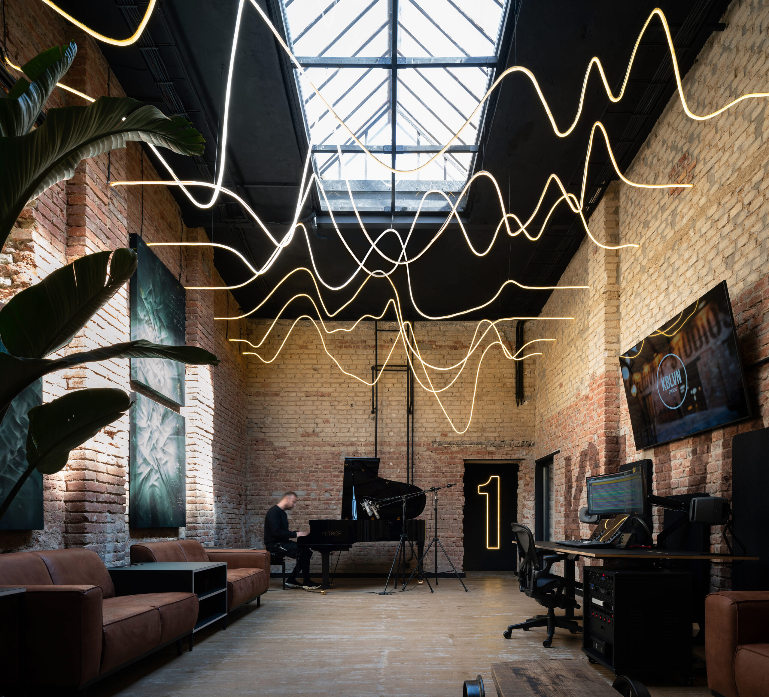
Photo by Alex Shoots Buildings
Set in what used to be a cable making factory, the super cozy atmosphere of this recording studio was established through the generous use of plants and the floods of natural sunlight that light up the entire space and allow an interplay of shades and shadows that complement the interplay of the musical notes across the sheets. The different recording studios are distributed around a central “living room” with a seating area and a kitchen, with the high ceiling giving a generous breathing space and the restored brick walls giving the studio a rustic and authentic character that offers a rich background for the recording artists.
Shenzhen Yeahka Office
By JSPA Design, Shenzhen, China
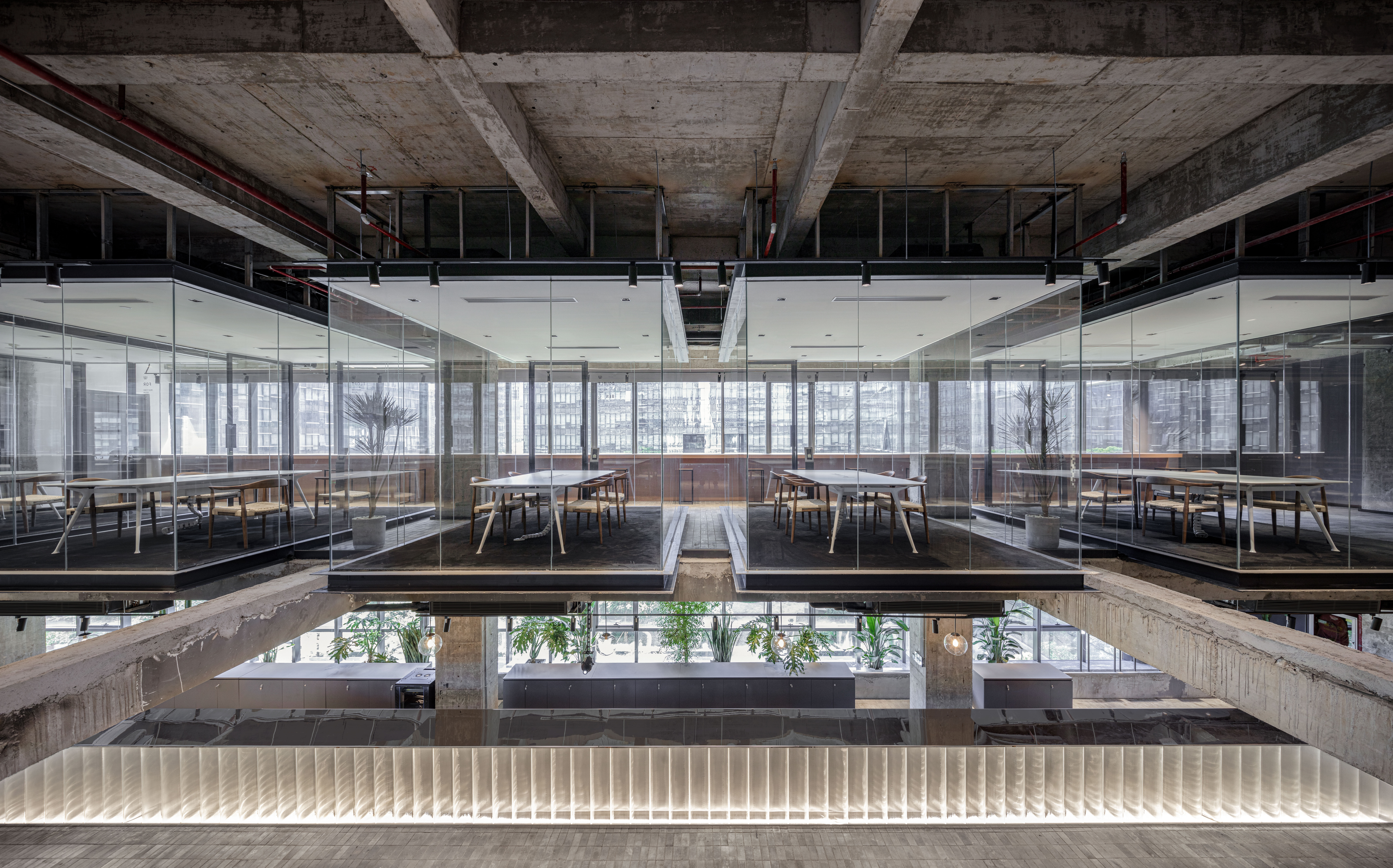
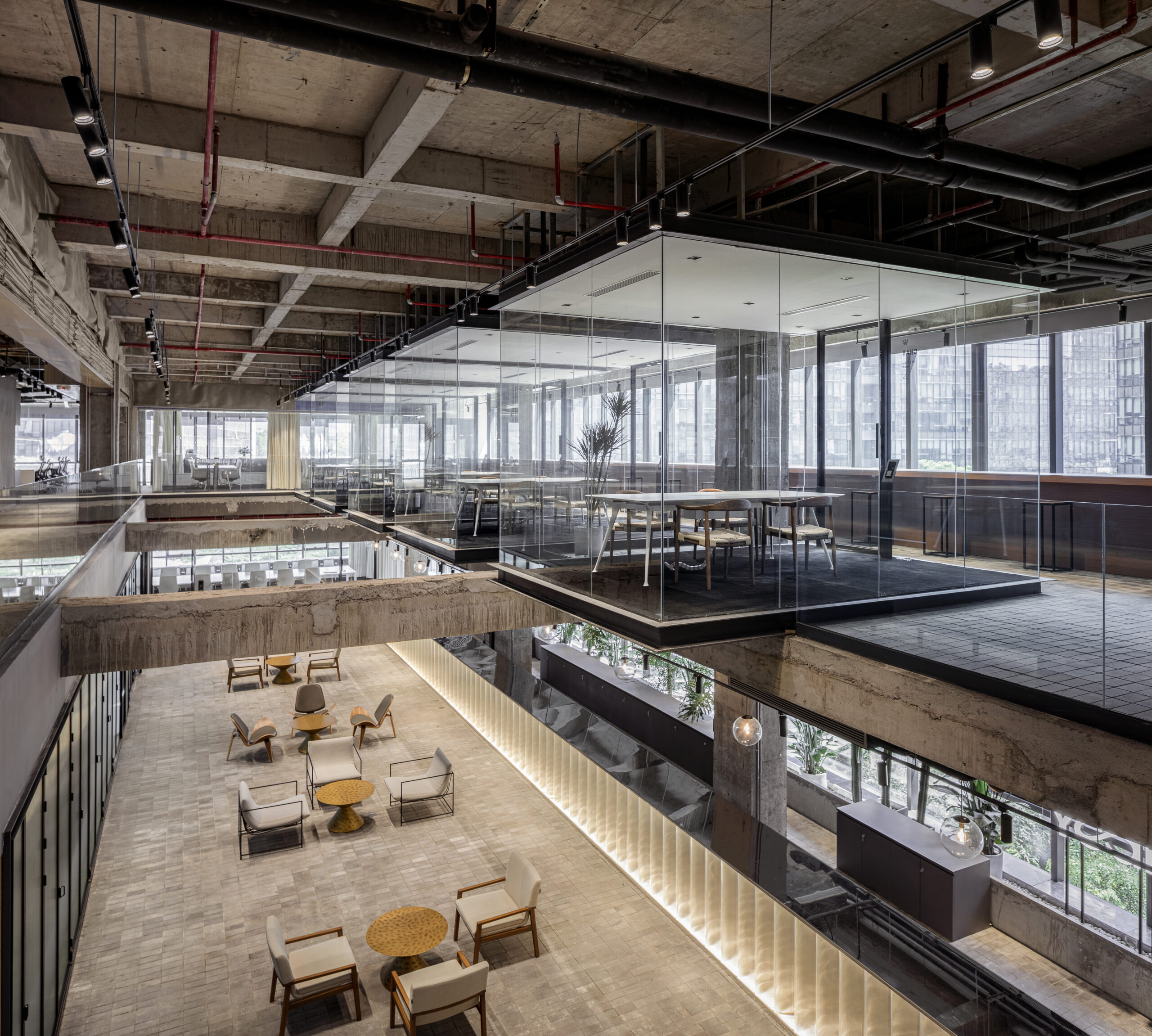
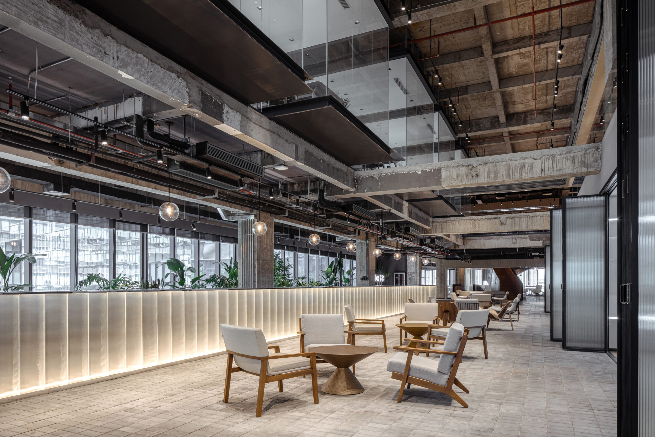 The interiors of the Yeahka headquarter office look like an ultra modern apartment set in a futuristic movie scene, with meeting tables hovering over the building’s central space inside glass boxes and the exposed structure of the refurbished building boldly exposed. The rough appearance of the building’s envelope is nicely contrasted with the use of softer materials and lighter colors for the partitions and the furniture, while the high ceilings allow floods of natural sunlight to travel across the office’s atriums and establish a variety of visual connections for visitors and employees across the different floors.
Casa Pich i Pon. LOOM Plaza Catalunya
By SCOB Architecture & Landscape
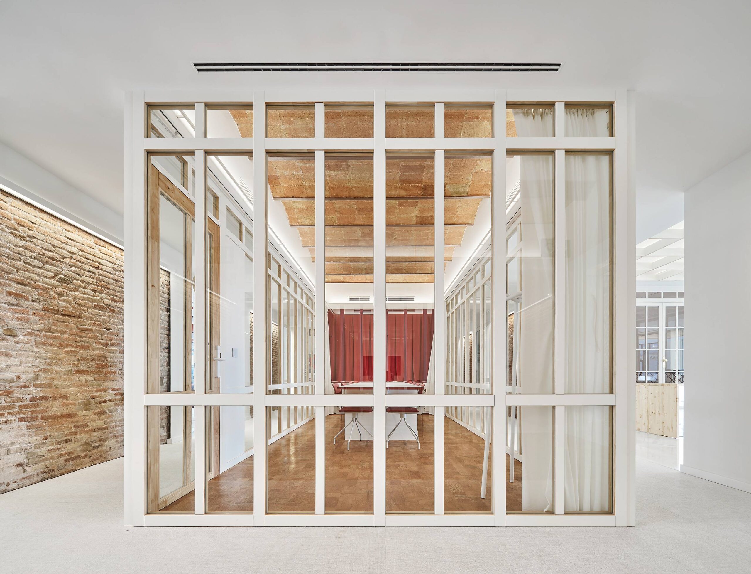
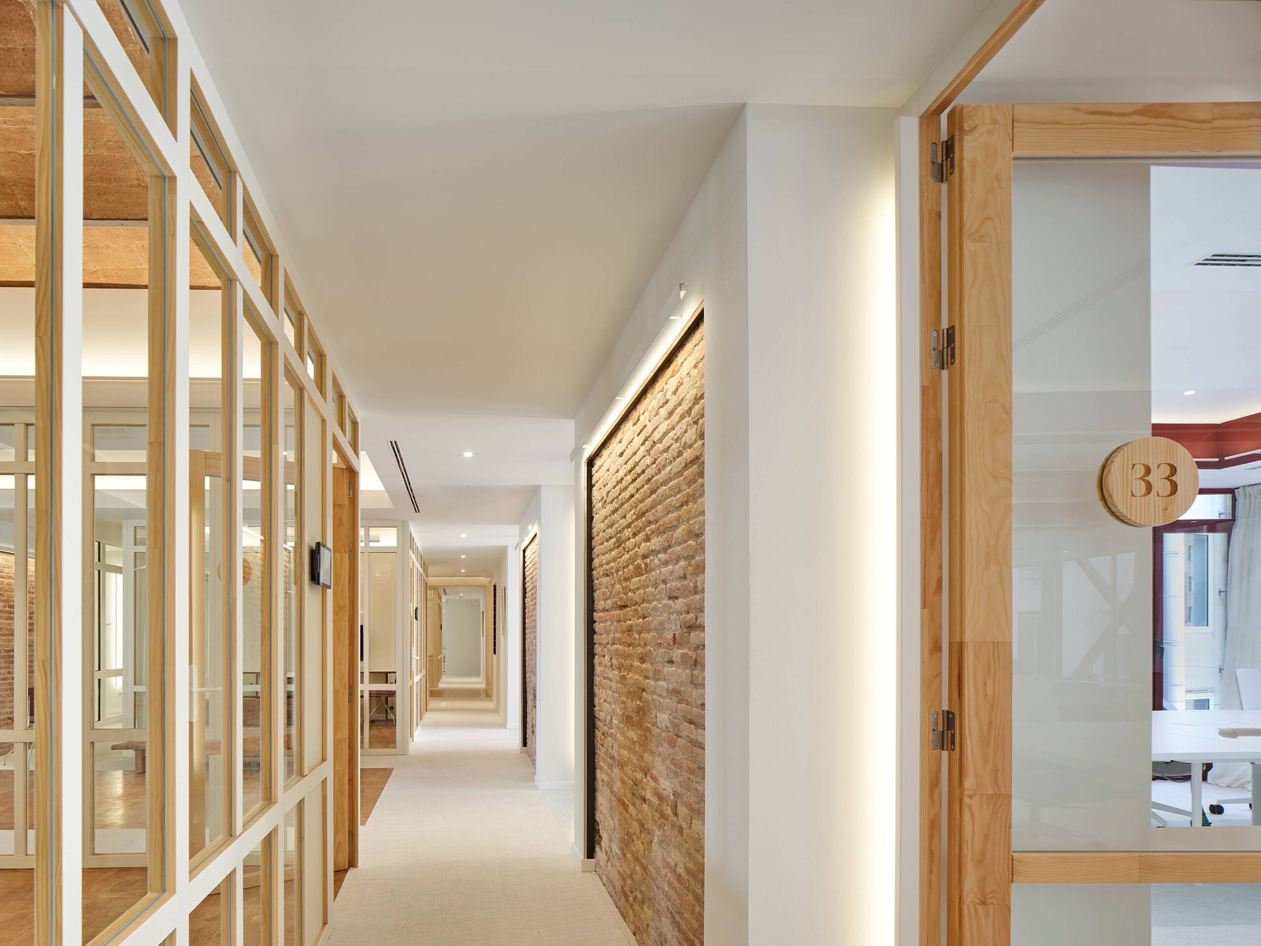
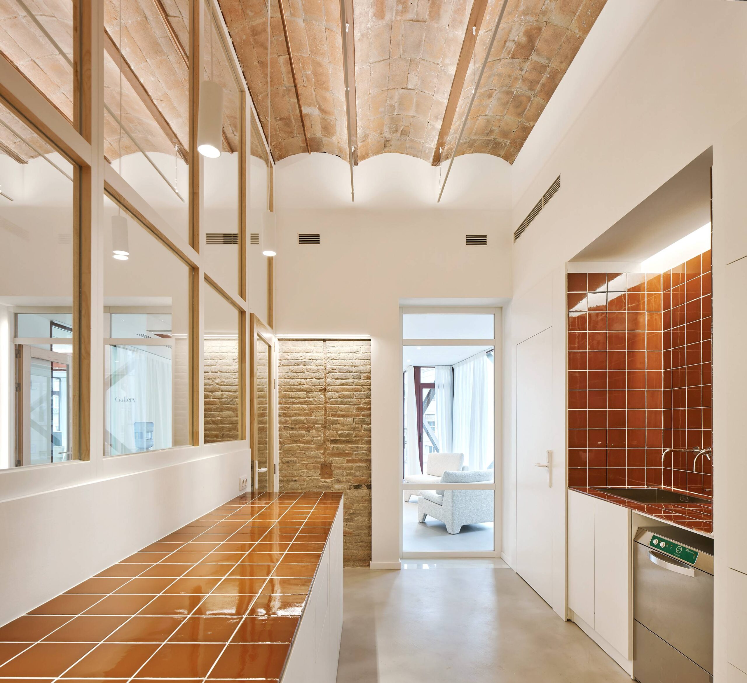 Aesthetically, the organization of this office space is remarkably appealing, allowing the eye to travel across a variety of layers and vertical lines around every corner. Whether it is through the contrast of materials, or the perfect positioning of the working chambers inside the open floor plan, a lot is happening inside this refurbished historical building whose celebratory classic exterior celebrates a masterpiece of its time. The color white, which dominates the interior, sets the stage for the other materials to occupy the space, particularly the red brick walls that stand as a reminder of the building’s rich past.
Architizer's 14th A+Awards judging is live! Subscribe to our Awards Newsletter for updates on Public Voting and the big winner reveal later this spring.
