Architects: Want to have your project featured? Showcase your work through Architizer and sign up for our inspirational newsletter.
Just like cities and neighborhoods, buildings go through many life stages. For example, many adaptive reuse designs feature “blind” windows, fenestration passed down from a previous life now blocked up with bricks. These features seem counterintuitive, blocking light and losing the possibility of increased ventilation. It is worthwhile excavating these waves of change and the various circumstances under which such interventions occur.
The following projects include many types of brick façade alteration and adaptation. Grappling with both historical context and contemporary identity, each featured project is concerned with revealing a perfect marriage between restoration and renovation. Dealing with one of the most salient and contested themes in contemporary construction, the architects were faced with an unforgiving challenge — how can additions to historic buildings be respectfully revitalizing? The architects behind these seven projects provided admirable answers to this challenging question.

© Herzog & de Meuron

© Herzog & de Meuron

© Herzog & de Meuron
CaixaForum by Herzog & de Meuron, Madrid, Spain
The CaixaForum is an urban magnet, attracting art and design lovers from Madrid and beyond. After the removal of the building’s original base, the structure — a heavy mass — appears daringly detached from the ground, in defiance of gravity. The only material from the old power station that was both reusable and retained was the building’s brick shell.
© Dennis De Smet Photographs

© Dennis De Smet Photographs
© Dennis De Smet Photographs
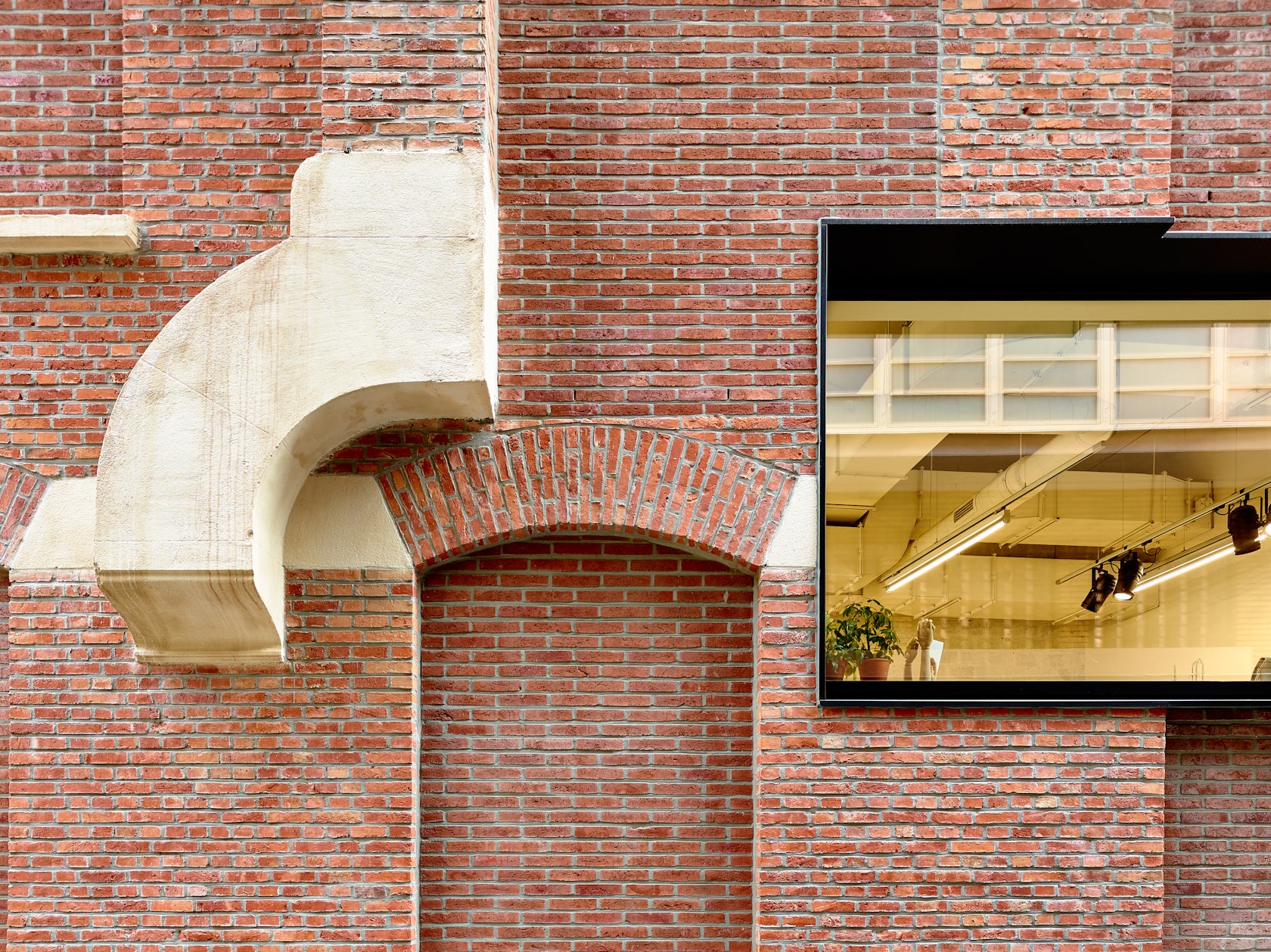
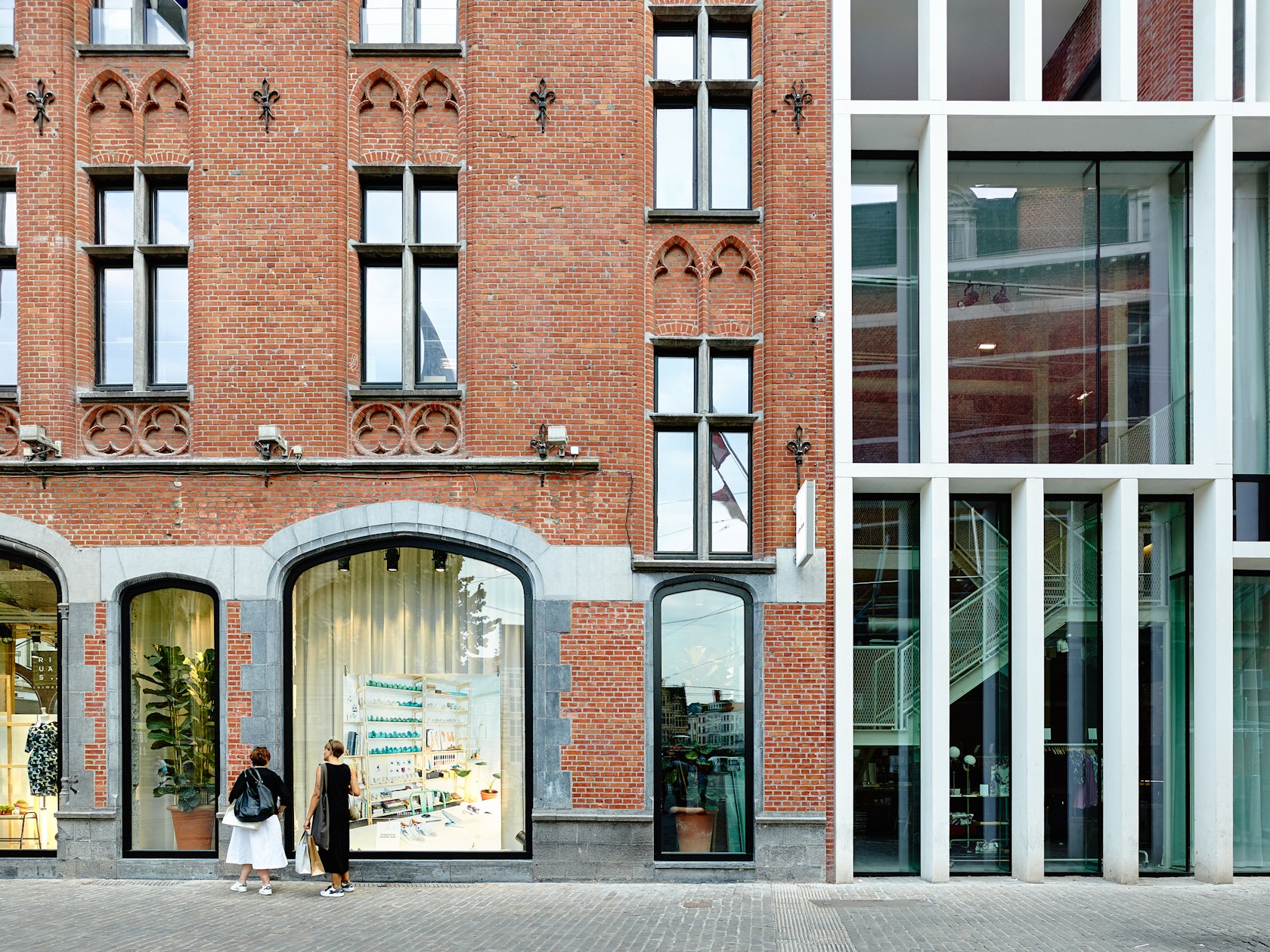
Schuurkensstraat by Abscis Architecten, Ghent, Belgium
A project that combines renovation and reconstruction, Schuurkensstrat exhibits a fascination with adaptive design and combining elements old and new. Over a layer of old windows, balconies and chimneys, a zinc roof volume and new window openings were added, which contrast the historical elements in both material and typology.
© MAMOUT

© MAMOUT

© MAMOUT
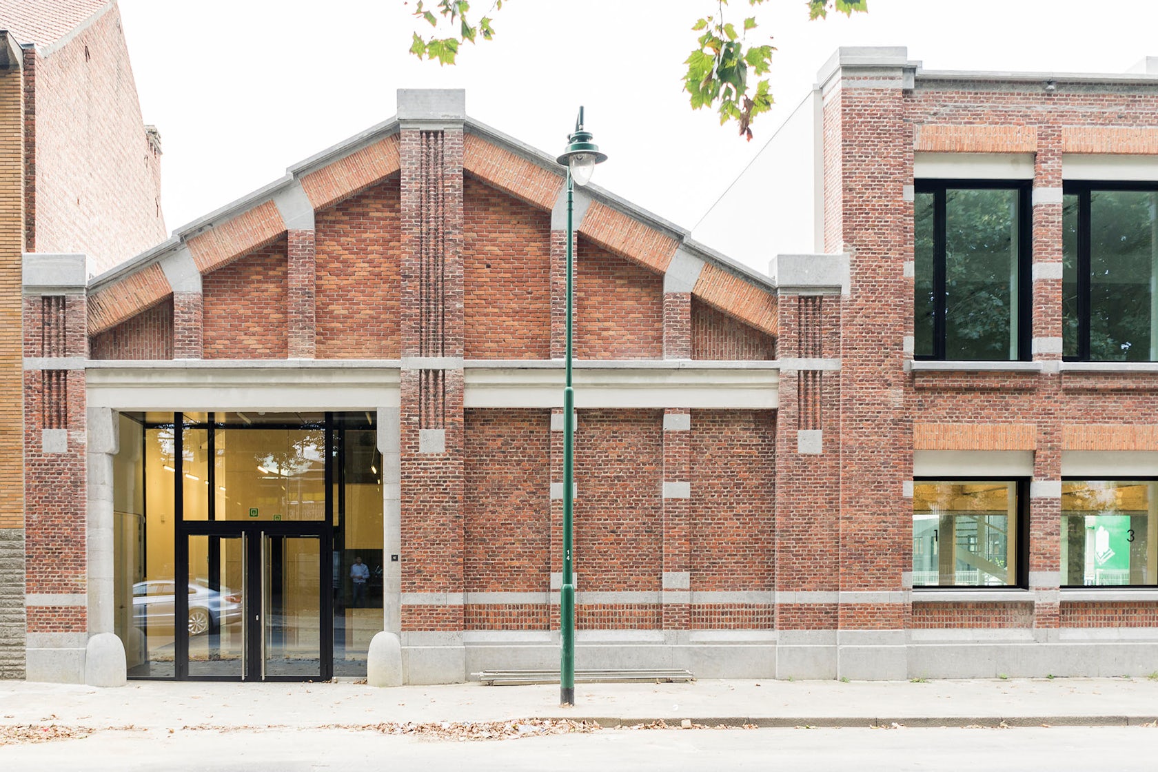
Charles Malis by MAMOUT, Sint-Jans-Molenbeek, Belgium
Previously a complex for cigarette production, only two volumes remained after several were demolished. The task was to transform the site into a local city hall branch. Even though each volume has a unique spatial identity, all are linked by the decorative front façade made out of ornamental bricks and blue stone. While the existing structure remained largely untouched, the façades were improved to achieve greater wellbeing for visitors and employees.

© Jim Stephenson Architectural Photography + Films

© Jim Stephenson Architectural Photography + Films
© Jim Stephenson Architectural Photography + Films
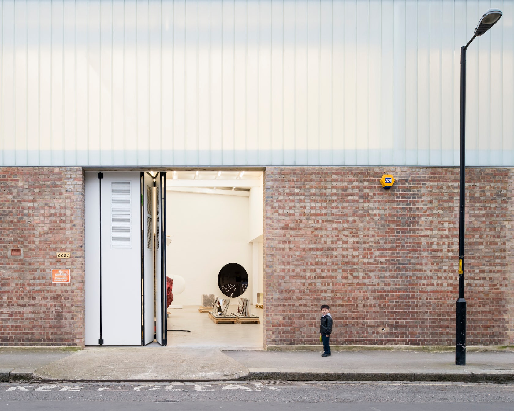
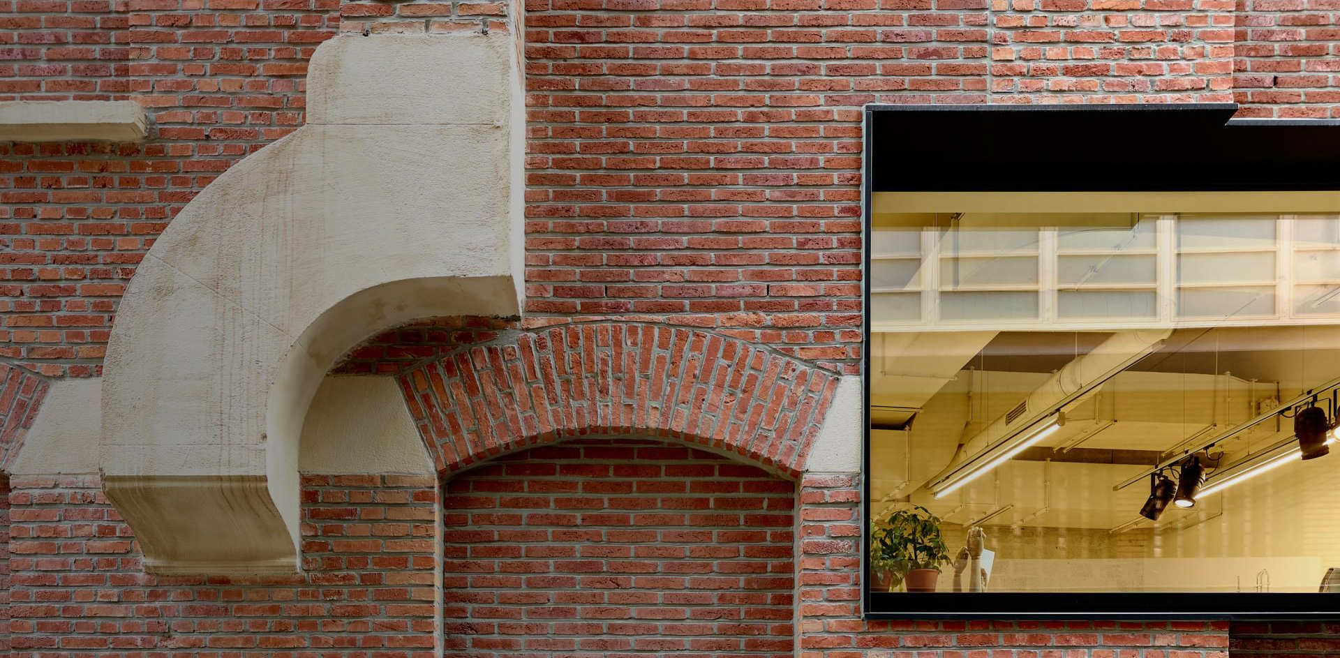
Anish Kapoor Studios by Caseyfierro Architects, London, United Kingdom
This project consists of six separate spaces that were incrementally transformed in order to allow for continuous use of the site. The history of the pre-transformed spaces was retained, with archaeological surfaces, drawing and sketches left untreated. The new spaces are naturally lit through glazed sky lights.

© Petreschi Architects

© Petreschi Architects
Bank of Albania HQ Renovation by Petreschi Architects, Tirana, Albania
Careful to maintain the building in its original splendor, the architects sought to bear witness to Rationalism, the period of international and Italian culture through which this site was built. All aspects of the historic building — architectural, structural, mechanical and technical — were restored and upgraded. Dialogue between the new and existing architecture was nurtured through obtaining the same materials as the old building: brick and Trani stone.

© Fotografia Maciej Lulko

© Fotografia Maciej Lulko
© Fotografia Maciej Lulko
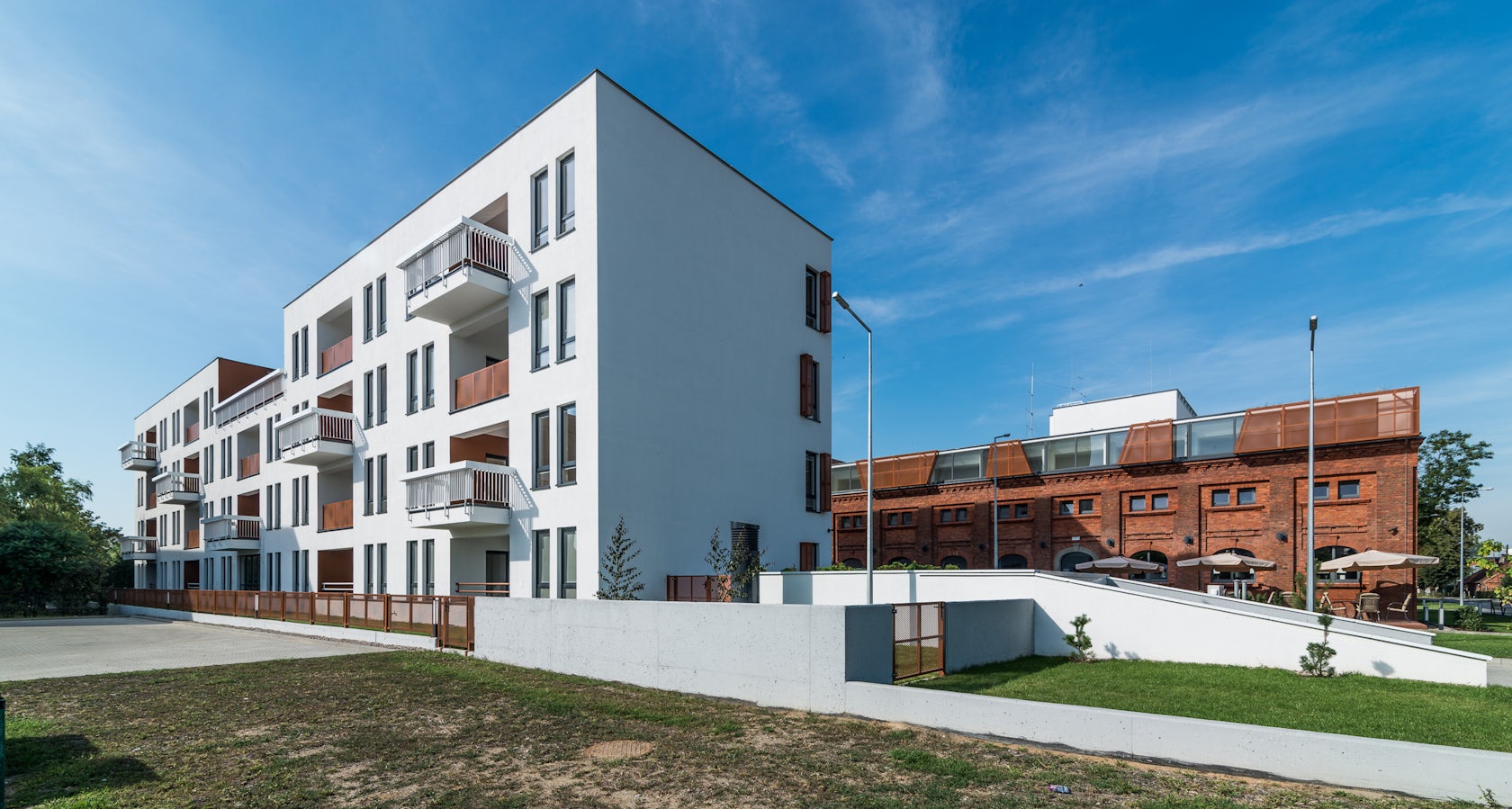
Elderly Healthcare and Residential Building with Hotel and Restaurant by NA NO WO architekci, Lesznow, Poland
Converting the site into a healthcare complex for the elderly, this project involved the restoration and extension of three farm buildings, and the construction of one additional building. One of the major design challenges was to convert the 19th-century stables such that they could support new functions. Thus, the structures needed to be subjected to reconstruction and expansion. Foundations were excavated, ceilings were raised and a recreational terrace was built.
© Doyle Collection Co. Ltd.
© Doyle Collection Co. Ltd.
© Doyle Collection Co. Ltd.
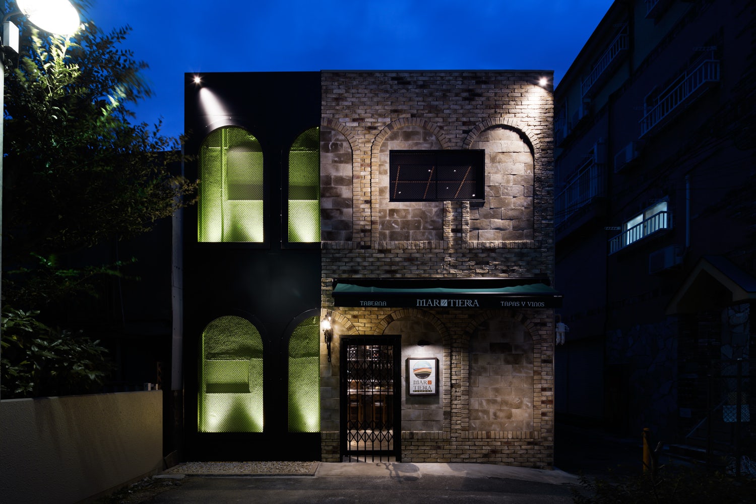
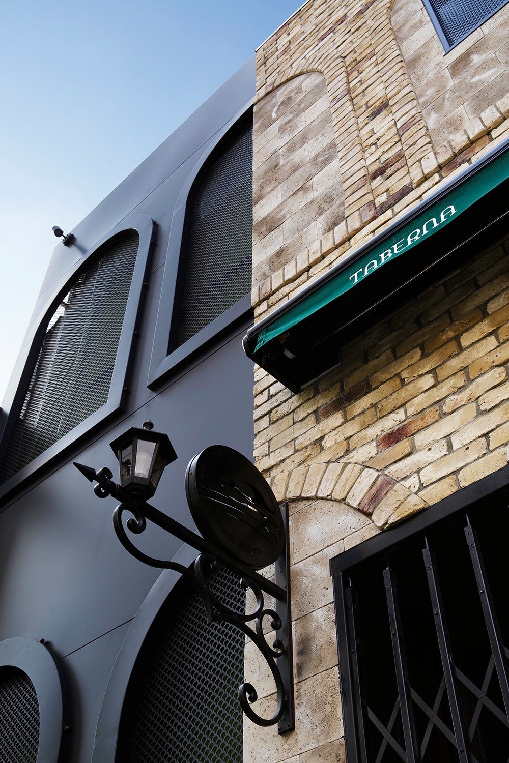
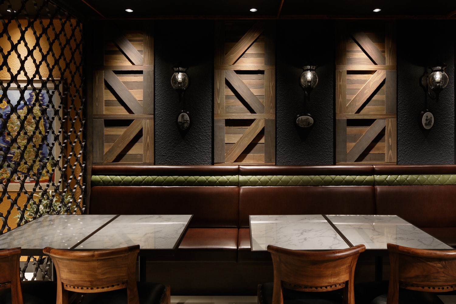
Mar y Tierra by Doyle Collection Co. Ltd., Tokyo, Japan
Located at the end of an alley with high-level visibility, the architects sought to create a unique façade that honored the Spanish cuisine and culture presented inside. Missing gaps of the wall were filled in order to create one large surface that would connect to the other walls. In order to emphasize new ideas, they also altered the materials and lighting productions.
Architects: Want to have your project featured? Showcase your work through Architizer and sign up for our inspirational newsletter.
 Anish Kapoor Studios
  Bank of Albania HQ Renovation
  CaixaForum
  Charles Malis
  ELDERLY HEALTHCARE AND RESIDENTIAL BUILDING WITH HOTEL AND RESTAURANT
  Mar y Tierra
  Schuurkensstraat