Architects: Want to have your project featured? Showcase your work by uploading projects to Architizer and sign up for our inspirational newsletters.
Diagrids have become an iconic architectural element. Living in the age of Foster + Partners’Hearst Tower in New York and the Gherkin in London, these famous buildings boast diamond-shaped weaves that creep up their elongated façades, resembling rockets on a launchpad, prepped and ready for take-off. Over the past decade, diagrids have been frequently incorporated to impress the public and challenge what is geometrically possible.
Composed of an intersecting framework of metal, concrete or wooden beams, the criss-crossing triangular pattern of a diagrid creates a mutually reinforcing support system. Just as you were told in middle-school geometry, triangles will not collapse under pressure, given that its joints are strong enough. With such a functional application, it is intuitive that the sinuous pattern would be implemented and transformed on ceilings — a core structural element of a building.
Interpretations of the diagrid are infinite. This collection shows those employed as structural supports, sculptural elements and dramatic shading screens. Regardless of their initial intention, the diagrid ceiling leads visitors to look up, gaze in admiration, and experience their surroundings under particularly extraordinary conditions.

© Balmond Studio

© Balmond Studio

© Balmond Studio
Serpentine Gallery Pavilion with Toyo Ito by Balmond Studio, London, United Kingdom
The intention of this Serpentine Pavilion was to transform the most ordinary spatial typology — a box — into something extraordinary. Inspired by the intersecting channels throughout London’s Hyde Park, Balmond used a network of crisscrossing lines to form the pavilion’s shape. The sharp structure is composed of supportive steel blades and a checkered pattern of glass and aluminum panels.

© Hufton+Crow Photography

© Hufton+Crow Photography

© Hufton+Crow Photography
King’s Cross Station by John McAslan + Partners, London, United Kingdom
Completed in 2012, John McAslan + Partners were commissioned to modernize and refurbish the historic King’s Cross Station. Representing a vibrant site of civic pride and place-making, the project created a highly expressive concourse, which acts as the beating heart of the design. The building’s dramatic diagrid, which fans out like a massive umbrella, performs as both a sculpture and ceiling.

© Architecture Commons

© Architecture Commons

© Architecture Commons
Hong Kong International Airport Preschoolby Architecture Commons, Hong Kong
The Hong Kong Airport Preschool is a new facility that provides daycare to airport employees. Through extensive glazing, the design takes advantage of the terminal’s high ceilings and proximity to the stunning Lantau Mountains. The daycare’s utilities are lined up against the back wall and defined by a series of pitched roofs. The same shapes are transformed upwards into a wooden diagrid, which wraps the back wall and ceiling. The design accentuates a gradient in both color and pattern.


Hackney Service Centre by Hopkins Architects, London, United Kingdom
Located in London, Hopkins Architects’ Hackney Service Center is a new administrative building that occupies five principal floors. The main focus of the building is an atrium, which features a glazed atrium roof that integrates an array of photovoltaic cells. Such technology helped achieve sizable reductions in the building’s carbon emissions.

© NOJI

© NOJI

© NOJI
Scale of Ply by NOJI, Dublin, Ireland
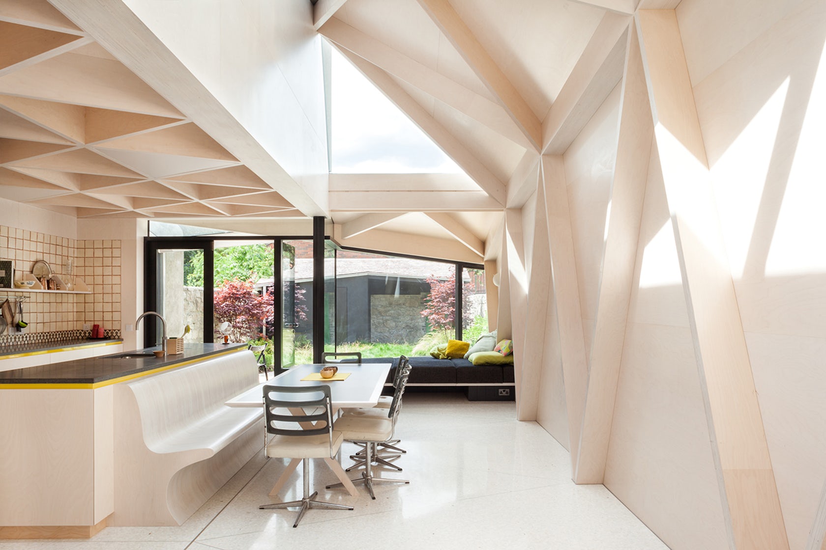
Previously dark and damp, this two-story Victorian house was transformed through a lattice plywood structure, which was carefully shaped in order to allow light to penetrate deep into the plan. For this project, plywood was selected to achieve three goals: strong aesthetics, structural support and economic properties. The structure was prefabricated offsite, which increased accuracy and quality of the build.

© School of Architecture, The Chinese University of Hong Kong

© School of Architecture, The Chinese University of Hong Kong

© School of Architecture, The Chinese University of Hong Kong
ZCB Bamboo Pavilion by Chinese University of Hong Kong, School of Architecture, Hong Kong
ZCB Bamboo Pavilion is an innovative public event space, which is composed of 473 bending bamboo poles, each hand-tied together based on traditional Cantonese bamboo scaffolding craftsmanship. The large diagrid shell structure, which supports a seating capacity of 200 people, is used to host performances and events that promote low-carbon living.

© Foster + Partners

© Foster + Partners
Smithsonian Institute, National Portrait Gallery by Foster + Partners, Washington, United States
The Smithsonian Institute occupies the former United States Patent Building, which was built between 1836 and 1867 and is described as one of the finest examples of Greek Revival architecture in the United States. Since 1958, when the building was rescued from demolition, the site has been designated a National Historic Landmark. The diagrid enclosure of the building’s central courtyard flourished out of a desire to create one of the largest event spaces in Washington.

© IwamotoScott Architecture

© IwamotoScott Architecture
Pinterest HQby IwamotoScott Architecture, San Francisco, Calif., United States
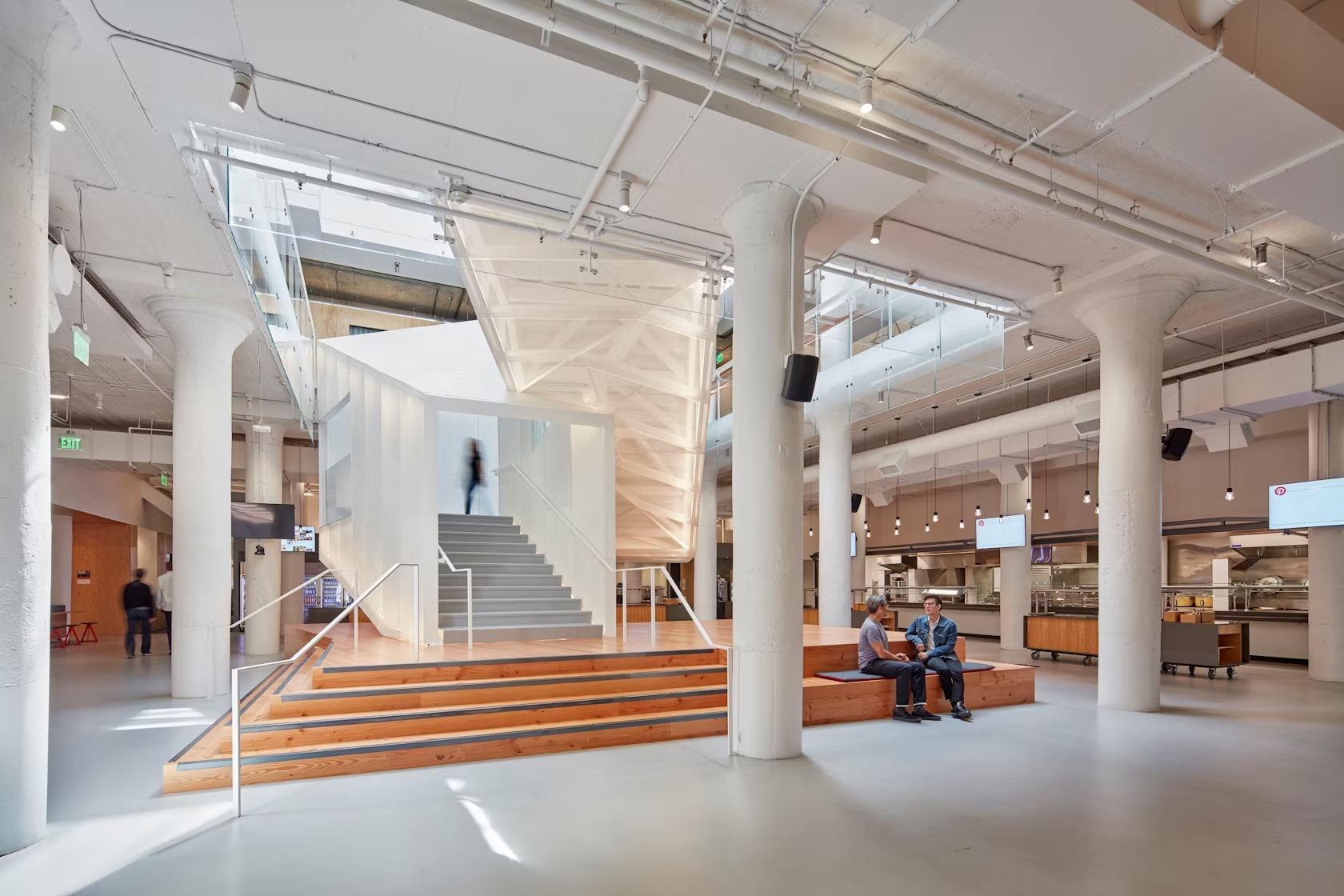
The program for Pinterest’s new headquarters was envisioned as a series of porous layers, which were concentrically designed around an atrium and staircase. At the front of the building, a plywood diagrid waffle acts as the threshold between the city and interior space. The geometric design acts as a canopy above the lobby, reception, coffee bar and public event space.
Architects: Want to have your project featured? Showcase your work by uploading projects to Architizer and sign up for our inspirational newsletters.


