Architizer's diverse jury of global experts is currently reviewing submissions to the 14th A+Awards! Sign up to receive updates on Public Voting and spring winner announcements.
The importance of physical and mental health is felt more and more as days go by. The understanding of healthcare has moved beyond just the treatment of physical ailments and has expanded to include mental wellbeing as well. Building on that, busy lifestyles and stressful environments have led to an increase in retreats and relaxing spaces that can help people disconnect from reality even if for a short while.
In the past decade, A+Awards saw several projects that have shown different ways of crafting spaces for treatment, care and relaxation. While some designers created isolated bubbles of tranquility, others redefined the perception of healthcare structures altogether. Follow the chronological sequence of A+Award-winning entries from the past decade as you consider changing approaches to wellness design.
2013: Pool and Spa Area for a Hotel in Majorca
Estudio A2arquitectos | Balearic Islands, Spain
Popular Choice and Jury Winner, 2013 A+Awards, Health Care & Aging Facilities
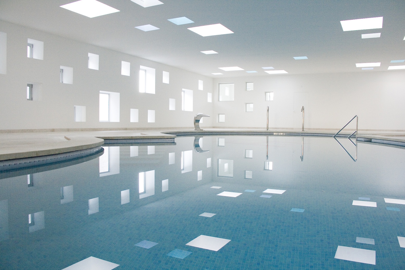
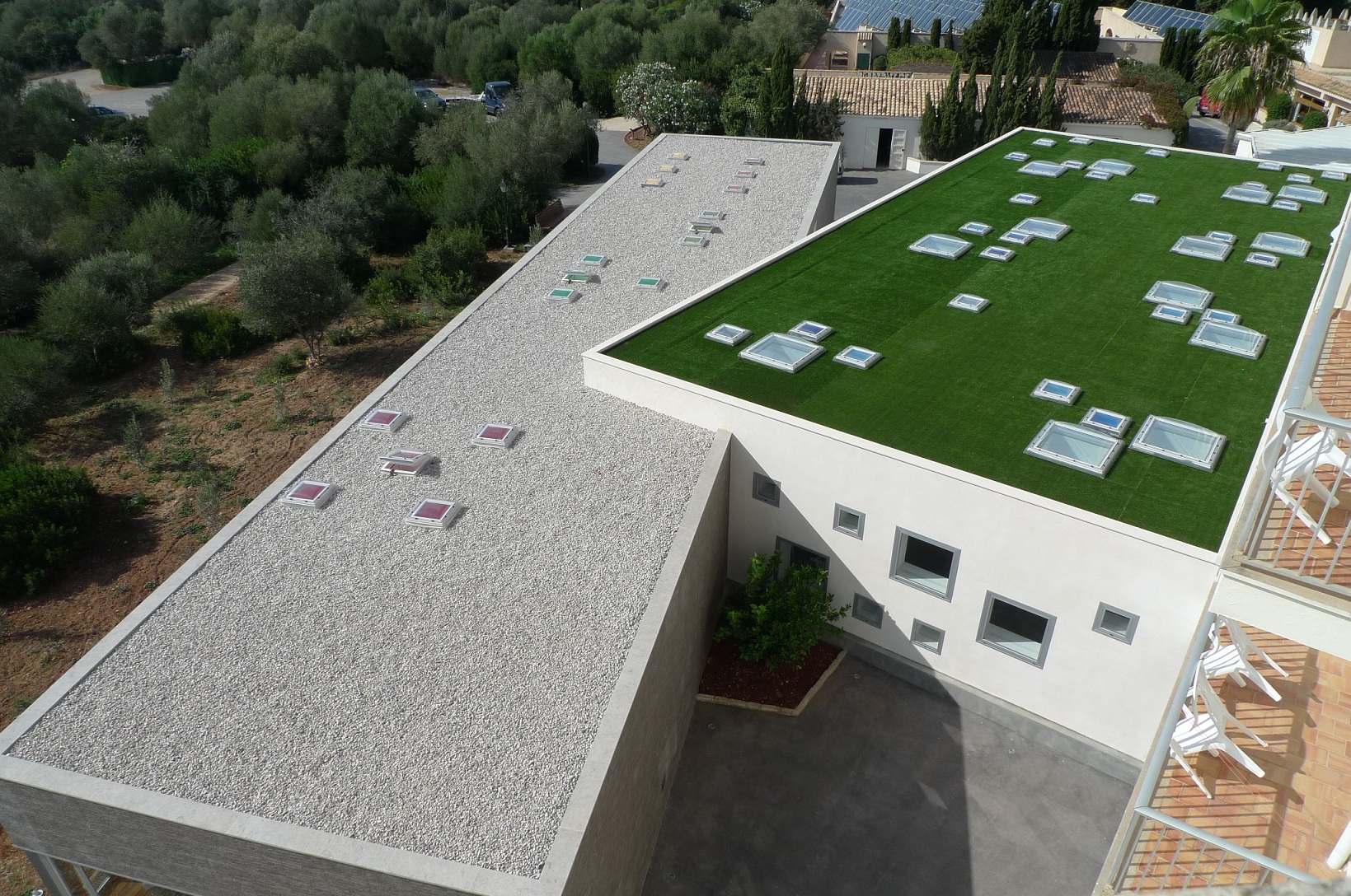 Estudio A2arquitectos stepped in to modify the heated pool area and add a spa to a building that had already gone through several changes over the years. The roof in the pool area has several square openings in the ceiling to allow natural light to flow in. On the outside, the top of the pool area has been turned into a green roof. Similarly, the spa area is also designed in a way that it is flooded with sunlight and helps visitors look at the landscape outside.
The two connected buildings have the same approach to wellbeing: helping their users connect with nature. The abundance of sunlight and relaxing views gives the users a complete Mediterranean experience.
2014: Elderly Persons Residence- Social Complex
Guedes Cruz Architects | Alcabideche, Portugal
Popular Choice and Jury Winner, 2014 A+Awards, Health & Wellness
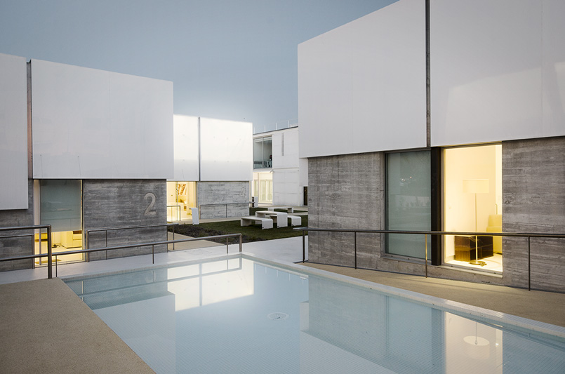
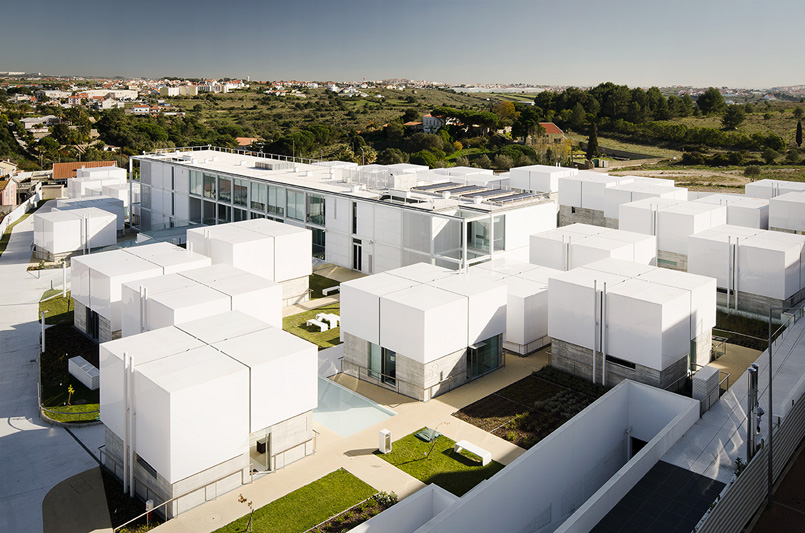 This social complex aims to create a lifestyle where there is an equal amount of privacy and social interaction. This is done by adding outdoor streets, plazas and gardens that act as extensions of the homes within. The complex includes 52 homes as well as a structure that houses nursing facilities and rooms for bedridden patients. Within the community, the roofs of the separate blocks light up at night in groups of 10, illuminating the adjacent pathways and gardens and guide circulation. In cases of emergency, the white light of a block turns red to alert the control station.
This project uses urban planning principles on a smaller scale to promote interactions and improve the quality of living for elderly residents. There is also an attention to sustainability with the use of photovoltaic cells to support heating systems and excess groundwater for irrigation and cleaning of pavements.
2015: Grotto Sauna
PARTISANS | Ontario, Canada
Popular Choice, 2015 A+Awards, Health Care & Wellness
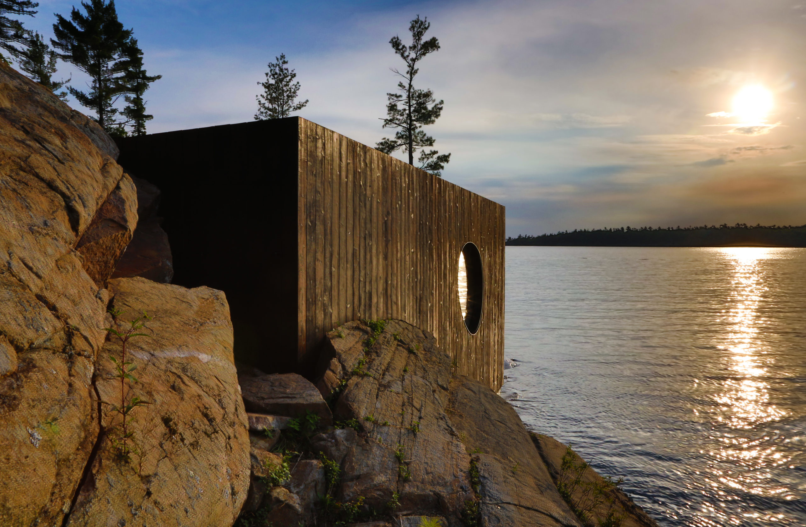
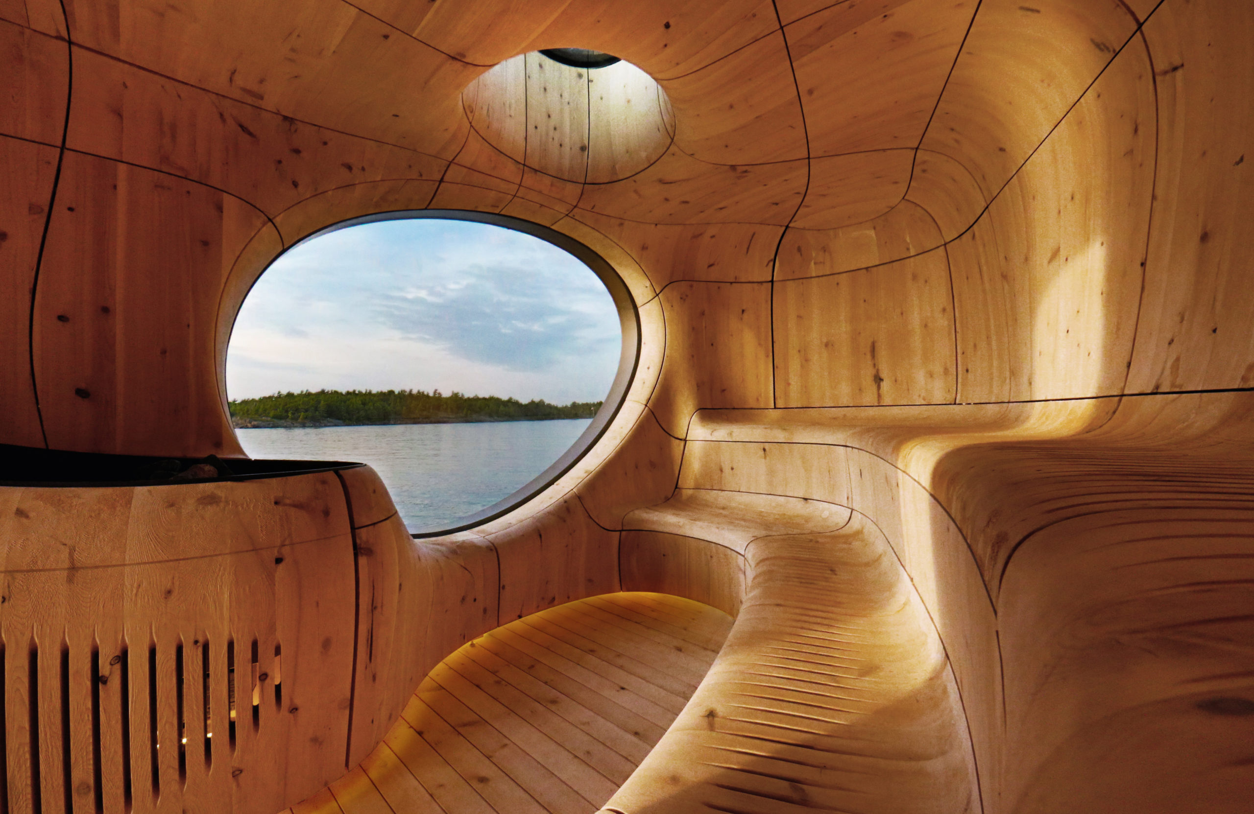 Much like its namesake, this private spa offers a cave-like experience by the water. On the outside, the freestanding cube imitates the natural surroundings in tones and texture. The interior, however, is a different story altogether. Here we see curved lines and organic openings that make turn the box into a space that looks like a naturally occurring grotto. The smooth surfaces and framed views heighten the luxurious experience.
We see the architecture stepping away from traditional box forms to more organic shapes with the advancement in technology. The firm used 3D technology to model and build a structure that might have been difficult with traditional methods.
2016: Naman Pure Spa
MIA Design Studio | Da Nang, Vietnam
Popular Choice and Jury Winner, 2016 A+Awards, Health Care & Wellness
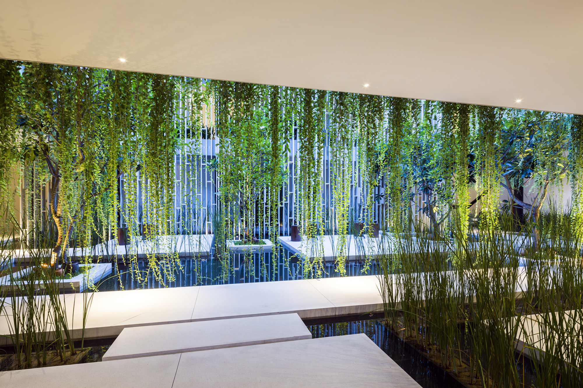
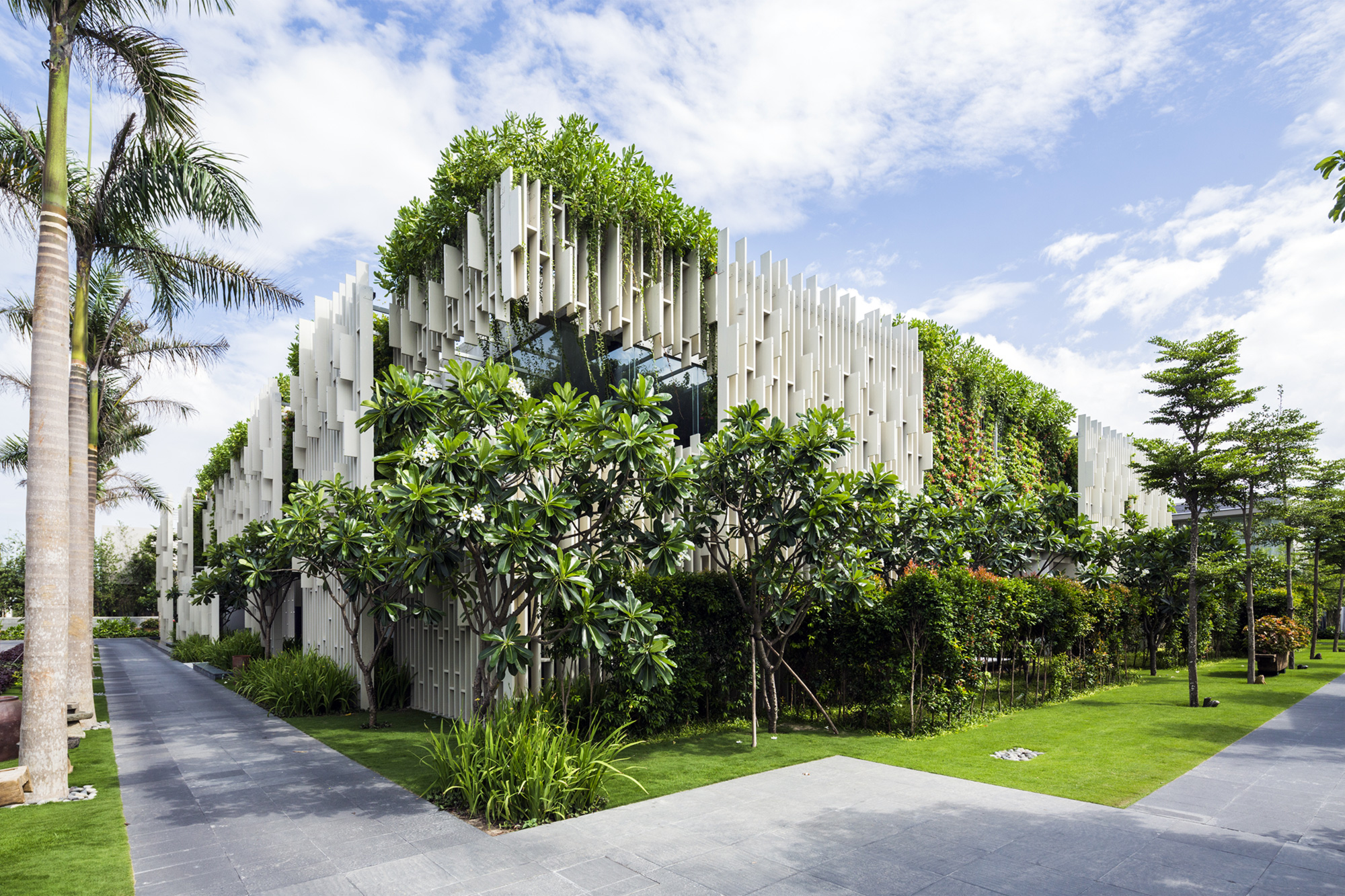
Image by Hiroyuki Oki
The Pure Spa is an extension of the Naman Retreat. The main façade features several white panels that create a 3D lattice screen, interspersed with a lot of foliage. The structure houses 15 treatment rooms that look out into a garden, deep soak bathtubs and cushioned daybeds. The lower level also contains a lotus pond surrounded by hanging plants.
Vegetation is a prominent feature in this design, supporting ventilation and creating an environment that promotes wellness and relaxation. The light comes in through the gaps in the walls; creepers animate the building. This goes to show that even as time passes, the inclusion of landscape in design for wellness spaces with conducive climates is still a growing trend.
2017: Löyly
Avanto Architects Ltd | Helsinki, Finland
Popular Choice and Jury Winner, 2017 A+Awards, Health Care & Wellness
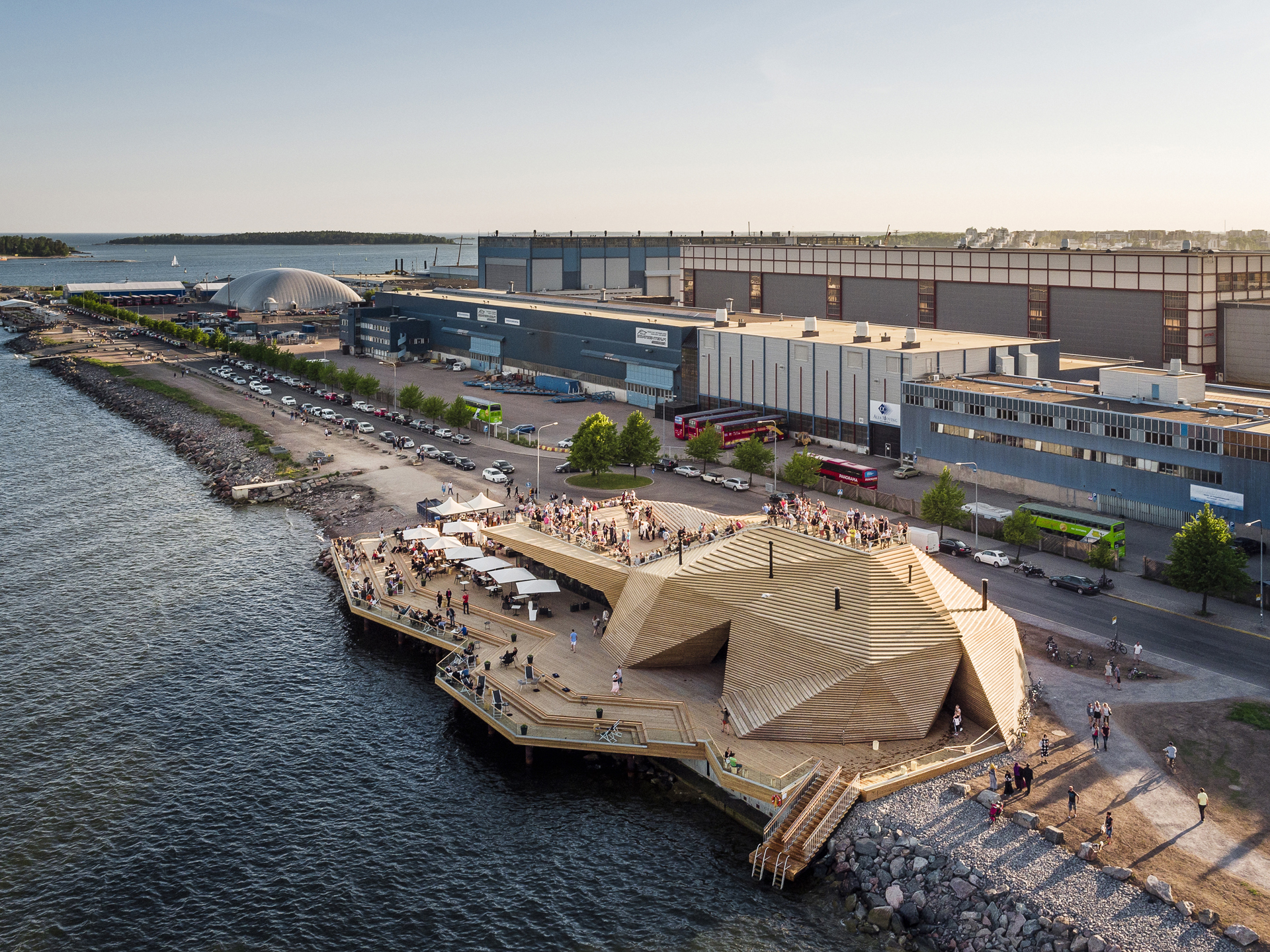
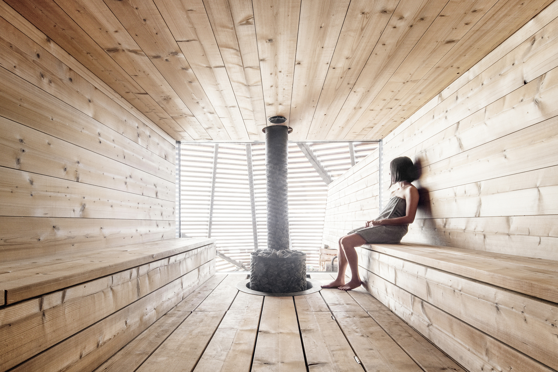
Public saunas, an integral part of the Finnish culture, are now becoming less common due to the increase in private saunas. Löyly is part of the city’s initiative to bring back these traditions and to give foreign visitors the opportunity to become a part of them. The overall form is narrow and low in height so that it doesn’t obstruct the view of the residents around. The geometry not only creates bathing spaces inside but also a stepped surface outside to be used as a deck.
The careful selection of wood sped up the construction process while also adding to the warm aesthetic. The Scandinavian birch wood is a leftover from the plywood industry that is pressed, glued and heat-treated to make an eco-friendlier material. The firm noted that as it turns grey with time, the building will resemble a rock on the shore. The power used for heating comes from wind and water, further contributing to the project’s sustainability.
2018: Maggie’s Centre Barts
Steven Holl Architects | London, United Kingdom
Jury Winner, 2018 A+Awards, Health Care & Wellness
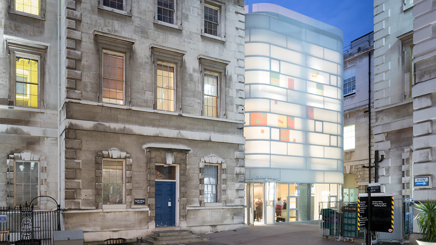
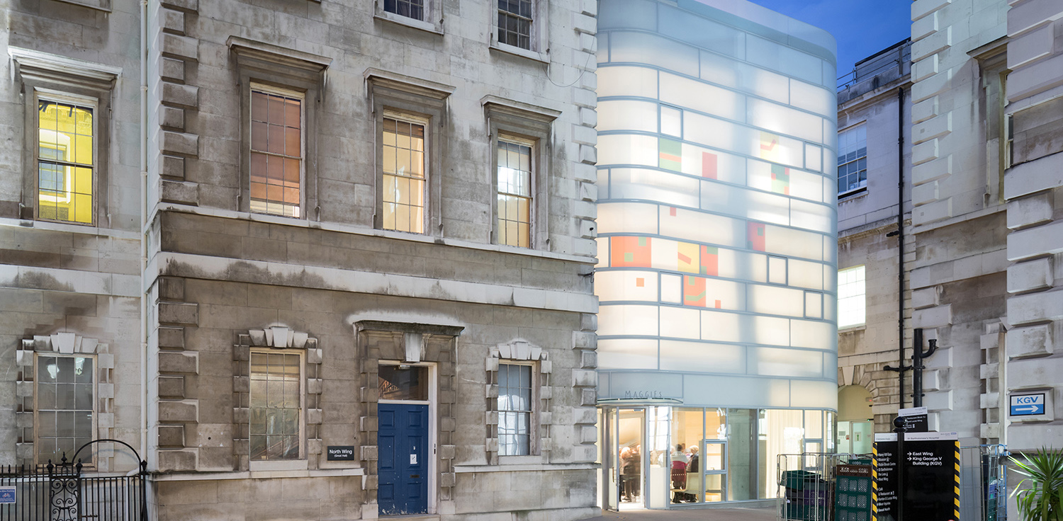
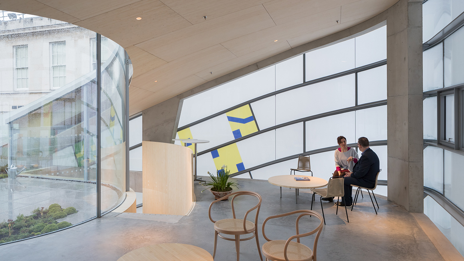 In contrast to the pale brick and stone buildings that surround the structure, Maggie’s Centre Barts is an illuminated box with colorful details. The construction is a central concrete frame with a perforated bamboo inner layer and a matte white glass exterior. The colored glass pieces in the black façade are inspired by the neume notation of 13th century Medieval music that references the force of life and inspiration. The horizontal lines on the building represent the musical staff while the verticals represent the hands. The structure also contains a rooftop garden for yoga and other activities.
The design stresses the importance of color to reinvigorate and energize spaces. The use of these elements animates a simple white rectangle into a symphony.
2019: Euphoria Spa in the Euphoria Retreat
Deca Architecture | Laconia, Greece
Popular Choice, 2019 A+Awards, Hospitality – Health Care & Wellness
Images by Margarita Yoko Nikitaki
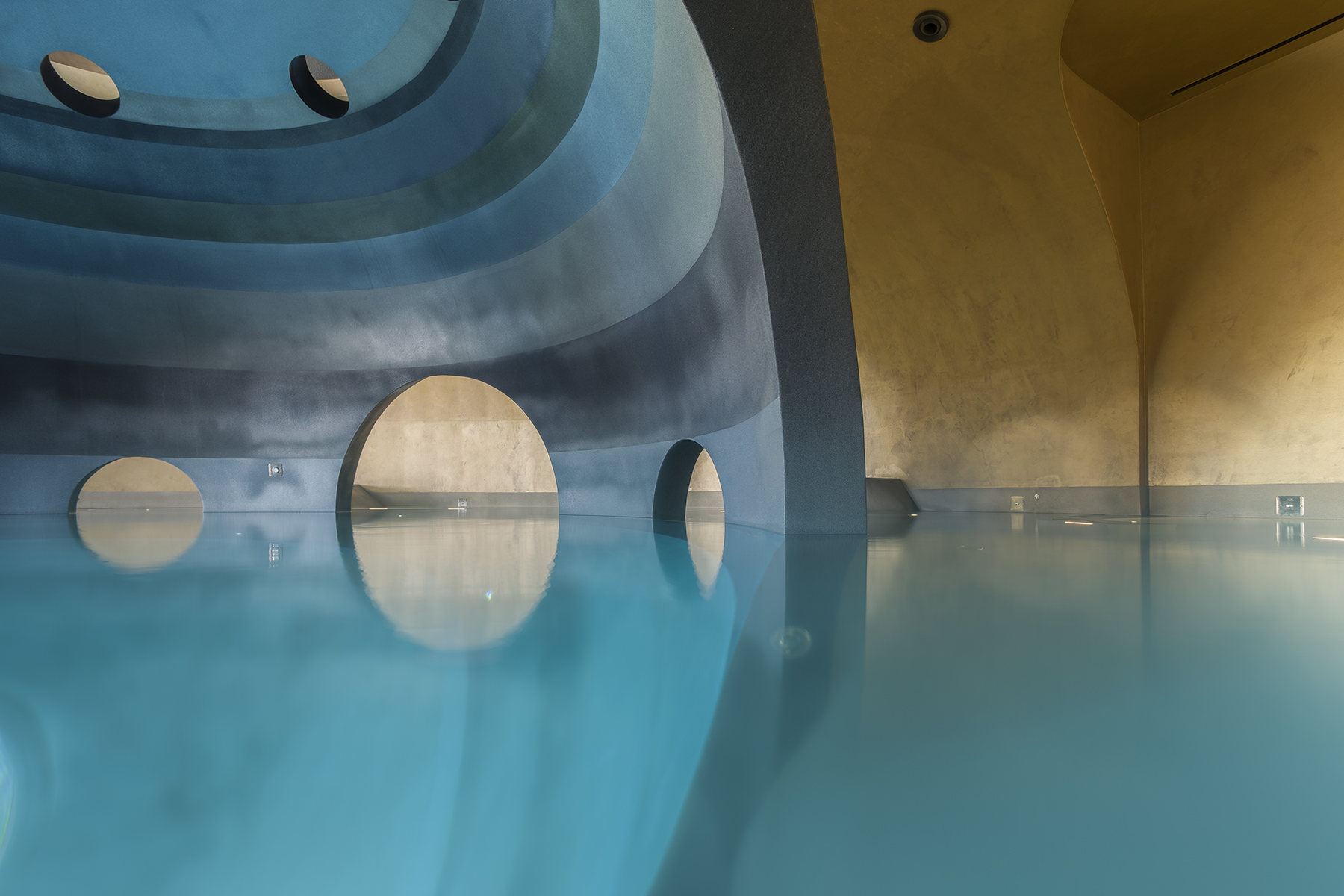
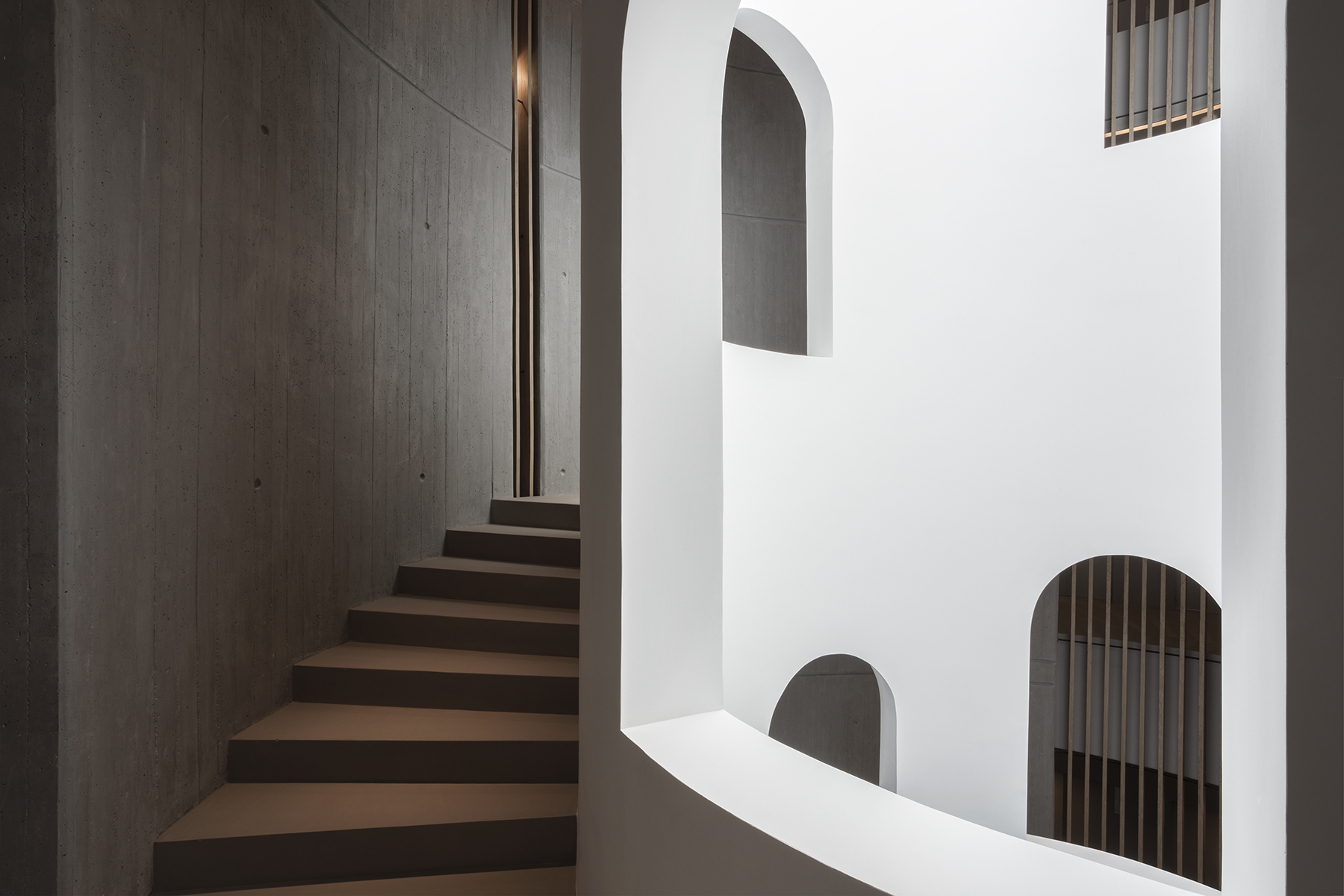
Located in the vicinity of the UNESCO World Heritage Site of Mystras, this four-level building is carved into the base of a mountain. The overall form of the building includes setbacks to help it flush with the mountain. Circular openings and curved narrow pathways guide visitors to a central light well that is enveloped by a spiral staircase. The second level imitates gears of a clock where users move to different spaces with varying temperature and humidity settings. The two upper floors contain private treatment rooms and conference areas.
As seen with a lot of spas and wellness centers, textures, tones and natural light play an important role in the overall design. Neutral tones and moderately lit spaces create a sensory experience that promotes a sense of serenity.
2020: EKH CHILDREN HOSPITAL
IF (Integrated Field co.,ltd) | Samut Sakhon, Thailand
Jury Winner, 2020 A+Awards, Hospitality – Health Care & Wellness
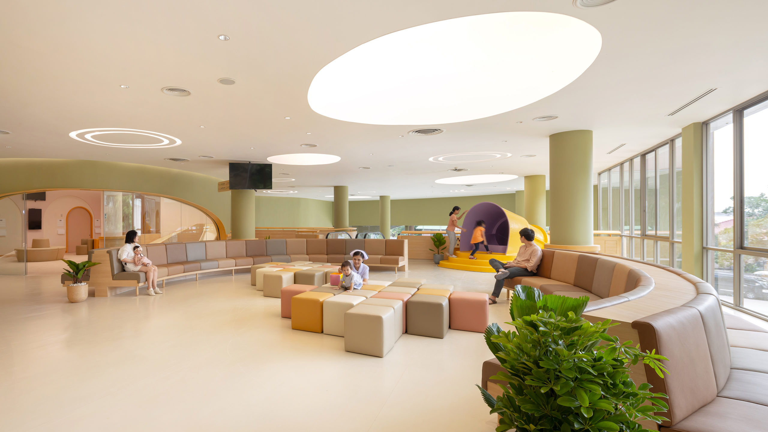
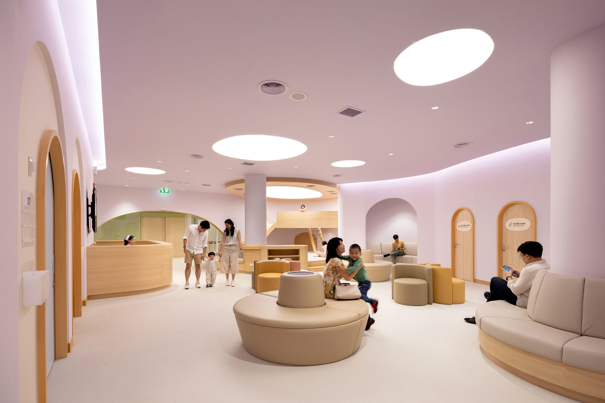
Image by Ketsiree Wongwan
Visits to hospitals can be difficult for most people, but they are often more so for little children. Integrated Field tried to overcome this challenge by creating a fun space that children could enjoy as their wait to get treated. One of the best features of this hospital is a slide that turns the waiting area into a playground. Moreover, they added a playful indoor pool, fun seating and a variety of pastel tones to heighten the experience. These animating elements extend to the hospital rooms, which are names after animals — Whale, Turtle, Lion and Rabbit — and feature glow in the dark constellations spread across their ceilings.
Architects all over the world are finding new ways to make the experience of going to a hospital a more enjoyable one. This can be done by injecting color, adding interactive installations and creating supporting functions for family members of patients.
2021: Maggie’s Leeds
Heatherwick Studio | Leeds, United Kingdom
Popular Choice and Jury Winner, 2021 A+Awards, Institutional – Hospital & Healthcare Centers
Images by Hufton+Crow Photography
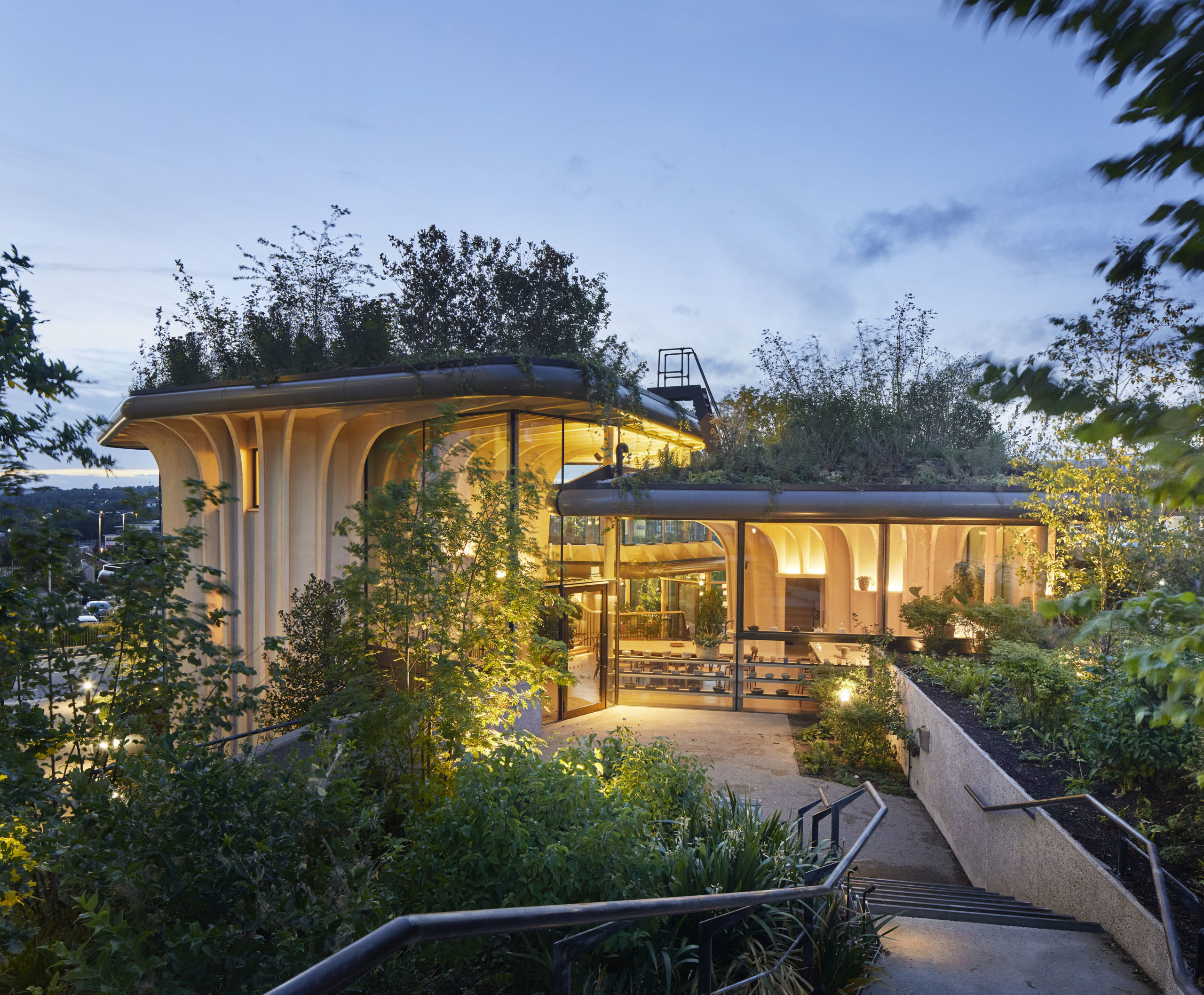
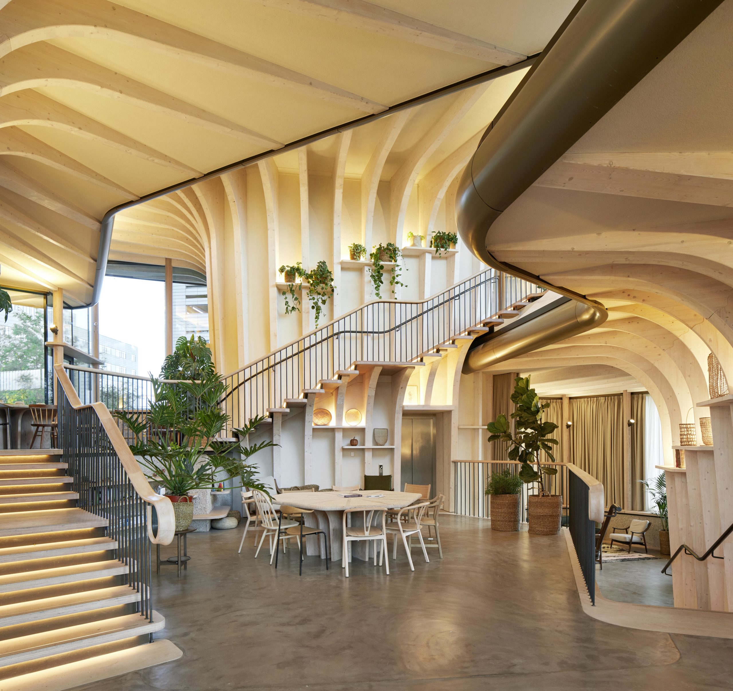
This center exudes the warmth and comfort of a home, making patients feel more at ease when sharing their deeply personal experiences. The remarkable design centers on a three-tiered green roof, which is accessible from every room in the building. The rooftop garden (designed by award-winning landscape designers Balston Aguis) not only preserves the little green space that remains on the hospital’s site, but also invites visitors to the cancer-support center to participate in caring for the tens of thousands of plants that grow there.
This green space is supported by a sustainably-forested spruce interior and glulam-fin detailing that rises like trunk from the ground, creating a warm, light-soaked interior that offers the comfortable feeling of home.
 EKH CHILDREN HOSPITAL
  Elderly Persons Residence- Social Complex
  Euphoria Spa in the Euphoria Retreat
  Grotto Sauna
  Löyly
Löyly  Maggie's Centre Barts
  Naman Pure Spa
  Pool and spa area for an Hotel in Majorca