Architizer’s newest print publication is available for pre-order! How to Visualize Architecture is an educational guide designed to help you master the craft of architectural storytelling and visual communication. Secure your copy today.
Renderings hold more weight and importance than ever before. Over the last twenty years, there have been dramatic shifts in the way architectural and spatial ideas are conveyed. Today, renderings are one of the most common ways that designs are shared and understood. However, there has also been a more recent move away from photo-realistic renderings and, instead, to collages, colorful doodles and even comics.
Celebrating the work of firms behind these imaginative renderings and visualizations, the following projects showcase ideas on illustration and image today. Now more than ever, architects, designers and digital artists can make renderings in less time, testing design concepts and creating dramatic visions of the future. In turn, they are utilizing diverse methods of representation to share ideas, reinterpret history and bring new ideas to life.
Do you have an illustration or a rendering that pushes the bounds of its medium? Architizer’s Vision Awards honors the world’s best visualizers and celebrate their contribution to architecture today. To learn more about the program, register for updates:
Rua do Paraíso House by fala atelier
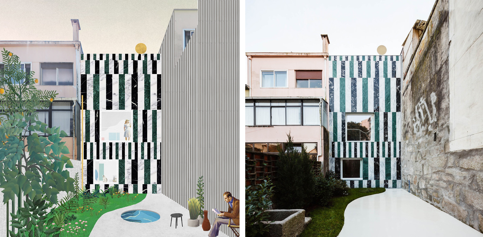
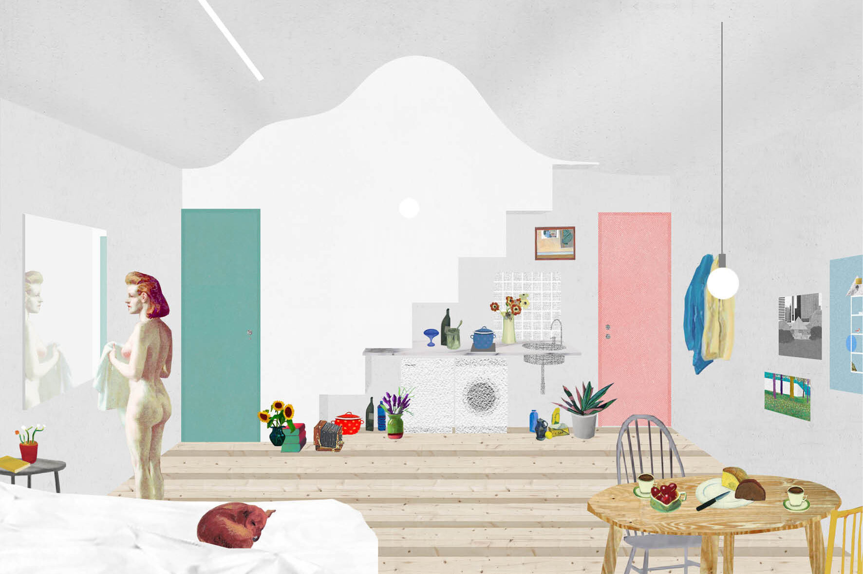 A young practice currently based in Porto, Portugal, fala atelier was founded in 2013 by three architects: Filipe Magalhães, Ana Luisa Soares and Ahmed Belkhodja. All three members started their architecture careers working for Harry Gugger in Basel before moving on to firms in New York and Tokyo. Their design process includes intricate drawings and bold design statements in built form, and they focus on both residential-scale architecture and competition proposals.
Fala’s projects are a medley of formal languages, references, quotations and themes. Their collages have become well-known, and they helped the architects stake out a practice. As Gavin Moulton describes, “Fala’s collages are brimming with a wide-range of citations — from 20th century painters like Hockney and Hopper to more conventional architectural references Boullée and Superstudio. Concrete roofs, repeating patterns and fruit banquets abound, rivaling the otherworldly opulence of the Dutch still life genre.” The practice’s use of collage, as readily seen in their Rua do Paraíso House project, has helped define an increasingly common rendering style.
Brygida Zawadzka by Duong Vu Hong
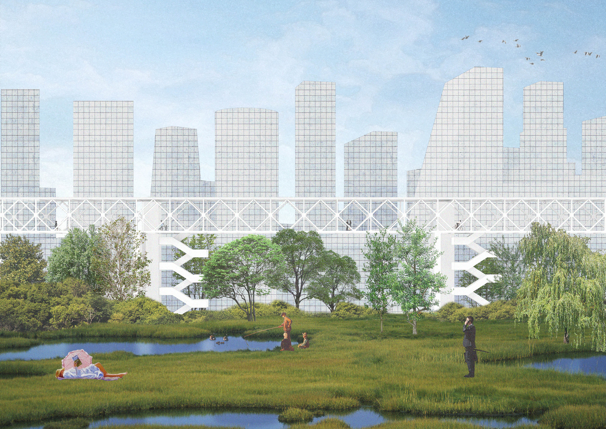
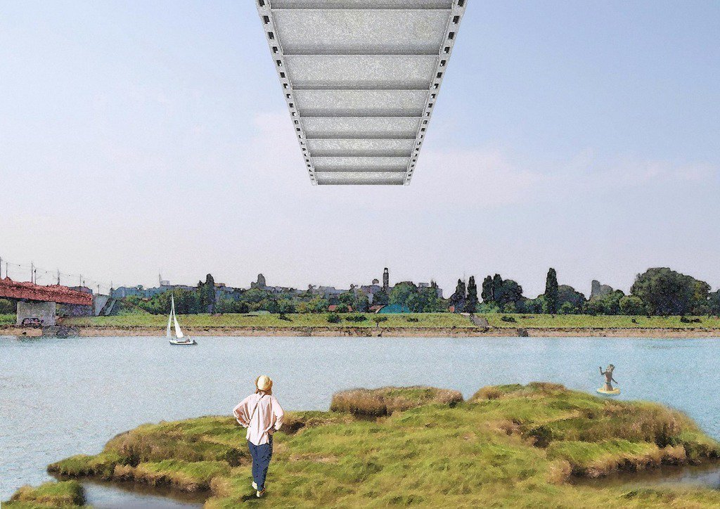 Each drawing is a story. The mediums and tools Duong Vu Hong uses to design each tell a different story, and in turn, shape the work. Instead of striving for photo-realism, post-digital drawings explore and exploit artificiality, and in turn, create a fictional form of representation with its own unique merits. This is in strict opposition to the digital rendering’s desire to make the fiction seem “real.” It incorporates narrative cues, art historical allusions and software-enabled collage techniques.
A great example of this is Brygida Zawadzka. As mixed media collages, they are a type of illustration that is less about the details, more about telling a story that can be playful and open-ended. Post processing is typically much looser and maintaining proper perspective is unnecessary. Here, photographs are combined with illustrations, drawings or renderings to create a layering of information. Duong Vu Hong’s result is drawings that are open ended and allow room for interpretation to understand the handful of distinct elements in the frame when moving across the images.
H431 – Recycled Content Apartment by CO Adaptive
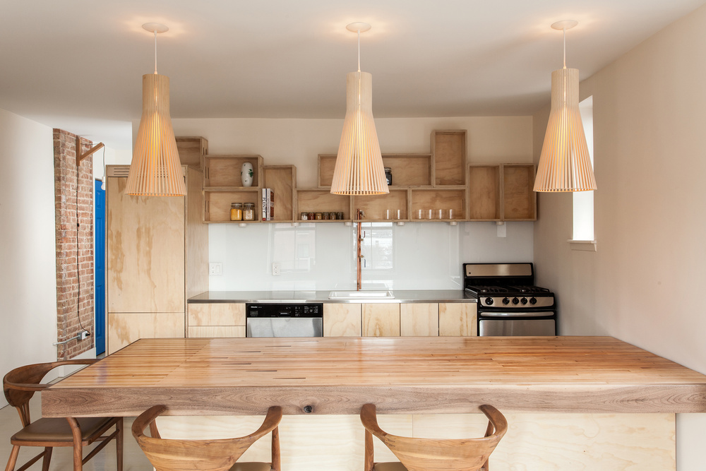
 For Brooklyn-based CO Adaptive Architecture, drawings can be a vehicle for new construction methods. Together, Ruth Mandl and Bobby Johnston have created a process-oriented firm that embodies how a values-based approach can take on issues like the global climate crisis. While their drawings and architecture are beautiful and elegant in their own right, they are also made to inspire change and rethink what it means to practice today.
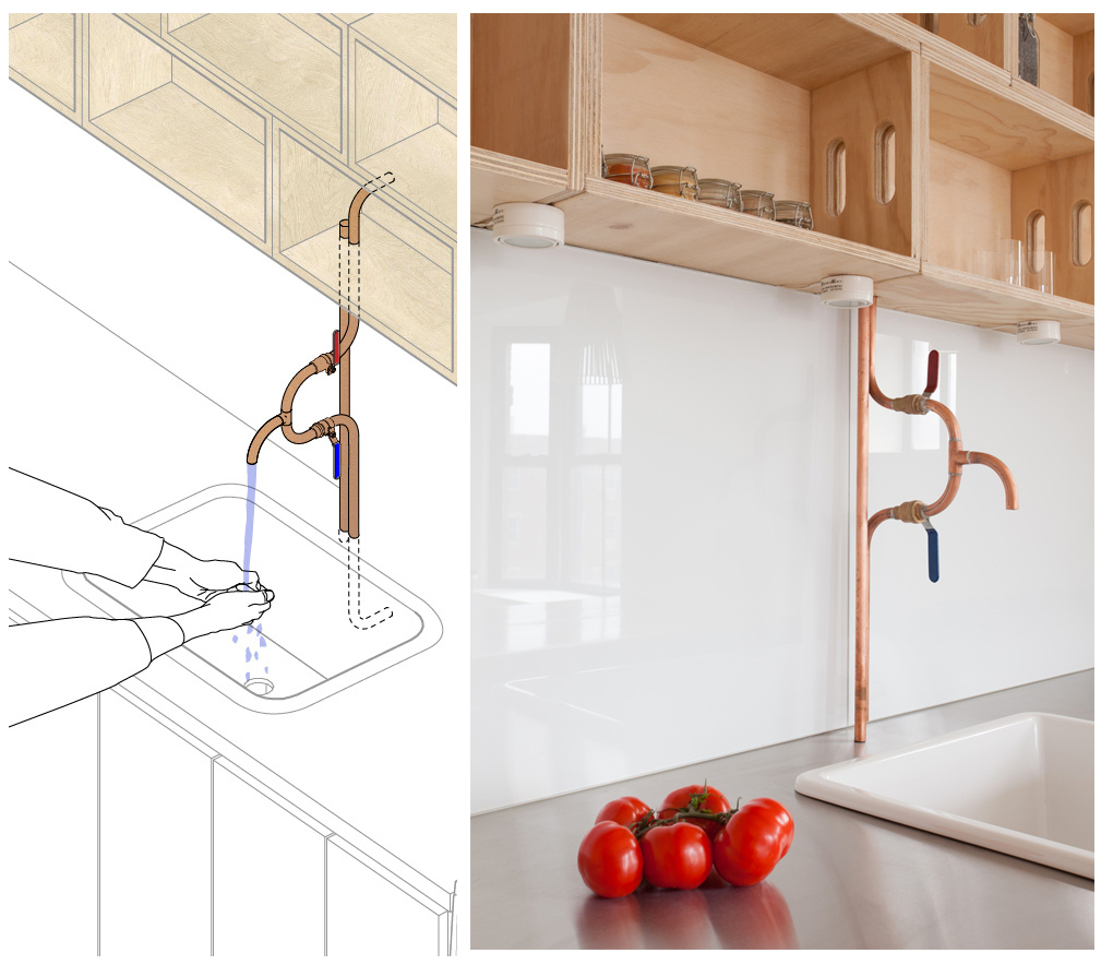
Tasked with creating a family home on a tight budget, CO Adaptive reconfigured this 675 SF apartment to accommodate two bedrooms and space for entertaining. As one of the most beautiful details showcasing the design team’s thinking and approach, they also designed custom plumbing fixtures. These were installed in the kitchen and bathroom, exposing the beautiful copper that is normally hidden within walls. Their playful axon rendering is a great example of how firms can inspire change by underlining the beauty and ingenuity of repurposing and retrofitting for the future.
YES IS MORE by Bjarke Ingels Group
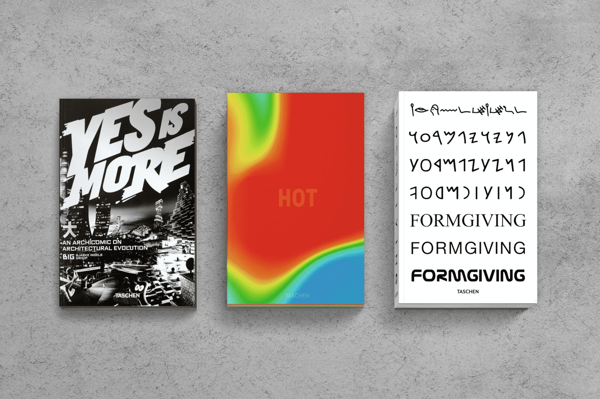
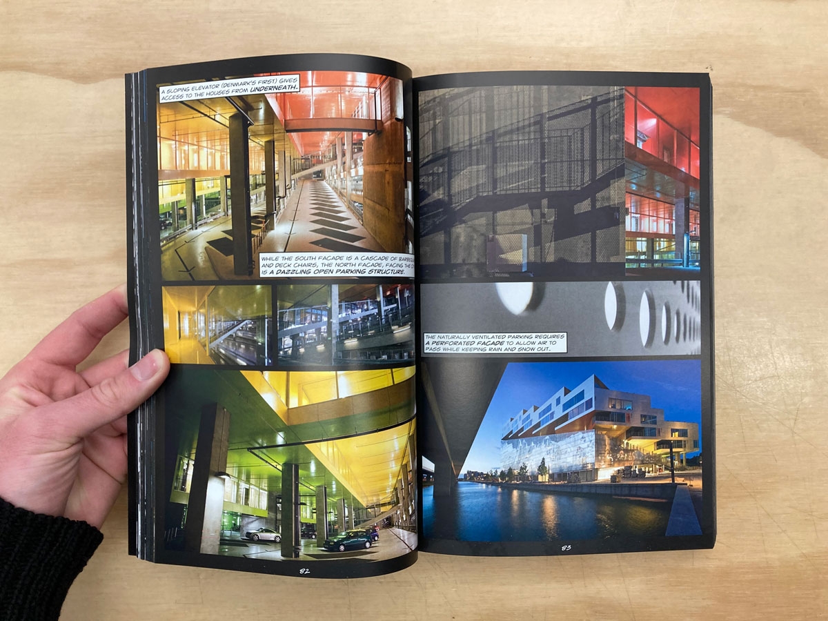 While BIG has created a series of books now, YES IS MORE was the first monograph devoted exclusively to the practice. Showcasing the work of architects, designers and thinkers operating within the fields of architecture, urbanism, research and development, it was created as a comic book that showcases projects, renderings, and the office in diverse ways. Unlike a classic architectural monograph, this book is more of a manifesto of popular culture, in which BIG’s methods, means, processes and approach to the concept of architecture are revealed.
For Bjarke Ingels Group, renderings are combined with videos and diagrams as a way of world-building, or “worldcraft” as they call it. While clients and the public increasingly expect more photorealistic images and presentations, BIG has continuously explored different ways to present architectural ideas in simple terms. In YES IS MORE, it shows how the studio responds to complexity and creates tangible solutions. YES IS MORE “speaks the language of popular culture, allowing the sublime to shine through in the commonplace” through comics and cartoons.
Mesterfjellet School by CEBRA
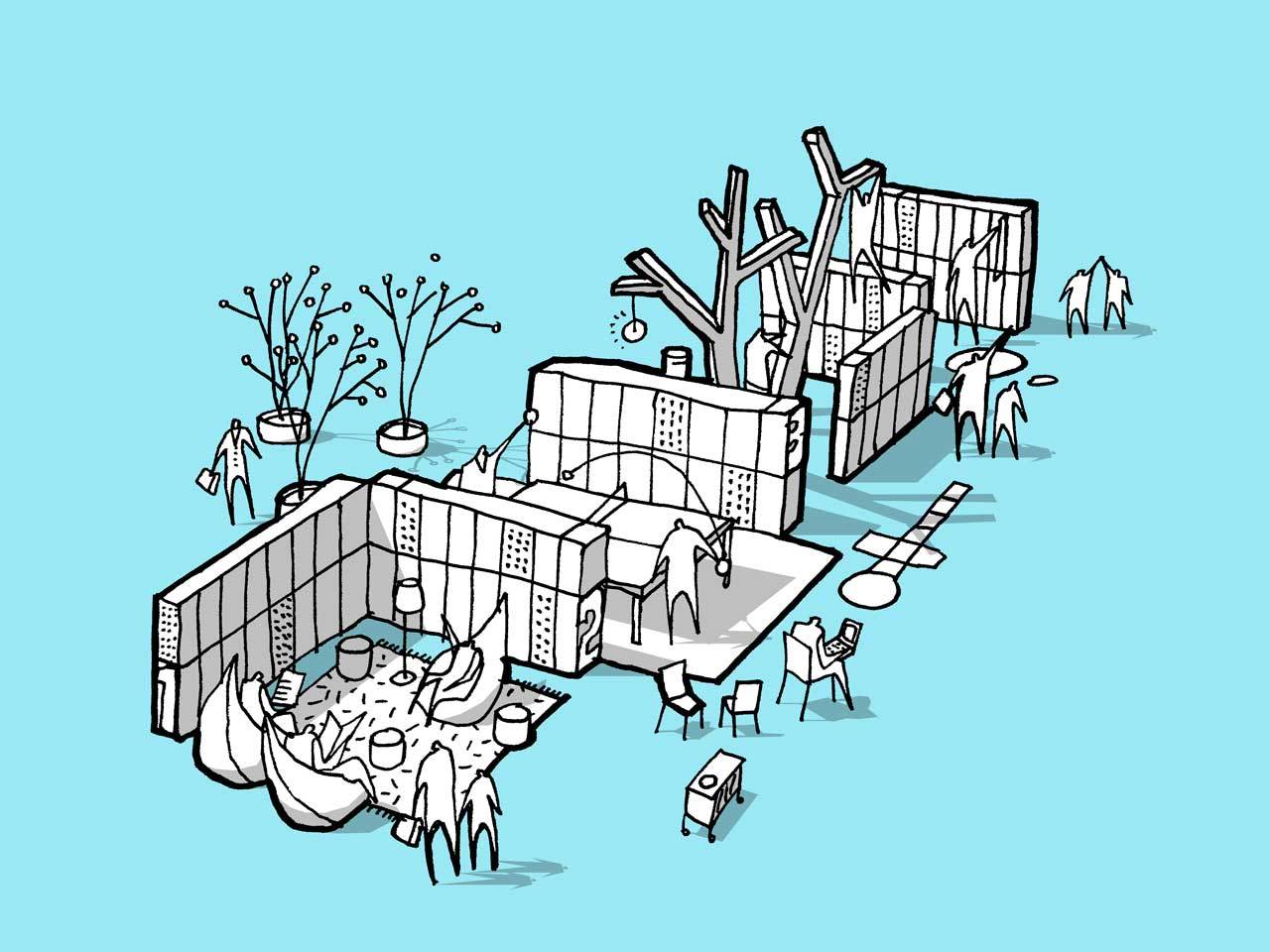
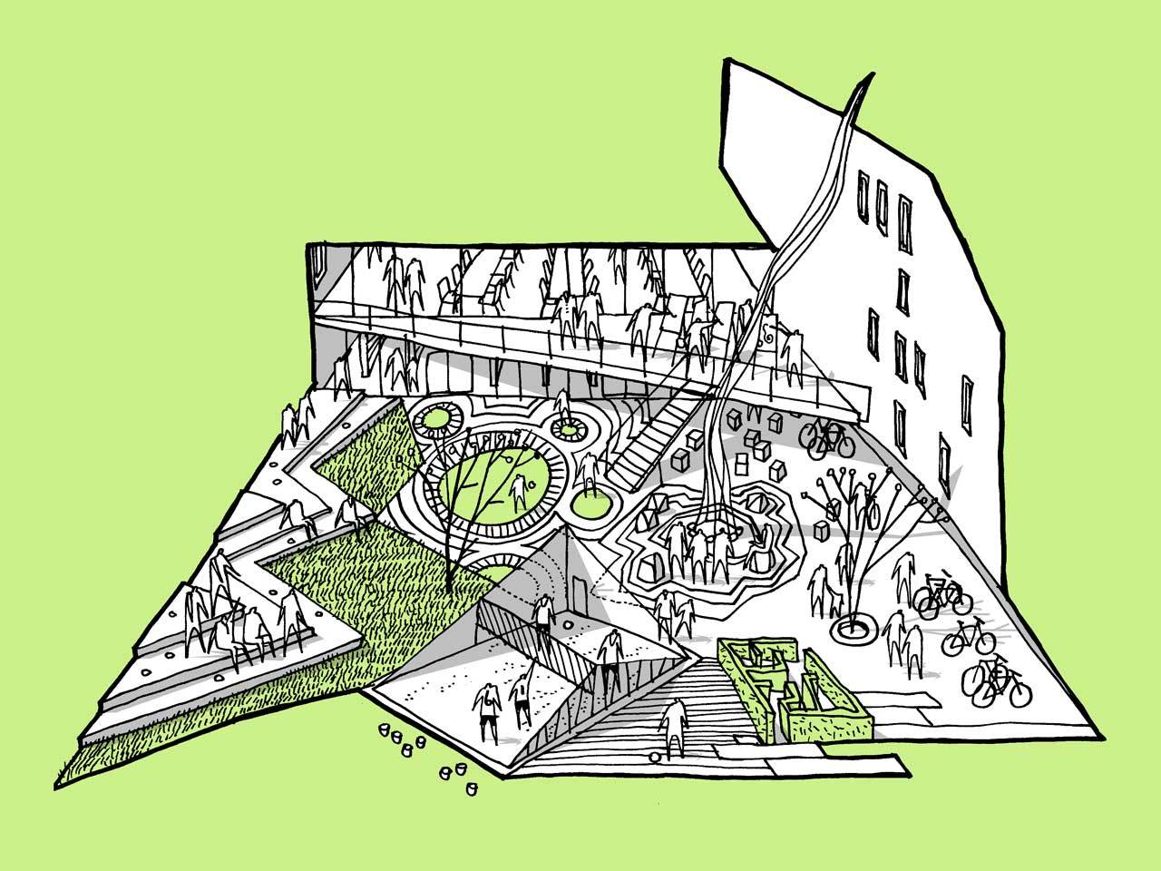 CEBRA is a Danish architecture and design practice, founded in 2001 by architects Mikkel Frost, Carsten Primdahl and Kolja Nielsen. CEBRA creates architecture designed to “move people.” They are known for renderings that take the shape of graphic doodles. This doodling can become a finished drawing. Their work includes these illustrations with concrete representational meaning, as well as random and abstract lines.
The Mesterfjellet School project combines a new 1st-10th grade school with three parallels and a public health centre in a new building that is linked to the existing sports facilities at Farrishallen. The project is based on the idea of a very compact building with a minimal footprint. As opposed to a traditional atrium school with an introvert central space and skylights, the vertical campus contains a vertical multi-functional space that reaches all the way to the facades creating a connection between indoor and outdoor areas. The school’s common areas are grouped around this vertical space, which is similar to a traditional theater space.
Democratic Monument by Atelier ANF
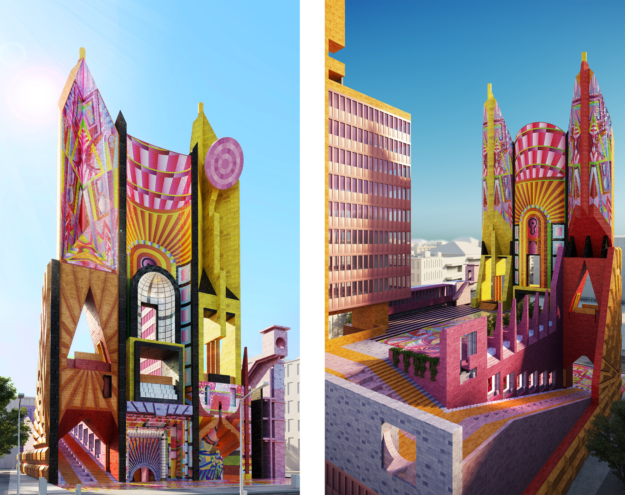
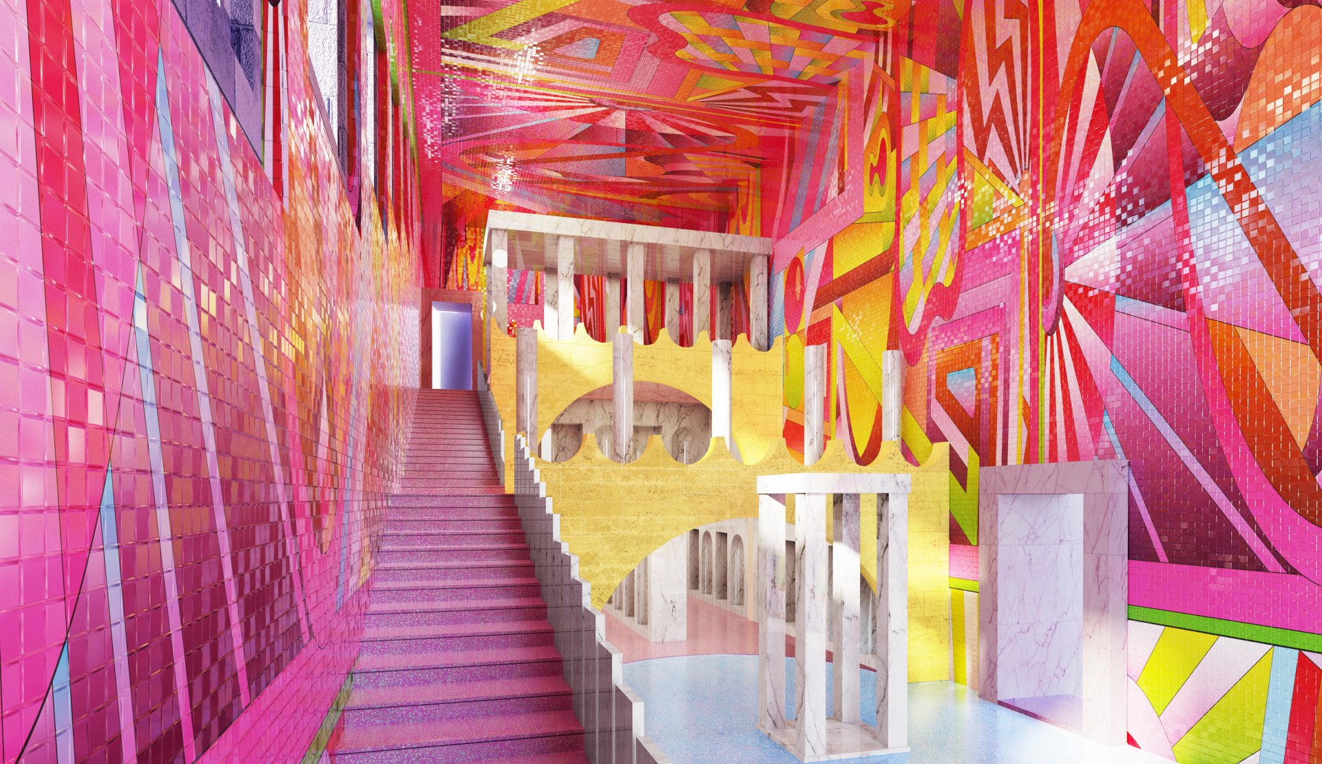 Adam Nathaniel Furman is an artist & designer of Argentine and Japanese heritage whose decorative work is inspired by memories of the countries, cultures, aesthetics and politics they grew up connected to. Based in London, they operate internationally, designing beautifully considered projects of all scales from interior sculptures and supergraphics, to large public realm artworks, domestic and commercial interiors, temporary and permanent pavilions, architectural schemes and architectural ornament.
Commissioned by the Architecture Fringe as part of New Typologies (curated by Lee Ivett and Andy Summers) under 2017s core program, Democratic Monument is a proposal for a new kind of Town Hall for British cities. The project’s public face is proposed to be a large civic facade, designed in a contemporary manner, but echoing older structures -such as Gothic Cathedrals- in its forthright form and ornamentation. Made with richly colored and patterned tiles, manufactured using the latest digital ceramic technologies, and designed by local artists, it was made as a “proud, joyfully new beacon of confidence to its city.” Atelier ANF‘s approach to rendering celebrates color, history and culture in a way that is as critical as it is beautiful.
Architizer’s newest print publication is available for pre-order! How to Visualize Architecture is an educational guide designed to help you master the craft of architectural storytelling and visual communication. Secure your copy today.
 YES IS MORE