Architizer's diverse jury of global experts is currently reviewing submissions to the 14th A+Awards! Sign up to receive updates on Public Voting and spring winner announcements.
Slides are more often than not associated either with playgrounds or with water parks. The changing perception of commercial and residential architecture as well as the willingness to experiment has resulted in this element being used in several unconventional typologies to energize simple spaces or add some play to monotonous routines. More and more architects are using different types of slides in diverse projects, ranging from large penthouses and cultural spaces to workplaces and restaurants.
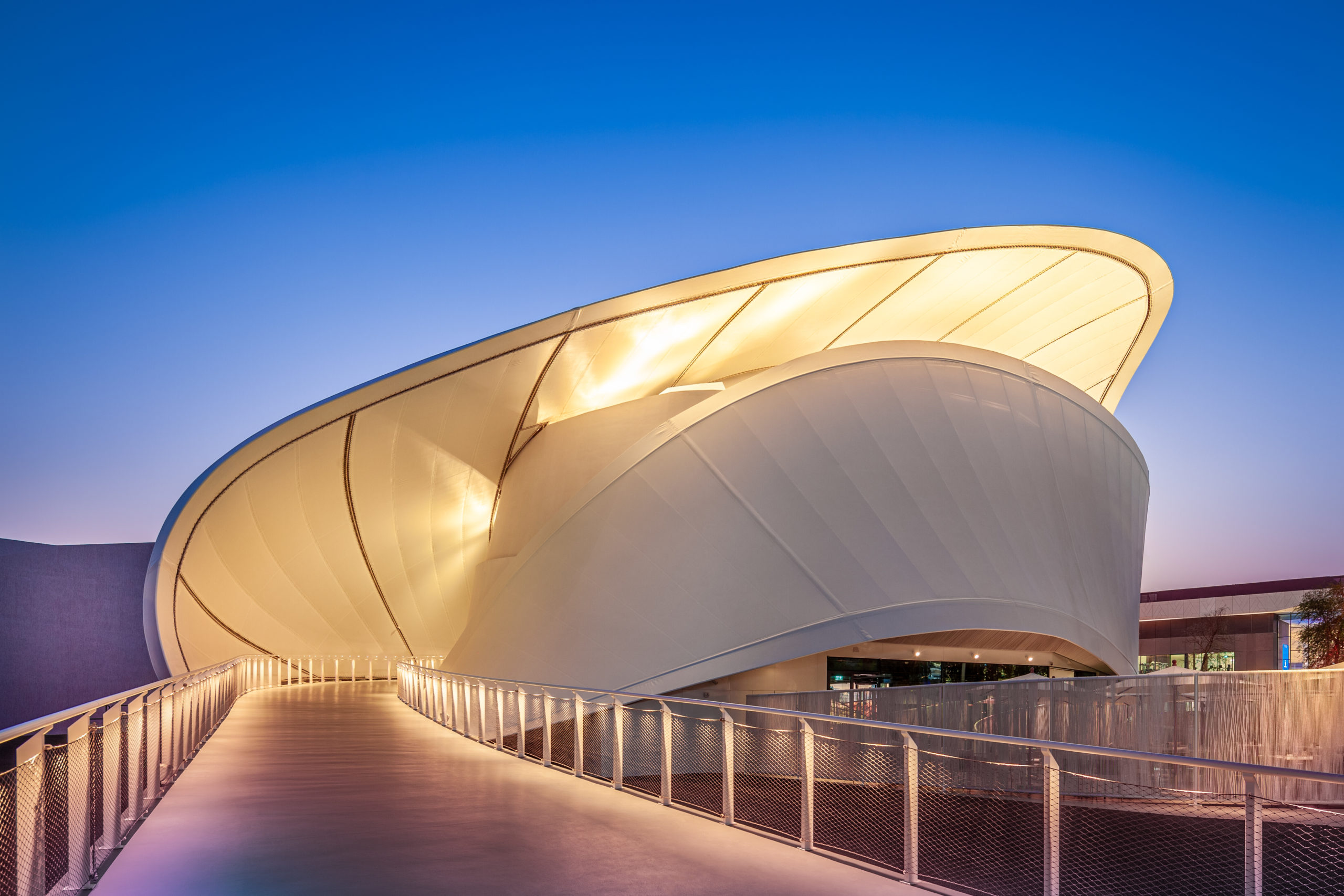
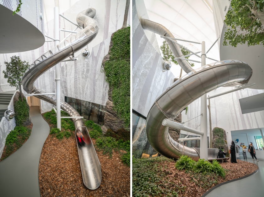 Luxembourg Pavilion at Expo 2020 Dubai by METAFORM architects, Dubai, United Arab Emirates
The ambitious and fluid design of this pavilion represents the values and aspirations of Luxembourg. Inspired by the Mobius strip, the structure creates the illusion of entering a looped cocoon. The lower floors contain a restaurant, gift shop, multifunctional space and exhibition areas. Making this experience even more surreal and fun is the addition of a slide that can take users from the second floor which houses a space-themed exhibit to a green patio on the lower level. This slide is choreographed in a way that ends the visitor’s journey on a lighter note, leaving them with a memorable experience.
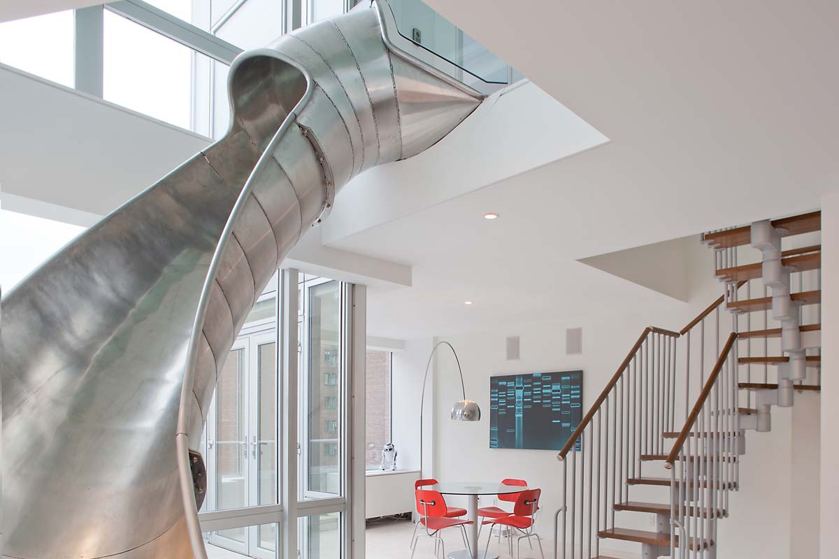
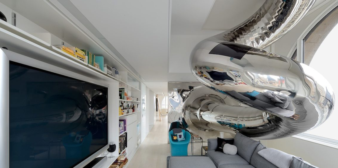
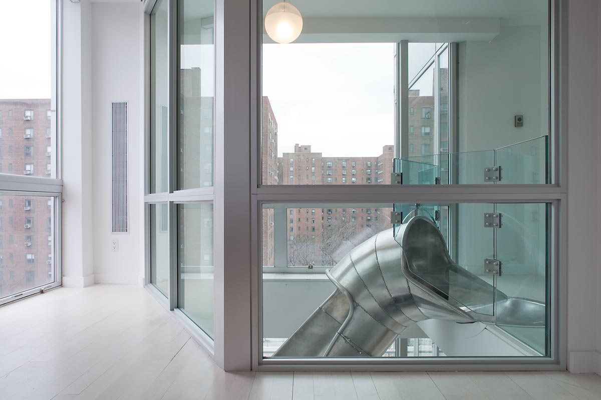 The Galfond Residence by The Turett Collaborative, New York, New York
The owners of this apartment in New York requested the architects to connect two apartments, one above the other, into a two-story home with a slide. The design features a large atrium that houses this stainless steel slide right next to a staircase, offering the residents two modes of circulation between the levels. On the upper level, this atrium is enclosed with glass railings to maintain the illusion of openness. Given the glass walls, adults can enjoy a quick glimpse of the city beyond as they travel down the metal curve.
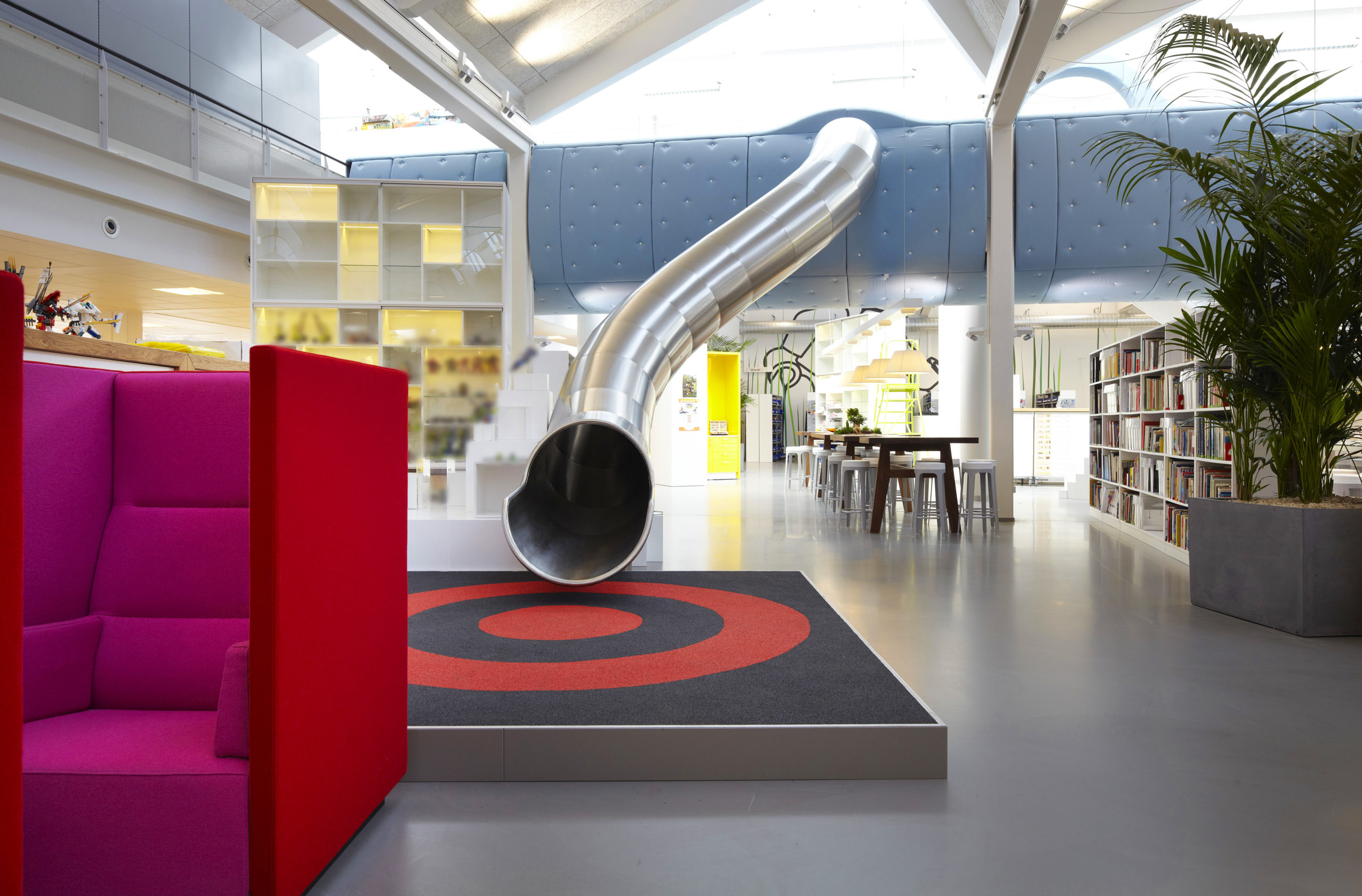
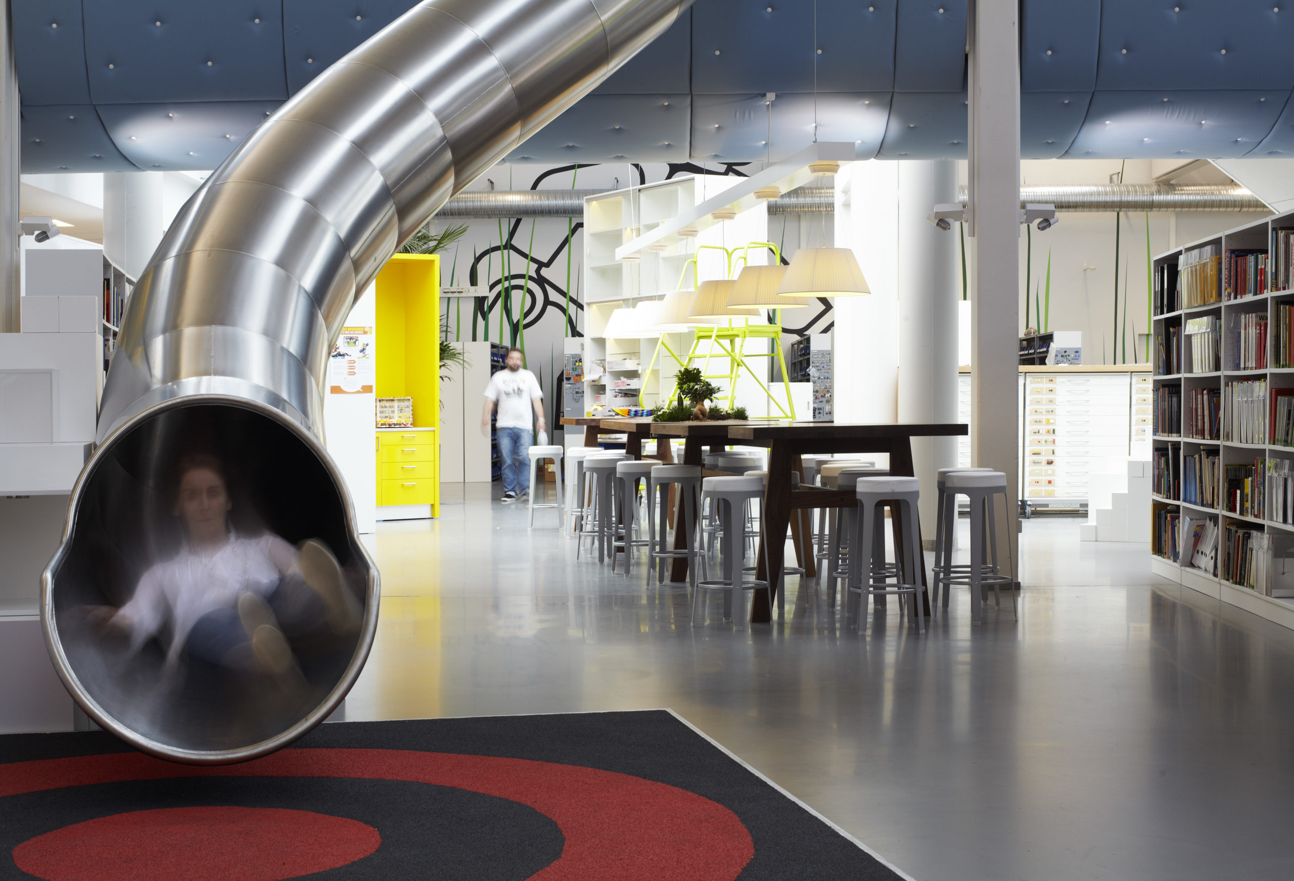 LEGO® PMD by Rosan Bosch Studio, Billund, Denmark
The word LEGO by itself is enough to create images of games and play in one’s mind. With bright colors and quirky shapes, the workplace of the development department reflects this childlike spirit. Rosan Bosch Studio created an environment that stimulates creativity with graphic walls, bold furniture pieces and even statement slide right in the center. It is an attempt to bring childlike wonder and imagination to the routines of professionals as they work and let them have fun while they create it for others.
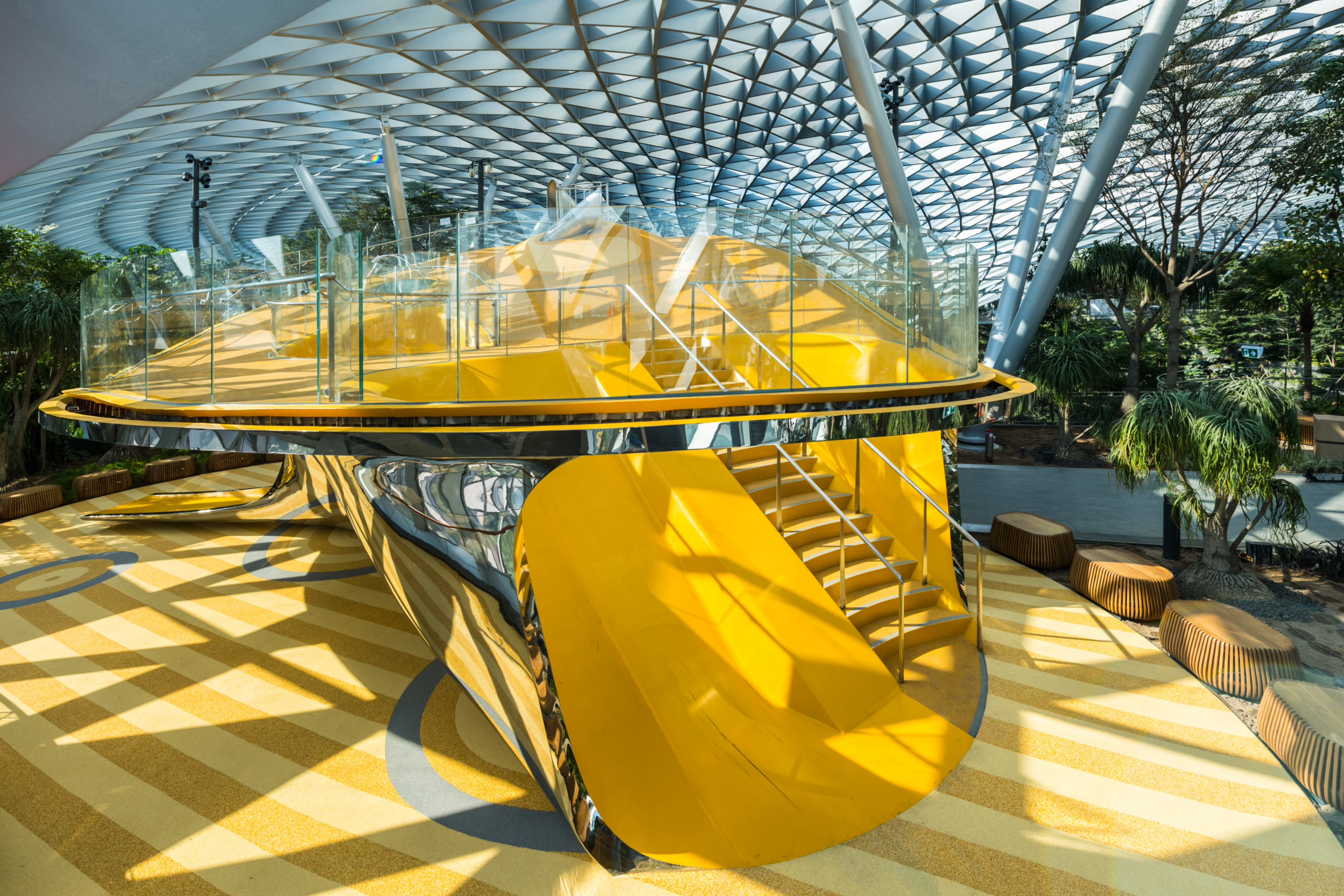
Images by Playpoint (SINGAPORE) Pte Ltd
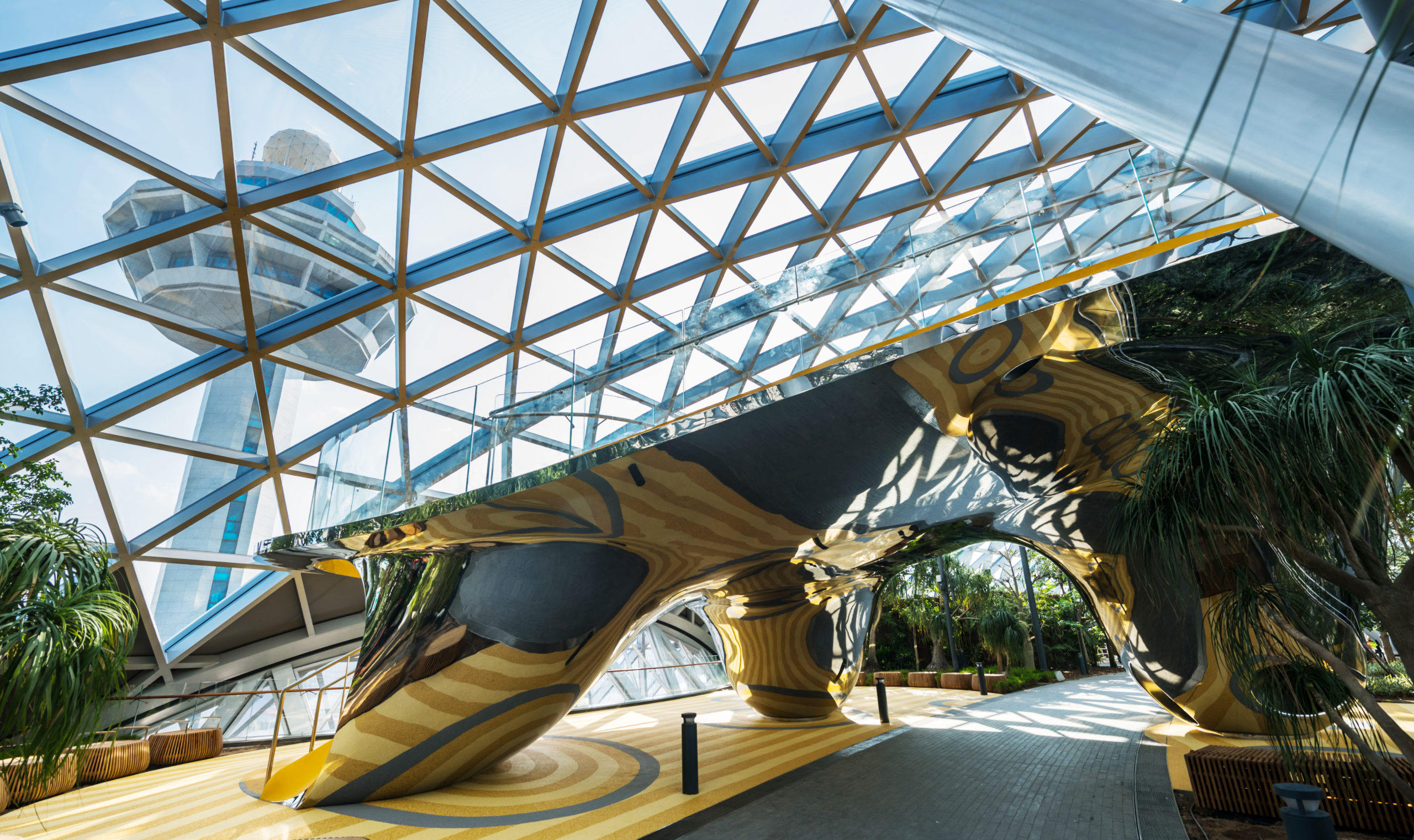
The Discovery Slides by Carve, Singapore, Singapore
Amsterdam-based design firm Carve was tasked with creating a sliding attraction in the Jewel Changi Airport complex in Singapore. The studio accomplished this task by fashioning a playground that is inspired by the multifaceted characteristics of a gemstone. It comprises a large reflective silver body with carved out pockets for the slides, steps and climbing ropes that also reveal its colorful core. The main platform is supported by three cones that also connect it to the main level. The polished steel surface of the side creates numerous reflections on the surroundings and also interacts with the patterns on the custom rubber floors below. The structure has four types of slides — a wider family slide, a steeper drop slide and two glass spiral slides — making it an enjoyable experience for visitors of all ages.
Images by Lulu Xi
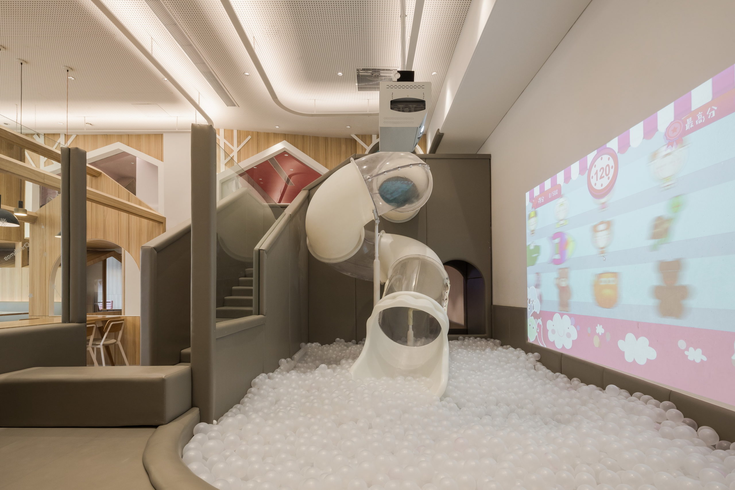
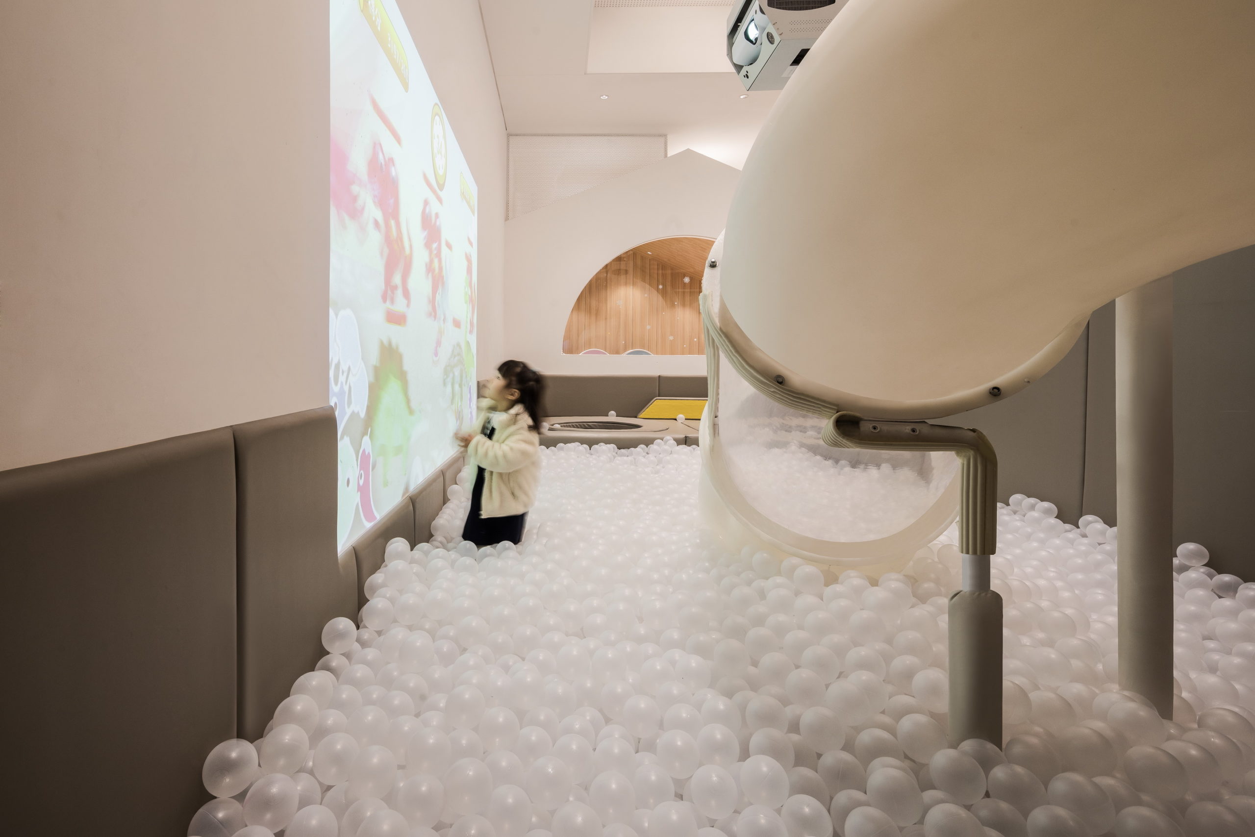
Vitaland Kid Restaurant by Golucci Interior Architects, Beijing, China
Recognizing the demand for a new type of dining experience, specially designed parent-child restaurants have been popping up in Beijing. Here the focus is not just to create an aesthetic setting for a meal but also to create an environment that deepens the connection between a parent and their child. The Vitaland Kid Restaurant uses treehouses as inspiration for the overall design, along with fun vegetable motifs and halo lights. The space also contains a play area adjacent to the dining area. In one corner is a partially see-through spiral slide that transports the kids directly into a large ball pit. A screen showing cartoons ensures they remain entertained.
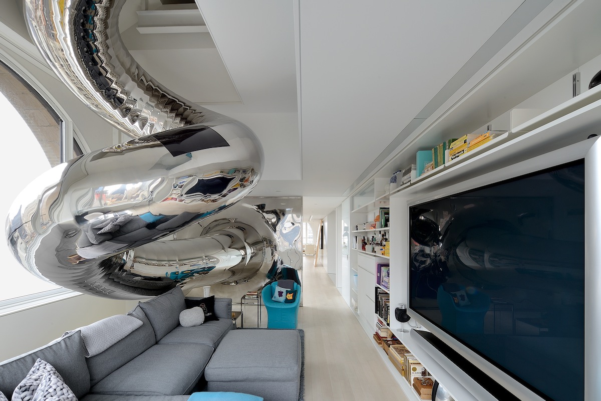
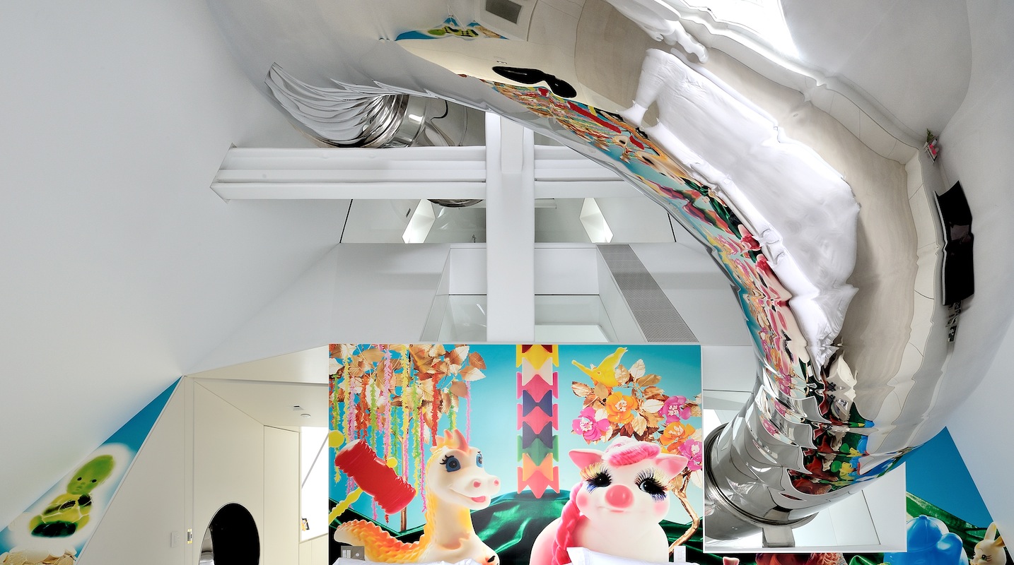 Skyhouse by David Hotson Architect, New York, New York
Jury Winner, 2013, A+Awards, Residential Interiors
This is another New York Apartment with an extremely unique design. The four-floor penthouse, being used as a residence for the first time, showcases a variety of cutouts and transparent surfaces that curate different views of the city outside. A large spiral slide makes this maze-like house an even more fun experience. The stainless steel addition is an easy way to get from the attic to the exit on the lower floor. It starts from a sloped partition, travels above a bedroom, makes a dramatic exit out of a window, and then goes over a staircase before finally coiling and reaching the lower floor.
Images by Andreaswidi
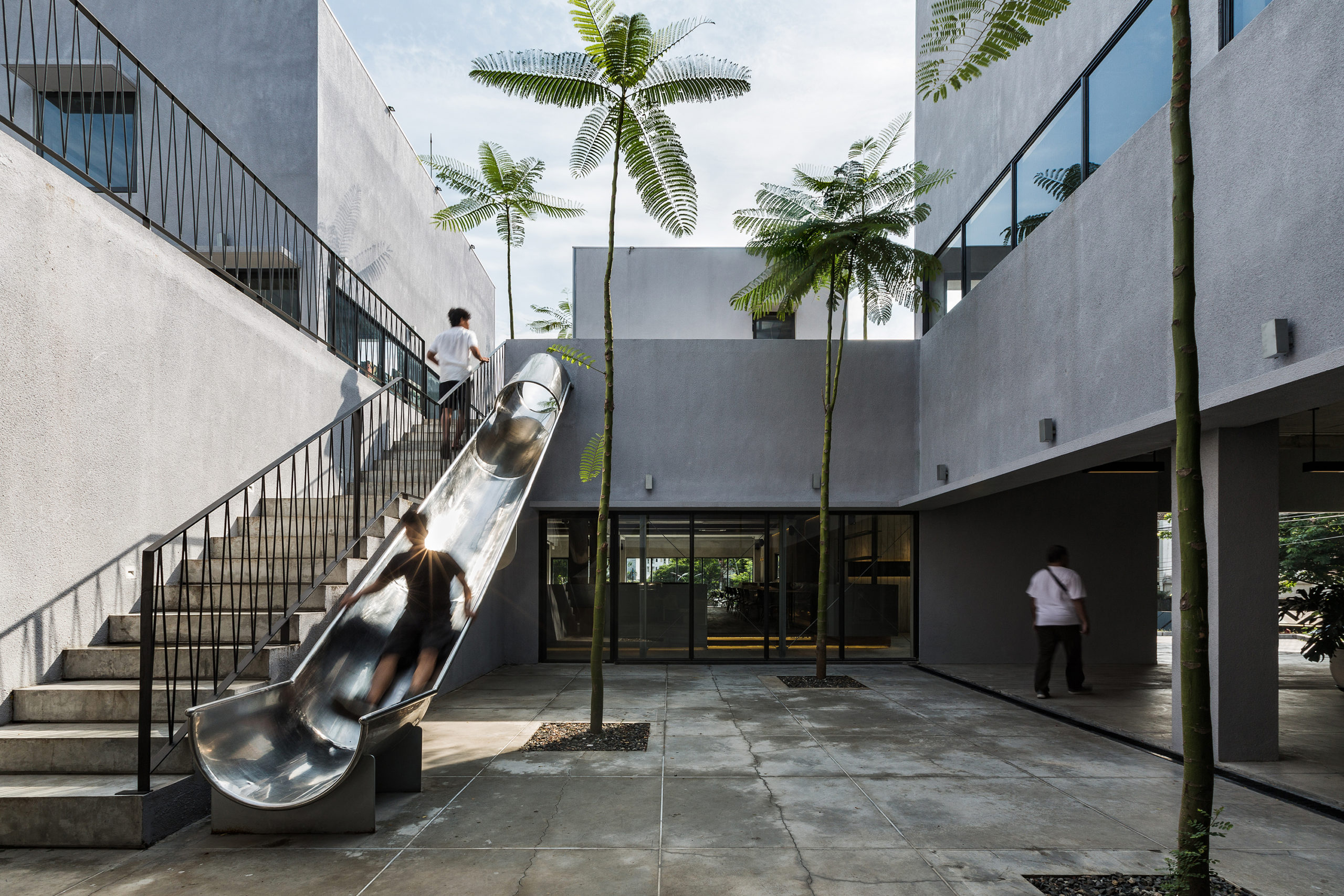
DipoMuria by SHAU, Semarang, Indonesia
Stark concrete walls contrasted with vibrant green Brazilian ferns create the design language of this commercial center in Semarang. It includes a photo studio, restaurant, café as well as a shop. The simplicity of the structure helps it blend with the residences around. The studio plays with volumes to create a central courtyard and terraces and also to maximize natural light in all spaces. They also installed a slide for children that connects one terrace to the courtyard. While designed for children, its clean and minimal appearance ties in seamlessly with the mature architecture of the building. They also imagined this addition as a great backdrop for photos.
Images by Ketsiree Wongwan
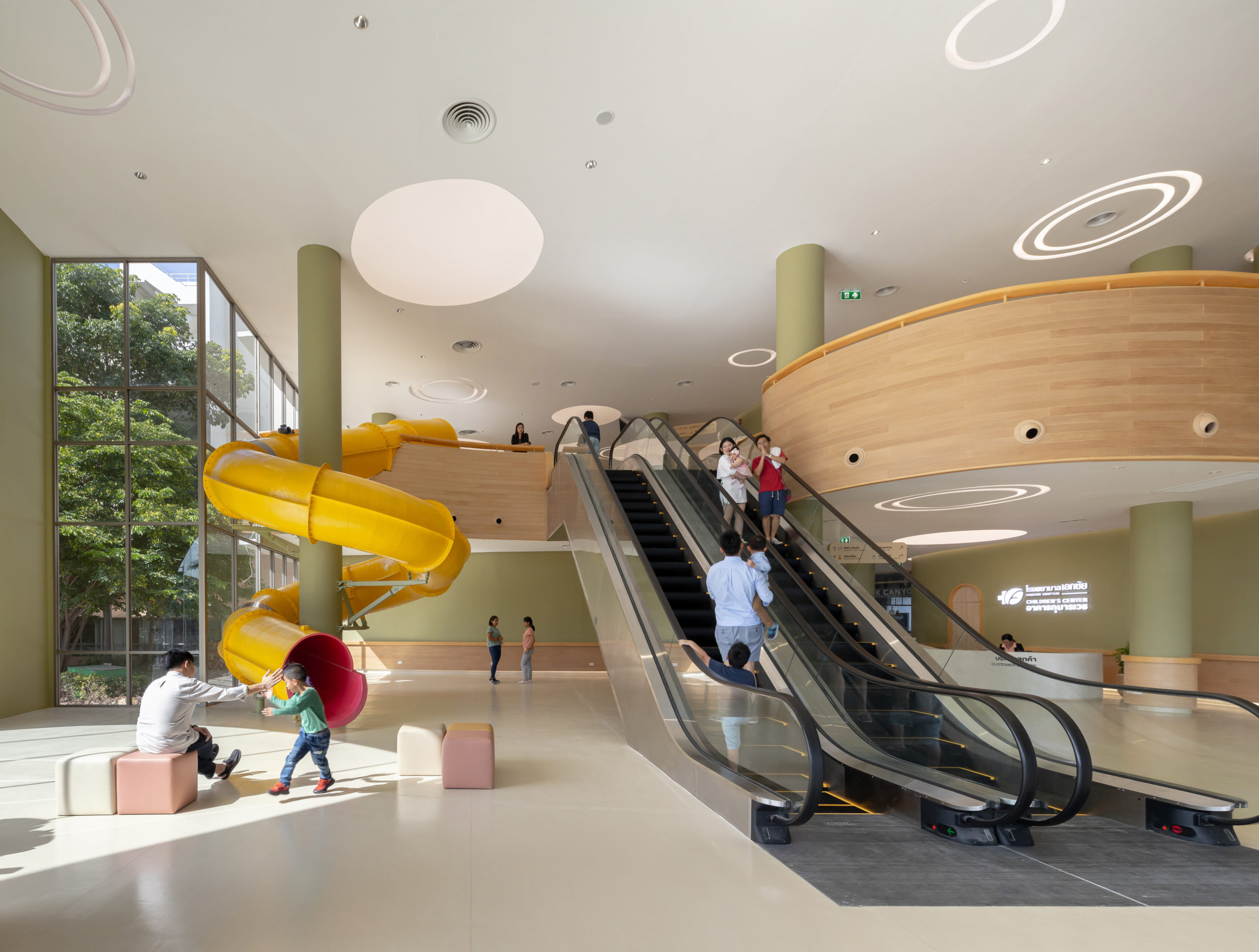
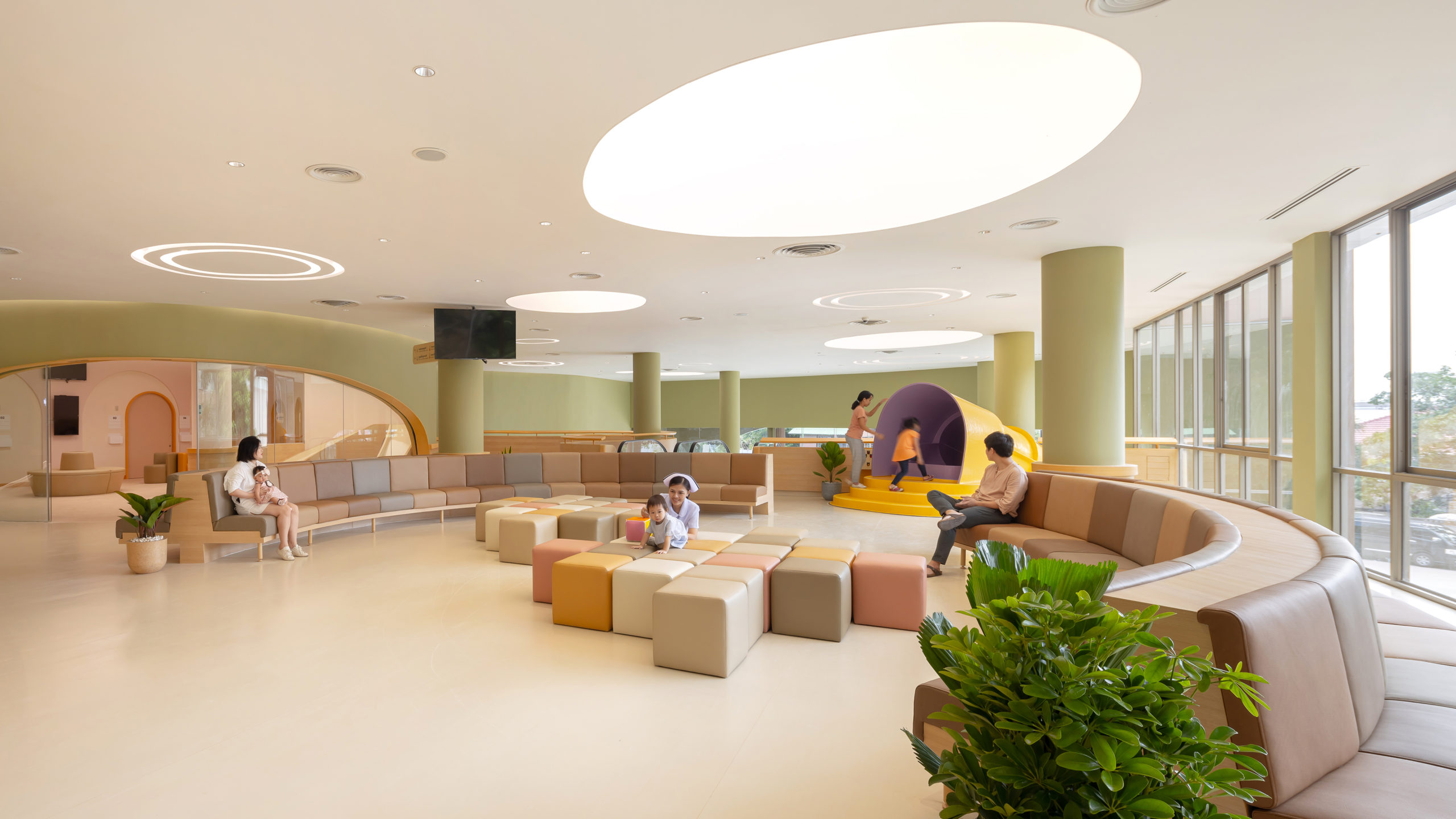
EKH Children Hospital by IF (Integrated Field co.,ltd), Thailand
Jury Winner, 2020 A+Awards, Health Care & Wellness
The EKH Children Hospital is designed to be a warm and inviting place for children to come in and get treated as opposed to a clinical space that could intimidate them. The waiting areas in the hospital are decorated in pastel hues with furniture that is made to accommodate shorter heights. Curved lines, animal motifs, cartoon clouds and a large swimming pool add to the whimsy. The entrance hall features a large yellow slide that kids can use to come down from the waiting area or even entertain themselves with when the lines are long.
Architizer's diverse jury of global experts is currently reviewing submissions to the 14th A+Awards! Sign up to receive updates on Public Voting and spring winner announcements.
 EKH CHILDREN HOSPITAL
  LEGO® PMD
  The Discovery Slides
  The Galfond Residence
  Vitaland kid restaurant
