Architizer's diverse jury of global experts is currently reviewing submissions to the 14th A+Awards! Sign up to receive updates on Public Voting and spring winner announcements.
Rather than building more, these architects strive to build better. Opting for adaptive reuse over completely new construction, the following designs breathe new life into deeply revered historic sites all over the globe. Not only does such an approach seek to directly address concerns surrounding land degradation and conservation, but it also takes obsolete, abandoned and under utilized buildings, and yields new forms that expand beyond the purview of their initial usage.
Such imaginative undertakings are hardly straightforward. Cutting edge and ahead of their time, these designs dare to envision a seamless marriage between preservation and fresh creation. Featured in this collection, Zaha Hadid Architects reconfigured an antiquated fire station into an avant-garde sculptural mass, while 1100 Architect converted a rundown cottage from the mid-1800s into an exciting hub for international collaboration.

© Anton Grassl

© Anton Grassl

© Anton Grassl
The Center for Asian Art at the Ringling Museum of Artby Machado Silvetti, Sarasota, Fla., United States
Located on a historic 66-acre estate, the Ringling Estate is one of the largest museum-university complexes in the United States. The creation of the new Asian Art Study Center involved the addition and gut renovation of the southwest corner of the Museum complex. Converting 18,000 square-feet of space into permanent galleries, the new exterior is composed of deep-green, glazed terra cotta, creating a new monumental entrance.

© Zaha Hadid Architects

© Zaha Hadid Architects

© Tim Fisher
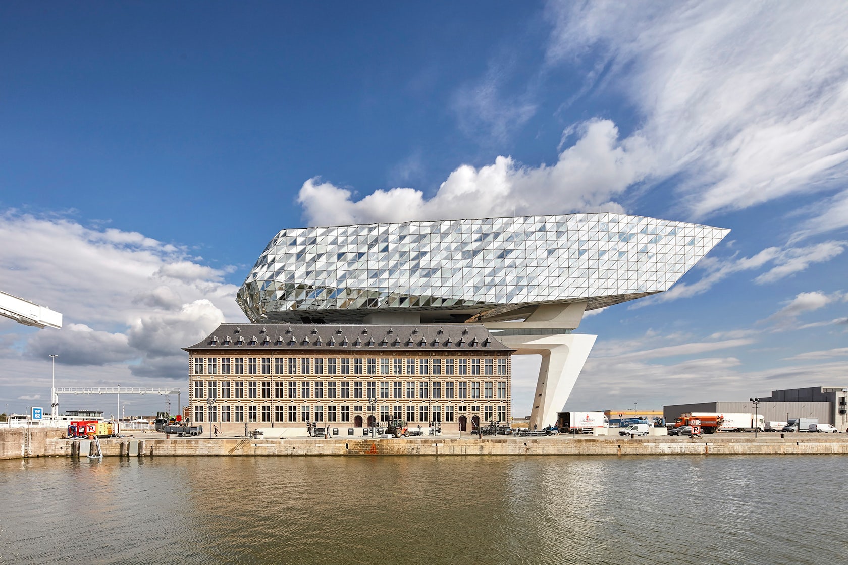
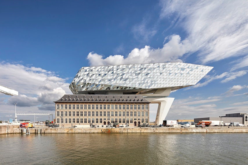
Port Houseby Zaha Hadid Architects, Antwerp, Belgium
Port House repurposes, renovates and extends a derelict fire station into new headquarters for the Port of Antwerp. The design composition, which carefully merges old and new, incorporates three key principles: a new volume that “floats” above the old building, respect for the old façade and the attainment of verticality, which was an unrealized element in the building’s original design. Surrounded by water, the extension’s glazed surface ripples like waves and reflects the changing tones and colors of the city’s sky.

© Bohlin Cywinski Jackson

© Bohlin Cywinski Jackson

© Bohlin Cywinski Jackson
Apple Store, Williamsburg by Bohlin Cywinski Jackson, Brooklyn, N.Y., United States
For Brooklyn’s first Apple store, Bohlin Cywinski Jackson designed this 13,700-square-foot retail space to complement the borough’s historic industrial past. Drawing inspiration from the preexisting brick façade and arched openings, the design features polished concrete floors, exposed structural steel and acoustical wood ceilings. Intended to draw in the street’s public life and serve as a community gathering space, storefront windows allow daylight to flood the space and for pedestrians to curiously peek through.

© BKSK Architects

© BKSK Architects
Tammany Hallby BKSK Architects, New York, United States
At its core, BKSK works to develop meaningful dialogues between contemporary and historic architecture. In line with that ethos, the formerly unassuming hipped roof of Tammany Hall on New York’s Union Square is being transformed into an unconventional dome of glass and terra-cotta. Inspired by a turtle’s shell, the structure represents the clan and legacy of Tamanend, the chief of the Lenape who was deeply revered from the late 17th to early 19th centuries.

© Daria Scagliola/Stijn Brakkee

© Daria Scagliola/Stijn Brakkee

© MVRDV
Crystal Houses by MVRDV, Amsterdam, Netherlands
Located on Amsterdam’s one and only luxury brand street, MVRDV was asked to design a flagship store that combined both Dutch heritage and international architecture. The daring façade mimics the original design, with glass bricks stretched up vertically, eventually dissolving into a traditional terra-cotta brick façade. As retail becomes increasingly globalized and homogenized, the design seeks to provide a solution to the loss of local character in high-end shopping areas around the world.

© 1100 Architect

© 1100 Architect

© 1100 Architect
University of Pennsylvania, Perry World House by 1100 Architect, Philadelphia, Penn., United States
When the University of Pennsylvania launched a new institute to aggregate all of its international activities, a small run-down cottage built in 1851 served as an unlikely canvas. Nevertheless, 1100 Architect’s transformative design incorporated a portion of the existing house through meticulous preservation. The design mediates two opposing conditions: a pedestrian scale to its south and west, and a bustling traffic corridor to its north and east.

© Ateliers A+

© Ateliers A+

© Ateliers A+
A+Agency by A+Architecture, Montpellier, France
Located at the heart of a nature conservation area in the South of France, A+Agency features a rehabilitated farmhouse and new real estate development, which boasts 75 additional apartments. Integrated within a sensitive environment, the new façades are composed of white concrete and white ceramic mesh, in order to match with the farmhouse’s traditional color. Welcoming employees of the A+ group, the interior spatial arrangement facilitates streamlined traffic flows and multidisciplinary exchanges.

© Dirk Weiblen

© Jonathan Leijonhufvud Architectural Photography

© Jonathan Leijonhufvud Architectural Photography
WeWork Weihai Lu by LINEHOUSE, Shanghai, China
Nestled in a turn-of-the-century brick building, LINEHOUSE sought to celebrate the grandeur of the site and encapsulate the feeling of being in a grand hotel. With the central atrium encased by the heritage façade, the architects incorporated industrial accents in order to complement the historic building. Counters are clad in reclaimed wood paneling and supported by concrete bases, while a steel staircase — painted in bold ivy-green — weaves through the entire space.
Architizer's diverse jury of global experts is currently reviewing submissions to the 14th A+Awards! Sign up to receive updates on Public Voting and spring winner announcements.


