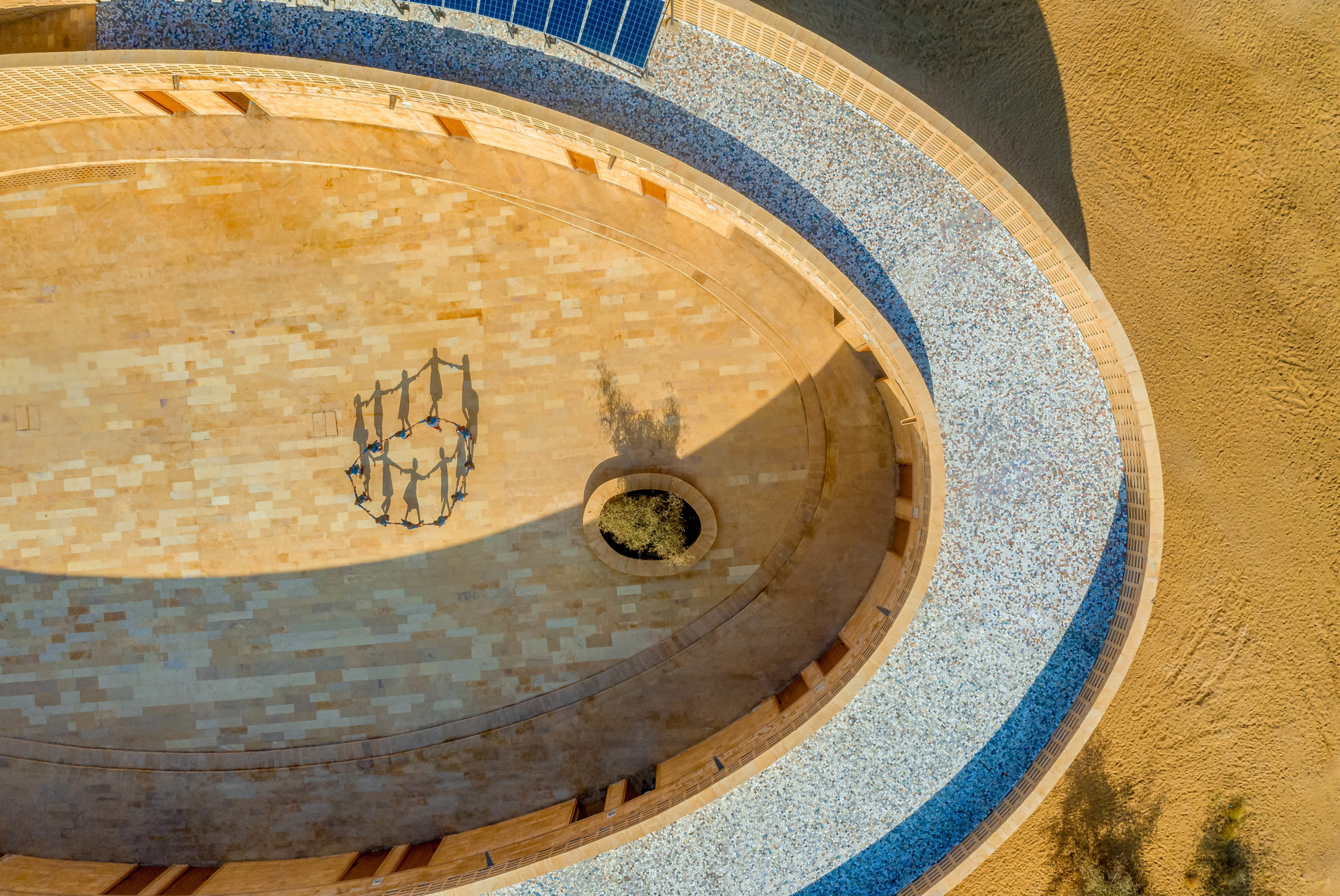
Got a compelling architectural drawing to share? Register for updates about the next One Drawing Challenge, the drawing competition with 2 Grand Prizes of $2,500! In the meantime, check out the remarkable Finalists of the 2021 One Drawing Challenge!
Drawing is at the heart of architecture. As the foundation of practice, it centers on ideation, technical detailing and self expression. Sketching is a type of drawing that allows designers and artists to explore concepts in multiple styles. Usually done for preliminary studies or quick idea generation rather than conveying a finished product, sketching is often less detailed. It’s tied to time, movement, and process as a way to capture a mood or the key features of a subject.
Sketches are unique and highly individual. They are tied to your hand and craft, to the way you see the world. Sketching can also emerge from observation, from a careful reading of a space or place in view. As a way to visualize ideas and concepts, there are multiple types of sketching you can explore. Each can be done with different media, and adapted or combined as you find what works best for you.
From diagrammatic sketches to more analytic and life drawings, sketching is a way to build understanding and to interpret both ideas and what we see. Analytic sketches allow us to record our observations and filter them through an individual perspective, whereas diagrammatic sketches are more often used to depict adjacencies and relationships between ideas that can be abstract. The following list compiles five distinct types of sketching, each lending themselves to different ways of sharing information and illustrating design concepts.
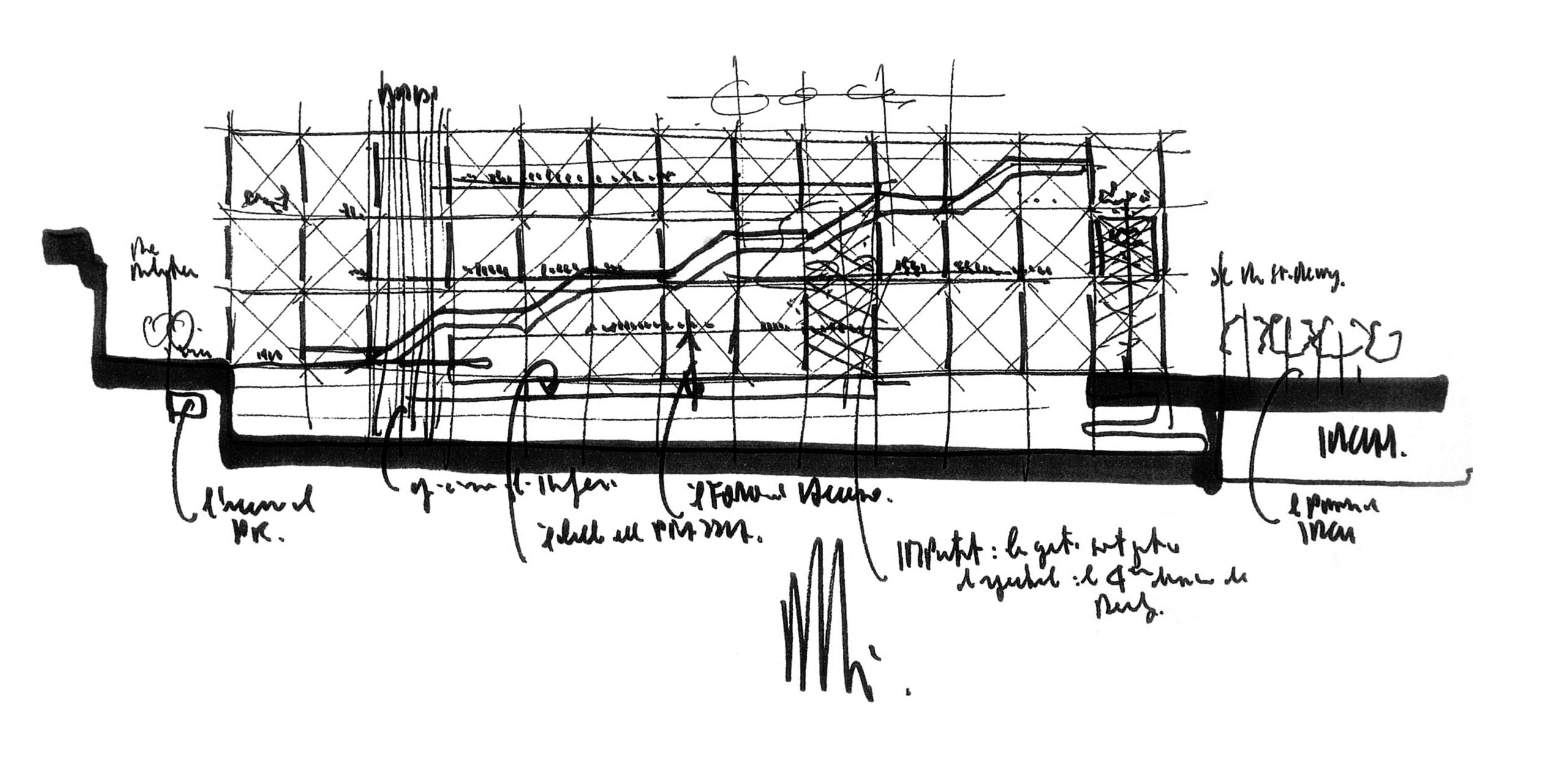
Centre Pompidou, Courtesy Renzo Piano Building Workshop
Line Drawing
At its most basic form, sketching is usually done as a line drawing. Defined as drawings done using only lines that vary in width and density, these sketches produce a range of depth. While lines do form the basis of all drawing styles, this specific type of sketching includes straight or curved lines placed against a (usually plain) background. Emphasizing form, they can be everything from continuous line drawings where the pen or pencil never leaves the paper, to caricatures and realism. However, they often don’t depict shading or light.
Line sketches create images by indicating the edge of a two-dimensional (flat) shape or a three-dimensional form with contours. They also include doodles — an informal types of line drawing that is done in a more subconscious and less attentive way. Drawn quickly and with simple, clear lines, doodles can be inspiring illustrations of our ideas and our impressions of the world. It’s good to begin here, as line drawings encompass one of the seven elements of art: line, color, shape, form, texture, value, and space. There are also implied lines, which aren’t physically present, but generated by our minds as we sketch and produce relationships between different subjects. It’s key to remember that by varying your line weight, you can capture movement and suggest when one object is in front of the other.
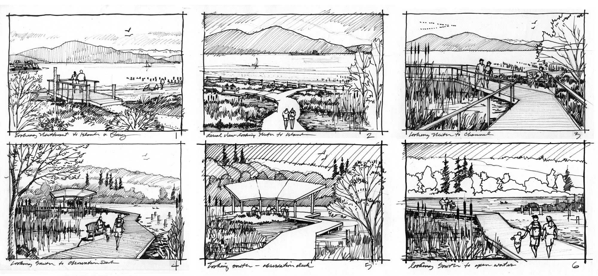
Thumbnail Sketches for a Ship Harbor Preserve by Dick Mullen, Courtesy eccosDesign
Thumbnails
Thumbnail sketches are quick drawings used for brainstorming and investigating the appearance and visual impact of ideas. These can span aspects of geometric proportion, configuration, scale and layout. You can try out several ideas and zero-in on the most likely layouts before beginning a project. You can use any medium, and these sketches are usually very small. They can also be used as a memory aid to help you remember important features of a subject, or plan out a more detailed drawing or storyboard. You can quickly experiment with format and composition, from horizon and perspective.
The key to thumbnail sketches is rough shapes and lines, implying larger environments or structures. These outlines are the key components. They usually begin with a rough box, then include a horizon line, verticals and horizontals of the built and natural environments you envision. Use thumbnails to suggest experience and interaction, and to portray use in the context of artifacts, people and relationships.
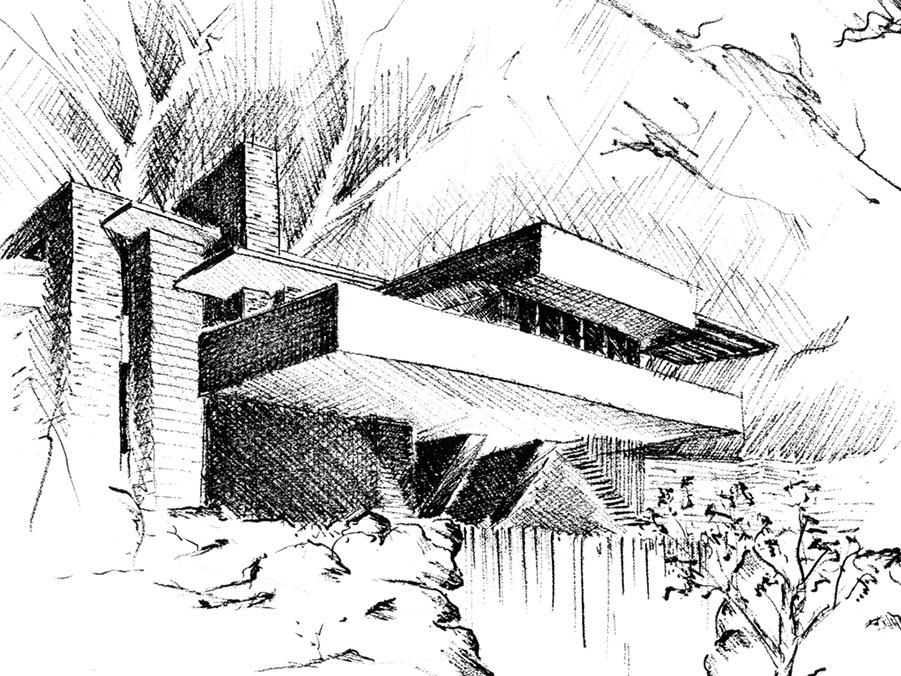
Fallingwater by Laforte
Cross-Hatching
As a type of sketching that creates rendered elements of light and depth, cross-hatching is a technique and a method of adding many lines together. It is the basis for a variety of textures and patterns, and can be used for many diverse subjects. The key to developing your skills in cross-hatching is the quality of your lines and the consistency of your execution throughout the sketch. At its core, the most fundamental way to create this sketch is through parallel lines. It’s useful to render spatial depth in an idea, and your lines can vary. They can be diagonal, vertical or horizontal, as well as long or short. You can also combine these different line types and weights as you add many lines together.
Cross-hatching relies on repetition and understanding where light falls on a subject. By expanding on your technique and understanding of the line density, you can create gradients and shadows. Usually, subtle gradients will allow your shadows to stand out, and this type of sketching can help as you render the materiality of a building or space.
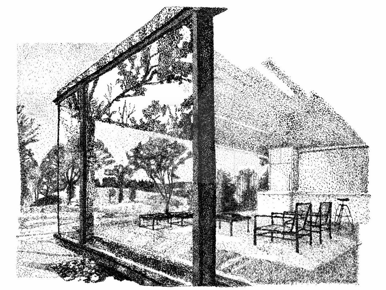
Ink Pointillism by Santitermi
Pointillism & Stippling
Moving into slightly more abstract representation, sketches that are done by pointillism and stippling rely on a process using numerous small dots or specks. The main difference between stippling and pointillism is that pointillism relies on the use of color theory and optical mixing to create a picture, while stippling uses multiple dots of monochrome or tones of black and white to create an image. Stipple sketches are done with varying nib sizes, which allows a wide range of dot sizes, densities and values.
Pointillism is rooted in the work of chemist Michel Eugène Chevreul, who was asked to solve a problem at a Parisian tapestry firm. The company thought its dyes were too weak, and Chevreul showed that the “right juxtapositions of dyes would mutually enhance each component and yield striking results.” Evolving from thread to paint, works were created from dots or points of color. On the other hand, stippling is a technique that was invented by Giulio Campagnola, an Italian engraver who translated Venetian oil paintings of Giorgione into the medium of engraving. Simply speaking, stippling creates light and shade with the use of dots, a kind of black-and-white pointillism.
As you try out this type of sketching, remember that is is a slower process. You can choose dot size by generally using larger dots for darker values and bolder results, while smaller dots (and the space between them!) can imply lighter surfaces and values. Rhythm is very important as you sketch, creating small repeating patterns of dots.
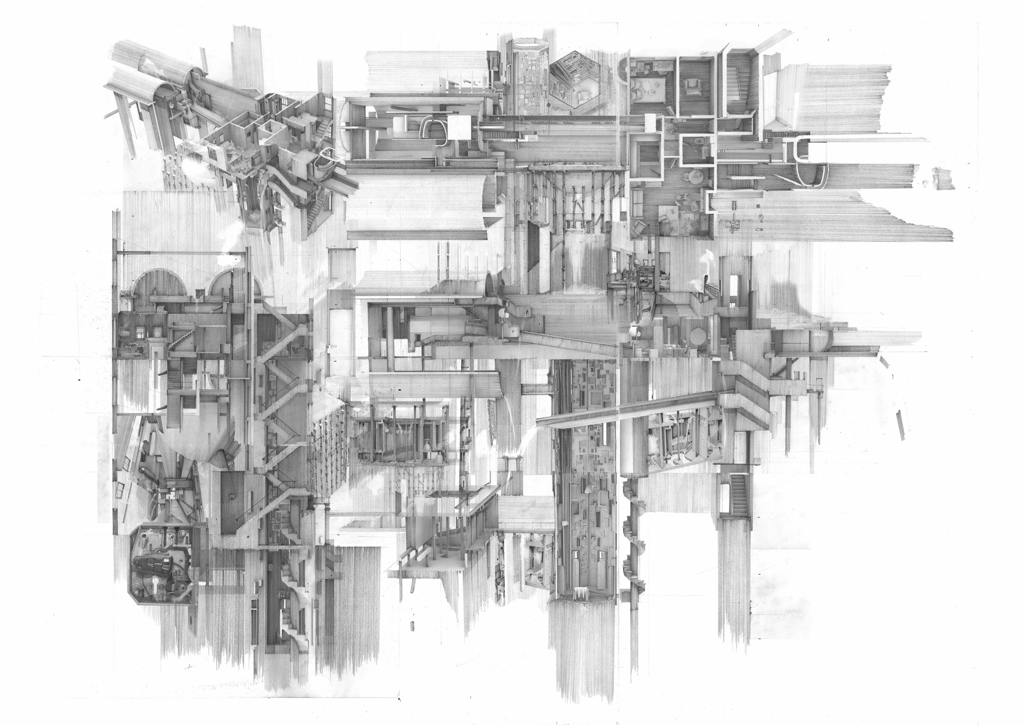
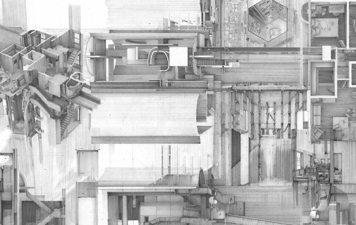
Apartment #5, a Labyrinth and Repository of Spatial Memories by Clement Laurencio
Hybrid & Composite Sketching
Hybrid sketches can be created using a single medium. They may combine different sections, elevations and isometric views together. As the overall winner of the fourth annual Architecture Drawing Prize, Apartment #5 by Clement Laurencio was also the winner of the Hybrid Category and a Commended Entry in Architizer’s One Drawing Challenge. The dwelling, set in London, re-creates atmospheres of places remembered from a recent voyage to India. Separate pencil sketches are digitally composed to create a labyrinth of spatial memories.
In his own words, Clement explored the impetus for this drawing, stating that “in this frightening period of the pandemic, travel has become unsafe and restricted. The future bears uncertainty, if and when we may travel to experience new places, and re-visit places of our past. Places which once drew people are now “indefinitely” and “temporarily closed”, with no certain opening date. We are isolated in our homes…left with our memories of those faraway places. Locked in our dwellings, we long to be able to escape to a past before the lockdown, to places far away from here.” Apartment #5 tells a fantastic story by combining line sketches, gradients and perspectives together.
Got a compelling architectural drawing to share? Register for updates about the next One Drawing Challenge, the drawing competition with 2 Grand Prizes of $2,500! In the meantime, check out the remarkable Finalists of the 2021 One Drawing Challenge!
