Architizer's 14th A+Awards judging is live! Subscribe to our Awards Newsletter for updates on Public Voting and the big winner reveal later this spring.
Cubism first disrupted the artistic landscape in the early 20th century, upending the status quo and offering a bold rebuttal to realism. Through the lens of this subversive movement, formative figures, including Pablo Picasso and Georges Braque, reimagined the world as a series of simplified, geometric fragments pieced back together to create abstract images that play with traditional notions of perspective.
This avant-garde outlook went on to revolutionize the built environment. Architects like Le Corbusier utilized Cubist values to defy conventional typologies of what buildings should look like. From angular shapes, sharp lines and multi-faceted forms to grid-like façades and ambiguous intersections of space, the stylized approach gave rise to some of the most iconic buildings across our global skylines today.
These winning projects from the 10th Annual A+Awards continue that legacy with dynamic and nuanced iterations of this radical philosophy. From residential housing to high-rise offices and cultural centers, here’s how architects are channeling the spirit of Cubism in exciting new ways…
1235 Vine Street
By Hawkins\Brown, Los Angeles, California
Jury Winner, 10th Annual A+Awards, Unbuilt Commercial
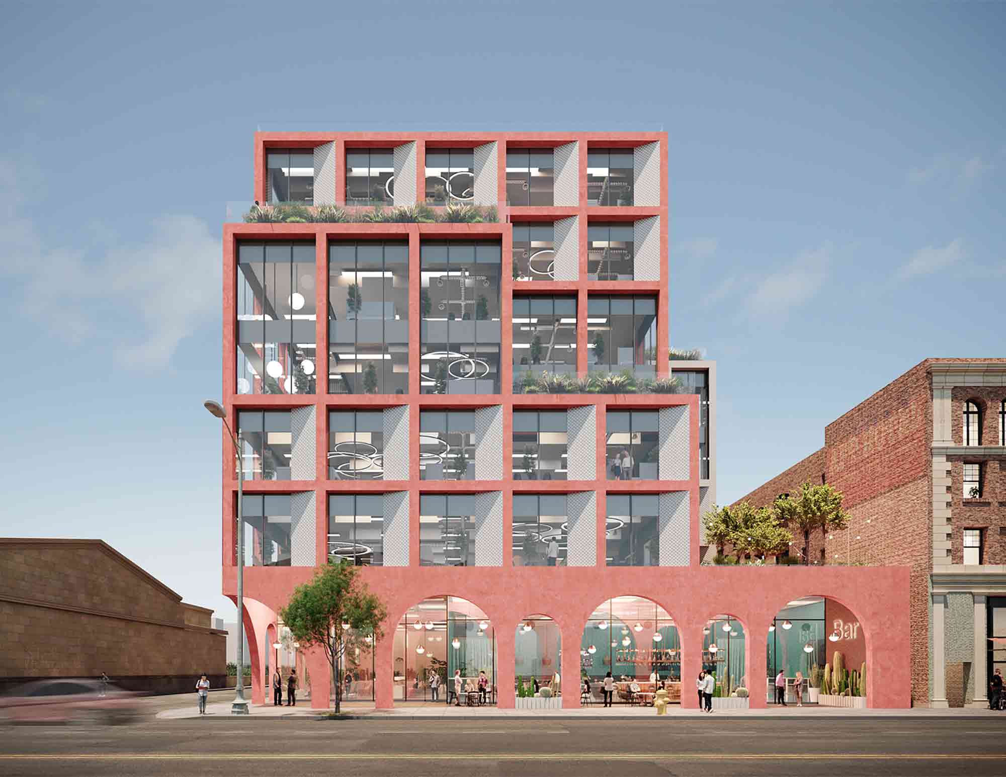
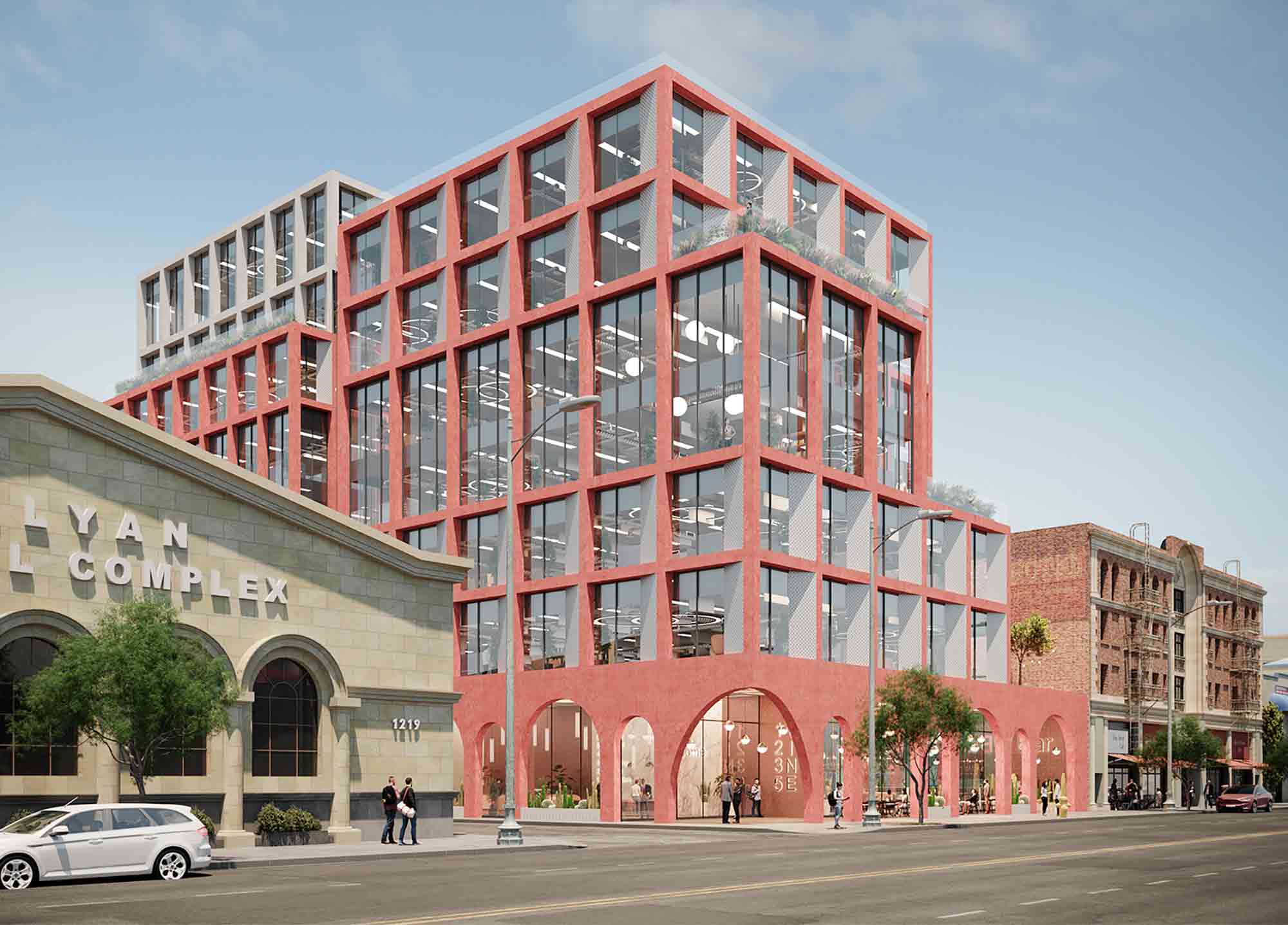 Synthetic Cubism, a later incarnation of the movement in the 20th century, emphasized bright colors and dramatic cut-outs. This remarkable mixed-used commercial building embraces these adventurous qualities. The concept design features a vibrant pink concrete exterior, while square and rectangular framework across the façade creates graphic, exaggerated windows that frame the cityscape of Hollywood.
Despite its ground-breaking approach, the project has reverence for the surrounding built landscape too. A colonnade framed by arched openings encircles the base of the structure, paying homage to the neighboring classical architecture while balancing out the rigidity of the project’s upper stories. Meanwhile, the stepped arrangement of the structure acts as a visual staircase, softening the transition from the residential bungalows to the west of the site.
Ministry of Taxes
By FXCollaborative, Baku, Azerbaijan
Jury Winner, 10th Annual A+Awards, High Rise (16+ Floors)
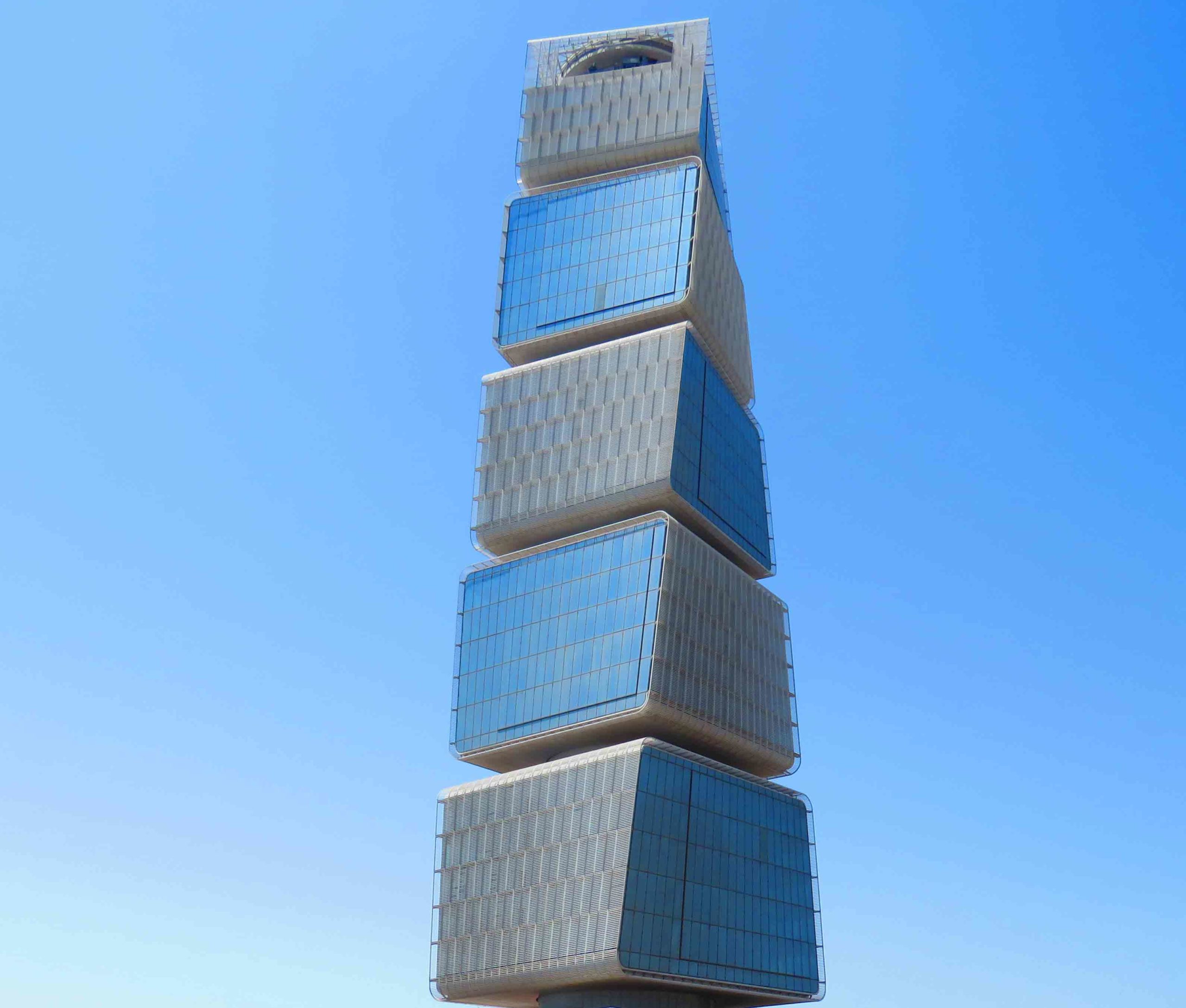
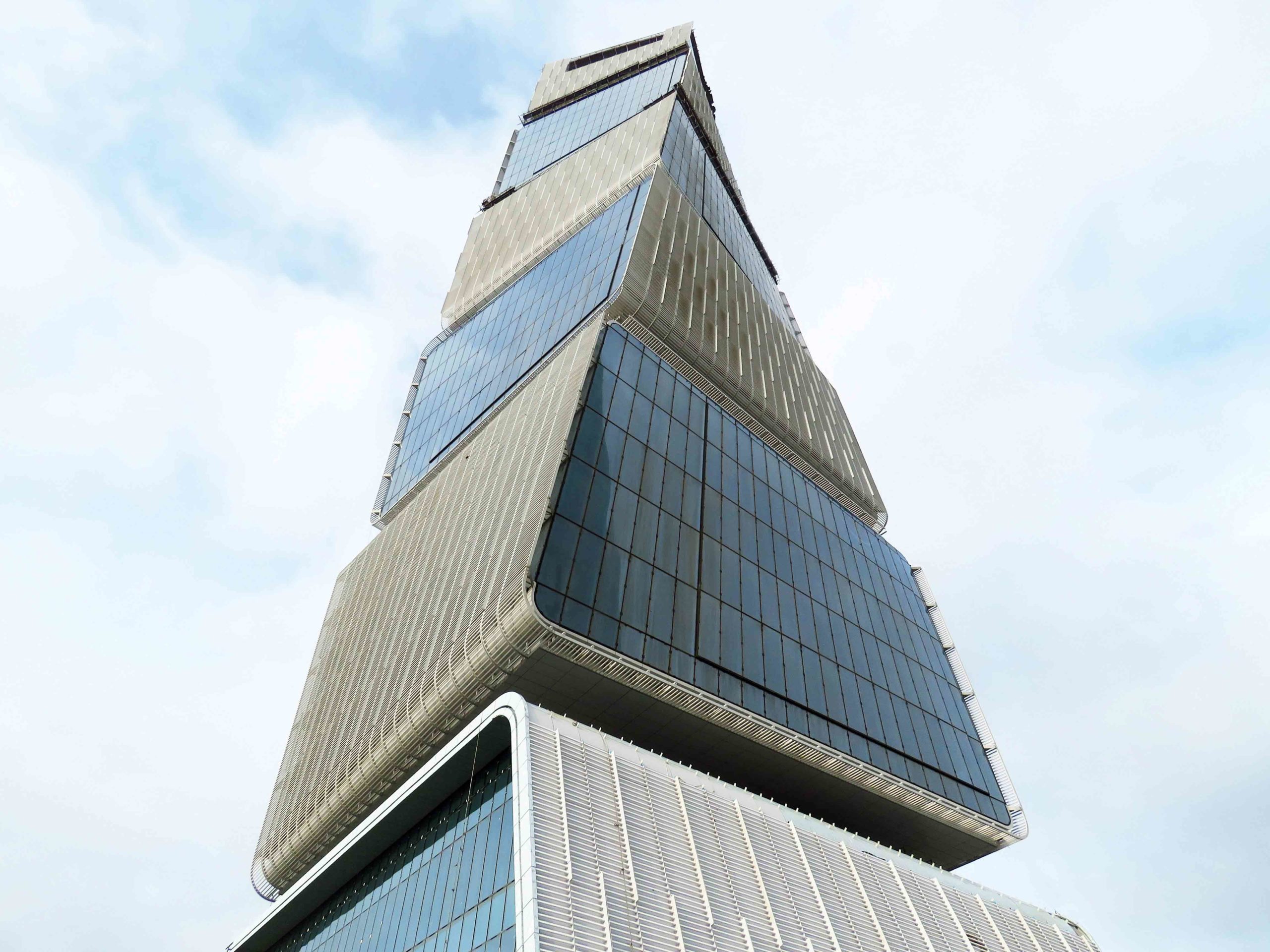 A trailblazing revision of traditional high-rise commercial buildings, the Ministry of Taxes adds a radically unique perspective to the skyline of Baku. Five cubic forms twist and taper upward to create a striking silhouette steeped in playfulness — as though a series of toy blocks were left behind by some higher being.
Each section cantilevers off from a central core, rotating 1.2 degrees as the cubes rise. As well as its visual impact, this spiraling orientation maximizes solar gains, while thermally efficient glazing helps to regulate the building’s internal temperature. Green sky gardens punctuate the voids between the modules, offering welcome pockets of nature amongst the urban topography.
Piiri wooden housing block
By Tommila Architects & Kaleidoscope, Kerava, Finland
Jury Winner, 10th Annual A+Awards, Multi-Unit Housing (S <10 Floors)
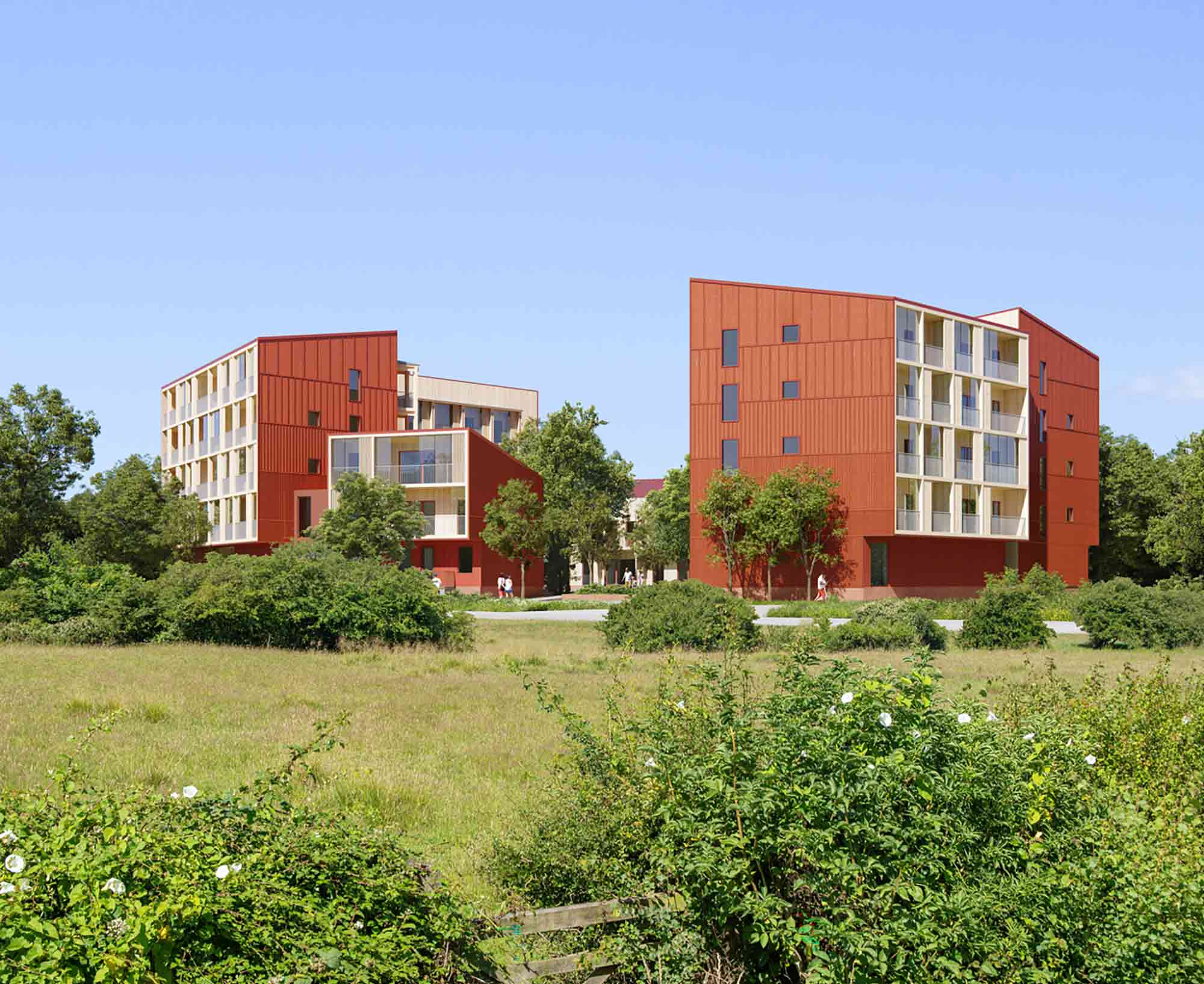
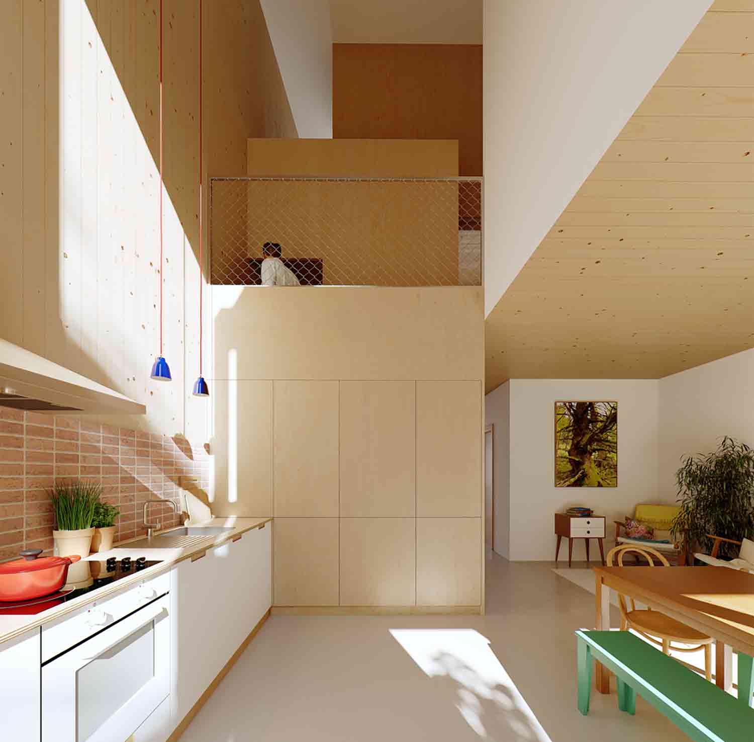 This innovative concept design in Finland is a marked departure from conventional multi-unit housing typologies. Clustered in a hexagon, each residential structure is made from sustainable cross-laminated timber, while photovoltaic panels and heating systems derived from forestry waste make the complex impressively energy efficient.
The buildings’ bold aesthetic is befitting of their pioneering construction. Vibrant red exteriors are offset to dramatic effect by light pine cladding across the inward-facing aspects and enclosed balconies. The result is a horizon of bright, angular forms rising up from amongst the trees. Inside, the living spaces echo subtle geometric references. Staggered volumes of pine frame the open stairwell, creating unique spaces of intersection as the staircase rises.
Mason
By Vaslab Architecture, Na Jomtien, Thailand
Popular Choice Winner, 10th Annual A+Awards, Hotels & Resorts
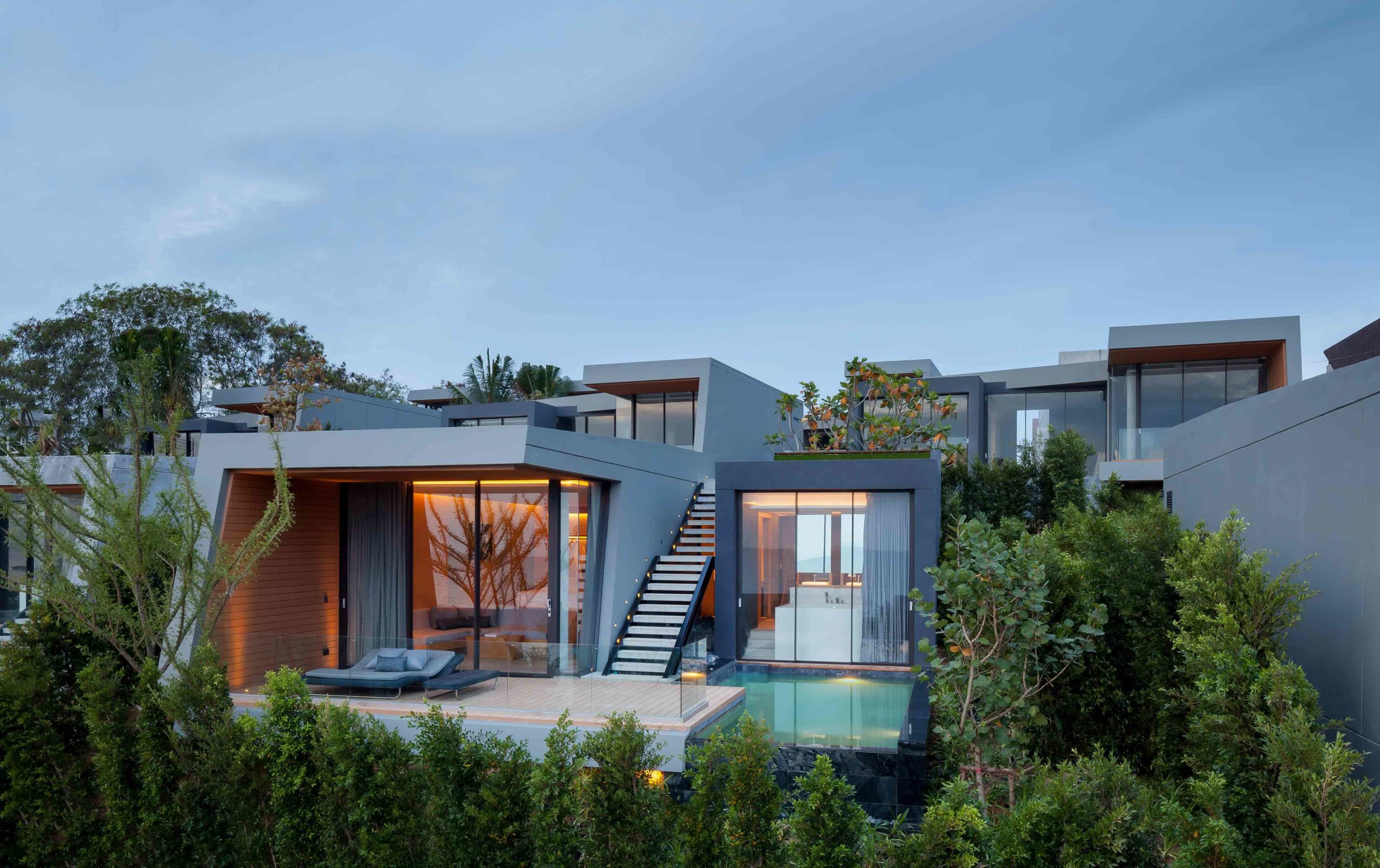
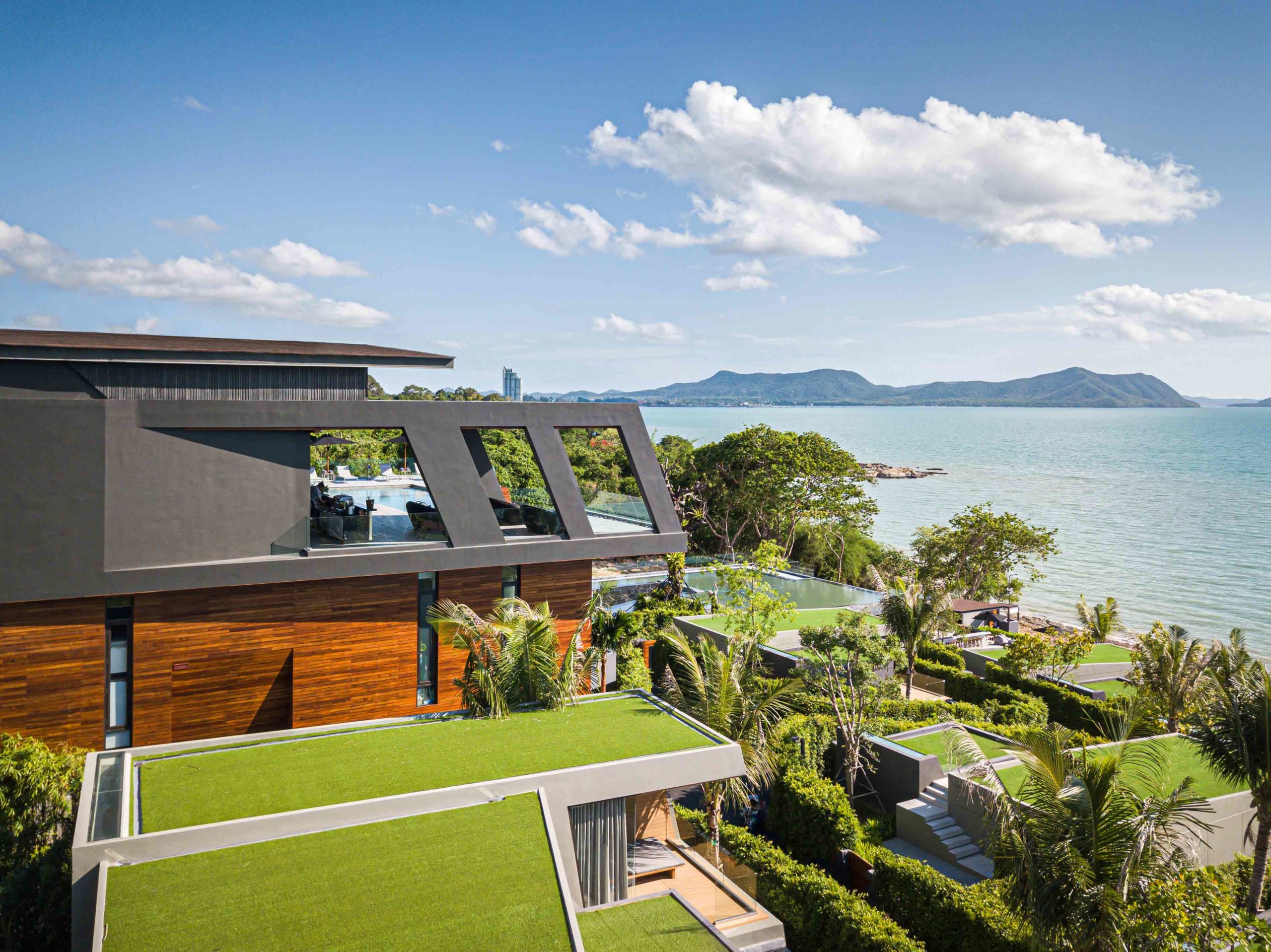 Built into a rugged granite hillside that overlooks the sea, this exceptional resort complex in Thailand required an ingenious design that was at once striking and respectful of the site’s existing terrain. Vaslab Architecture achieved just that, delivering thirty-five cubic villas that follow the natural gradient of the slope.
With their angular lines and boxy gray forms and overhangs, the concrete units were conceived as a series of modern, architectural caves. Crowned with green roofs, the staggered development sensitively blends into the organic hues of the environment, while offering breathtaking ocean views from each residence. Inside the villas, granite washbasins and artwork shaped from local resources further blur the natural landscape with the domestic. Historically, Cubism rejected the realist principle that art should reflect nature. However, this ground-breaking project demonstrates the value of exchange between these contrasting approaches.
Ice cubes
By Zone of Utopia + Mathieu Forest Architecte, Xinxiang, China
Popular Choice Winner, 10th Annual A+Awards, Cultural & Expo Centers
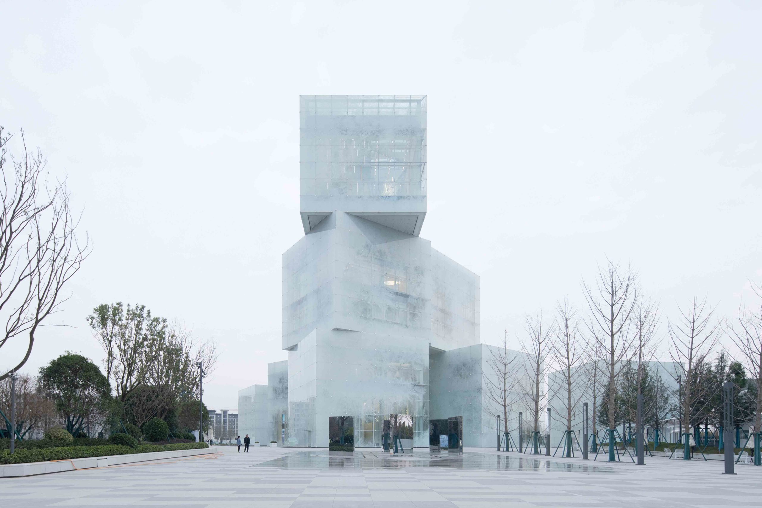
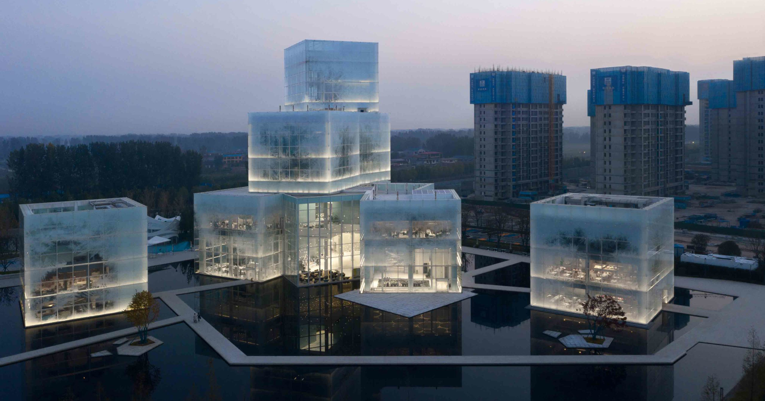
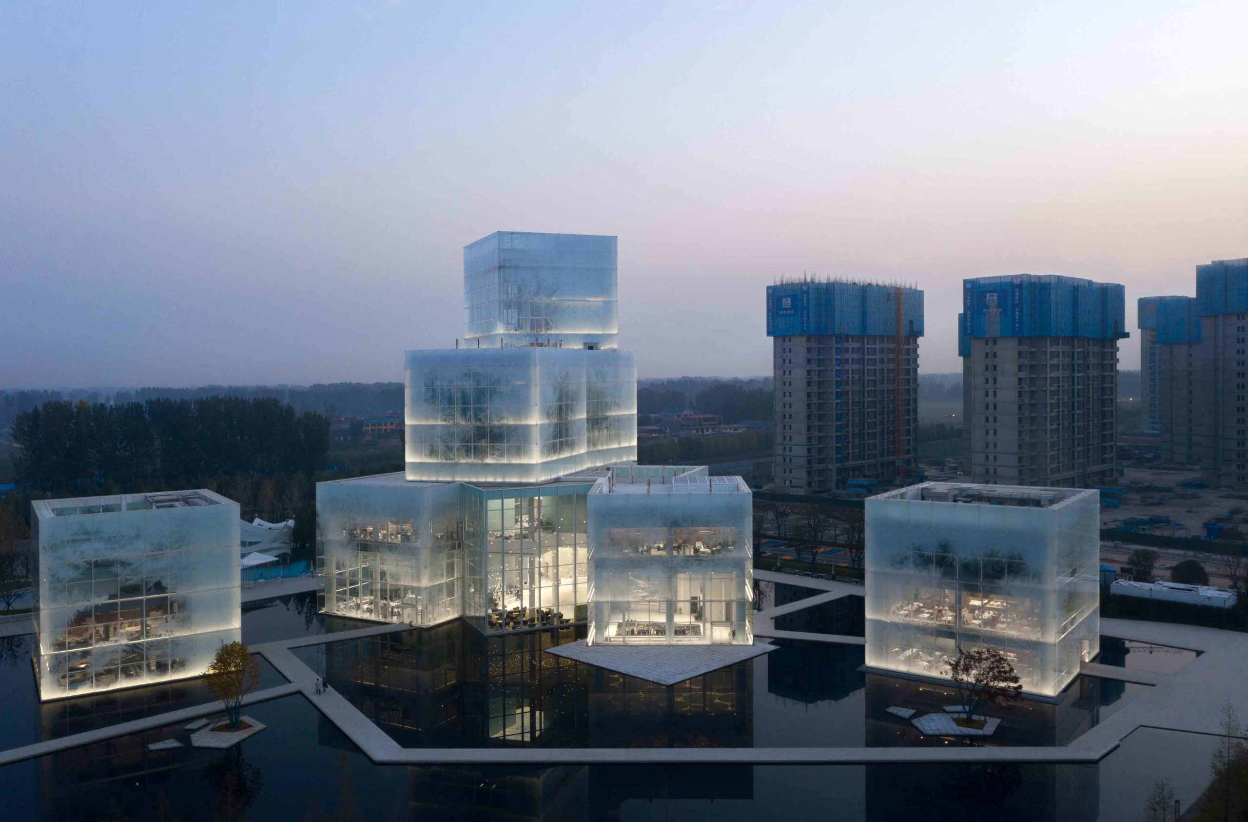 Inspired by winter sports, the Xinxiang Cultural Tourism Center is more sculpture than commercial space. Nine cubes stack and merge together in a radical arrangement of modules. Analytical Cubism, the early phase of the movement, was defined by muted hues and intersecting forms. These qualities are present in the project’s spatial ambiguity — overlapping architectural planes make it impossible for passers-by to discern the number of levels.
The treatment of the façade contributes to its visual liminality. Glazed panels laced with translucent ice crystals are suspended from stainless steel cables. The exterior oscillates between opacity and clarity, concealing and revealing across its many facets. After nightfall, the supersized ice cubes transform into glistening lanterns as light filters out through the crystalline skin.
Tony Fruit Office
By TAA DESIGN, Ho Chi Minh City, Vietnam
Jury Winner, 10th Annual A+Awards, Low Rise (1-4 Floors)
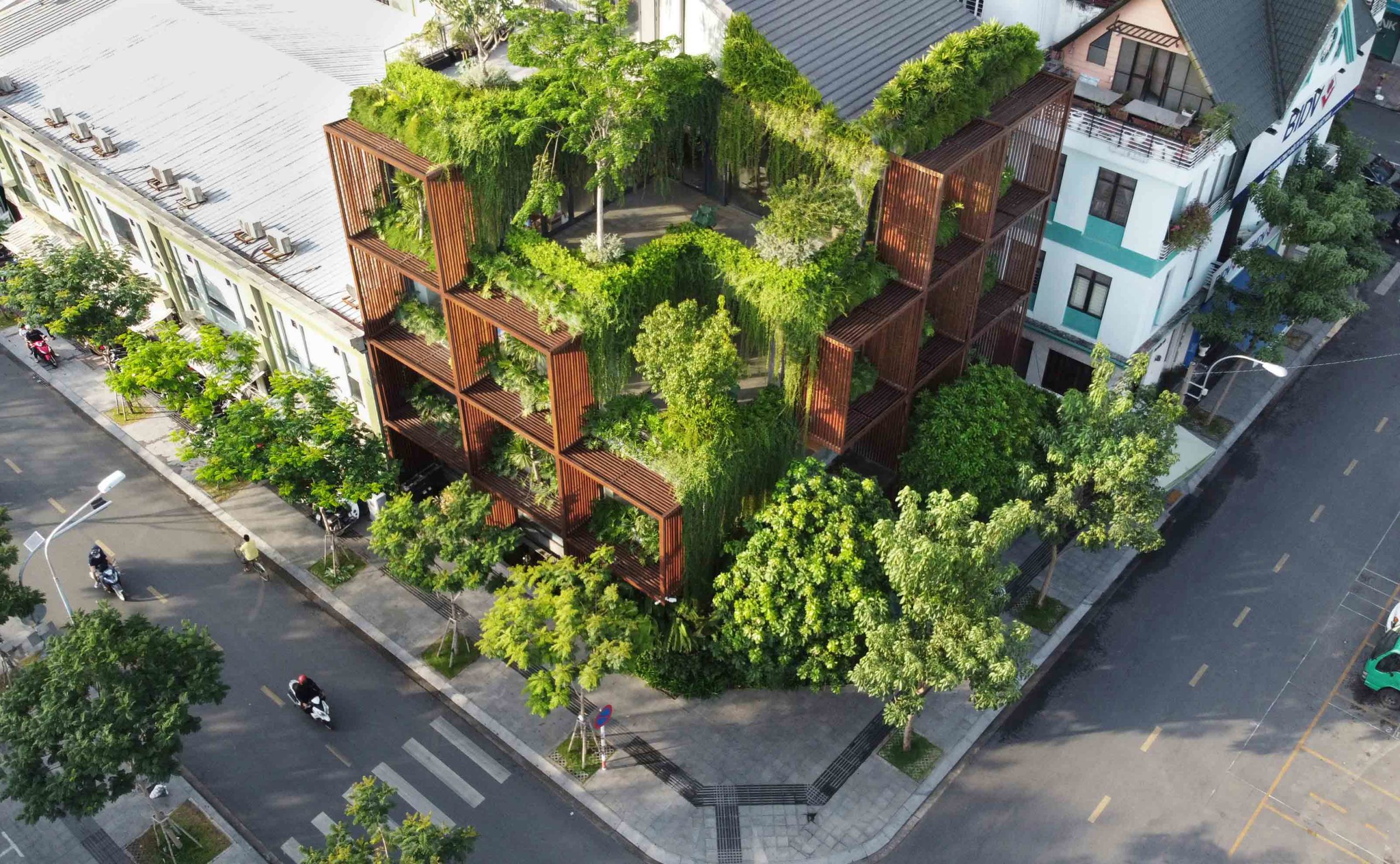
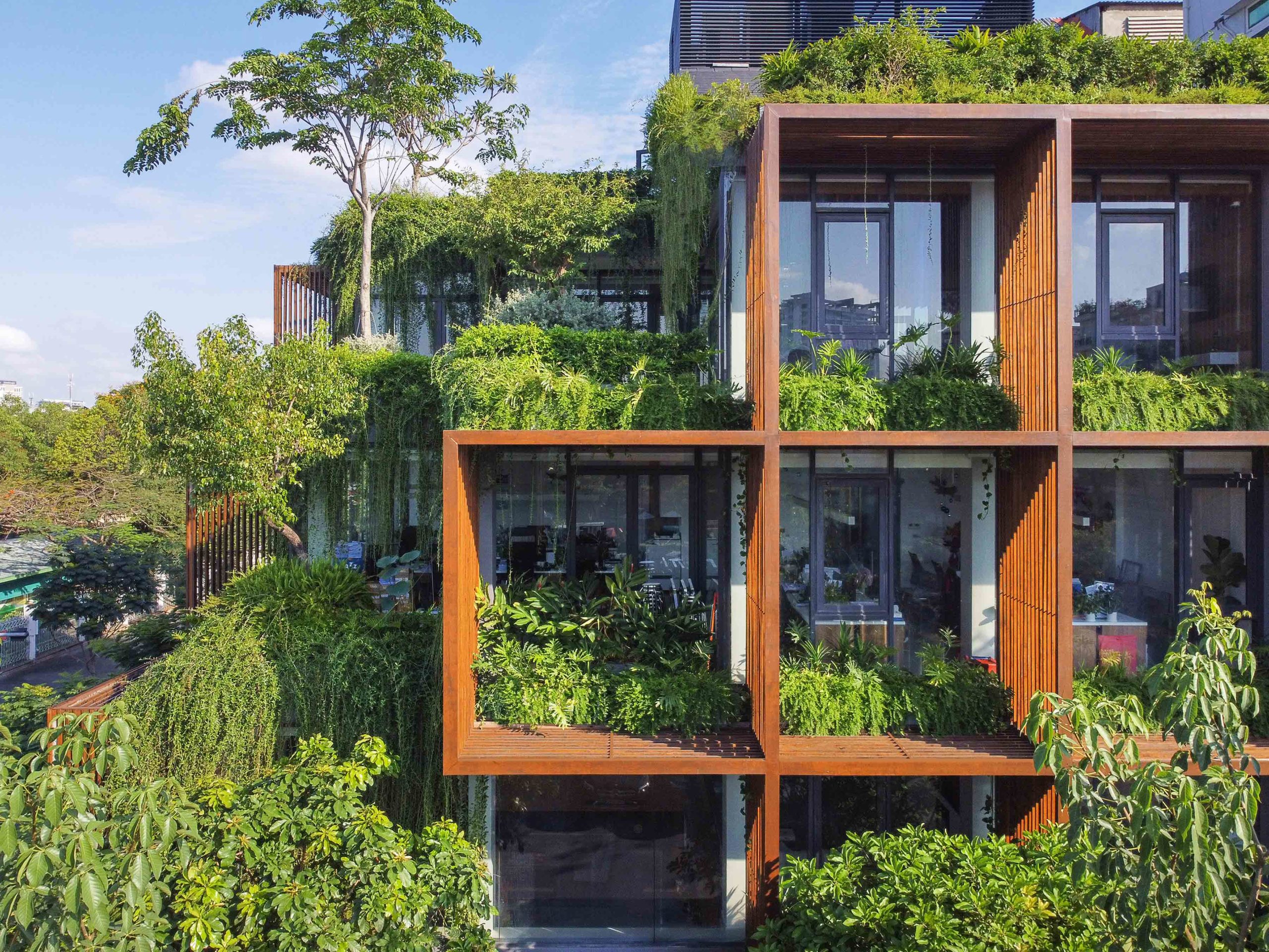 The grid formation, which rose to prominence during postmodern iterations of Cubism, is ingeniously utilized in the design of this office building in Ho Chi Minh City. Architects TAA DESIGN were tasked with creating a scheme that wouldn’t overheat — a challenge given that the two main aspects of the building receive direct sunlight throughout the day.
The solution was this remarkable wooden framework, which sets the building back from the street and creates shade for the internal workspaces. The geometric boxes function as intermediary zones where nature can flourish in the sunshine, while the perforated construction allows air to circulate. Here, the graphic skeleton becomes a biophilic playground with aesthetic value and impressive functionality.
FH Office
By TA-CHA Design, Bangkok, Thailand
Jury Winner, 10th Annual A+Awards, Mixed Use (S <25,000 sq ft)
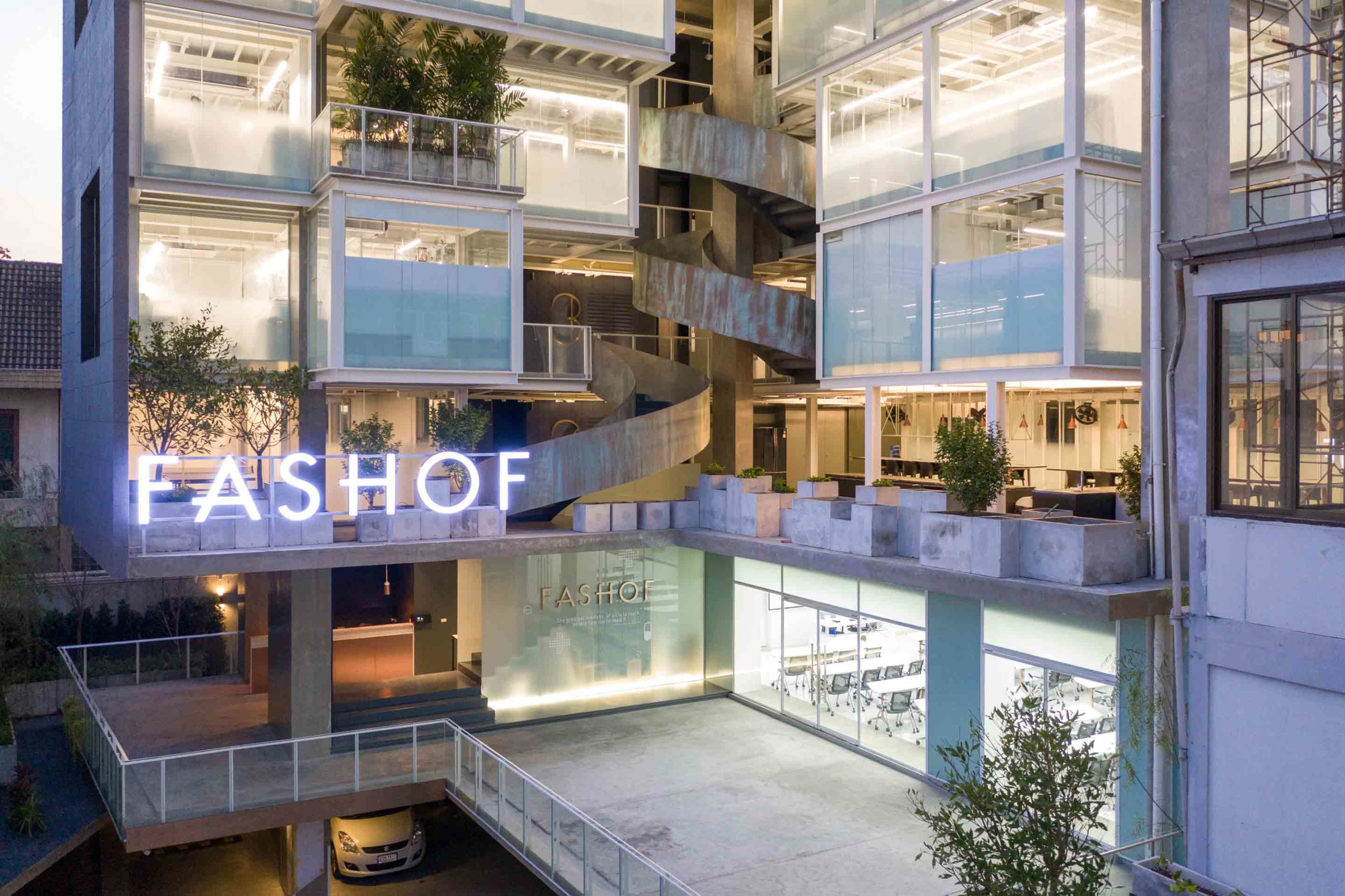
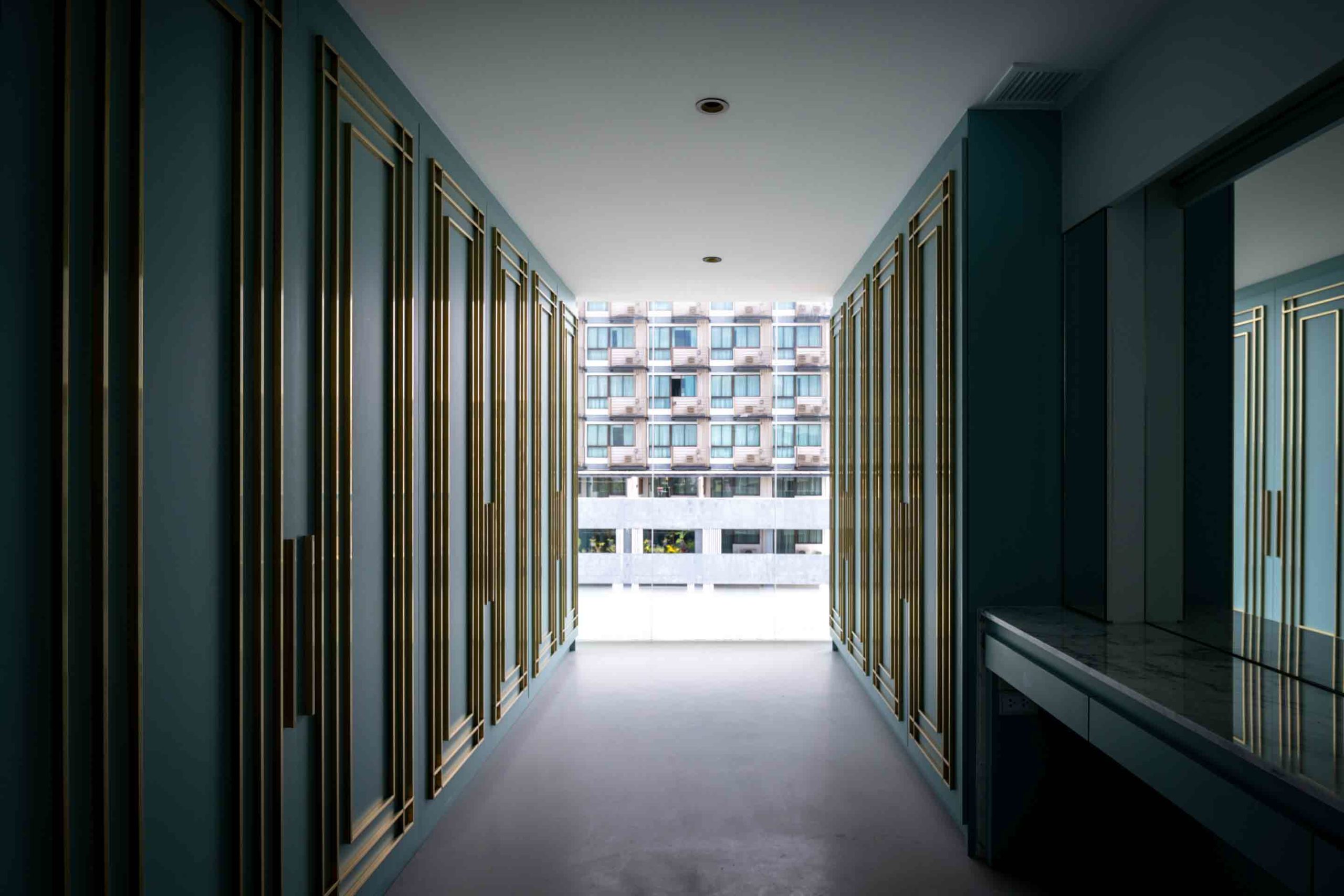 Nuanced nods to Cubism can be equally as powerful as grand, graphic displays. This mixed-use commercial and residential building negotiates a masterful balance between standing out and blending in. Square volumes protrude from the building’s glass face, imbuing the structure with movement and dynamism. Duality is central to the project’s philosophy — the angular lines are balanced out by the soft curves of the spiral staircases at the heart of the structure.
While the project is distinct in its design, it responds to its residential locale. The grid alignment of the frontage mirrors the silhouettes of the neighboring housing blocks, their cubic designs translated into the contemporary development. Inside, some of the common spaces look out onto the row houses, offering fresh perspectives and a sense of unity with the existing built environment.
Architizer's 14th A+Awards judging is live! Subscribe to our Awards Newsletter for updates on Public Voting and the big winner reveal later this spring.
