The jury is deliberating... stay tuned for the winners of Architizer's A+Product Awards! Register for the A+Product Awards Newsletter to receive future program updates.
Defining what constitutes a design classic is highly subjective, in part because we each respond to design from our unique perspective as well as the fact that we seldom recognize something as a classic until a significant amount of time has passed. Design classics ultimately transcend the traditional lifecycle of a product. Escaping the traditional ebb and flow of trends, a design classic will remain popular across generations. Typically, a design classic will sell continuously, and while the manufacturing processes and materials used will evolve and be adapted to align with the changing times, the product fundamentally remains the same.
It is often difficult to pinpoint the specific reasons that a particular piece resonates with consumers, and it can be even more challenging to predict what will gain cult status in the future. That being said, there are often distinct characteristics that a design or object will have that put it into what I like to call the “potential design classics” category.
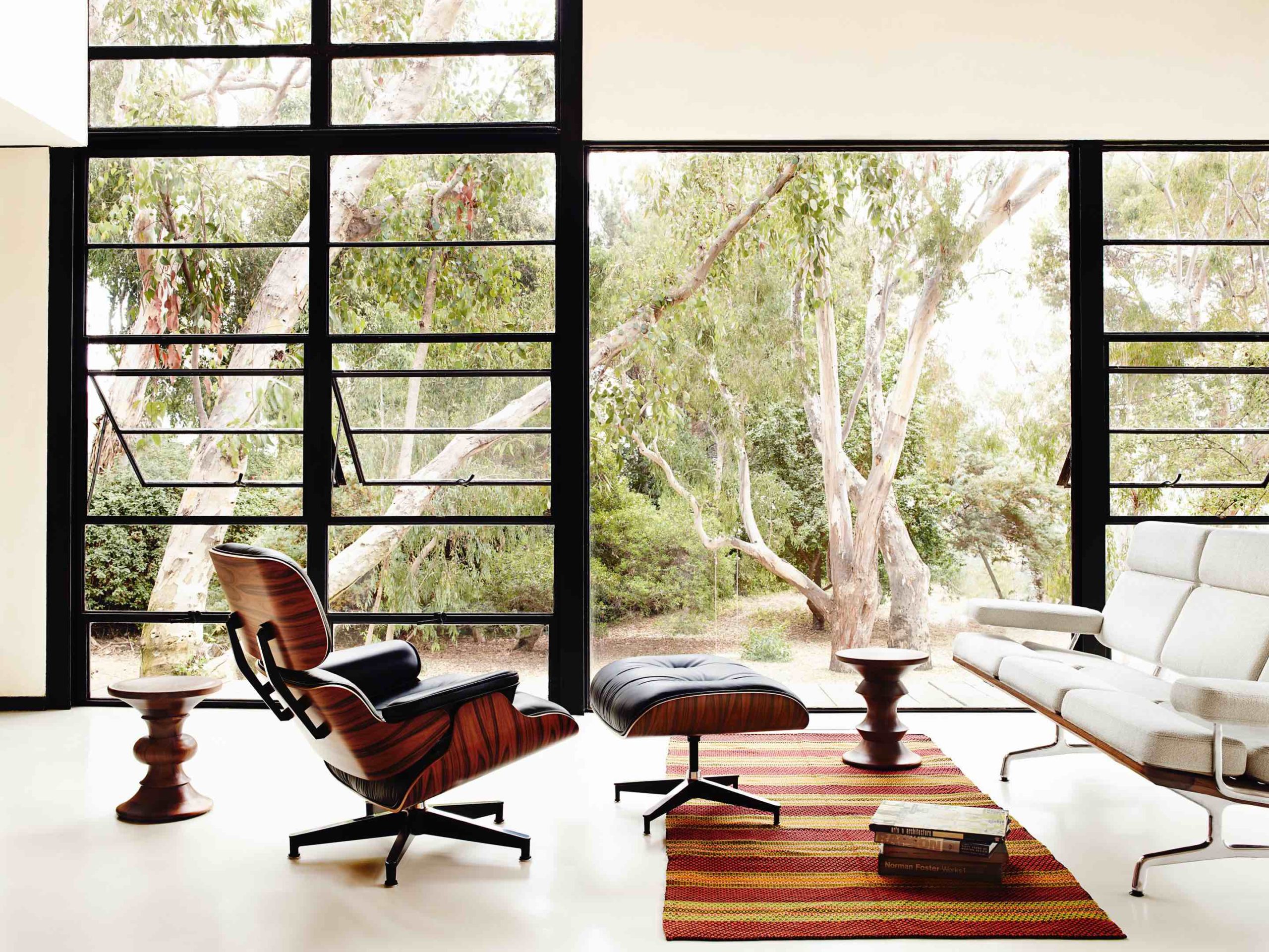
Eames Lounge Chair and Ottoman by Charles and Ray Eames for the Herman Miller company (1956)
Architizer engages with thousands of product specifications every year and has developed a keen eye for recognizing the tell-tale signs of a “potential design classic,” and that’s why each year, entrants to the A+Product Awards are given an incredible platform to showcase their innovations to Architizer’s widespread community. From the renowned Jury, consisting of some of the world’s best architects and design firms, to the open Pubic Vote, which puts your product in front of tens of thousands of architects and designers that make up Architizer’s engaged community.
Meanwhile, winners of this year’s A+Product Awards will be included in the inaugural A+Product List, a definitive rundown of Architizer-approved brands distributed to 124,000+ design-savvy newsletter subscribers. Furthermore, the A+Product List will be published on Architizer Journal and shared with our social media community of over 7+ million architects and designers.
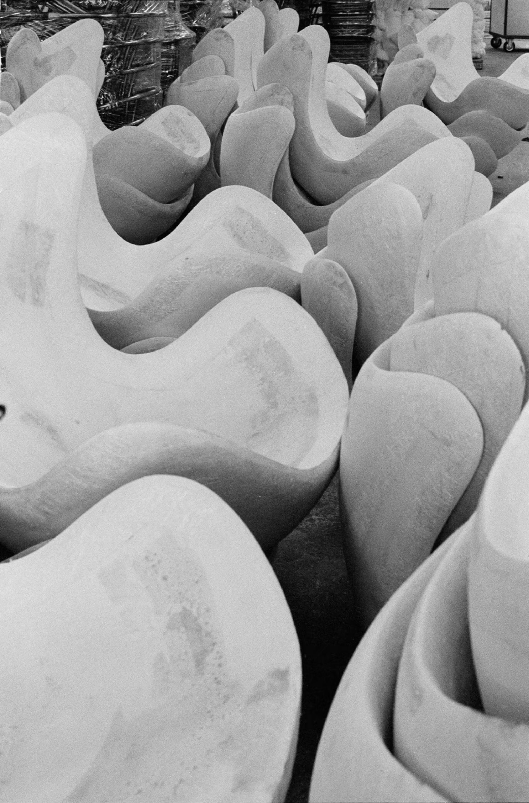
Molded seats of Egg™ Chair by Arne Jacobsen (1958)
Perhaps you think your design has the potential to be a future icon; if so, we’ve summarized a few of the stand-out characteristics that have defined the design classics we have grown to cherish over the decades — maybe your product will be next.
Design classics commonly encapsulate an era, demonstrating characteristics of a specific point in time. The historical significance of the period often becomes the attribute for which a piece is known. Case in point: Arne Jacobsen’s Egg Chair. Danish architect Jacobsen designed the Egg Chair for the Royal Hotel, SAS House (1955-1960). The chair has a minimalistic and organic form, internally made of molded plastic which was a revelation at the time; the foam-covered seat upon a metal pedestal base is by far one of the most recognizable Mid-Century chair designs to ever exist. Still manufactured by Fritz Hansen as it was originally, the Egg™ Chair embodies the late 50s and early 60s in physical form.
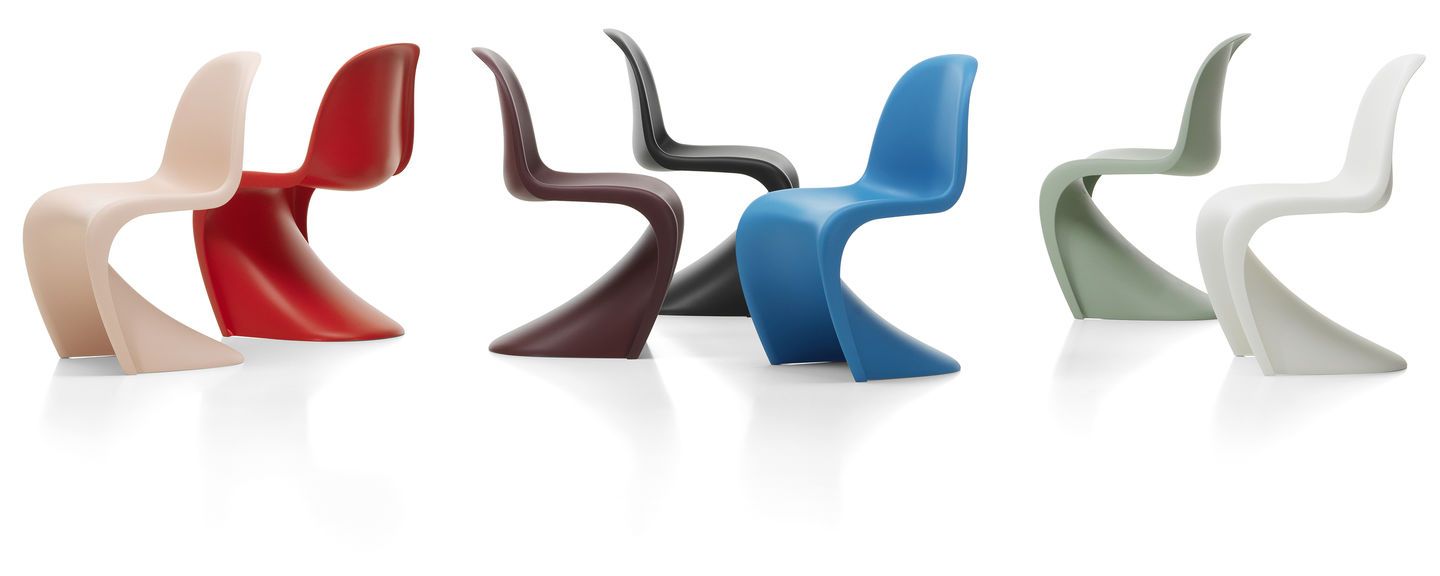
The Panton Chair by Verner Panton for Vitra (1959)
As with the Egg™ Chair, design classics often come to be for the innovation they showcase. We all know that’s is hard to forget a first love and, for the design enthusiasts like us, the same can be true of a first encounter with a new design process or a style that speaks to you. One such example is The Panton Chair. Designed by Verner Panton, one of Denmark’s most influential 20th-century furniture and interior designers. In post-war Europe, plastic first came to the forefront of design and manufacturing.
Experimental Panton became fascinated with the progressive polymer that could be molded into any shape and mass-produced. His dream was to design a chair made in one piece. “Fifteen to 20 manufacturers have tried it but have all rejected the project for different reasons,” Panton is said to have told Rolf Fehlbaum of Swiss manufacturer Vitra, and despite this, in 1963, they took on the task. It was four years and ten prototypes before a limited run of what became known as the Panton chair—a cantilevered seat in laminated, fiberglass-reinforced polyester—debuted at the Cologne Furniture Fair.
The novel injection molded techniques were new at the time. They didn’t take hold commercially until 1979 when plastic injection molding overtook steel production and became the most used manufacturing method worldwide. It was Panton’s groundbreaking work with injection-molded plastics that led to the manufacturing processes we are so familiar with today.
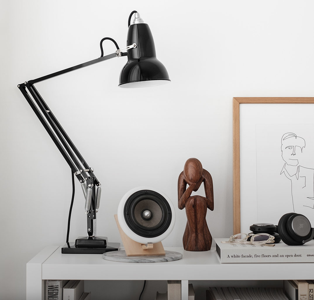
Anglepoise 1227 Lamp by George Carwardine (1932) Photo by Thibault De Schepper
As with the Panton Chair, it was an innovation that has held George Carradine’s name at the top of most influential designs for almost a century. George Carradine is a name synonymous with industrial design, and the talented engineer built a reputation of acclaim over many years through his profession in the motor industry. Throughout his career, his work was varied, and his obsession with the mechanics of suspensions remained with him through his successes. After a redundancy from mechanics, his unwavering drive for robust design led him to create one of the most well-known design classics of the past century — first Anglepoise 1208, followed by the iconic 1227.
In 1934 Carradine created a new spring-and-lever mechanism, which stayed in position when moved or twisted. His final design for the Anglepoise lamp comprises joints that create tension in the springs and allow the lamp to be articulated into multiple positions. Thanks to its practical innovation, Anglepoise has become a staple in home and office for 90 years and has scarcely changed since then.
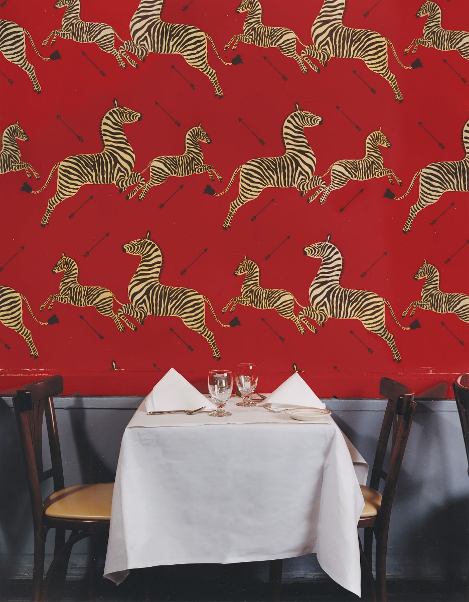
Zebras by The House of Scalamandre, Gino’s, Lexington Ave., New York, NY
Design classics will often embody some form of cultural significance, so it is for Flora Scalamandré’s Zebras. 1940s New York was a time of revival and regeneration. Many European immigrants had fled to the city, many designers and architects among them, bringing with them a developed and expressive modernism that was beginning to take hold of the design aesthetic across the city.
The Zebras wallpaper was created in the 1940s for Gino of Capri restaurant, or “Gino’s.” Contrary to popular belief, the original design was created by Scalamandré’s friend Valentino, not Scalamandré himself. Mr. Circiello dreamed of an African safari he could not afford, so instead; he had playful zebras flanking the walls of his restaurant in a dramatic pattern colored in the now-iconic tomato red said to have been chosen to hide sauce stains on the walls. Having shut its doors in 2010, Gino’s had been a refuge for the creative elite of New York, including Ed Sullivan and Frank Sinatra. While loved and used by many interior designers over the years, Zebras is also well known for its use in Wes Anderson’s 2001 The Royal Tenenbaums. The wallpaper is steeped in cultural significance for the restaurant, the period and the people of New York at that time. Zebras has retained its favored status over the years, and now available in 11 alternative colors, the design is as popular as ever.
There are few who set out to design a classic and even fewer who succeed to do so, but who knows, the next might just be yours. Shoot your shot by applying for Architizer’s A+Product Awards:
Pictured at top: Egg™ Chair by Arne Jacobsen for Fritz Hansen (1958)

