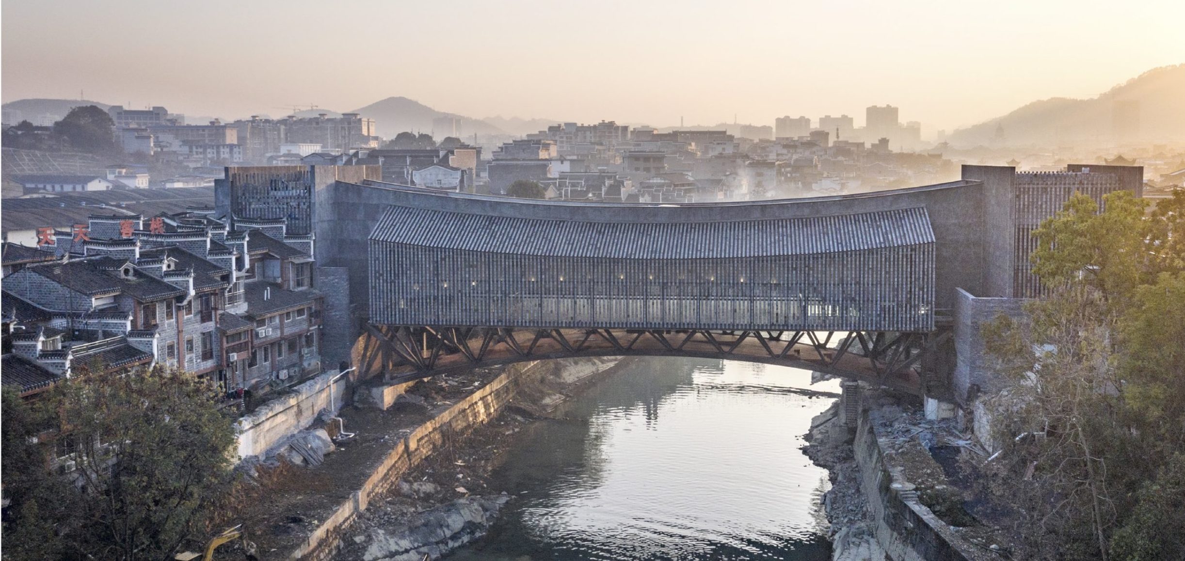
Architizer’s newest print publication is available for pre-order! How to Visualize Architecture is an educational guide designed to help you master the craft of architectural storytelling and visual communication. Secure your copy today.
Architectural photography is more than a tool of documentation; at its core, it seeks to interpret and communicate the central aspects of an architectural design. An array of photographic styles have developed as the world of architecture has evolved. While the practice of architectural photography is incredibly experimental and creative, the inclusion of people in photographs has always been the subject of much debate. Immaculate, empty spaces are typically the images we see. These spaces showcase architecture in its most pristine, untouched form, as if to provide a snapshot from the architect’s mind as the building was originally envisaged. What context is lost by removing the messy, untameable subjects of the buildings we photograph?
Historically, architectural photographs were static images of distanced facades, usually taken at the ground level. During this time, technological limitations and time constraints kept humans outside of the frame. Shutter speed and aperture limitations meant that images would appear muddy and blurred if the camera detected any hint of movement. For this reason, crisp, empty compositions were the norm. By the 1960s, photographic documentation was an essential part of most projects. Publishers clamored to print works documenting all eras, the post-war commercial convention of full building shots began falling out of favor, and art stepped forward to influence the composition.
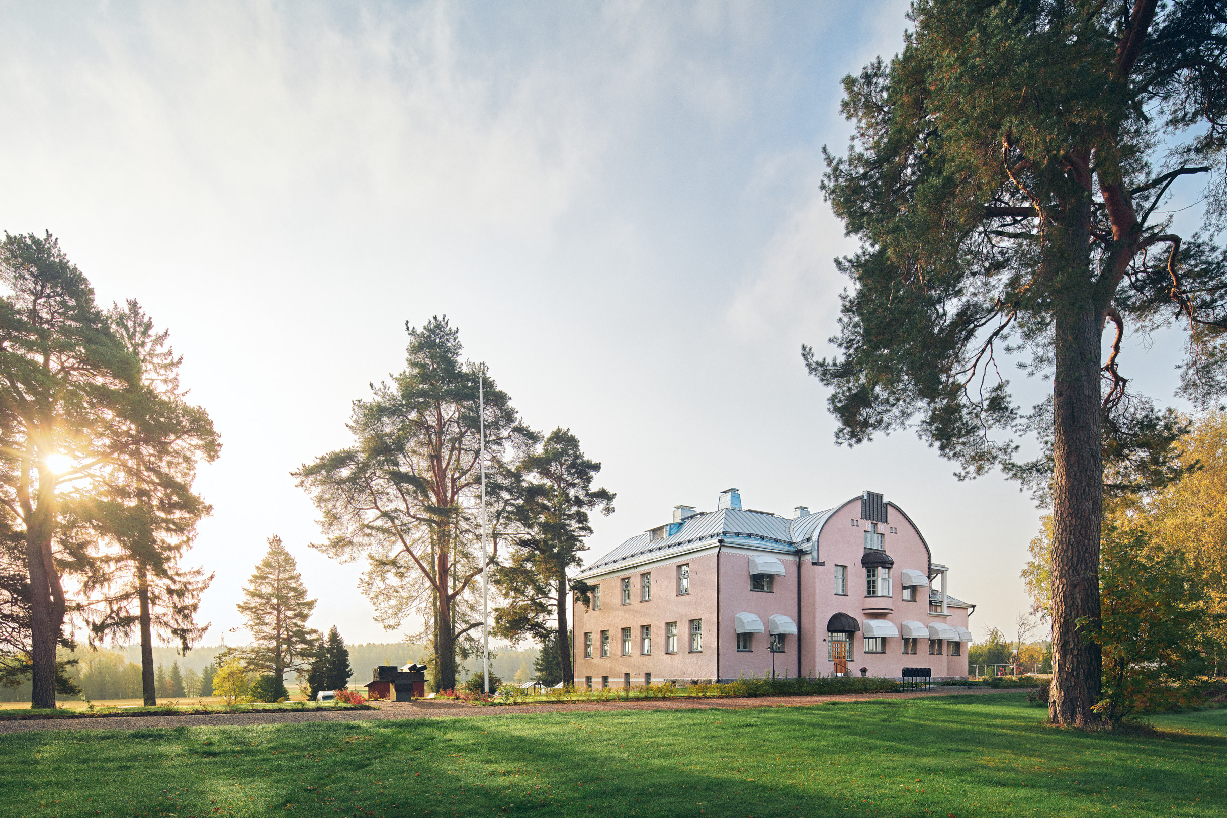
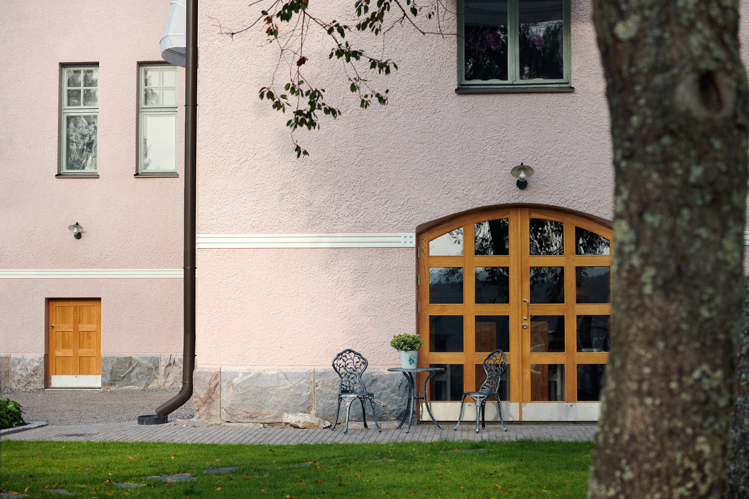
Paviljonki 2 by Avarrus Architects Ltd, Helsinki, Finland
The modern era of architectural photography was ushered in by radical perspectival experiments such as tilting, fragmenting, and twisting viewpoints. Manipulating angles and embracing lens distortion created new opportunities for architectural photographers to highlight details, materials, forms, and structure. These new visions offered more than just mesmerizing aesthetics; they pinpointed specific elements within buildings that photographers had previously overlooked, bringing them to the forefront of the viewer’s attention. These modern interpretations paved the way for placing architecture front and center in editorials. Much like high fashion across magazine spreads, architects and their buildings figured as glamorous parts of culture to be widely coveted.
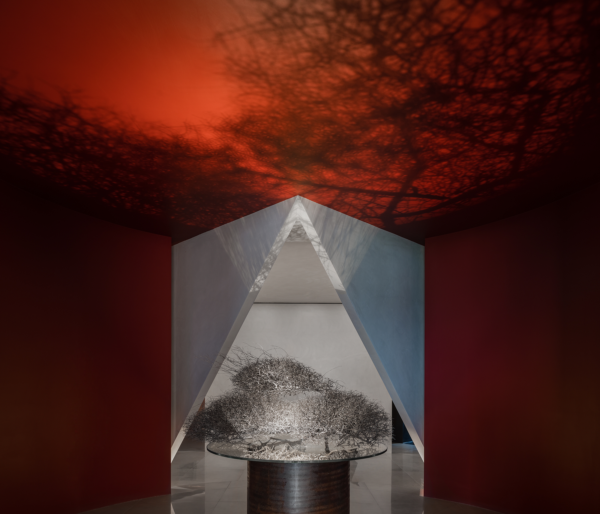
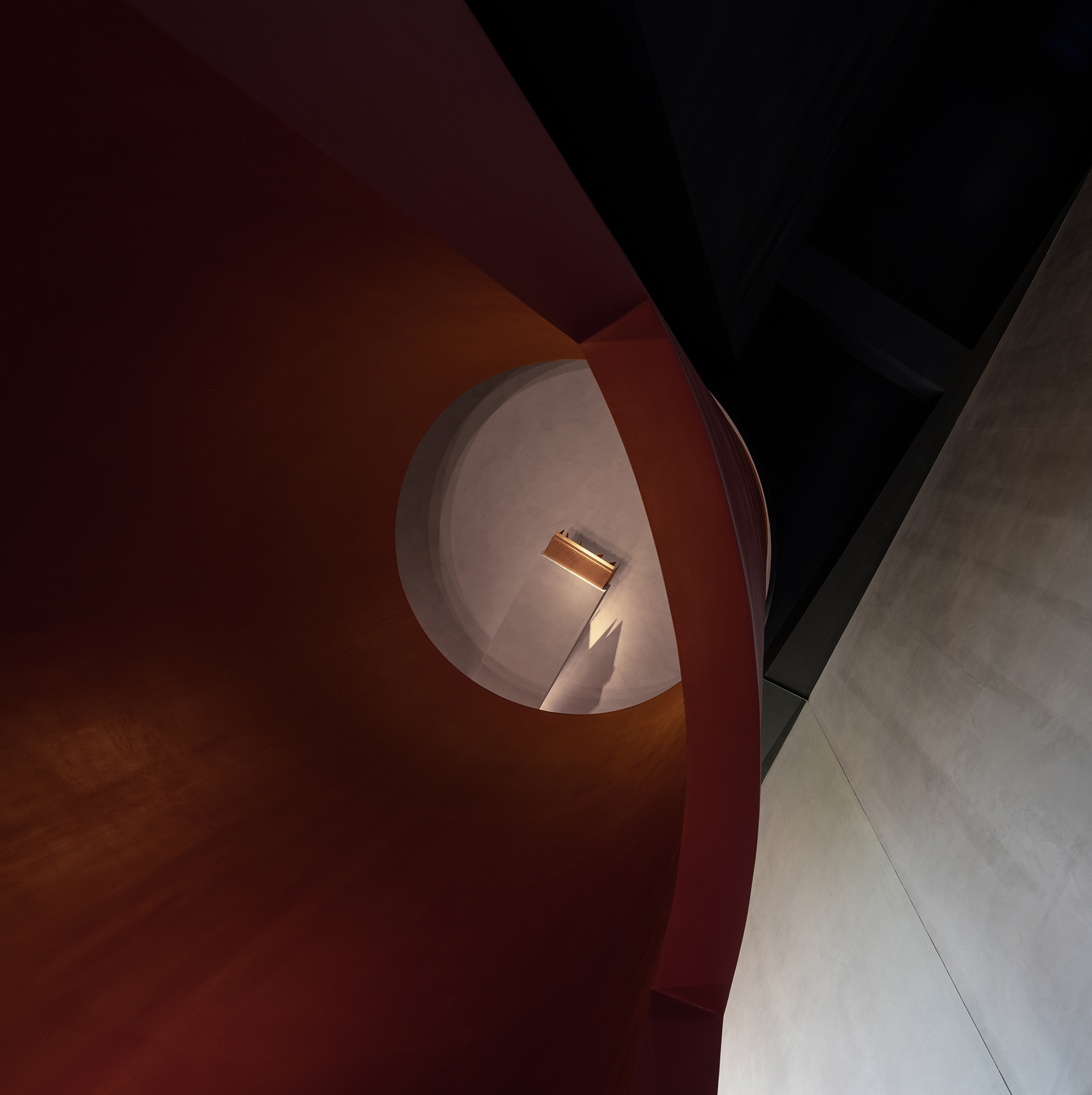
In | Out by Lucien Organization-Masanori Designs, Foshan, China
The progression into double-page editorial spreads amalgamated architecture and the curated photoshoot and photographers began populating their images with human subjects. Models, styled to complement the surrounding building, were staged in the buildings to add intrigue and emotion to images. By incorporating garment styles — for example, black tie, workwear, or street style — the models emphasized the building’s purpose and societal positioning. That is, they projected an almost prescriptive vision of the occupants who would likely frequent the space. By staging humans in the scene, photographers did more than simply curate a particular aesthetic. In creating a more human context for the image, they constructed a specific narrative for viewers.
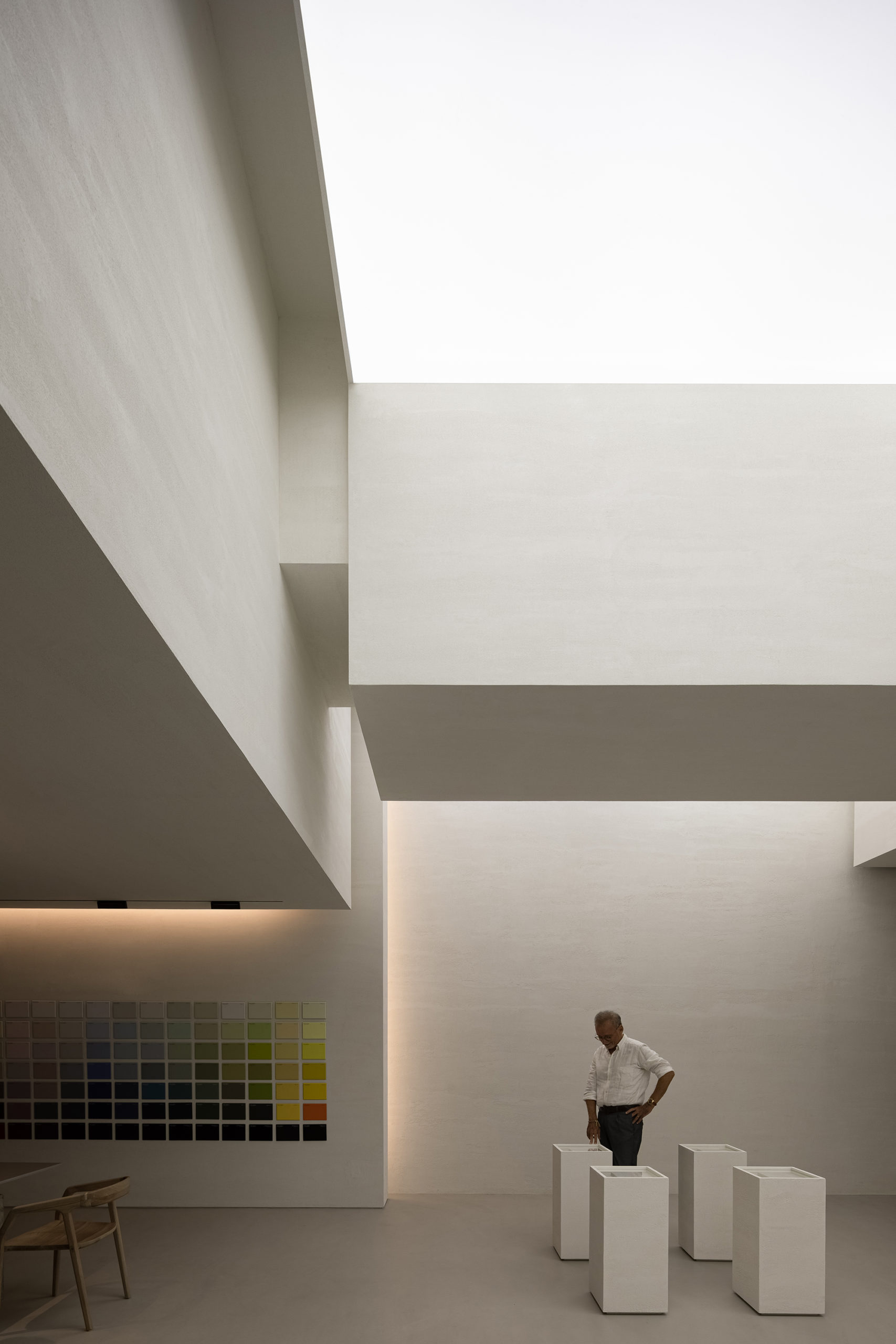
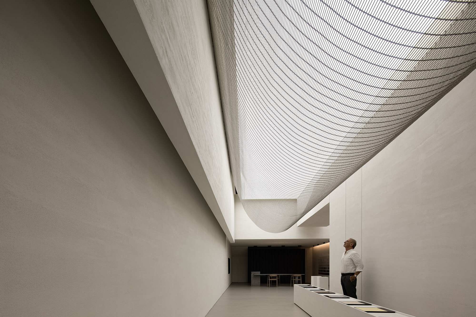
ANBONG HOME by AD ARCHITECTURE, Shantou, China
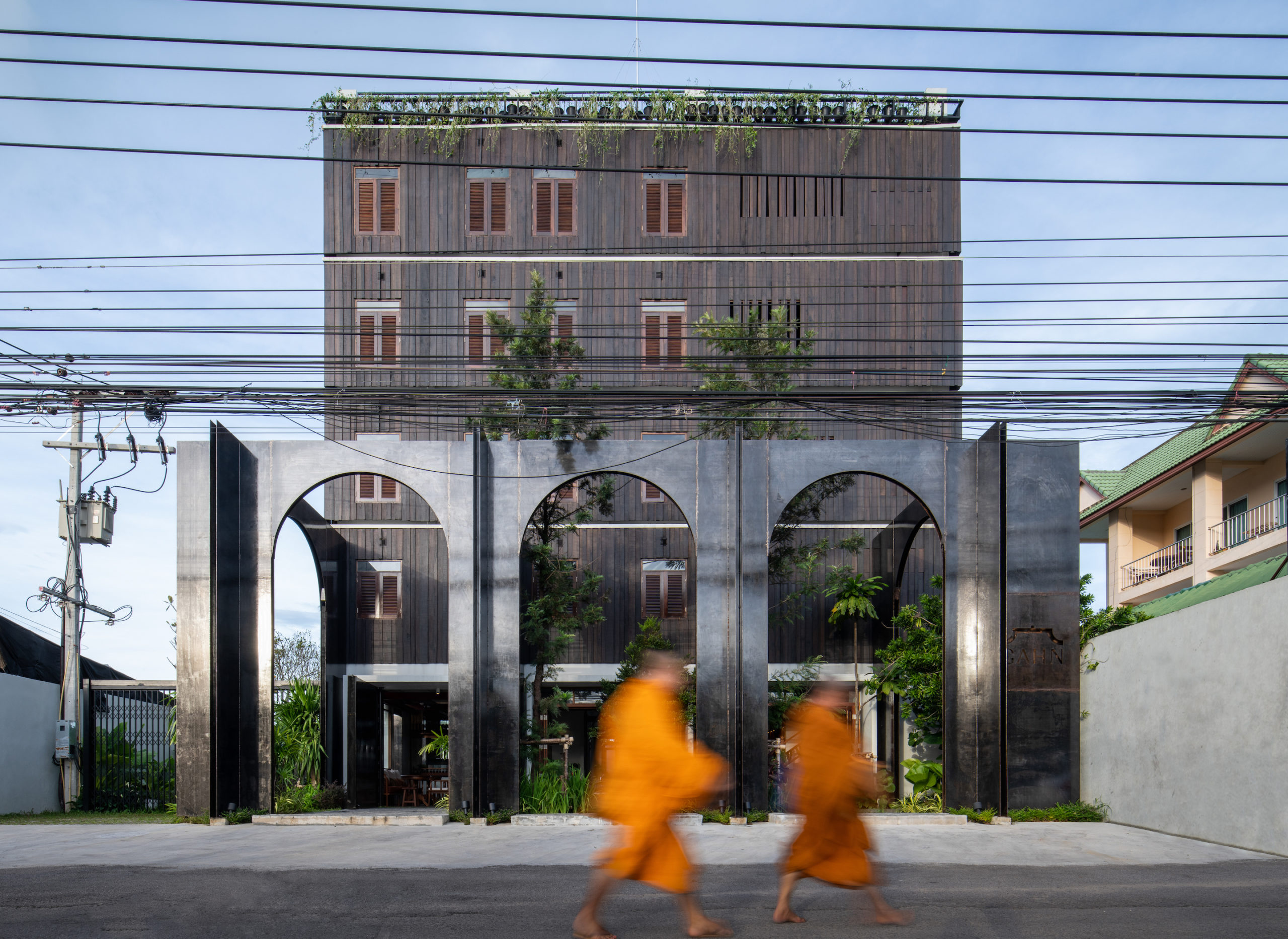
Adding humans to a spatial equation can destabilize the delicate balance between the categories of architectural and lifestyle photography. Many photographers choose to indicate movement in their subjects by blurring their figures in the composition to maintain focus on architecture. This technique of obscuring the occupants, or even the urban context surrounding a building, aims to reestablish focus on the architecture itself. In this way, the viewer does not become distracted by the people’s expressions or emotions in the buildings. Instead, the focus remains on the building’s structure and space, allowing viewers to engage with the architecture itself without distraction or digression. This task is made easier when the figures surrounding it are secondary and un-explorable.
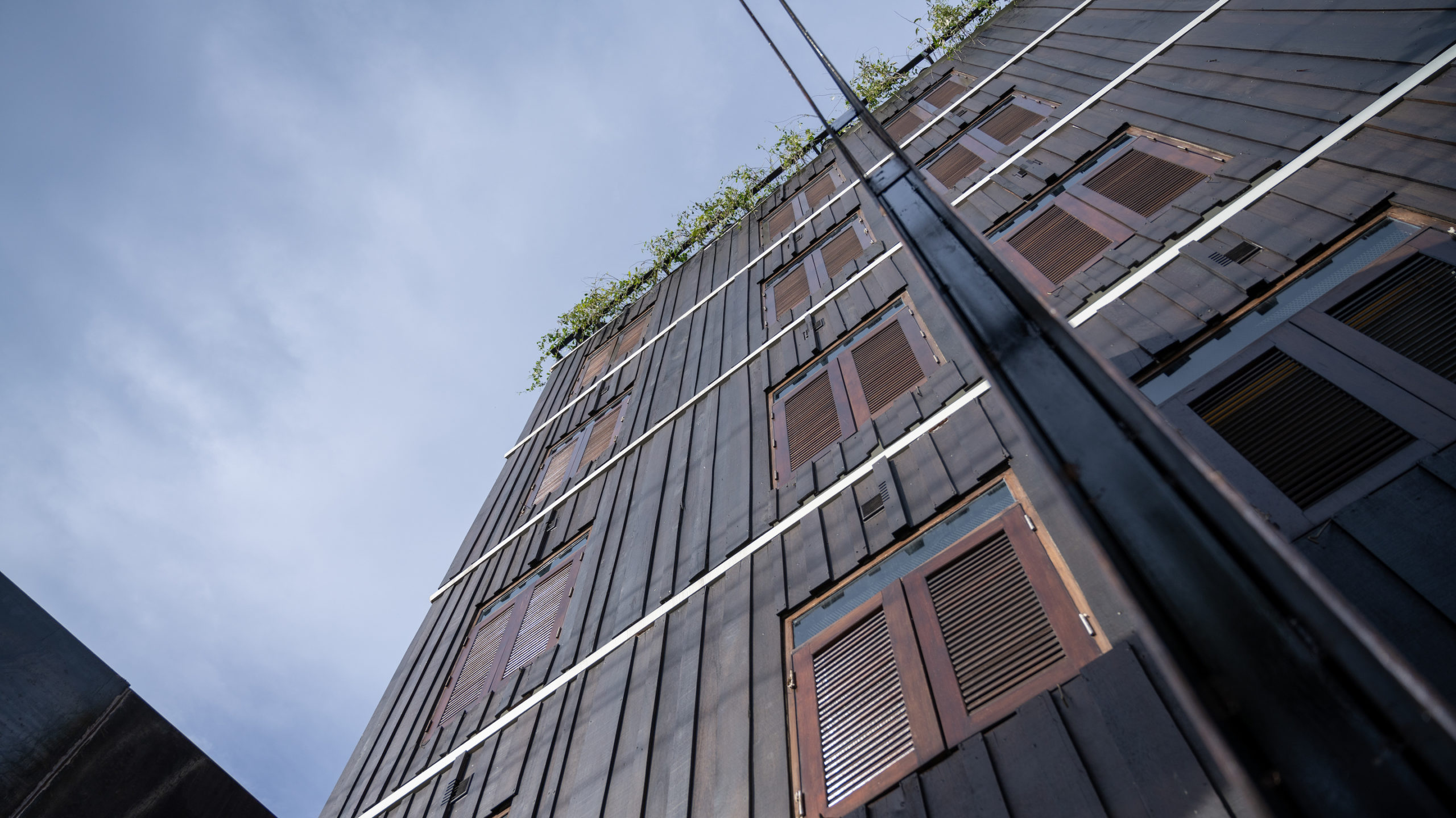
Hotel Gahn by Studio Locomotive, Phang-nga, Thailand
Architectural documentation and building imagery often incorporate figures into compositions for scale and perspective. A common feature in architectural drawings, this technique is taken up by architectural photographer for the same purpose — that is, to give the viewer an idea of the proportions of space. Since the human body’s physical characteristics are relatively confined and universally understood, the mind’s eye can accurately compare and recognize the comparison between a person and the space they are inhabiting.
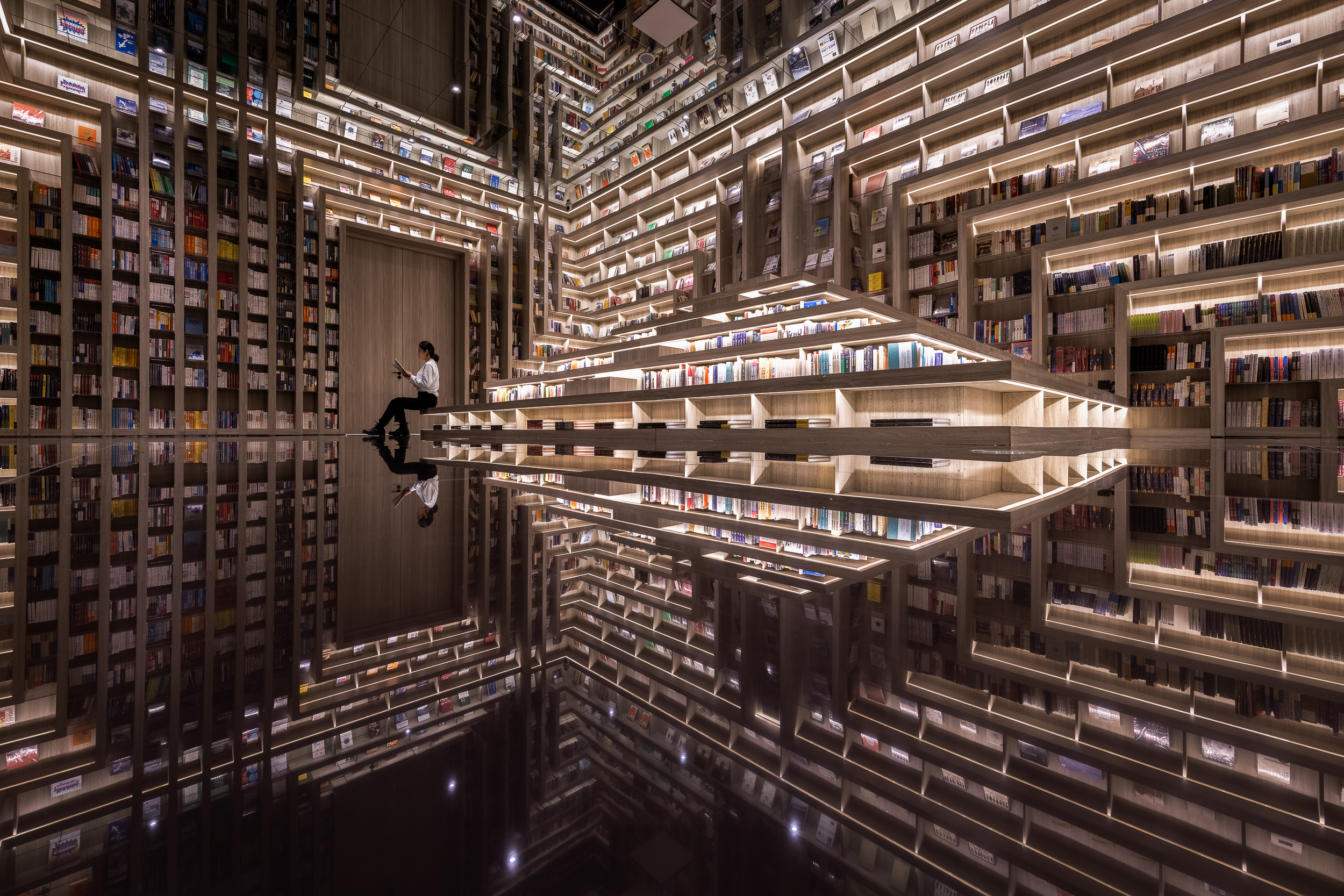
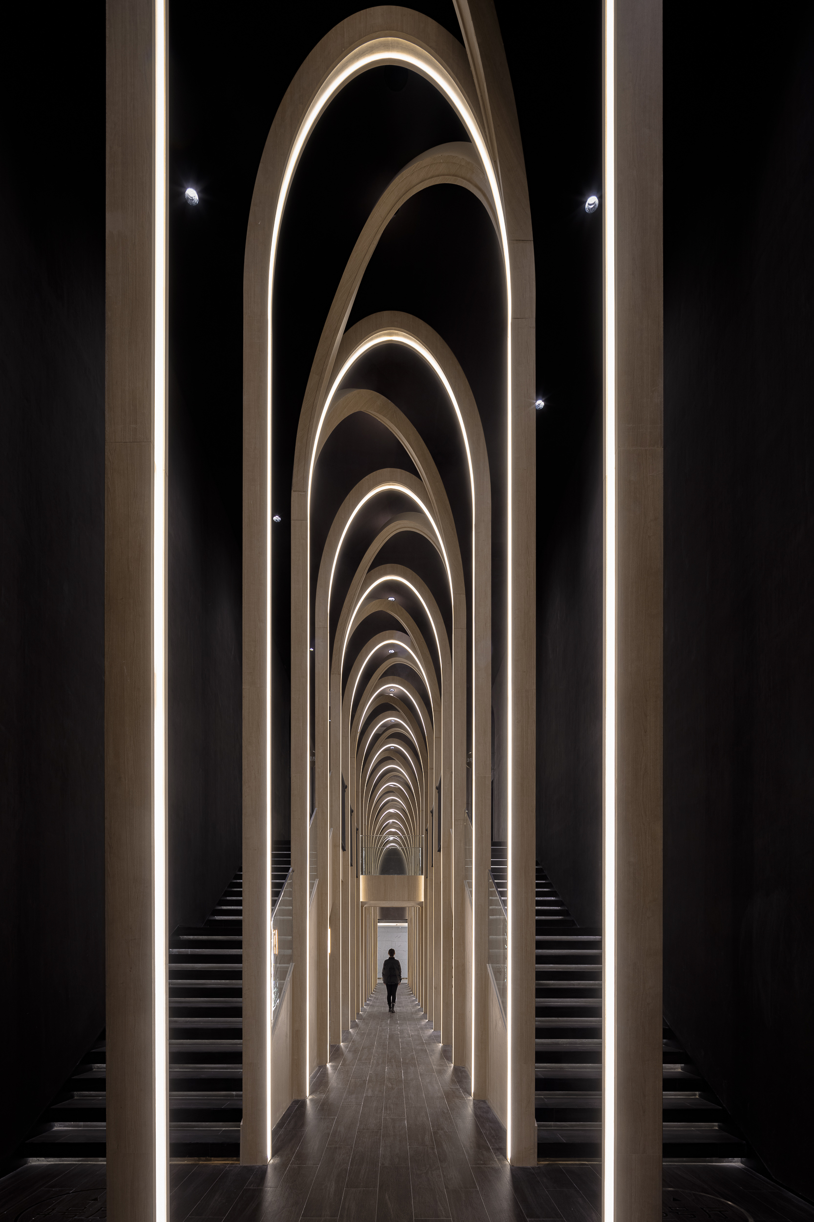
Taiyuan FAB Cinema by X+LIVING, Taiyuan, China
Both architects and photographers alike have personal preferences about including people in their renderings and photographs, respectively. Whether or not to include human subjects is a decision that is often bound to the central aspects of a building’s program, which decisively influences the decisions of how best to showcase it — depicting spaces that are full and in use offers viewers insight into architectural function. More than simply transporting us into the building, the flow of occupants — the interaction of person and place — can provide viewers with a deeper understanding of who uses the space, as well as when and how they use it. All of this can be distilled into a single photograph.
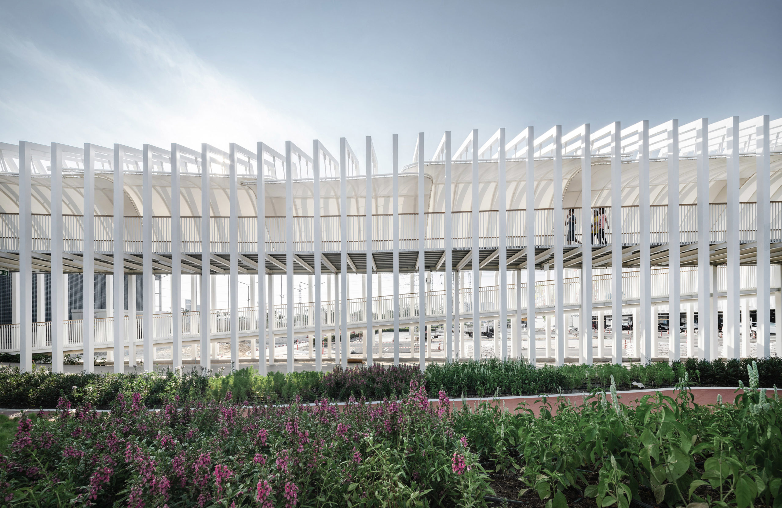
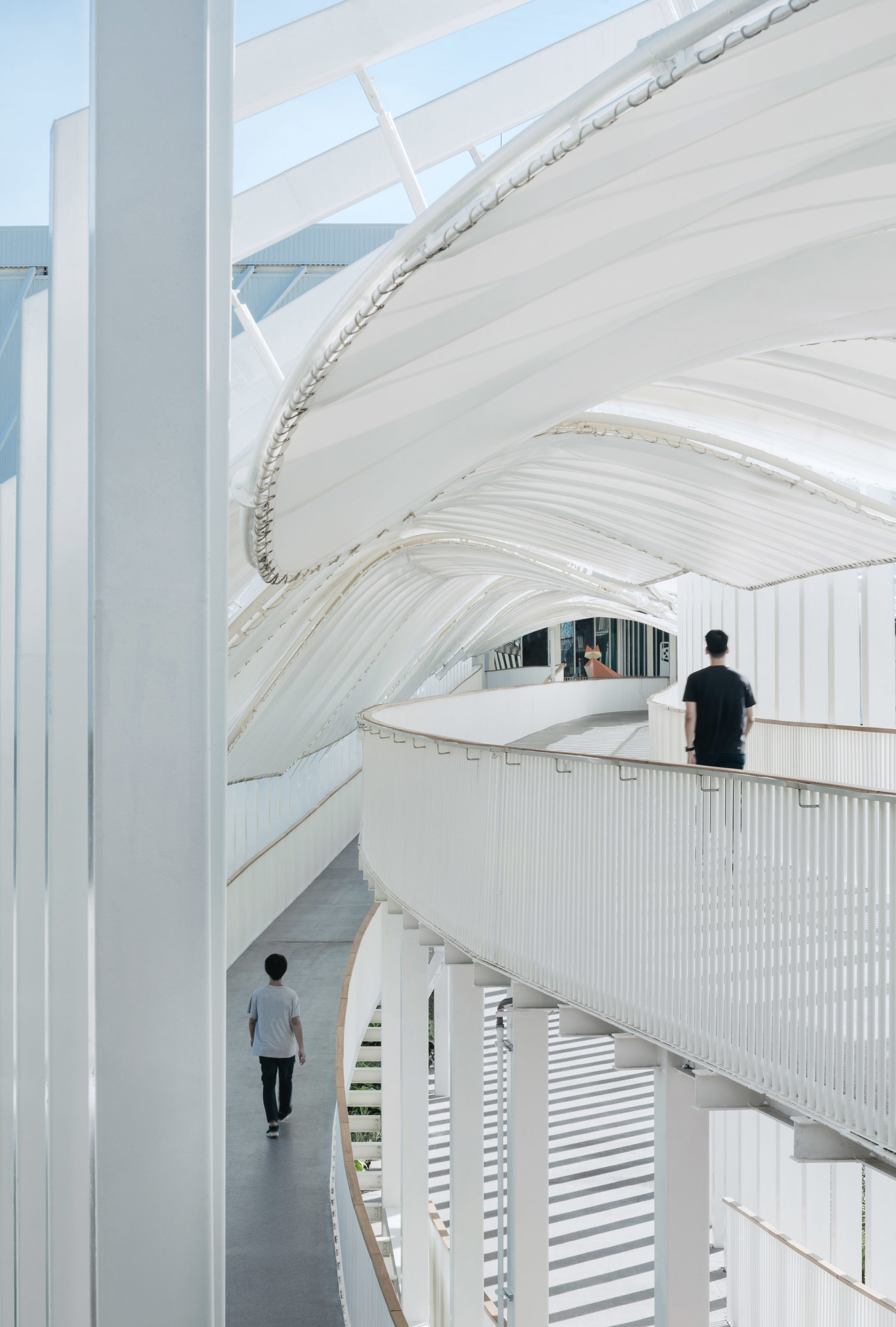
Megapark by Architectkidd, Bangkok, Thailand
It is important to recognize that there is no right or wrong when it comes to populating an architectural photograph. There are arguments to be made on the side of leaving a structure empty. The choice lies with the photographer and the narrative they wish to explore. While including people will most definitely provide context, how, why, and when this context is necessary to include is an artistic decision that is unique to each photographer and always will be.
Architizer’s newest print publication is available for pre-order! How to Visualize Architecture is an educational guide designed to help you master the craft of architectural storytelling and visual communication. Secure your copy today.
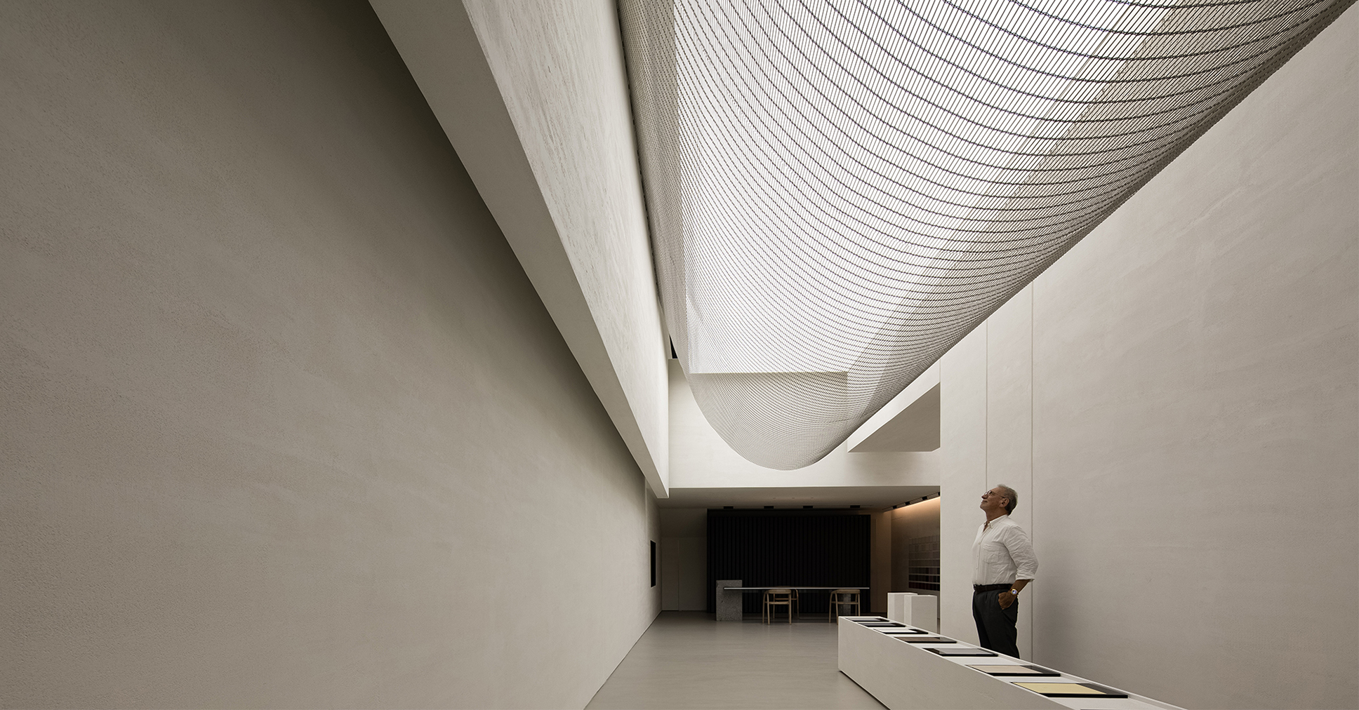
 ANBONG HOME
  FAB cinema
  IN/OUT gallery
  Megapark
  Paviljonki 2