Architects: Showcase your next project through Architizer and sign up for our inspirational newsletter.
In the history of architecture, metals began by playing a supplementary role and were primarily used as masonry dowels, chains, domes, for tie rods across arches and to reinforce ceiling vaults. Otherwise, metals served purely decorative purposes, adorning windows, doors and walls as rivets, hinges and handles.
Cast iron was the first metal that could successfully be substituted for traditional structural materials. Regularly used in bridge building, its strength, adaptability and resistance to corrosion quickly encouraged its architectural application. Combined with wrought-iron features, cast iron was commonly used as columns and arches in many buildings. It forms the skeletal structure of many historic spaces that date back to the last century. Meanwhile, the industrial revolution in the 19th century led to the increased demand for metal and, in turn, metal structures. Steel, with its workable, flexible and easily manufactured properties became the metal of choice for architecture. Today, various alloys are added to steel, enhancing its properties. A harder, stronger and more heat resistant stainless steel is now used widely in architectural practice.
Today, metal is the backbone of modern construction with copper, brass, steel and aluminum being used every day to facilitate beautiful and unique buildings. Architects now have a huge variety of metals to choose from in their projects, allowing for the construction of taller, stronger and more unique structures, and expanding the range of metallic finishes that imbue interior spaces with distinct characters. Numerous modern manufacturing techniques provide an immeasurable variety of finishes to choose from and these seven beautiful buildings showcase how versatile metal is as a design material.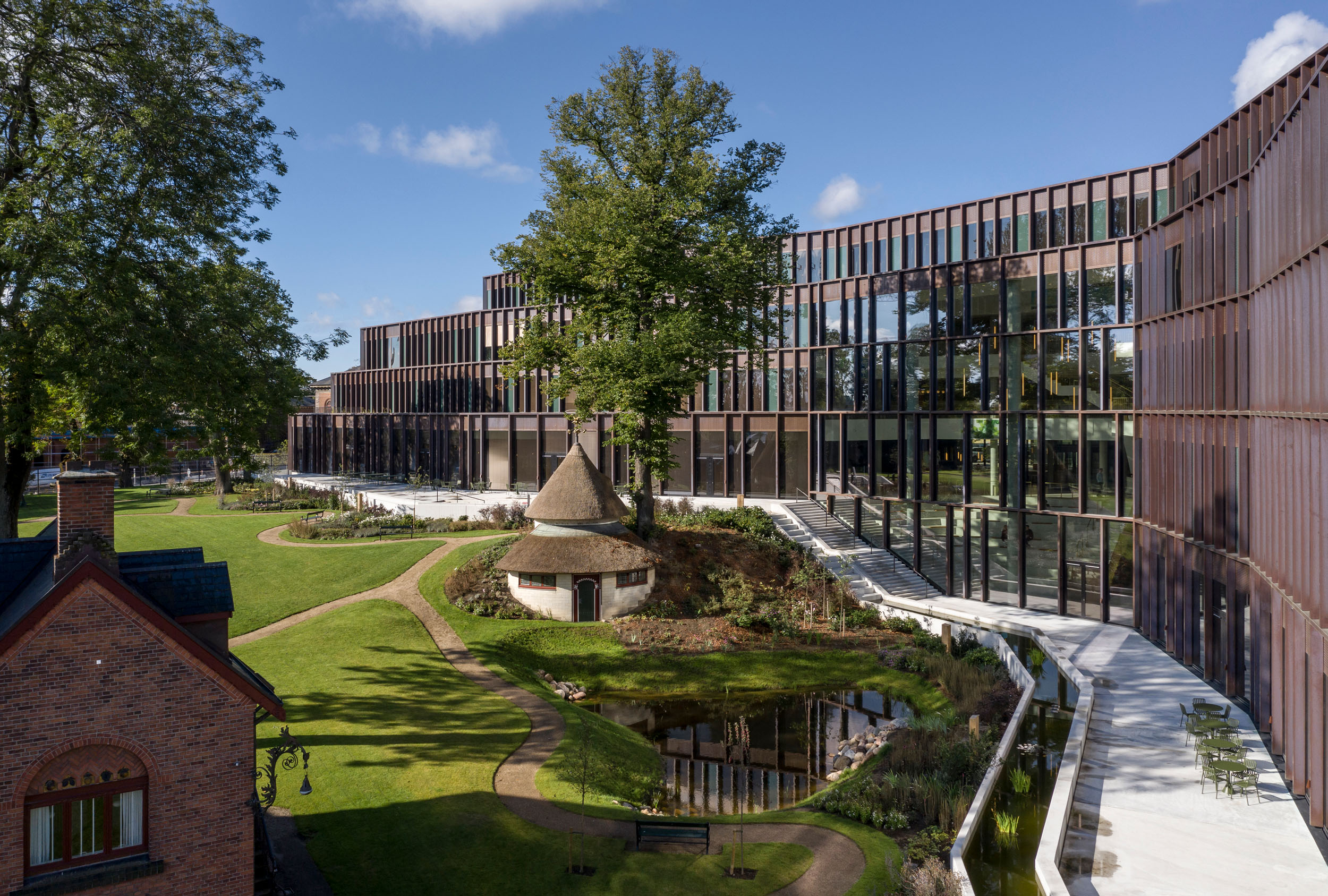
Photos by Adam Mørk
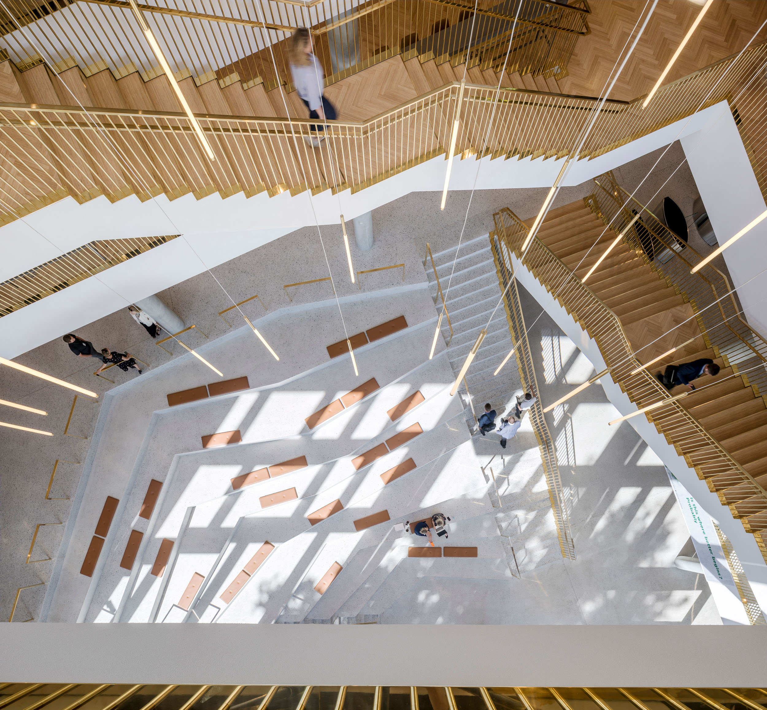
Carlsberg Central Office by C.F. Møller Architects, Copenhagen, Denmark
Located in the historic area of Valby Bakke in Copenhagen, the central office of Carlsberg is a unique and innovative building. The building’s façade is made up of vertical copper-plated slats that create a vibrant harmony with the surrounding landscape. The choice of copper links back the old brewery tanks and refers to the many beautiful copper details on the historic buildings of the Carlsberg City District. The copper used is 50% recycled, reinforcing the brand’s focus on sustainable. Taken as a whole, the building offers a varied and inspiring workspace for all tasks while creating a community atmosphere throughout.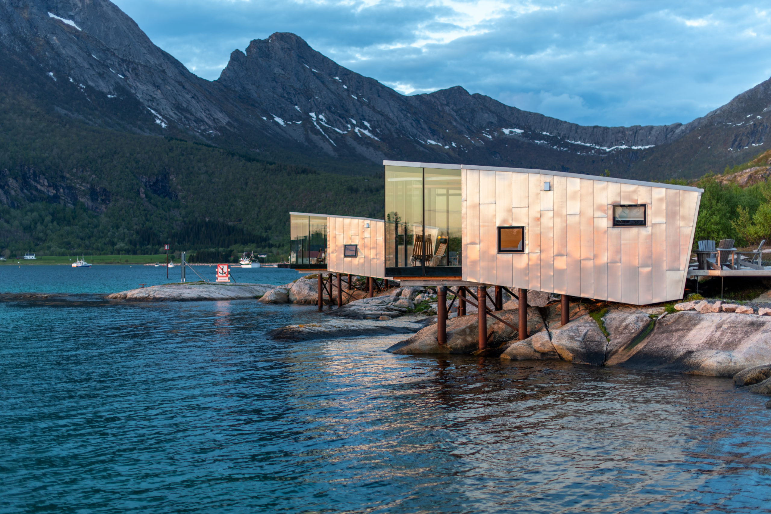
Photos by Siggen Stinessen
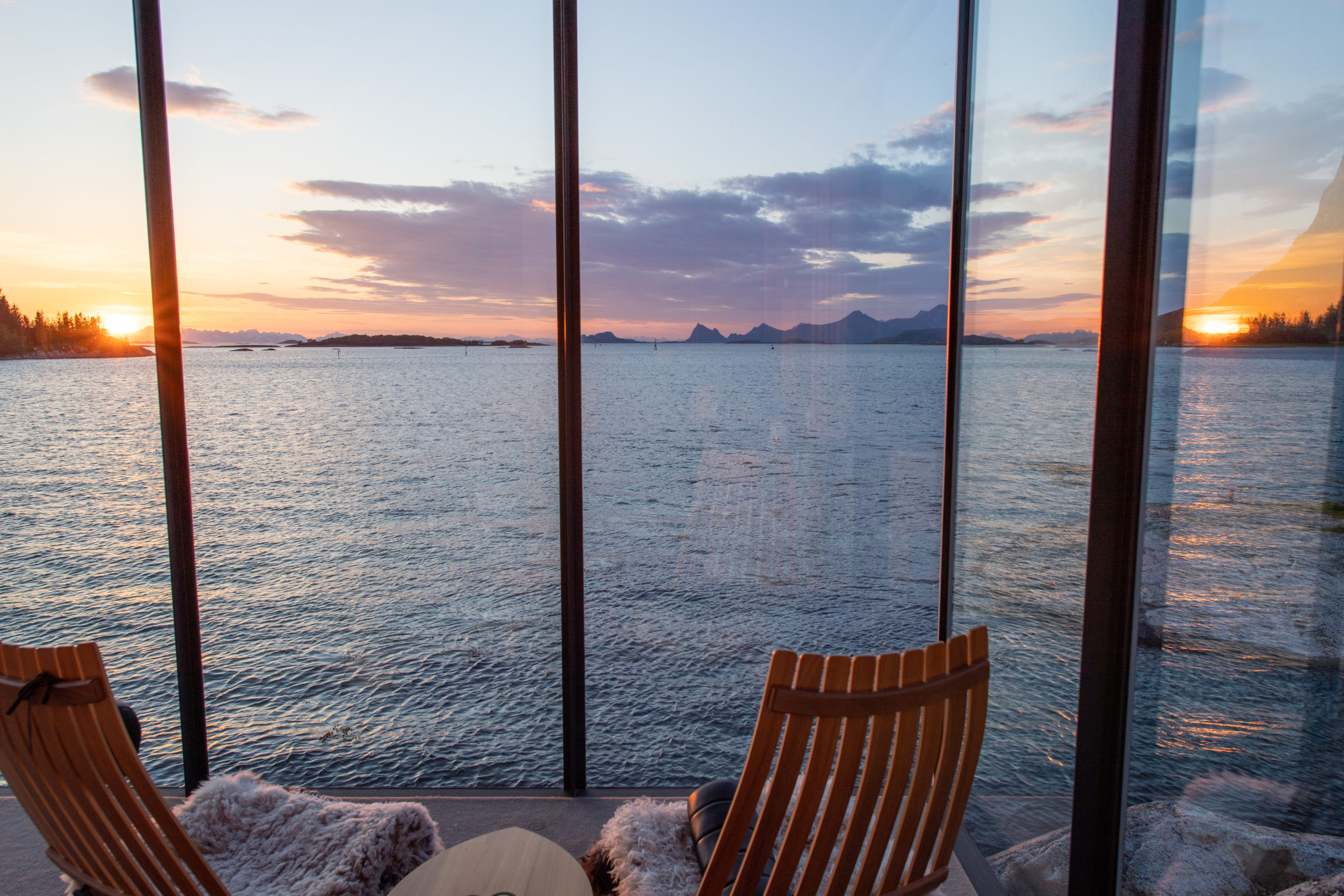
Manshausen by Stinessen Arkitektur, Steigen, Nordland, Norway
The beautiful island of Manshausen in Norway is the inspiration behind Stinmessen Arkitekturs’ design. The cabins’ minimal footprints are designed to immerse visitors into the landscape while creating the least possible disruption to the environment. The extreme weather conditions of the area determined the buildings’ finishes. The architect chose to use aluminum sheets to protect the structures from salinity in the air and saltwater corrosion. The small spaces offer protection and warmth from the surrounding landscape; their calm minimalism is modern and unique.
Photos by Feng Shao
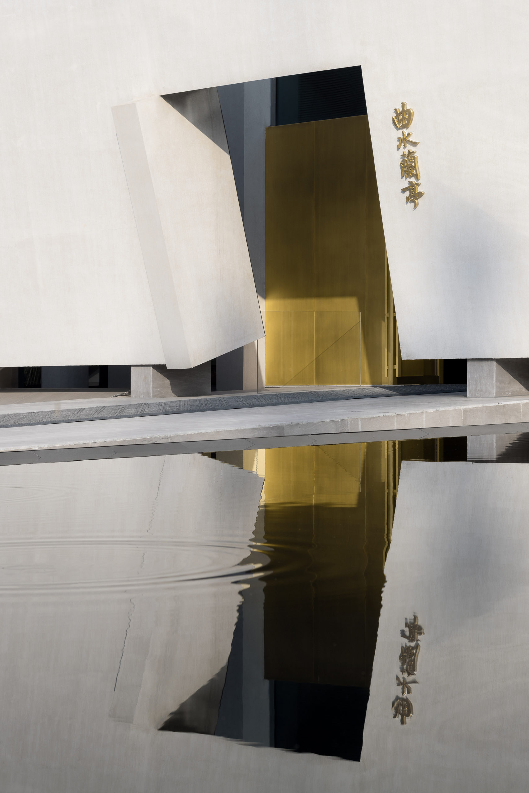
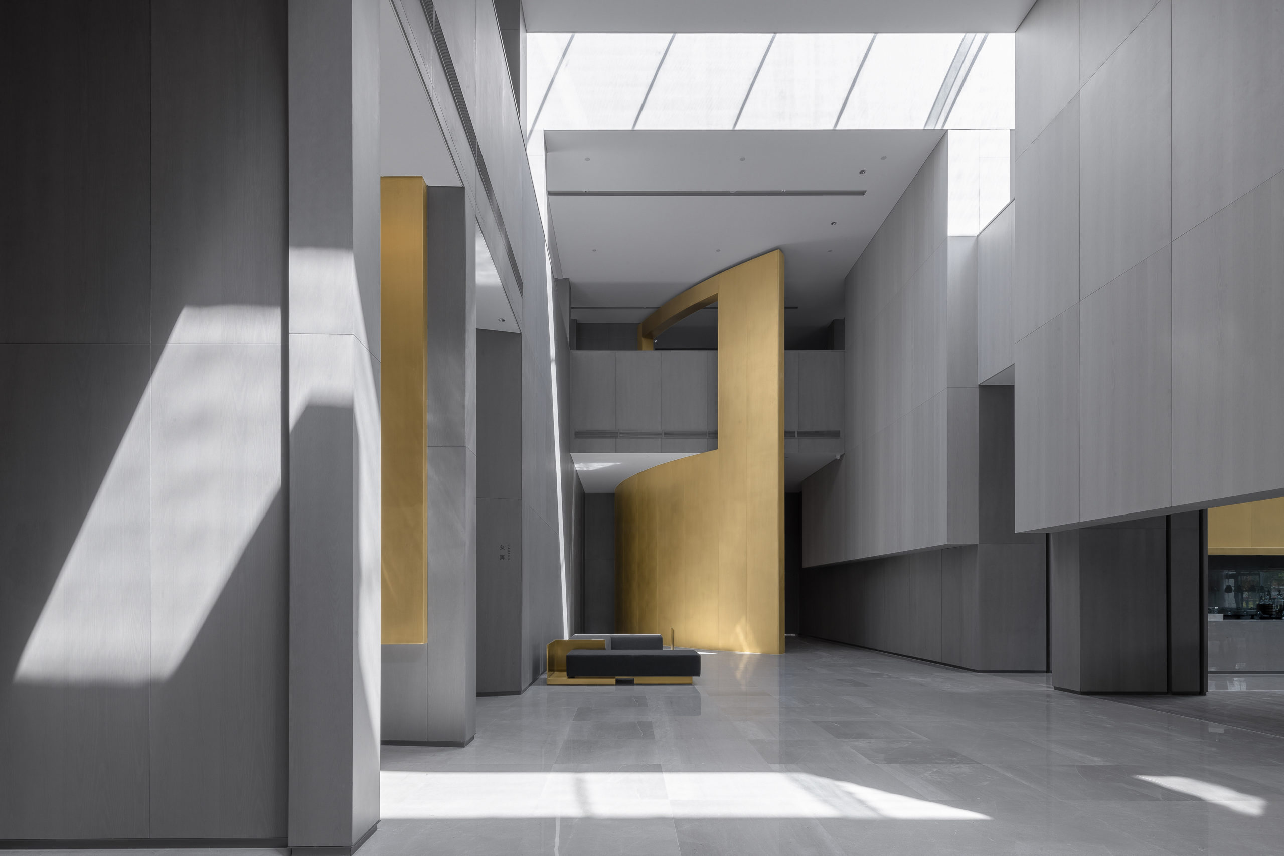
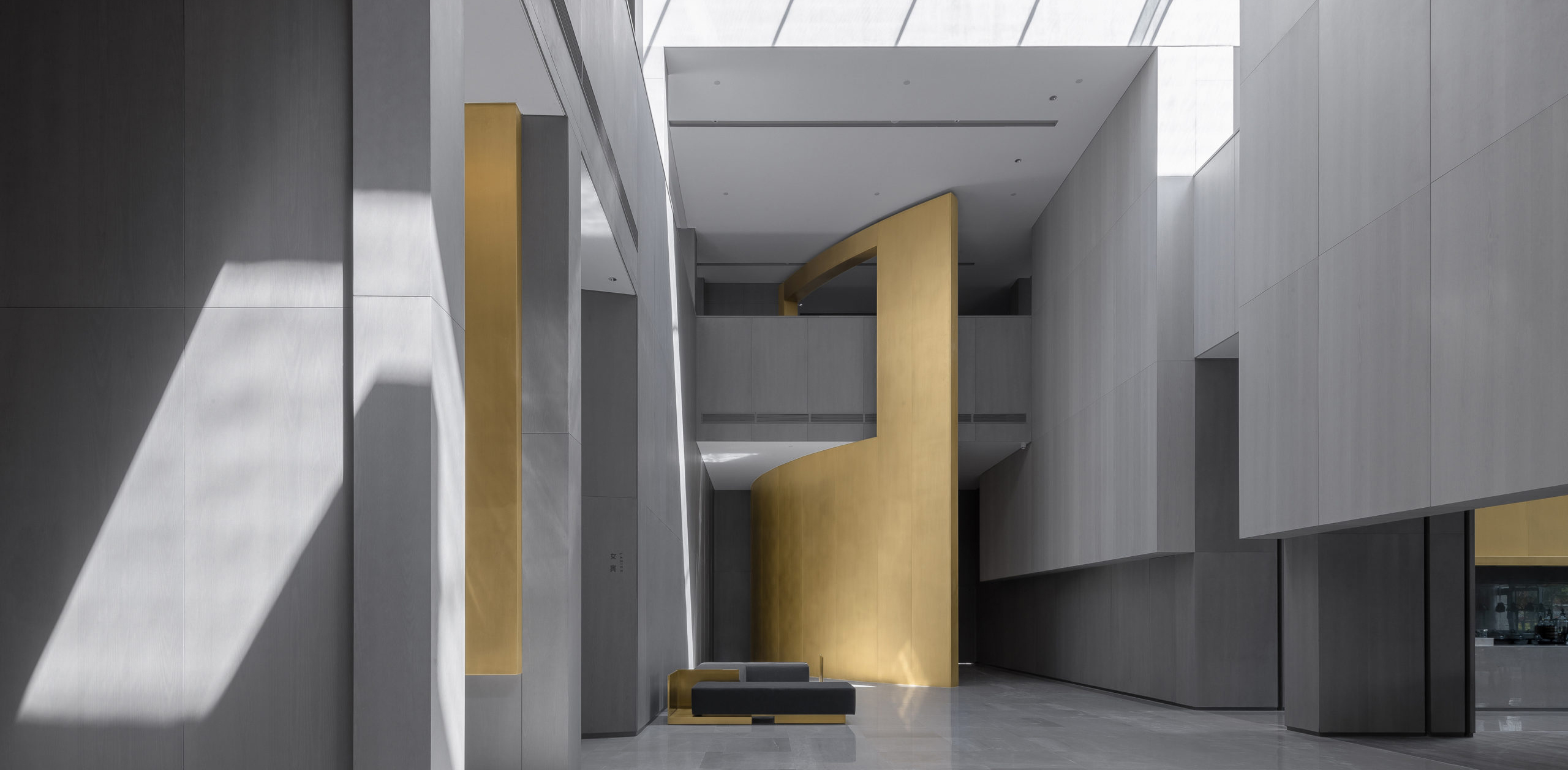
Qushui-Lanting Resort Hotel by DJX Design Studio, Hangzhou, China
An exploration of water and light, the Qushui-Lanting Resort is a balanced and spiritual place. The construction and division of the building center on a series of geometric forms. The concrete and marble interior maintain a similar tone throughout — aside from a huge brass wall that dissects the space. The statement divider is an asymmetric feature, its boldness adds a decisive elegance to the space. Meanwhile, the metallic hue also reflects the light and water, allowing them both to fill the building. In this sense, the wall brings a dancing movement of shadows and reflections onto the otherwise monotone grey space.
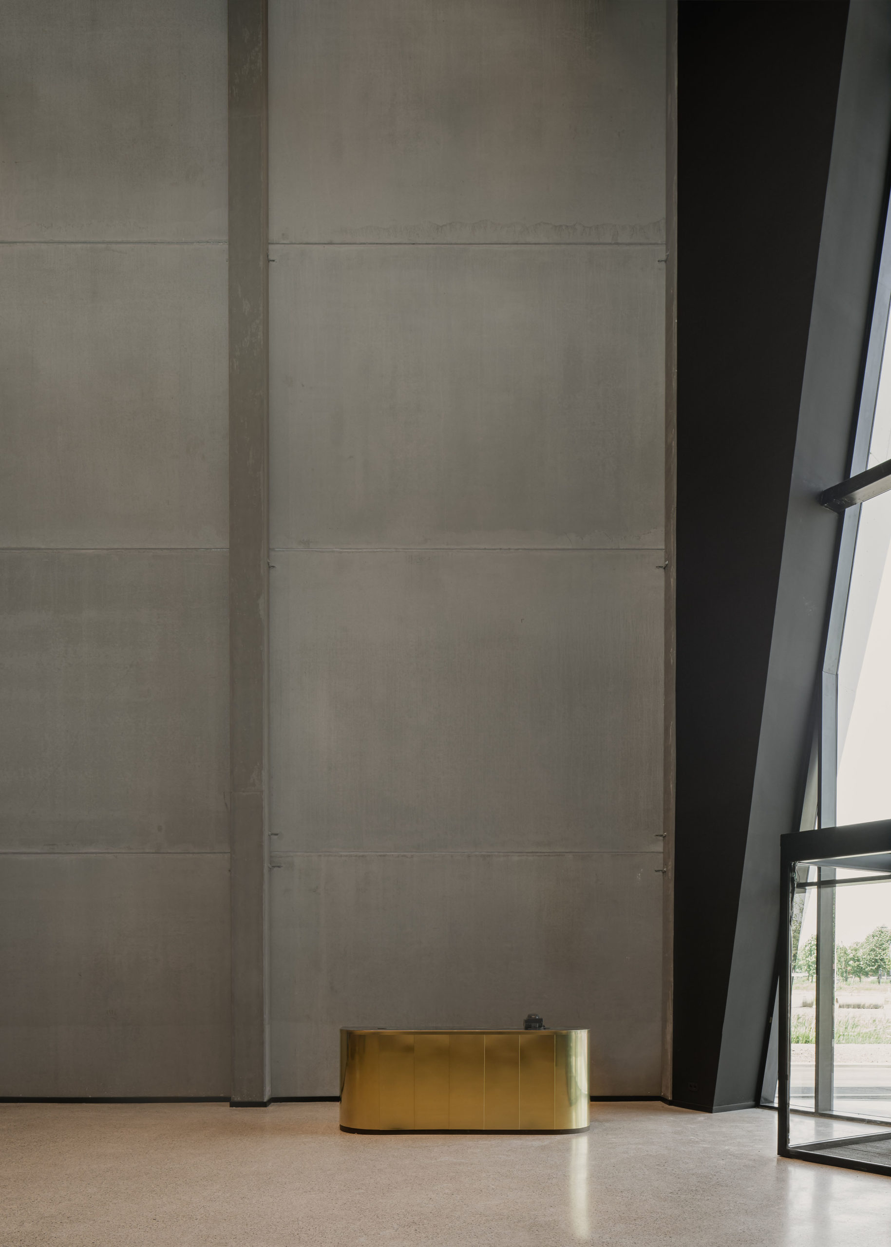
Photo by Jeroen Verrecht
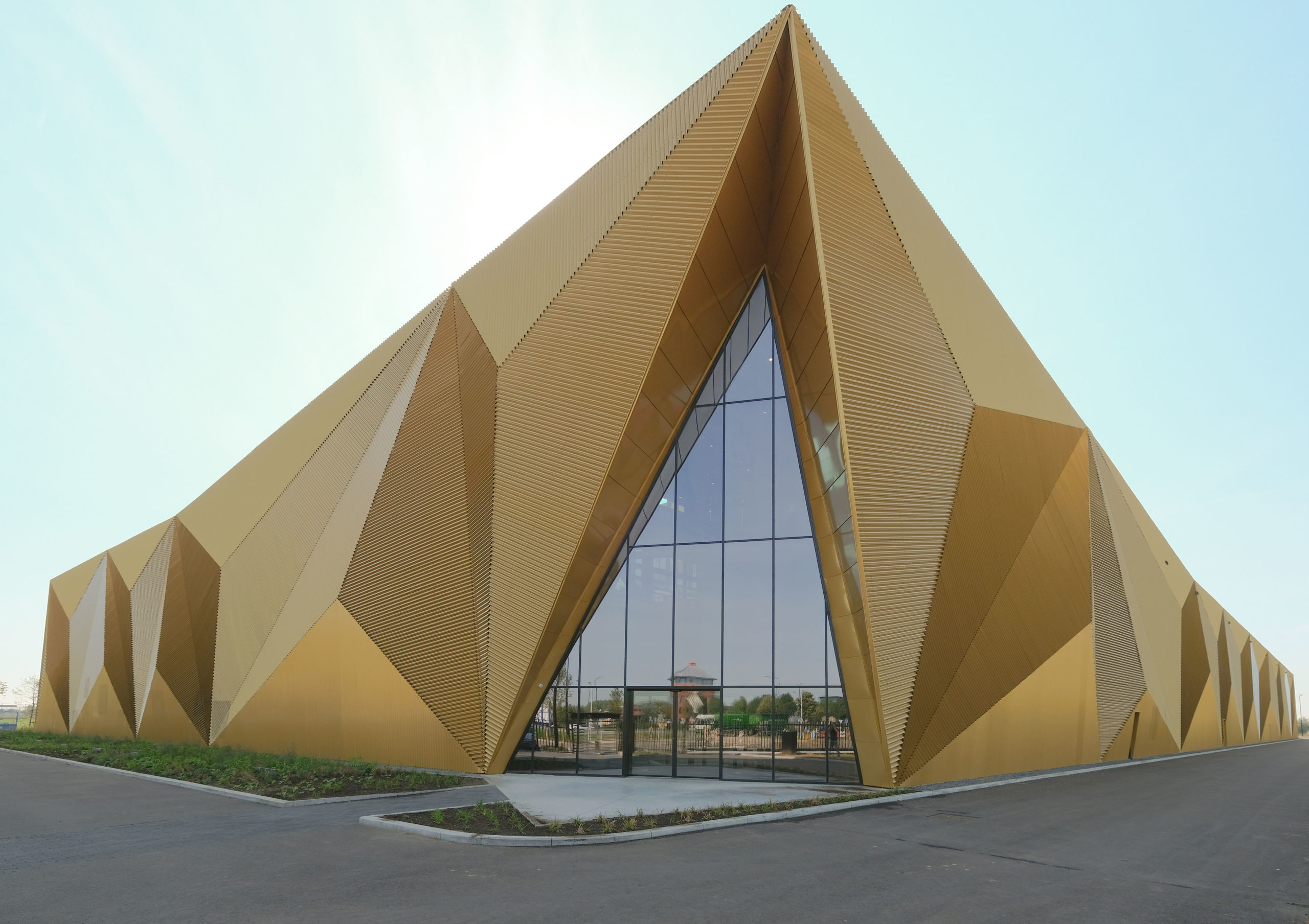
Photo by Jan Boons
The Dutch Vault by Wilma Wastiau, Houten, UT, Netherland
The Dutch Vault is the home of the Royal Dutch Mint, a production facility where coins from various countries are minted and stored. Appearing as an impenetrable bunker, the building’s concrete walls communicate a message of high security throughout the interior. Likewise, the exterior façade was inspired by the multifaceted production process of coins; its industrial steel cladding and bespoke gold coating specifically match the hue of Euro coins. To a similar end, the cladding panels are fastened to the façade in a three-dimensional pattern, creating an intricate pattern reminiscent of the details of a coin.
Photos by Gustav Willeit
Grow Out Hotel Pacherhof New Cellar by Bergmeisterwolf Architekten, Neustift, Italy
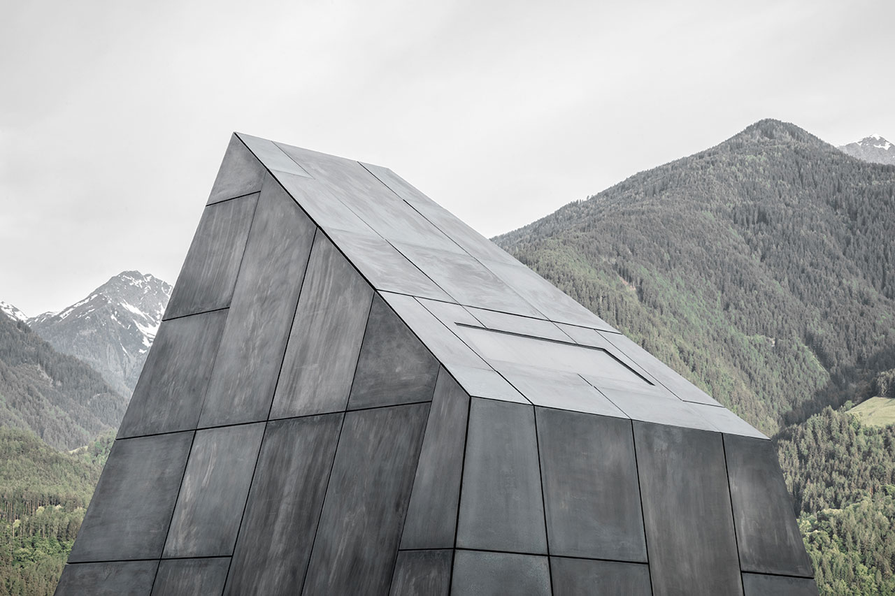
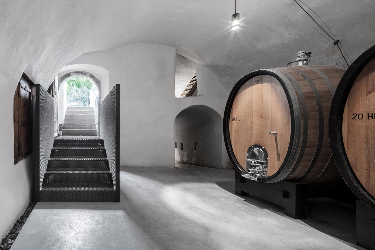
The Isarco Valley is synonymous with wine production. This design reimagines the architecture of wine cellars, using monolithic shapes that protrude from the ground. The tower openings have no frame and are flush with the bronze panels adorn the facade. The glazing is treated with a bronzed effect, which offsets the subtle way that the form blends with the surrounding jagged landscape. Below, the tasting room, offices and harvesting machinery sit comfortably within the simple minimalist spaces, which, although they are ancient, feel modern in design.
Photos by Yun Ouyang
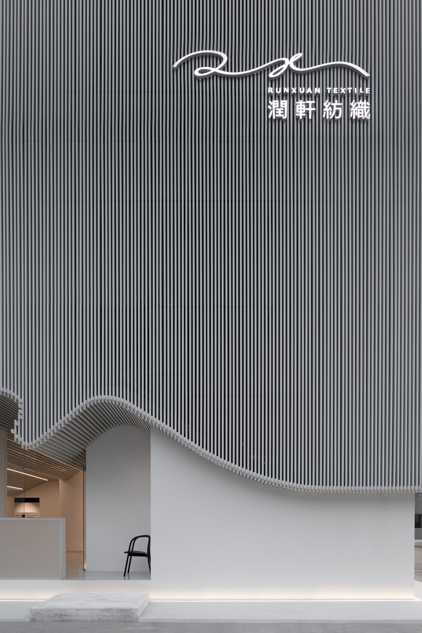
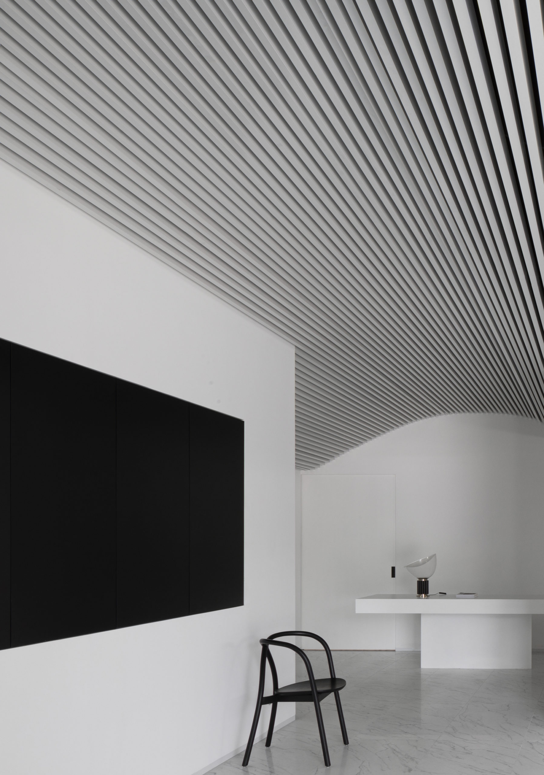
Runxuan Textile Office by Masanori Design Studio, Foshan, China
The textile office of Runxuan in Foshan is striking and unique. Bright white aluminum rods run down the exterior of the building, mimicking the shape and color of pure white cotton. Thanks to the interspaced facade, natural light fills the building, creating a comfortable and bright internal environment. The form of the interior changes throughout, yet it also relies on a certain continuity based on shared design language. More aluminum bars run across the ceilings, forming vaults and curves that soften the stark white walls.
Photos by José Hevia
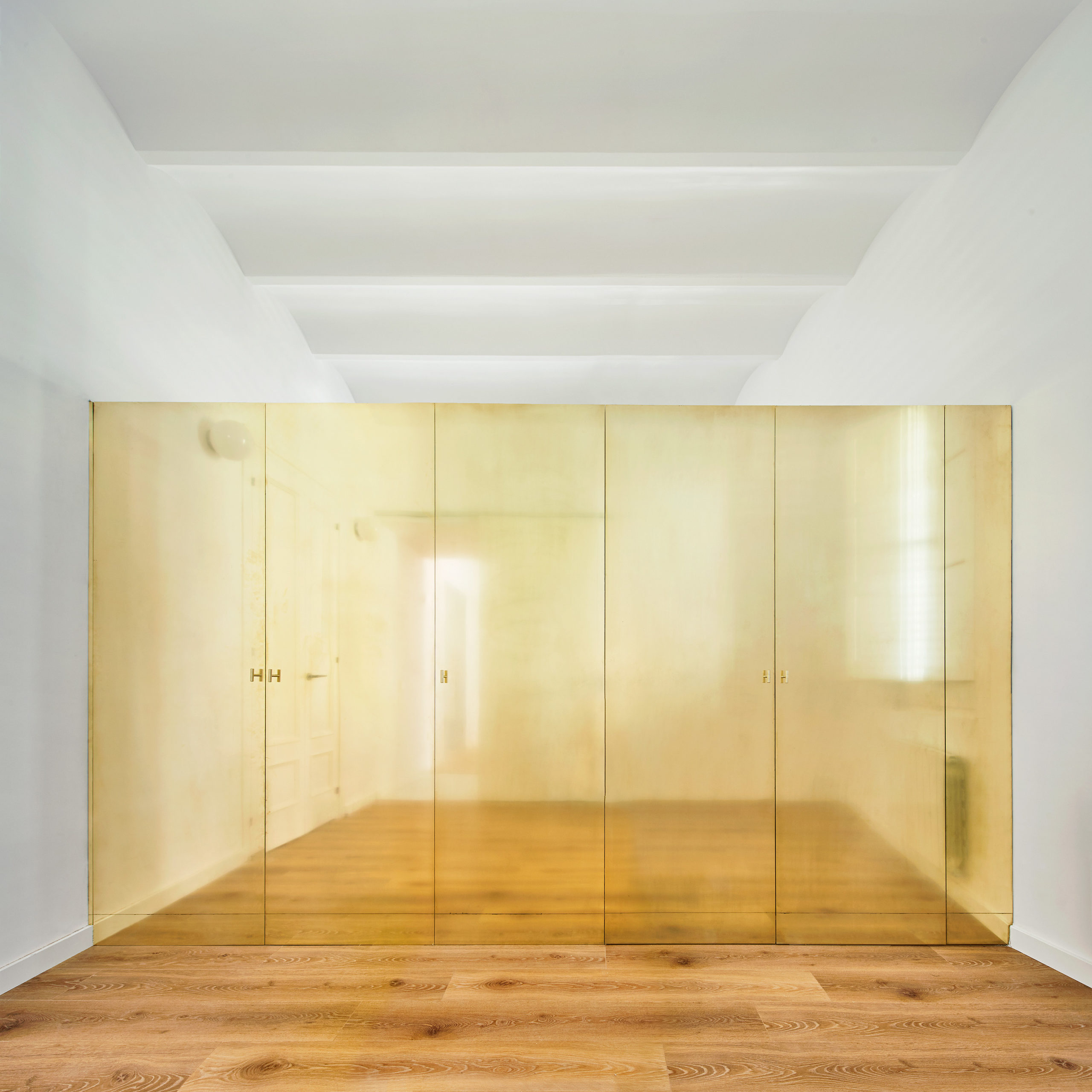
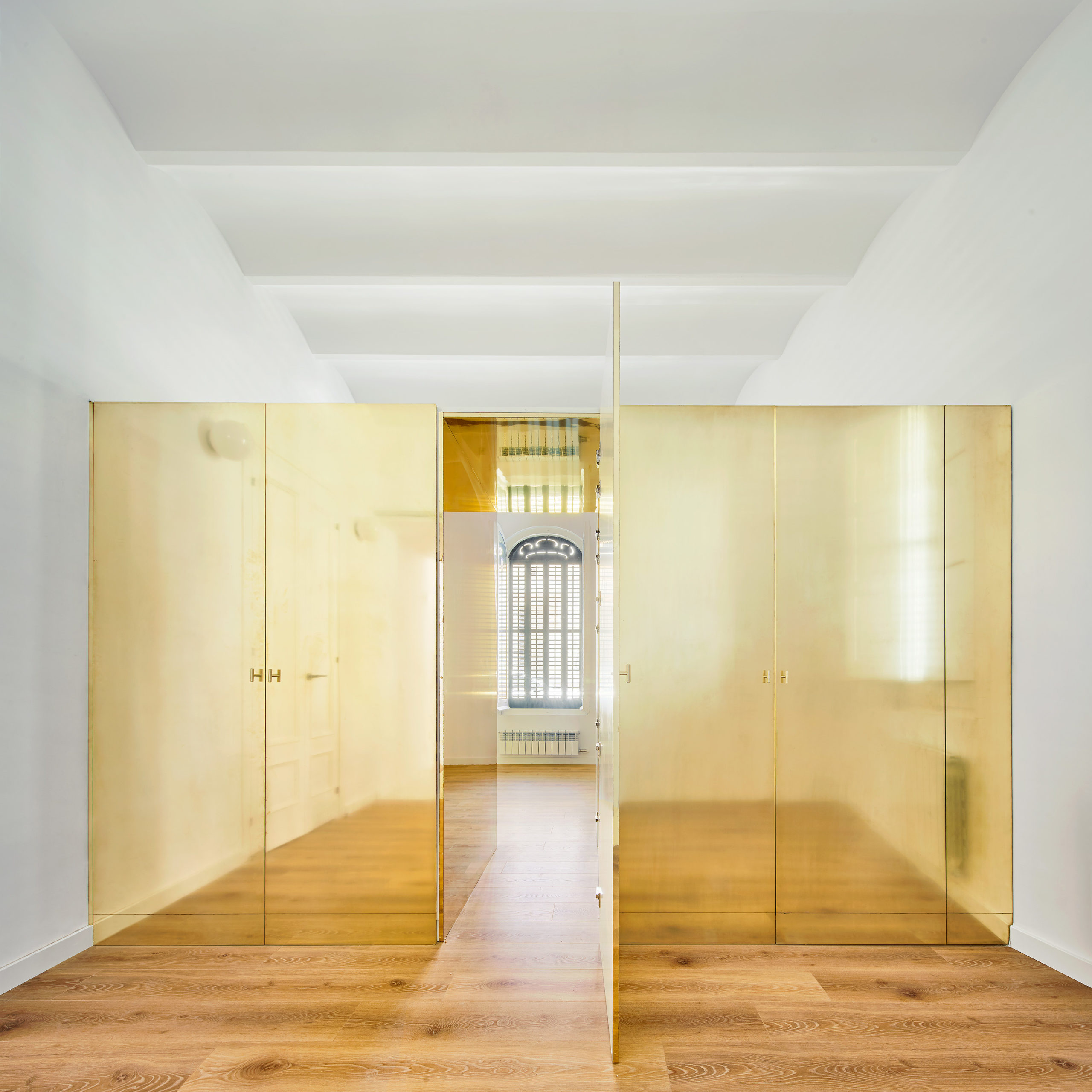
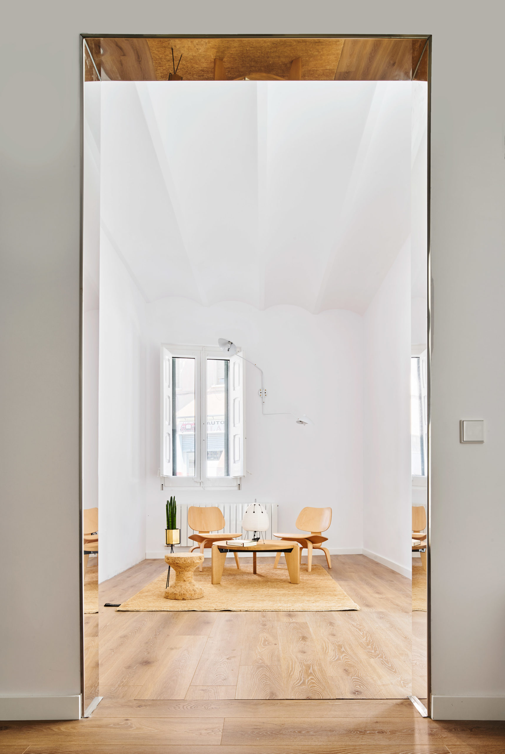
The Magic Box Apartment by Raúl Sánchez Architects, Viladecans, Spain
This seemingly traditional family home was refurbished to support a family’s changing needs. The house, for the most part, appears modern, bright and well finished; however, a surprising feature was added to provide a special space for the owner’s young daughters. Like a jewelry box, a portion of the wall at the center of the building has been re-made in polished brass. It encloses several wardrobes and also provides access to a secret passage that leads to two bedrooms. A unique and special feature the architects have added humor and elegance to the space by making such a bold material choice.
Architects: Showcase your next project through Architizer and sign up for our inspirational newsletter.
 Carlsberg Central Office
  grow out hotel pacherhof new cellar
  Manshausen 2.0
  The Magic Box Apartment