Architizer’s newest print publication is available for pre-order! How to Visualize Architecture is an educational guide designed to help you master the craft of architectural storytelling and visual communication. Secure your copy today.
Architecture is rousing in its ability to express, disrupt and innovate without words. Despite such absence of words, architects have long used form as language, resulting in buildings coded with endless symbols and embedded text. As spectators, we read said abstract form and extract profound and deeply personal narratives about the time, place and context under which buildings may have arisen. That is to say, just like text and words written out on paper, buildings are ongoing representations and abstractions of the world we inhabit.
In contrast to common practice, the following projects use words as central aesthetic components in their designs. Through façades that integrate words in themselves, they probe us to think about memory and memorialization, how we understand buildings and the ways through which we inscribe them with meaning. By toying with the sacrality of text, these façades aim to engage the public and invite human interaction and interpretation. In many cases, these projects use an alternate approach in order to reach out and bridge the often cold divide between public and private space.

© Manuel Herz Architects

© Manuel Herz Architects

© Manuel Herz Architects
Jewish Community Center Mainz by Manuel Herz Architects, Mainz, Germany
Unusual for a synagogue, the volume of this building is situated parallel to the streets without any kinds of barriers. As a result, the building’s square has become a truly public space that is seamlessly integrated into the urban fabric, thus questioning the position of sacrality. The design for the community center is abstractly drawn based on the Hebrew word for raising or blessing.

© People’s Architecture Office

© People’s Architecture Office

© People’s Architecture Office
Tubular Baitasi by People’s Architecture Office, Beijing, China
Using HVAC metal ducts as a type of architectural vernacular, this project’s façade features a building-size sign that spells out 白塔寺, meaning “White Pagoda Temple.” The design aims to engage the public and ensures visibility from a distance. Additionally, pedestrians may look into the ducts to discover images of a 700-year-old White Pagoda Temple and the People’s Commune Building, an experimental housing complex from the 1950s.

© CODA

© CODA

© CODA
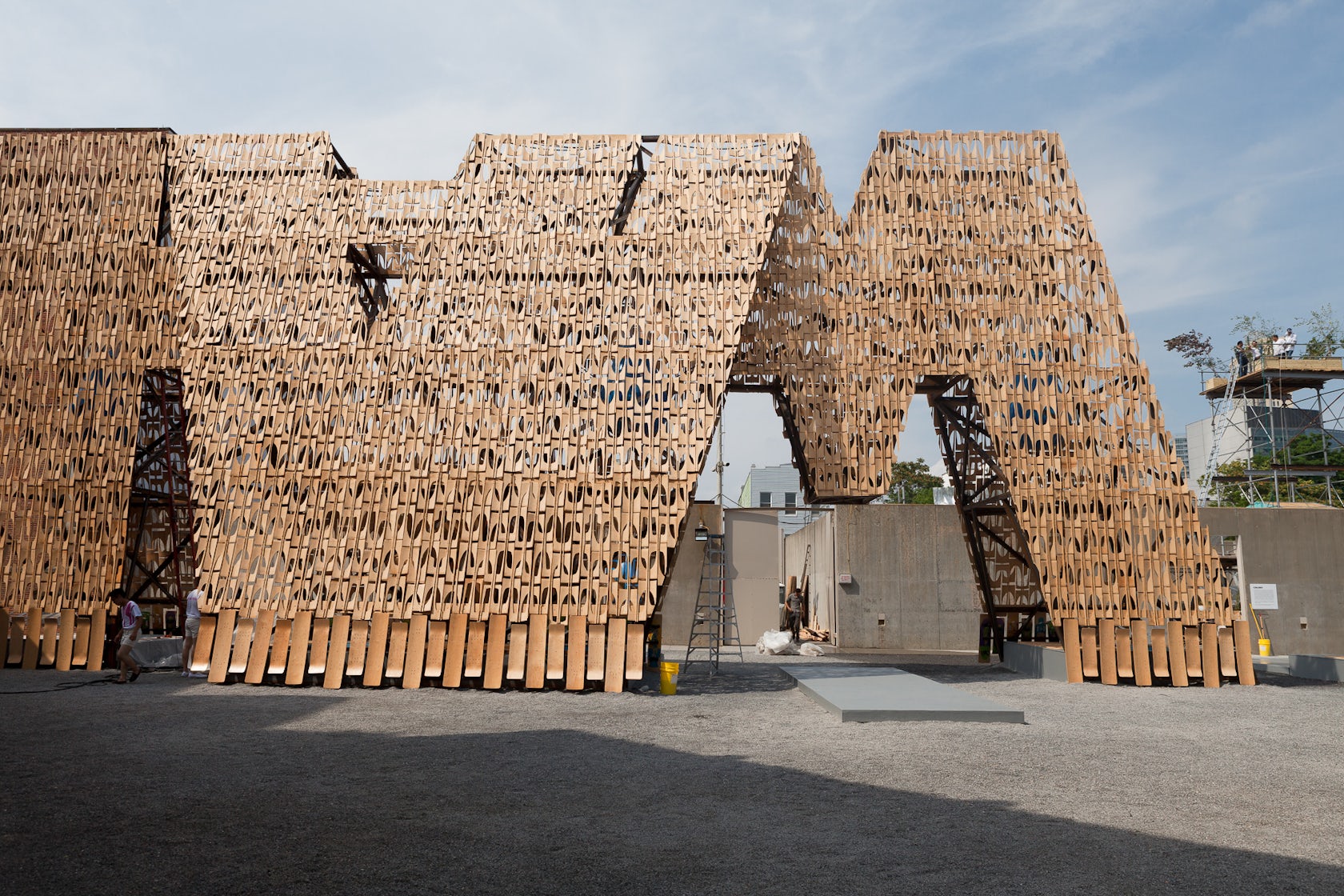
Party Wall by CODA, New York, N.Y., United States
The winning design in MoMA PS1’s 2013 Young Architects Program, Party Wall creates a porous façade that provides shade, seating and water at a range of scales. It provokes the question: Does it say something and if so, what does it say? According to CODA it does not say anything in itself. Its text is only revealed when a shadow is cast in relation to the ground and sun.

© Moriyama Teshima Architects

© Moriyama Teshima Architects

© Moriyama Teshima Architects
Canadian War Museum by Moriyama & Teshima Architects, Ottawa, Canada
Located in the nation’s capital city, the Canadian War Museum features morse code windows, which spell out “Lest We Forget” in both French and English. Inspired by the theme of regeneration, the design not only recalls the impact of war on the landscape, but also nature’s profound ability to recover from said devastation.

© Jan Siefke

© die photodesigner

© die photodesigner
Shanghai Museum of Glass by logon urban.architecture.design, Shanghai, China
Located on a former glass manufacturing site in the Baoshan District of Shanghai, the aim of this urban regeneration project was to preserve existing structures while rediscovering the original character of each building. On the museum’s façade, multi-language words related to glass glow with LED backlighting, creating a unique visual effect.

© OOF! architecture

© OOF! architecture

© OOF! architecture
Hello House by OOF! architecture, Melbourne, Australia
Perhaps the most conspicuous message displayed in this collection, the Hello wall was designed in collaboration with artist Rose Nolan. The white brick wall is a large public face that offers those passing by with a cheerful greeting, while giving little away about the world inside.

© klab architecture

© klab architecture
Placebo Pharmacy by klab architecture, Athens, Greece
Located in Athens, Placebo Pharmacy is a cylindric structure that seeks to create circular movement and conversation with the urban artery in which it exists. The panels of the façade are perforated in Braille, which both alludes to the system’s use on pharmaceutical packaging and boosts visibility by allowing the light to find its way into the interior.
Architizer’s newest print publication is available for pre-order! How to Visualize Architecture is an educational guide designed to help you master the craft of architectural storytelling and visual communication. Secure your copy today.


