Architects: Want to have your project featured? Showcase your work by uploading projects to Architizer and sign up for our inspirational newsletters.
Architecture is where the past converges with the present. In adaptive reuse, designers balance history with new spaces, materials and amenities for modern life. Architectural drawings give us a glimpse into this process. Through section drawings, we can begin to see how existing structures and new interventions coexist. Showing the balance between preservation and reinvention, these drawings highlight the diverse approaches to repositioning architecture for the future.
The best illustrations tell powerful stories of how we experience design. In section drawings, architects can understand how light, structure, and scale shape how people move through rooms and gather. Today, adaptive reuse projects are rising as the understanding of embodied energy grows. The following projects showcase section drawings of adaptive reuse projects at various scales. Together, they represent a dialogue between history and innovation.
Moynihan Train Hall
By Skidmore, Owings & Merrill (SOM), New York City, New York
Popular Choice Winner, 10th Annual A+Awards, Transportation Infrastructure
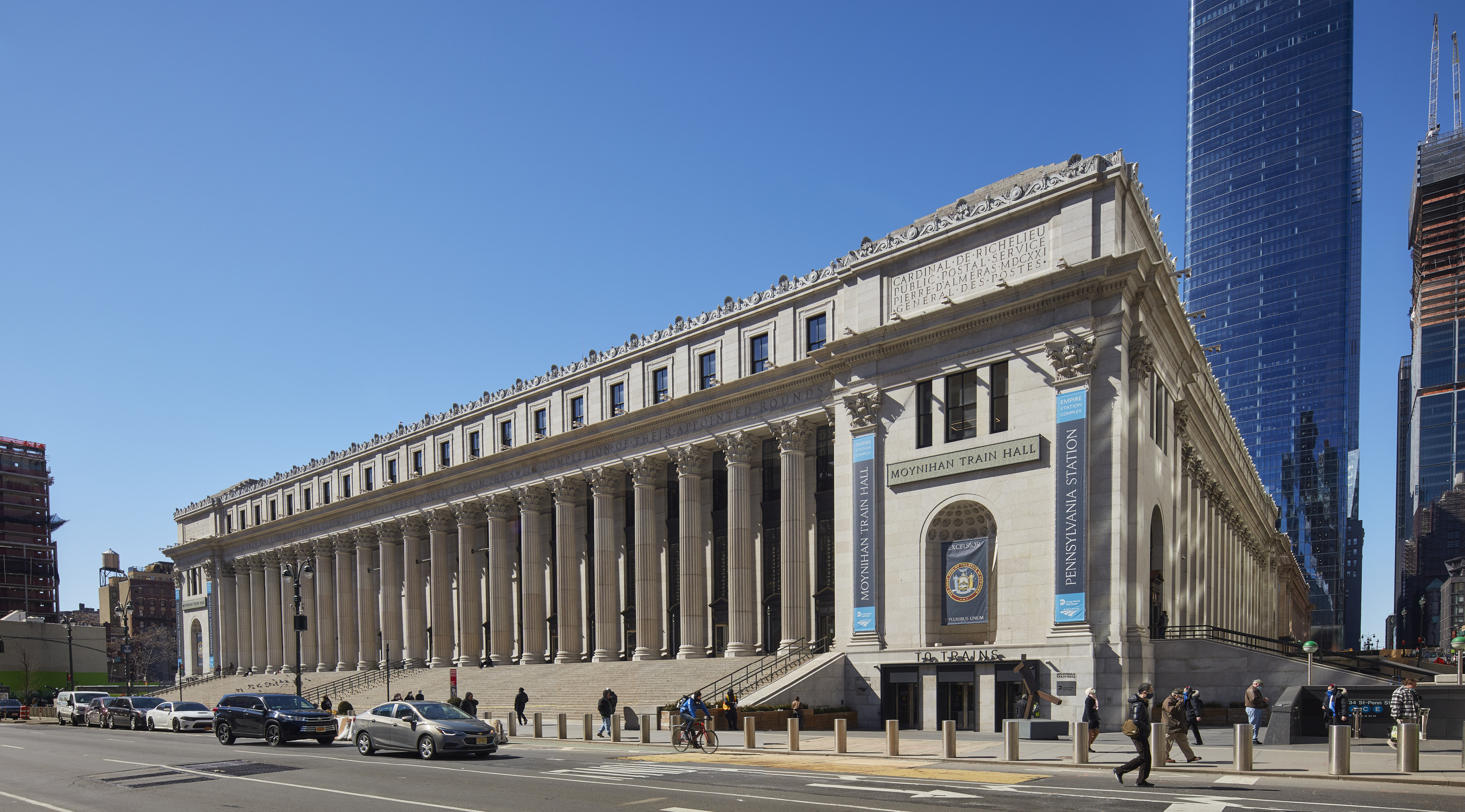
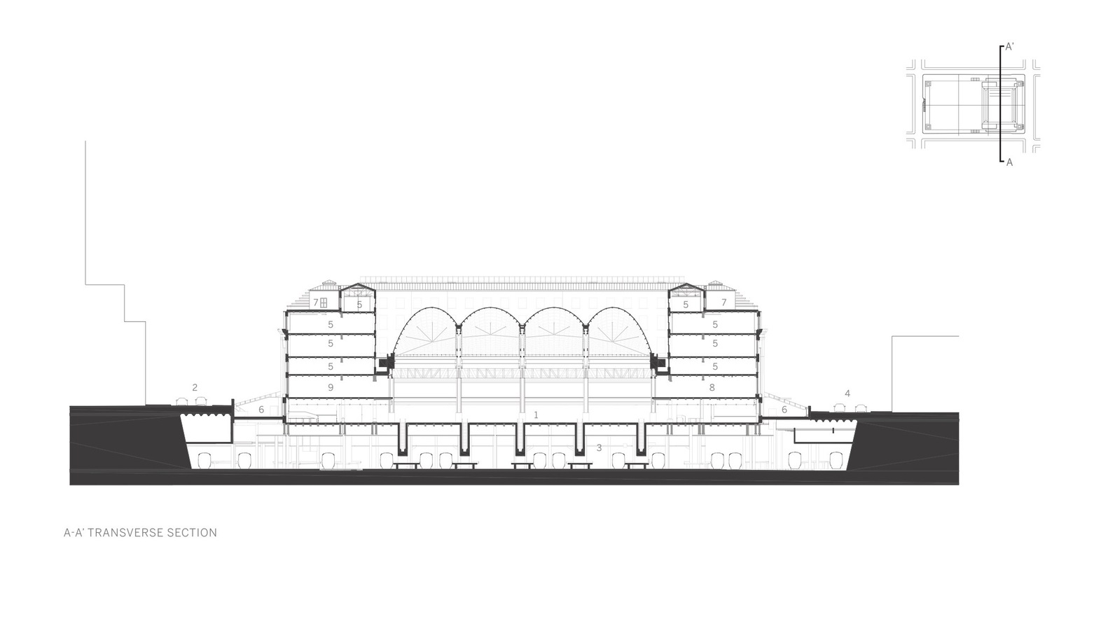
 At the heart of this transformation is the adaptive reuse of the Farley Building, originally designed by McKim, Mead & White and completed in 1913. This underutilized structure has been repurposed into a welcoming new front door for New York City. The Main Concourse, situated in the Farley Building’s former mail sorting room, features a striking skylight that spans the entire space. In section, the skylight pays homage to the design of the original Penn Station, comprising four catenary vaults with over 500 glass and steel panels arranged to create a moiré effect.
SOM’s Moynihan Train Hall marks a monumental civic endeavor that expands the Pennsylvania Station complex into the James A. Farley Post Office Building across Eighth Avenue. The project aimed to rejuvenate the environment that countless commuters endured for decades. The design team’s approach focused on introducing natural light to the concourses and increasing the total concourse space by fifty percent. Additionally, the project sought to restore the grandeur lost with the demolition of the original Penn Station half a century ago.
Quay Quarter Tower
By 3XN, Sydney, Australia

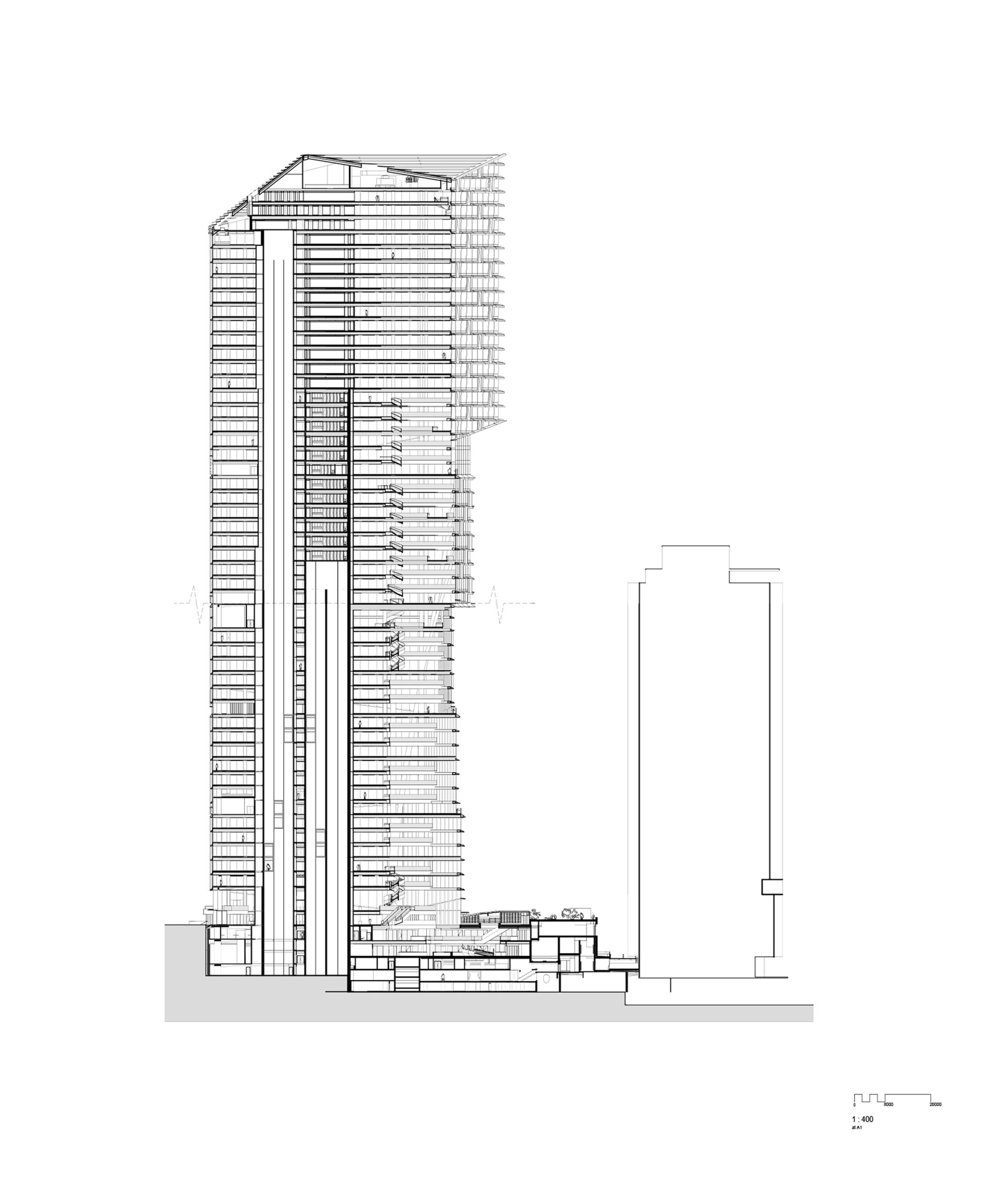
 Quay Quarter Tower rethinks the potential of tall buildings near the end of their commercial life. As 3XN outlined, the design strategy involved upcycling the existing 1976 AMP Centre; the project retains 65% of its beams, columns and slabs, and over 95% of its existing core. By adding new construction, the project doubled the floor area as components of the existing structure that were utilized are seen in section. The project challenges high-rise adaptive reuse and models a more sustainable approach for the future.
Challenging the norms of a conventional high-rise structure, the design embraces a novel approach, transforming the building into a vertical village that fosters a strong sense of community. This forty-nine-story tower deviates from the uniformity often associated with traditional skyscrapers, opting for an arrangement of five stacked and shifting volumes. Each volume is strategically positioned around an atrium that opens towards the iconic Sydney Harbor in the north. Within these atria lie informal social spaces.
T653 – Stone Barn Passive House
By CO Adaptive, New York, United States
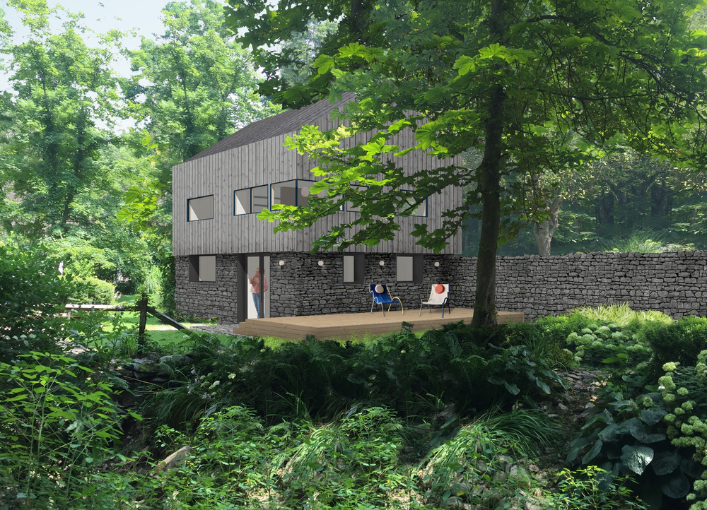
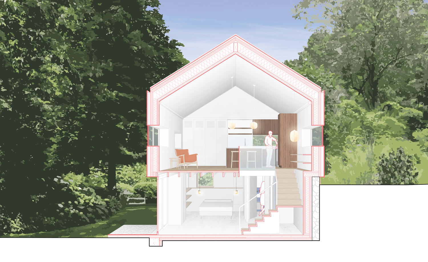
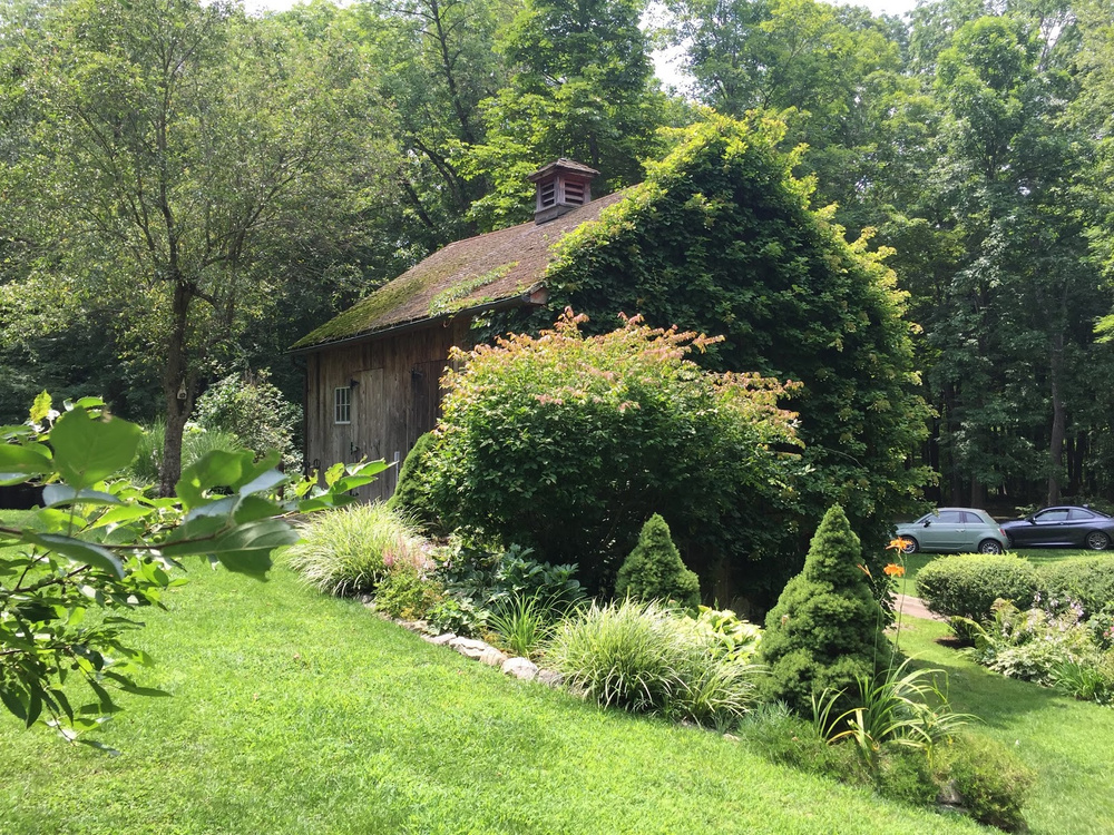 The project involves the renovation of an old stone barn. Nestled in the trees on the site of an 18th-century house, the barn will be turned into a Passive House guest home. CO Adaptive is preserving the stone walls that enclose the base of the structure and extend into the landscape as retaining walls. The wood frame structure above will be rebuilt to create an open kitchen and living room with views into the surrounding tree canopies. As seen in the section drawing, below, the stone walls will be insulated from the interior and the existing openings will be infilled with high-performance windows and new stonework creating a bedroom and ensuite bathroom that are comfortable year round.
Coal Drops Yard
By Heatherwick Studio, London, United Kingdom
2019 A+Award for both Jury and Popular Choice
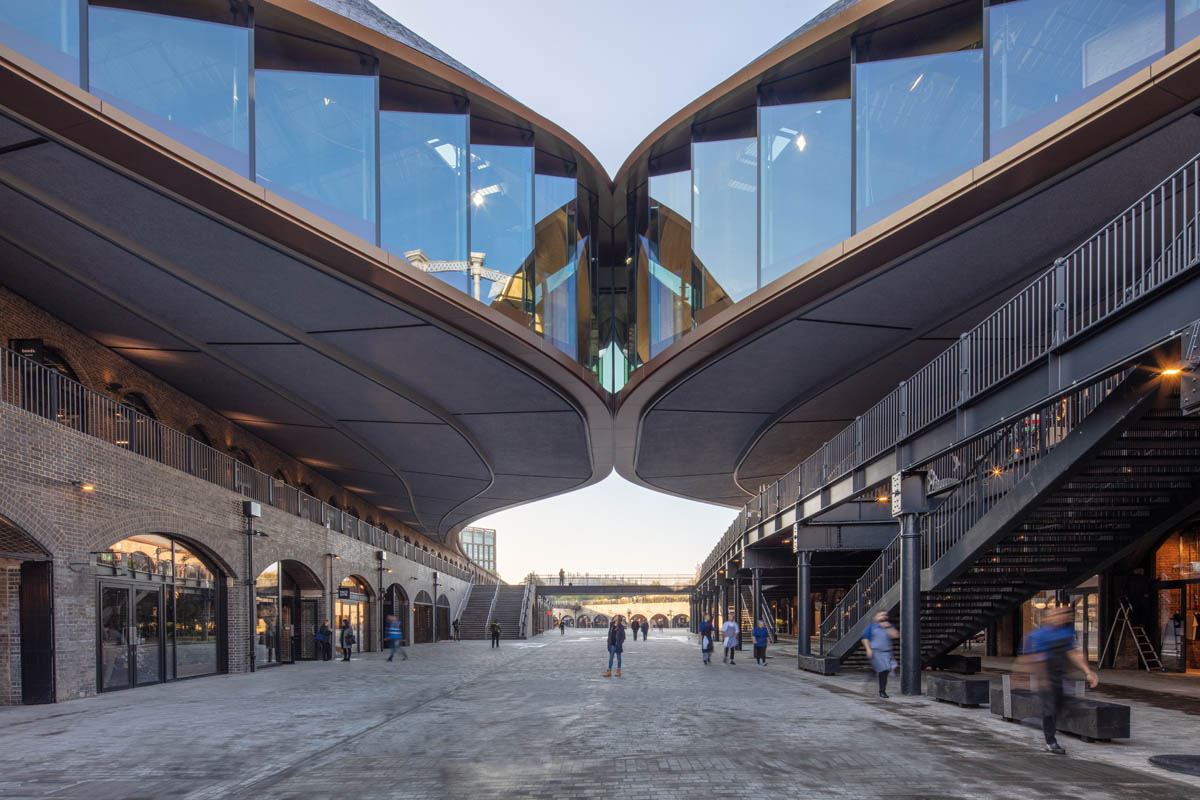

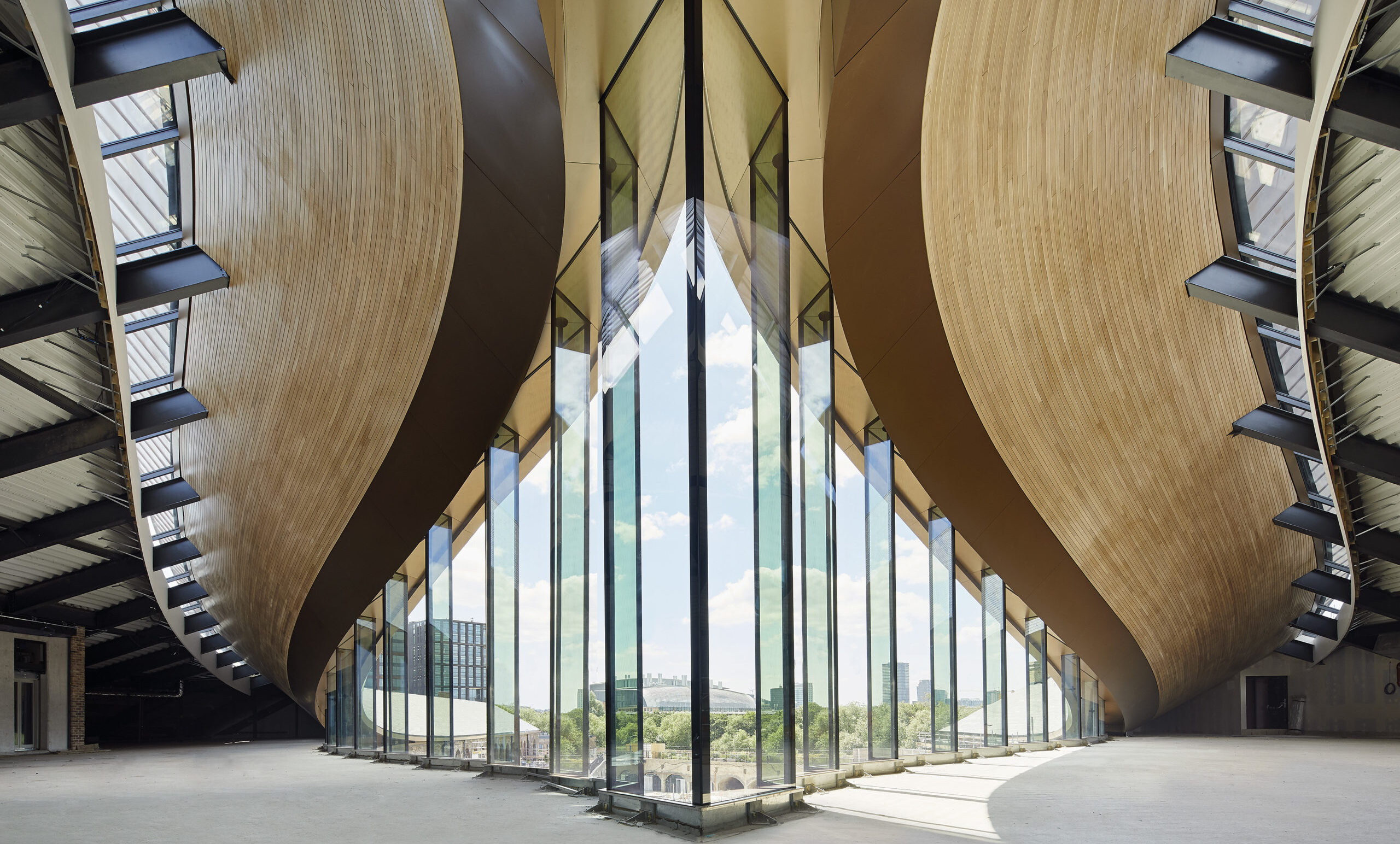
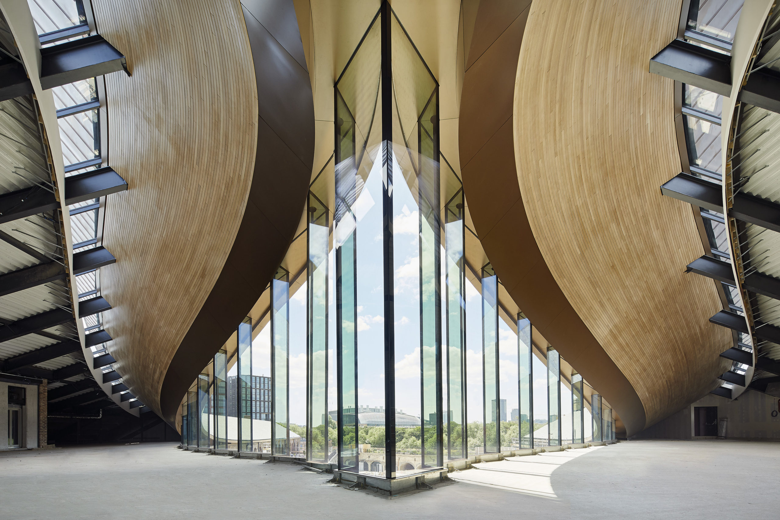 Heatherwick Studio was commissioned by the King’s Cross Development Partnership to revitalize the Coal Drop Yards site into a retail quarter. The team’s vision aimed to honor the unique texture and historical resonance of the existing industrial structures while forging a cohesive new public space and retail hub. The challenge was turning weathered buildings within a lengthy, linear site into an animated retail precinct where people could seamlessly gather and move.
The solution with the existing roof geometry involved the creation of ‘kissing’ roofs that form a distinctive upper story. As seen in section, the original structures hold their identity while also transforming over the length of the buildings. The project encompassed a broader restoration initiative for the historical structures on-site that prioritized the enhancement and adaptation of existing buildings. The design retained rich textures, such as graffiti and historical signage, preserving the unique character of Coal Drops Yard and paying homage to its industrial heritage.
High Line
By James Corner Field Operations, New York, NY, United States
2015 Popular Choice A+Award
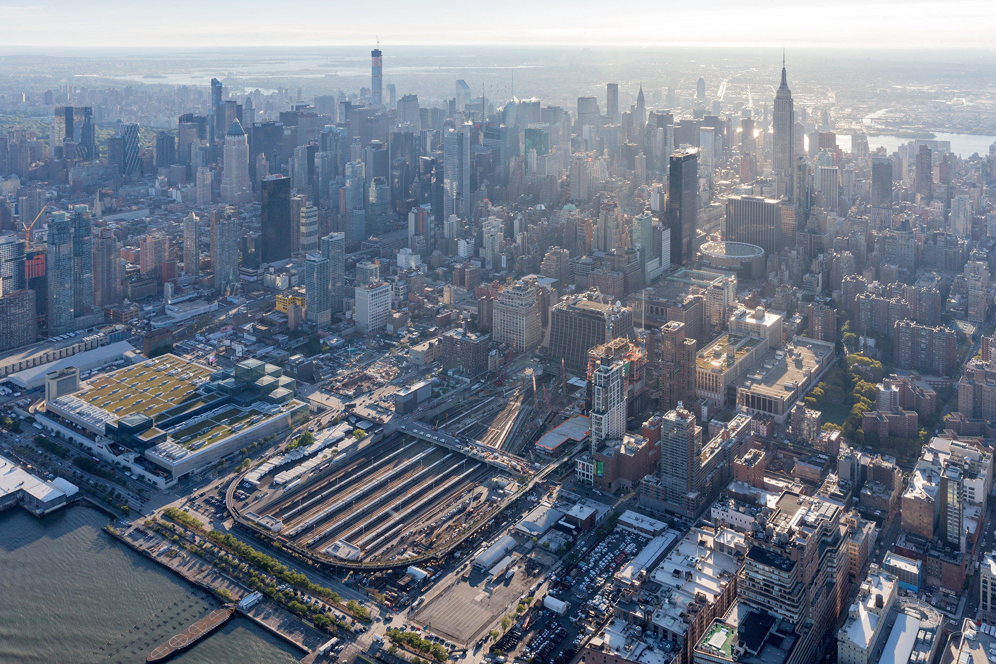
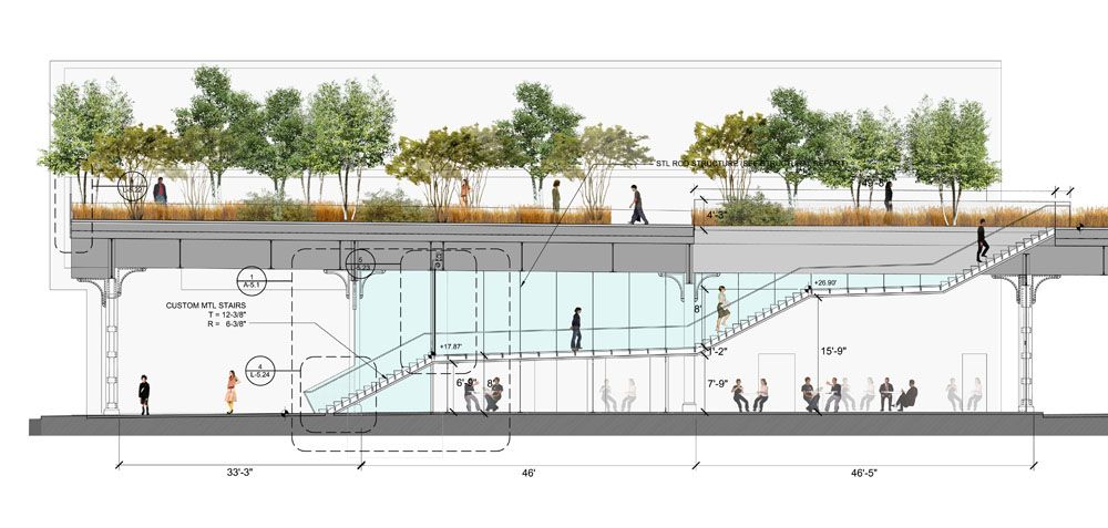
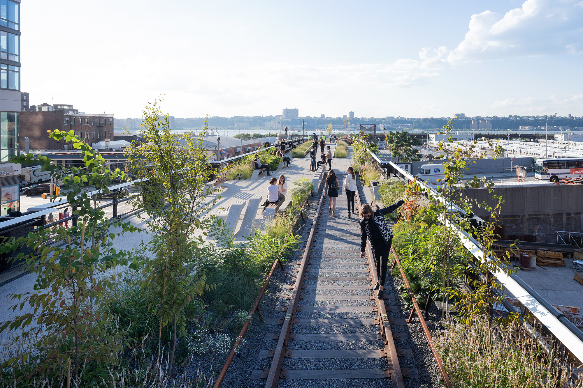 Representing a third of the High Line, the Rail Yards section stands out as one of the most iconic stretches, offering expansive views of the Hudson River and the Midtown skyline. Section 3 not only builds upon the identity and success of the existing High Line but also explores innovative ways to adapt to the new 21st-century context of the future Hudson Yards development.
This collaborative design involves James Corner Field Operations as the Project Lead, along with contributions from Diller Scofidio + Renfro and Piet Oudolf. Drawing inspiration from the postindustrial ruins of the rail, where nature reclaimed a once essential urban infrastructure, the new park interprets its historical legacy. Illustrated in the section drawing, the access points are meticulously crafted experiences, deliberately prolonging the transition from the bustling city streets to the serene and otherworldly landscape above.
E131 – Timber Adaptive Reuse Theater
By CO Adaptive, Brooklyn, New York, United States
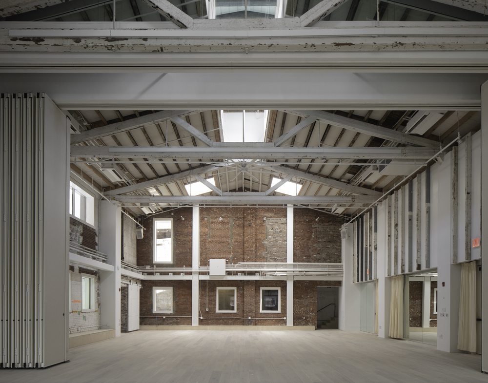
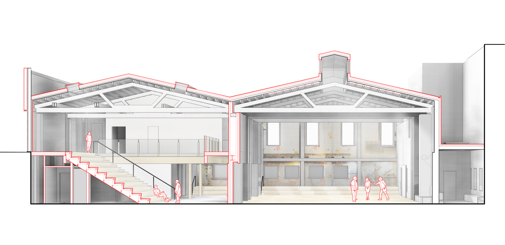
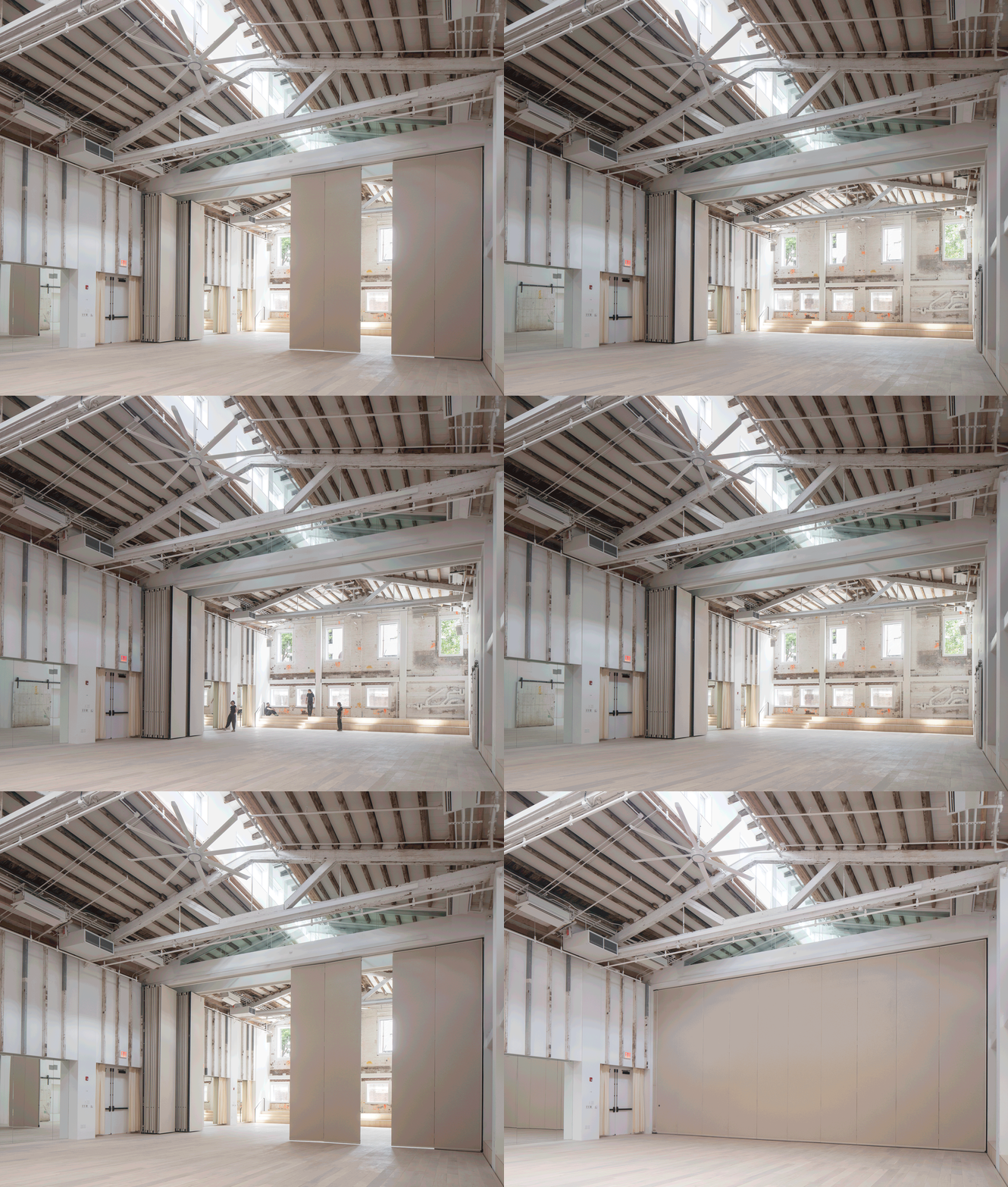 Once a bustling metal foundry in Brooklyn’s Gowanus neighborhood, this double A-frame building has undergone a remarkable transformation into a vibrant space for theater artists. The project serves as a prime example of sustainable design thinking with a focus on low-carbon practices, breathing new life into existing structures through adaptive reuse.
Central to the endeavor was a commitment to foster innovative uses for the space, all the while minimizing demolition waste and honoring the historical significance of the site. The section drawing vividly captures many of the project’s core concepts. By repurposing materials extracted during the demolition process to craft distinctive architectural features, the project not only breathes new life into discarded elements but also significantly reduces the use of virgin materials.
Danish National Maritime Museum
By BIG – Bjarke Ingels Group, Helsingør, Denmark
2014 A+ Jury Choice Award
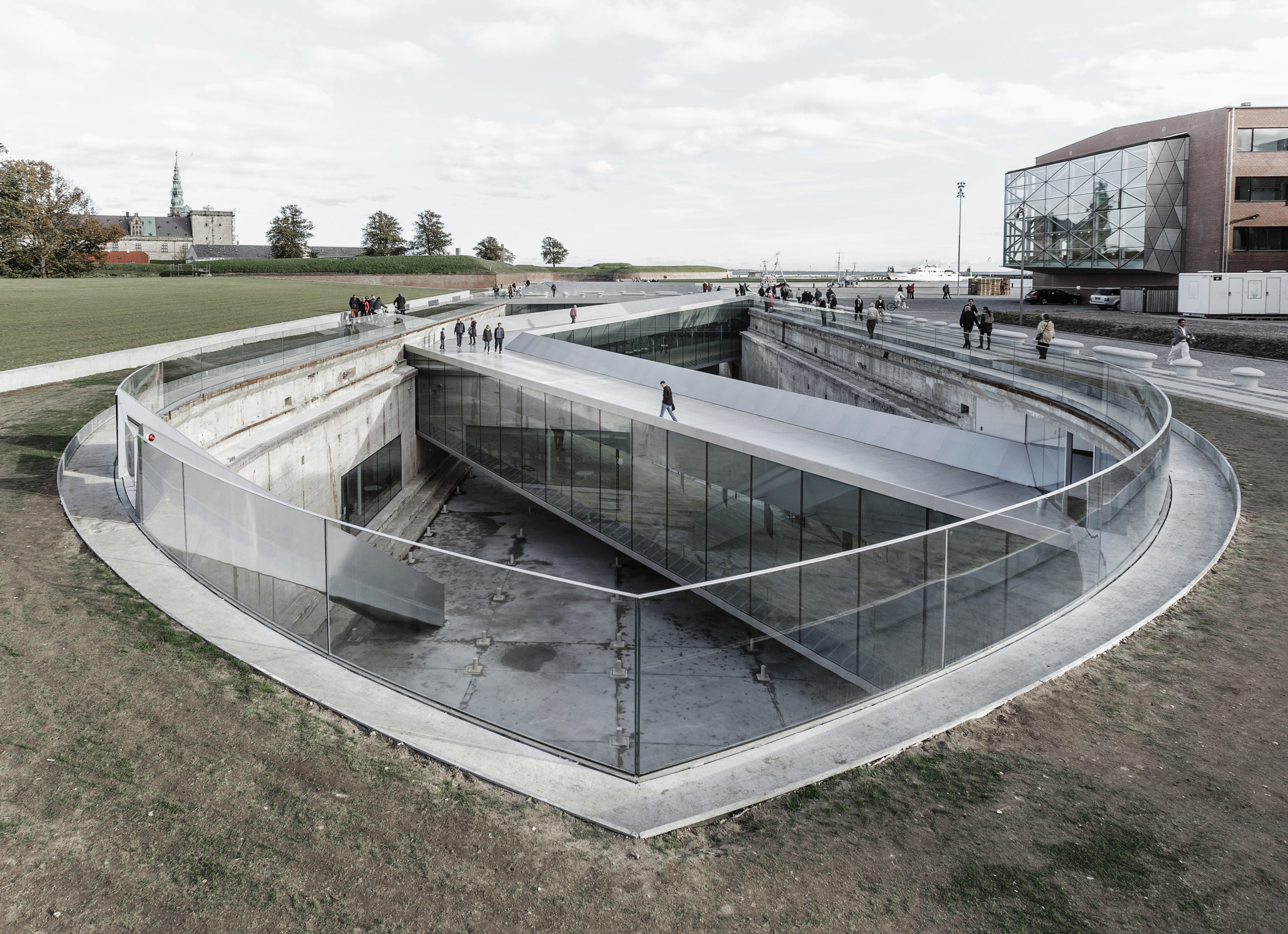
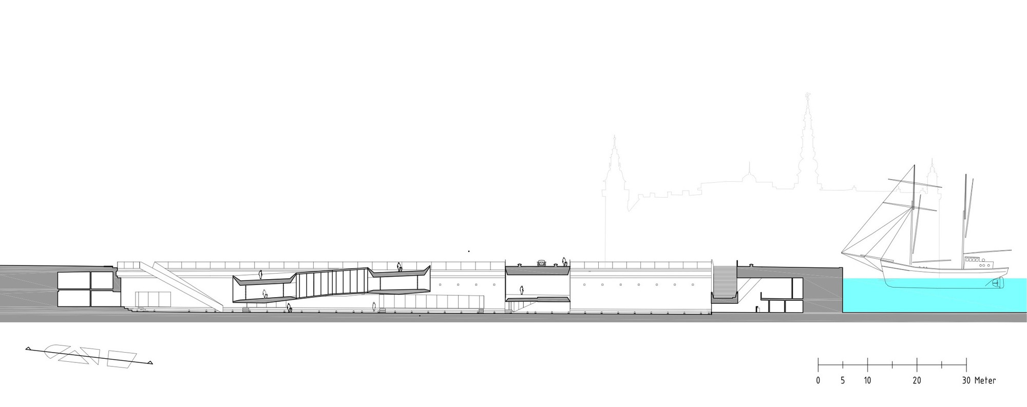
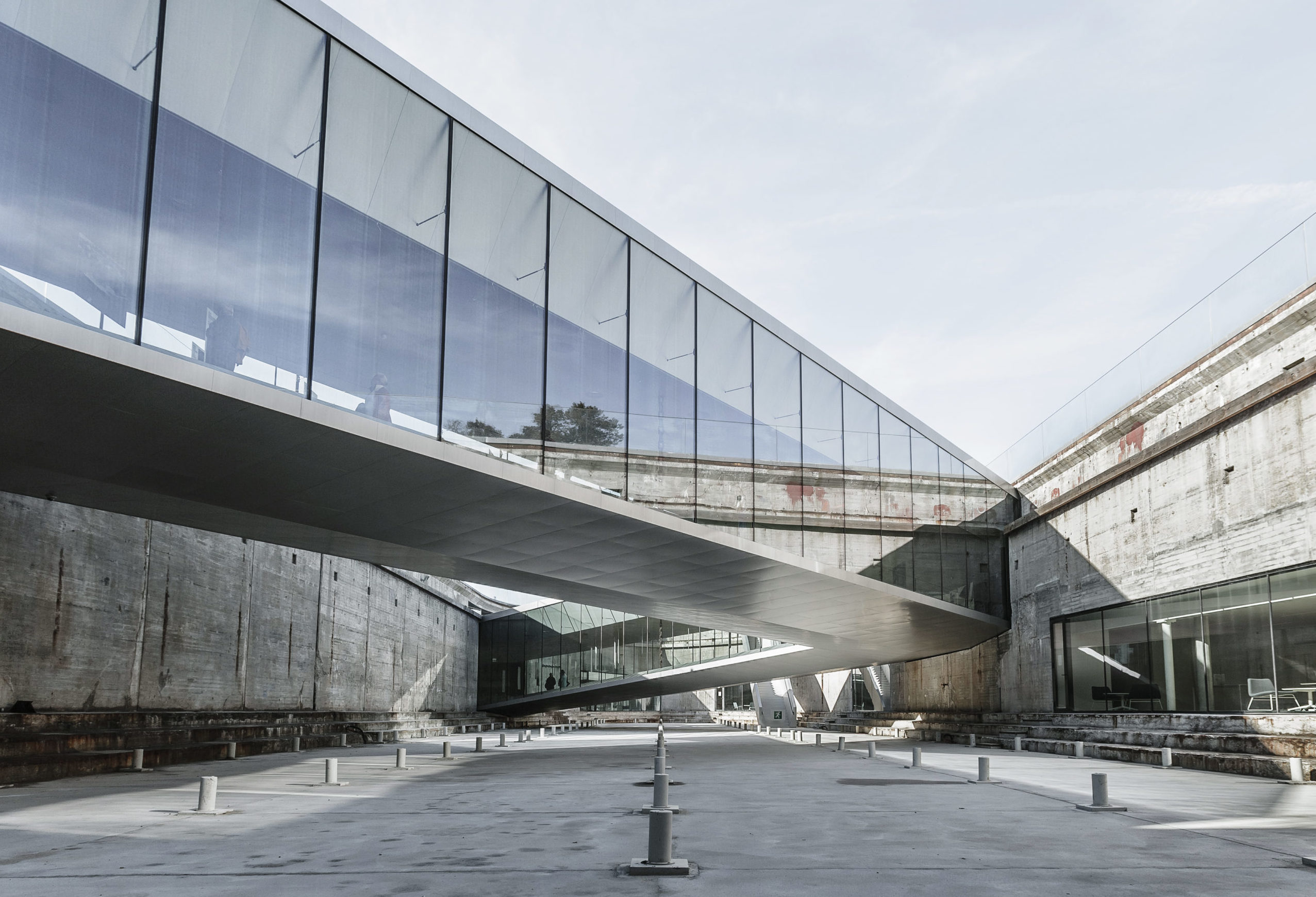 The new Danish National Maritime Museum is located in Helsingør, just north of Copenhagen. The 65,000 square foot (6,040 square meters) museum finds itself in a unique historical context adjacent to one of Denmark’s most important buildings, Kronborg Castle, a UNESCO World Heritage site. Leaving the sixty-year-old dock walls untouched, the galleries are placed below ground and arranged in a continuous loop around the dry dock walls — making the dock the centerpiece of the exhibition. The result is an open, outdoor area where visitors experience the scale of ship building.
As seen in section, the design reimagines museum architecture within the dry dock. As architect Bjarke Ingels explained, “By wrapping the old dock with the museum program we simultaneously preserve the heritage structure while transforming it to a courtyard bringing daylight and air in to the heart of the submerged museum. Leaving the dock as an urban abyss provides the museum with an interior façade facing the void and at the same time offers the citizens of Helsingør a new public space sunken 16 ft below the level of the sea.”
Architects: Want to have your project featured? Showcase your work by uploading projects to Architizer and sign up for our inspirational newsletters.
 Coal Drops Yard
  Danish National Maritime Museum
  High Line at the Rail Yards


