Calling all architectural model-makers! Architizer’s Vision Awards is honoring your craft in a special category dedicated to Physical Models. Learn more and start your submission before the Main Entry Deadline on June 9th.
The Office for Metropolitan Architecture has long challenged the status quo in architecture. OMA was founded in 1975 by Rem Koolhaas and Elia Zenghelis, along with Madelon Vriesendorp and Zoe Zenghelis. Since then, the team has become known for visionary solutions that reinterpret history and vernacular building techniques. In turn, the firm uses models as a way to understand design and construction around the world.
Drawn from the firm’s portfolio of work, the following projects showcase OMA‘s models alongside finished photographs of their buildings. Showcasing critical and rigorous design concepts in different materials, they explore shadow, light, circulation and more. Known for investigations in structure, program and building skins, they also showcase relationships between interior and exterior space. Together, the models represent how one of the world’s best-known design practices transforms concepts into built architecture.
Taipei Performing Arts Center
Taipei, Taiwan
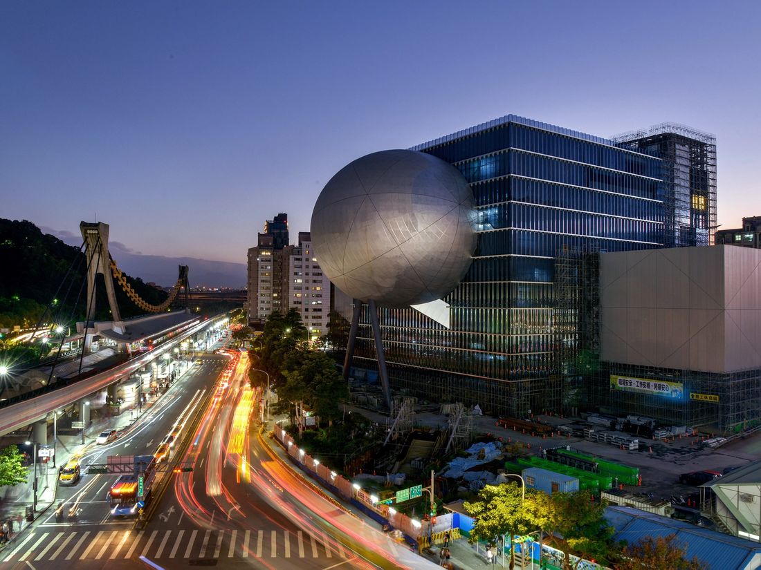
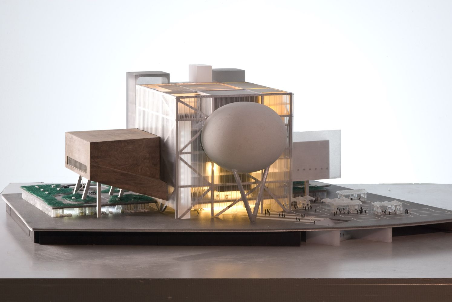 The Taipei Performing Arts Centre consists of three theaters, each of which can function autonomously. The theaters plug into a central cube, which consolidates the stages, backstages and support spaces into a single and efficient whole. This arrangement allows the stages to be modified or merged for unsuspected scenarios and uses. The design offers the advantages of specificity with the freedoms of the undefined.
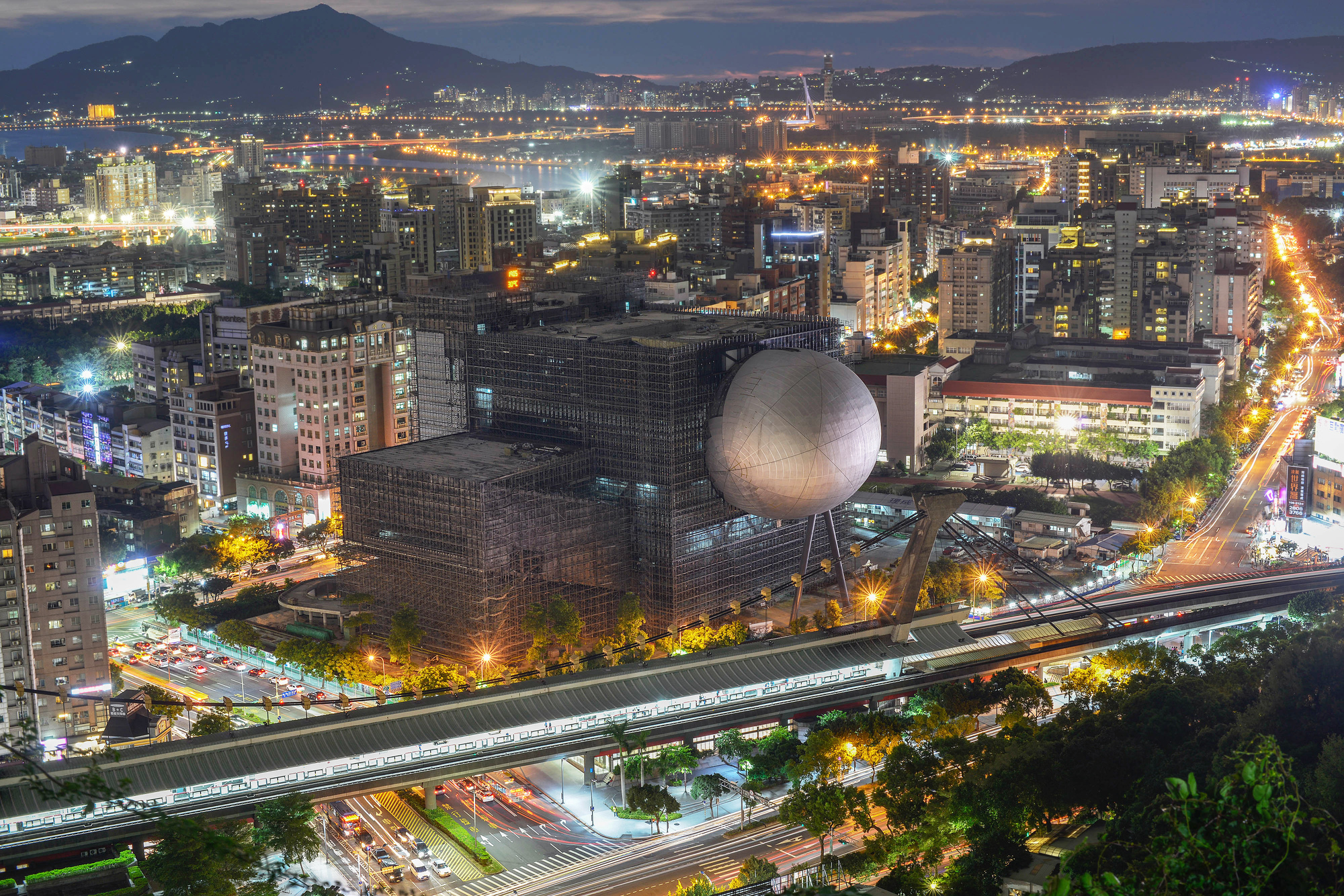 OMA’s model has long reflected the actual, finished building. TPAC offers the possibility for theatrical experimentation and unique views through the stage and into the other auditoriums. The TPAC aims to preserve and channel the existing energies of its site: instead of replacing the vibrant Shi Lin Night Market, it is on stilts above it, as shown in the model. Through its compactness, the TPAC has four different “faces”, each inviting different uses and entertainment.
De Rotterdam
Rotterdam, Netherlands
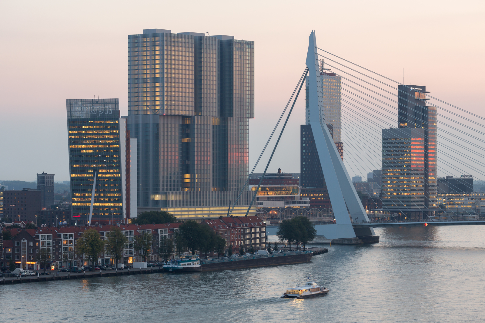
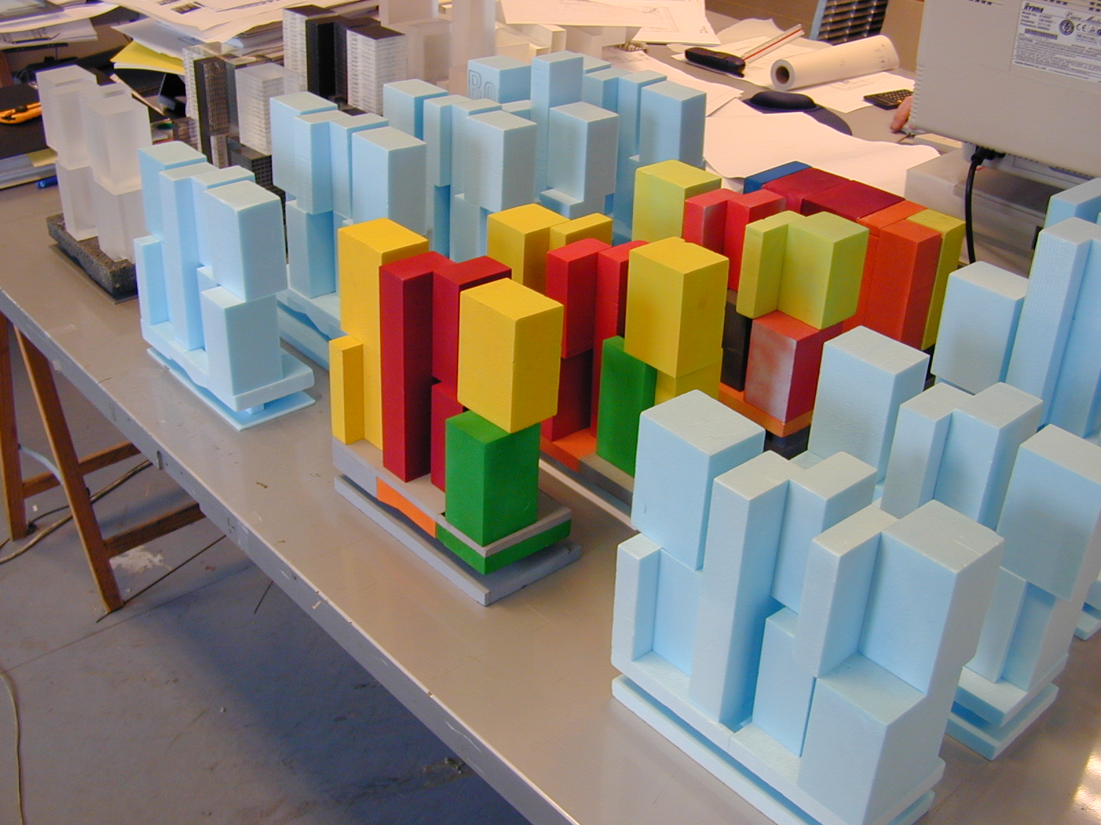 Standing as the largest building in the Netherlands, OMA’s De Rotterdam project explores urban diversity and density through three monumental towers joined by a shared plinth. Formed around the idea of a vertical city, the project has 1.7 million square feet of utilizable floor space along the port area district. The building envelope was designed with floor-to-ceiling glass windows overlooking the River Maas. This provides the complex with a unifying, compact shell.
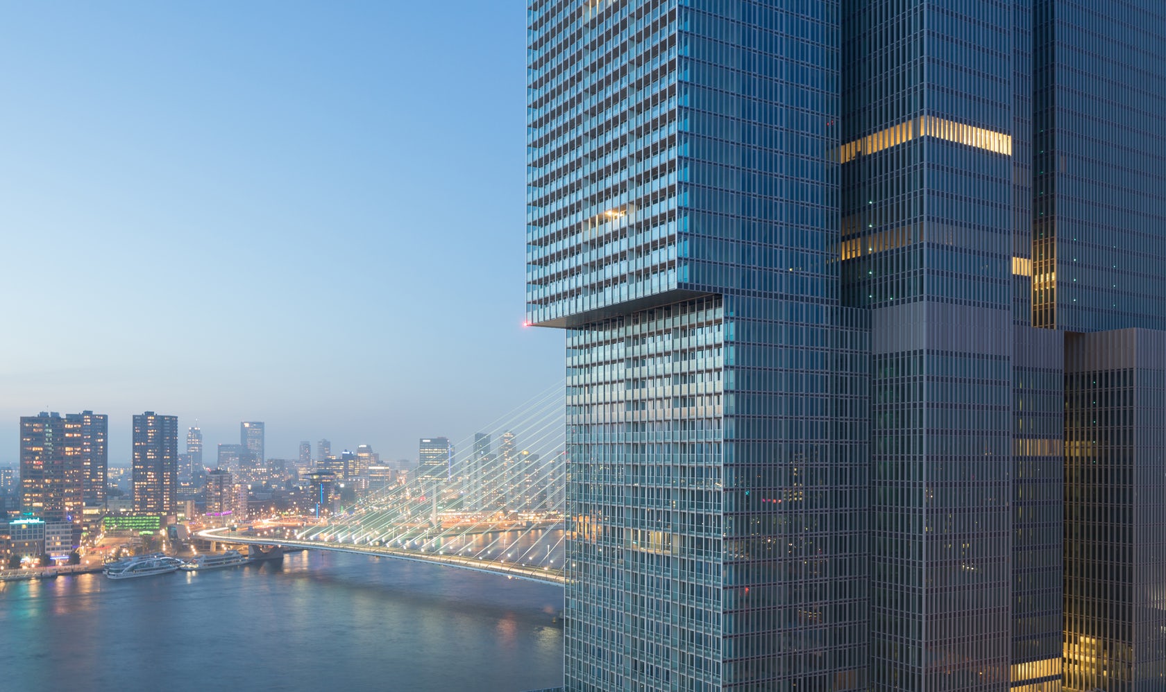 Made with subtly irregular stacks, the design organizes program into distinct blocks that embrace a wide variety of uses. As seen in the different model iterations, OMA’s architectural concept produces more than size; it also creates urban density and diversity in the form. The private uses of the building have contact with the general public on the ground floor, with its waterfront cafes. The lobbies for the offices, hotel, and apartments are located in the plinth – a long elevated hall that serves as a general traffic hub for the project.
Pierre Lassonde Pavilion
Québec City, Canada
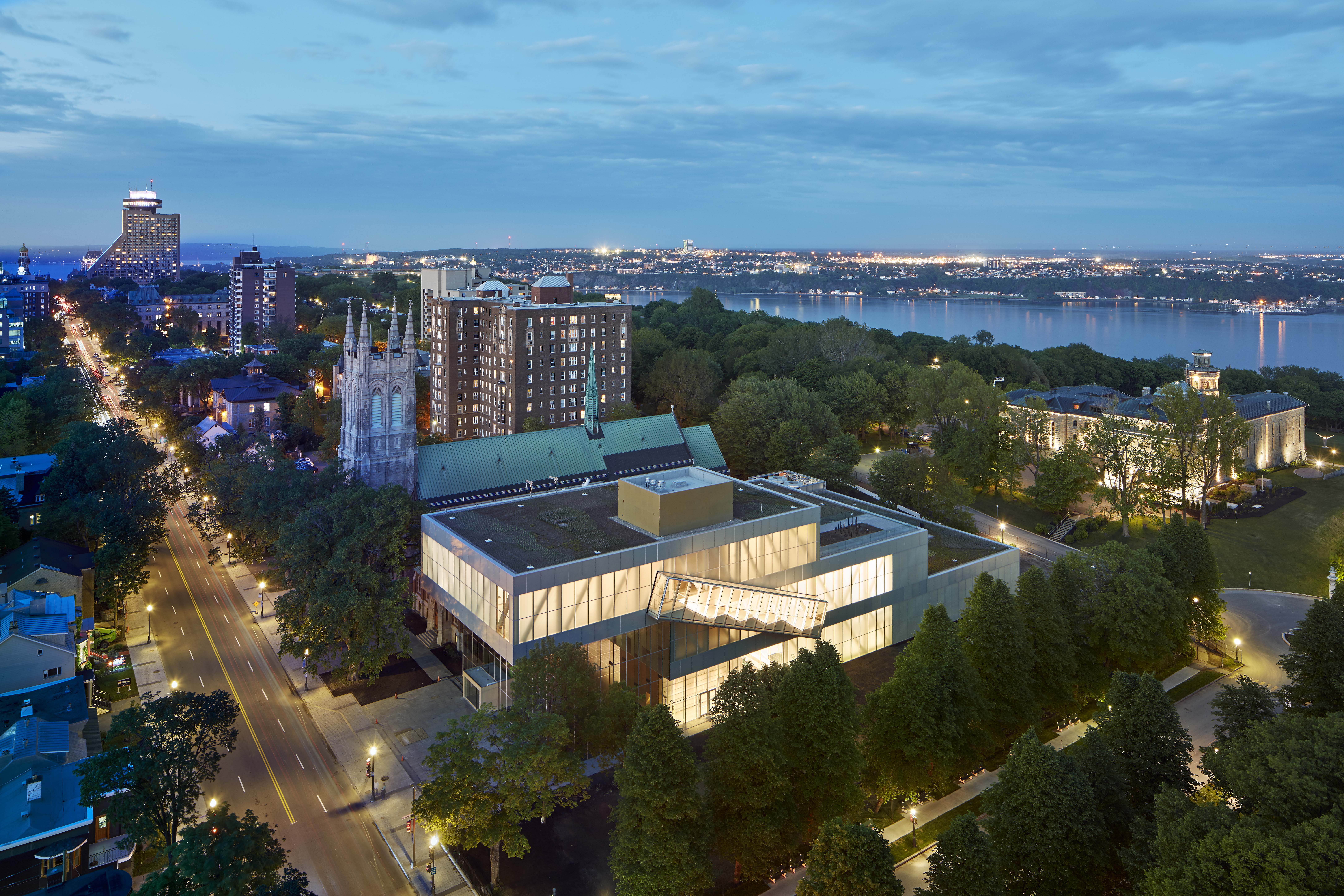
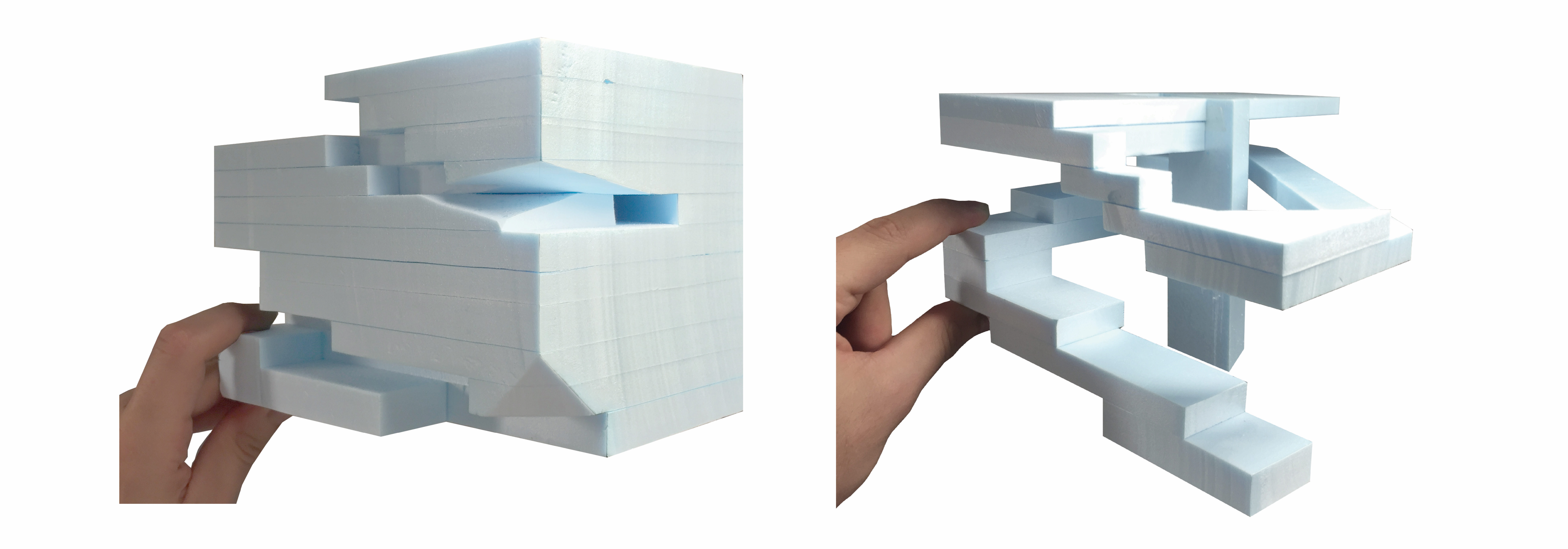
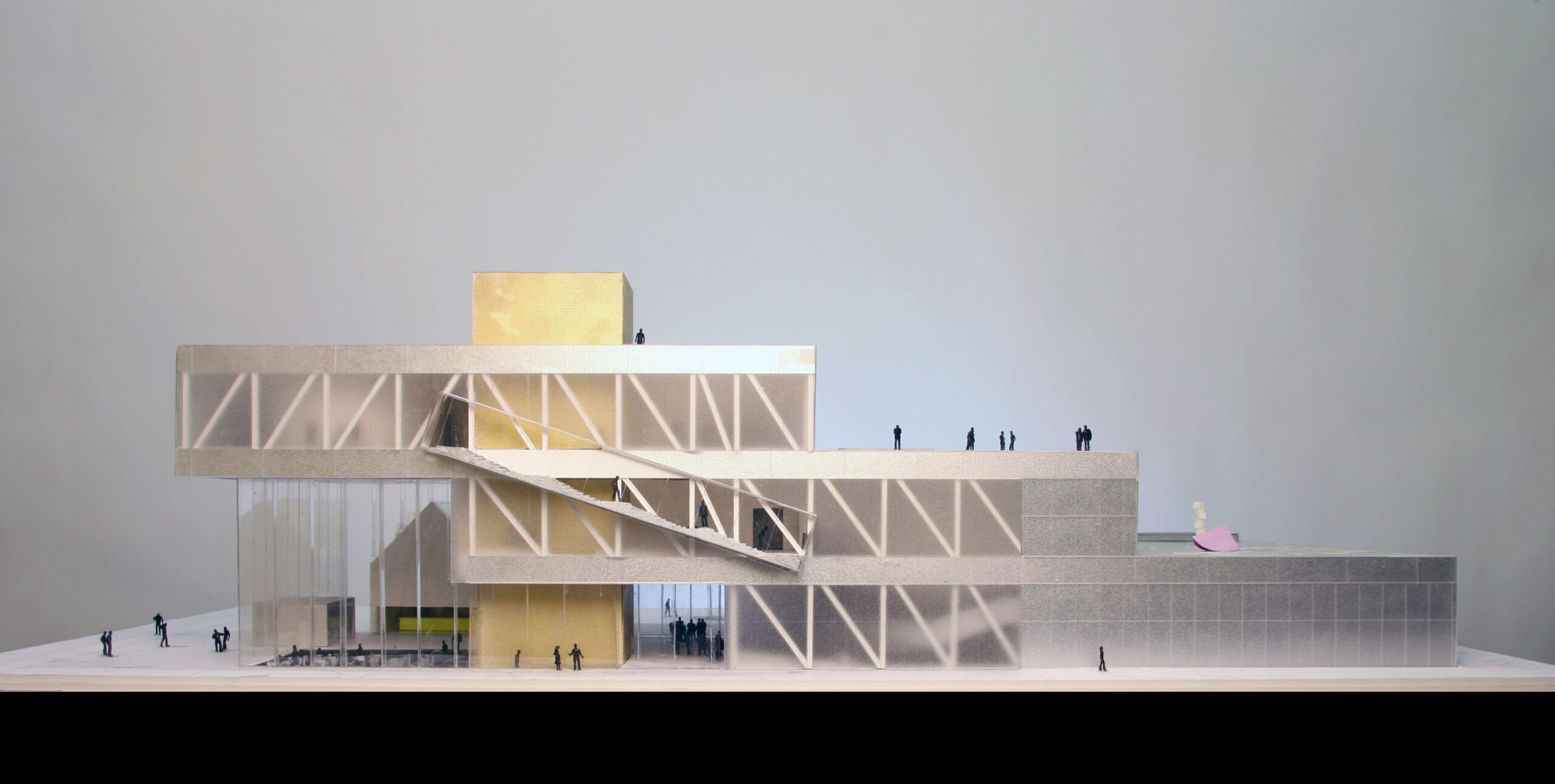 The Pierre Lassonde Pavilion is an ambitious addition to the city. Rather than creating an iconic imposition, it forms new links between the park and the city, and brings coherence to the MNBAQ. In order to respond to context while clarifying the museum’s organization and adding to its scale, new galleries were stacked in three volumes of decreasing size. As seen in the model, the result is a cascade that aims to weave together the city, the park and the museum as an extension of all three simultaneously.
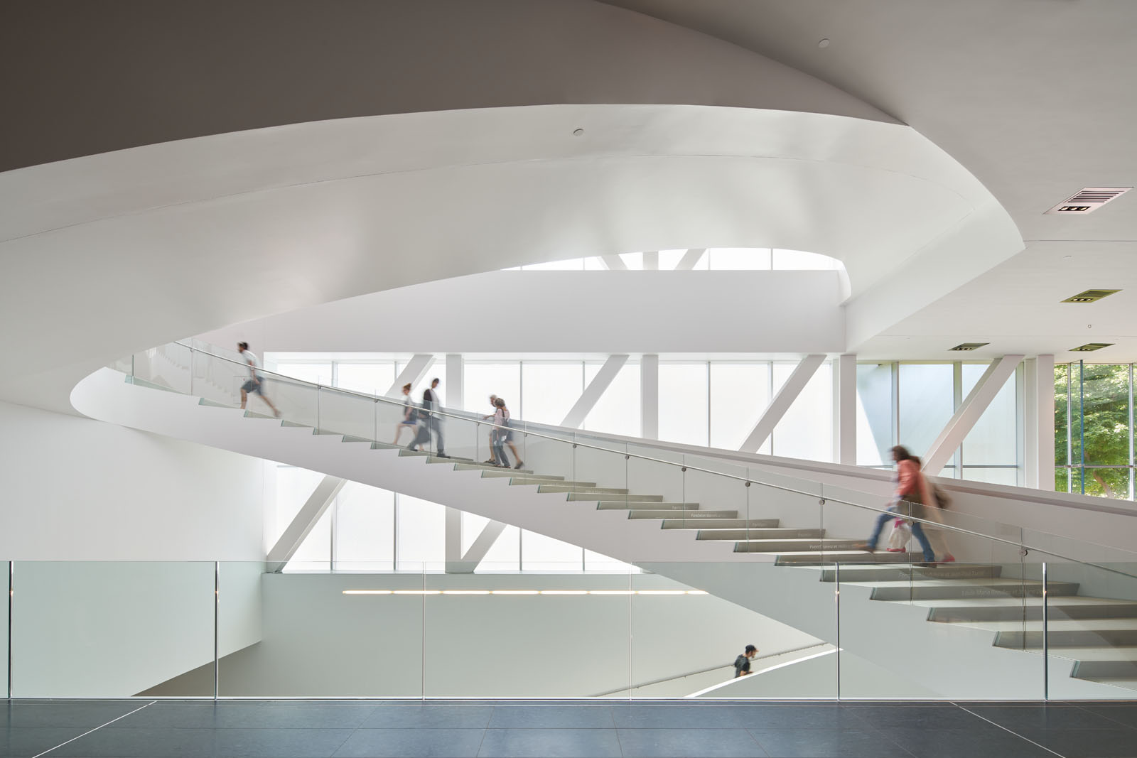 The model very closely resembles the finished project. Like the model, the gallery boxes step out in plan, framing the existing courtyard of the church cloister and orienting the building towards the park. As the team outlined, the park spills into the museum and the museum into the park. The stacking creates a Grand Hall, sheltered against a dramatic cantilever. In turn, a chain of programs along the museum’s edge offer a hybrid of activities, art and public promenades.
Galleria
Yeongtong-gu, Suwon, South Korea
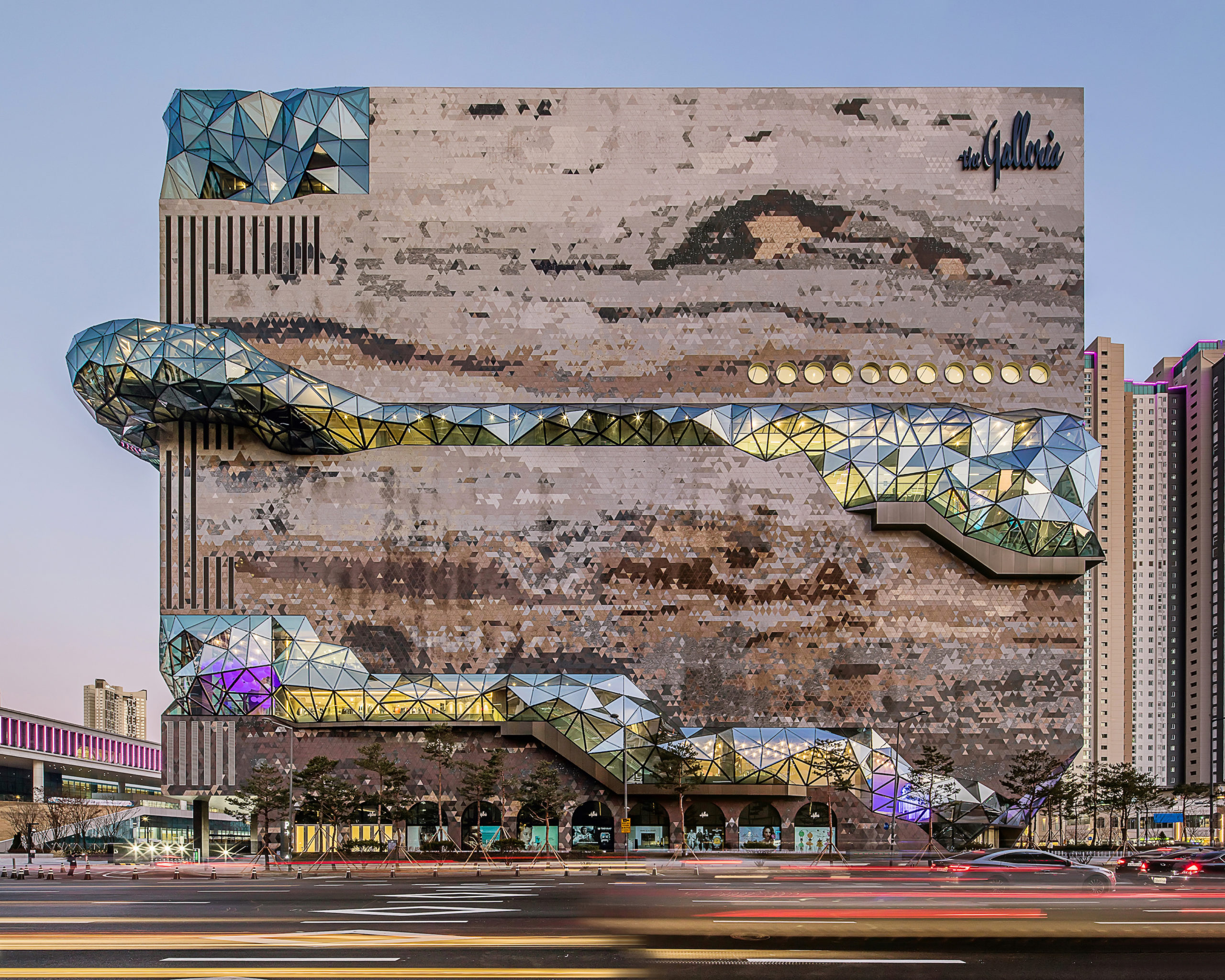
 This store in Gwanggyo, just south of Seoul, is the sixth branch of Galleria. The Galleria’s stone-like appearance makes it a natural point of gravity for public life in the city. The store has a textured mosaic stone façade that evokes the nature of the neighboring park. As the team explains, the Galleria is Korea’s first and largest upscale department store franchise founded in the 1970s, and has remained at the forefront of the premium retail market in the country since then.
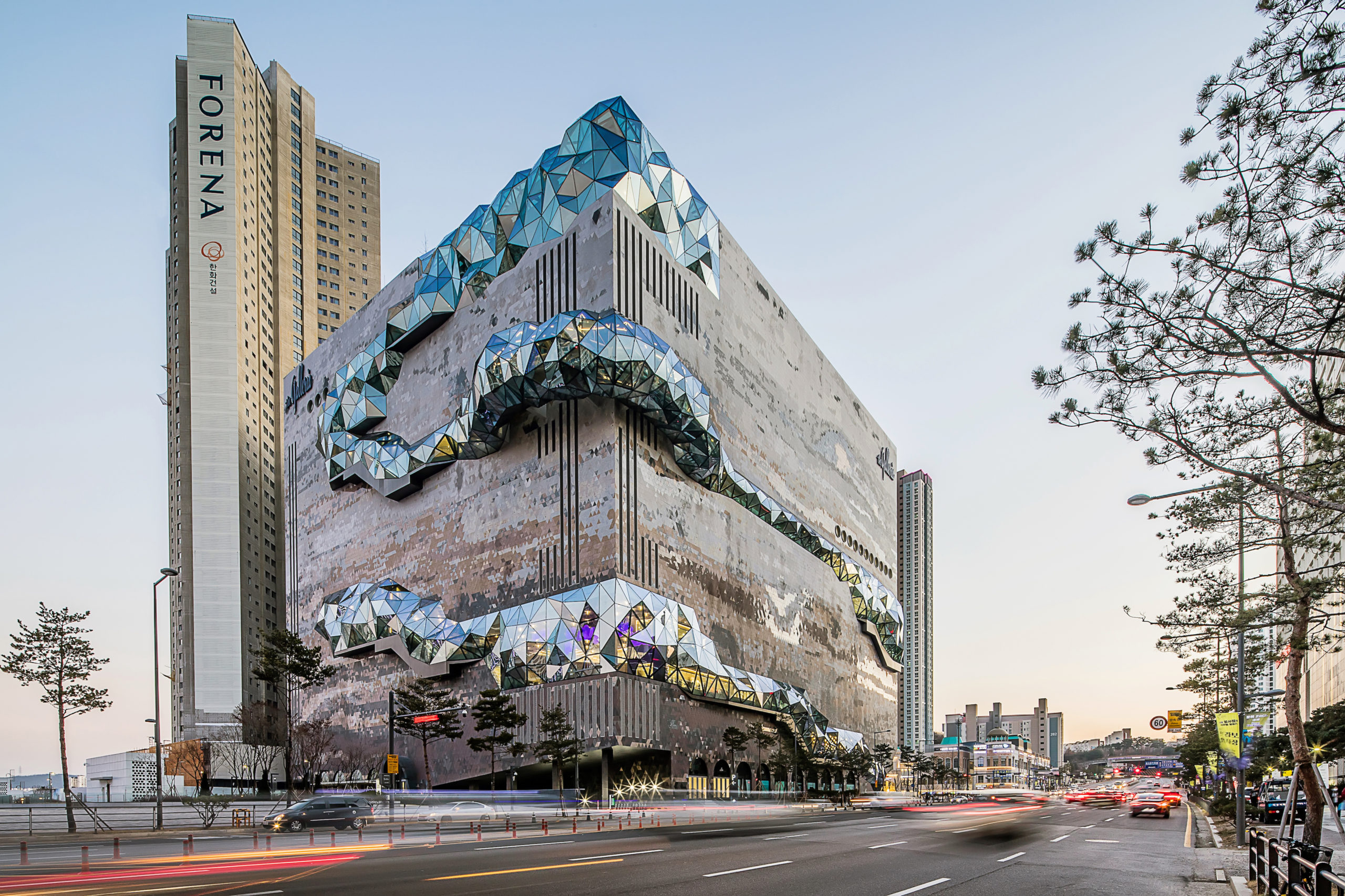 For the concept model, a study of massing reflects how the final building was constructed. The circulation wraps the building volume and become an external expression on the facade. The store is located between the Suwon Gwanggyo Lake Park and ubiquitous buildings in the city: an intersection between nature and the urban environment. Appearing as a sculpted stone emerging from the ground, the store is a visual anchor in the city. Formed with a sequence of cascading terraces, the public loop offers spaces for exhibitions and performances.
Timmerhuis
Rotterdam, Netherlands
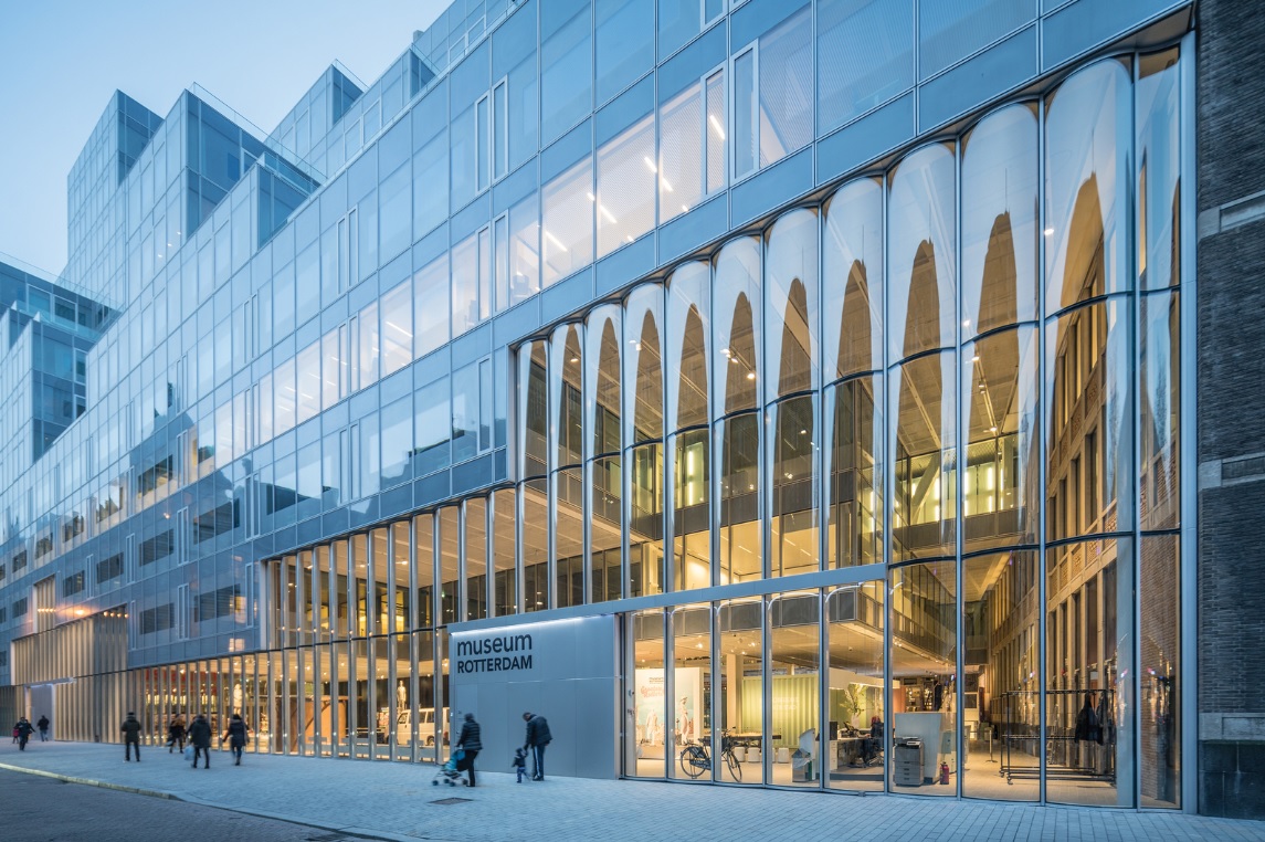
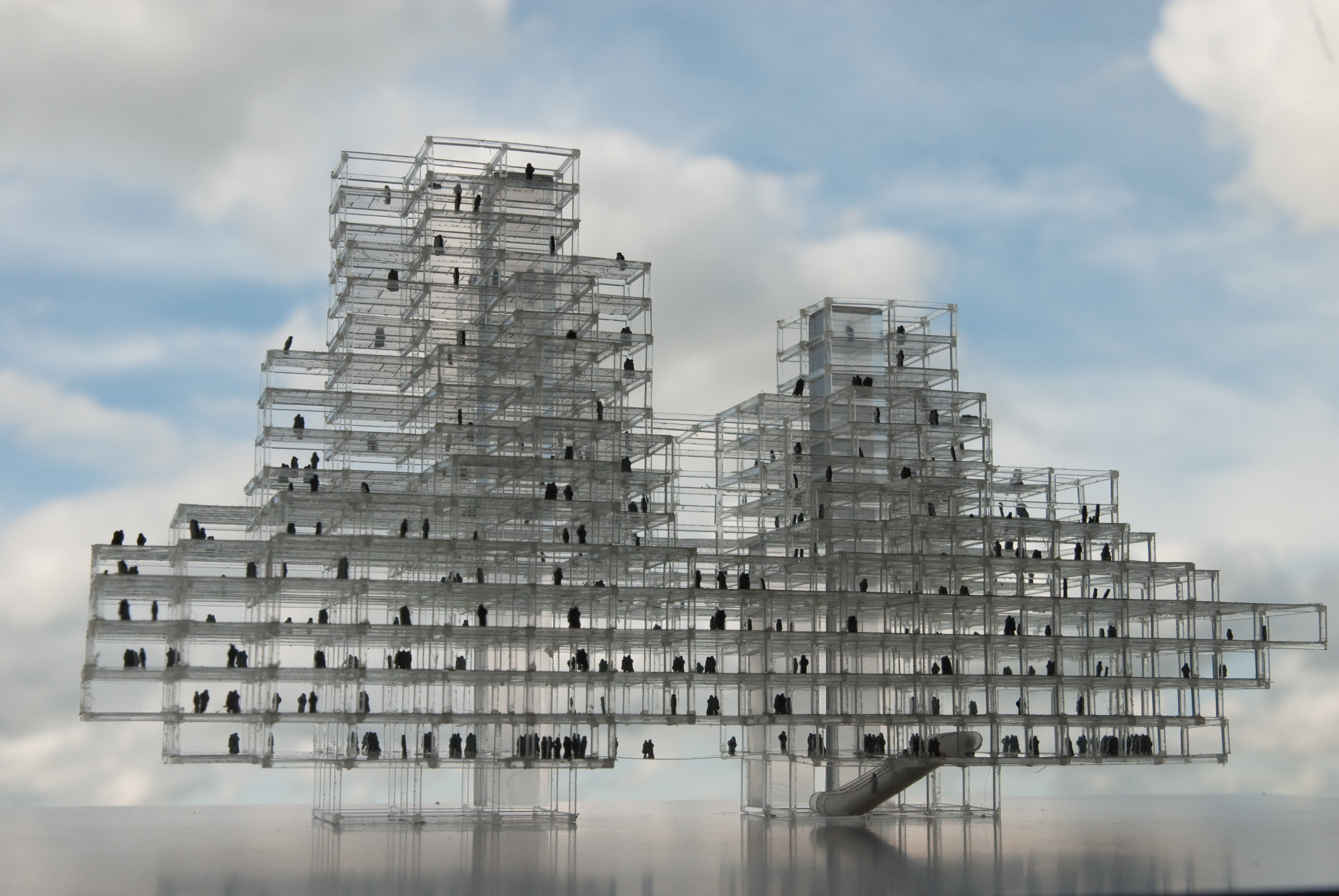 Timmerhuis was designed as a new municipal building for the city hall that combines residential and administration space. Formed as modular units that work within an innovative structural system, the building was made to be the most sustainable building in the Netherlands. OMA accomplished this through the building’s core concept of flexibility, and also through the two large atriums that act like lungs.
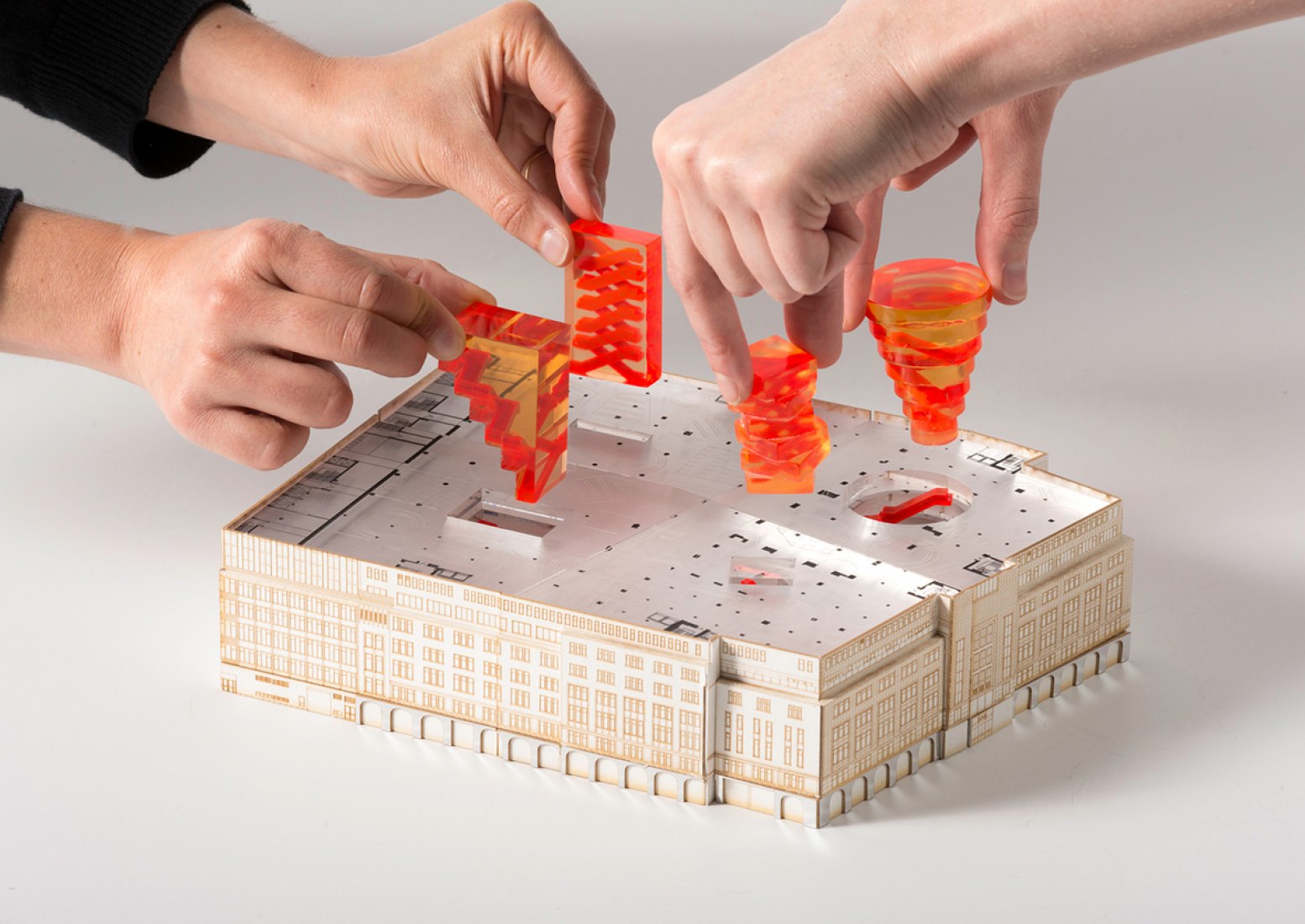
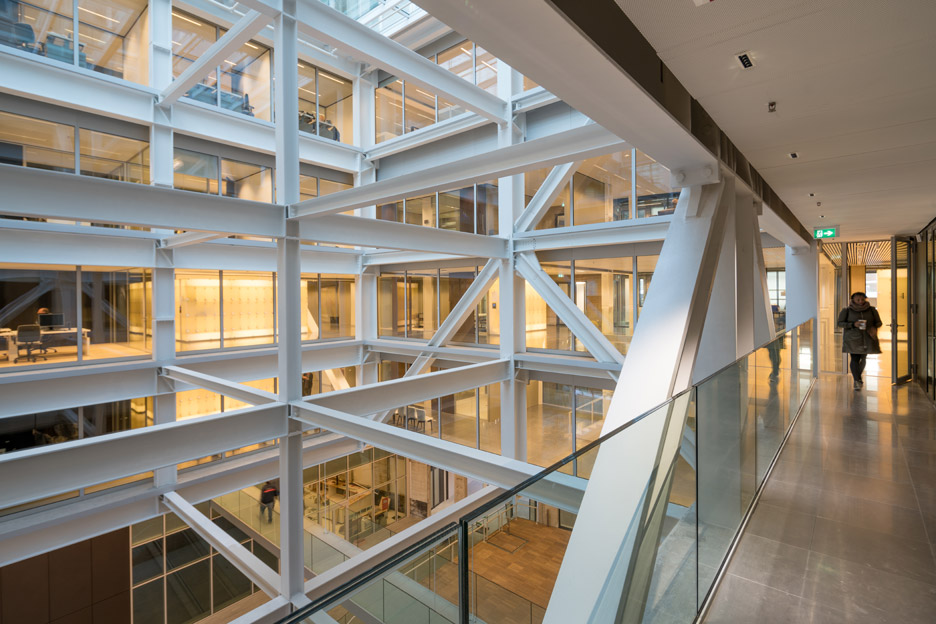 As the model clearly shows, the modular units stack through the structural system. The cantilevering steel structure allows for an uninterrupted public space on the ground floor that unfolds through the building. The Timmerhuis massing aims to mediate between the surrounding existing buildings. Through the modular system, units can adapt to either office space or residential parameters, and green terraces on higher levels of the envelope provide the possibility of an apartment with a garden in the heart of the city.
Garage Museum of Contemporary Art
Moscow, Russia
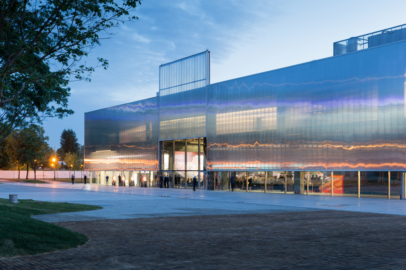
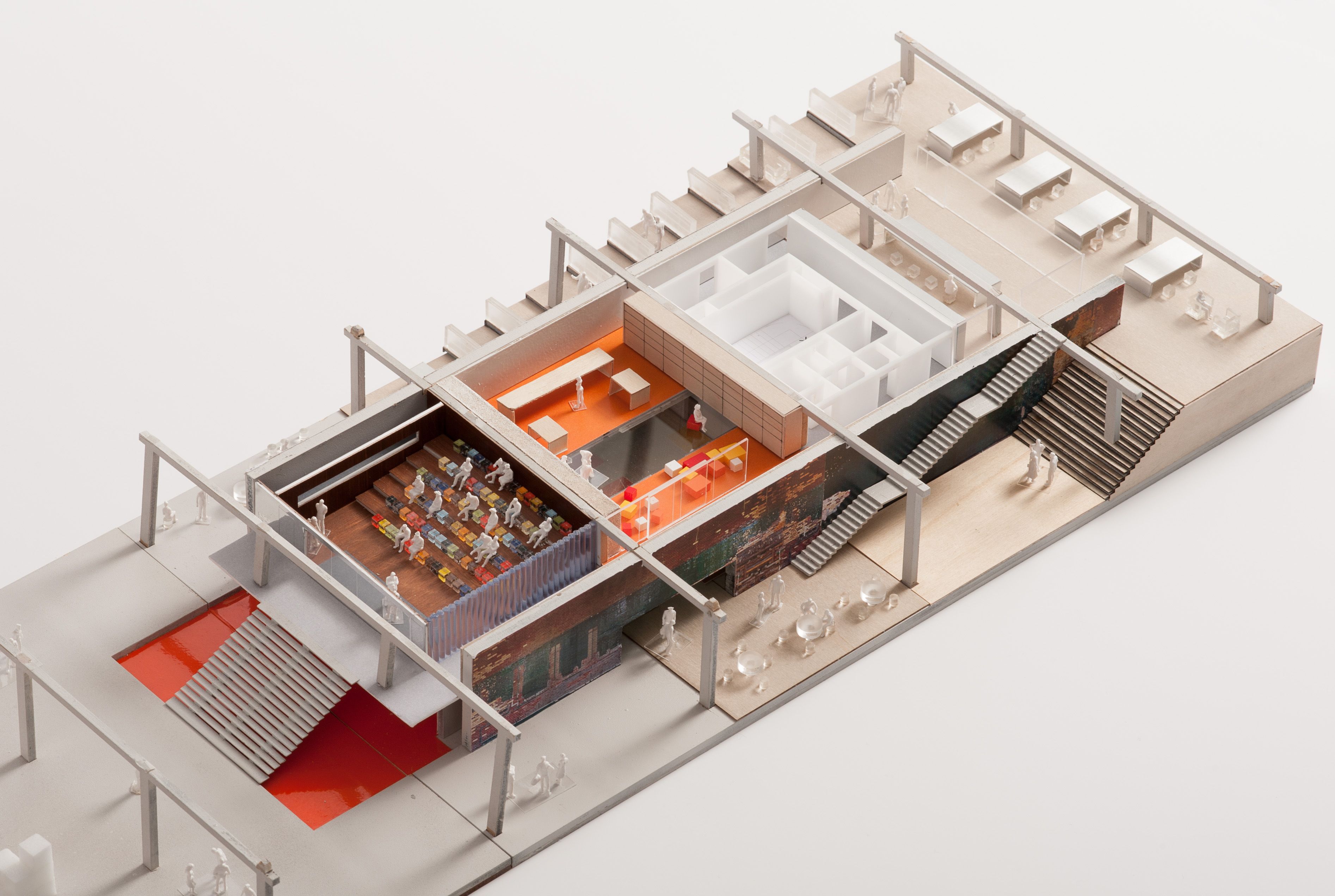 A dramatic renovation of the 1960’s Vremena Goda (Seasons of the Year) restaurant on site, the Garage Museum is a center for contemporary art in Moscow. The museum program includes galleries, a shop, café, roof terrace, auditorium and offices. A new translucent polycarbonate façade wraps the original structural framework and is lifted off the ground, allowing views between Gorky park and the exhibition space inside.
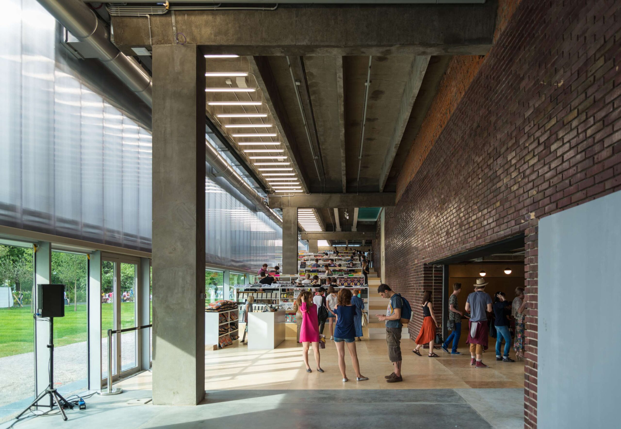 The envelope and the spaces it encloses offer a range of interior conditions for the exhibition of art and provides innovative curatorial possibilities, such as hinged white walls that can be folded down from the ceiling. The model highlights how the building offers two levels of unobstructed open space dedicated to exhibitions, organized around two circulation and service cores. The museum programs occupy three levels, adapting to spatial and structural possibilities of the existing structure.
Calling all architectural model-makers! Architizer’s Vision Awards is honoring your craft in a special category dedicated to Physical Models. Learn more and start your submission before the Main Entry Deadline on June 9th.
 De Rotterdam
  Garage Museum of Contemporary Art
  Pierre Lassonde Pavilion
  Taipei Performing Arts Center
  Timmerhuis