Architects: Want to have your project featured? Showcase your work by uploading projects to Architizer and sign up for our inspirational newsletters.
Although it may conjure up images of intricately ornamented Gothic paneled glass, the term bay window may be generically applied to any window that protrudes outwards from a wall-face. Used to expand interior space and push a room’s volumetric possibilities, bay windows breathe life into cramped and dark spaces. Earlier this year we published a series of projects showing modern adaptations on the bay window.
The windows included below are unified by their tendency to delicately hang over the public and exterior realm. By doing so, these structures dramatically increase one’s range of view from the inside out, and intimately interweave the viewer into their surrounding environment. Browse through the following collection, and get a sense of how you can use a modern bay window.

© f m b architekten bda - Norman Binder, Andreas-Thomas Mayer

© f m b architekten bda - Norman Binder, Andreas-Thomas Mayer

© f m b architekten bda - Norman Binder, Andreas-Thomas Mayer
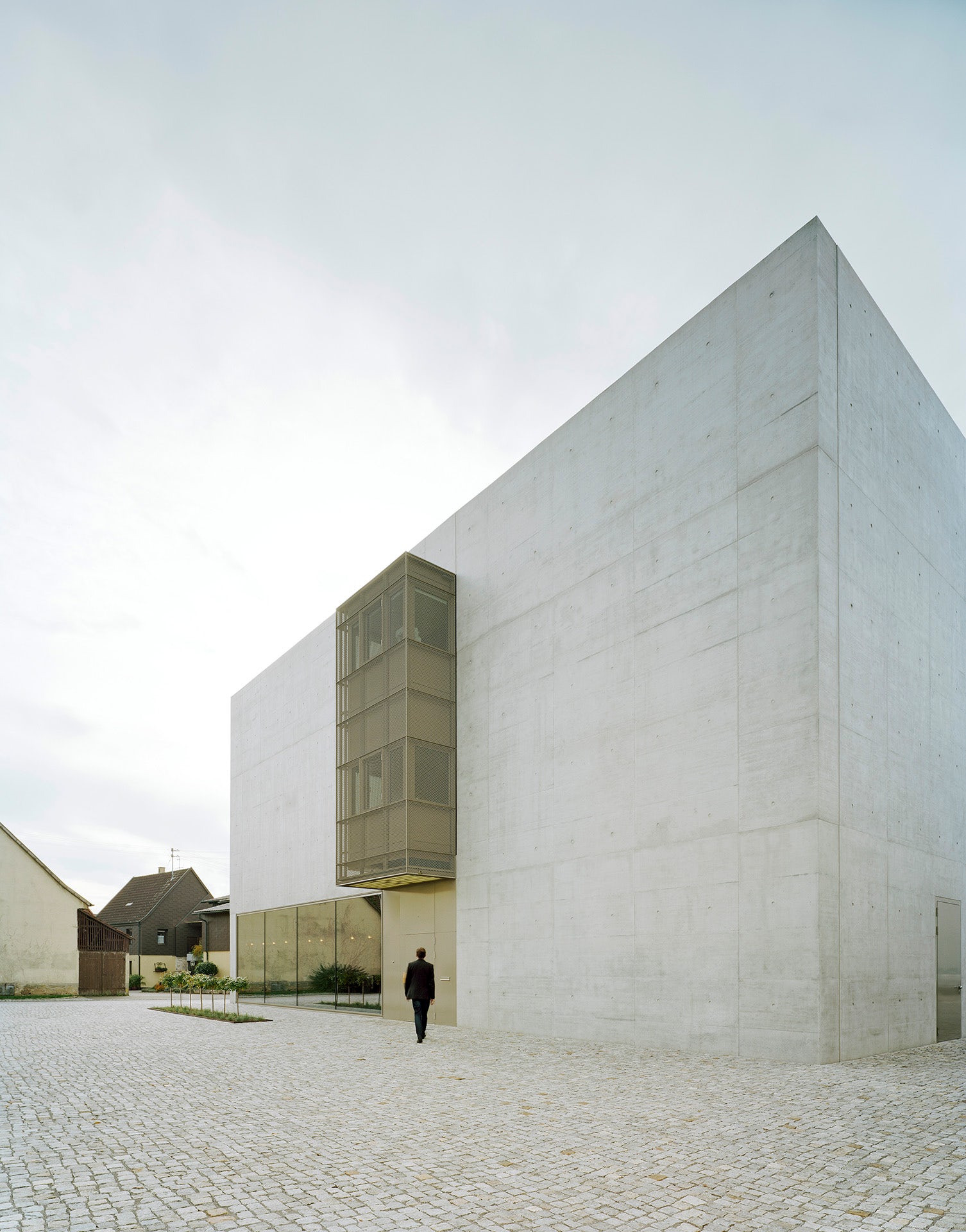
Greiner Headquarters by f m b architekten – Norman Binder, Andreas-Thomas Mayer, Pleidelsheim, Germany
A company known for high quality chairs and seating, Greiner had outgrown its previous office and showroom space. Forward thinking, they chose to build a new headquarters conveniently located much closer to the city center. Inspired by timeless qualities of classical modernism, the façade is composed of exposed concrete, which gives the structure a modest yet unique identity. In contrast, a sculptural rectangular structure protrudes from the front of the building, bringing texture to the otherwise homogenous building façade.

© DL Atelier

© DL Atelier

© DL Atelier
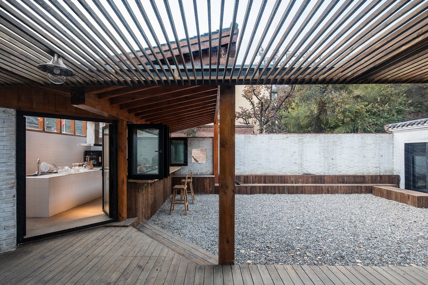
Yi She Mountain Inn by DL Atelier, Beijing, China
Yi She Mountain Inn is located just a one hour drive from Beijing beside Ming Dynasty Tombs. A place to escape the city’s bustle and simply relax, the environment was designed to inspire humility, enthusiasm and calmness. The cantilevered window was incorporated to interweave guests with the surrounding mountains and lakes and offer a place to sit and think. Erected through simple construction, DL Atelier used entirely local materials, including brick and timber.

© Buchanan Architecture

© Buchanan Architecture
Envelopeby Buchanan Architecture, Dallas, Texas, United States
Envelope derives its name from the rigid zoning laws in the area. As such, the building’s form is a manifestation of maximum volume allowance. Under such specific constraints, the luminous bay window represents a playful rupture of those rules. Extending outwards from the building’s metal paneling, the geometric structure offers new views and the increased feeling of space, while still abiding by necessary legalities.

© Saunders Architecture

© Saunders Architecture

© Saunders Architecture
Solberg Tower & Park by Saunders Architecture, Sarpsborg, Norway
Located in a flat, green and calm piece of Southern Norway, Saunders sought to create an environment where people would stop, slow down and explore the neighboring forest and coastline. The terrain’s flatness meant that the beauty of the landscape could only be truly enjoyed from a heightened vantage point. Thus a tower was quickly incorporated, which provides aerial views of the dramatic Oslo fjords.

© Torafu Architects

© Torafu Architects

© Torafu Architects
House in Megurohoncho by Torafu Architects, Ohno, Japan
House in Megurohoncho is a renovation project, which completely transformed a 40-year-old concrete building that was originally used for storage and offices. The first phase of the project was focused on the building’s exterior and converting the second and third floor into living quarters. Well lit and functional, an aperture was carved out in the center of the space in order to accommodate a diverse set of needs and personalities. Finally, a long bay window was updated and now serves as a large desk.

© Anton Grassl

© Anton Grassl

© Anton Grassl
The Chazen Museum of ArtbyMachado Silvetti, Madison, Wis., United States
For this project, the goal was to create a sense of flow and continuity with the existing museum, while also incorporating a new façade that would be much more transparent and inviting to the public. The public lobby consists of a two-story glass volume, oriented towards the central courtyard space. Extruding from the third level is a rectangular window, which dramatically interrupts the otherwise continuous band of stone.

© Gwendolyn Huisman & Marijn Boterman

© Gwendolyn Huisman & Marijn Boterman

© Gwendolyn Huisman & Marijn Boterman
skinnySCAR by Gwendolyn Huisman & Marijn Boterman, Rotterdam, Netherlands
At skinnySCAR, architect couple Gwendolyn Huisman and Marijn Boterman sought to show how forgotten spaces throughout the city could be used. Harnessing the challenges associated with such a narrow plot and extreme proportions, they offered an elegant solution. Opening up the street-facing façade, deep bay windows extend over the public realm and frame the urban fabric.
Architects: Want to have your project featured? Showcase your work by uploading projects to Architizer and sign up for our inspirational newsletters.


