Architects: Want to have your project featured? Showcase your work by uploading projects to Architizer and sign up for our inspirational newsletters.
Architizer’s journal is fueled by the creative energy of the thousands of architects from around the world who upload and showcase their incredible work. From conceptual designs to projects under construction to completed buildings, we are proud to serve as a platform for showcasing global architectural talent and the brilliance of visualizers, engineers, manufacturers, and photographers who are crucial members of the industry. A stellar drawing, rendering or photo, as well as a detailed project description, can go a long way in making a project stand out, as does indicate the stellar contributors on a project.
Firms who upload to Architizer share their work with professionals and design enthusiasts through our Firm Directory and Projects database. They also gain exposure by having their projects shared on our Facebook, Instagram, and Twitter pages, as well as in our Journal feature articles. Indeed, through these various channels, hundreds of thousands of people in the global design community have come to rely on Architizer as their architectural reference and source of inspiration. In 2022, we’re rounding up our database’s top 10 most-viewed, user-uploaded architecture projects at the end of each month.
10. Kiwoom Finance Square Headquarters
By MeierPartners Architects, Seoul, South Korea
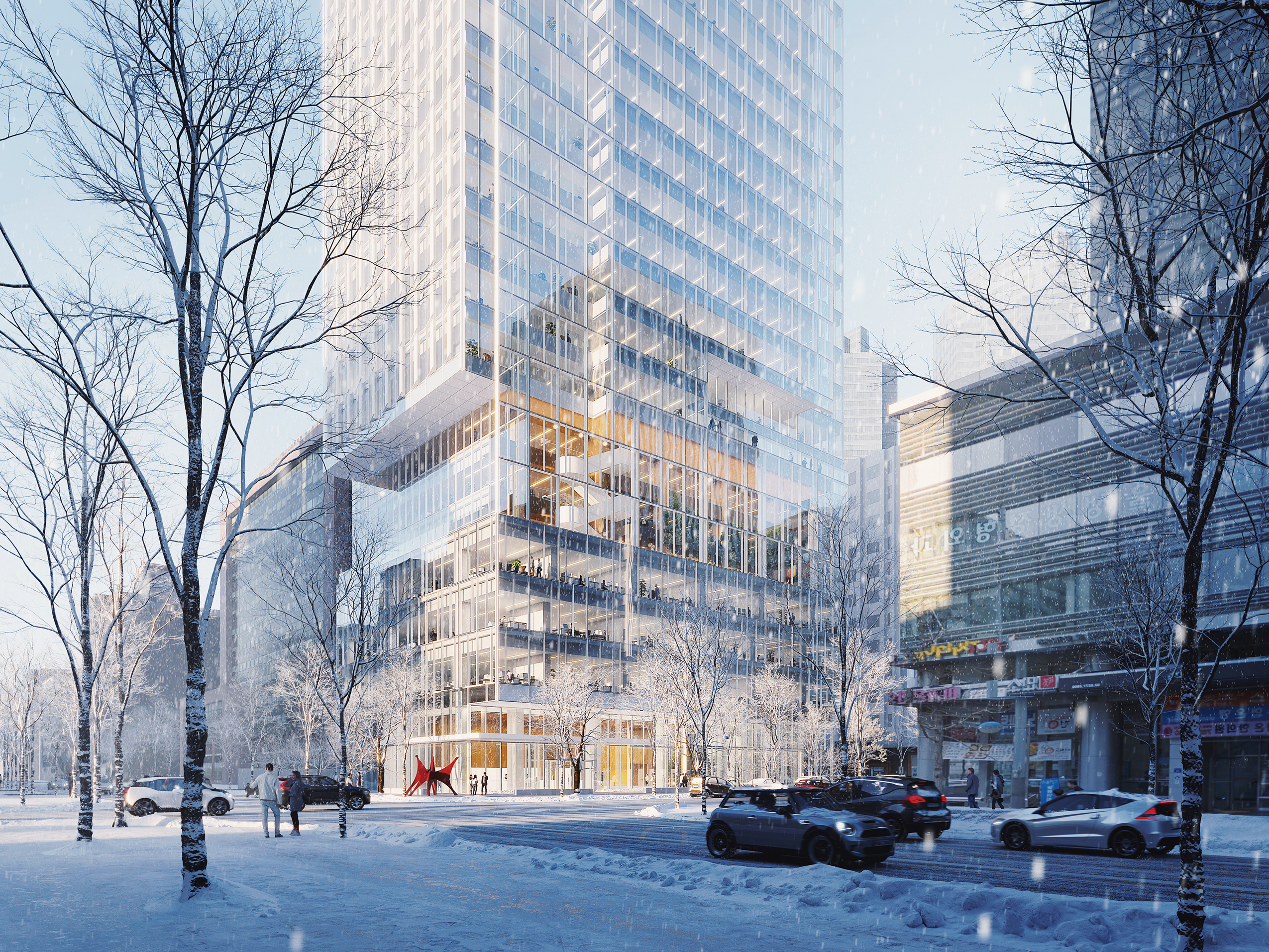
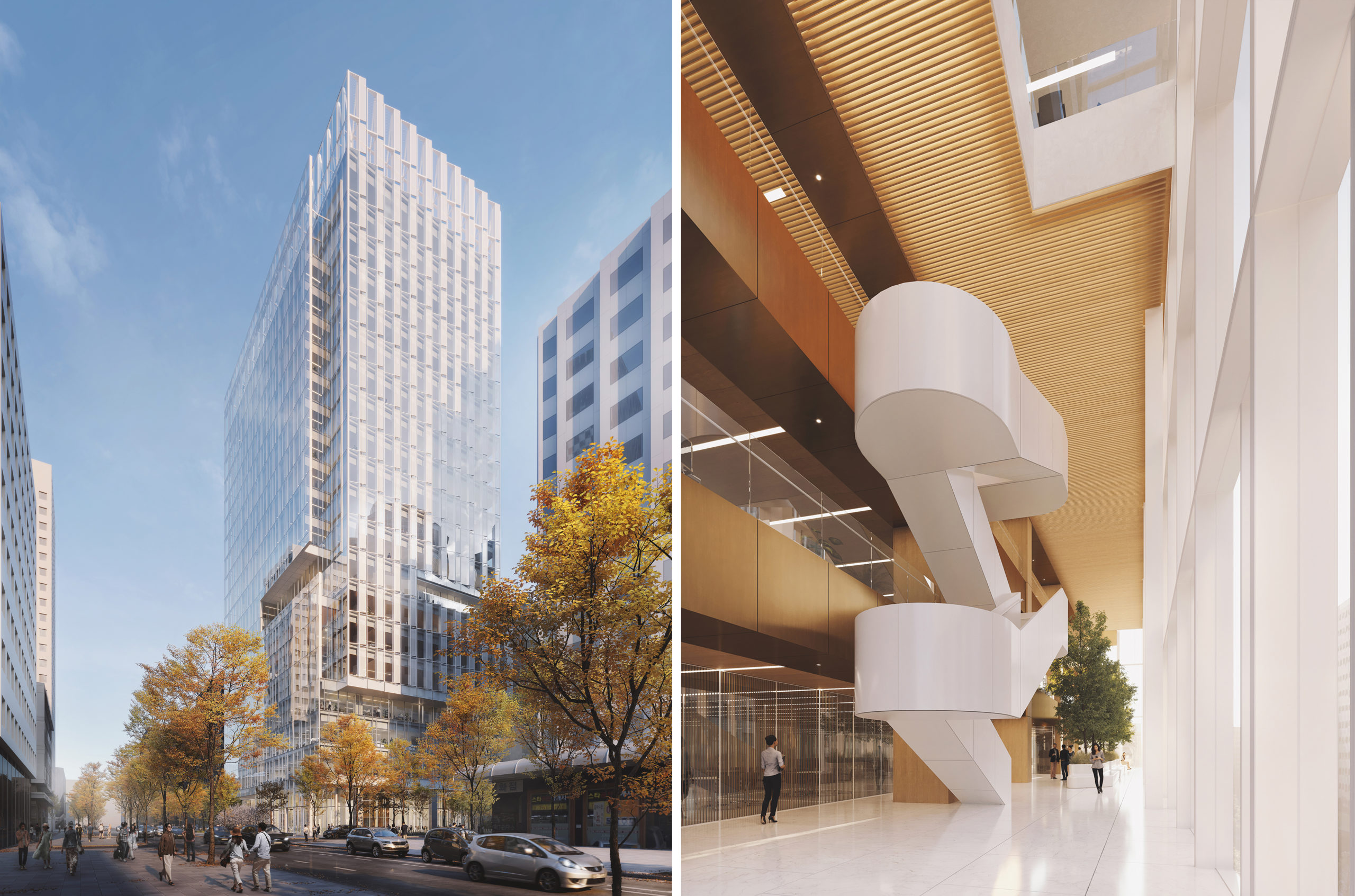 This new flagship tower is located in a 40-year-old building in the heart of Yeoeui-do, an international financial hub. The new building will take its place in a globally recognized skyline, representing the leading IT and high-tech financial services company. The tower is composed of three separate volumes, stacked one on top of another to creating a dynamic profile. The shifting blocks are unified by a monumental screen wall, which also serves to create a dramatic atrium envisioned as a vertical garden and green conservatory.
9. Weekend House in Bukovany
By SENAA architekti, Bukovany, Czechia
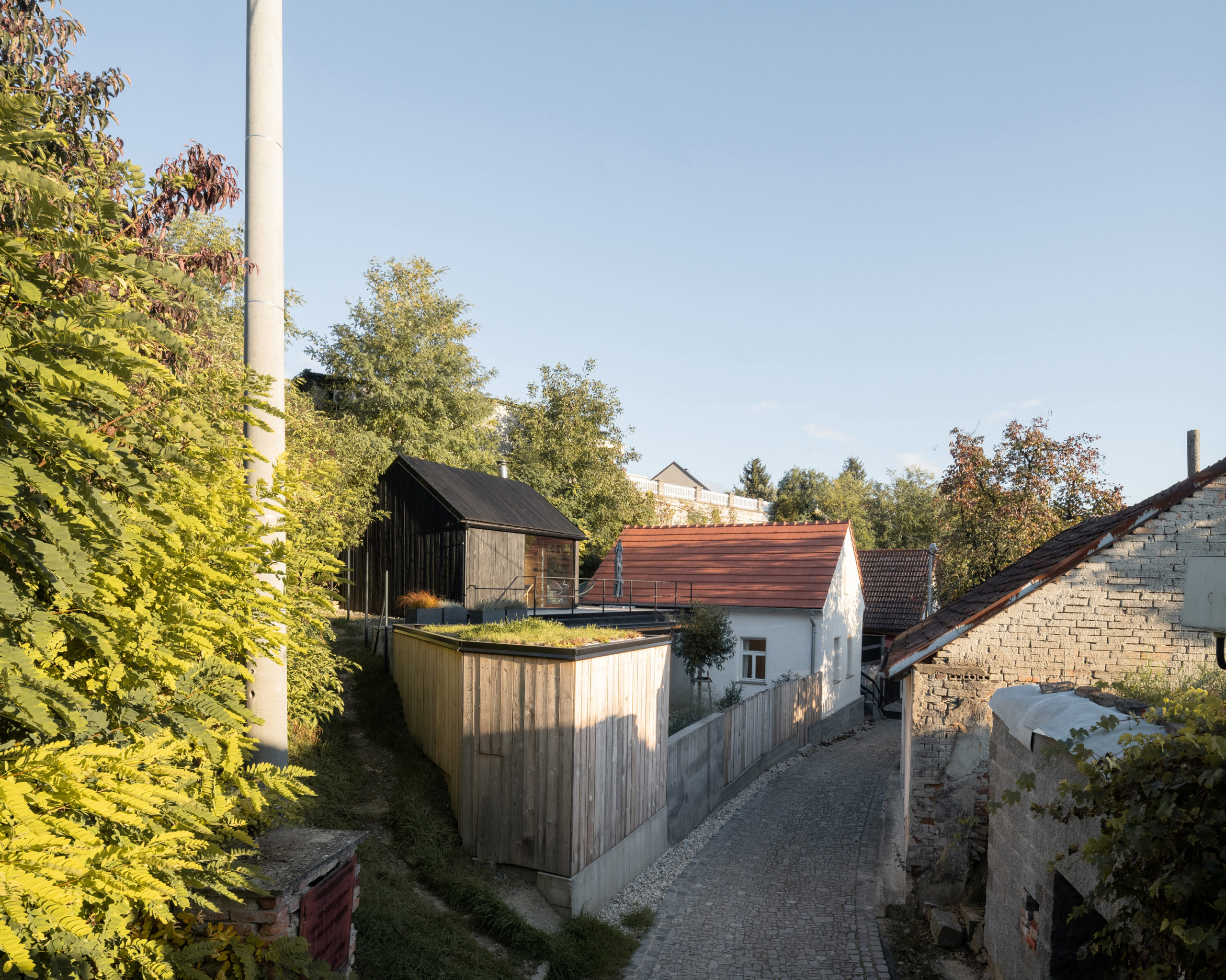
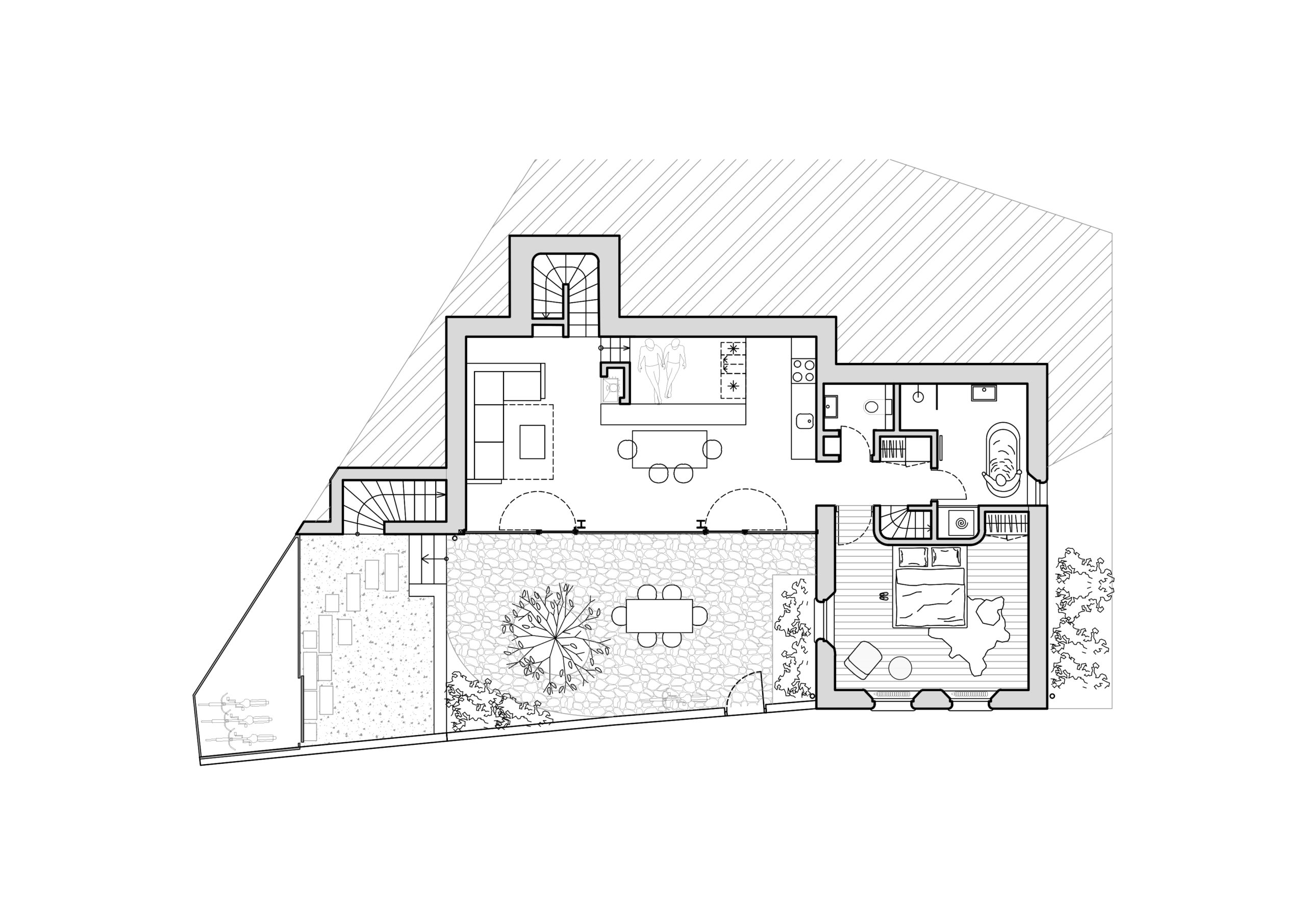
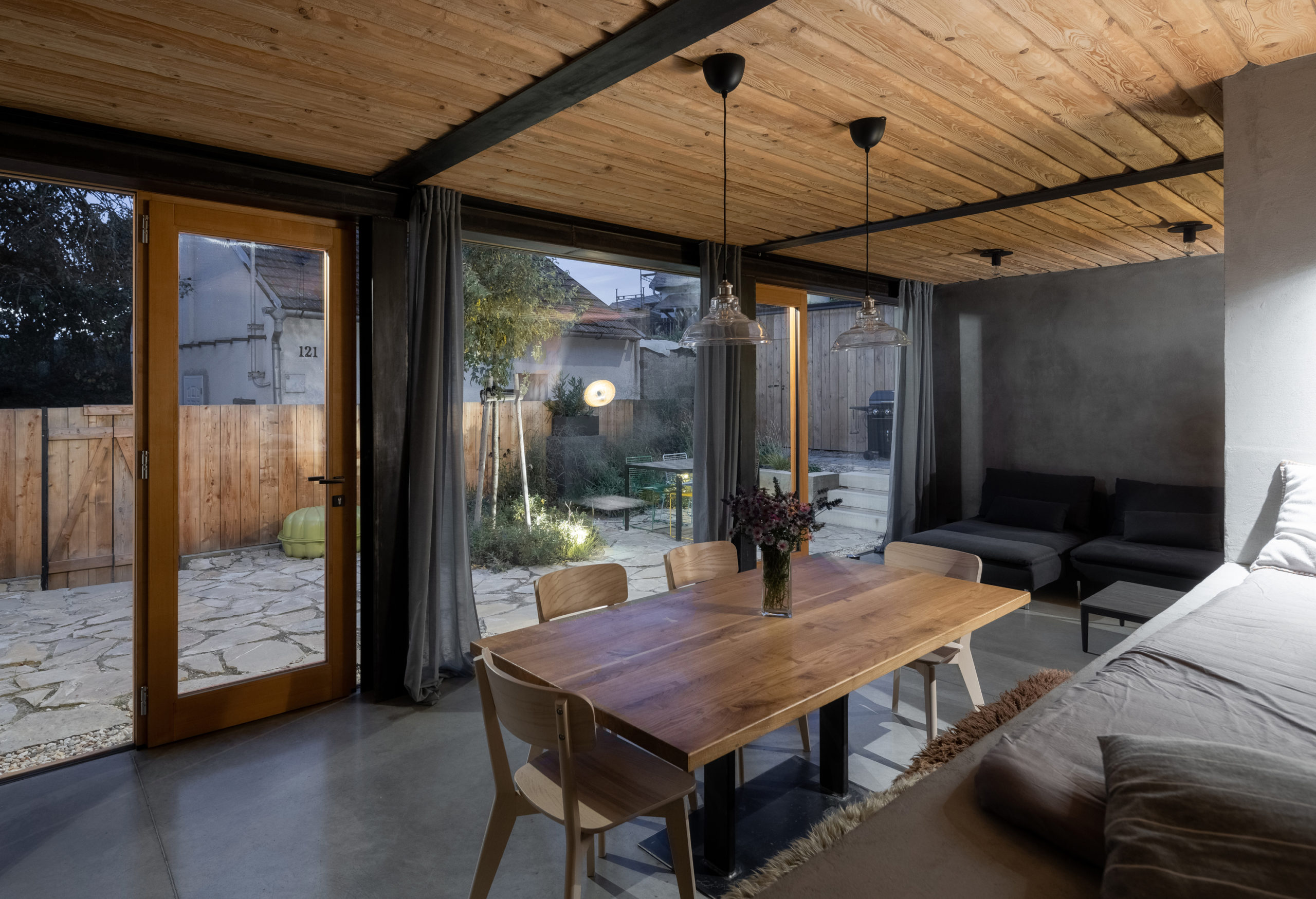 Upon discovering that there was no space for construction equipment to access the site, located on a wine cellar lane, the architects had to abandon the original reconstruction plan. The new building respects the footprint and shape of the old house while utilizing every bit of the steep sloping plot. The house has a traditional morphology but combines modern details with historical technologies. The mixture of the variety of details and the overall layout creates an architectural experience of the space and shows the possibility of implementing modern architecture in the historical context of the cellar lane.
8. NOKHA GARDEN LIBRARY
By Sanjay Puri Architects, Nokha, India
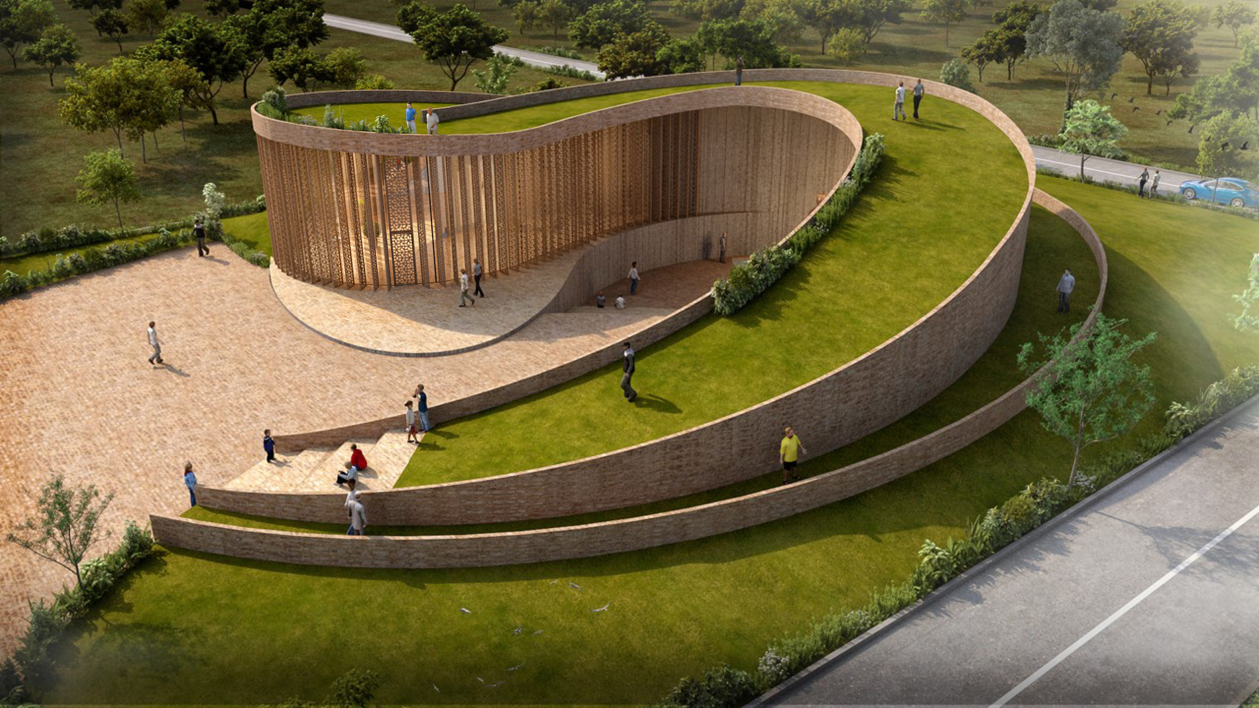
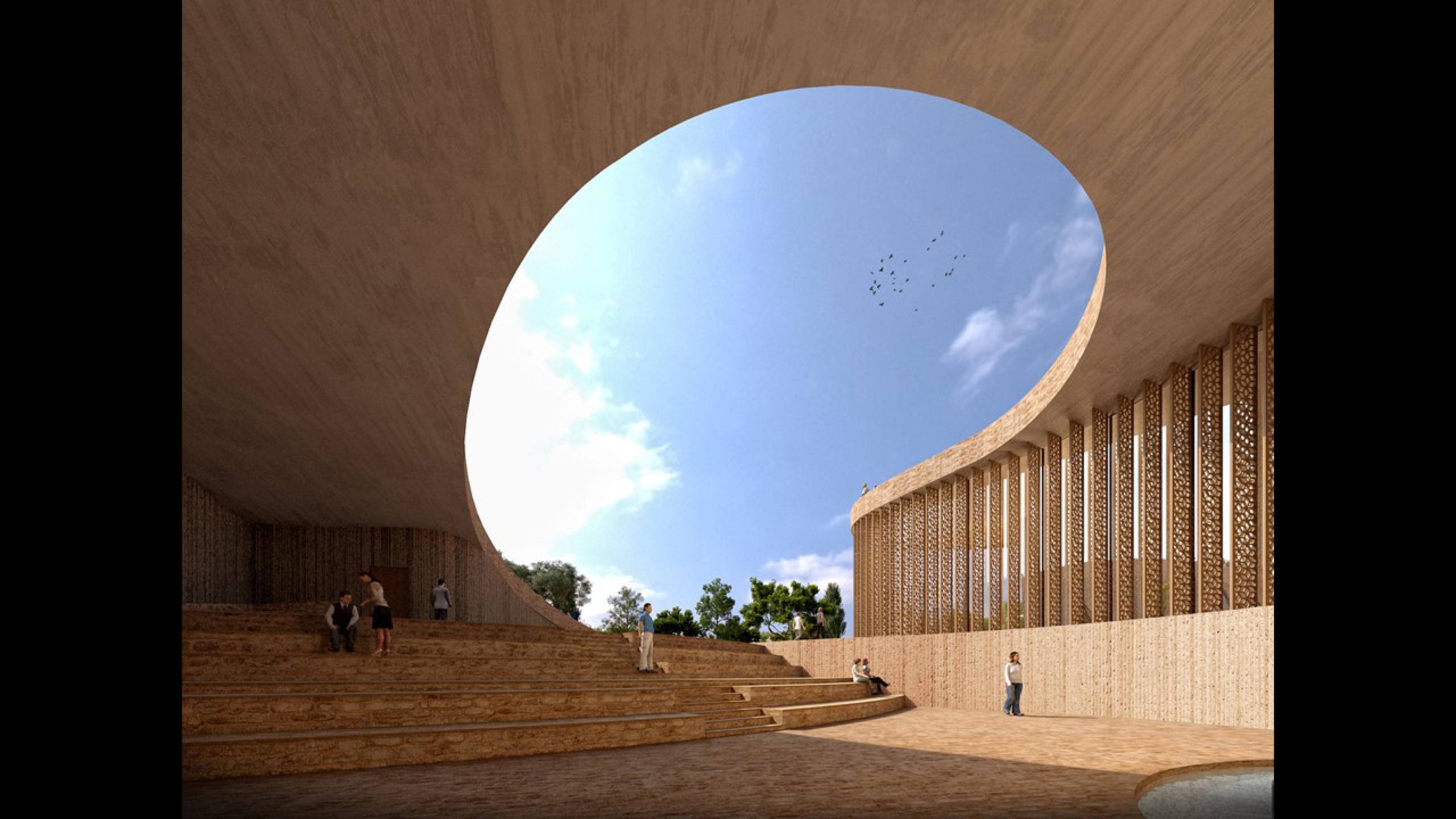 Interlocked curvilinear volumes spiral asymmetrically creating a children’s library for underprivileged children and a community space for the inhabitants of this small village. A gradually sloping roof garden rises up to form an iconic open air space, creating a memorable volume for the community building. Simultaneously, a larger series of curvilinear steps descend to form a subterranean open auditorium and community space.
In response to the hot desert climate of Rajasthan the southern side is protected by an earth berm. Within this small site, the design creates multiple community spaces which are protected from the harsh desert climate by the way they are configured and allow numerous ways for people to engage in various activities.
7. Naked House
By penta arquitectura, Lambaré, Paraguay
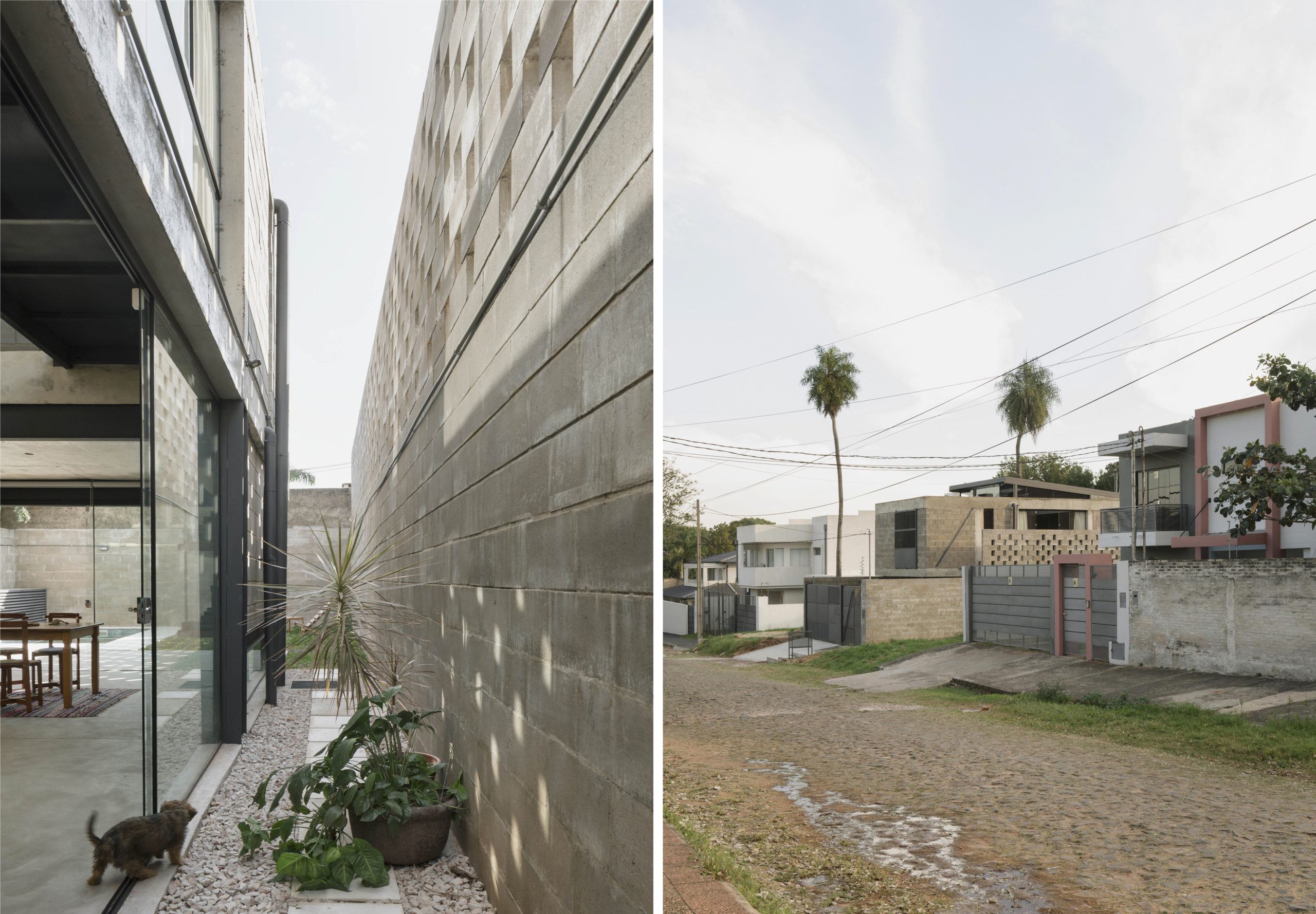
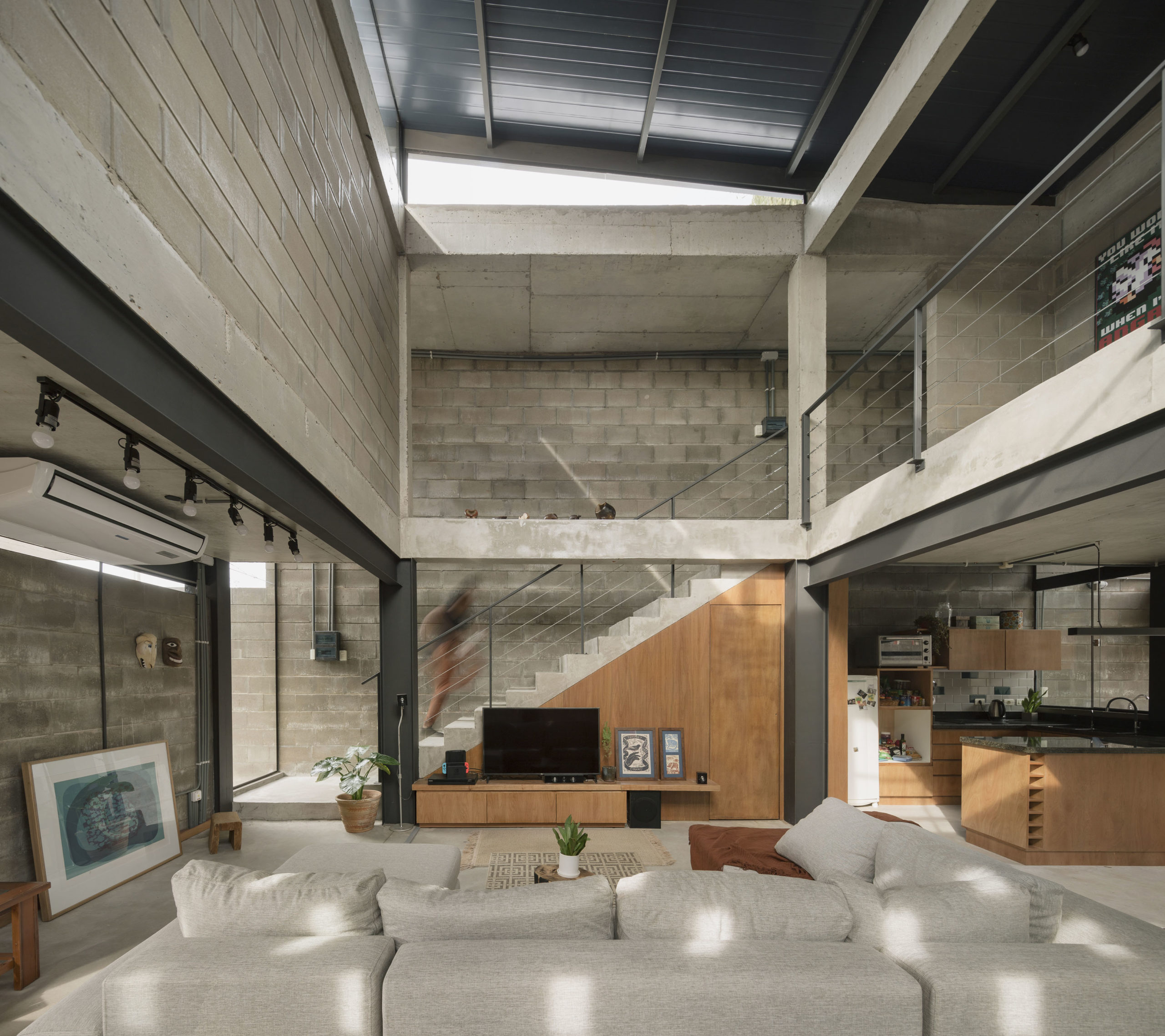 The architects were charged with designing a home with an airy and open ground floor while offering the highest possible privacy on the upper floor. The result is a design that could provide inspiration for other urban lots, with a flexible and adaptable mixed-system structure and rooms that meet different uses for different users. The ground floor is made of metal while the upper floor uses fair-faced concrete. Moreover, prioritizing the economy and performance of materials, the design was preconfigured in such a way that floors and walls do not have additional coatings or plasters, except in humid areas. Decisions made during all instances; of design, context, materiality and execution, allowed to reach a cost per square meter below the average.
6. 20°_A summer living experience
By Modulus Architecture, Naxos, Greece
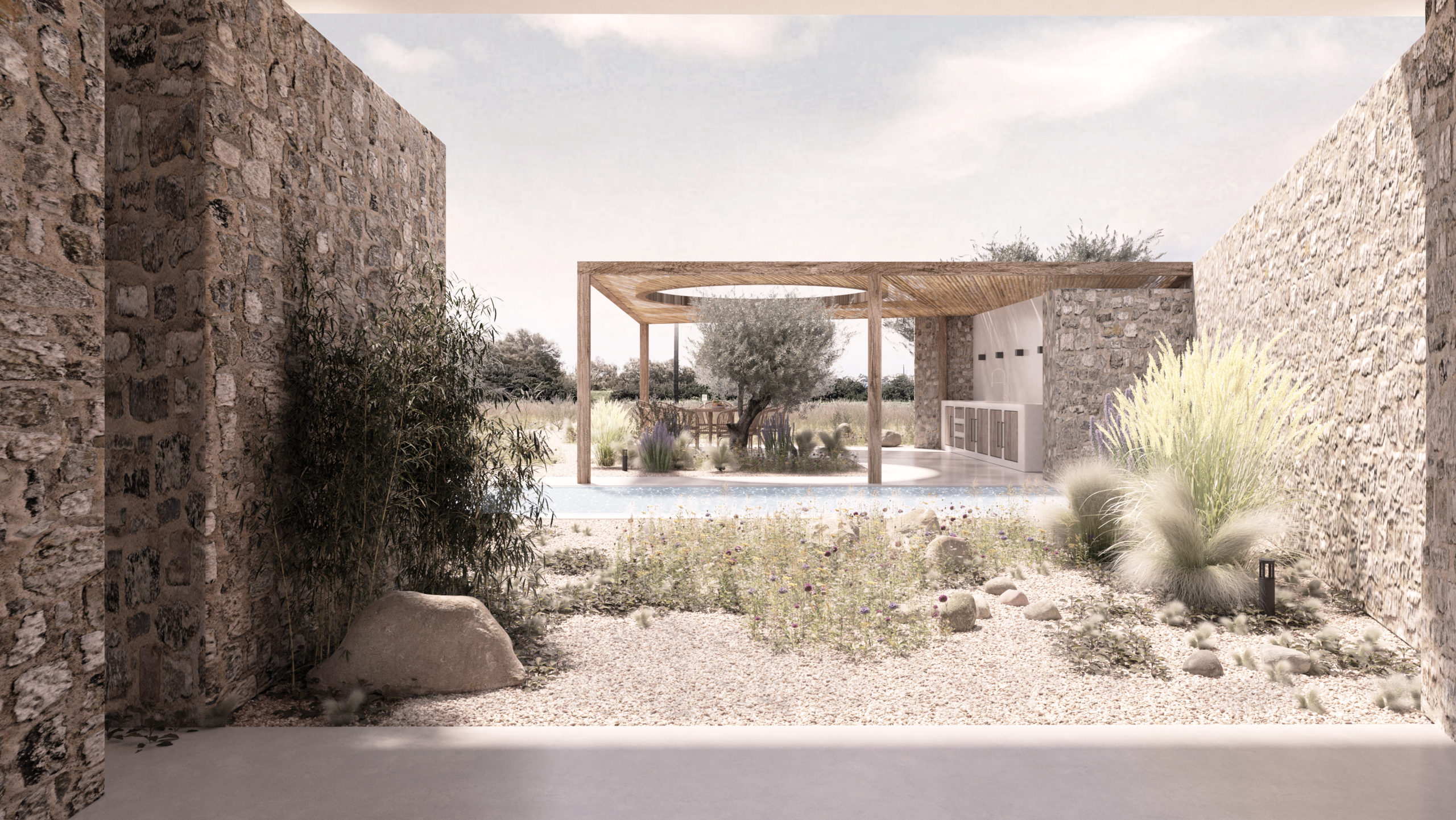
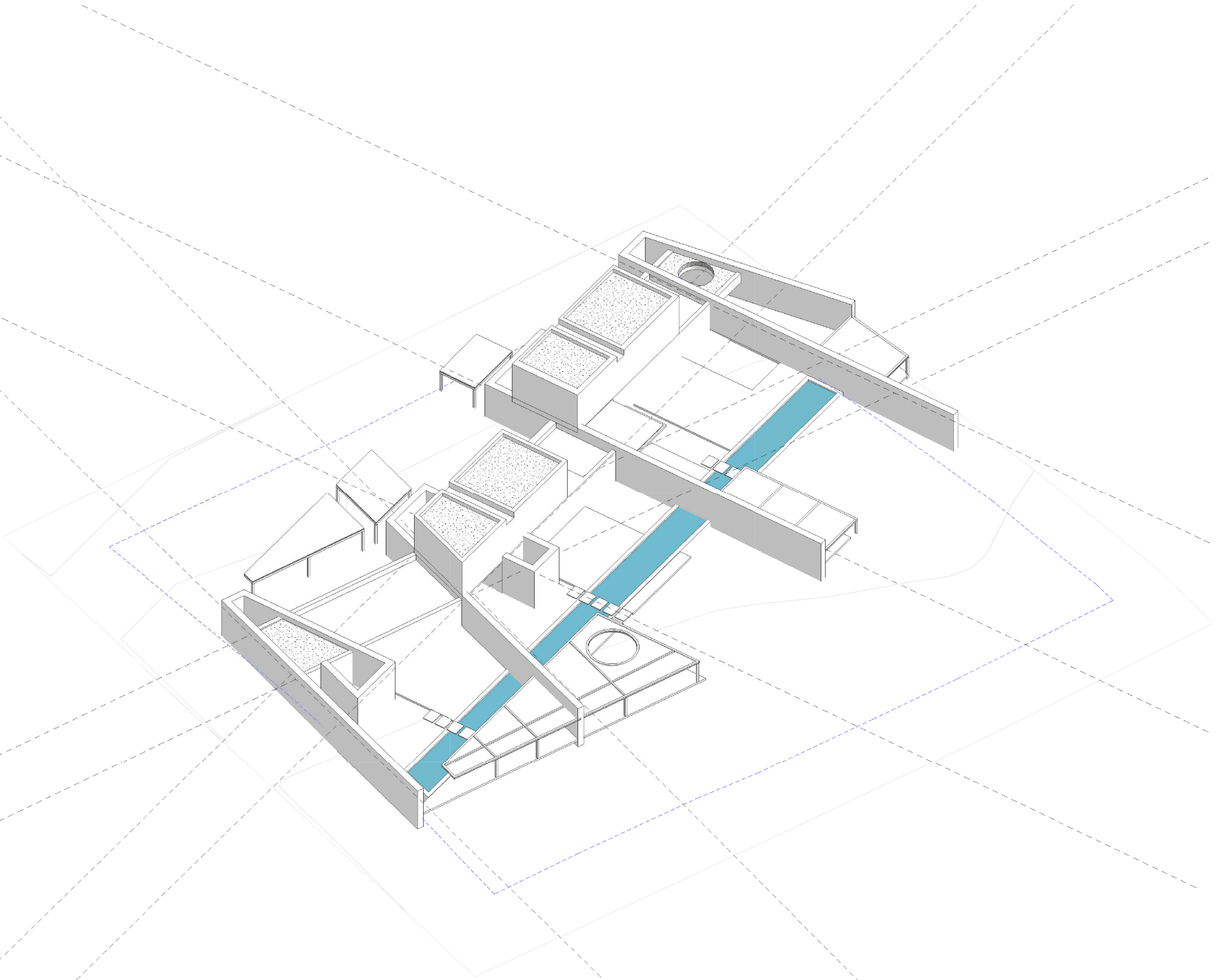
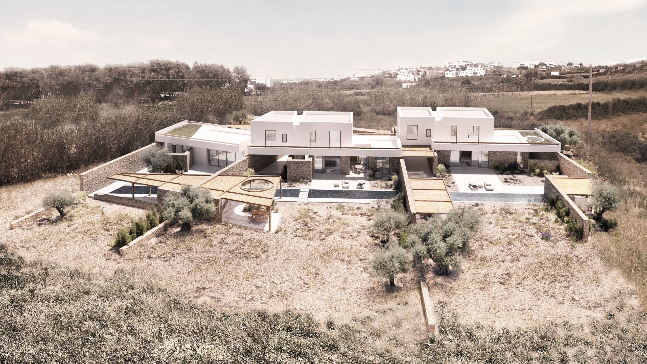 How to integrate three residences while retaining privacy of the various inhabitants? This project arranges each dwelling along a single line, which breaks and rotates 20 degrees, which also ensures that each unit has a sweeping view to the sea. Stonewalls separate the properties, creating passages and inner spaces. The residences are designed in a way that promotes an outdoor lifestyle. Large openings at the ground floor allow the internal and external spaces to merge into each other, blurring the boundaries between them.
5. Vertes Retreat
By Woven Architecture and Design, Sunshine Coast, BC, Canada
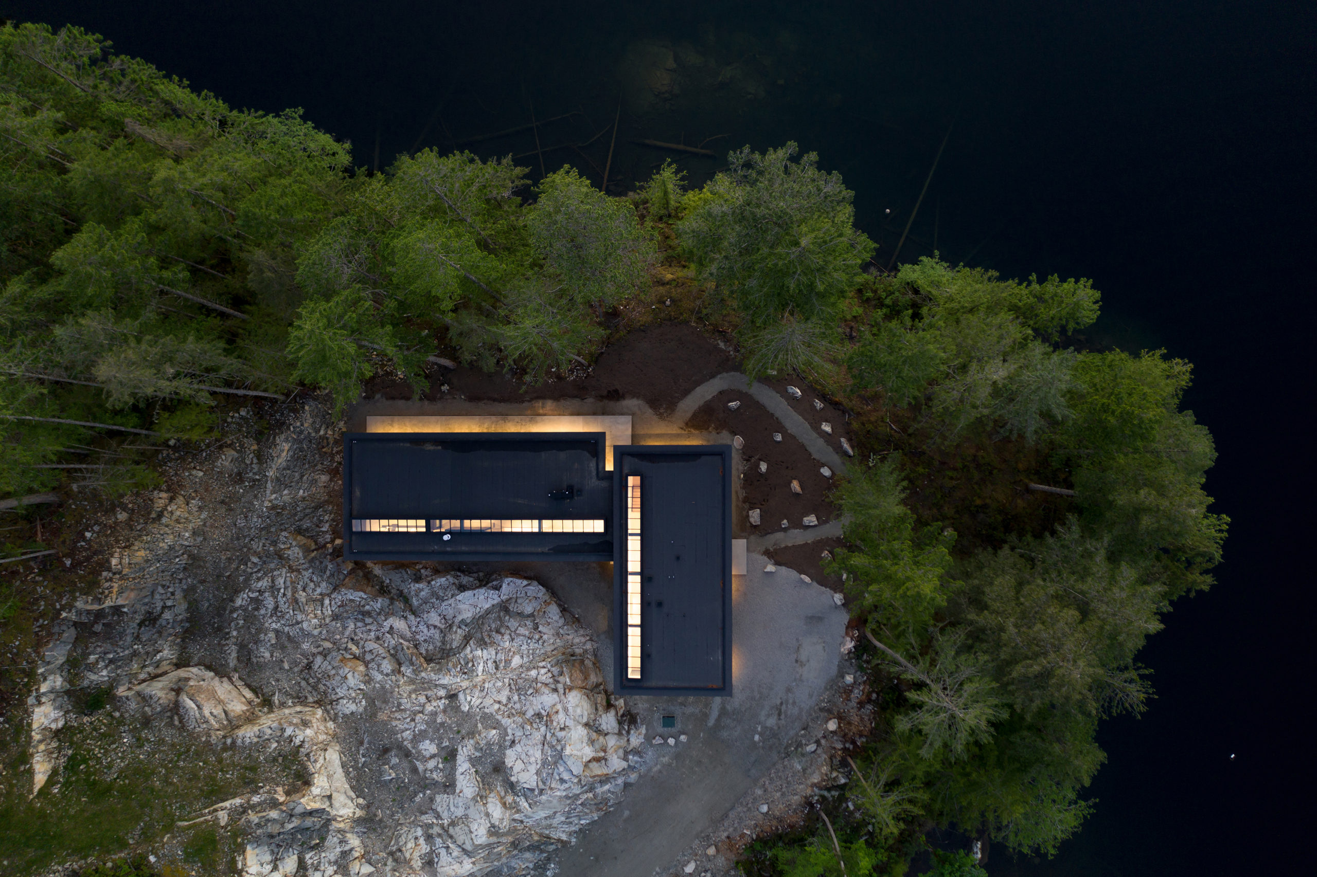
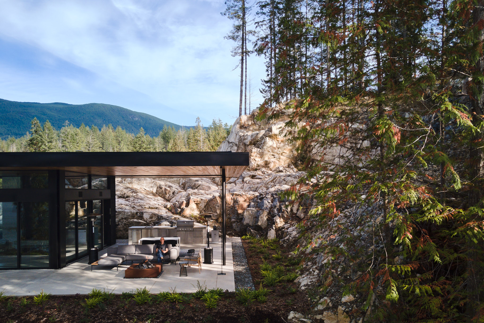 Perched on a rocky outcrop overlooking a pristine lake on British Columbia’s Sunshine Coast, this L-shaped family home is designed for a life in harmony with the great outdoors. Flat roofs hover above two wings of the home, providing large overhangs and covered outdoor spaces. Skylights extend the entire length of the circulation paths at both wings of the home, flooding these areas with much needed natural light during the long rainy winters of the Pacific Northwest. Large glass openings throughout the home frame stunning lake views with glimpses of the rocky landscape behind positioned in select locations.
4. Zuiderzicht
By evr-architecten, Antwerp, Belgium
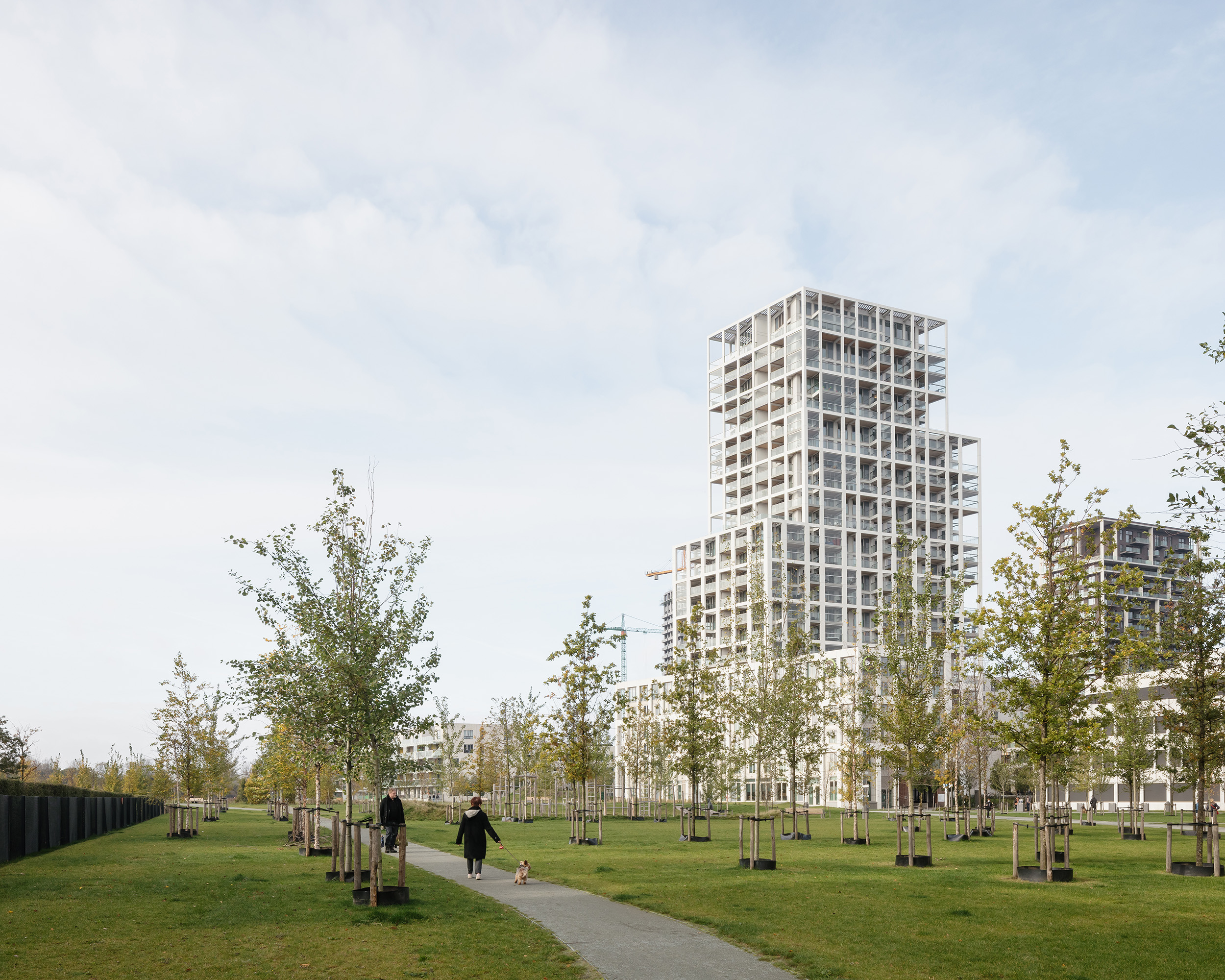
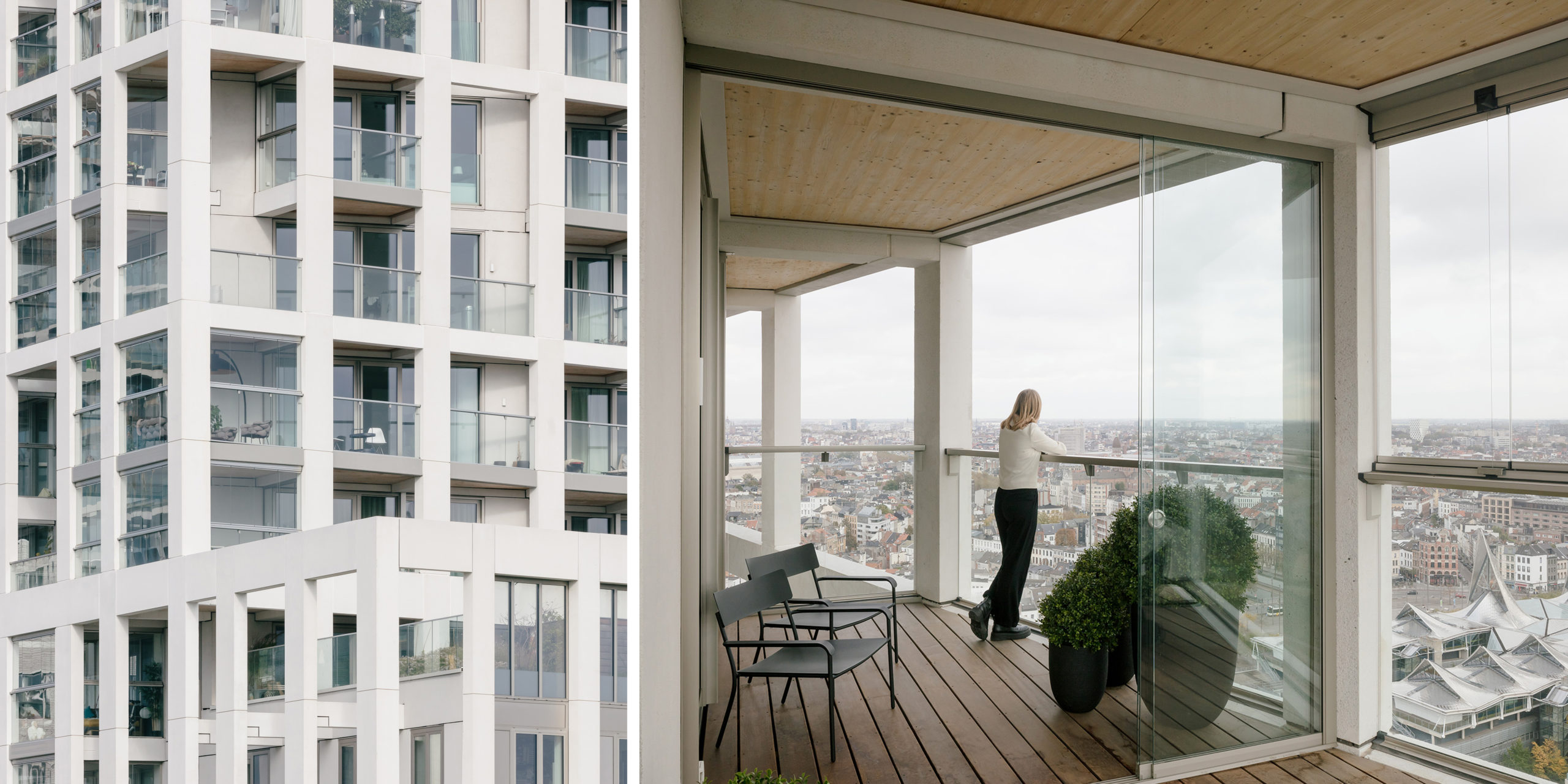 In Europes historic cities, new towers stand out; architects tread carefully with any sizeably tall intervention. While this tower stands out for its iconic double façade and staggering height, it does so while remaining in dialogue with its surroundings. With its open appearance and white façade, the Zuiderzicht tower fits withAntwerp’s tradition of white, layered, tectonic high-rises such as the Onze-Lieve-Vrouwe Cathedral, the art deco style KBC-tower and the Police tower and others. The apartments are compact and efficiently organised around a central core, designed with flexible floor plan layouts and constructed with a structurally exciting load-bearing façade.
3. NOTARÍA
By circuito., Actopan, Mexico
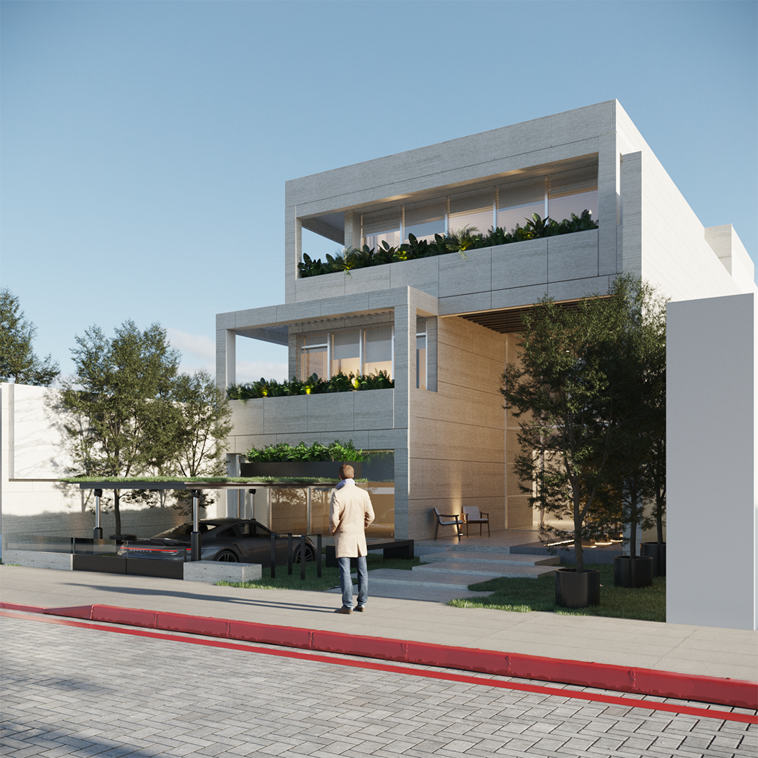
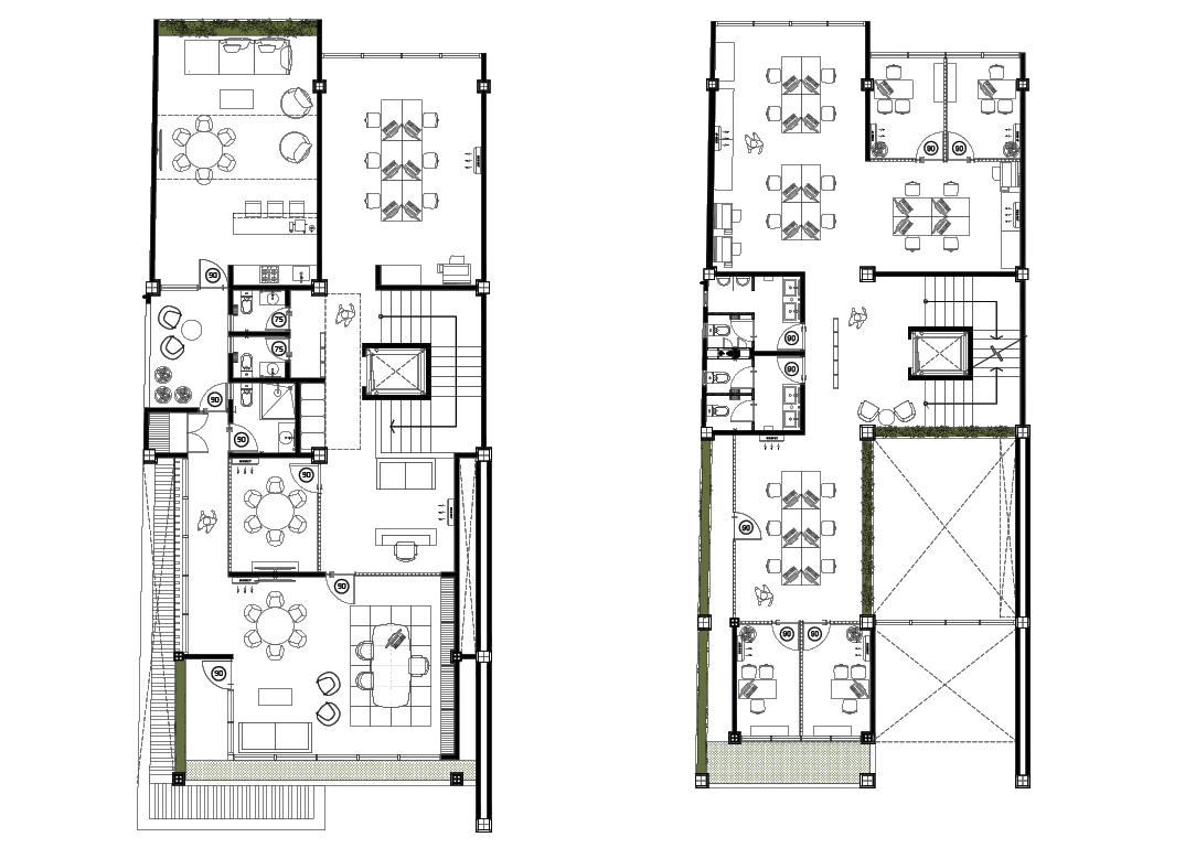 Actoplan is a small and internationally recognized historical town. This project is located a stone’s throw from the main square, which is dominated by one of the most important convents of Mexico’s colonial period. The project begins with a volume that echoes colonial prototypes, but made more spatially efficient by playing with the levels. The floors are divided base on varying levels of privacy, with the first being completely public, while the archives act like a document shelter.
2. Toy Block Project
By Aida Doi Architects, Japan
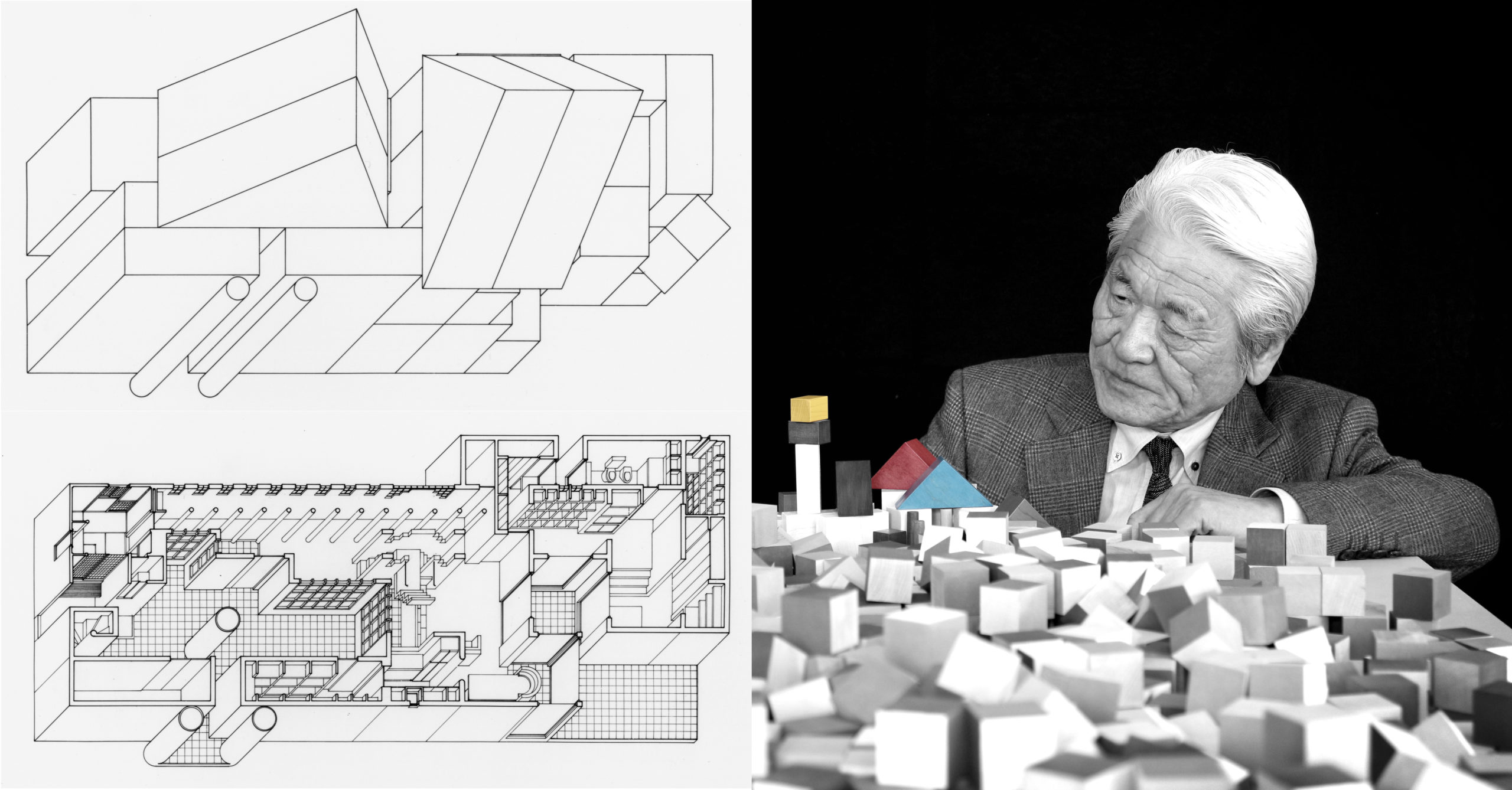
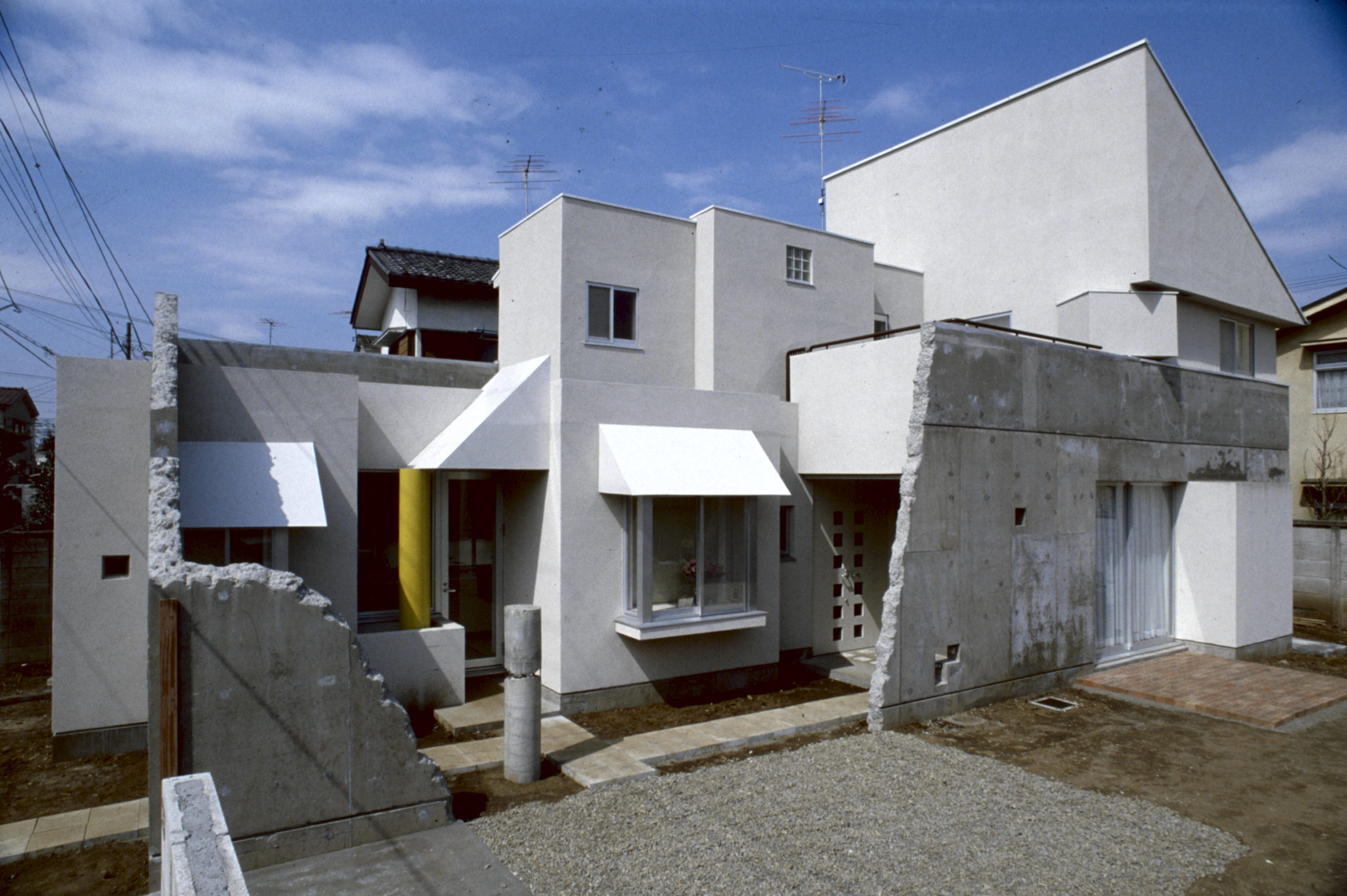 In 1981, this Japanese designer designed AIDA BLOCK, a set of building blocks based on geometric forms (circles, triangles and squares). Today, the building design based on this set, TOY BLOCK HOUSE, is 43 years old and continues to be inhabited. Against the functionalist designs that reigned supreme in the post-war years of reconstruction, this house champions playfulness, opening up possibilities for architectural expression.
1. Qpokee Flagship Store in Sanlitun
By CUN Design, Beijing, China
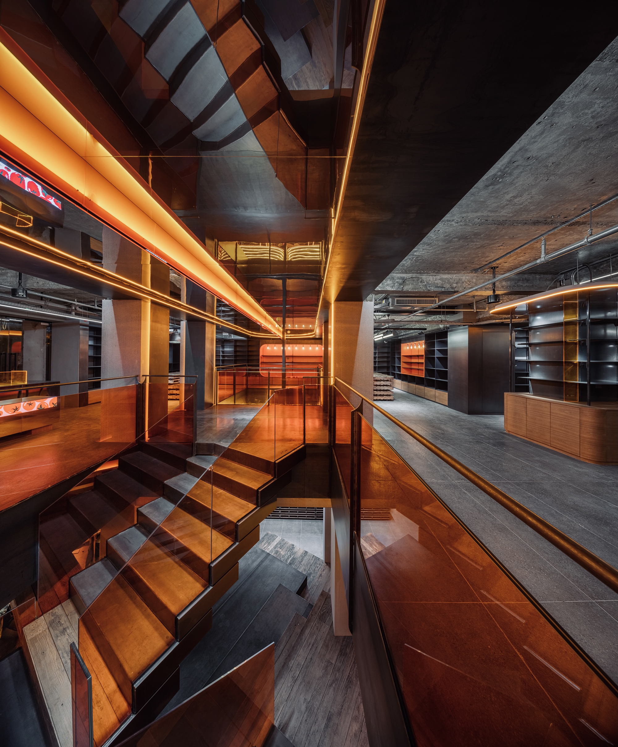
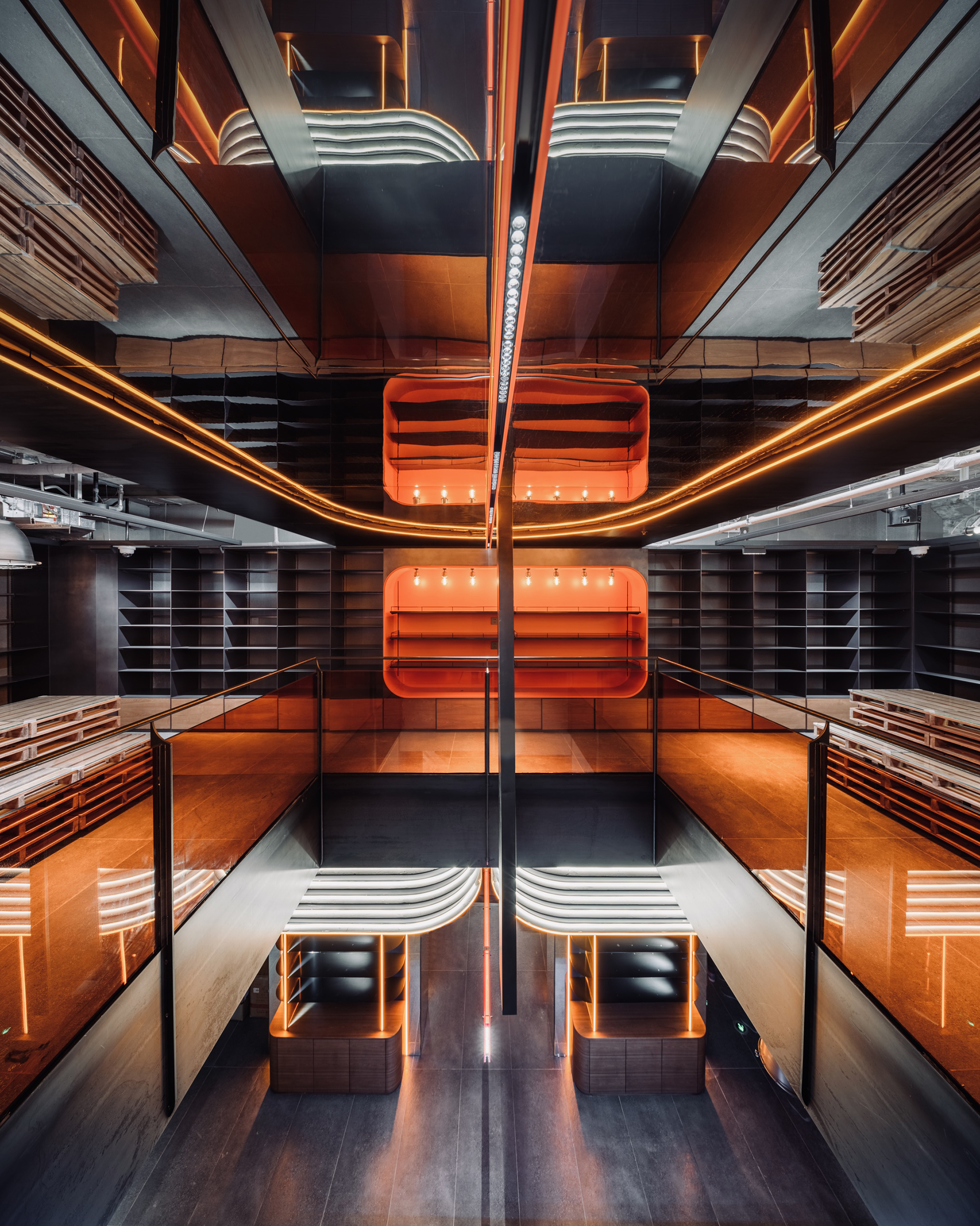 Styles change, but over the years, certain aesthetics have been gendered as either masculine or feminine. While color is often used to demarcate between the masculine and the feminine, textures, lighting materials and lines can also all be harnessed in ways associated with the former and the latter. This design for a brand whose target audience is young women between the ages of 16 to 26 turns these conventions on their head. The project takes an old industrial style, infusing it with a tomato-inspired shade of orange to present a new retail trend, resulting in an energetic and modern space.
Architects: Want to have your project featured? Showcase your work by uploading projects to Architizer and sign up for our inspirational newsletters.


