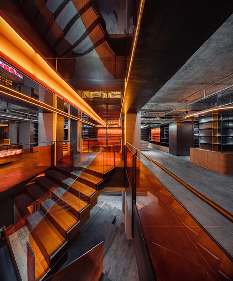

Qpokee Flagship Store in Sanlitun by CUN Design – This project mainly hopes to use an old industrial style that adapts to space and architecture to present a sense of new retail trend. The two styles are very different, because industrial sounds relatively masculine, but Qpokee defines the age of target customers between 16~26 years old girls, so we hope to make a good relationship between the masculine industrial sense and the girls interests, which is also a proposition that this project tries to solve.
Architizer chatted with Cui Shu, Chief Designer at CUN Design, to learn more about this project.
Architizer: What inspired the initial concept for your design?
Cui Shu: The very beautiful orange color of the tomatoes inspired the initial concept for my design.

© Design Aesthetics
© Design Aesthetics
What do you believe is the most unique or ‘standout’ component of the project?
I believe the most unique component of the project is that we not only complete the design work from the perspective of designers, but also think about problems from the perspective of operators and customers. Qpokee defines the age of target customers between 16~26 years old girls, who have their own dreams and are willing to pay for themselves. This group of people is exactly the new consumption trend and the main customer base.
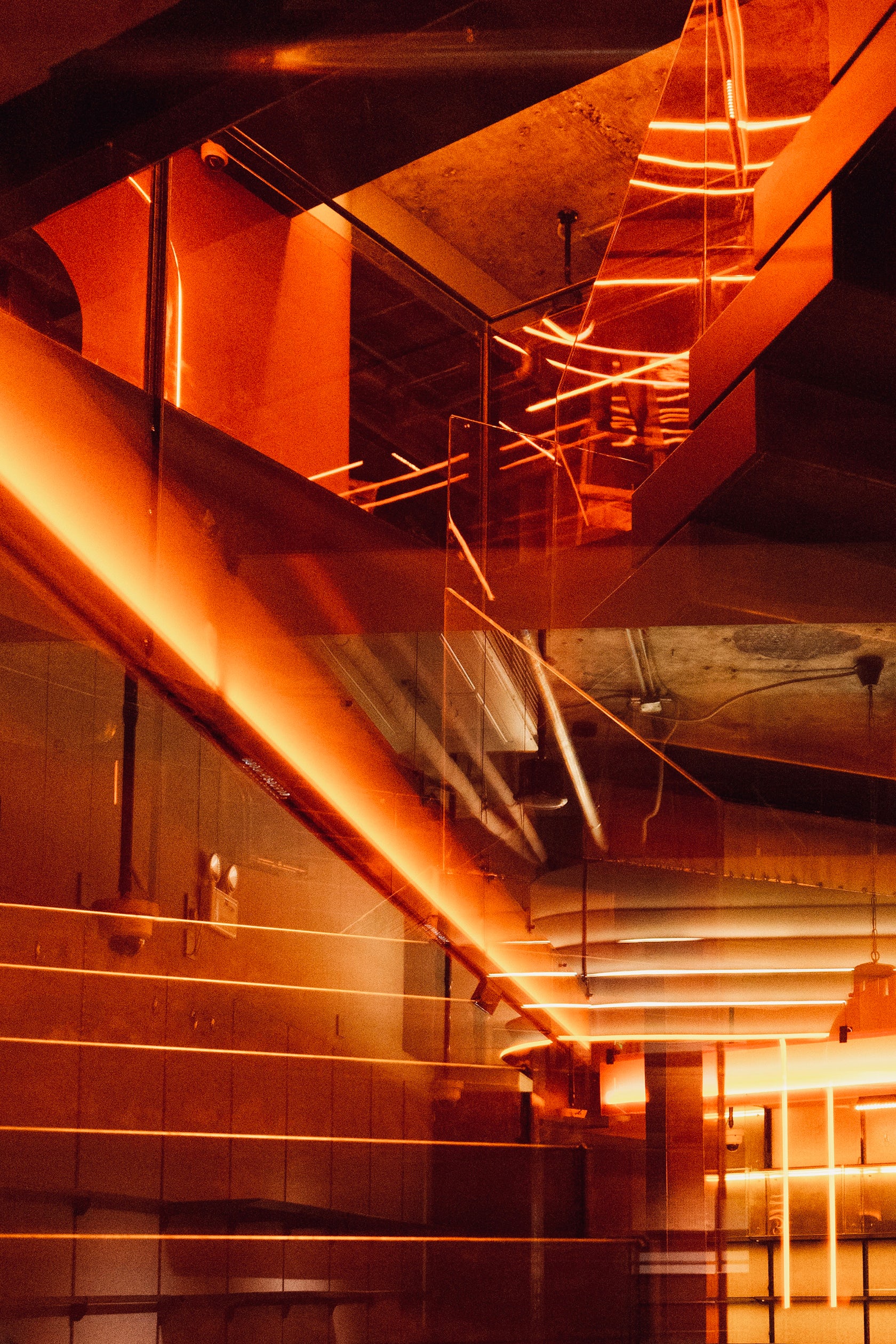
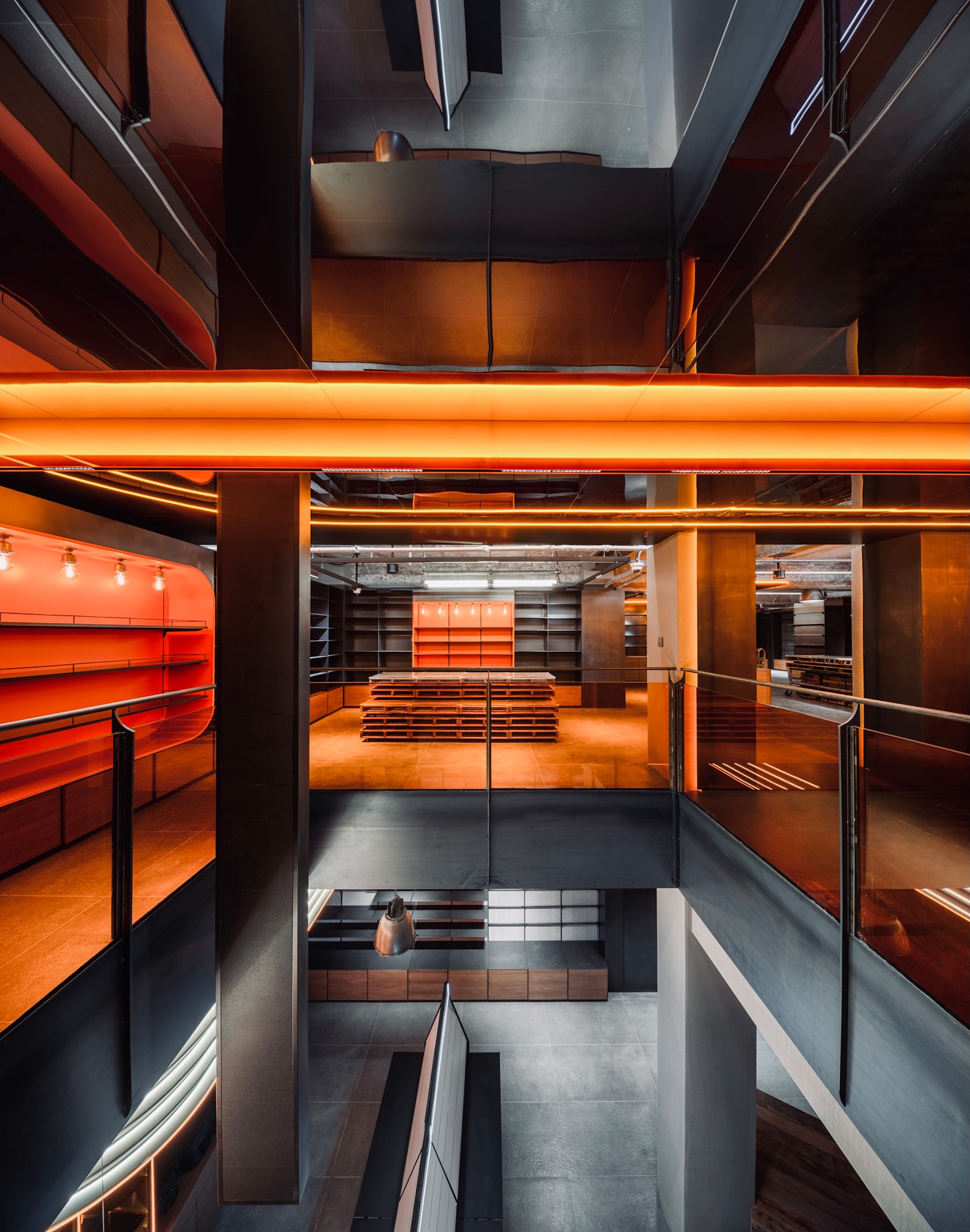
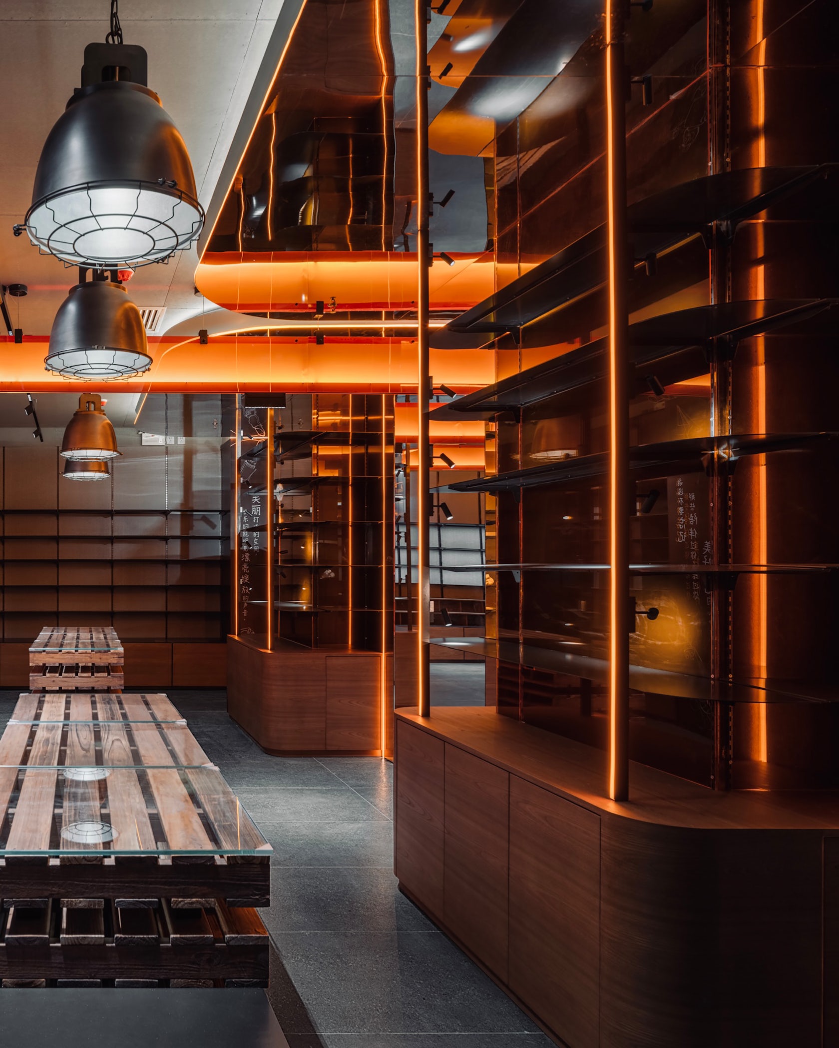
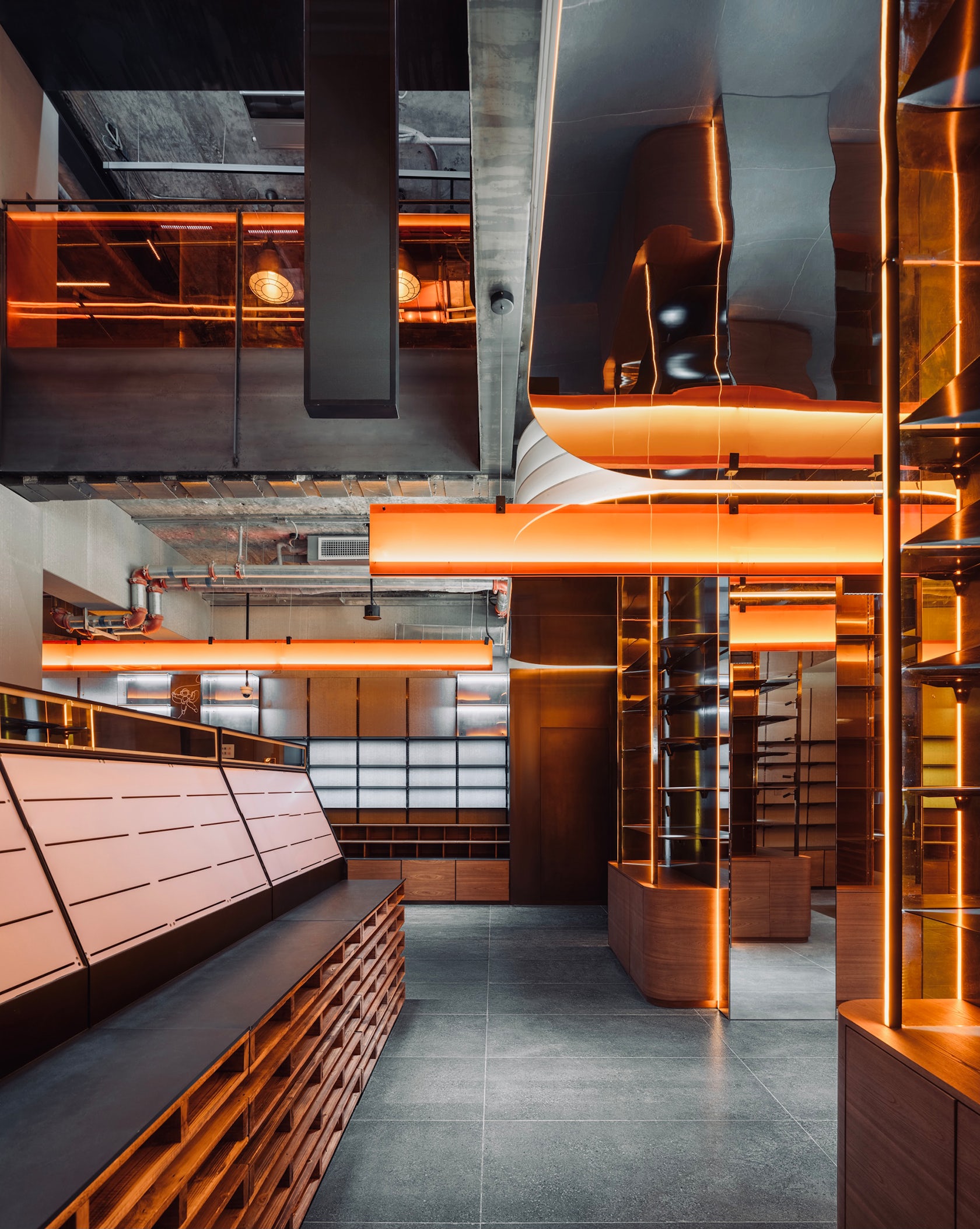
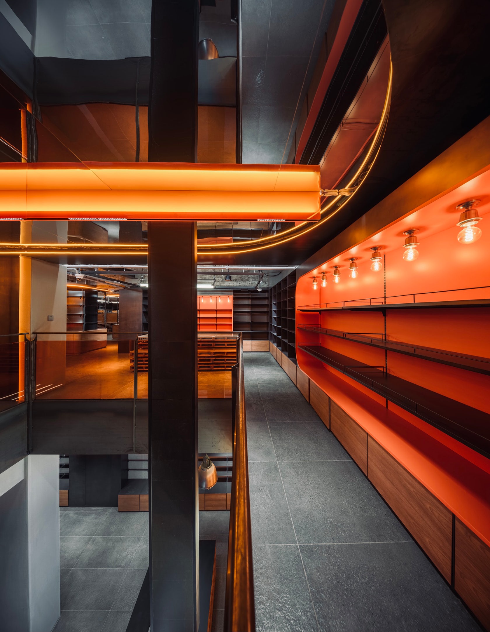
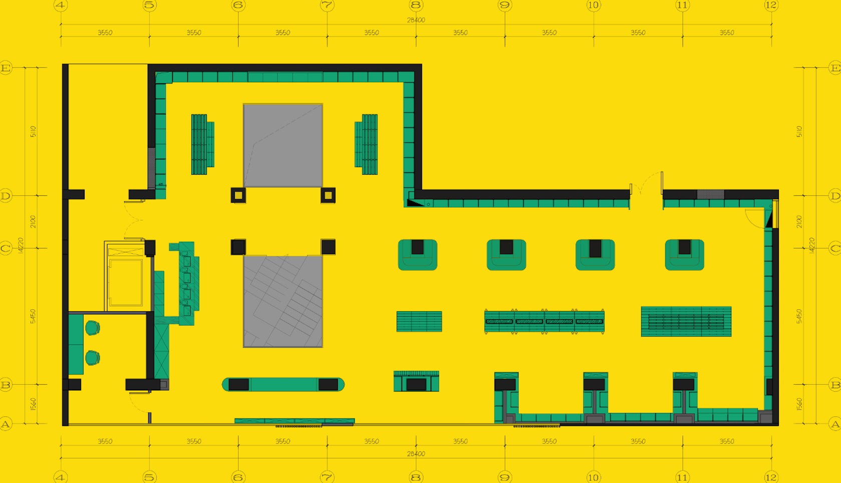
In the end, a more scientific and effective movement line is extended, which can better save spaces. The products are arranged in a logical and scientific layout according to the sales movement lines, their proportions and selling prices. The black steel plate integrates the colors of various products, and then the lighting system highlights and presents products on different levels.
After all these done, we improved the efficiency for the products again.

© Design Aesthetics

© Design Aesthetics
What was the greatest design challenge you faced during the project, and how did you navigate it?
In this design process, as in the past, we were faced with challenges from various aspects, such as the sense of urgency in time, the emergence of various difficult problems during the construction process, and the changes in effects due to budget control. Challenges from multiple aspects have contributed to the emergence of a comprehensive problem, and the effective solution of the comprehensive problem has contributed to a good design result. Every designer faces challenges, what we have to do is to solve the challenges and enjoy the design on the way to the result.

© Design Aesthetics

© Design Aesthetics
How did the context of your project — environmental, social or cultural — influence your design?
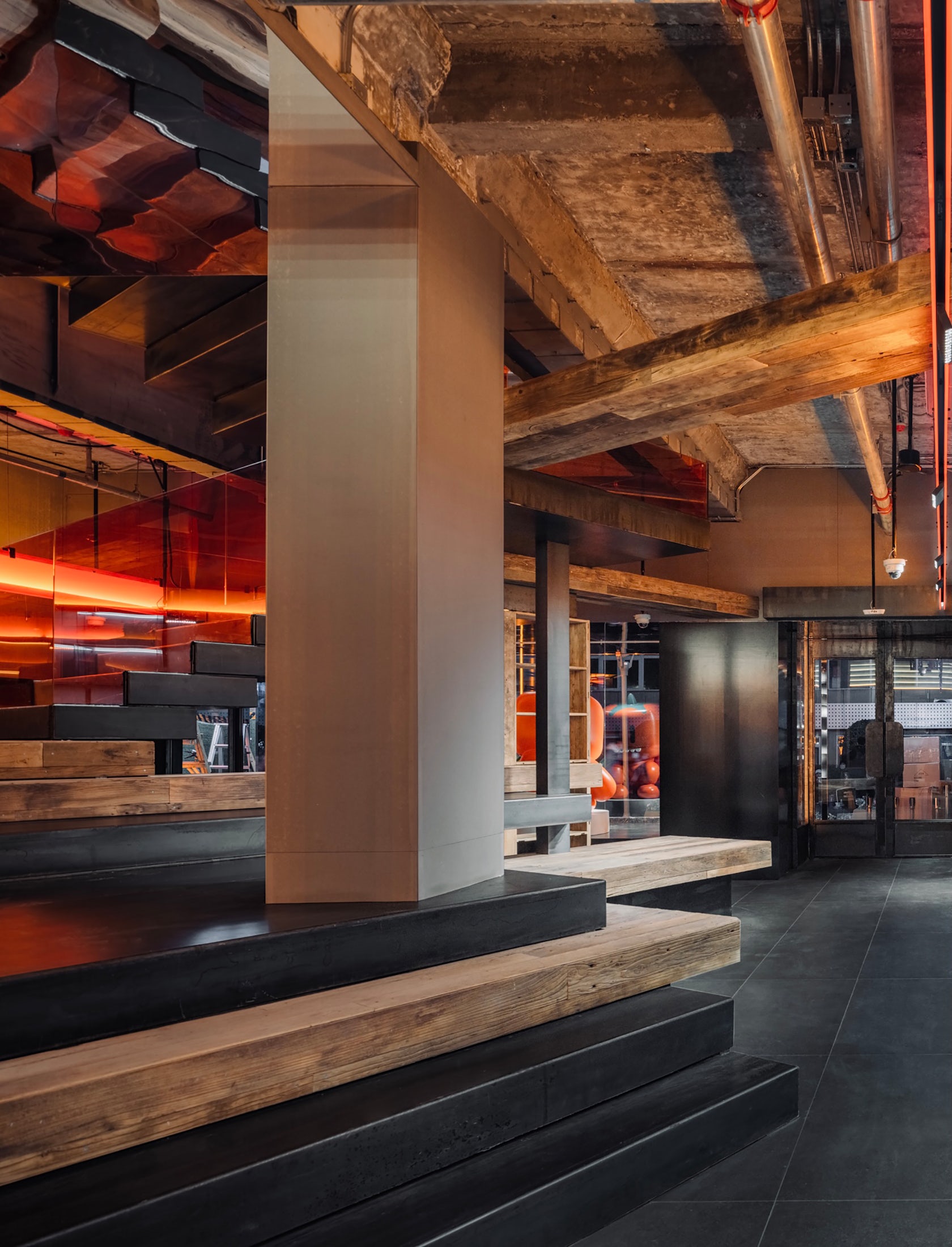
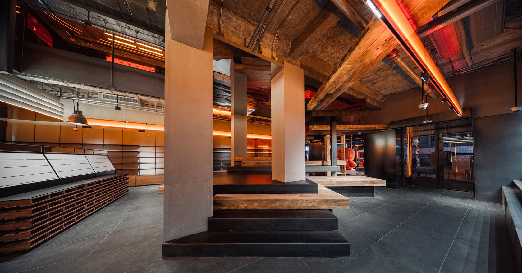
This store is located in the Middle street of Sanlitun in beijing. In the past, most of the surrounding area was a gathering place for trendy products and some fashion brands. This time, taking advantage of the opportunity of comprehensive upgrading and renovation of the entire block, we chose the location of the store in the core of the block.
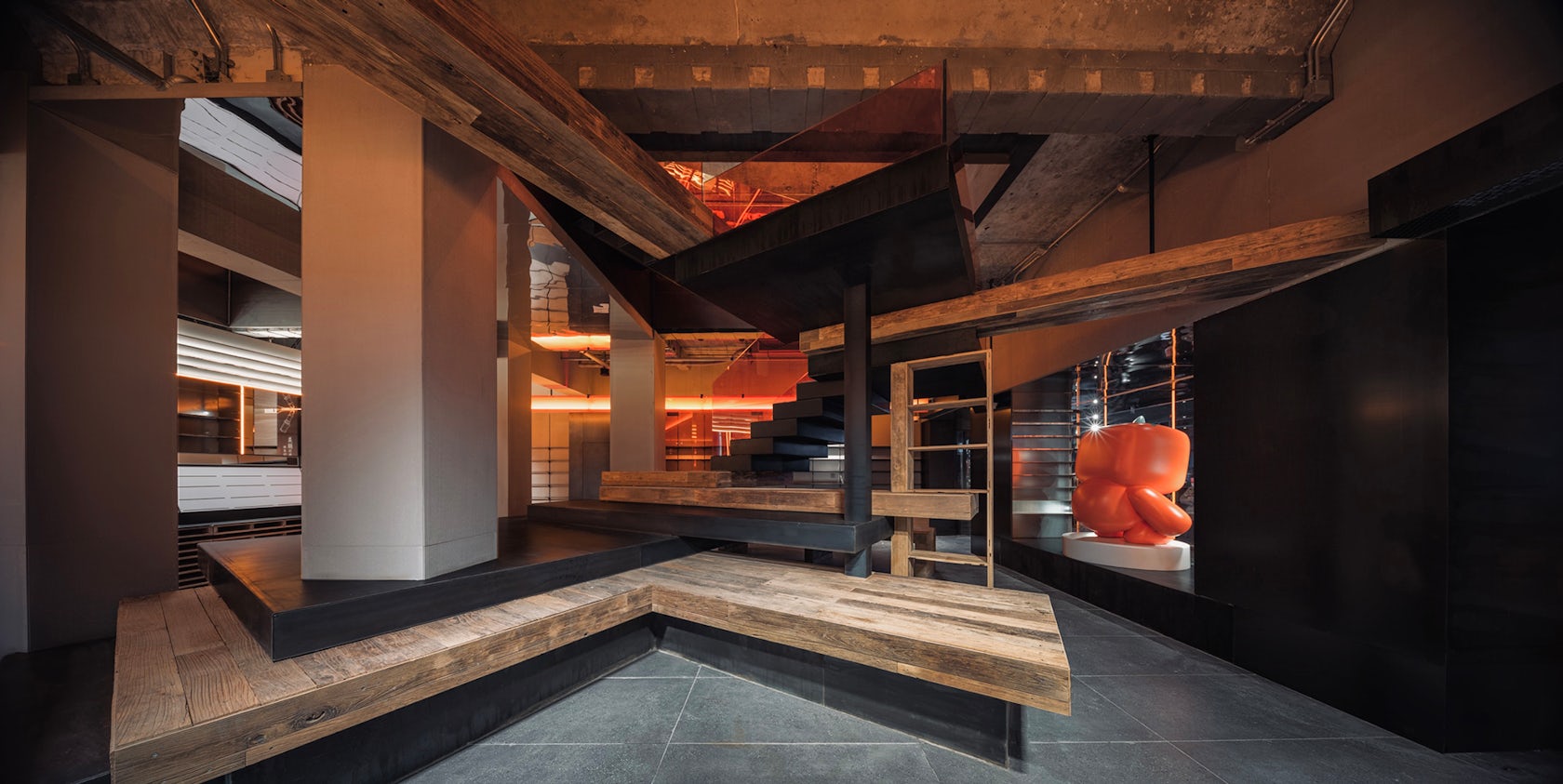
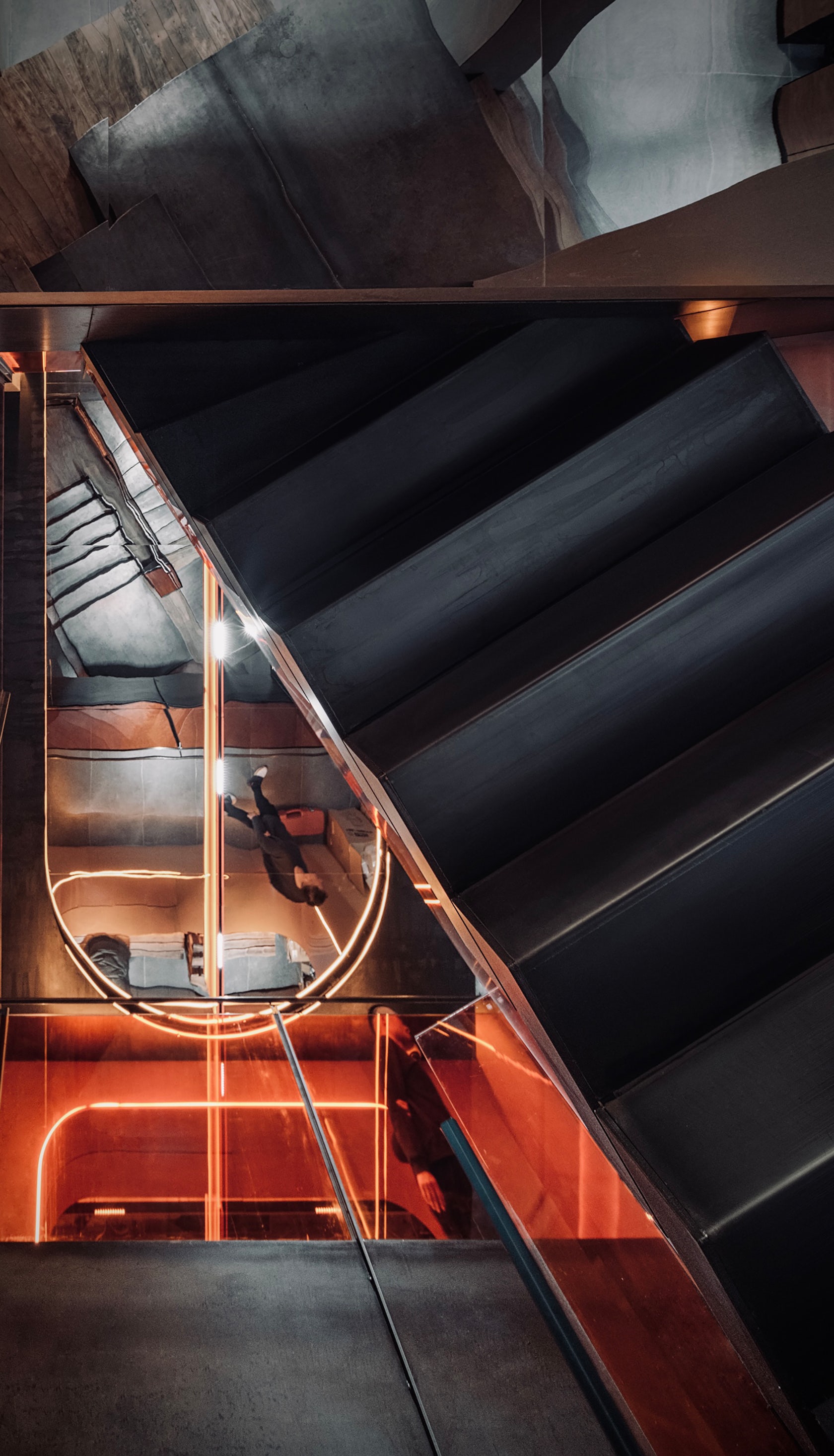
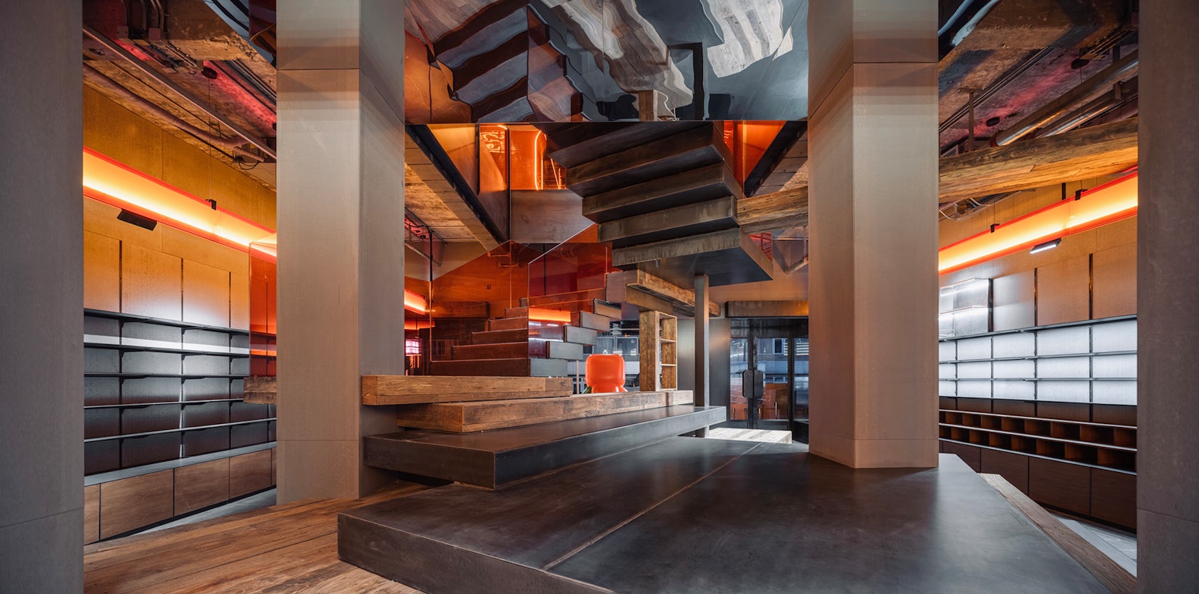
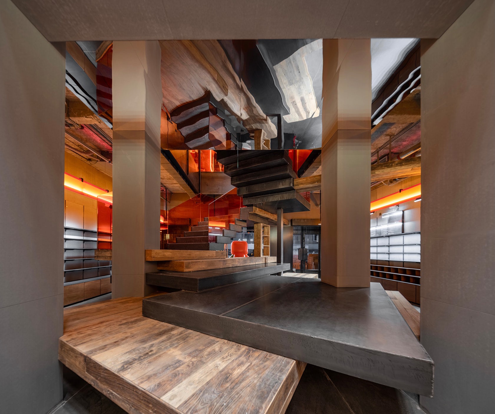
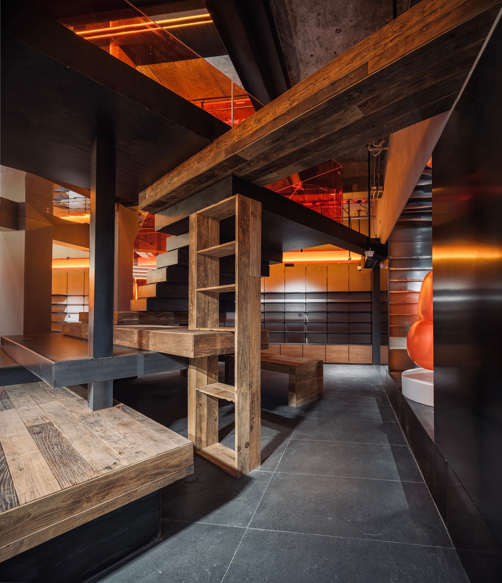
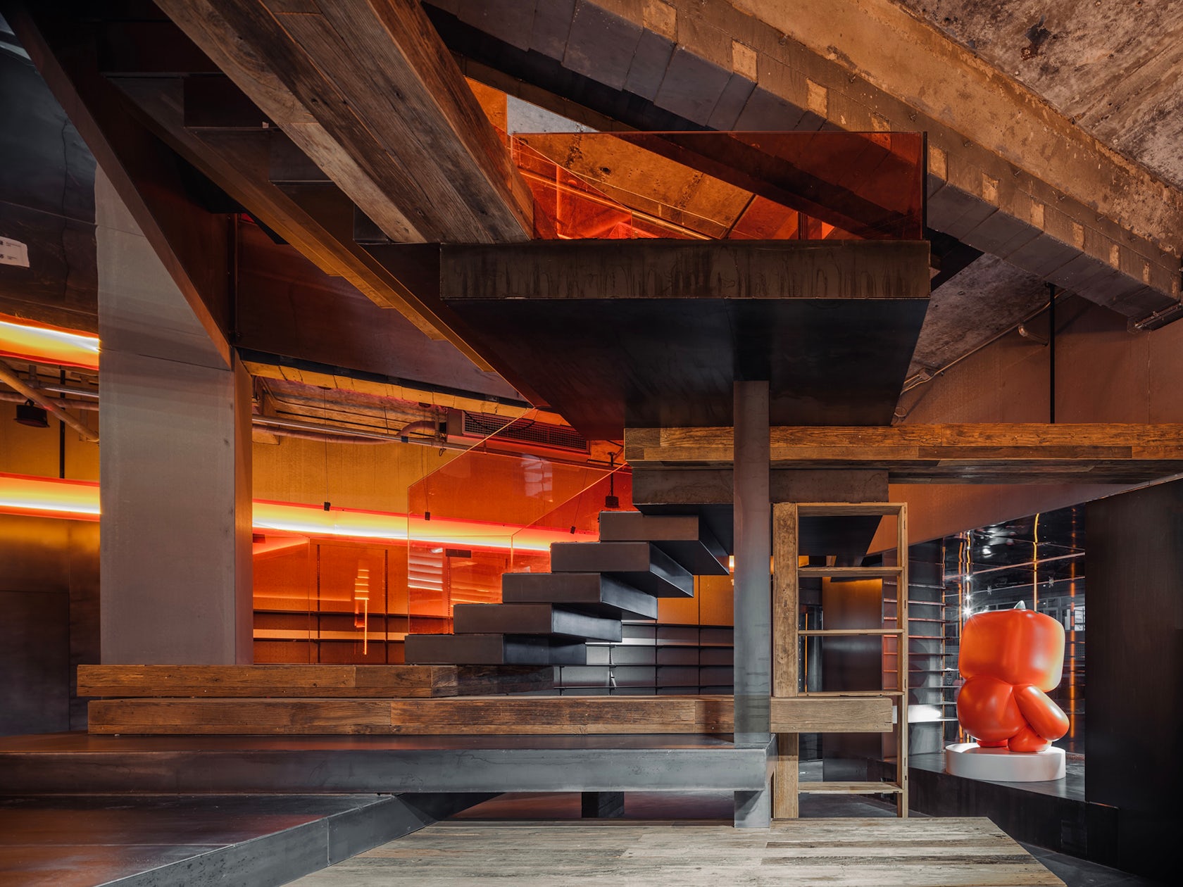
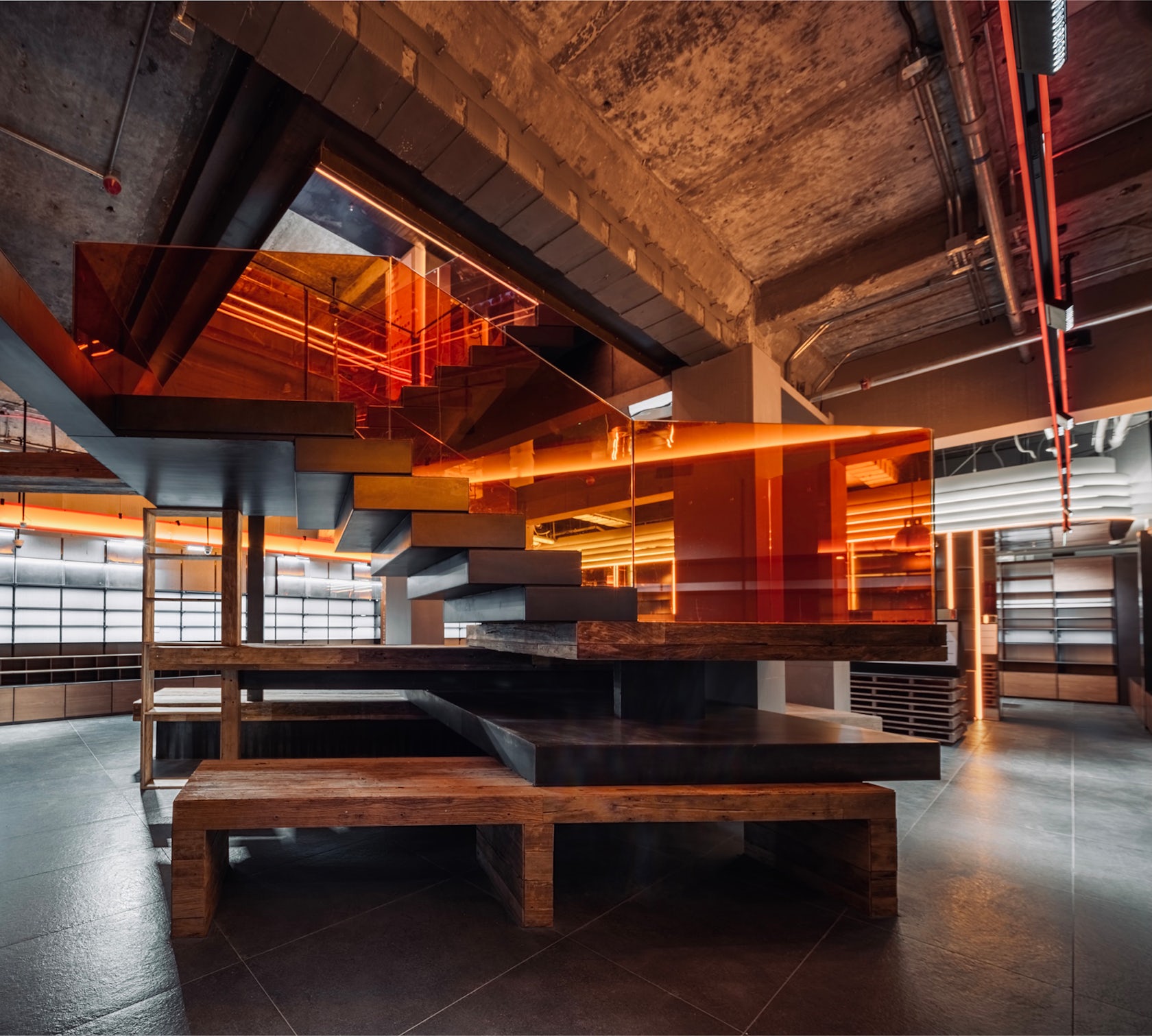
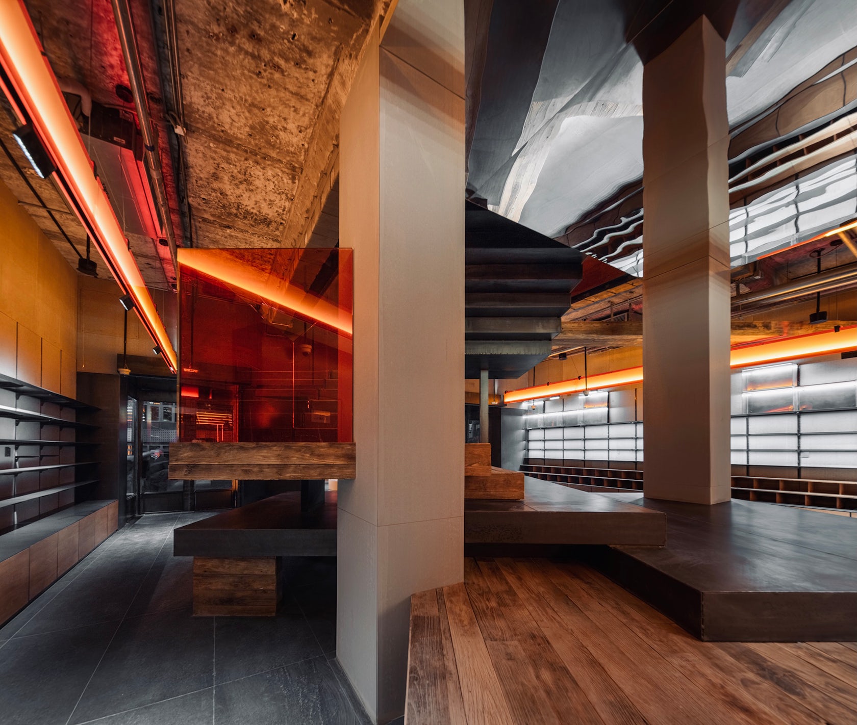
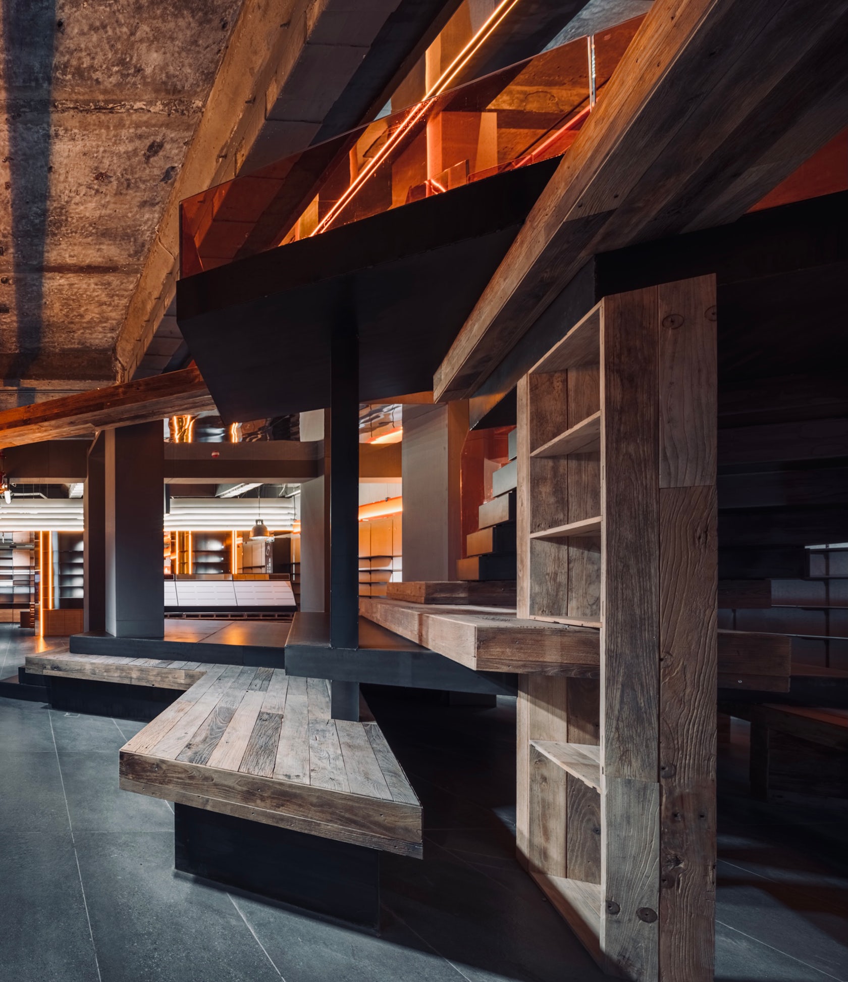
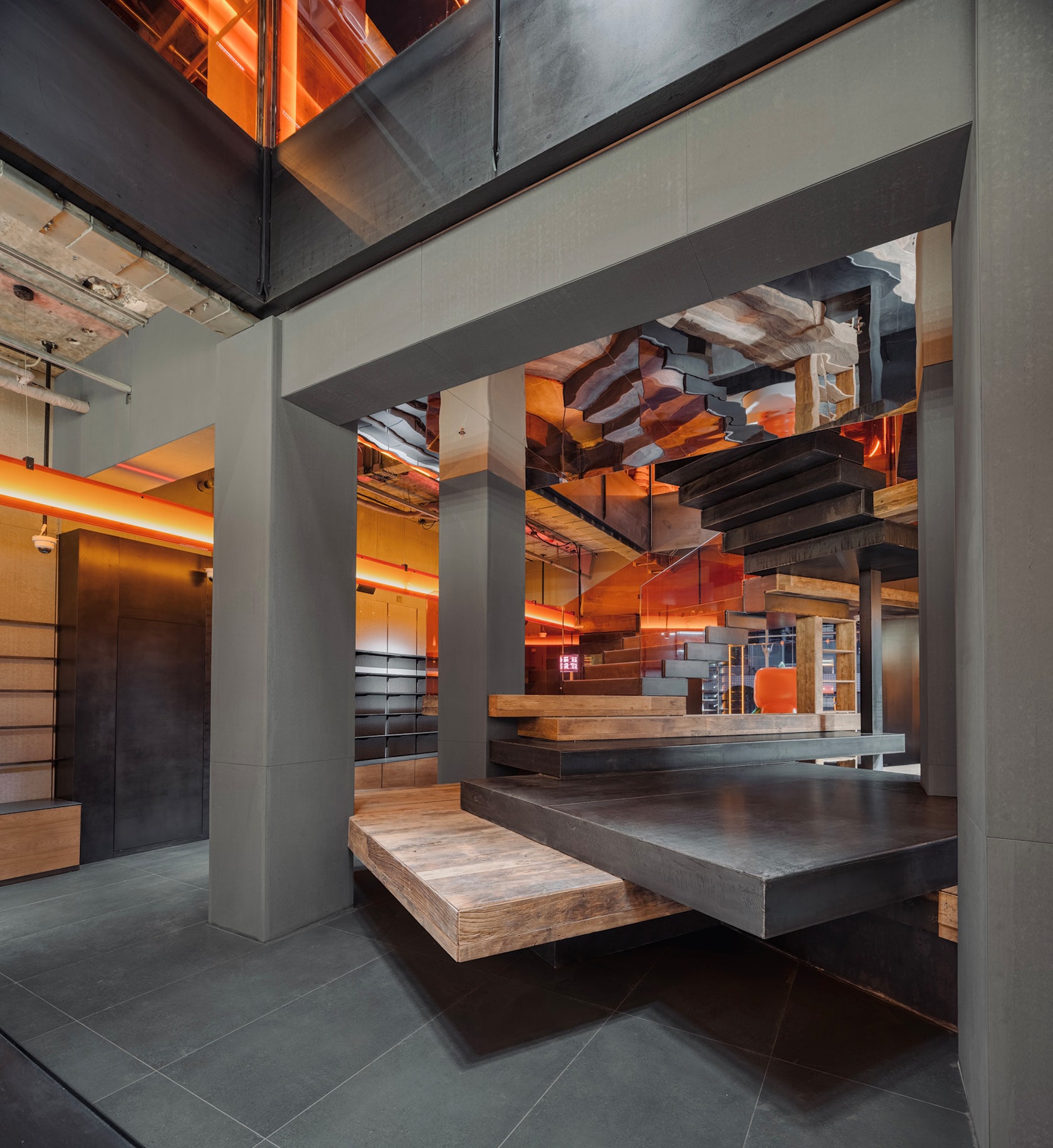
The building is about 40 years old and was built in the early 1980s. Due to the old building and multiple renovations, the main structure of the building is extremely unstable. In view of this problem, firstly, we renovated the structure optimization and reinforcement, and secondly, we also carried out a lot of thinking on the connection method from the first floor to the second floor, and finally the form of the stairs was slowly presented.

© Design Aesthetics
© Design Aesthetics
What drove the selection of materials used in the project?
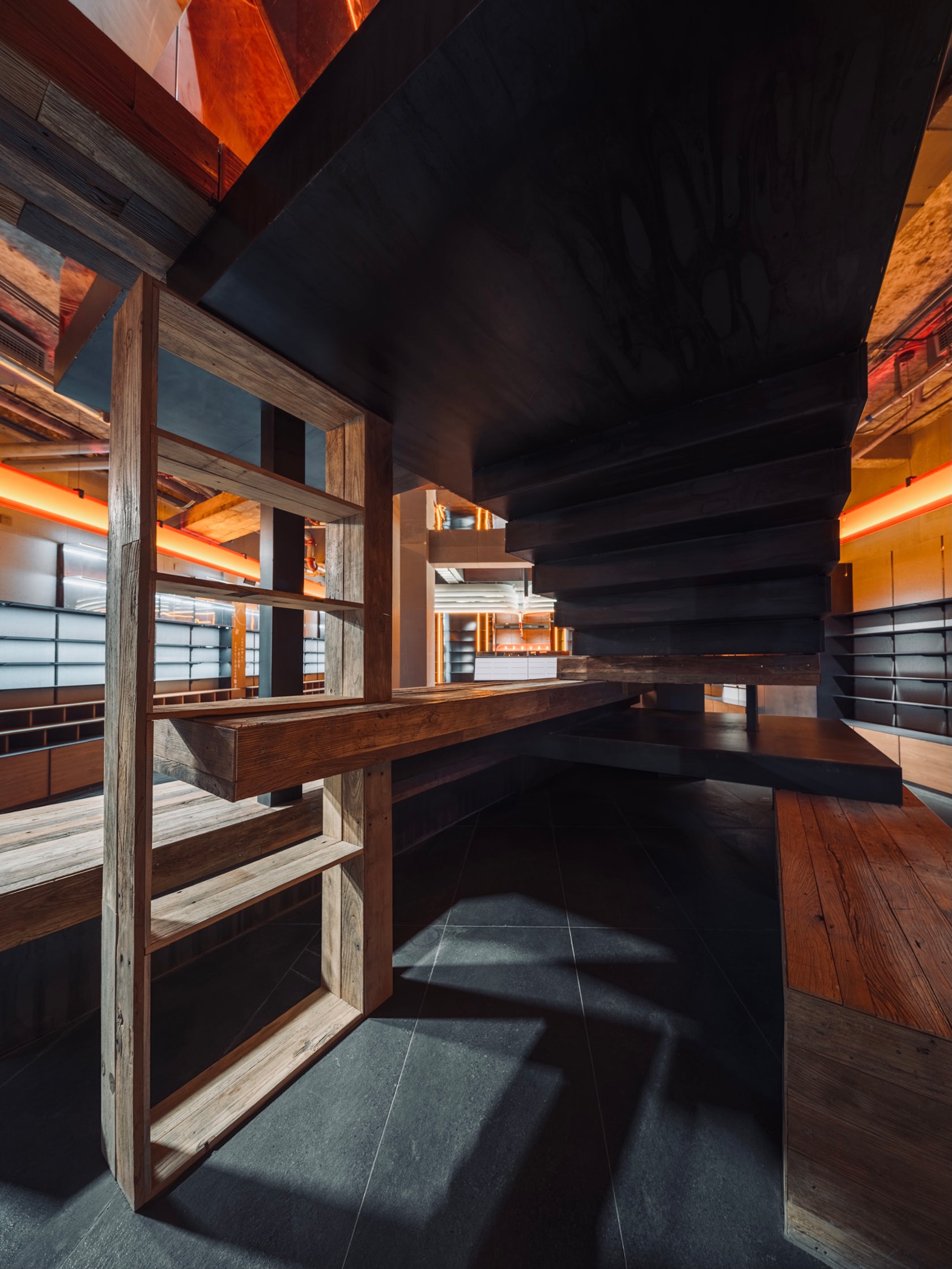
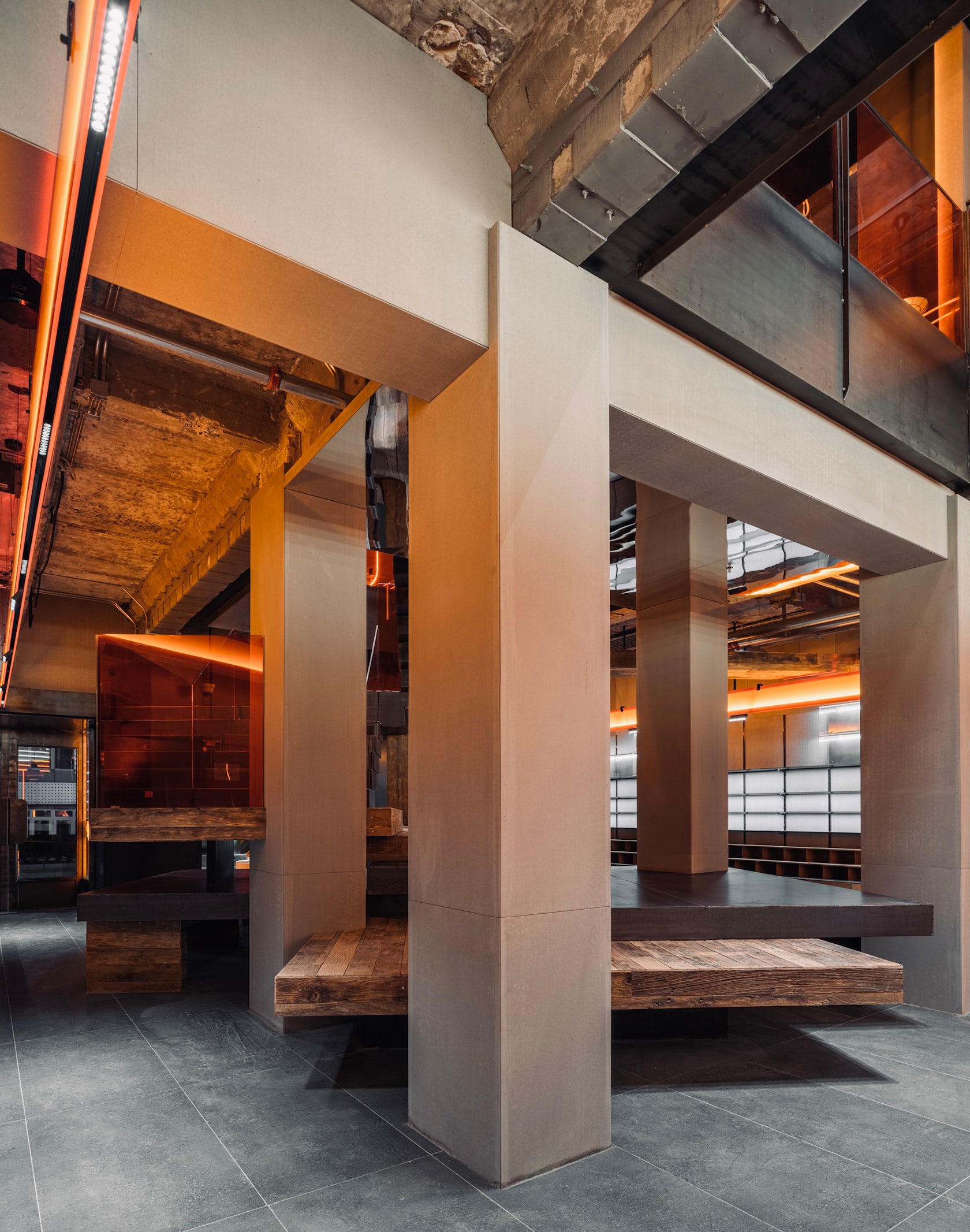
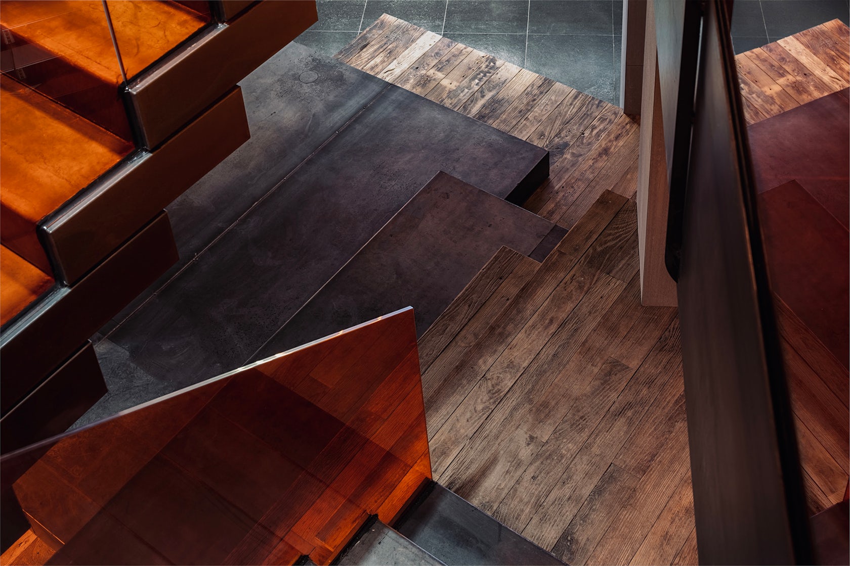
1) Cement pressure board (simulate the skin material of the original building)
2) Iron plate (enhanced industrial sense)
3) Old wood (age material)
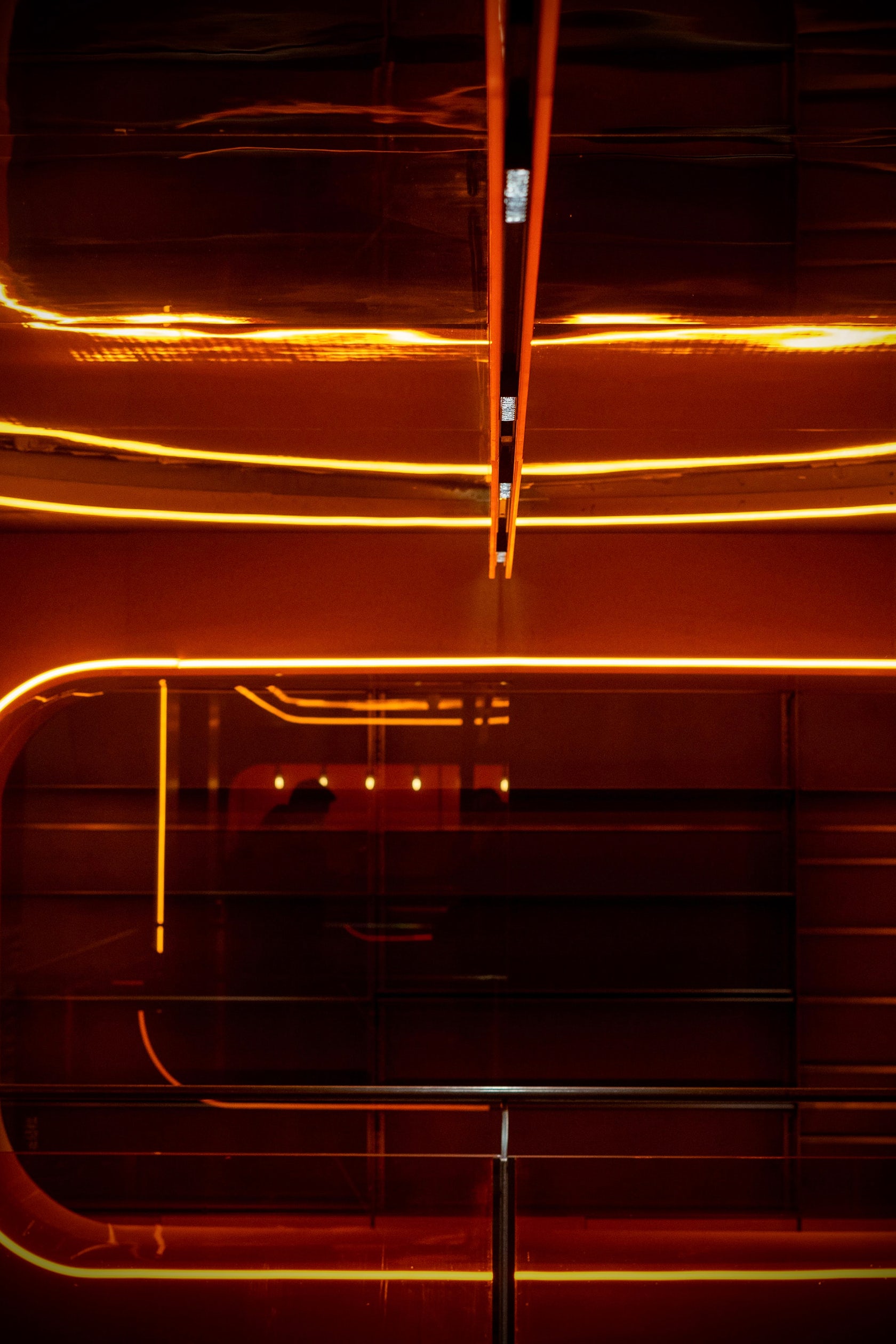
4) Orange acrylic (embellish the space with characteristic materials to create space charm and transparency)
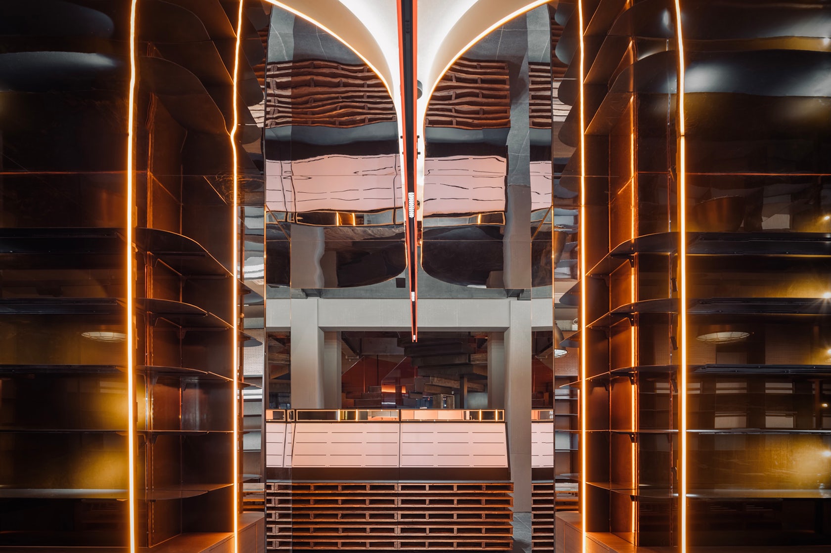
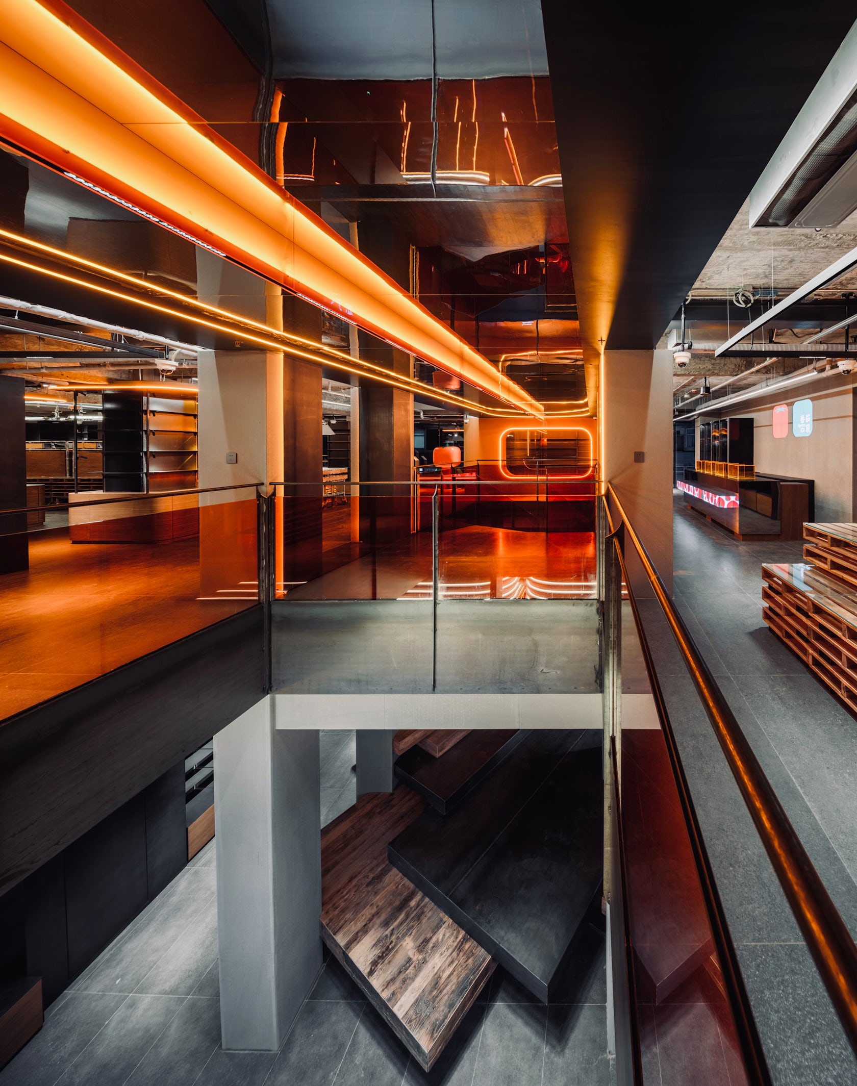
5) Mirror material (increase the depth material of the second floor space to visually expand the space area)

© Design Aesthetics

© Design Aesthetics
What is your favorite detail in the project and why?
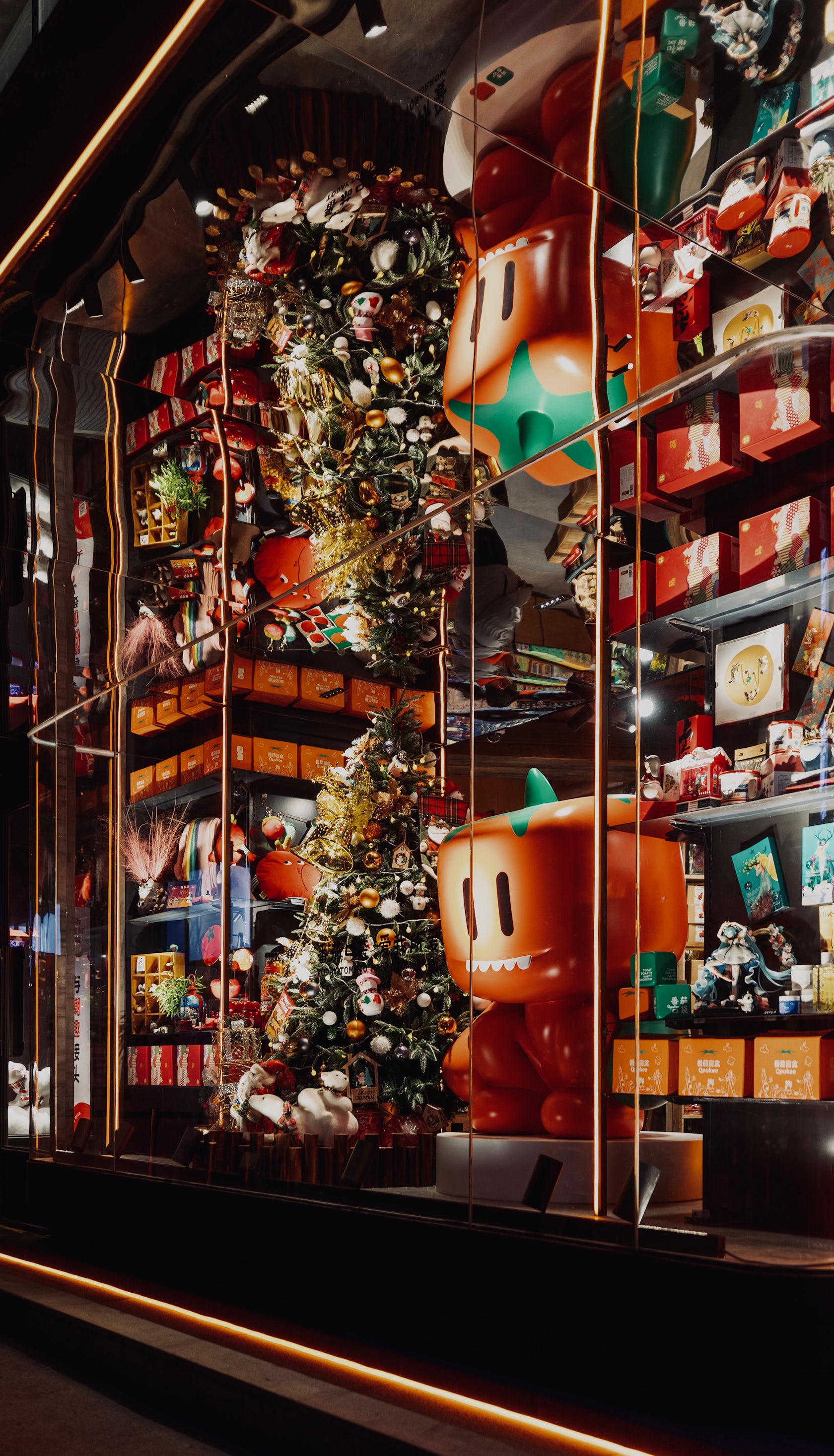
My favorite detail in the project has two parts. First, we used the representative tomato color of Qpokee as the main color, and used the largest area to make a large display window, so that the overall Qpokee brand can be enhanced, and stopping, visiting, and staying of dynamic passenger flow is also increased.
The second is that we instead renovated and designed floor stairs linking the first and second floors, so that people can be better introduced into the large area. Moreover, a structural staircase was used to solve the overlap of display, enhancement, function, and stocking. The staircase can be passed through, and it is also a display surface of products.

© Design Aesthetics

© Design Aesthetics
How important was sustainability as a design criteria as you worked on this project?
In this project, sustainability is mainly reflected in the two aspects of function and material. In terms of materials, all the props in the store use old elm and iron plates as the main materials, which not only control the cost, but also have a fast production cycle and can be recycled.
In terms of functions, the props shelves in the store are mainly installed on-site with finished components, which are easy to assemble and have strong adjustability. All the shelves can be assembled repeatedly and used in other stores of Qpokee.

© Design Aesthetics
In what ways did you collaborate with others, and how did that add value to the project?
We adopted three methods to complete this goal. Firstly, we spent a lot of time with the whole Qpokee team, especially the store manager and sales to discuss the layout, finally we completed the three-dimensional layout design through product partition layout, dynamic product layout, vertical display layout, and color display layout. Secondly, our team paid attention to the online clients’ feedback to the existing stores to enhance and adjust product visualization. Thirdly, CUN team stayed on site to observe the stores operation. We have always believed in the saying “You can only know the direction of waves by standing in the water.” We turned the problems on site into design goals to solve them!

© Design Aesthetics
Were any parts of the project dramatically altered from conception to construction, and if so, why?
Before the project was launched, we communicated fully with the Qpokee team. Therefore, during the implementation of the plan, although corresponding adjustments will be made according to the actual situation on site, there was no dramatically altered from conception to construction.
How have your clients responded to the finished project?
The clients highly recognized the effect after completion. They believed that the result not only created a new visual and spatial system architecture for the Qpokee brand, but also solved some previous problems in operation and function.
Therefore, we have also carried out more follow-up cooperation. After the opening of the Qpokee in Beijing received a warm response, we are also in the process of designing the Beijing Daxing Huiju Shopping Center Qpokee Store and Chongqing Longhu Shopping Center Qpokee Store.

© Design Aesthetics
What key lesson did you learn in the process of conceiving the project?
Mr.Ye, the founder of Qpokee, was a well-known entrepreneur in the domestic Internet industry, and has served as the chief operating officer and manager of the major leading enterprises. The cooperation with the Qpokee team is not only an interesting design collision, but also gained a lot of inspiration from the enterprise operation, which can be said to benefit a lot.

© Design Aesthetics
How do you believe this project represents you or your firm as a whole?
CUN tried to use a style to attract and target shoppers, and this style would be better to be classic and anti-popular. Therefore, we organically combined the art toy, IP color, Qpokee series, industrialization, metallic sense, and structure into the unique “warm industry” style of Qpokee.
This is also highly matched with the creed that CUN has always adhered to: be no slave to experience design, be no slave chaserto aesthetics trend, never stop in finding our own way.

© Design Aesthetics
How do you imagine this project influencing your work in the future?
When we come to discuss the new commercial spaces today, they are already composite and multi-dimensional! Then space design should no longer use single thinking methods and techniques to solve spatial problems.
This is a summary and change of CUN design’s thinking. In the future practices, we will show our design power for business empowerment.

© Design Aesthetics
Is there anything else important you’d like to share about this project?
In fact, in this project, in the process of preliminary research, we can accurately find through data that a large percentage of store successes depend on the selection and display of products. It is also a very big test to find improvement on an excellent result.
However, through the efforts and cooperation of the two teams in the past three months, the data of the Qpokee Flagship Store in Sanlitun has reached a record high since its opening, truly realizing the empowerment of design for business! This is also one of the directions that CUN will continue to move forward and develop in the future.
Team Members
Design Team: Hou Longyang, Ma Chuan, Fu Lin, Wang Jizhou
Products / Materials
1) Cement pressure board (simulate the skin material of the original building) 2) Iron plate (enhanced industrial sense) 3) Old wood (age material) 4) Orange acrylic (embellish the space with characteristic materials to create space charm and transparency) 5) Mirror material (increase the depth material of the second floor space to visually expand the space area)
For more on Qpokee Flagship Store in Sanlitun, please visit the in-depth project page on Architizer.


 Qpokee Flagship Store in Sanlitun by CUN Design