Architects: Want to have your project featured? Showcase your work by uploading projects to Architizer and sign up for our inspirational newsletters.
Since the mid-19th century, plastic has transformed the world. The material is ubiquitous in almost all consumer materials. Even still, plastic architecture and structures in which plastic is the primary building material remain sparse and mainly experimental. Firms like Plastique Fantastique and Selgascano are working to change this.
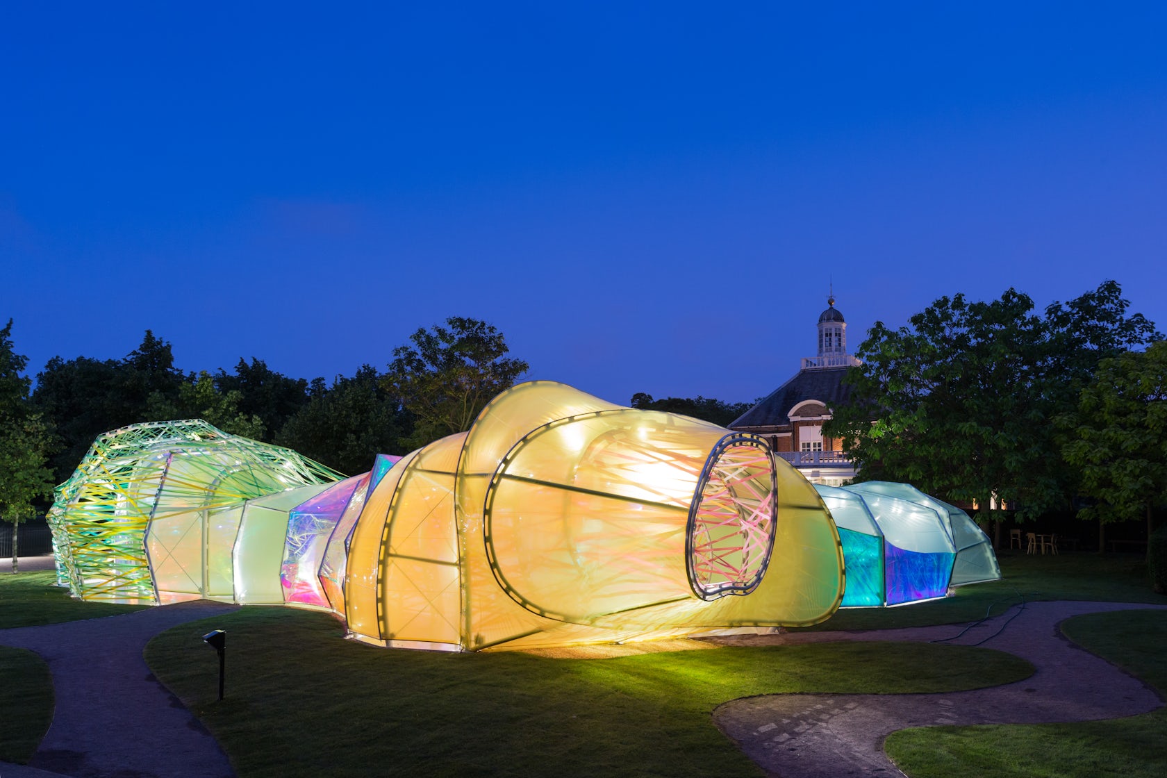
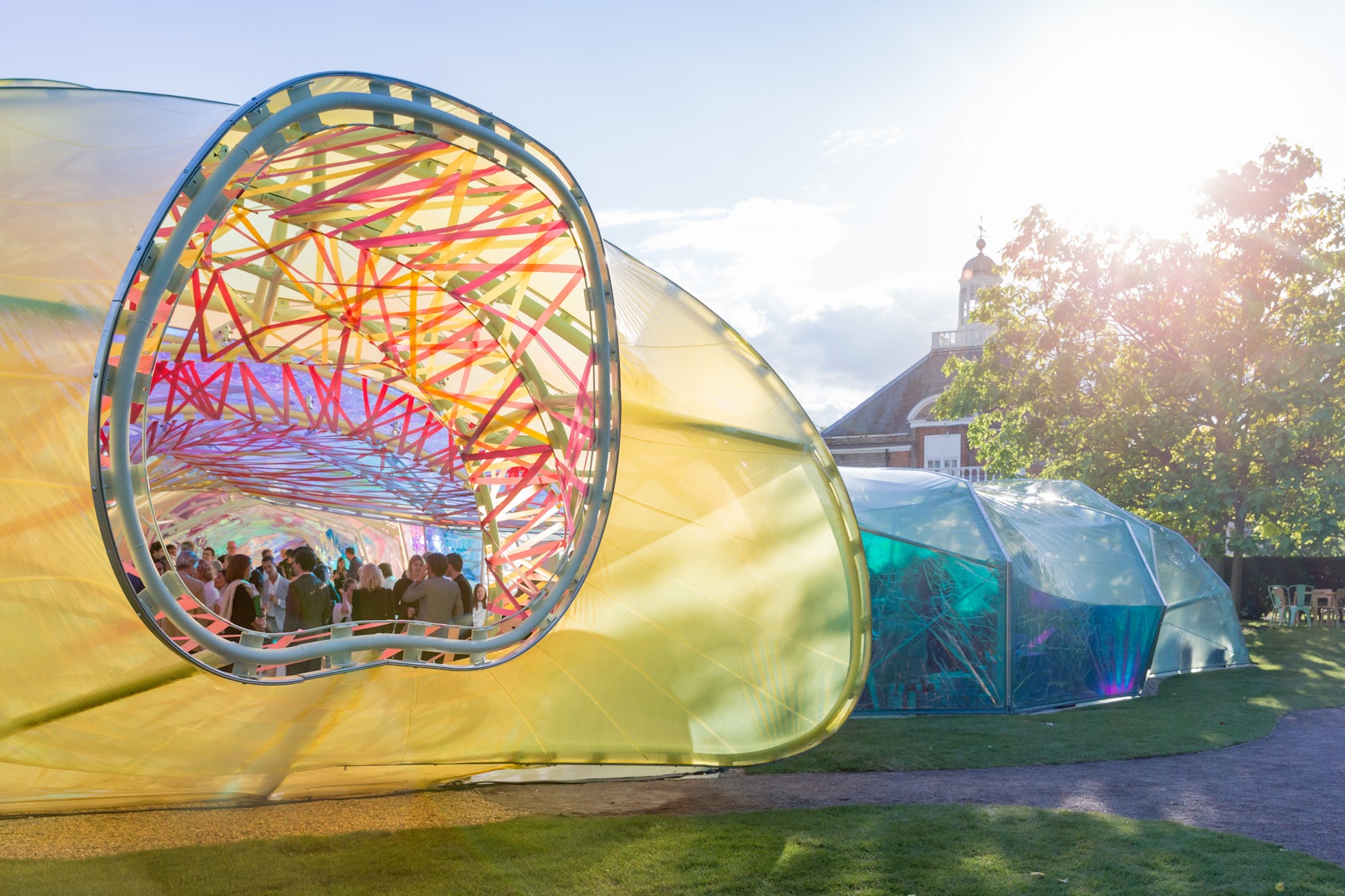
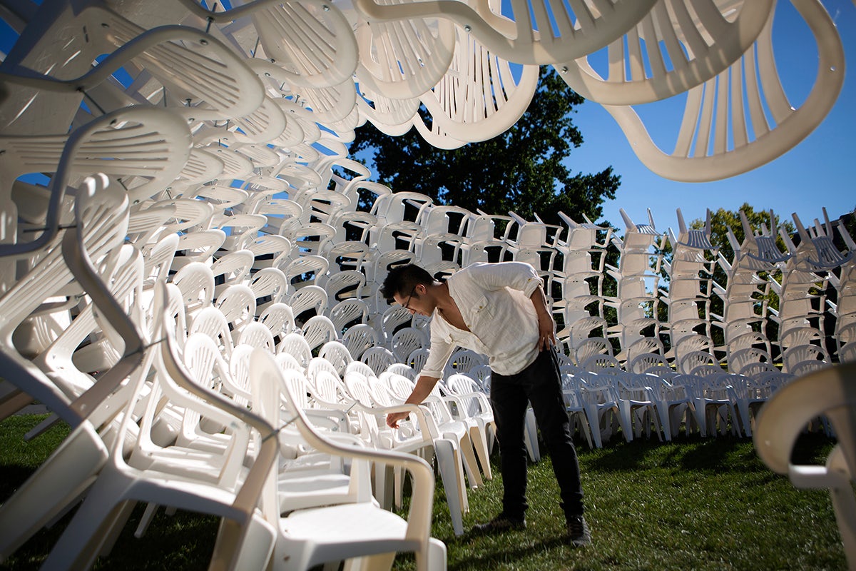
This collection exhibits an emerging wave of plastic expression in architecture. A few years ago, Selgascano’s Serpentine Gallery Summer Pavilion incorporated two layers of vibrantly coloured Ethylene Tetrafluroethylene plastic wrapped around a white steel frame. Meanwhile, URCHIN Impossible Circus by CODA is built from 500 borrowed plastic chairs. CODA’s award-winning work is known for its use of an innovative material palette. By using plastic as a primary material, it is on display in both method and manifestation.
Technicalities aside, these structures are stunning. The material’s translucency allows light to partially pass through it, rendering shapes and shadows that are completely transfixing. Despite the complexity of their construction, these buildings and installations are inviting, playful and retain a sense of lightness. It is easy to fall deeply enamored with these spaces, so go ahead and take a look.
© Iwan Baan
© Iwan Baan
Serpentine Gallery Summer Pavilion 2015 by selgascano, London, United Kingdom
The Serpentine Gallery was built to celebrate the pavilion’s “crystal” anniversary. The concept that selgascano used for this project was pure experience. This meant creating a way to experience architecture through some of its most central elements: “structure, light, transparency, shadows, lightness, form sensitivity, change, surprise, materials, materials, materials.”
© Robert Barker

© CODA
URCHIN Impossible Circus by CODA, Ithaca, N.Y., United States
Urchin aims to question the role of everyday objects and their typical use. Built from 360 plastic chairs, the object’s features are no longer understood in terms of their use (legs, arms, seat) but in terms of their form (spikes, curves, voids). No chairs were harmed in the production of Urchin.

© Plastique Fantastique

© Plastique Fantastique
Aeropolis by Plastique Fantastique, Copenhagen, Denmark
Aeropolis is a 1075-square-foot, single-layer pneumatic structure that has been designed with two optional “tops,” to allow for a maximum amount of mobility and flexibility. The various tops were used during its tour through 13 different locations in Copenhagen. Aeropolis’s take on malleability and plasticity allows it to squeeze into all sorts of peculiar environments.

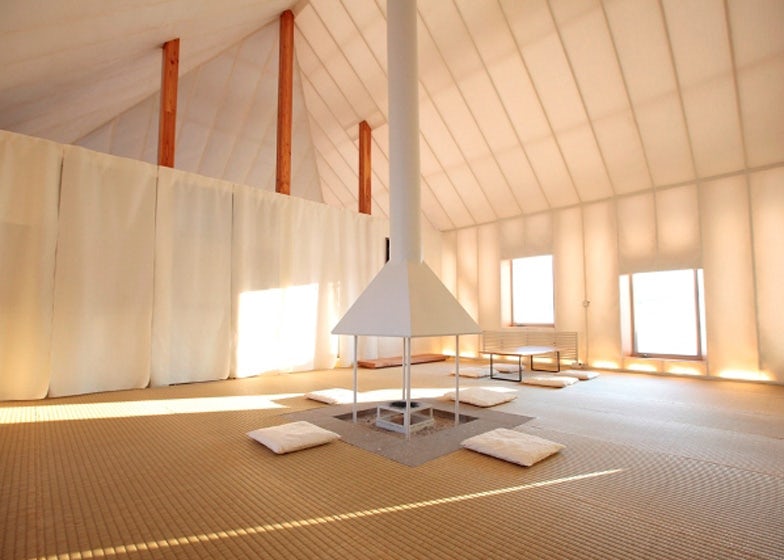
Memu Meadows Experimental House by Kengo Kuma and Associates, Hokkaidō, Japan
Memu Meadows Experimental House was influenced by the traditional “Chise” style of the Ainu people, whose homes were typically built out of bamboo grass in order to insulate heat from a central fireplace. Kuma’s project replicates this with a modern twist. The house uses an efficient light-wall system built from recycled plastic bottles, sandwiched in between two thin membranes. The system locks in heat and refracts light from the central fire, creating light and warmth that is entirely natural.
© VINN PATARARIN X FAHPAV

© VINN PATARARIN X FAHPAV
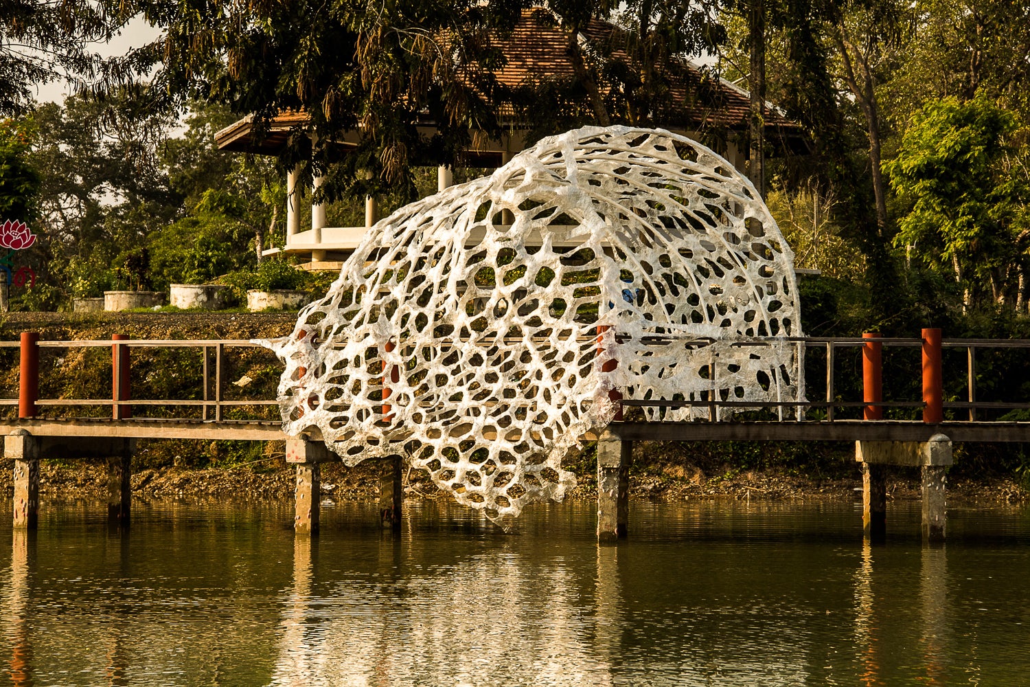
Self-Ornamentalize by VINN PATARARIN X FAHPAV, Doi Saket District, Thailand
Self-Ornamentalize is a multidisciplinary installation that challenges resource limitation in Thailand. As a result of postmodern expansion and change, the area is witnessing an increasing use of plastic products. The plastic bottle was chosen as a primary material because it has become a present day “true local material.”

© Kengo Kuma and Associates

© Kengo Kuma and Associates
Oribe by Kengo Kuma and Associates, Miami, Fla., United States
Oribe is a cocoon-shaped mobile tea room created from corrugated plastic boards, which are fixed together using banding. When the bands are unfastened, the tea room reverts to a collection of cheap materials, making it easy to transport.
© Abedian School of Architecture
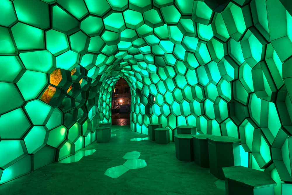
© Abedian School of Architecture
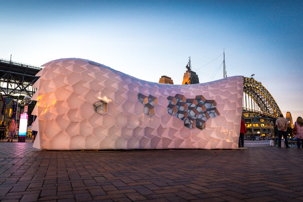
Cellular Tessellation by Abedian School of Architecture, Sydney, Australia
Cellular Tessellation, built for Sydney’s 2014 Vivid Light Festival, uses plastic to create 380 nested cells. As pedestrians travel through the pavilion it emits colored light, creating both spatial and aesthetic interactions. This project uses plastic to create something atmospheric, ephemeral and distinctly experiential.

© Sanrok Studio

© Sanrok Studio
Microlibrary Bima by SHAU, Bandung, Indonesia
The Microlibrary’s mission is to rekindle interest in books by offering a dedicated place for reading and learning. For this project, SHAU used 2000 ice cream buckets to form the building’s façade. The ice cream buckets are cost efficient and are able to let daylight and cross-ventilation pass through. By inclining the buckets outwards, they even work to repel rainwater.
Architects: Want to have your project featured? Showcase your work by uploading projects to Architizer and sign up for our inspirational newsletters.
