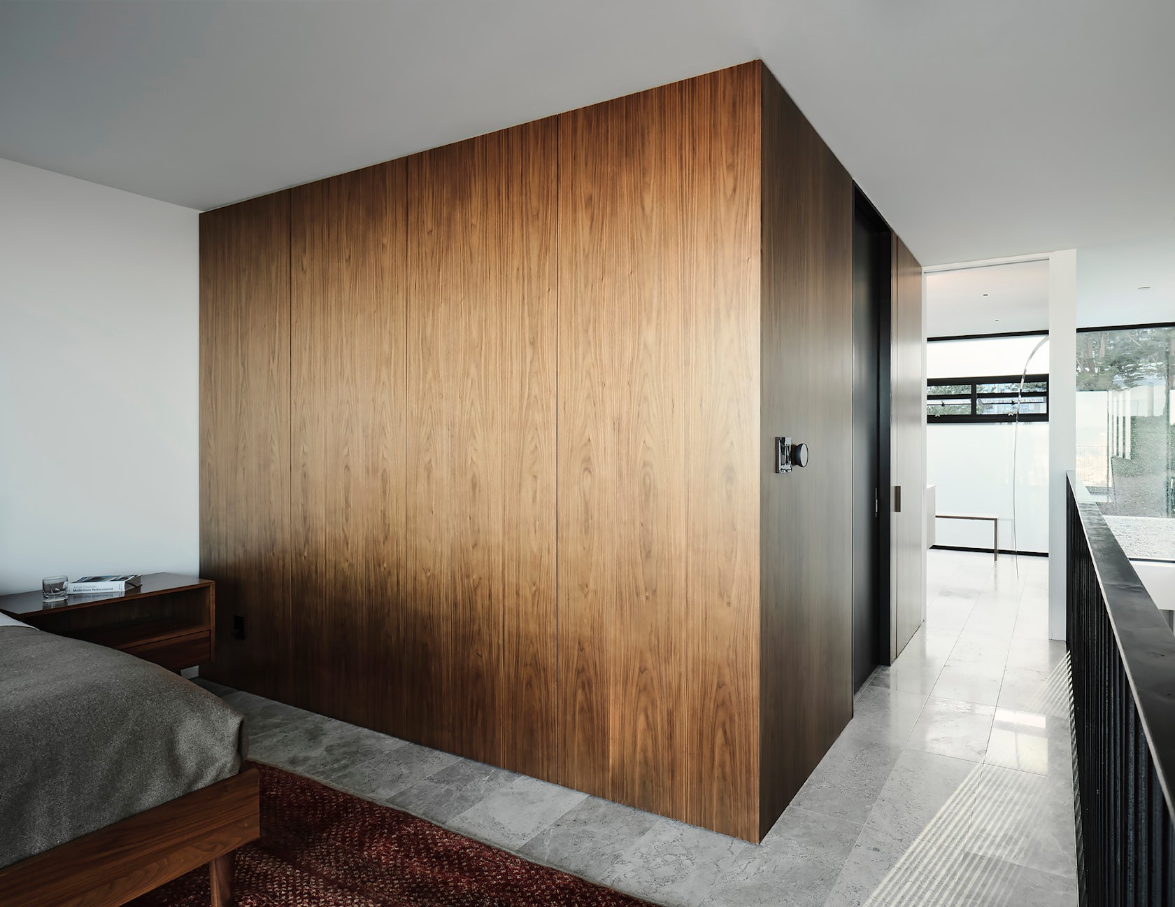
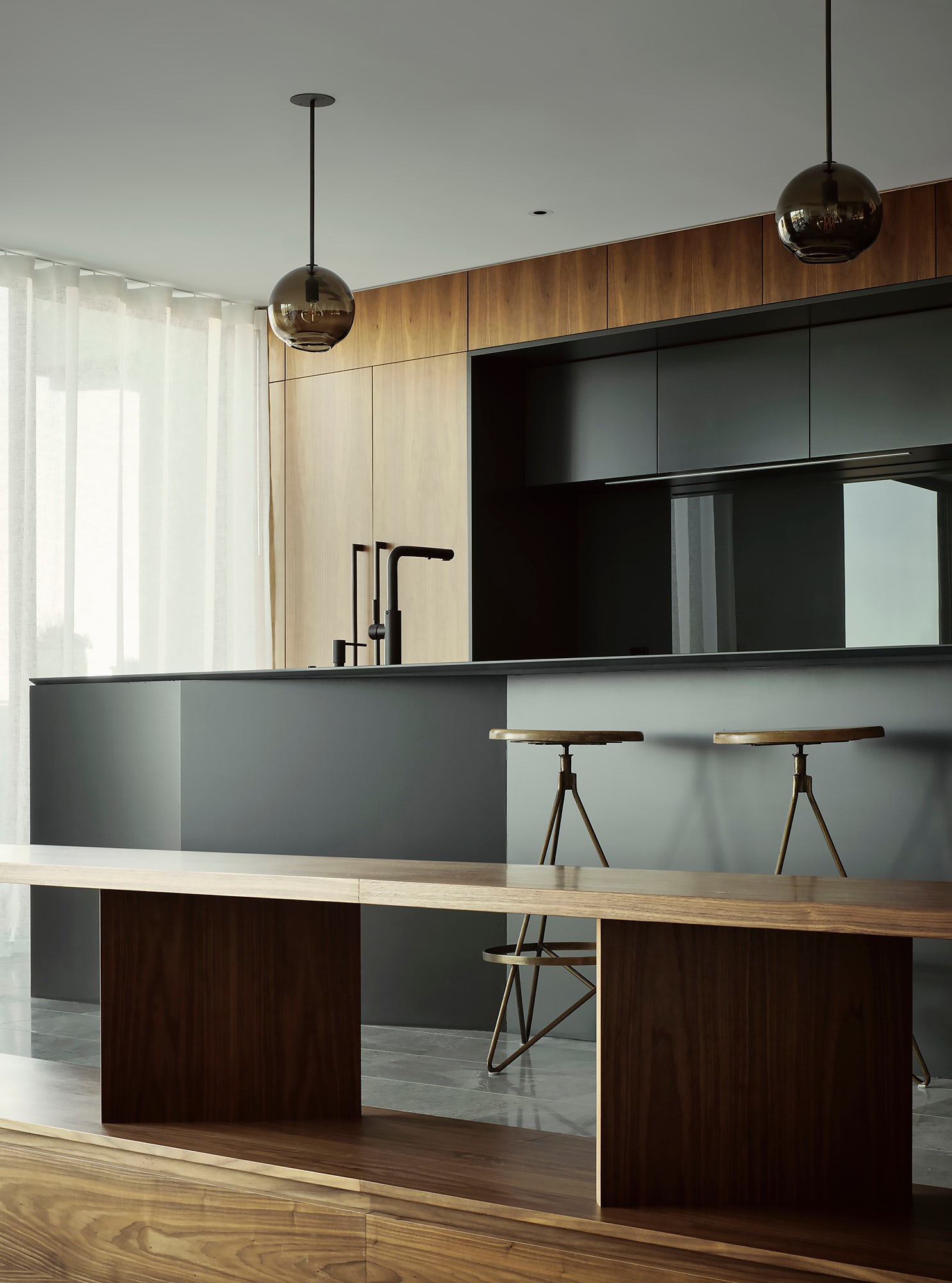
Twin Peaks Residences – We were approached to convert an existing dilapidated single-family residence into a three-unit building. The unique opportunity for this project was to create three distinct residences of different scales and configurations, while maintaining a high level of detailing consideration. By designing a project with a three-bedroom upper unit, a two-bedroom middle unit, and a one-bedroom lower unit, we are creating a unique building type within a city that is starved for thoughtful housing options.
Architizer chatted with Michael Hennessey from MICHAEL HENNESSEY ARCHITECTURE to learn more about this project.
Architizer: What inspired the initial concept for your design?
Michael Hennessey: We initially set out to design a glass box that maximized views to the city below. As each of the three units began to take shape, we evolved this approach to make sure the glazing responded in a specific way to each space at the interior. For example, at the front elevation, the lower levels are quite opaque to address privacy from the busy street. While the upper levels contain a significant amount of glazing where privacy is less of a concern, to bring natural daylight deep into the upper unit. At the rear of the building, each space is framing the view of downtown San Francisco in a specific way. At the lower unit bedroom, a dramatic horizontal window frames the distant view, while at the upper levels, corner glazing is employed to accentuate the sweeping nature of the view.

© MICHAEL HENNESSEY ARCHITECTURE

© MICHAEL HENNESSEY ARCHITECTURE
What do you believe is the most unique or ‘standout’ component of the project?
Each residence has its own distinctive character even though the interior material palette is consistent from unit to unit. Walnut veneer, travertine floors, simple ceramic tiles, blackened steel, and sheer curtains, are timeless materials that tie the entire project together. We take great care to compose these materials in a specific (and hopefully beautiful) way that reacts to each space’s functional considerations. This results in a dynamic project where each space has its own feeling and character, even though the material palette does not vary.

© MICHAEL HENNESSEY ARCHITECTURE

© MICHAEL HENNESSEY ARCHITECTURE
What was the greatest design challenge you faced during the project, and how did you navigate it?
Given the tight dimensional constraints of most projects in San Francisco, developing a strategy for the stairs is a critical challenge that must be resolved early in the design process. On this project we incorporated a strategy of an exterior common stair that serves the three residences. Not only did this create a wonderful experience of being outside while located in the heart of the building, it had the benefit of avoiding a stair penthouse that would have impacted the overall massing of the building. We designed these exterior stairs and one of the interior stairs with perforated metal treads & risers to avoid blocking natural daylight and views. Dramatic shadows are created by the perforations in the afternoon as sunlight pours into the building.

© MICHAEL HENNESSEY ARCHITECTURE
What is your favorite detail in the project and why?
The steel framework at the front elevation that contains the aluminum windows and cement plaster is my favorite detail. It’s a detail that allows the windows to extend past the floor plates and helps to elevate the modest cement plaster into distinct vertical panels. This steel framework is used as an organizing device that also brings subtle depth and shadow lines to the face of the building.

© MICHAEL HENNESSEY ARCHITECTURE

© MICHAEL HENNESSEY ARCHITECTURE
In what ways did you collaborate with others, and how did that add value to the project?
We had the opportunity to collaborate with a skilled builder, Uwe Dobers of Fine European Construction. Detailing a project is a great joy of mine and a point of emphasis at MHA, but no architecture firm has all of the answers on how to bring materials together in a meaningful way. We rely on great craftspeople and engage in a collaborative discussion to resolve the many details within any given project. On this project, Uwe and his team elevated the assemblies beyond our expectations.

© MICHAEL HENNESSEY ARCHITECTURE
How have your clients responded to the finished project?
We had an enlightened client for this project that stayed committed to a high level of design and craft for the project. He now lives in the upper unit of the project and is gracious in his compliments on the design and quality of the spaces. This project lead to a lasting friendship between the client and the MHA team.
Team Members
MHA Team Members: Claudia Merzario, Manuel Vivar-Nieto
For more on Twin Peaks Residences, please visit the in-depth project page on Architizer.


 Twin Peaks Residences


