© Richard Martin
What inspired the initial concept for your design?
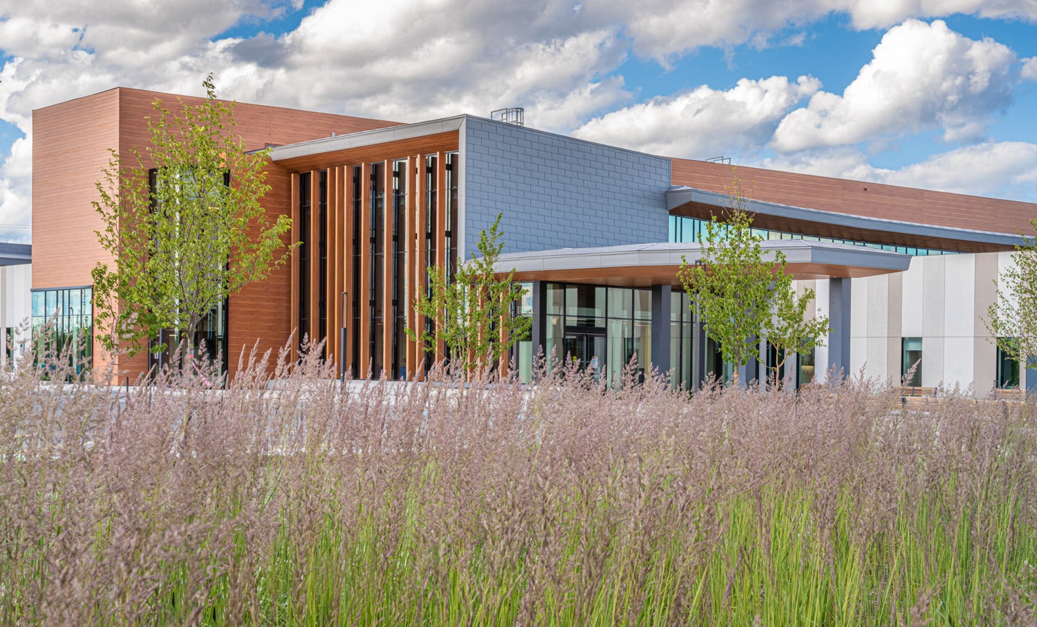
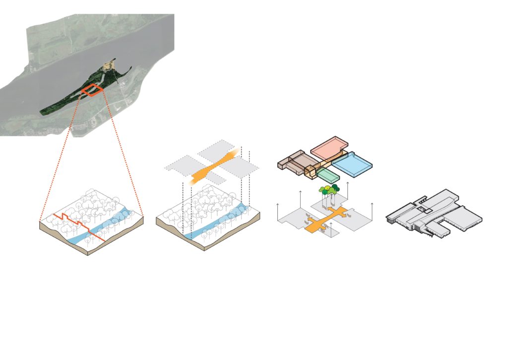
The project aims to increase the biophilic relationship of the region to the adjacent Petrie Island Natural Area. The building’s central public space unites the various collocated partner programs while emulating the natural landscape of Petrie Island, which includes a series of sandbars and canals along the Ottawa River. The visual and spatial association to natural spaces of activity, recreation, and respite in the region informed the materiality of the project to de-institutionalize the of the healthcare setting for patients and the community.
© Richard Martin
What do you believe is the most unique or ‘standout’ component of the project?
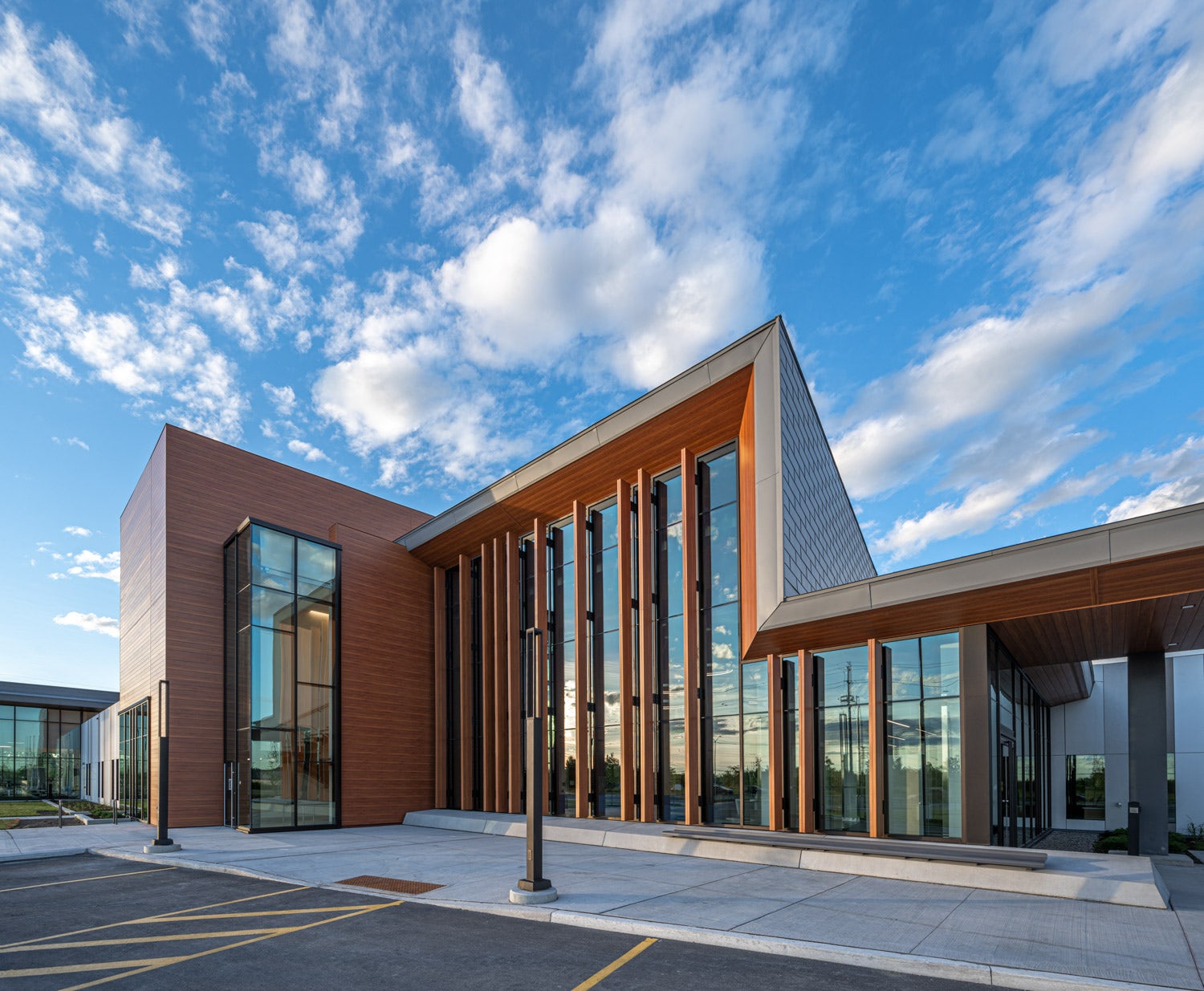
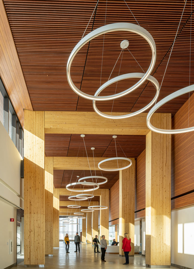
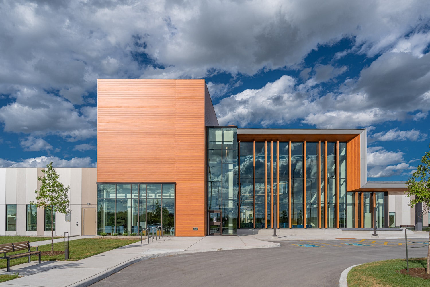
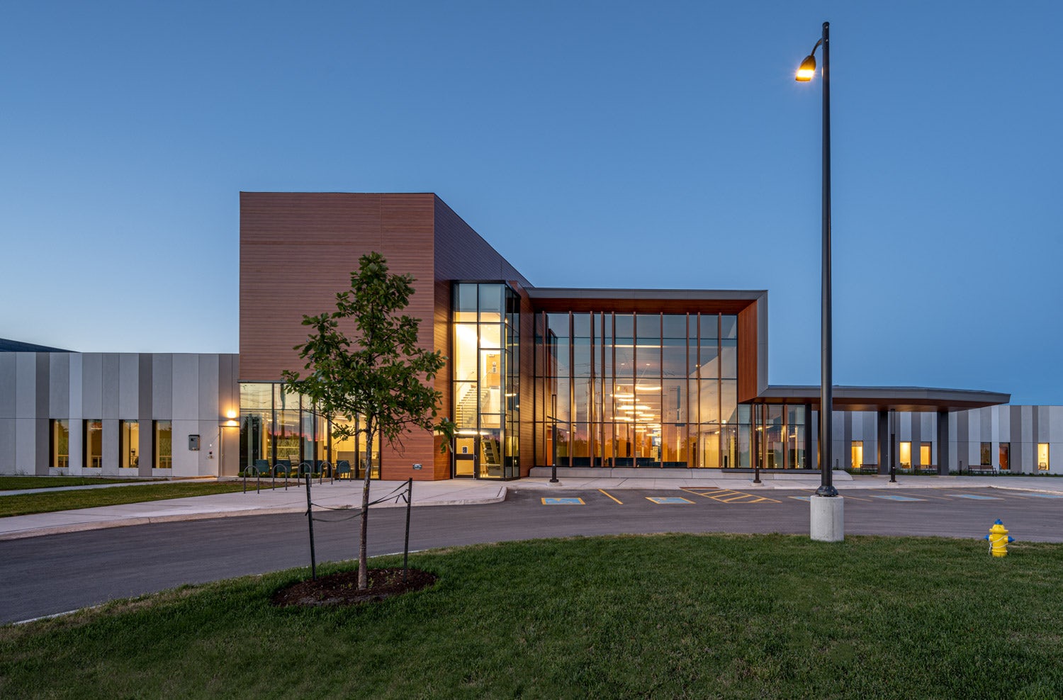
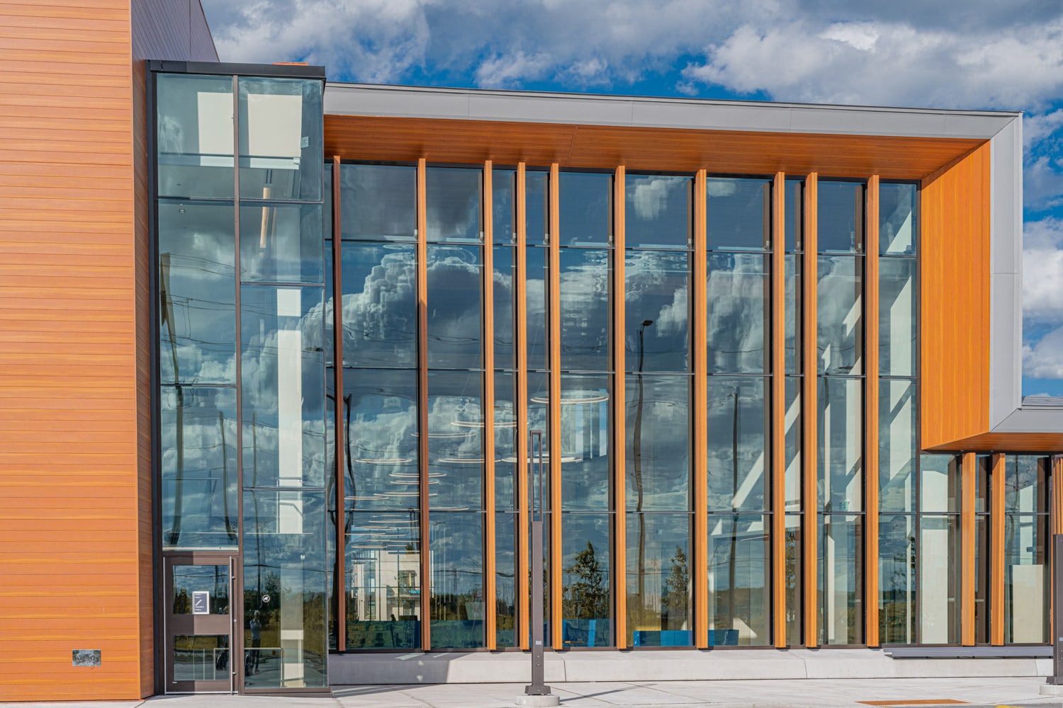
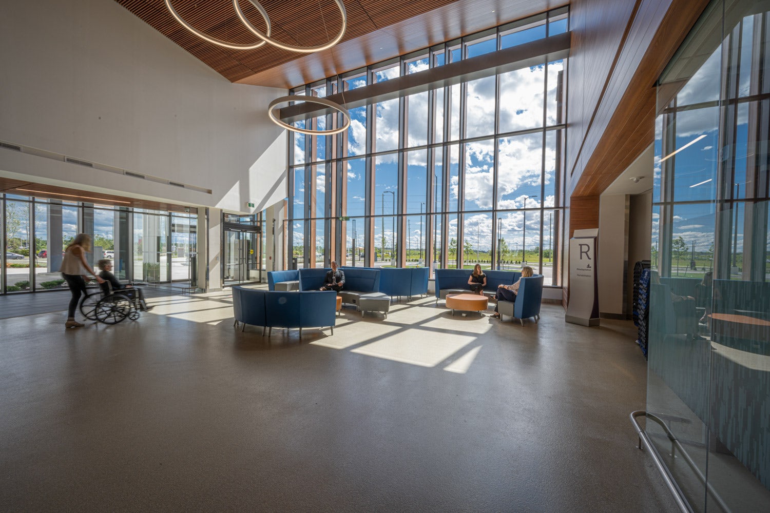
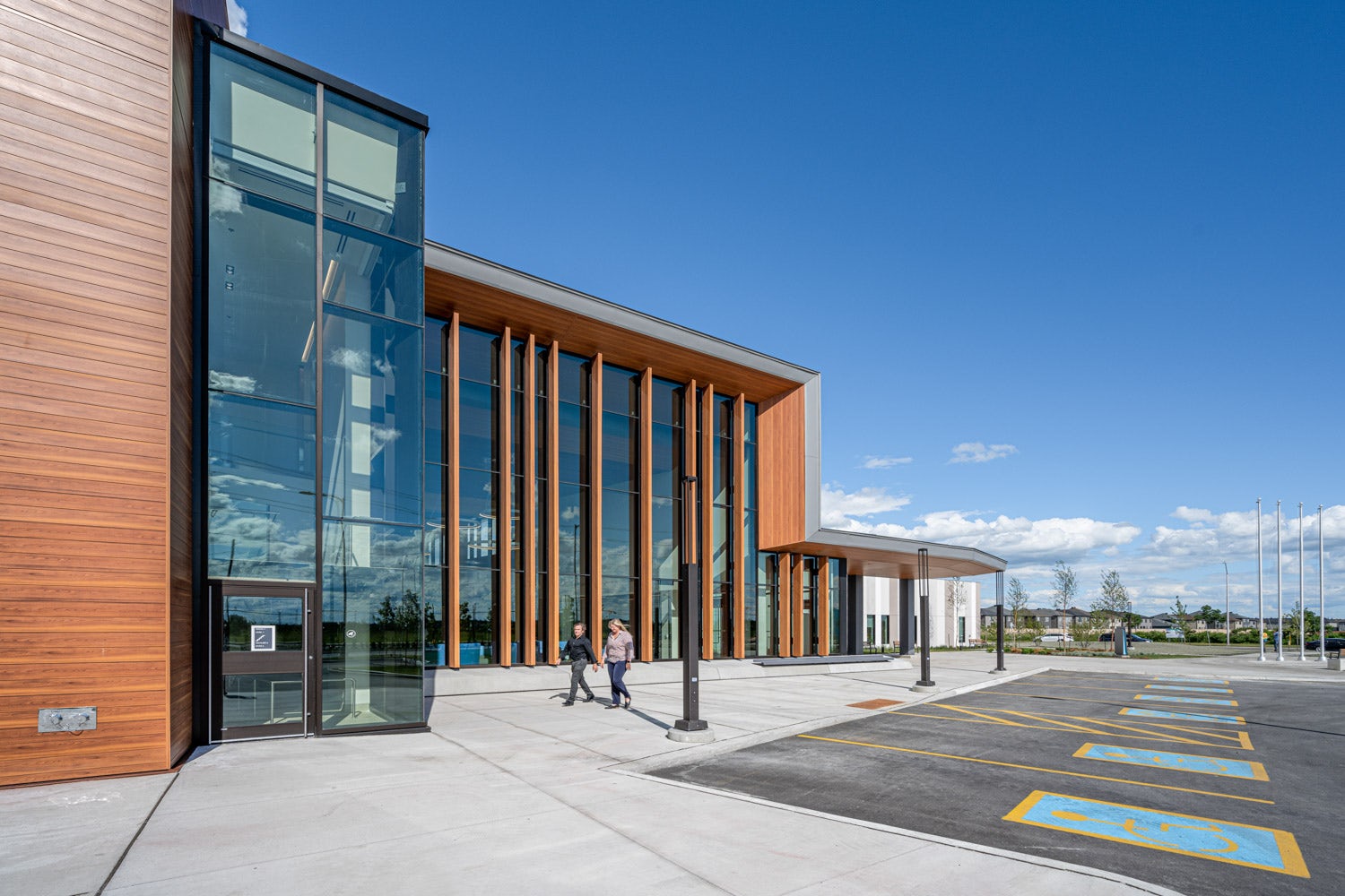
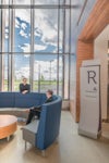
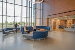
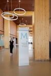
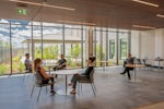
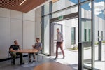
The main hallway is a space that allows visitors and staff to see out in all cardinal directions as a central public spine of the facility; a rare typology in the typically dense healthcare programs and designs in the region. The two-storey mass timber internal structure and the adjacent penthouse – conceived as a carved wooden block – gently curve in unison to frame the primary public space, guiding views back towards the community. The west end of the main hallway develops into a beacon that signals a clear civic presence in the community, as viewed from a busy round about and gateway to the community. Single-storey porches stretching from the main hallway into adjacent three-sided outdoor courtyards offer memorable places to linger and relate to the landscape in all directions.
© Richard Martin
What was the greatest design challenge you faced during the project, and how did you navigate it?
The design of healthcare facilities in Eastern Canada tend to focus on functionality without adequate importance given to how these spaces respond to the human factors and broader concepts of wellness. The project team and distinct institutions that form part of the facility came together to fundamentally change this approach in this first-ever built health hub prototype in the Province of Ontario. Working through multiple governmental agencies in Canada’s public healthcare system, the design team started with a community-focused charette process and presented the case for a stronger connection to the natural realm. This evolved into a place-based approach to the overall design while striving to de-institutionalize the overall program and architecture.
© Richard Martin
How did the context of your project — environmental, social or cultural — influence your design?
The reality of urban sprawl had a profound effect on the design team, given that the project site sits at the gateway to an expanding suburban neighborhood. The site had been stripped of topsoil and left barren without vegetation for some time. The opportunity to create an oasis for the community drove the project team to focus on landscape as a way to recreate a sense of place. The goal thus became to go well beyond the creation of a place for the administration of healthcare and to develop a new sense of belonging for the community. A gathering place for all.
© Richard Martin
What drove the selection of materials used in the project?
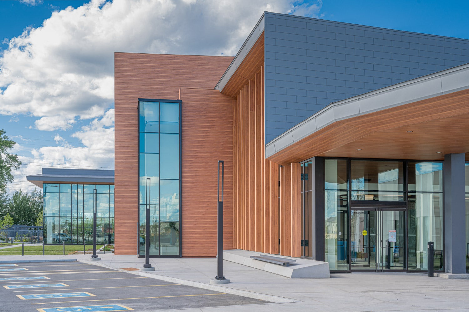
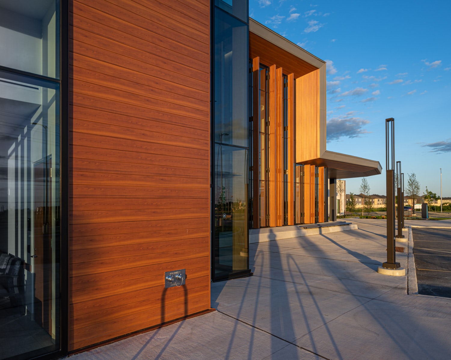
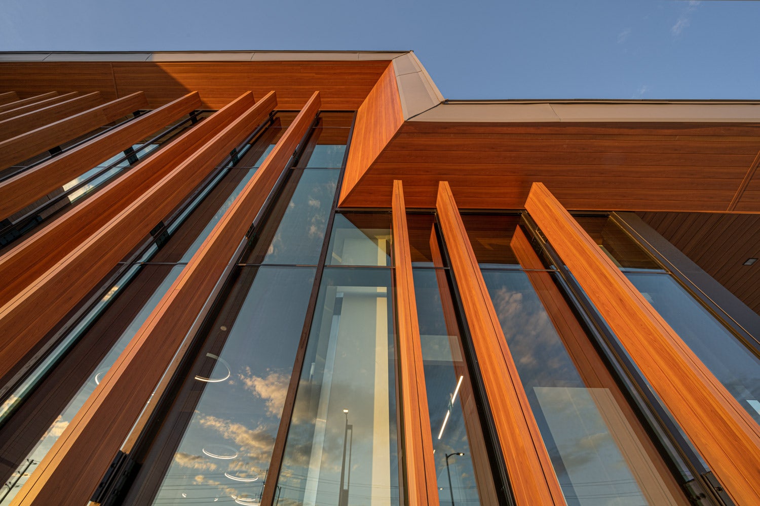
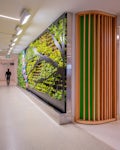
The desire to shift away from typical sterile clinical finishes drove the selection of wood and wood-like materials in the project. The materiality, tied to key volumes and elements in the building, not only offered visual clarity to the overall parti, but allowed for a much more intuitive wayfinding experience. Screens of Douglas Fir surround the waiting areas, wood slat walls and ceilings folding through paths of entry and the monumentality of glulam columns in the main public space all offer varying levels of detail and scale emulating the spaces, rhythms, and textures found on nearby Petrie Island.
© HDR
What is your favorite detail in the project and why?
The undulating Douglas Fir wood screens in the waiting and reception areas encapsulate much of the project in a single detail. The screens relate to the natural elements found on Petrie Island such as the meandering geometry of the canals and the play of light and shadow in the forested areas in how they add dynamism to the space as one walks through the facility. The use of real wood adjacent to areas of respite in the interior as well as complimentary colors help define each program space as welcoming places.

How important was sustainability as a design criteria as you worked on this project?
Sustainability was fundamental to the overall design not only in terms of reduced energy usage and embodied carbon, but also in how the building needed to go well beyond in order to answer to the needs of the community. Striving to combine access to daylight and views to nature while creating an entirely new park-like setting within the neighborhood, the project seeks to integrate broader elements to foster wellness not only in the patients served, but the community at large.

© HDR
How have your clients responded to the finished project?
The client has responded with great pride in the new facility. Upon substantial completion, the community had so completely adopted the facility (before it has even become fully functional) that requests have recently come in to rent the space for weddings – something unheard of with this building typology. Clients who receive care and services at the Hub have reveled in the vastness, cleanliness, comfort, and calmness of the design, which is not typical for a healthcare facility.
© Richard Martin
What key lesson did you learn in the process of conceiving the project?
The group of distinct institutions and the design team came together to realize a truly new prototype for care in the province. Lessons learned throughout the process included consistently maintaining the focus on the overarching idea – and working at each step of the way to balance decisions based on striving for the ultimate goal: to minimize compromises where possible.
How do you believe this project represents you or your firm as a whole?
The project relates directly to HDR’s three design pillars: Toward a Regenerative Future, Community Well-Being and Transforming the Delivery of Design.
In terms of sustainable and regenerative design, the project seeks to minimize its footprint while offering the potential for future transformation with a more regenerative approach. The project went well beyond the brief to give back to the community as a whole and although the project procurement used a standard process in our market, the collaborative approach to the design a project management was transformational in that it allowed for the primary ideas to be reinforced along the way – maintaining the essence of the project to completion.
© Richard Martin
How do you imagine this project influencing your work in the future?
The project offers clear evidence that focused design intent is achievable in the healthcare sector in our region. The Urban Design Review Panel in Canada’s capital predicted that, “…this project will set the bar for design in the region …” and we hope that this positively influences the Authorities Having Jurisdiction as well as the multiple governmental agencies in our region that oversee our public healthcare such that they adopt a deeper desire for design excellence in this market sector.
Is there anything else important you’d like to share about this project?
A quote from the client:
“It is quite spectacular! I remember the 3P session from a couple of years ago and it was really something to see those concepts translated into space. The lighting, colours, wood accents are warm, modern and not institutional. Our design team listened well and translated it into something innovative that I think can become a model for the province.”
Kathy O’Neill, Initial Project Director
© HDR
© HDR
Credits / Team Members
Jason-Emery Groen – Lead Design; Chris Havers – Project Architect; Kerry Clifford – Interior Design; Ingrid Felso – Account Manager; Abel Solana Morales; Dean Mapeso; Jeff Mosher; Shelley Greenaway; Kyle Moore
Consultants
Cleland Jardine Engineering Ltd – Structural Engineers; Smith + Anderson Mechanical and Electrical Consultant; Vertechs Design Landscape Architects

 Orléans Health Hub


