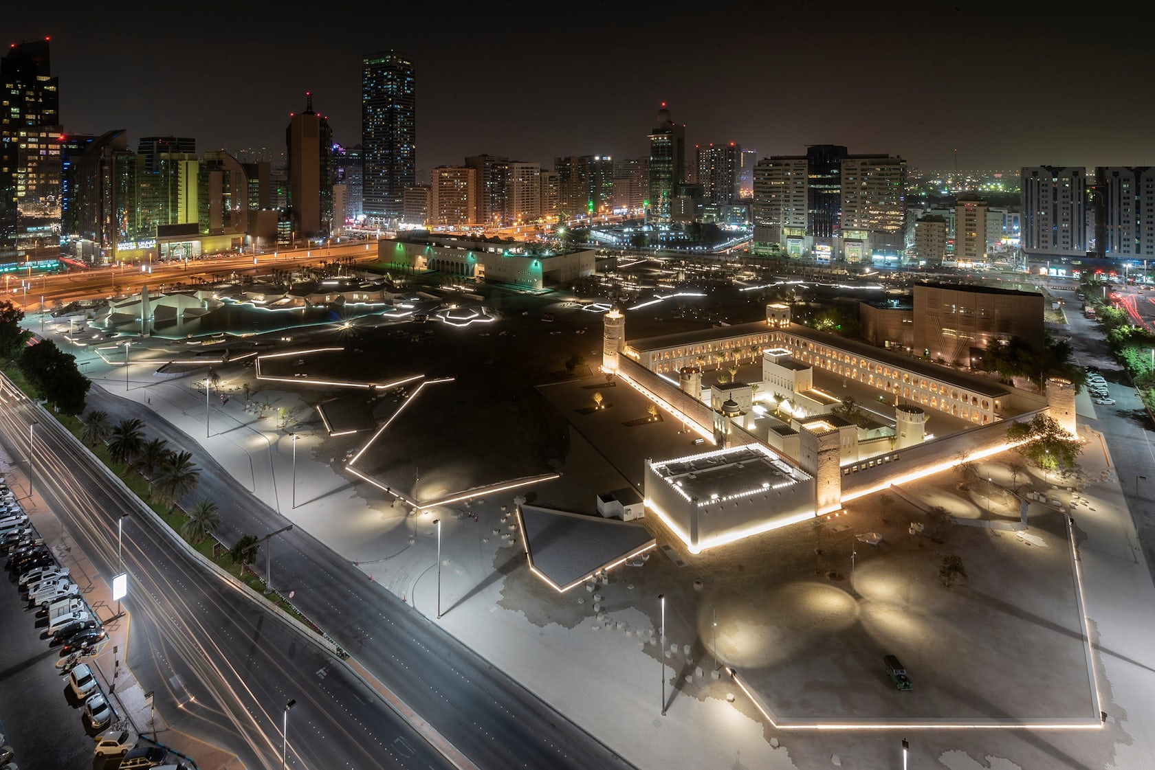
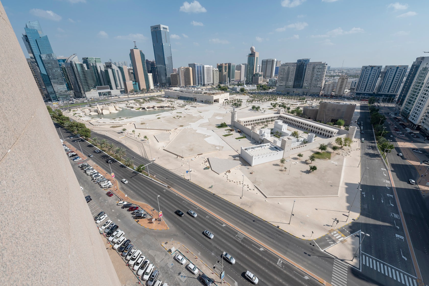
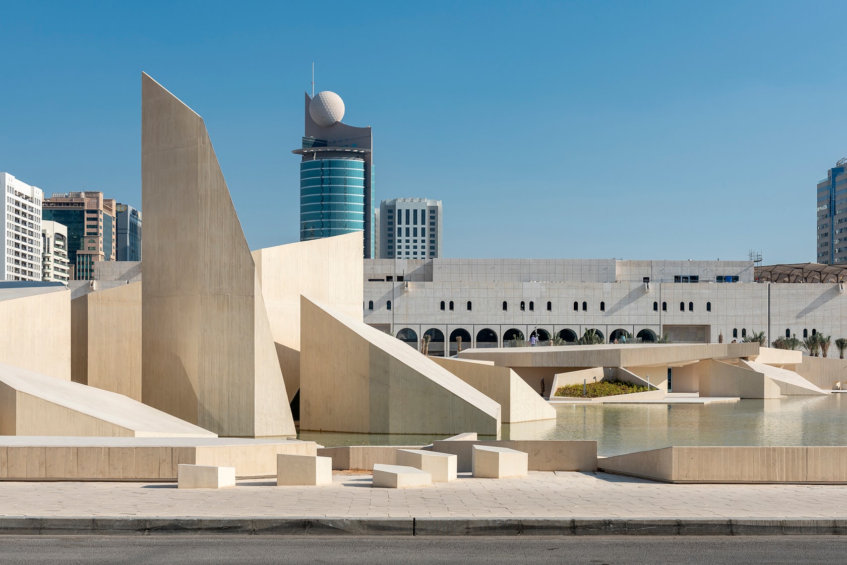
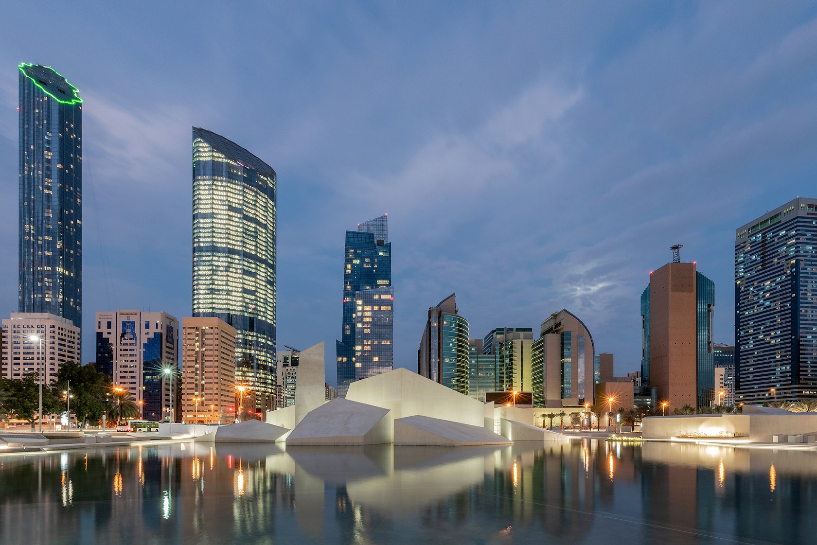
Al Hosn Masterplan and Landscape – The client and stakeholder’s vision was to reinstate the Qasr Al Hosn Fort as an important landmark while revitalizing the nearby Cultural Foundation Building (the CFB) – a modern heritage building of Bauhaus origin – which was for a while considered for demolition. Both buildings are sitting within a 400 by 400-meter plot and we were invited to an international competition with the scope of designing a public heritage park with adequate facilities around the two buildings. In essence, this meant that we had to deliver a somewhat underplayed design that wouldn’t challenge the position of the existing landmarks. Therefore, the new buildings we added were “camouflaged” to merge with the landscape design.
Architizer chatted with Mikkel Frost, founding partner and architect at CEBRA architecture to learn more about this project.
Architizer: What inspired the initial concept for your design?
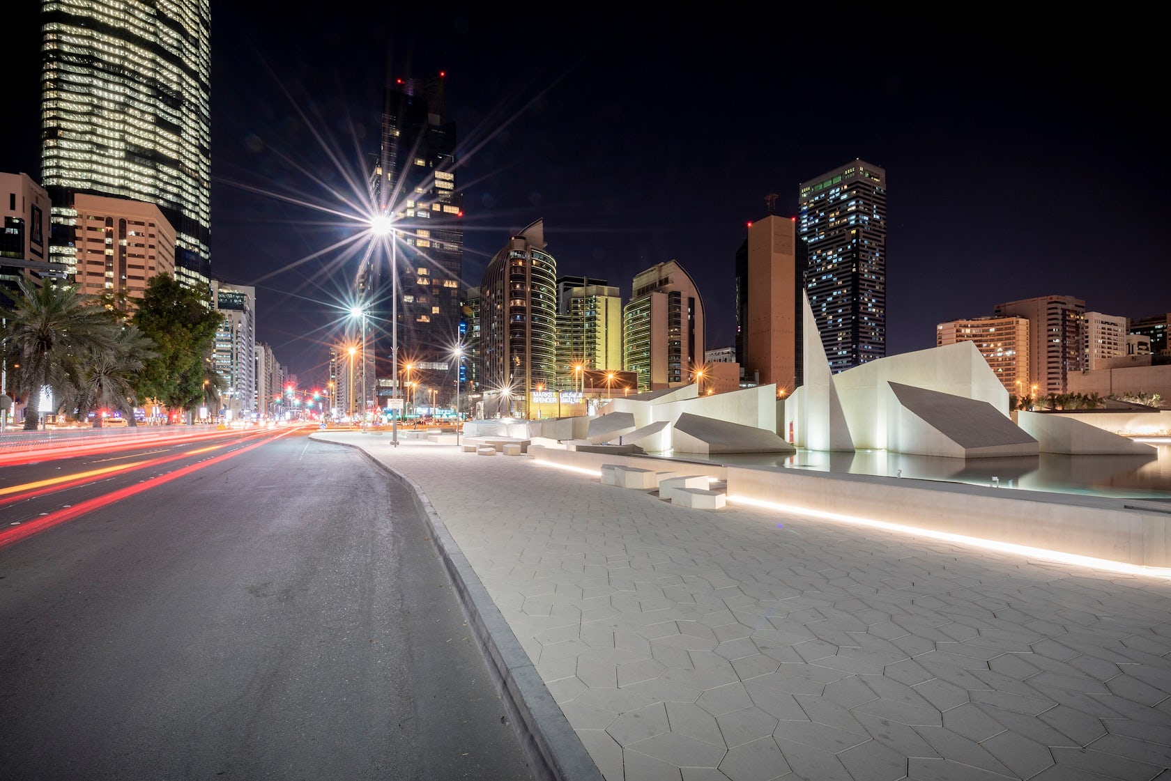
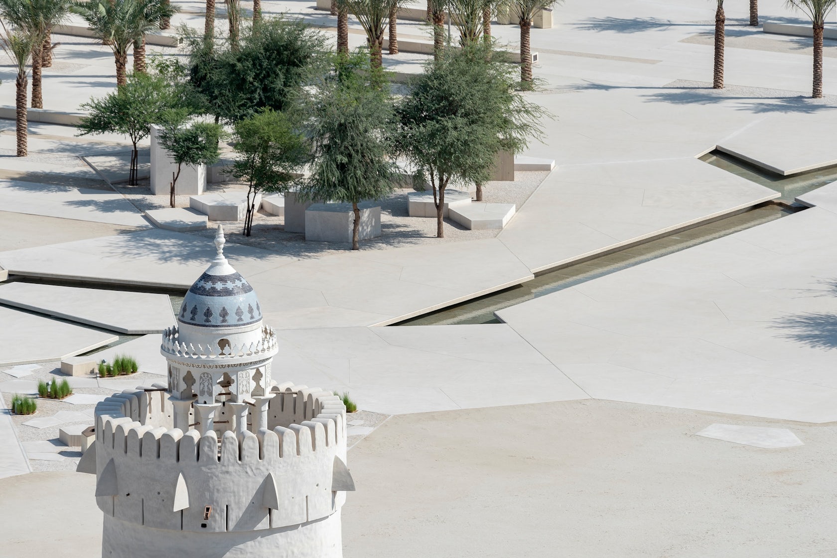
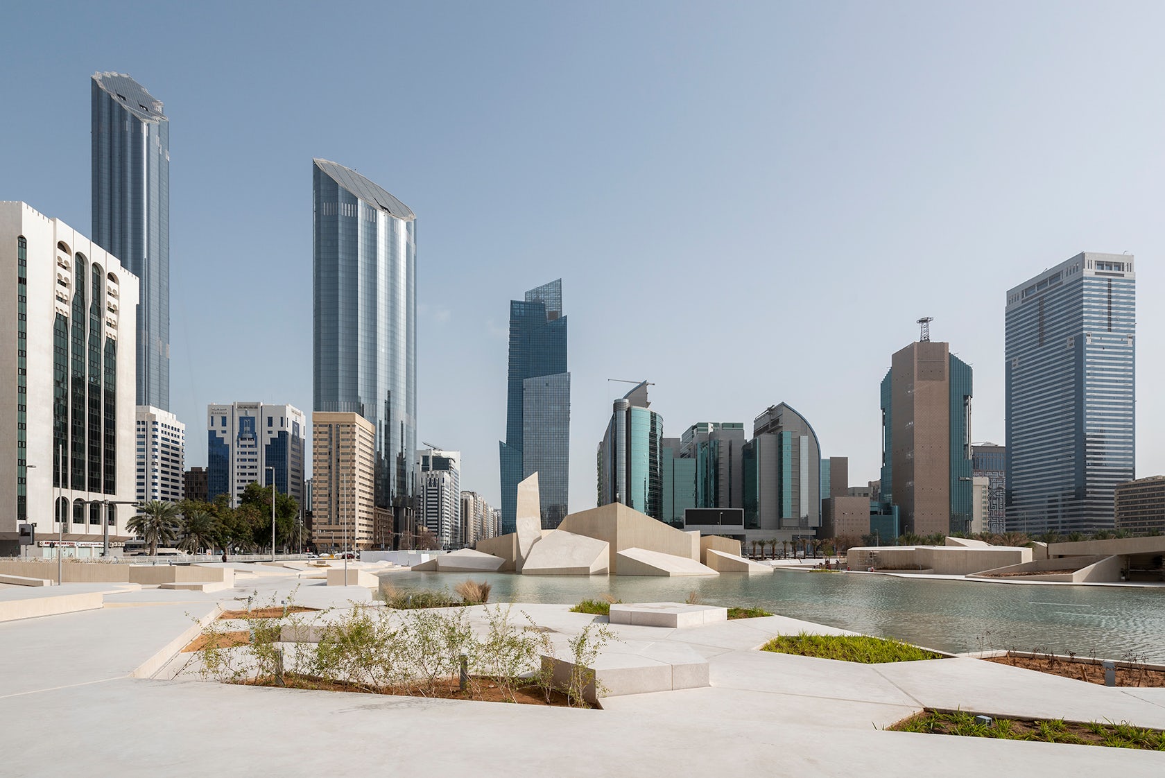
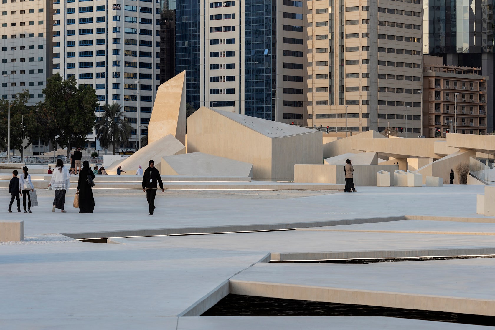
Mikkel Frost: The conditions I just mentioned were the main drivers behind the overall concept. We divided the almost square site diagonally along a “desire line” connecting two important streets of Abu Dhabi. This placed the Fort in one distinctive zone of its own and the CFB in another. The Fort was reinstated as a magnificent object on a sand plane resembling the position it used to have as the first building people traveling to Abu Dhabi would meet after crossing the coastal desert. The area around the CFB contrasts the open sand plane as it is paved and planted with trees offering shade and enhancing the direction of the city grid. To connect with the site on a haptic level as well, we looked for inspiration in the coastal desert. Thus, the geometry of the landscape is based on mud crack patterns and salt flake-inspired shapes throughout the site.
© CEBRA
What do you believe is the most unique or ‘standout’ component of the project?
I’m hoping that the Qasr Al Hosn itself is what remains the key feature of the project, as nothing else on site is supposed to challenge this position. This is where the rulers and the founder of the nation used to reside, so it’s one of the most important buildings in the country, which should be clear for people visiting the place. Among the things we subtly added on site, I believe it’s worth mentioning the Musalla in the north-eastern corner of the park. This little place for prayer is concealed as part of the landscape, but when one enters the building and the halls, a both intimate and spectacular interior is revealed.
© CEBRA
What was the greatest design challenge you faced during the project, and how did you navigate it?
The sheer scale and complexity of the project obviously posed a number of challenges ranging from staff mobilization to coping with the management required, but in the design process itself, we struggled to find the right expression. On the one hand, we needed to be respectful of the heritage buildings and on the other, we had to create an experience. Luckily, we were guided by both patient and insightful people on the client’s side and as soon as we all felt confident about the look and feel of the design surrounding the Fort and the CFB, it was pretty much downhill from there. I’d say that we developed a design system rather than an actual design. Working with the mud crack pattern and shapes – we also refer to them as voronois after the mathematician Georgy Voronoy – is very flexible. They are widely applicable and hold vast potential for variation.
© CEBRA
What is your favorite detail in the project and why?
The project is so big and full of details that it’s hard to point out just one, and both buildings and landscape are so uniform in terms of expression that nothing really stands out. But in the Children’s Library in the CFB, we designed a comic book corner. Here, children can read and even make comic books in a cartoonish setting created with large furniture. The piece stands out like an artwork within the existing building. It’s a surprisingly bold detail in an otherwise quiet design, which is partly why I like it. I’m also a big comic book fan and I’ve found inspiration here for my architectural drawings and the way I visually communicate our ideas. The language of comic books where text and image are combined is powerful because it transcends cultures, so for me, this part of the project represents the international collaboration of the entire scheme.
© CEBRA
How important was sustainability as a design criteria as you worked on this project?
We’ve worked with the local sustainability methodology called Estidama and its Pearl Rating System, which deals with various green components and topics. However, the most visible consequence of this focus has to do with planting. We’ve almost exclusively planted indigenous species to reduce irrigation and maintenance. Furthermore, we decided to “invent” a new and more local park typology with much less vegetation. To a European, a lush park would look very sustainable which makes sense in some climates, but in this region planting requires irrigation, meaning that a park environment with less vegetation is in fact more environmentally friendly. This way of thinking is what led us to develop a more desert-like look and feel. We do have trees there as they provide shade and “soften” the urban space, but not too many and mostly grouped around pocket spaces for rest and contemplation.
© CEBRA
In what ways did you collaborate with others, and how did that add value to the project?
The Al Hosn commission is so far-reaching and complex that most single companies could not undertake it on their own. We’ve had to collaborate with many different experts from all over the world – counting conservation management specialists, botanists and cultural consultants. After a short while, we all forgot that we represent different firms as we worked together on one project, and we started operating as a single entity. In this environment, everybody learns from one another, which is extremely stimulating on a personal level and very beneficial for the design. In the end, it creates a kind of reassurance knowing that the decisions made are based on solid knowledge and experience provided by specialists.
© CEBRA
How have your clients responded to the finished project?
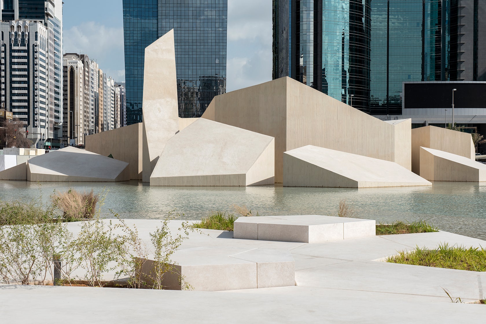
It’s my impression that our clients are generally very happy with the design, and as far as I know the site and its different destinations are very popular. One indication that our clients are proud of the result, is that they are very keen on submitting for architecture awards such as the Architizer A+Awards.
© CEBRA
What key lesson did you learn in the process of conceiving the project?
The key thing here is context. We have always tailored our designs to fit the surroundings and reflect the circumstances, which is why our portfolio has a very diverse expression. In this case, we were a bit slow to understand what was right for the site and in particular how little we had to add not to go too far. It’s the first time we’ve worked in such a historically precious context, and we have learned how important it is to focus on what to preserve and only add very little and to do so with subtlety.
© CEBRA
How do you believe this project represents you or your firm as a whole?
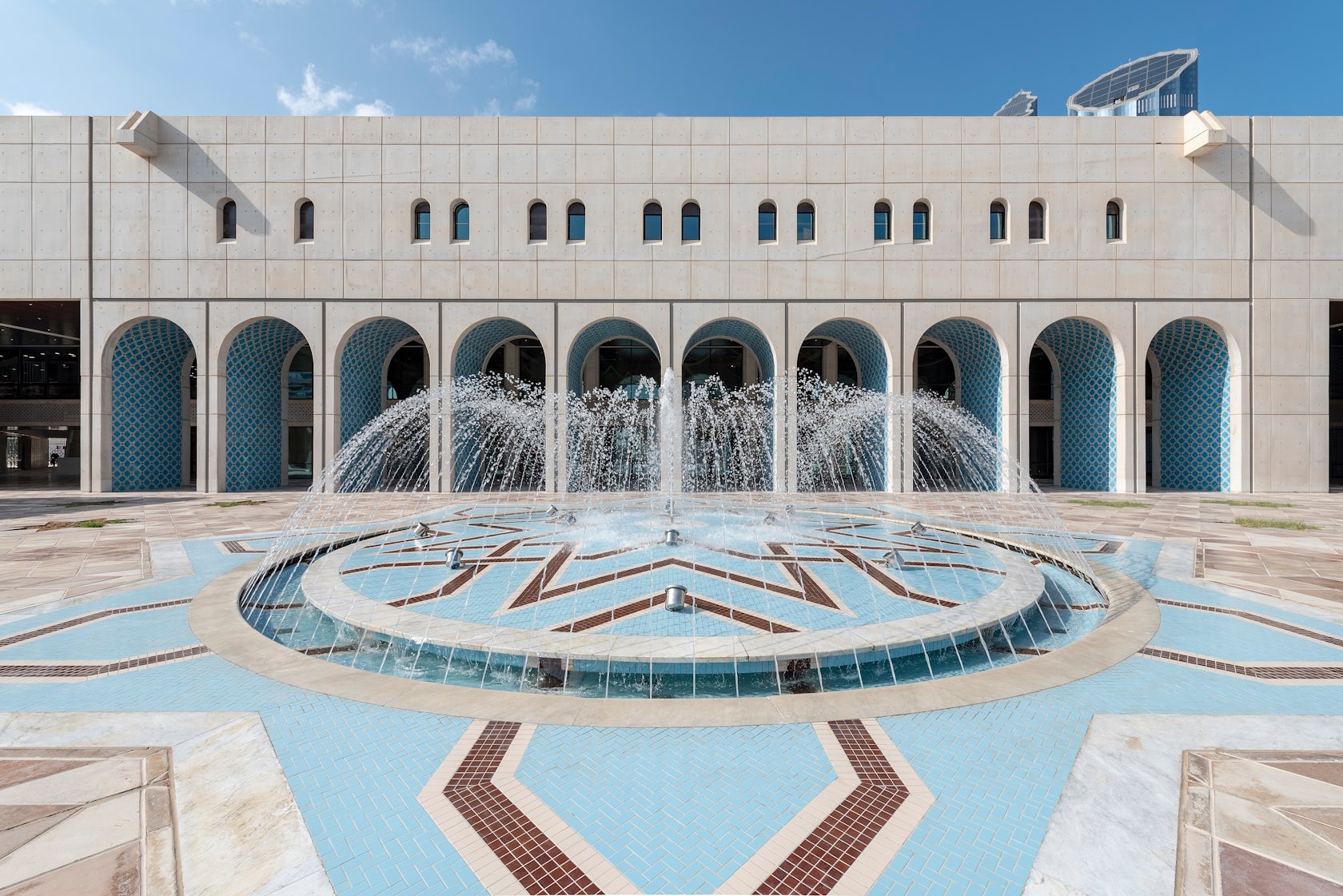
I’d say that, along with a handful of other designs we did over the last 20 years, the Al Hosn project represents our firm very well indeed. The direct connection between a strong and comprehensible idea based on tangible values and the actual expression and materiality, is what we always aim for. Due to the design consequence of the Al Hosn scheme the link between concept and geometry is very visible. Besides the more design-oriented features the project is very people-friendly and informal. I think we managed to create a work of art, which is still very inclusive.
© CEBRA
How do you imagine this project influencing your work in the future?
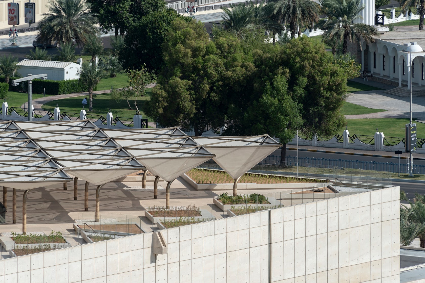
The project has rocked the boat in many ways – there are many things learned that we´ll bring along with us. One thing that working in Abu Dhabi has brought to our attention is how climate can and should impact architectural designs. Since we grew up in Denmark where the weather is mild, we never considered it much. But as temperatures and humidity are sometimes quite extreme there, we simply had to take them into account. And then we started looking into it in other places as well. In the end, this topic has to do with sustainability, as simple measures might reduce the total energy consumption of our buildings. This is something our forefathers knew, but as technical solutions were invented we forgot about all the low-tech solutions that make buildings comfortable without the use of electricity. This project kind of woke us up, and now we explore these things with great enthusiasm.
© CEBRA
© CEBRA
Team Members / Consultants
CLIENT: DEPARTMENT OF CULTURE AND TOURISM – ABU DHABI (DCT ABU DHABI), PLANT SPECIALIST: SLA, ENGINEER: GHD, SIGNAGE AND WAYFINDING: KOSSMANN.DEJONG, CONSERVATION MANAGEMENT PLAN: PRODENKMAL
For more on Al Hosn Masterplan and Landscape please visit the in-depth project page on Architizer.


 Al Hosn Masterplan and Landscape
