
Showcase your visionary architectural concepts: The 2026 Vision Awards features categories that reward UNBUILT projects presenting bold ideas for the future of architecture. Take advantage of early bird pricing before April 17th.
Successful architectural visualization artists often stress the importance of looking at photography, film and, most importantly, nature for inspiration. Photography is regarded as not only essential for creating accurate materials and lighting, but also as an indispensable tool for better understanding composition, framing and atmosphere. This, next to exploring physical qualities of the real word, is seen as the crux of photorealism.
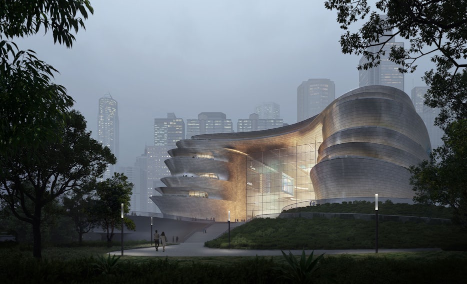
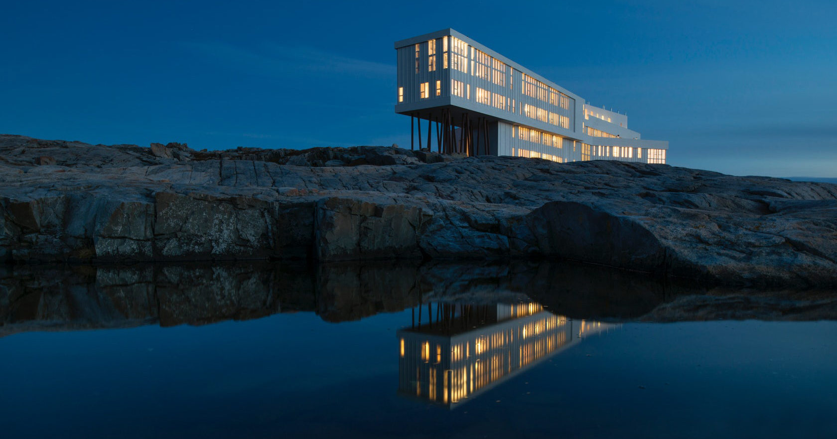
Those who establish a recognizable style go beyond photorealism. They create attractive images that don’t look overtly presentational, but provide an emotional context for spaces that goes beyond desirability. This is the goal of those entering Architizer’s One Rendering Challenge, which tasks entrants with telling a story about architecture through a single rendering.
This evocative quality of CG images gives 3d artists a role that, to a degree, combines those of a film director of photography and production designer. Comparatively more restricted, creative choices made by visualization artists do touch upon a number of visual elements shared with the film medium — lighting setup, point-of-view (POV), lens focal length, assets and materials, to name a few. In the case of architectural animation, this can include various steps of post-production–editing, scoring, sound design, color correction and grading.
After combing a list of over 50 films, I’ve chosen nine which should work as great sources of inspiration for 3d artists.
Lighting


Barry Lyndon (1975) by Stanley Kubrick
Lighting a 3d scene is an art form in itself and can make or break a perfectly modeled, blocked, shaded and textured scene. There are some great examples of visualizations lit using a single, high-quality HDRI. Stanley Kubrick’s Barry Lyndon is proof that keeping things simple when it comes to lighting can produce stunning results.
Many scenes in Stanley Kubrick’s Barry Lyndon resemble a series of tableaux vivants, staged shots that call to mind the Romantic painting style of Thomas Gainsborough, John Constable and Sir Joshua Reynolds, but also French painters like Watteau and Italians like Zoffany. Shot using only natural light, Barry Lyndon portrayed 18th-century England like it has never been seen before on the big screen–almost like a documentary of the period.
For the famous candlelight scenes, they used 50mm lenses with an f-stop of 0.7, the lowest ever recorded in film, with incredibly shallow depth of field. Together with his long term collaborator DOP John Alcott and renowned production designer Ken Adam, Kubrick used visual restraint to create some of the most beautiful, painterly shots in cinema history.


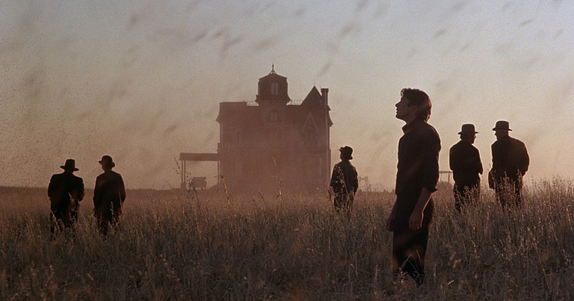
Days of Heaven (1978) by Terence Malick
Considered by many the most beautiful film ever made, Terence Malick’s Days of Heaven is a sort of elegiac reverie in which the gorgeous Texan prairies and yellow wheat fields come to life. It was shot mostly during “magic hour”, when the light isn’t harsh and doesn’t cast strong shadows. Cinematographer Nestor Almendros almost completely eliminated artificial lighting and, together with Malick’s visual acuity, captured both stunning panoramic views–perhaps the best shots of rural America since John Ford– as well as intimate close-ups in which you can see individual wheat stalks.
In his book “A man with a camera”, Almendros described his approach to lighting:”I believe that what is functional is beautiful, that functional light is beautiful light. I try to make sure that my light is logical rather than aesthetic.” This is a fantastic reminder of the fact that light is not a decorative element of an image or frame, but a powerful chisel with which an artist sculpts space.

The Revenant (2015) by Alejandro González Iñárritu
Unlike its implausible storyline, which follows Leo DiCaprio as he makes his miraculous recovery from being mauled by a grizzly bear, the shots of natural scenery in Iñárritu’s The Revenant are incredibly immersive. Cinematographer Emmanuel “Chivo” Lubezki, who also worked as DOP on Malick’s Tree of Life, used natural light, which constantly changes, to underline the transformation of nature as one of the main themes of the movie.
Beside the beauty of the landscapes, the film is a great example of choosing the right tools for the task. Up until The Revenant, Lubezki had been shooting mostly on film. Because of the changing lighting conditions, and absence of artificial lights, Lubezki needed cameras with a high dynamic range and sensitivity to light to get a extra latitude in the shadows at dusk, dawn and night scenes. This motivated him to shoot digital.
Point-Of-View
POV is the element with which architectural visualization artists experimented the least. Cameras are usually positioned at eye-level to provide a wide or ultra-wide angle of an interior in order to show off as much of the design as possible. While this uninspired choice can often be attributed to client demands, there are many images out there to prove that an unusual, “restrictive” POV can make the strongest visual impact and capture the essence of a project.


Tree of Life (2011) by Terrence Malick
All of Malick’s films are filled with beautifully shot scenery, but what makes Tree of Life particularly interesting is the way the director lets us see the world through a child’s perspective. This approach gives the images, shot by Emmanuel Lubezki, a more visceral quality, an innocence that brings back memories of first encounters with rain, and the tickling sensation of running fingers through tall grass.
Malick reminds of the power of POV to shape how the seen is perceived and reimagined. Also, it’s a great opportunity to re-tune our senses to what objects and natural elements feel like, so we can be aware of their tactile qualities when trying to capture them in 3d, and tall grass is nowhere in sight.


Enter the Void (2009) by Gaspar Noé
Gaspar Noé’s Enter the Void plays out from the perspective of the drug-addled main character’s afterlife. As his soul drifts into Tokyo night and passes between different levels of being, the camera wafts over the city and into buildings, breaking conventions of camera movement, cutting and composition. Looking like a psychedelic x-ray of Tokyo, the film becomes a compelling formal exercise in capturing neon-lit cityscapes. Neon is getting back in style, from Nicolas Winding Refn recent nods to the 80’s aesthetic, and films like Tron, Beyond the Black Rainbow and 2046.


The Shining (1980) by Stanley Kubrick
Sometimes, seemingly subtle changes in angle, framing and color palette can make a huge impact on how a scene, both static and moving, is experienced. While movie camera angles run a much larger emotional gamut, from highlighting the discrepancy of power between characters to accentuating inner emotional tension, camera angles in 3d stills and animations in particular also have an important role in how a space is experienced.
In The Shining, the POV constantly shifts between the three characters, often relying on wide shots and one-point perspective that’s slightly removed from the character. This distanced POV strengthens a sense of isolation. Long gliding steadicam shots create a hypnotic rhythm as if being in a dream state. Together with the labyrinthine layout of the Overlook Hotel, these shifts of POV create the effect Kubrick was after-one of isolation and dread.
Assets


Only Lovers Left Alive (2013) by Jim Jarmusch
Jim Jarmusch’s modern-day vampire romance “Only Lovers Left Alive” is a great study on storytelling through set design. Berlin-based production designer Marco Bittner Rosser designed the film as a pastiche of different historic and cultural references which reflect the personalities of the main characters- two vampires engaged in a centuries-old love affair.
Vintage furniture pieces sit next to modern musical equipment in Adam’s house. Adam’s wall is covered in portraits of icons — from Buster Keaton to Joe Strummer. If you look closely, you can see it’s an eclectic group of people — Bach, Kafka, Poe, Screamin’ Jay Hawkins, Gustav Mahler, Tom Waits, William S. Burroughs, William Blake and Nikola Tesla. Shot in a Caravaggesque chiaroscuro, the interiors reflect Adam as a disaffected recluse.
Eve’s house is the light to Adam’s darkness. Adam’s colors are blues, greens and blacks, while the color palette for Eve’s house is softer and warmer. This visual dichotomy extends to the chosen shooting locations, Detroit and Tangier.
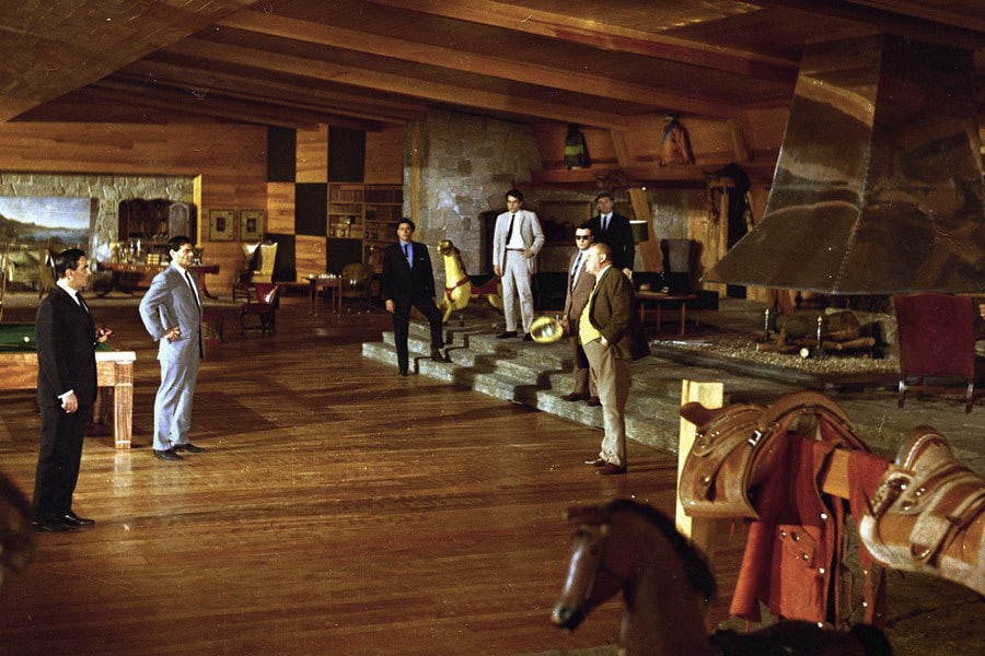

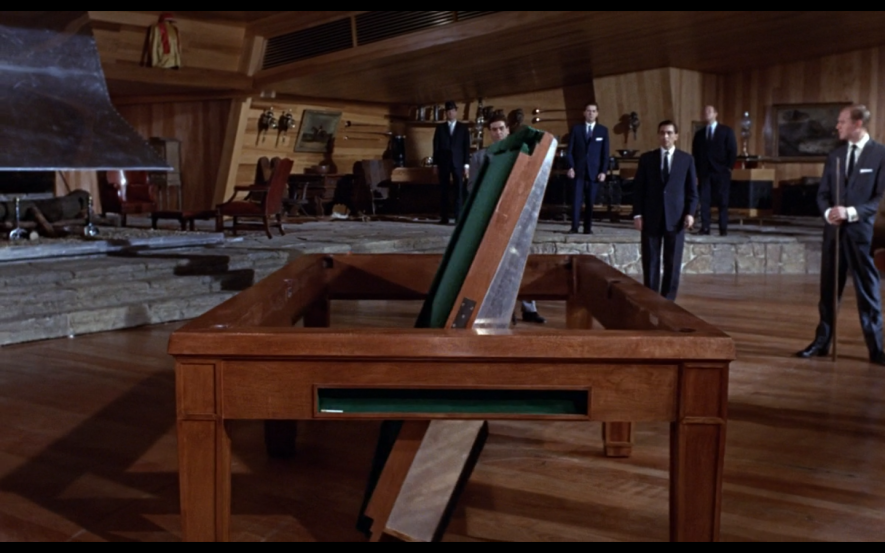
Goldfinger (1964) by Guy Hamilton
Every once in a while, I see a 3d image of a luxury interior design that screams “villain lair”. This archetype was largely defined by Ken Adam’s designs for the James Bond films. One of the most memorable sets in Goldfinger is the residence of the main baddie, a rich gold smuggler, avid golfer and owner of a stud farm.
The Rumpus Room is dominated by warm wood, monumental stainless-steel fireplace and several references to horses–horse-shaped lamps, a wagon wheel and horse tacks. There is also the classic Bond gadgetry such as a retractable wall-size aerial map, a pool table that transforms into a secret control panel, and a floor segment that slides open to reveal a model of the Fort Knox.
Ken Adam’s designs on Bond movies have defined the idea of a villain’s lair, just like the duplex in The Breakfast at Tiffany’s has become a cultural classic and an example of nonchalant sophistication.
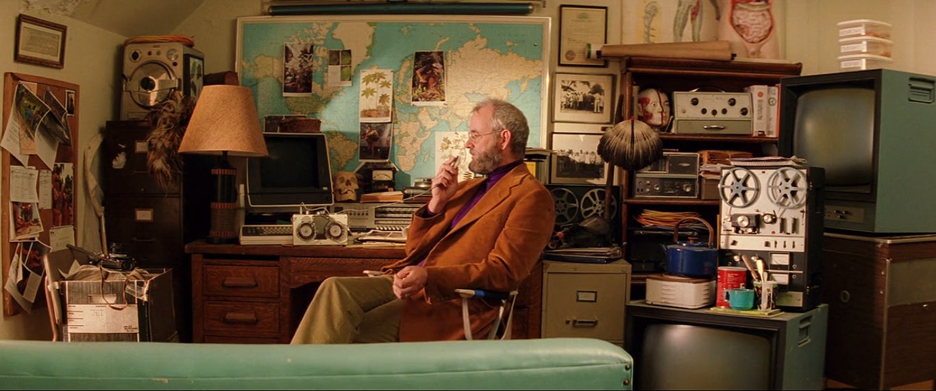

The Royal Tenenbaums (2001) by Wes Anderson
Wes Anderson’s sets and costumes often reveal more about his characters than the writing, acting or plot combined. Adidas tracksuits, vintage sneakers, fur coats, tweed jackets, adventure books, rotary phones, registers, and turn-of-the-century leather suitcases are some of the elements of a highly stylized approach to set design.
The story follows a family of geniuses-a former tennis star, business enfant terrible and reclusive novelist, all accompanied by consistent visual themes. The film starts with a tour of the Tenenbaum house to make us understand who the characters are. While the visuals in Wes Anderson’s films often overpower all other elements of his films, they are so attractive and carefully curated that it’s difficult not to be drawn into his universe. This consistency and meticulousness is a fantastic example of how you build a character through visuals.
Showcase your visionary architectural concepts: The 2026 Vision Awards features categories that reward UNBUILT projects presenting bold ideas for the future of architecture. Take advantage of early bird pricing before April 17th.