Byron Cai is the lead editor at Archi Hacks, a platform dedicated to architecture visualization, portfolio, and design tips and tricks for students and professionals.
Duy Phan is the winner of the Ronen Beckerman TMRW 2020 Challenge and his project “Orchard Jenga” was honored to win two out of ten best-commended entries from One Rendering Challenge by Architizer.
I first came across Duy Phan’s work while browsing through the finalist gallery of Architizer’s One Rendering Challenge. His images immediately stood out to me for their bold expression of color and uniquely crafted narratives.
I would describe his style of visualization as ‘hyperrealism’; the prefix “hyper” being defined as above-and-beyond or ‘enhancing reality’. Robin Eley, Nathan Walsh, and Emanuele Dascanio are excellent examples of hyperrealist artists.
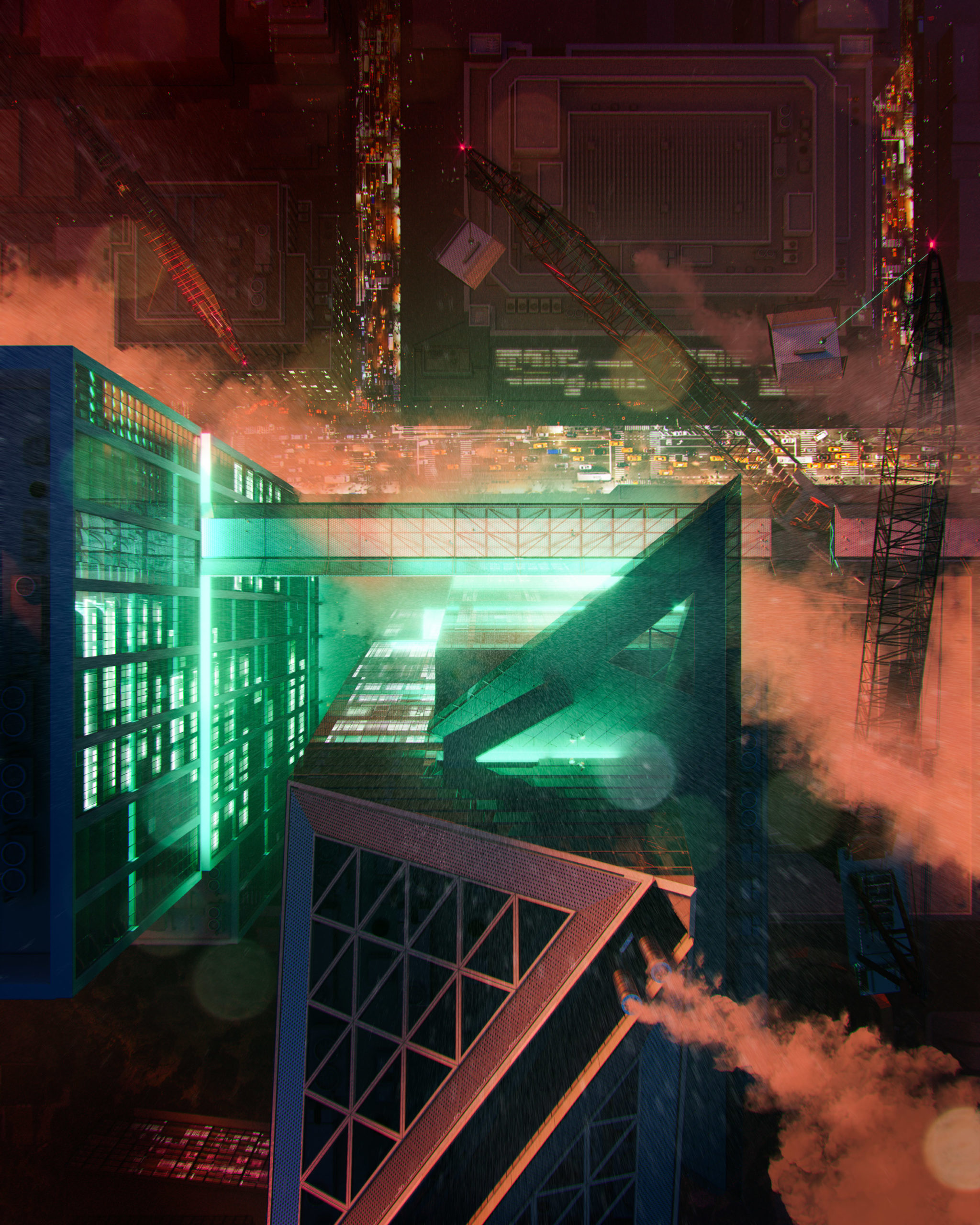
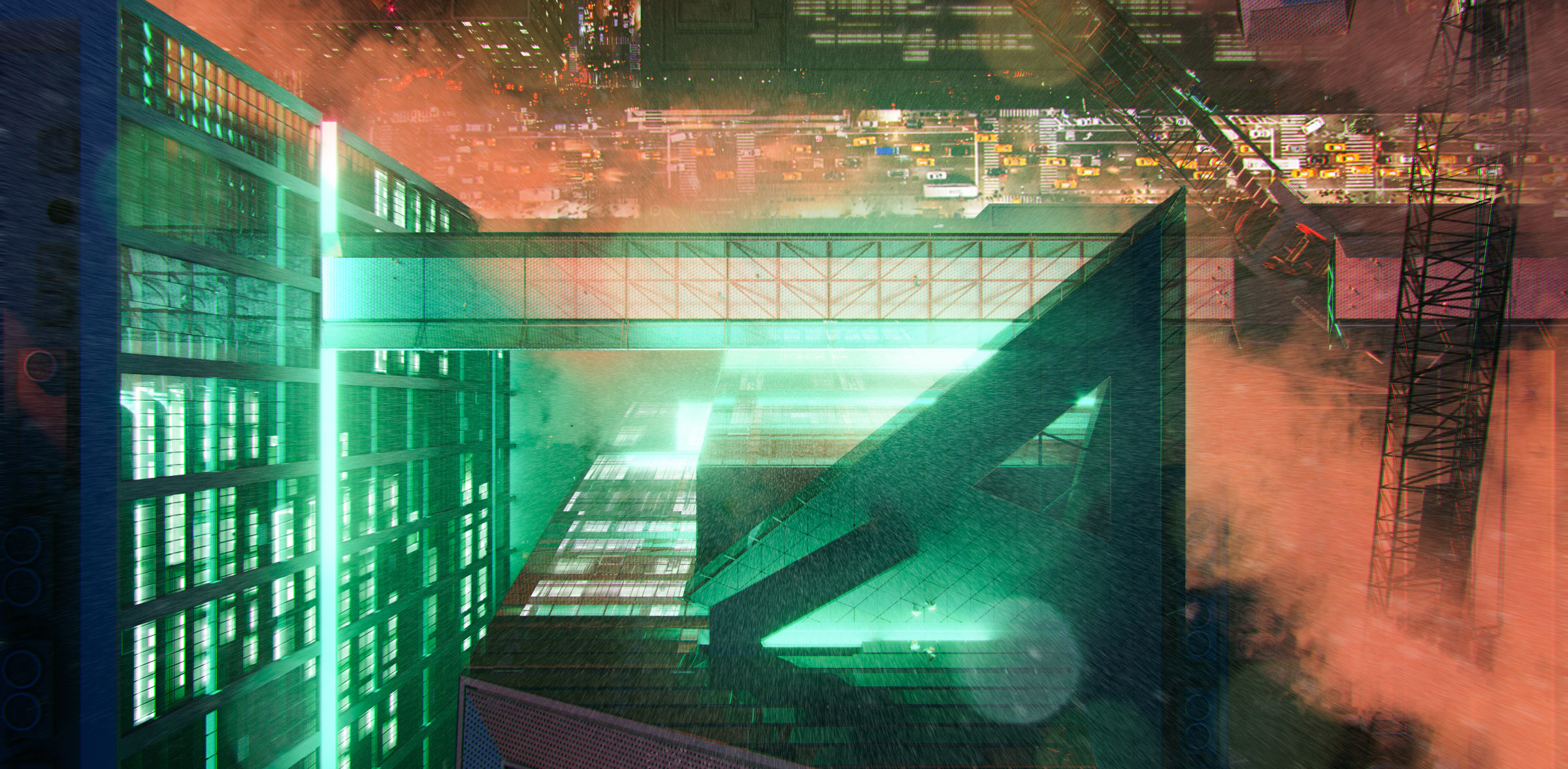
The ARM at Hudson Yards; design and visualization by Duy Phan
I think it is important to mention that hyperrealism, even though it is often mistaken as a term to be synonymous with photorealism, is not the same as photorealism. Rather, hyperrealism is the clever synthesis of color, composition and atmosphere with a hint of the avant-garde that ultimately invokes a heightened sense of emotion and mood. Duy Phan’s work does it all, and its exemplified in his winning entry for the Ronen Beckerman TMRW Challenge 2020.
I had a chance to reach out to Duy Phan and ask him about his work, methodology, and any insights he may have about ArchViz.
Byron Cai: How did you initially become interested in the field of architectural visualization? What made you decide to pursue architectural visualization or even architecture to begin with? Did you have a background in traditional art or digital art?
Duy Phan: Things started back in my high-school days when I got too addicted to drawing imaginary comic scenes and my Mom discovered that I designed and drew the little buildings I put in my images so she encouraged me to apply and study architecture. It is not that architectural design bored me, but on the contrast, having to portray and represent my ideas glued me so tight to the chair.
It made me as the question — how do I convince the project viewer to explore my work further by showing powerful images just like all the legendary architects and visual artists do? Genuinely speaking, the more I refined my project images, the more it helped me to realize my path as an ArchViz illustrator in the future.
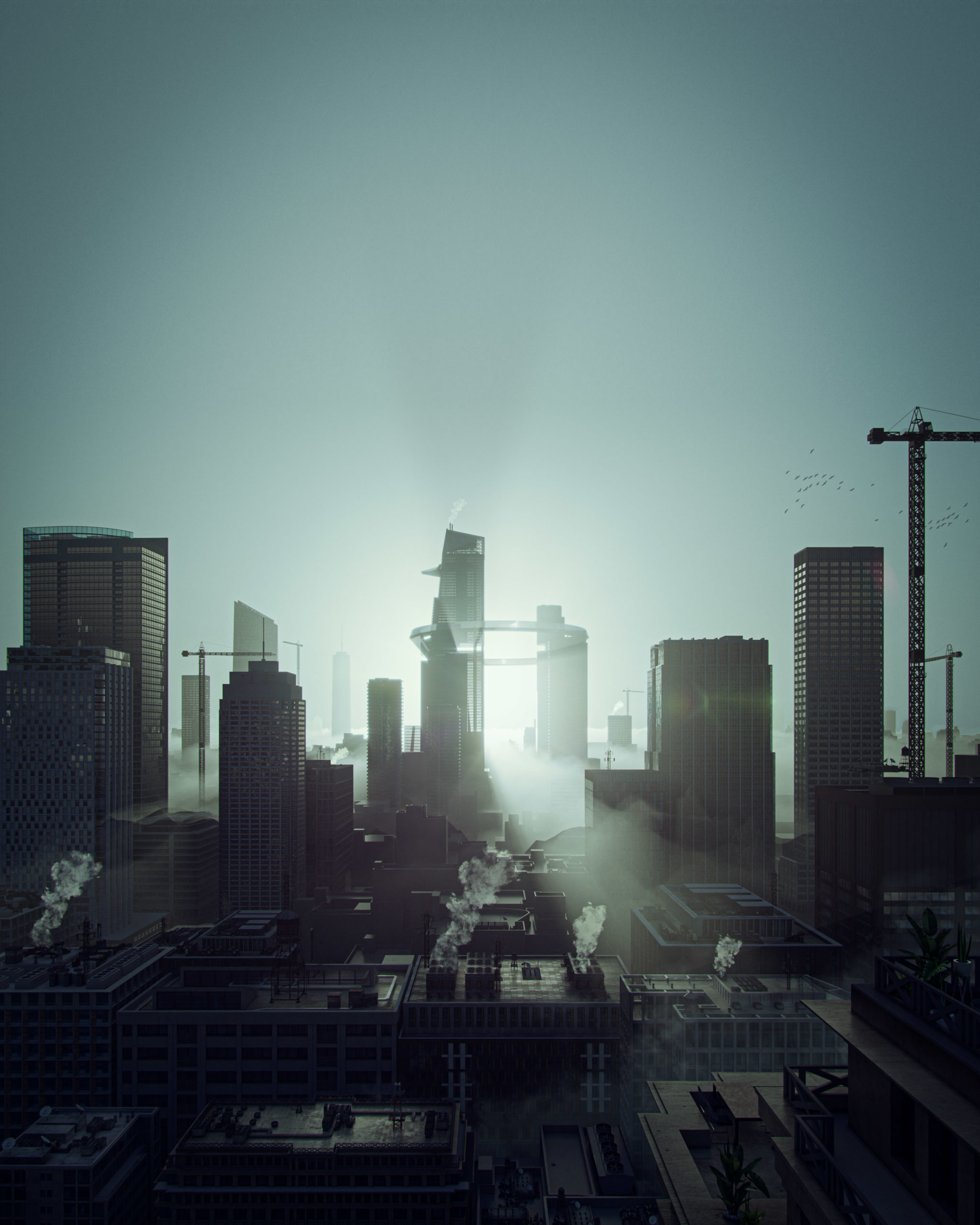
The ARM at Hudson Yards; design and visualization by Duy Phan
Your renderings often invoke a unique sense of mood. Is photorealism the goal, or are you striving for something more?
I believe Photorealism is more of a tool rather than a goal in order to chase the outcome. Understanding and using physics in visualizing images could help the shot be more convincing, but the most realistic image might not be the most interesting. Since we observe our world with all its lights and materials daily, things become curious if those realities are stretched a bit to promote certain ideas. I have to keep reminding myself about the message I would like to convey in the image to help me collect the ingredients, and photorealism usually plays a main part here.
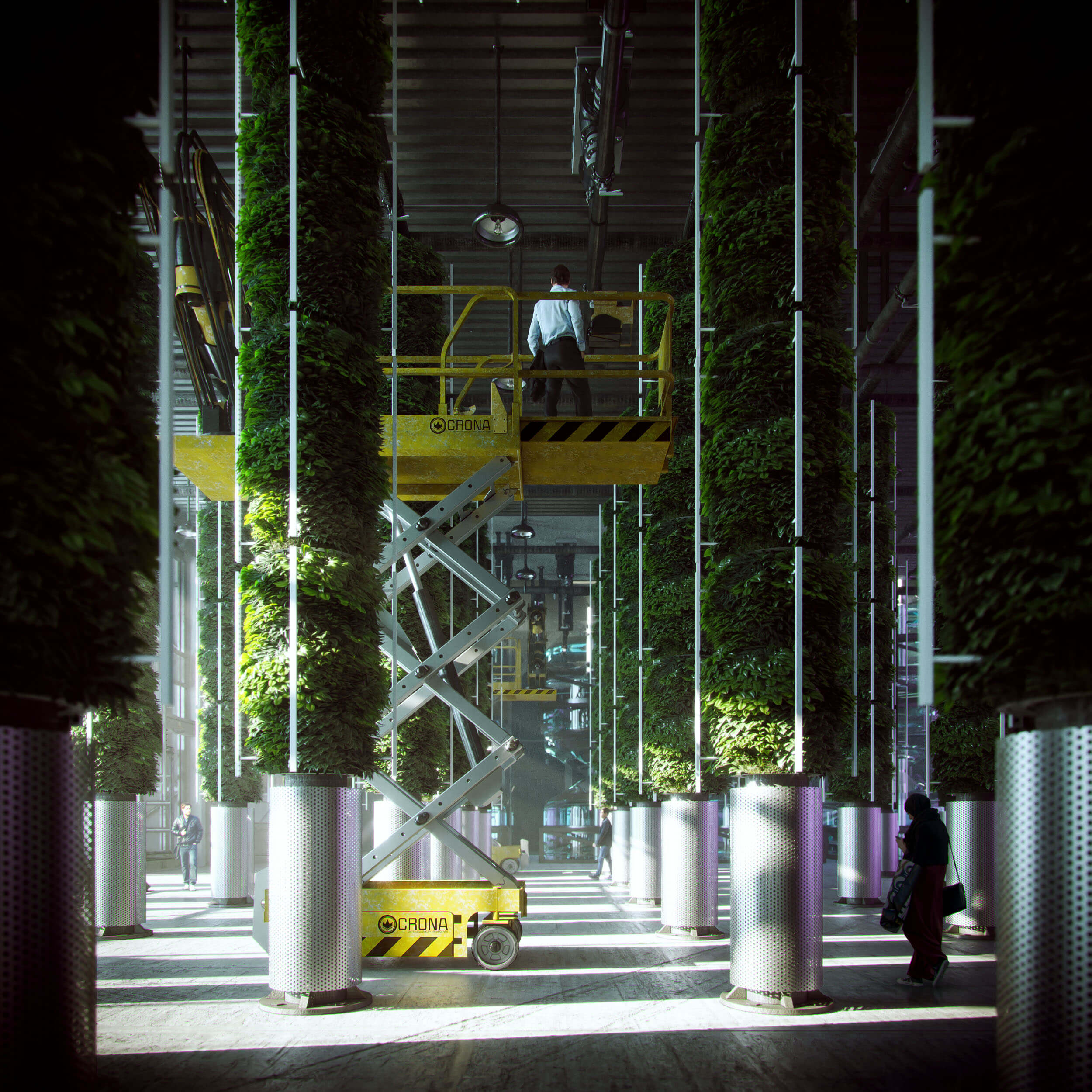
Urban Farm Temple; design and visualization by Duy Phan
What I find interesting about your work is that each image has its own unique quality. Where do you get your inspiration from? Does it differ from image to image?
I’m really glad that you found my works differ from one to another, as I love to try and bring something fresh to the table each time. Besides following and studying visual images from profound studios, I love to spend a bit of time everyday exploring photography sites such as Flickr and Unsplash, training my eyes to see how all physical elements attach together in a beautiful shot. At the same time, I note interesting moods that are present in some adventurous photographers’ work.
I keep these random inspirational images in a cloud drive, where I can access and note any ideas I have during my free time. Later on, when touching base with a specific image, this resource helps remind me of some concepts, and I explore whether it could fit the project brief and is worth developing further.
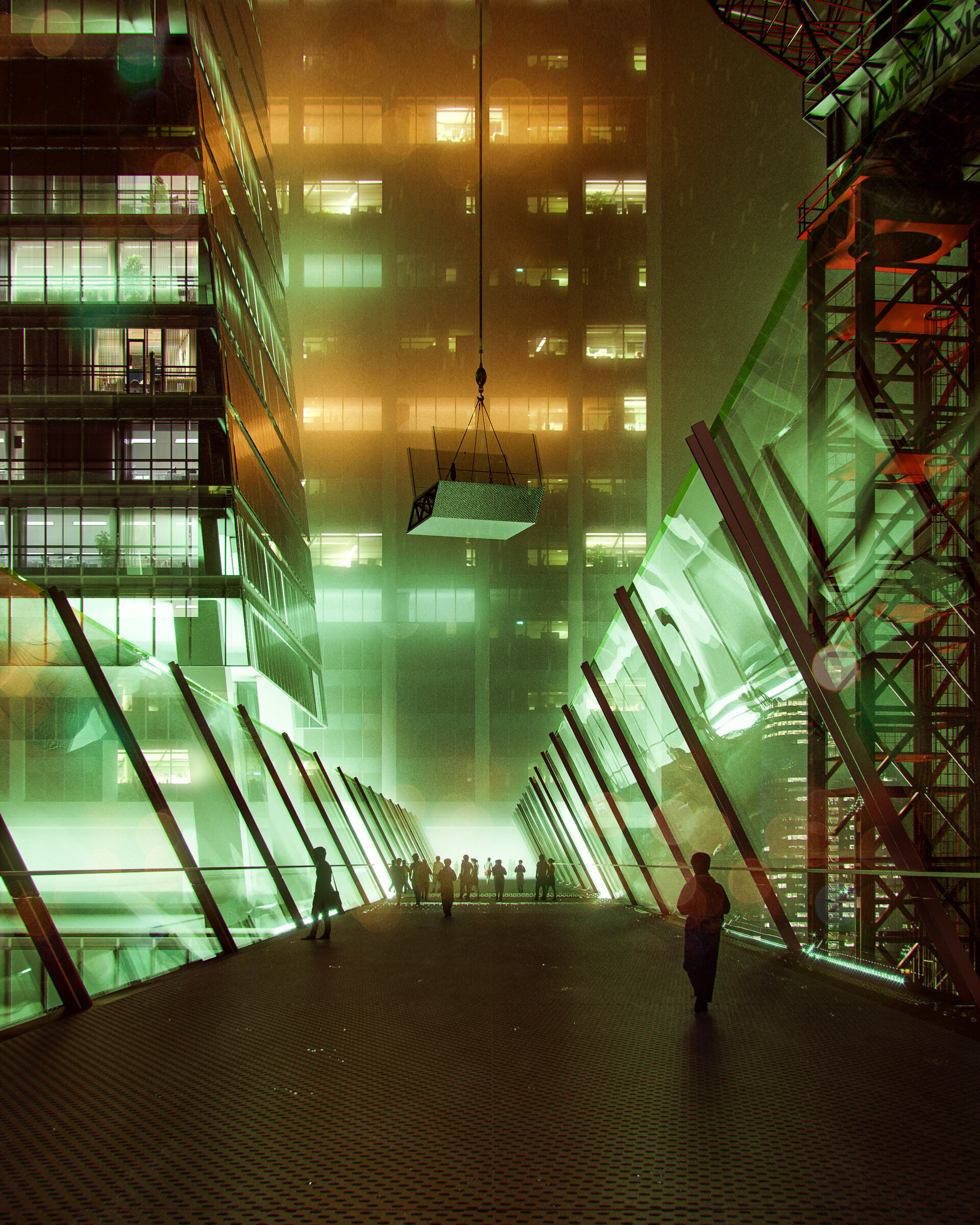
The ARM at Hudson Yards; design and visualization by Duy Phan
One thing that stands out immediately are the beautifully selected color palettes for each render. How do you decide which colors to use?
Color in an image is like the alphabet of our language. Letters and words are picked and organized to help us demonstrate our thoughts. In the case of visualization, considering which color to go with sis dictated by what feeling the painters would like their viewer to have. Studying the color palette and how it connects to the narrative of the image concept is key. Collecting reference images by both photographers and other rendering artists can help pre-production go in the right direction.
What is your favorite rendering that you have done so far?
Orchard Jenga is my most memorable image, which happened to be a career guide for me when I was finalizing my thesis project in university recently.
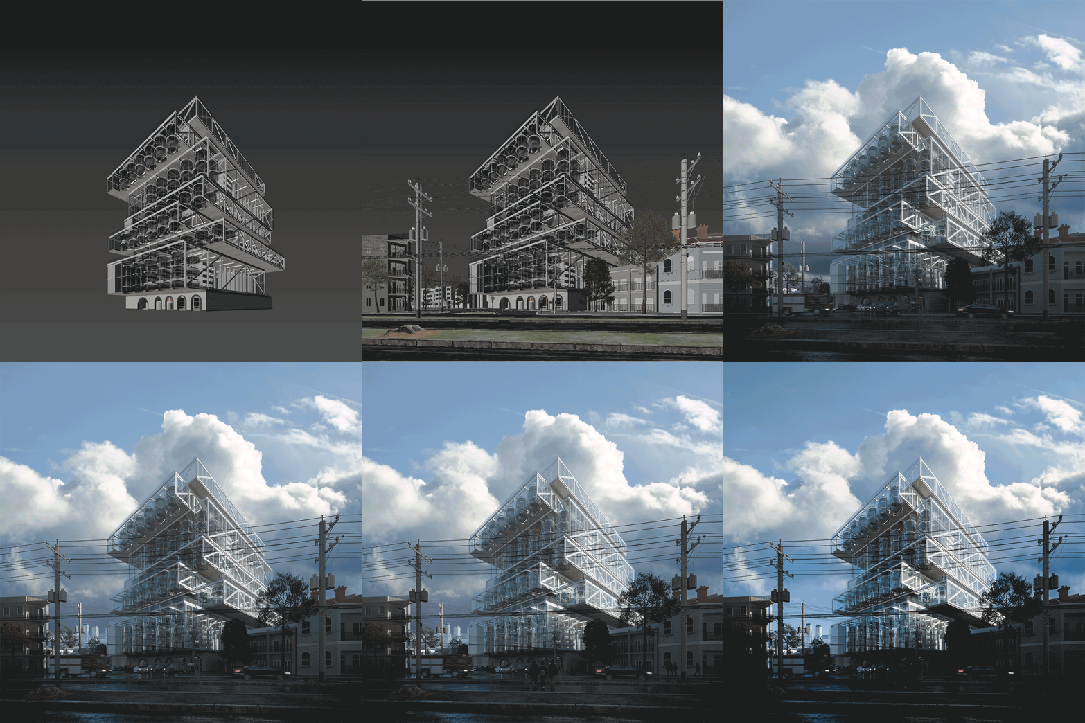
Orchard Jenga image development; design and visualization by Duy Phan
What kind of software do you use? How did your choice of digital mediums change between your school education and the ArchViz industry? Vray or Corona? Something else?
At the moment I mostly use Sketchup, 3ds Max, Corona and Photoshop. I found it was quicker for me to build my concept and preview it quickly in Sketchup, playing around with it by adjusting the Style tab features before moving on to 3ds Max. Corona got me hooked straight away when I first tried it after using Vray for a while. It’s more of personal preference when comparing these two; we can barely distinguish between them when looking at high-end renders by the masters in this industry.
Though I continually learn new techniques in 3D software, the more images I have a chance to work on, the more I lean toward 2D resources to get the result pictured in my head. Hence, the digital mediums might not change, but the proportion of time I spend on each step is changing in my workflow.

Orchard Jenga image development; design and visualization by Duy Phan
You obviously have your own creative approach to an image. Your work-in-progress images can look very different from the final result. Can you describe the process you go through for an image?
In the brainstorming process, if I didn’t model the design myself, I simplify the 3D file and then import it to Sketchup. Personally, I have found the user interface in Sketchup helps me explore and invoke more potential concepts by playing with basic light and shadow, lines weight and fog. With some images, I could go straight to Photoshop from a shot I captured here and matte paint the rest, but usually the next stage is moving to 3ds max for rendering.
From the sketched concept, I replicate the angle similar to what I had in Sketchup using Corona cam, and start with sun, lights and materials. I always keep all the lights separated in Corona Lightmix so that I can quickly find a potential mood by messing around with the light setting. As an example, two versions of the Orchard Jenga both came out of a single rendering, but differ by custom lightmix. I try to balance the time I spend in 3D and 2D; if I can solve a problem using Photoshop, I will not invest too much time in the CPU burning process.
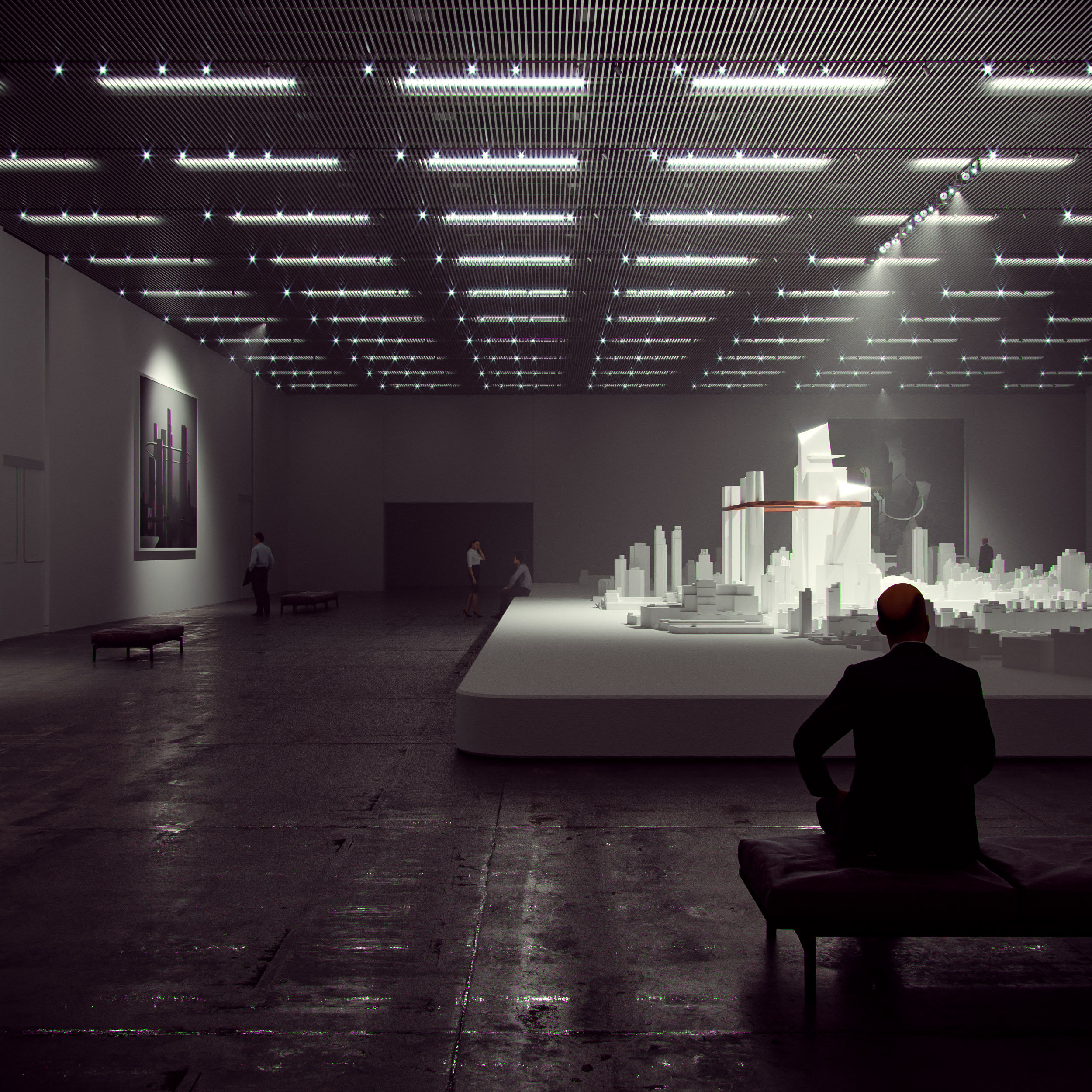
The ARM at Hudson Yards (gallery view); design and visualization by Duy Phan
Can you describe the influence of matte painting and how you use it in the visualization process?
In my case, I think matte painting is more about eye-training rather than hand-training, just like in the old days when painters had to mess up the palette to find out which color is most similar to nature. Attaching and gluing all the pieces together to create a beautiful image is a time consuming process, and requires knowledge about any brush or montage we choose to put in.
Fully relying on 3d software sometimes gets us to forget how reality works and makes us hesitant to pursue the original concept because there is a limitation of technology, or we simply can not find the right 3d model.
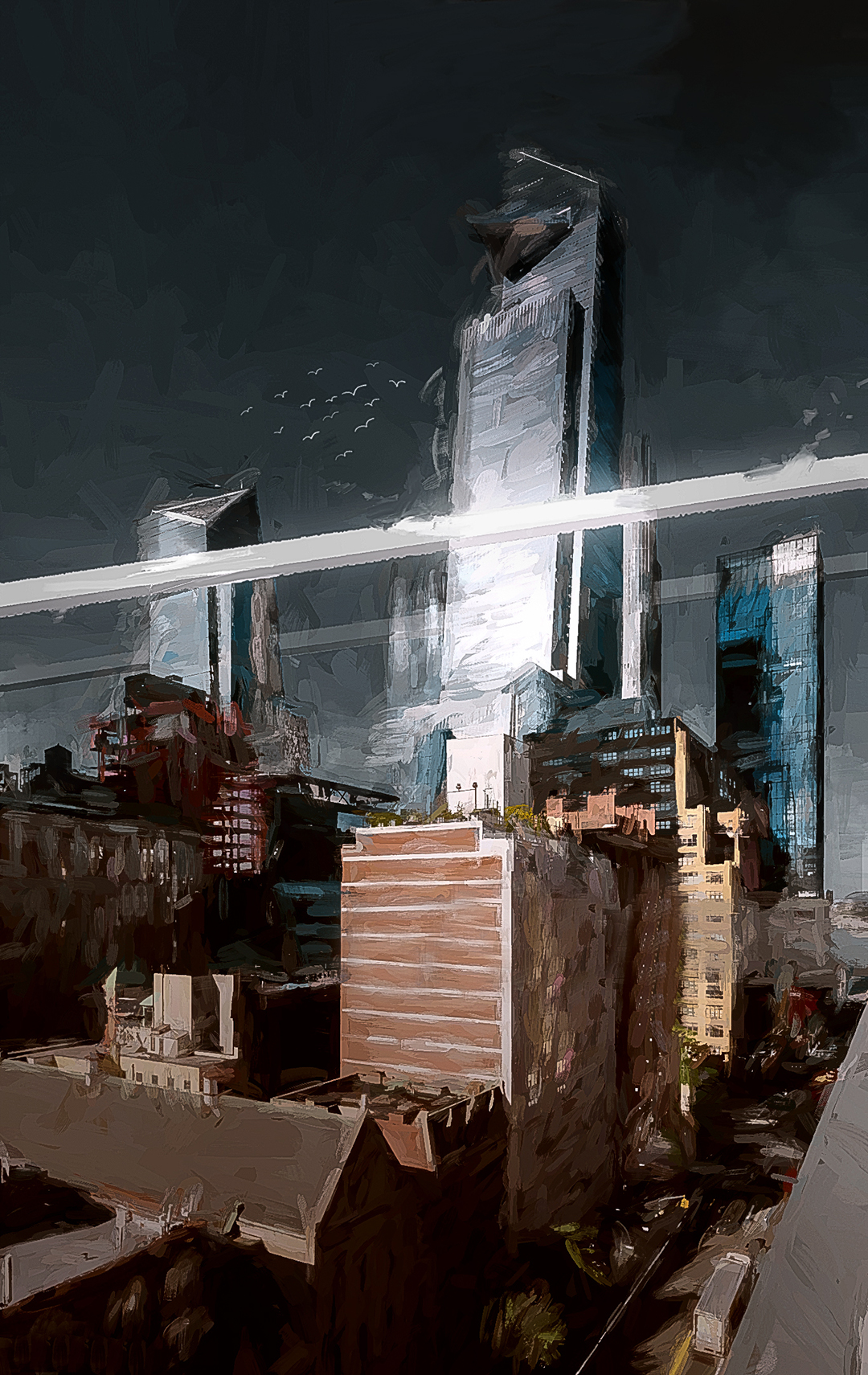
The ARM at Hudson Yards (matte painting); design and visualization by Duy Phan
Are there different visual approaches that you use depending on the kind of architecture you are portraying?
Yes there are a few ways to approach a specific image in my case. A good example for this is with a birds-eye view, I would spend more time studying the surrounding context, if not in person then by google map and local images. This sometimes results in capturing good images for a photomontage, or otherwise provides me heaps of information to build the context from scratch, either in 3D or using matte painting.
Then there are interior images, where I spend more time on looking or making the right materials which happen to be exposed within the scenes, again things could be purely done from the render engine but I found it always needs a quite decent of touches when moving onto post-production process.
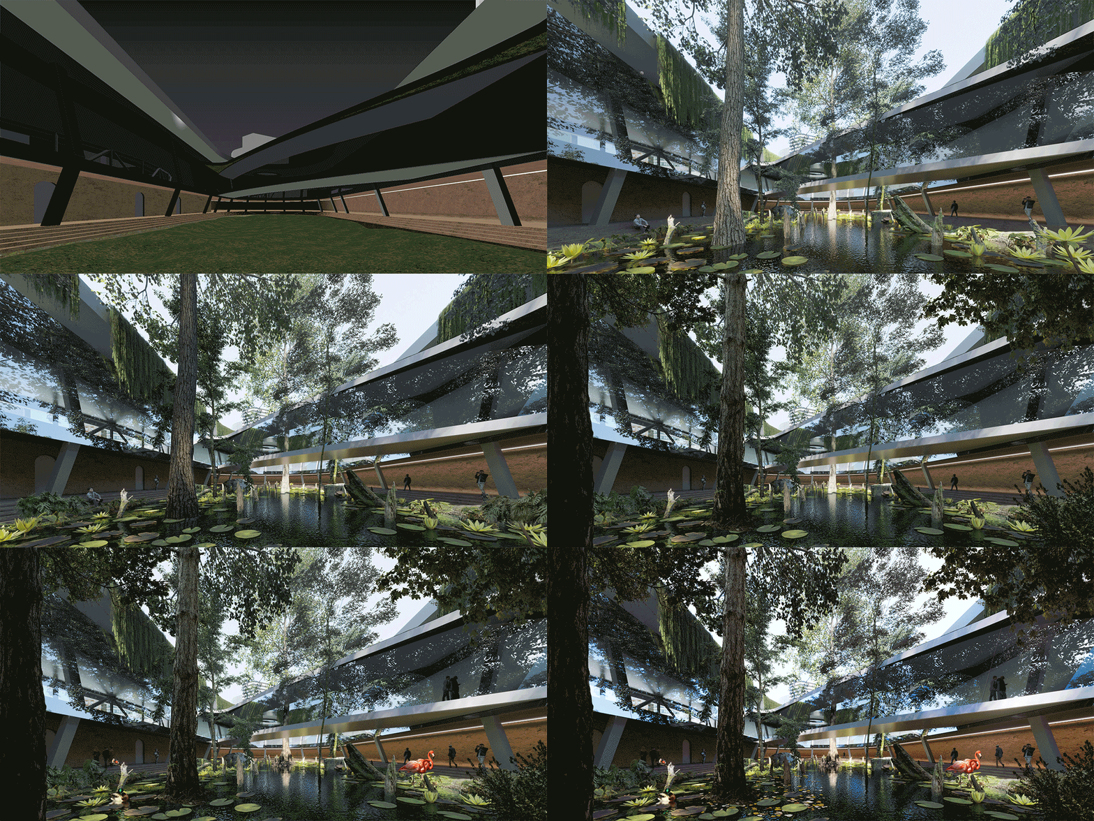
Interchange Oasis image development; design by Xpace, visualization by Duy Phan
Tatiana Bilbao controversially said that renderings are “dangerous and damaging” in a recent Dezeen article. Do you agree with her reasoning?
I partly agree with Tatiana about holding ideas from further development after seeing a realistic render. As I understand, from a design concept to built reality, it has been and will always be a constantly communicating process, back and forth, between designers and decision makers. Realistic renderings, collages, physical models, technical drawings or any other presentation mediums are considered as a method to convey the message from one mind to another.
Choosing to use any of these mediums is dependent on an architecture studio’s culture of demonstrating their thoughts, and this should be uniquely tailored to that studio’s type of project and their clients. Hence, in Bilbao’s studio, with a very interesting story about an old client and their potential clients, it makes sense that they found a new way to express their process.
From the viewpoint of architects, using renderings is just one of the tools to achieve their goal for a specific client or public community. When a project suits the need of making compelling images that communicate ideas, that is where ArchViz artists can help.
Where do you see the future of ArchViz going?
The more developed technology is, the easier it is to produce renderings for architectural designers. For illustrators, this should be a more positive thing rather than a competitive thing. There are always good, very good and super good images. Those who recognize the differences between them tend to value the manual work and effort put in to portray the unbuilt.
Nonetheless, this raises the bar higher for the industry. Better tools help artists unveil their potential skill set and discover more hidden inspiration in the corners of their imaginations. As a result, we will see more and more stunning work that will define new boundaries.
Want to be a part of the One Rendering Challenge? Register now and prepare your submission for a shot at the grand prizes:
