Showcase your visionary architectural concepts: The 2026 Vision Awards features categories that reward UNBUILT projects presenting bold ideas for the future of architecture. Take advantage of early bird pricing before April 17th.
They say a picture is worth a thousand words, and when it comes to advertising, this classic idiom couldn’t be more pertinent. The biggest brands in the world, from Apple and Nike to Amazon and IKEA, utilize compelling imagery, iconic colors and distinctive logos to define themselves, catch the eye of millions and sell products around the globe. Given this incredible power, it makes sense that — as one of the most provocative visual mediums available to graphic designers — architecture has played a central role in many masterful marketing campaigns in recent years.
The advertisements that follow are incredibly varied in their approach — some harness the iconic, instantly recognizable forms of real-world architecture, while others portray dream worlds to capture the imagination and illustrate unforeseen possibilities. While no two campaigns are alike, every one of these advertisements has something in common: They were all crafted by talented visualizers with an appreciation of architecture’s innate power to provoke an emotional response.


Via Epica Awards
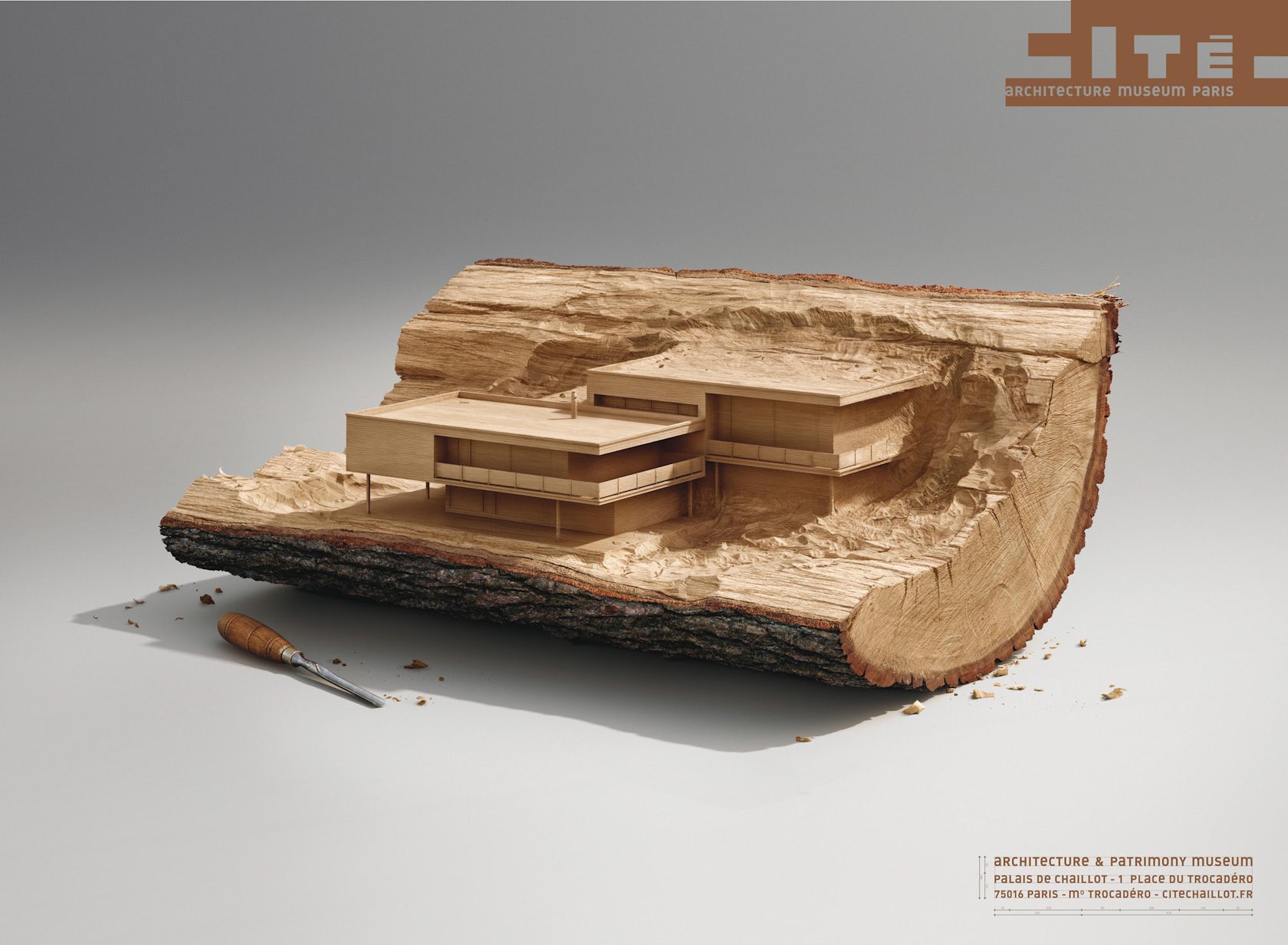
Come Take a Closer Look by Havas Paris for Cité De L’architecture Et Du Patrimoine
Havas Paris’ campaign for one of the premier architecture museums in the French Capital tapped into the romance of beautifully handcrafted scale models. Each advertisement displays an iconic structure from a different stylistic period, and each appears hewn from a single raw material, emphasizing the innate link between architecture and the art of making.

Via Ads of the World
ARCHITECTURE by Y&R Kuala Lumpur advertising agency for Penguin Books
Y&R took a literal approach to its representation of Penguin Books’ architectural editions, depicting a towering concrete construction in the shape of the publisher’s iconic logo. The monumentality of the structure represents the incredible breadth of information to be found within Penguin’s collections, while its incomplete nature reflects the fact that the pursuit of knowledge never truly ends.


Via Behance
Fester concrete products by Garrigosa Studio for Henkel
Garrigosa Studio combined jaw-dropping visuals with a touch of humor for a remarkable advertising campaign to promote Fester concrete products by Henkel, a company specializing in adhesive technologies. Envisioning implausible architectural scenarios including a dramatic cantilevered residence and an underwater hotel, the message is clear — with Fester concrete products, the impossible is made possible.

© Alexey Bykov


© Alexey Bykov


© Alexey Bykov

Via Behance
Discover the Full Story by Saatchi & Saatchi Russia for the Schusev State Museum of Architecture
To promote a major architecture museum in Russia, Saatchi & Saatchi seized upon the idea that the buildings we see around us are the tip of the proverbial iceberg, as each iconic structure possesses fascinating backstories and hidden histories just waiting to be revealed. The agency depicted ornate subterranean additions to some of the country’s most well known architectural landmarks, with each series of images revealing the creative process from initial sketches to incredibly detailed final renderings.

© Stephen Cheung

© Stephen Cheung
Via Epica Awards
Where It All Begins by Staedtler
German fine writing instrument company Staedtler is in no mood to see their classic drawing tools superseded by today’s high-tech gadgets, and this advertising campaign was designed to help keep it relevant. While the pencils themselves tap into the nostalgia of architects everywhere — who doesn’t love a beautiful graphite sketch? — their sculpted tips speak to modernity, juxtaposing the scale of this humble writing tool with the towering vision of global skyscrapers.

Just As Mega Beneath by TMP Worldwide / Radoslav Žilinský
Commissioned by Transport for London (TFL) to design a promotional poster for the London Underground, digital artist Radoslav Žilinský produced a vibrant poster with a terrific level of detail. Seeking to highlight the hidden complexity of the subterranean network, the designer eschewed the traditional cross section, instead opting to lift up the ground in dramatic fashion to reveal the Tube’s inner workings. Better still, Žilinský’s dynamic creative process is captured at every stage in an amazing video, complete with a highly appropriate soundtrack.


Via Coloribus
Look Ahead to a Great City by Jabjai for the Architect Fair in Thailand
If you have been reading Architizer for a while, you are probably aware of our appreciation of a good pun, and Thai creative agency Jabjai provided one of the visual kind to promote a Thai Architect Fair back in 2007. While the premise might seem cheesy, the visuals are undeniably striking: the weaves signify the variety of architecture on show across Thailand, from vernacular houses on stilts to ancient temples and futuristic skyscrapers.
Showcase your visionary architectural concepts: The 2026 Vision Awards features categories that reward UNBUILT projects presenting bold ideas for the future of architecture. Take advantage of early bird pricing before April 17th.
Top image via Epica Awards