The acts of sketching and model-making traditionally provide architects with much of their inspiration at the outset of the creative process. However, some move further into the realms of art to help them visualize their concepts, enjoying the fluidity and flexibility of paint and, in particular, the free-flowing qualities of watercolors. One such architect is American Steven Holl, who adopted the brush as an efficient way of transferring his ideas to paper.
“I used to do pencil drawings. Those took eight hours,” reflects the architect. “Around 1979, I streamlined it to five-by-seven-inch watercolors. With the watercolor, in the quickest way, I can shape a volume, cast a shadow, indicate the direction of the sun in a very small format. And I can carry these things around because I am always traveling.”
As shown in Phaidon’s richly illustrated book on Holl’s work, this ability to visualize two of architecture’s defining elements — light and shade — has made his watercolors almost as renowned as the buildings they helped shape. Here, we look more closely at seven pages from the architect’s sketchbook, together with the landmark structures that emerged from them. Follow Holl’s path from brushstrokes to buildings:

1. Hangzhou Triaxial Field, Hangzhou, China (Concept)
The paintings Holl produced for this cultural center in China encapsulate the architect’s desire to create a building with an intimate connection with the surrounding landscape. The interior watercolor evokes a porous cave with light streaming down from above, while the external painting implies a building that extends seamlessly from the ground, as if part of the terrain itself. Holl’s sketchy notes refer to the building as a “field” where “landscape and arch[itecture] merge.”

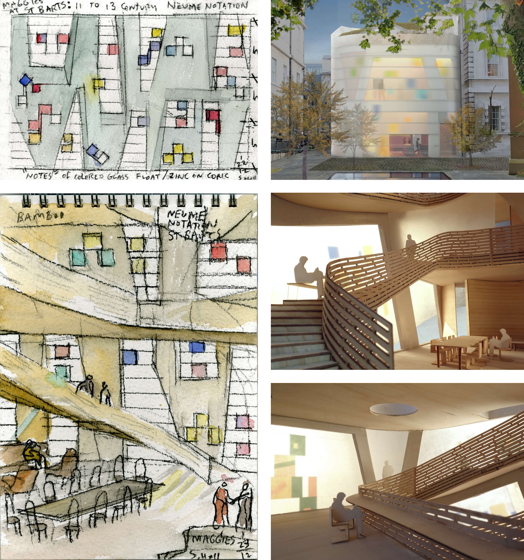
2. Maggie’s Centre Barts, London, United Kingdom (Under Construction)
When Holl was selected to design a new Maggie’s Centre for cancer care in the heart of London, he set about conceiving a welcoming place of warmth and calmness in the midst of this frenetic city. His watercolors for the center emit an aura of playfulness, joy, and optimism, emphasizing the use of a colored glass envelope to provide an optimistic atmosphere within the light-filled central atrium. The building is set for completion in 2016.

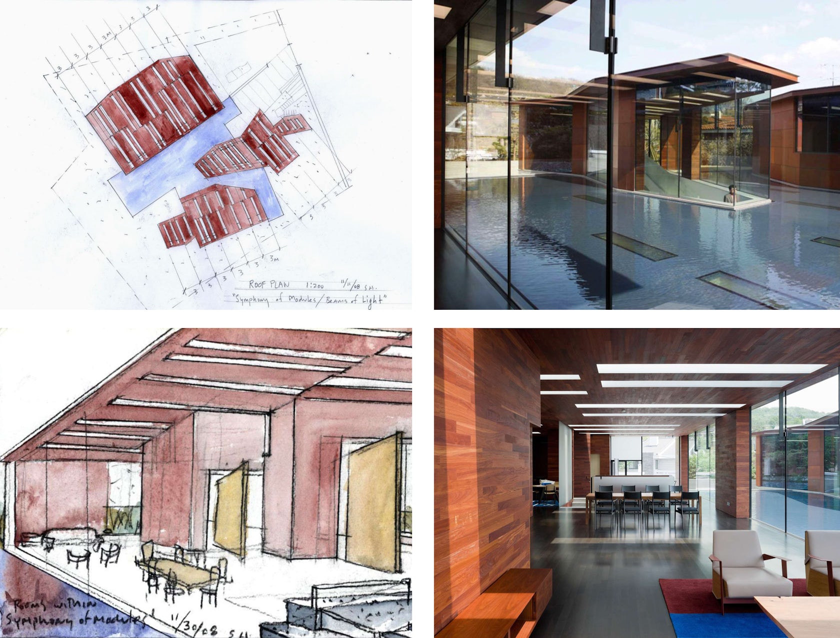
3. Daeyang Gallery and House, Seoul, South Korea (Completed 2012)
Watercolors for this experimental design in South Korea were not the only artistic muse for the finished structure: the basic geometry of the building was inspired by a sketched music score by the composer Istvan Anhalt entitled “Symphony of Modules,” discovered in John Cage’s book Notations. Both plan and perspective paintings juxtapose the complementary colors of blue and orange, emphasizing the contrast between the rich terra cotta façades and the cool water that fills the central courtyard.

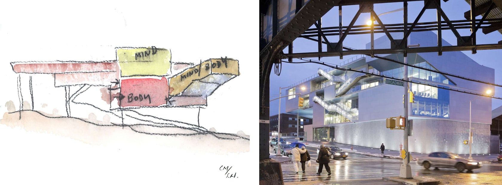
4. Campbell Sports Center, Manhattan, New York City (Completed 2013)
The Campbell Sports Center in New York City was conceived as a three-dimensional manifestation of sports field markings, delineating space and evoking the push and pull of activities throughout the building. Holl’s watercolor is reminiscent of Rem Koolhaas’s famous section diagrams in its prominent use of text to define the juxtaposition of program. Areas dedicated to the body and the mind are stacked one atop the other, diagonal circulation spaces creating tension between the two.
To see more of Steven Holl’s watercolors, check out Phaidon’s book Steven Holl

Enjoy this article? Check out the previous entries in our series “How Architecture Is Born”: Stunning models and drawings by Allied Works, joyful sketches by CEBRA, and meticulous models by Safdie Architects.


