VIATechnik specializes in technology for the architecture, engineering and construction industries and works with clients in the realm of virtual reality, BIM services and artificial intelligence. Architizer is glad to present a selection of the firm’s blog posts on all things AEC. check out their website for more.
Architectural rendering techniques have gotten out of hand. Realistic rendering seems to have vanished from the portfolio of the modern architect in favor of overly stylized representations that leave the rest of the world without a genuine sense of what a structure will look like. It’s a problem and one architects need to address.
Architects have plenty of reasons to continue to rely on stylized rendering. Stylized renderings are beautiful; they show a proposed building in the best light and help sell contemporary design. While there’s certainly some truth there, that doesn’t excuse the more problematic elements of this trend.
Advances in architectural visualization have been happening for centuries. With each advancement, our ability to show what a proposed building will look like has improved along with the ability to make that proposed building look better and better. Up to a point, that’s been fantastic. But there is a point — and architects have finally passed it.
That’s the point where the lack of realistic rendering is harming architecture, the point where the arms race of stylized rendering is leading to an ugly future. But, as with any arms race, there’s the problem of unilateral disarmament. If one architectural firm decides to make all of its renderings totally realistic, how can it expect to compete?

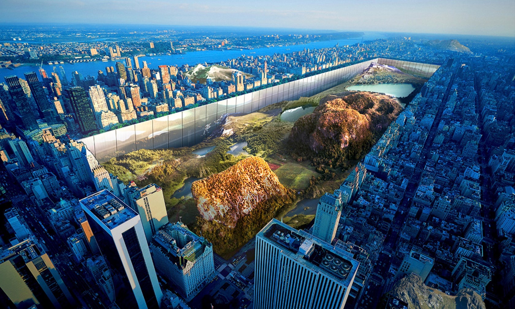
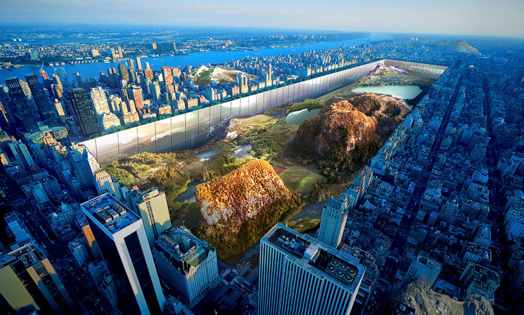
New York Horizon by Yitan Sun and Jianshi Wu; image courtesy eVolo
“New York Horizon”: A Case Study
Let’s look at an example: “New York Horizon,” the winner of the 2016 eVolo Skyscraper Competition. This example illustrates the ways in which poor digital rendering is being driven by competitions.
One of the major goals of architectural contests is to raise awareness and possibly funding for noteworthy projects. A major component of that goal is media attention, and the media loves flashy images. Even ArchDaily admitted it was part of the problem to some extent.
“New York Horizon” shows a design that is so focused on grand ambition and aesthetics of its architectural design that it ends up disconnected from reality. How likely is it that New York would permit Central Park being torn up, that the city would pay for removing billions of dollars of subway, sewage and other utility lines? Not likely at all.
So why did this entry win the competition? It commits every sin of digital rendering, thereby giving the competition committee exactly the kind of flashy winner that could bring them incredible publicity.

Rendering Elbphilharmonie by Herzog & de Meuron; via Metalocus
The Deeper Dangers of Unrealistic Digital Rendering
If the worst result of these bad examples of rendering was that impossibly imagined structures would routinely win major competitions, it wouldn’t be such a serious issue. However, this problem becomes much worse when structures are actually built. Take the example of Herzog & de Meuron’s Elbphilharmonie.
When it finally opened, the project was seven years late and cost more than three times the original planned budget. While undoubtedly stunning, the project’s lofty ambitions played a large part in the enormous controversy it has garnered. Rendering has played its part in setting unrealistic expectations. The culture around it has helped push architectural styles to even more grandiose and unrealistic places, leading to disillusionment with cost overruns and delays.
That’s not to mention the marked difference between the renderings and the end product.

University Library, Osijek, Croatia; via Flickr (GYF a&m)
Reasons to Believe in Responsible 3D Rendering
One thing to bear in mind here is that 3D design software itself is not to blame. As much as the technology is abused, 3D visualization is an essential part of architectural illustration today. What needs to change is the focus of architects and the clients and committees who purchase and reward their work.
As mentioned earlier, there’s the problem of the arms race. If one architecture firm starts to create realistic renderings, it may find competing difficult. Some get around this by only using stick models, but that’s simply not realistic for the entire industry.
Ultimately, what needs to happen is larger umbrella organizations like the American Institute of Architects lobbying for industry-wide changes. That means changes in how firms create their renderings as well as how prize committees look at them.
In the meantime, however, the best we can do is work to ensure the worst excesses of rendering don’t enter the relatively new medium of virtual reality. This new technology is immersive enough that you shouldn’t need to rely on a lack of realism to make your project look fantastic. If the industry can make that happen, then the transition to virtual reality for architectural and construction rendering could be the best solution to these problems.
This post was written by Traci Beilharz and originally appeared on VIATechnik.


