Architizer’s newest print publication is available for pre-order! How to Visualize Architecture is an educational guide designed to help you master the craft of architectural storytelling and visual communication. Secure your copy today.
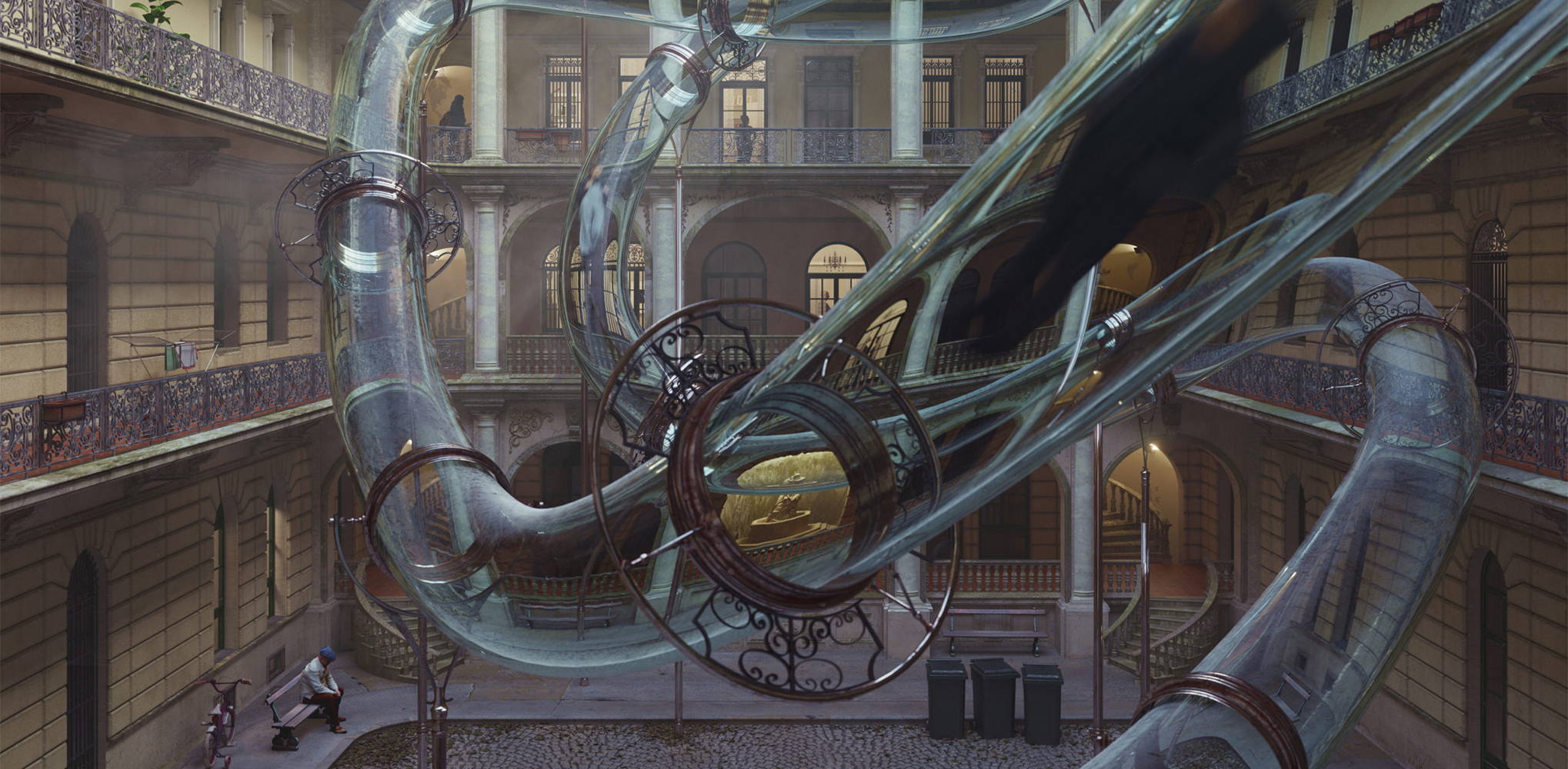
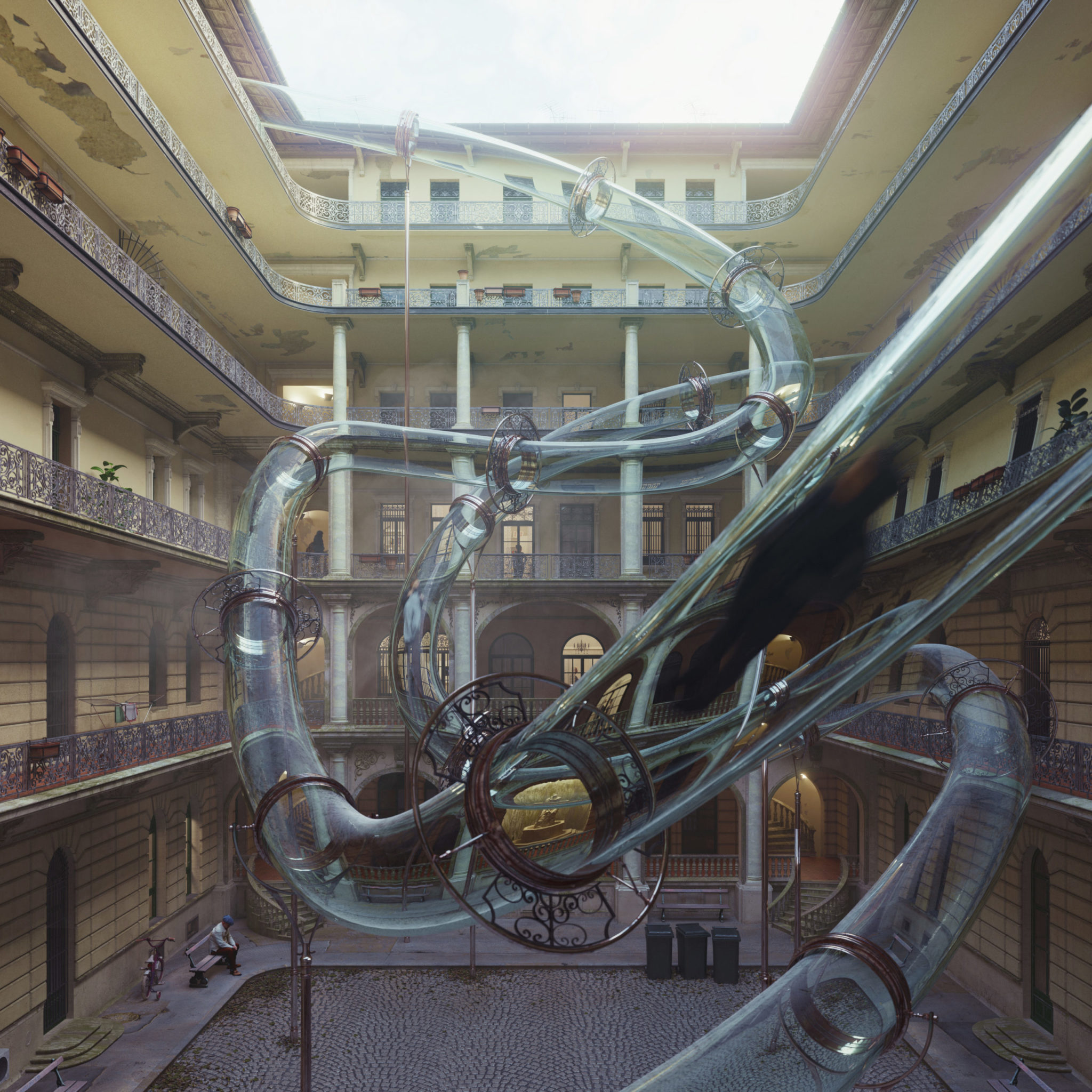
What do the best architectural visualizations look like? Clues can be found by looking at the winners of the inaugural One Rendering Challenge. The Non-Student Winner was “Zoom to the Future” by Carlotta Cominetti, Tamás Fischer and Camelia Ezzaouini of visualization studio Virginlemon. Their rendering tells the story of an elderly man resting his weary feet in the courtyard of his residence … with a futuristic twist:
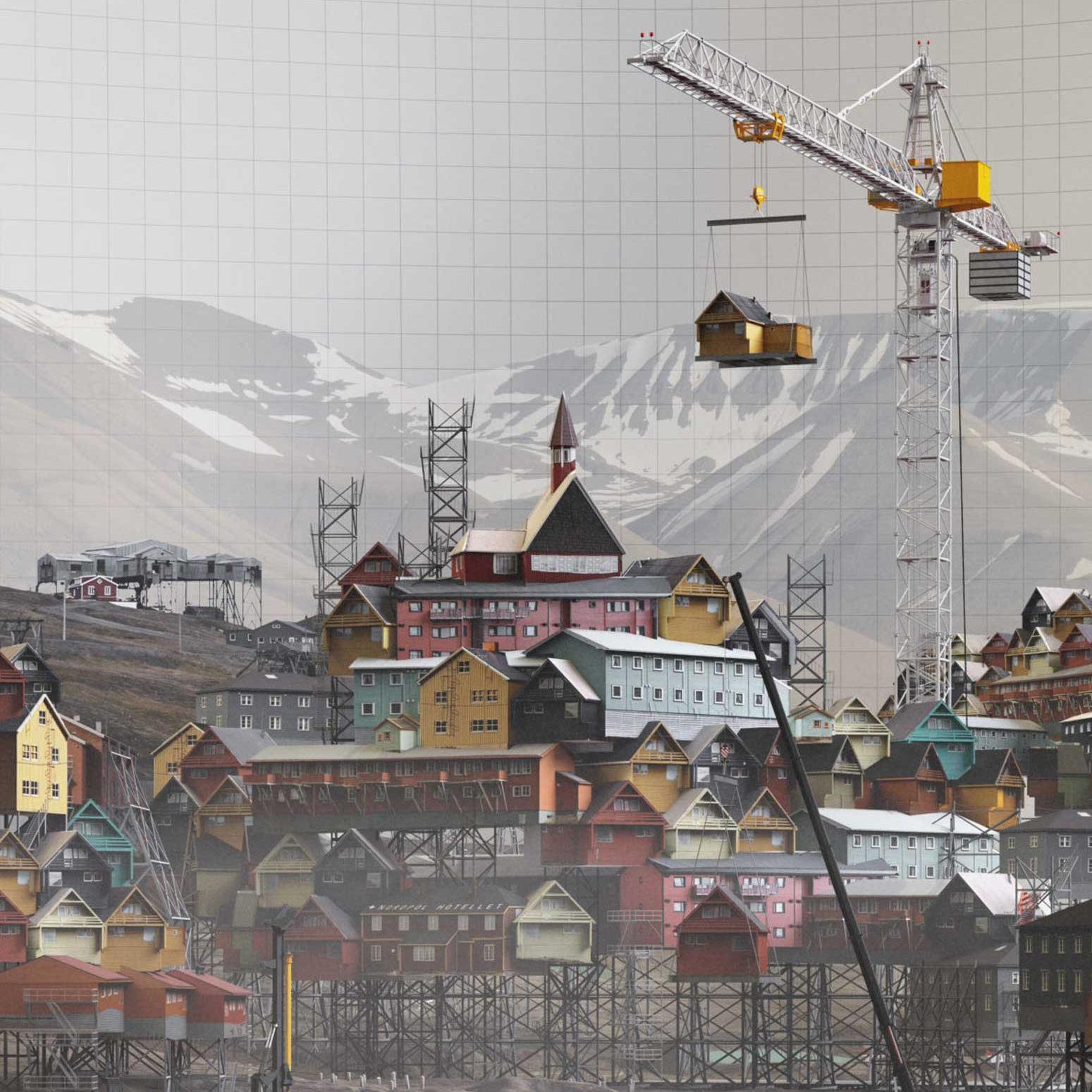
The top winner in the Student category was “Lifting Longyearbyen” by Brandon Bergem, a 2019 MArch graduate at the University of Toronto. Bergem’s image was inspired by the dramatic, barren landscape of Svalbard, Norway:
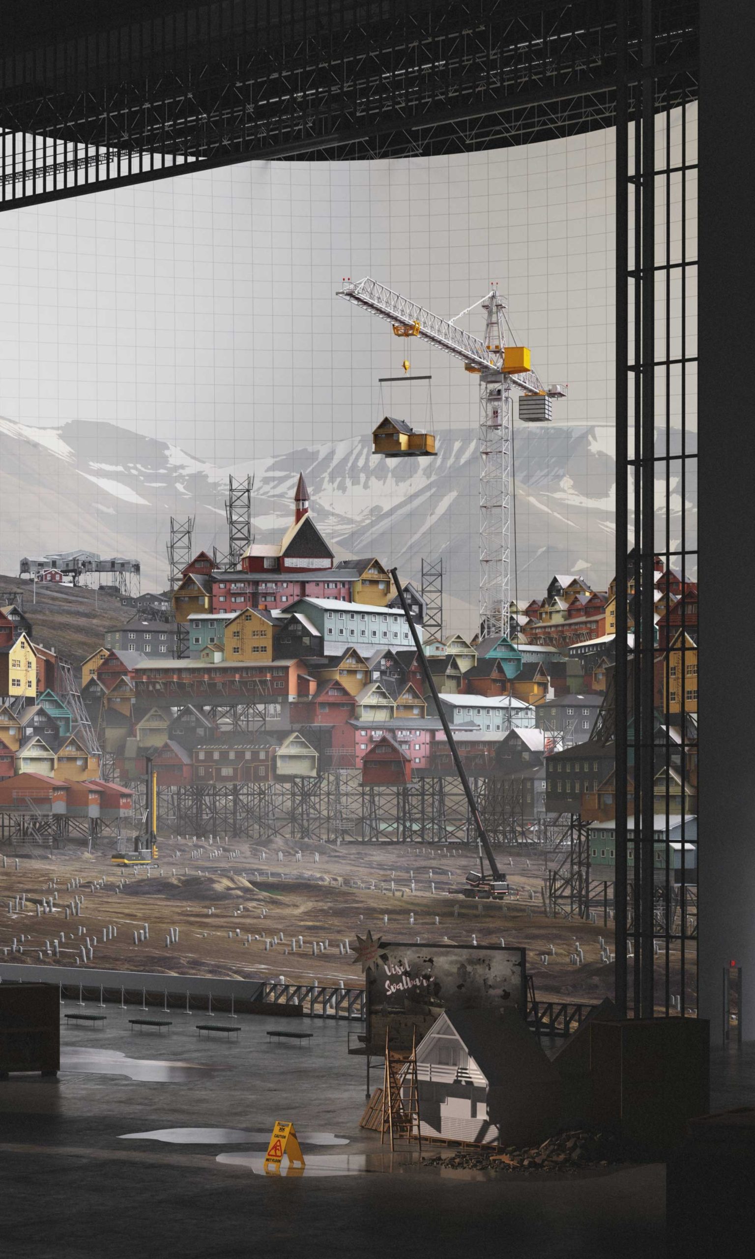
What do these visualizations have in common? First, they are far from “clean” in the conventional sense. They are full of texture; each material reveals its age, with shiny, dull, smooth and rough surfaces striking contrasts that add a strong legibility to each image. While stylistically different, these renderings share certain, distinct qualities — their use of light, shadow, depth and perspective result in an atmospheric scene that draws in the viewer.
Furthermore, each rendering has an ephemeral quality. They capture a unique moment in time — if they were photographs of real places, each image would be different if it had been shot a mere second earlier, or a second later.
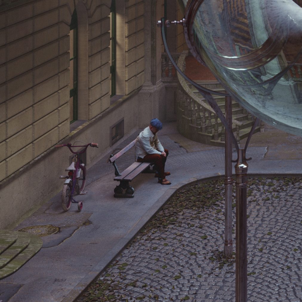
Most of all though, these renderings tell stories. They provoke a series of questions, sparking a sense of curiosity. Looking at “Zoom to the Future”, we can’t help but ask: Who is the elderly man in the corner of that image, and how does he feel about the space in which he sits? Studying “Lifting Longyearbyen”, we wonder: Why are these buildings being hoisted into the air? What will become of this fragile place in the future?
Both renderings eschew beauty in favor of communicating a narrative about architecture and those that inhabit it. This is what the One Rendering Challenge calls for — The winning submissions and commended entries are uniquely evocative, each telling a story through one, solitary image.
Glossy, “beautiful” visualizations remain the convention, and their aesthetic fits their function — they aim to present an idealized version of an architectural proposal to clients, convincing them to move forward with a design concept and ultimately pay for a project to be taken through to completion. Whether this polished rendering is matched by its built reality matters less once the developers and architects have finished their business and taken their checks away.
The question is, can renderings do more? Do less beautiful, more honest portrayals of our spaces, buildings and cities have a place in architectural discourse? Can they teach us something, not only about architecture, but also about the ways in which it can or should be represented? Last season’s One Rendering Challenge suggests so. Accordingly, get your dirty, ugly, chaotic, textured renderings ready to submit for this year’s competition!
Architizer’s newest print publication is available for pre-order! How to Visualize Architecture is an educational guide designed to help you master the craft of architectural storytelling and visual communication. Secure your copy today.
