Architizer’s newest print publication is available for pre-order! How to Visualize Architecture is an educational guide designed to help you master the craft of architectural storytelling and visual communication. Secure your copy today.
There was a time when no self-respecting rendering would allow itself to be seen in public without a zeppelin hovering somewhere in its desaturated sky. Supermodels in haute couture garments strutted across opera foyers, uninterested expressions and blasé attitudes adding to the exclusivity of the space. These gimmicks are still widely used, but since its early days architectural rendering has seen major technical advancements that allowed it to appropriate cinematic techniques relying on color, lighting, framing, composition and angles to convey moods.
This disciplinary overlap between architecture and film is fundamental in the use of similar software and modeling techniques and has brought the two closer through the idea of storytelling, a notion inherent to both disciplines. In architectural rendering, if the spirit or the main feeling isn’t persuasive and engaging enough, the function of images is reduced to regurgitating information already provided through drawings and schematics.
An overabundance of visual content, brought on partly by the democratization of architectural publishing, has produced an almost pornographic fixation on architectural representation, rendering techniques in particular. Computer generated imagery is no longer an intermediary between an idea and its realization, but a finished product on its own. Different rendering genres have emerged over the years, similar in approach and style to recognizable cinematic tropes.

Eleftheria Square by Zaha Hadid Architects, via Skyscrapercity

Phoenix Towers by Chetwoods Architects
The Mad Max
City lights dimmed, the “urban wasteland” awaits the appearance of the new development whose lights seem to be the only sign of life for miles around.

Kaohsiung Port Terminal by RTA-Office

Park51 by Soma Architects
The Whodunit
These renderings sport a menacing atmosphere achieved by desaturating the image or using only dark blue and green tones. Stormy skies, shadowy figures, and strong contrasts create tension that transforms spaces into potential film noir crime scenes.


The Quest by Ström Architects
The David
The David flaunts its perfectly mapped textures, lifelike grass, and clinically precise reflections to the point that, like the android boy David in Spielberg’s A.I., the architecture looks a bit too perfect.


Camellian Opera House by Matteo Cainer Architects
Paranormal Activity
Blended so well into their surroundings, these projects are practically not there. Buildings appear as dreamy echoes of themselves held up by light and memory, instead of concrete pillars and slabs.

Boulders Resort by Diller Scofidio + Renfro
The Gondry
The stubborn collage technique may feel anachronistic but, every so often, it makes a powerful comeback. The combination of photos, renderings and drawing can be surprisingly effective and reminds of Michel Gondry’s distinctive visual style. In its most experimental form The Gondry may include unicorns, movie stars, space ships and a cutout photo of Le Corbusier.

Green Valley by Schmidt Hammer Lassen Architects

The Theodore
The Theodore could be a subcategory of Paranormal Activity, but, unlike the latter, it is found mostly among representations of interiors. Airy spaces and more than generous amounts of diffuse lighting make one want to lay back in an armchair and dictate a heartfelt love letter, just like Theodore in Spike Jonze’s “Her.”

Le Brassus by BIG

Samaranch Memorial Museum by HAO Holm Architecture Office.
The Katherine Heigl
Romantic snowbound streets, palpable silence of the first snow, kids having fun, couples holding hands, and a building in the background. The Katherine Heigl promises a happy ending and a lighthearted story enacted in and around the omnipresent new building. This category includes sunsets, images whose large portions show meadows, forests, parks and all kinds of pastoral scenery.
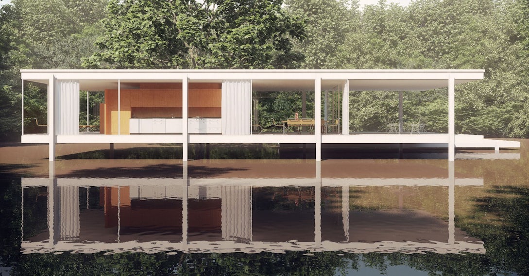
Top image: Mies van der Rohe’s Farnsworth House by Max Gooday. Enjoy this article? Check out the other features in our series on “The Art of Rendering”:
Architizer’s newest print publication is available for pre-order! How to Visualize Architecture is an educational guide designed to help you master the craft of architectural storytelling and visual communication. Secure your copy today.


