Architects: Find the right materials for your next project through Architizer. Manufacturers: Sign up now to learn how you can get seen by the world’s top architecture firms.
In the offices of Stonehill Taylor, a Manhattan-based architecture and interior design firm, architect Neill Parker sits at the center of a long conference table strewn with façade mockups and material samples. As he speaks, he excitedly bounces from one model to the next, stopping occasionally to scrutinize a drawing or point to renderings on a large projection screen. His eye for details of every scale — from specifying the right metal cladding to celebrate a neighborhood’s industrial past, to figuring out the perfect corrugation depth to catch the afternoon sun — is typical of a principal of Stonehill Taylor, a practice which prides itself on meeting the demands of property developers and preservationists alike.
“We were introduced to the industry through our expertise working with historic buildings, notably with the conversion of the landmark Hudson Theatre into the centerpiece of what became the Millennium Broadway Hotel’s three-building urban campus,” he explained, “Around this time, we also began to build our hospitality interiors studio. Slowly, but steadily, we found the world of hospitality design to be the space in which we most enjoyed working and it remains our focus today.”

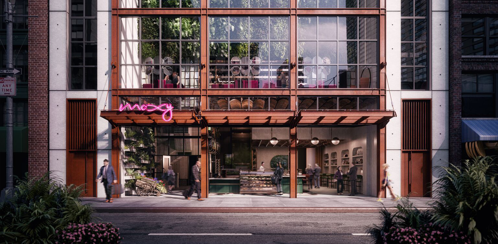
Exterior rendering of Moxy Chelsea, image by Rockwell Group via Stonehill Taylor.
Although the firm’s hospitality portfolio now spans 15 states, and an award-winning pop-up hotel in London, its architects like to stay close to the city they call home. “Right now, a project at the forefront of my mind is Moxy Chelsea here in New York,” Parker said, “It’s around the corner from our office, so I get to see how it’s evolving every day. What I am most excited about are the combinations of textures and materials that we used, and the sights and even the smells of the things it’ll be populated with.”
“It’s on 28th Street near Avenue of the Americas, the last block that remains of New York’s Flower District. Here, sidewalks are crowded with thousands of potted exotic shrubs, palm trees and flowers. We were inspired by the unusual contrast of the lush greenery with city grit and wanted our building to emphasize and preserve that. To do so, we created a big, vertical glass conservatory made of raw concrete and rusting steel, an urban greenhouse filled with plants. At ground level, the front of the building tilts up and opens to the street, inviting people in. In the lobby and bar at the second floor, guests will take in the views of the flower-packed street, beneath a 40-foot-tall, fragrant green wall.”
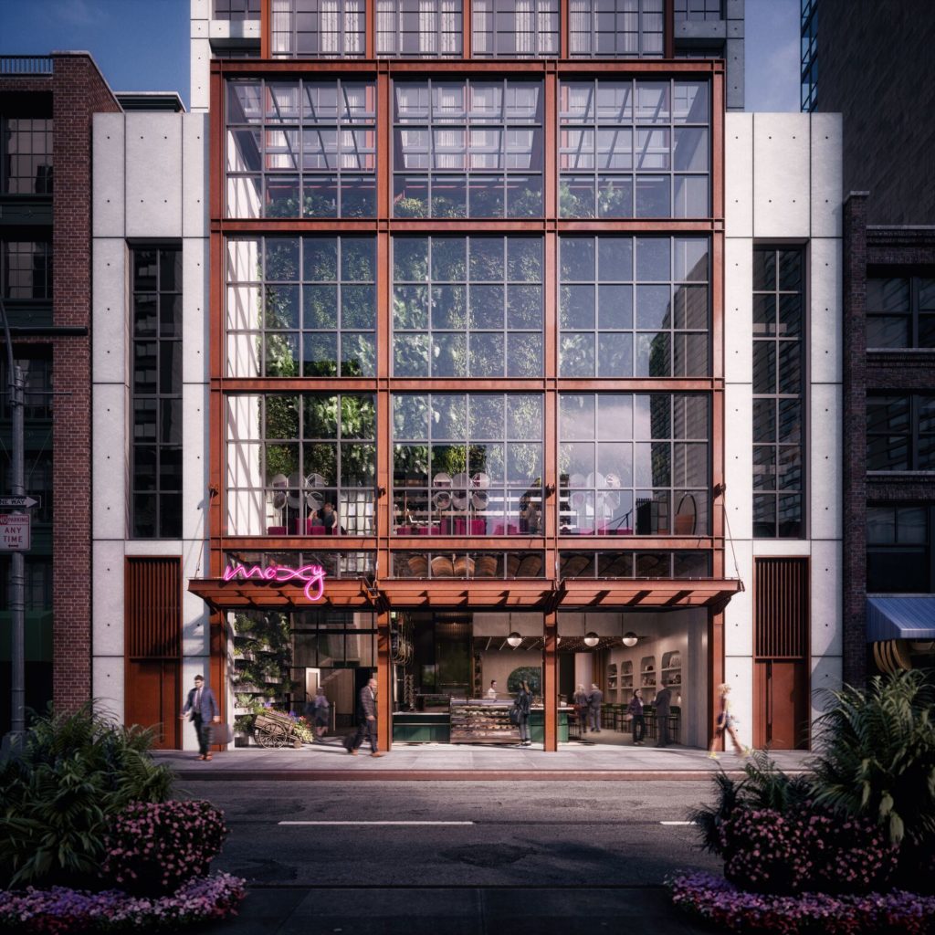
Exterior rendering of Moxy Chelsea, image by Rockwell Group via Stonehill Taylor.
Moxy Chelsea, like many projects on Parker’s drawing board, strikes a delicate balance between his contemporary sensibilities and his affinity for historic buildings, both of which inform his material choices. “[Inspiration] is totally unpredictable. More often than not, it’s something I saw walking down the street early one morning — New York City is wonderful that way — or a clever new product an associate noticed in a trade publication. Recently at a trade show, I saw a wonderful rain-screen system that marries the natural beauty of traditional hand-cleft slate with an industrialized anchorage system, which I think has real promise. I’d like to pair it with some sleek metal trim or glossy porcelain.”
As with many architects interested in materials, Parker has been conflicted about the growing popularity of imitation building products which, he concedes, have made remarkable strides in recent years. “It is now possible to specify flooring which looks and feels like wood, even when walking barefoot, but it’s made of porcelain! My old-school, traditional modernist mind finds such a concept troublesome in the abstract, but it’s hard to argue when people find it warm, comforting and pleasurable. Even more so, it’s capable of withstanding years of use before going into a landfill. So, I’ve mellowed in my view of these things, but it’s still important to use them correctly. A ‘wood’ floor that lasts a long time is a great solution for an interior, but if you put the same imitation product on a façade, any natural materials next to it will fade and weather but it will not, which could lead to an aesthetically disastrous effect.”

Moxy Chelsea is clad in aluminum with a digitally printed, rust-like finish, image via Pure + Freeform.
“One of these new materials is a product by Pure + Freeform which we are using on several projects. The manufacturers have developed a process for printing patterns on sheet aluminum using pigments that are applied several times from different directions. This gives the surface an unusual depth and richness. They have automated the printing process digitally, so that they can offer finishes that can be tweaked to vary the effect. Several times we have specified a general direction, maybe rusted steel, or maybe crystalline white, and then we let the client have the satisfaction of fine-tuning the look to suit their needs and desires.”
Whether new or old, authentic or synthetic, the most important aspect to consider when specifying a material is how people will interact with it, says Parker. “I like to create environments that tantalize and excite as many of the senses as possible. I think not only about how the materials look but also how they feel to the touch, how the spaces sound and even how the smells change as you move throughout the building. One thing that I really enjoy in particular is juxtaposing materials that I know are cool to the touch, like glass or stone, with warm, comfortable materials, like wood or plush fabric. I think people are happier when they see that playfulness.”
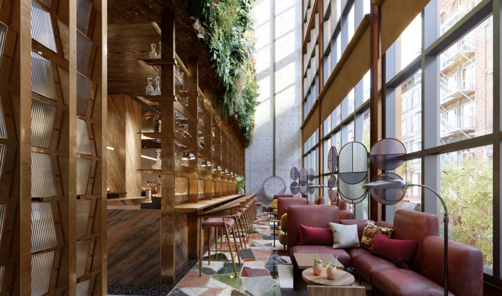
Interior rendering of Moxy Chelsea, image by Rockwell Group via Stonehill Taylor.
These unlikely combinations of textures and colors are surprisingly effective. They emerge, not through some cut-and-dried specification process, but through continuous experimentation, a love of tinkering. “Someone once asked [musician] Keith Richards what tunes he plays if there’s a guitar around and he’s got a spare moment,” remembered Parker, smiling, “‘The next one’ was his reply. I think it’s that way with all creative people — our minds are always restless and considering new things, or new combinations of familiar things. I can’t help but keep my eyes open for things that excite me and toy with shapes, materials and assemblies in my head.”
Research all your architectural materials through Architizer: Click here to sign up now. Are you a manufacturer looking to connect with architects? Click here.
