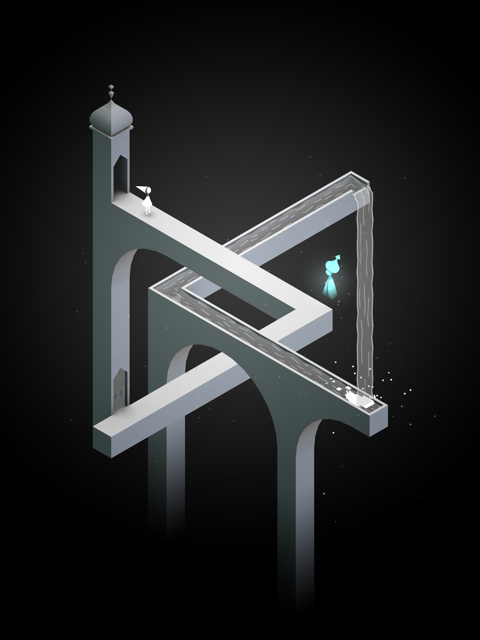
Monument Valley by Ustwo is an award-winning game for iPhone and iPad that combines architecture and video games, in which the user journeys through puzzling isometric-perspective spaces. While architecture appears in the background of many games, architecture takes center stage in Monument Valley.
Praised for its serene aesthetics and mind-bending optical puzzles, the game won Apple’s iPad Game of the Year Award in 2014 and has sold over 26 million copies since May 2014. You may have read our review of the game back when it came out. Since then, Ken Wong, the game’s lead designer, has left Ustwo and started his own craft games studio in Melbourne, Mountains. Today we had the pleasure of talking with Ken Wong about the creative process behind Monument Valley.
Orli Hakanoglu: The highly architectural nature of the game caught our attention here at Architizer. What’s your relationship to the field, and do you have any favorite architects or building styles?
Ken Wong: I come from an illustration background. I’m definitely a layman when it comes to architecture. But I think all forms of storytelling cross over. The more you understand a chosen creative field, the more that other forms and mediums open up to you. So though I may lack formal education, I feel like I’m able to study architecture through a lens of storytelling and visual design.
I’m quite partial to brutalism and art deco.

Image via Gamespot
Every frame of the game is like a work of art. Can you talk a bit about your aesthetic decision-making and creative process?
Thank you, that’s a huge compliment. Each screen of the game is usually based on one puzzle or geometric idea that we’re trying to convey to the player. We start by creating a ‘white box’ version, which is playable and has hints of architecture but looks more like a blueprint. We user-test, discuss feedback and iterate until players can reliably solve puzzles with the right amount of friction. We then do an art pass, which fills in details and color. Because we’re working in an entirely digital environment, we can experiment and improvise a lot. All the color palettes, for example, are the result of freeform tweaking as opposed to a formal plan.

Images via Ken Wong’s Pinterest
Can you share with us some of the visual inspiration you were drawing from?
We looked at a wide range of architecture, from Moroccan mosques to temples in India. We also studied what I like to call ‘little worlds’: any self-contained structure enclosed in an empty void, like a dollhouse or a bonsai tree. We found examples of little worlds in graphic art, sculpture and architectural models. It became an important principle that, in Monument Valley, everything you need to solve a puzzle is contained within a screen.
You were in a small team of eight: artists with an interest in programming and programmers with an artistic sense. What was the breakdown of work between team members?
Three programmers, one artist, one QA (quality assurance), two producers and myself as game designer. As you mentioned, in truth some of the members wore various different hats at different times. The game took 10 months to produce.

Image via World-Architects.com
Some of the most rewarding moments in playing the game occur when it seems there is no logical way for Ida to move forward, yet a seemingly simple shift in angle reveals an optical illusion that allows the player to progress. Such illusions remind me of M.C. Escher’s drawings, in a way. What was the design process like for creating those illusions?
Growing up, I had an interest in special effects for movies. Many of these ‘in-camera’ effects were the result of perspective tricks and fakery. Additionally, if you really understand computer graphics, you realize everything is a trick. Elaborate systems are designed to fake perspective, light and depth, to emulate the real world. Creating digital, interactive illusions is a bit like inventing a new magic trick; you present the player with one version of the truth, but behind the scenes, you’ve spent months constructing an elaborate setup that allows for another version of the truth to be the solution to the puzzle.

The game is in isometric perspective. Did you ever think of using a different representational technique?
Most of the illusions in the game require an orthographic projection to work.

What was one of the greatest challenges while developing the game? What did you find most rewarding?
I think if something wasn’t challenging, we found ways to make it challenging! I guess finding the right aesthetic for sound and music stands out as it’s a highly subjective topic and most of us lacked the vocabulary to give meaningful feedback. Undoubtedly the most rewarding aspect was getting awards, articles, emails and tweets from people outside of the typical gaming audience. We heard from parents of three-year-old players, from teachers who used the game in their classroom and from people in their 60s. We’re very proud and humbled that we were able to connect with such a wide range of people.

One last question: Is there a story behind the highly lovable totem character? (I for one had an oddly emotional connection to it and was overjoyed when it returned after disappearing for a number of levels.) How did it come to be?
The Totem at first served a gameplay function. Ida can walk on him (we usually refer to the Totem as a ‘he’), but he can also move, which allows for interesting puzzle design. This companion relationship produced a really strong emotional response, which we decided to exploit!
All images via the Monument Valley website unless otherwise noted
Step behind the scenes to learn more about how Monument Valley was produced:


