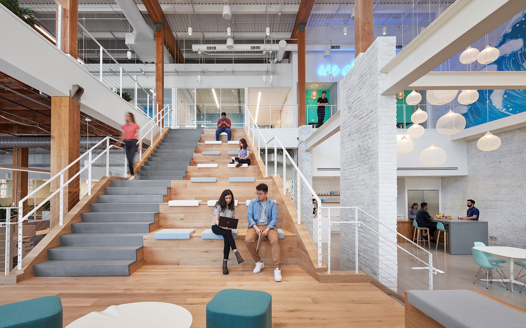
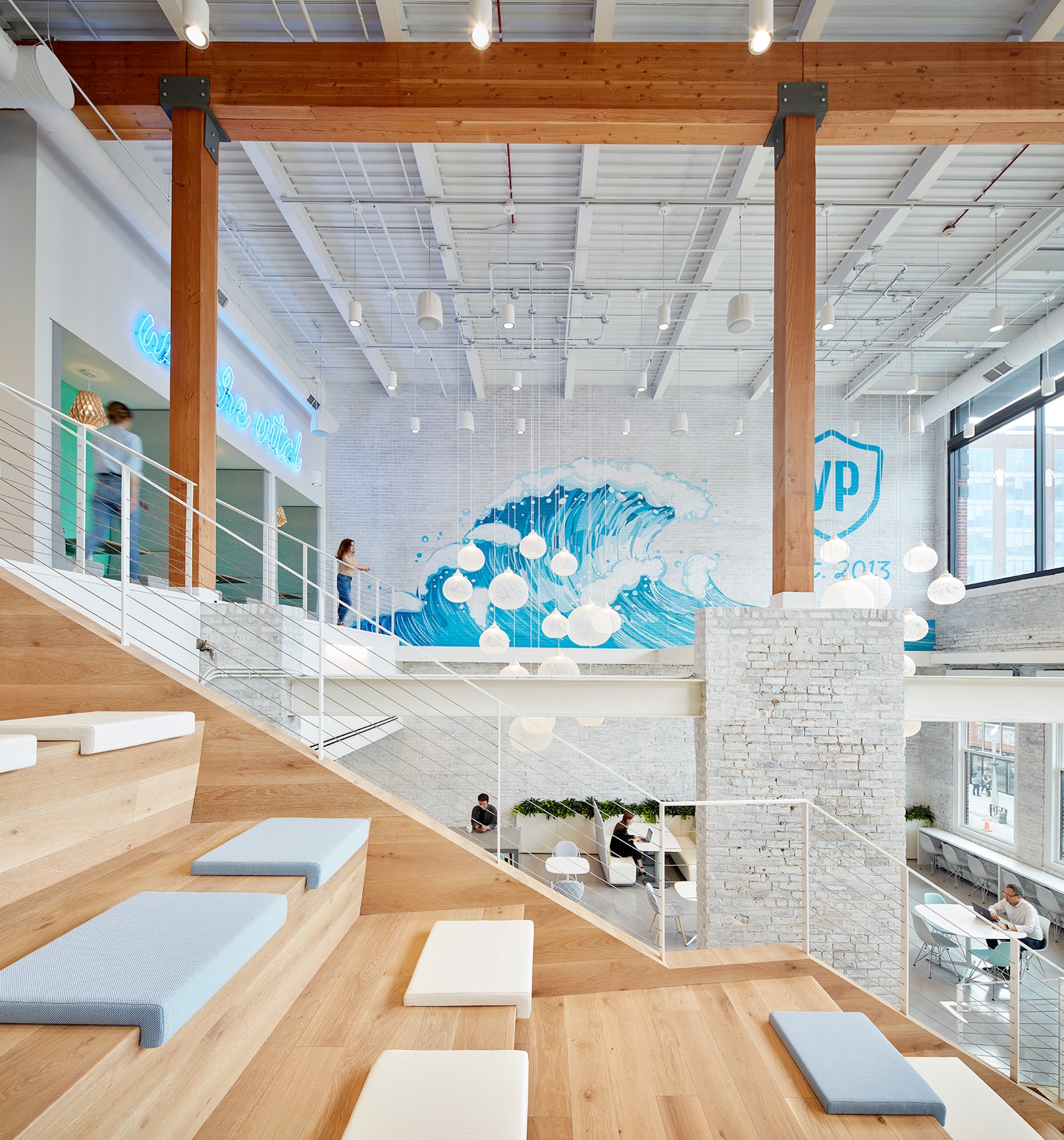
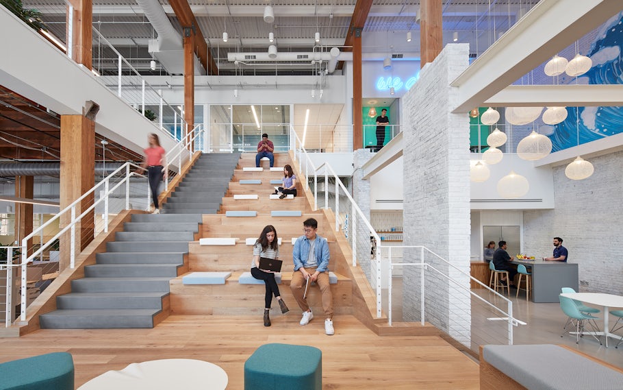
Vital Proteins – The new headquarters for Vital Proteins (VP), a collagen-based wellness company, was designed to embody VP’s brand and support the dynamic and evolving organization. Located in Chicago’s Fulton Market district, VP represents a shift from a more conventional branded-environment design approach to one more focused on embodying the ethos of the company. While branding elements are thoughtfully integrated throughout the space, the primary design drivers for the project are based on the company’s pillars of health, wellness, fitness, and natural beauty. Whitewashed wood, verdant living walls, vibrant visuals and geometric elements create a modern, California-inspired “lifestyle office.”
Architizer chatted with Sheyla Conforte, IIDA, NCIDQ, LEED AP from Solomon Cordwell Buenz (SCB), to learn more about this project.
Architizer: What inspired the initial concept for your design?
Sheyla Conforte: The initial concept for the project was a direct response to the brand vision that was evolving as the design process began to unfold. With a company focused healthy living, we knew a headquarters for Vital Proteins wanted to be energizing and full of light. We wanted the space to help support Vital Proteins’ team to live out their brand values. Our goal was for it to be uplifting, vibrant, approachable, and inspiring.

© SCB

© SCB
What do you believe is the most unique or ‘standout’ component of the project?
In contrast to many of the industrial-inspired offices located in Fulton Market, this project stands out by bringing a refreshing West Coast vibe full of bright whites, verdant living walls, warm woods, and vibrant visuals to the Midwest, merging all of these elements to create a natural setting within an urban Chicago loft. Biophilic design played an important role in the design for the space. Instead of scattering potted plants through the office as an afterthought, we integrated an infusion of plant life into various design elements. Lush flora in purpose-built partitions subdivides workstations, while custom living-moss slat walls define work zones and departments in the office. As an adaptive reuse of a former warehouse building, oversized windows allow for an abundance of natural daylight to flood the interior space.

© SCB
What was the greatest design challenge you faced during the project, and how did you navigate it?
As an adaptive re-use of a former meat packaging facility, the project posed a unique set of challenges within the limitations of the existing building and structure. However, within those constraints we found great opportunities for memorable design elements. A third floor had been added to the exiting 2-story building, resulting in a stark difference between the old and new. We resolved this contrast by using the historic and existing architectural vocabulary to inform elements of the interior design as well as finding ways to unify the old and new. For example, by whitewashing the interior brick, the old and new brick are indistinguishable. We also played off of the existing structure by mirroring the proportion and scale of the original warehouse windows in the doors and glass partitions of conference rooms to connect the building’s architecture with the company’s new workplace.

© SCB
What drove the selection of materials used in the project?
As a renovation of an existing building, we worked to reuse many of the original materials, including some of the original timber beams and brick walls. As the new headquarters for a wellness company, we also prioritized using environmentally responsible and mindful interior materials, fixtures, and finishes for the project, including zero VOC paint; post-consumer recycled wallcoverings; non-vinyl fabrics; recycled clay tile for backsplashes; quartz countertops composed of 30% recycled material; recycled rubber back flooring products; FSC-certified wood flooring/wall products; and
low emitting adhesives and sealants.

© SCB
What is your favorite detail in the project and why?
I have two. The office is organized around a central two-story atrium which features a large social stair for all-staff meetings, gatherings, and presentations by influencers and brand partners. Beneath the stair, however, the design team was able to carve out a small space for the Vital Café, where a resident barista serves signature collagen-infused beverages daily. The café is saturated in a bold seafoam green color, playing into the fun coastal California vibe of the project as a whole. My other favorite detail is a private meditation room that we created in a former wagon elevator shaft located toward the rear of the building. It’s a nice, quiet little spot where staff can just take a breather if they need to during the day.

© SCB
In what ways did you collaborate with others, and how did that add value to the project?
Vital Proteins had experienced tremendous growth in the years leading up to this project, growing from a startup into a recognized brand in the ever-expanding wellness industry. We worked closely with VP’s leadership through an extensive programming effort to identify key space needs, strategies to accommodate their growing workforce, and unique amenities to support the dynamic and evolving organization. Flexibility and adaptability were major design drivers for the space, with future growth in mind. To that end, various lounge spaces, collaboration areas, and telephone rooms were designed to easily convert into more workspaces in the future.

© SCB
Is there anything else important you’d like to share about this project?
Working on this project was an experience our design team will not soon forget. The stark contrast of where Vital Proteins was when we first met them to where they are today is tremendous. I recall when we pitched this project and first met the founder and his core team. We rang the doorbell to be buzzed up to a tiny workspace on the third floor of a walk-up on the west side of Chicago. This first “home” was the incubator of something very special. Their workspace then was small, but their vision and conviction in their product and their brand was huge. We thought “big” right alongside them. It was so exciting to work with clients who were so thoroughly passionate about their vision. It challenged our team to respond with equally big ideas. The results are something we are all very proud of.
Team Members
Sheyla Conforte, Renee Sprogis-Marohn, Chris Liu, Tina Farris, Erin Meyers, Kurt Brethauer
Consultants
Skender Construction (General Contractor), IMEG (MEP Engineer), Thomas Interiors (Furniture Dealer)
Products / Materials
Shaw (Main Flooring Manufacturer), Herman Miller (Main Furniture Manufacturer)
For more on Vital Proteins, please visit the in-depth project page on Architizer.


 Vital Proteins


