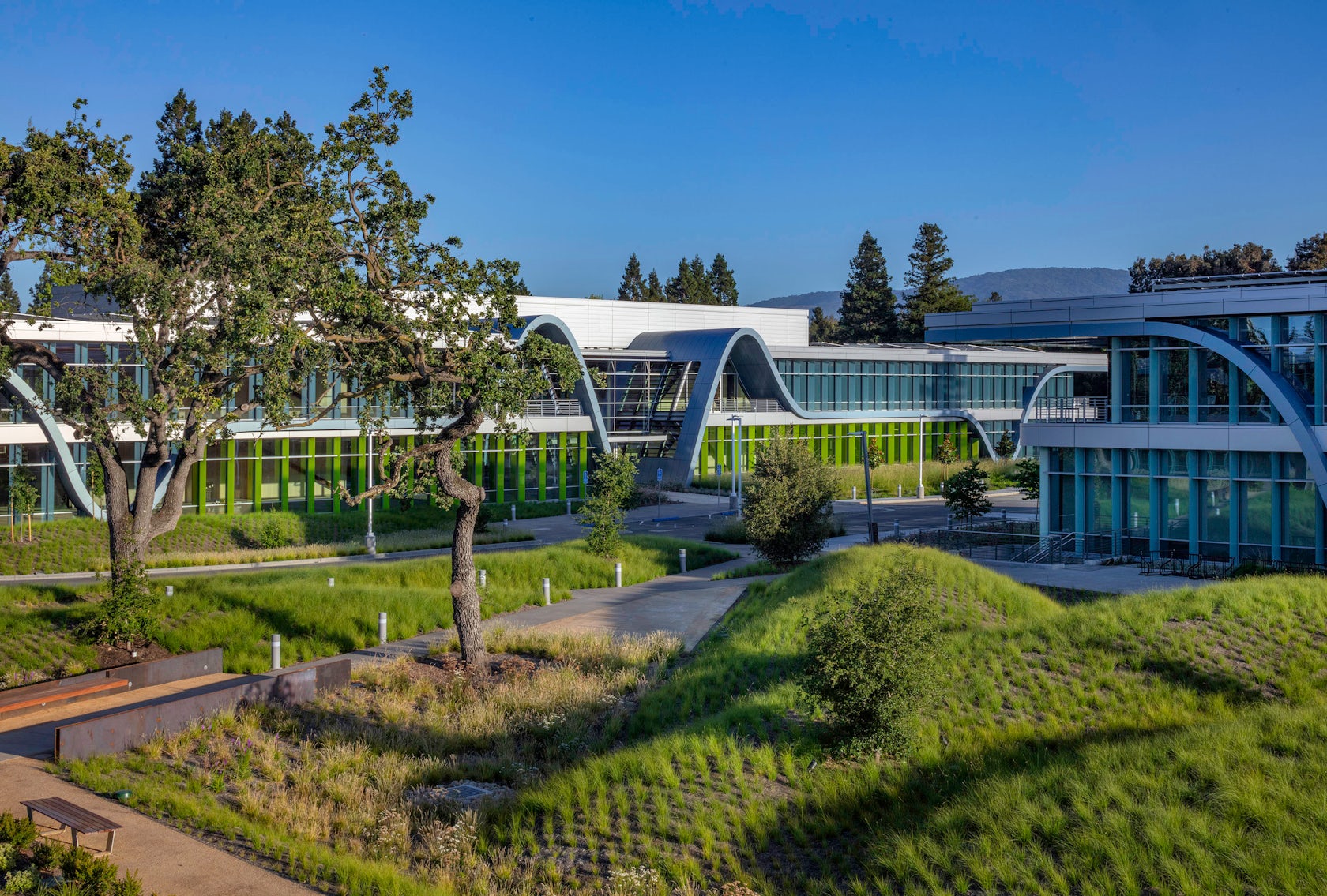
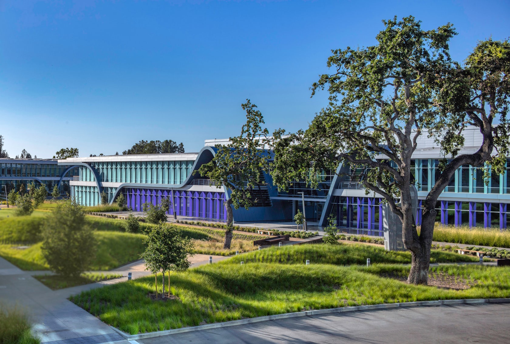
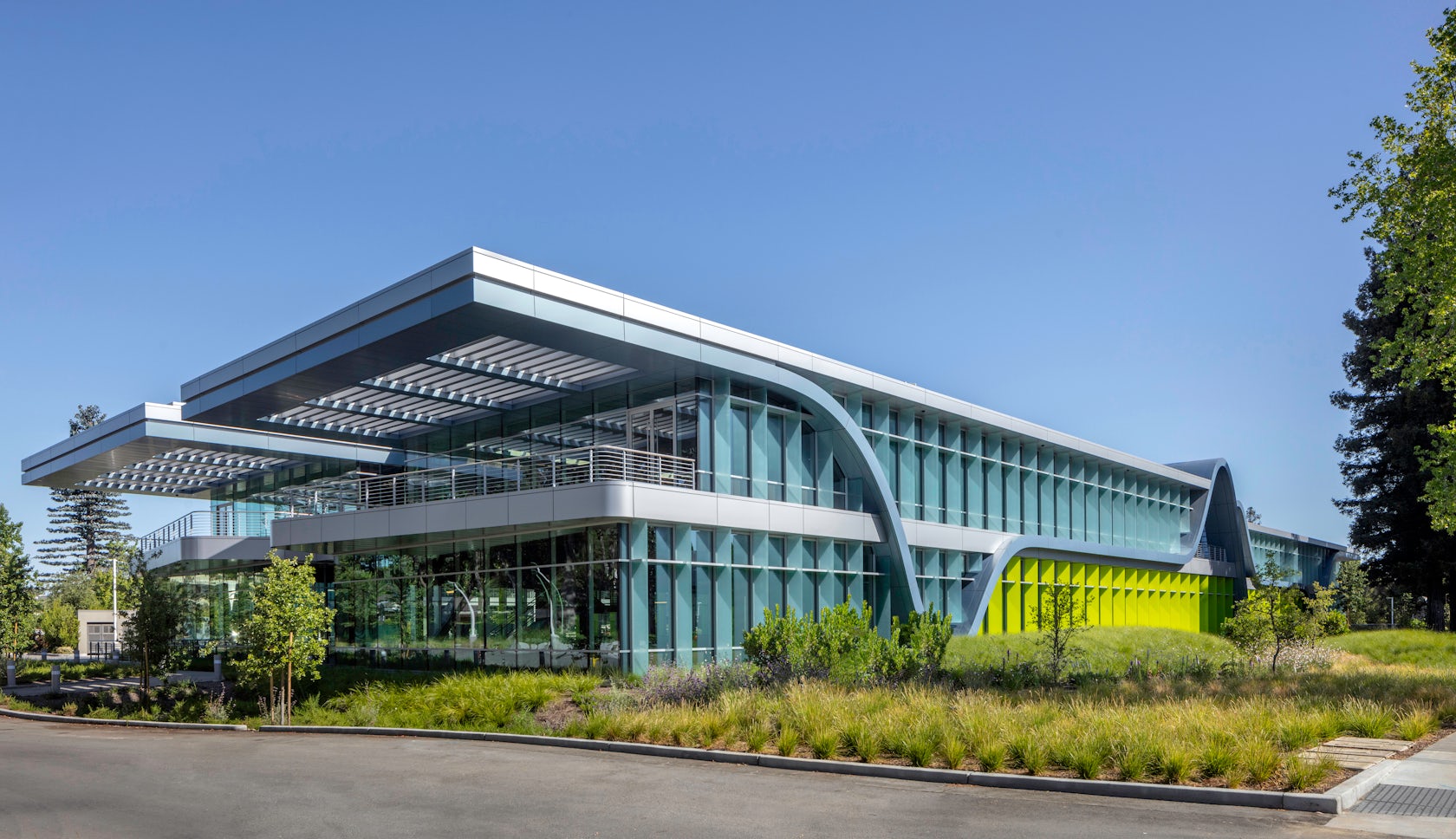
The Innovation Curve – Innovative Curve Technological Park is a 13.5-acre workplace that uses bold design elements to create an open, inviting working environment located in the heart of Silicon Valley. Our design incorporates the tech industry’s “evolution of innovation” curve on the buildings’ facades, serving as a visual reminder of the dedicated, expansive, and intense work taking place inside.
Architizer chatted with John Marx, Chief Artistic Officer at Form4 Architecture, to learn more about this project.
Architizer: What inspired the initial concept for your design?
John Marx: Innovation Curve is conceived around a lyrically expressive dominant design element that celebrates the innovation process that is often associated with its geographical location of Silicon Valley. Four two-story color-coded buildings are arranged to define extensive multiple landscape narrative spaces. We wanted to capture the forward-leaning spirit of technology in metal and glass to evoke machined precision, transparency, and modernity. Thus, the process of creativity is made visible in three dimensions. From a conceptual standpoint, the design is remarkable by embracing several design paradoxes, both minimalist and elegant, while simultaneously rich, colorful, and vibrant.
© Form4 Architecture
This project won in the 10th Annual A+Awards! What do you believe are the standout components that made your project win?
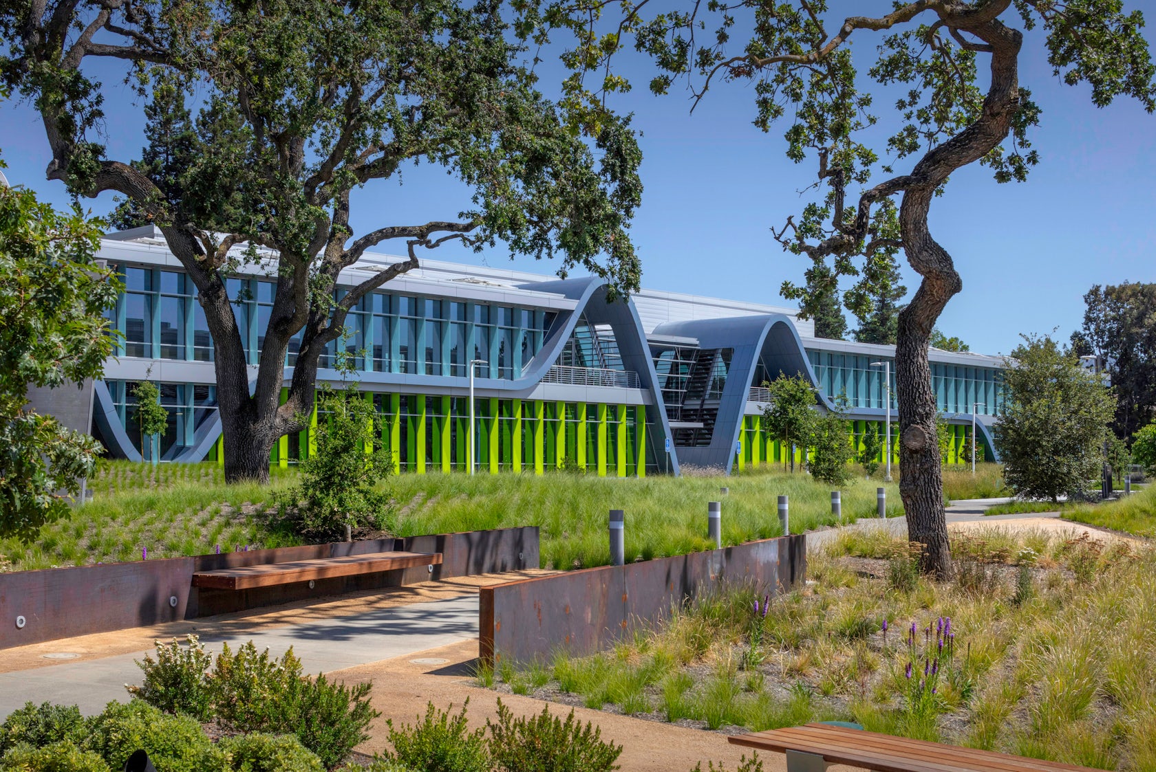
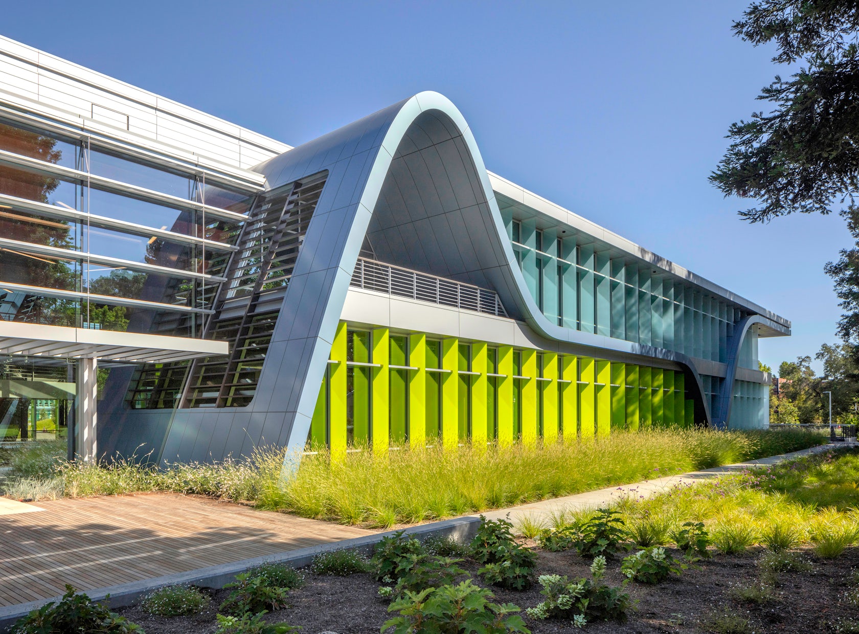
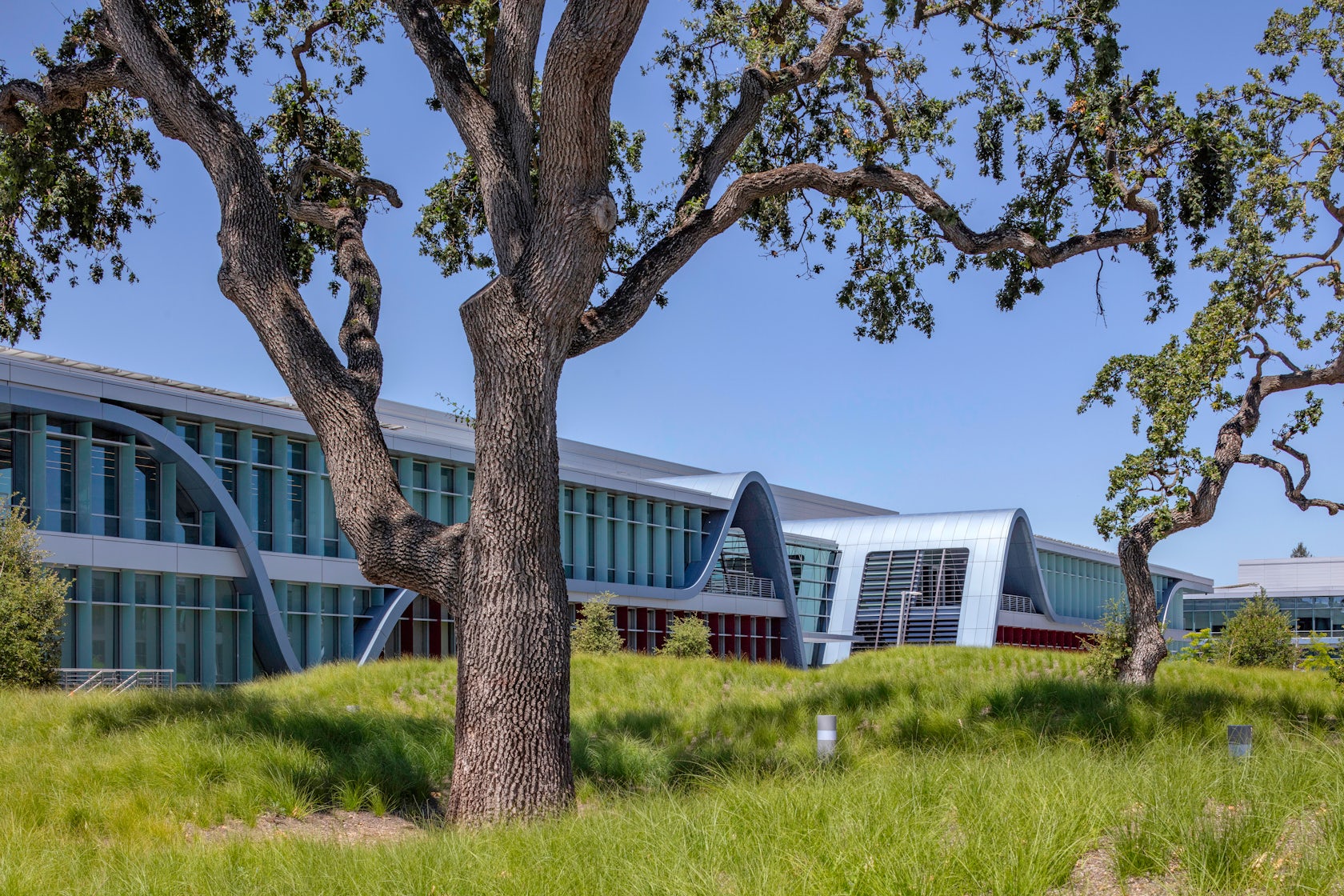
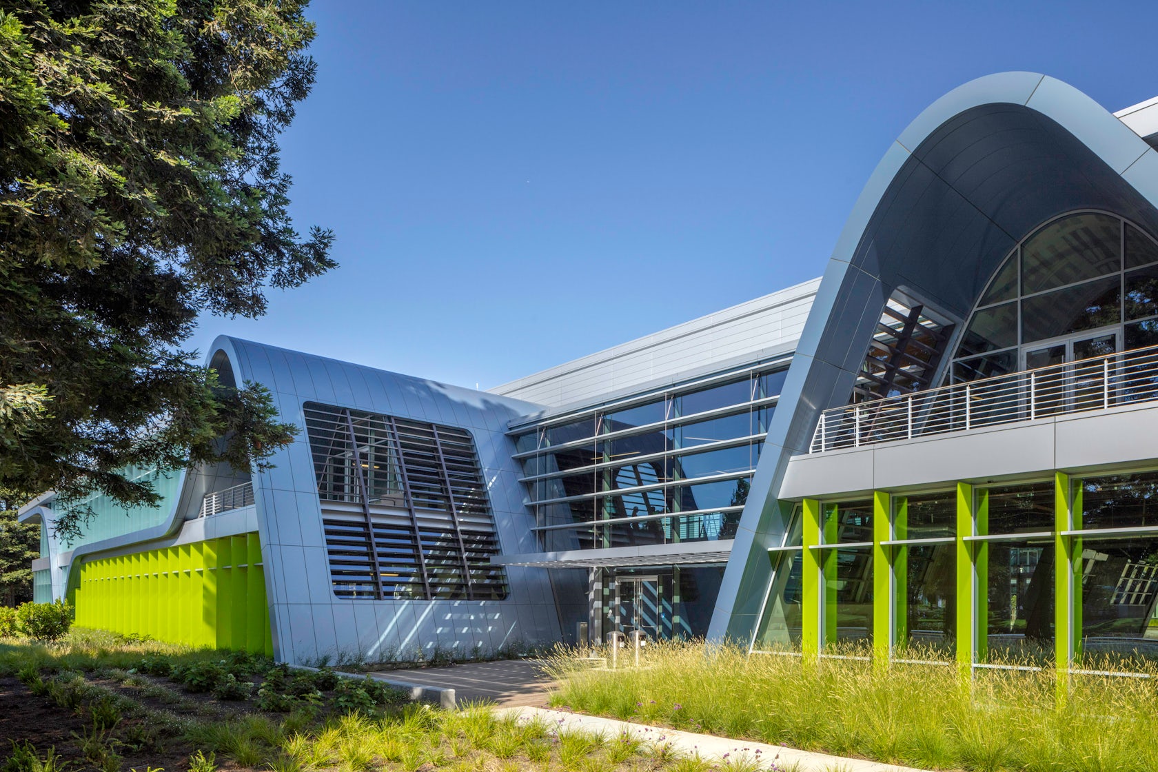
The facades’ sweeping metal curves serve as architectural metaphors for the peaks and valleys of exploratory research, innovation, and development. It playfully balances playful aesthetics with sustainability in innovative ways. The curves undulate through sections of the buildings’ roofs while flat overhangs provide shade to outdoor balconies that delineate the different stories. The innovation on the face of the buildings and the lyrical design serves as a potent visual reminder of the dedicated, expansive, and intense work taking place inside.
© Form4 Architecture
What was the greatest design challenge you faced during the project, and how did you navigate it?
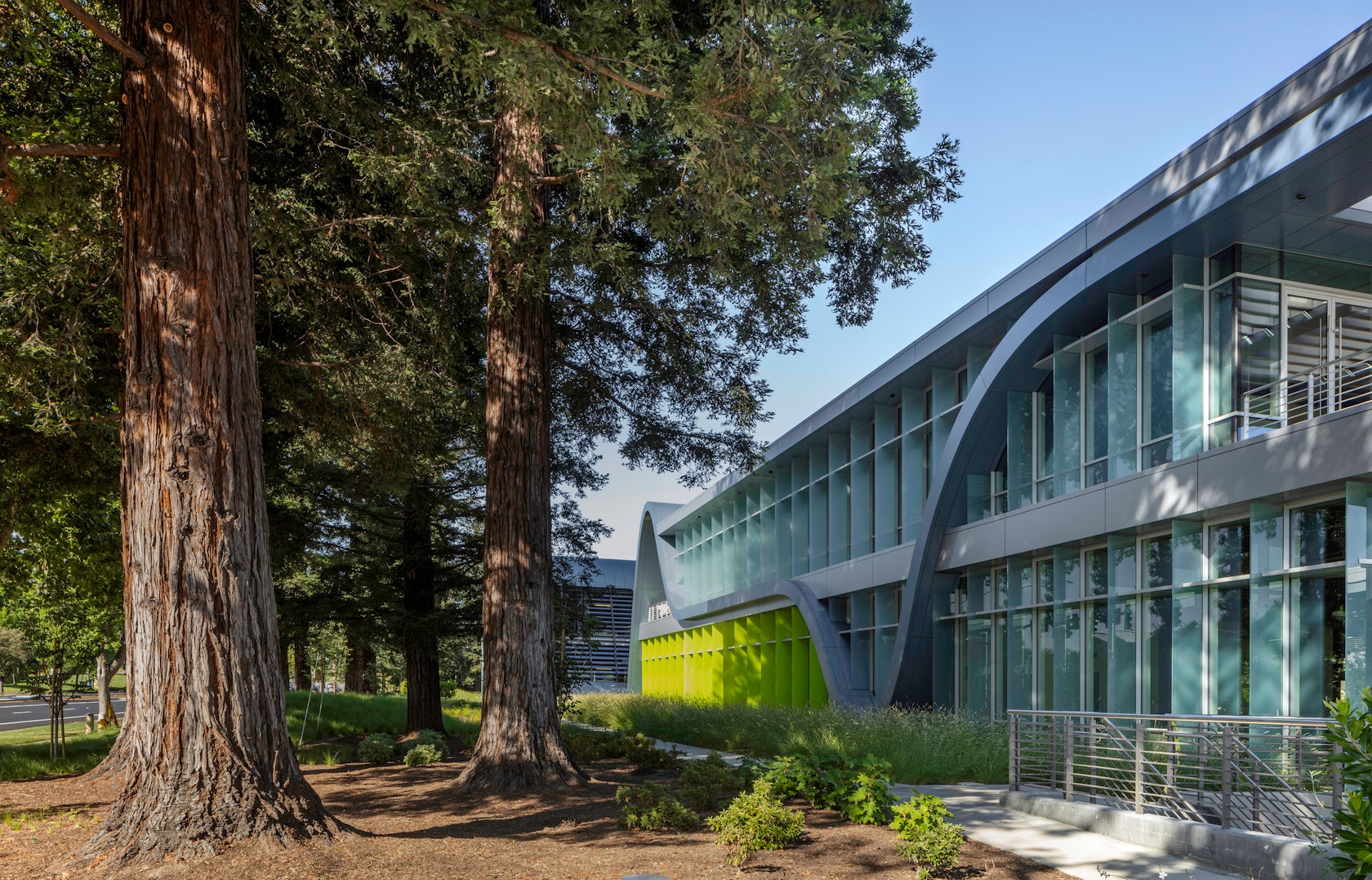
The greatest design challenge was implementing and detailing a complex design and optimizing the energy performance of an all-glass building. To do this, we used vertical glass fins on the long elevations. We also used horizontal metal shading devices that functioned as light shelves, high-performance spectrally selective glass, vertical fins of fritted glass, automated electrochromic diffusing skylights, and automated shades that maximize daylight while controlling glare and minimizing heat gain. Making the curving part of the building watertight was tricky but working with a general contractor helped us overcome this by creating an effective rain screen system. We also had to deal with an all-glass façade and mitigate the appearance of HVAC mechanical and structural systems. This was dealt with using dense fritted glass that was semi-transparent.
© Form4 Architecture
How did the context of your project — environmental, social or cultural — influence your design?
The scheme is built in a significant historical hotspot in Silicon Valley—Stanford Research Park, a location that previously housed Facebook’s headquarters, and earlier Beckman Industries, which invented the oscilloscope. Innovation Curve serves as a visual reminder of the immediate environment. As spec office buildings, they really needed to appeal to creative tenants that want to be within the culture of invention. Environmentally, the site is home to oak grassland restoration and redwood preservation zones, so the complex is designed within groves of preserved heritage oaks as well as existing and transplanted heritage redwoods. The normative Silicon Valley tech campus is closed to the public. This design changed the suburban narrative to a sophisticated urban one by welcoming visitors into the campus by reaching out to Page Mill Road.
© Form4 Architecture
What drove the selection of materials used in the project?
Metal was used as one of the few materials that could have the plasticity that follow the curves of the design. Glass was used to create a high-tech, transparent light, as well for solar control. This made the project appear less restrictive and added a softer tone of color to each building.
© Form4 Architecture
How important was sustainability as a design criteria as you worked on this project?
The design expresses both technology and the humanness of daylighting. As a LEED Platinum complex, the buildings are highly energy efficient, yet project a light, airy high-tech image. In addition to their symbolic significance, the deep overhangs work in combination with vertical glass fins to shade the building exteriors, control solar heat gain, and allow for greater transparency and connection to campus life. To achieve LEED Platinum certification, we incorporated many other sustainable elements: automated shade infrastructure, high-efficiency mechanical and electrical systems, high-performance cool roofs, solar photovoltaic power generation, recycling of construction waste, locally sourced materials, and bioswales landscaped with native plants. The sustainable features contribute to a significant increase in thermal comfort, resulting in higher occupant satisfaction.
© Form4 Architecture
How have your clients responded to the finished project?
This was our first project for Sand Hill Development, and we’ve partnered with them on two additional projects at the Stanford Research Park, where we’re actually involved in 13 projects totaling around 2.75 million square feet. Our clients were especially delighted that this project was highly regarded by Stanford Research Park and the City of Palo Alto, which are the two most difficult organizations to please in the public design sector in Silicon Valley. This has led our relationship with both organizations to grow. The success of this project has led to additional project approvals with both organizations due to Form4 setting such a high standard. In addition, this project is highly sought after in the real-estate community, making it easy to lease.
© Form4 Architecture
What key lesson did you learn in the process of conceiving the project?
Form4 Architecture believes in returning a sense of humanity to Modernism through emotional meaning and poetic design. All of our projects respond as equally to the environment of the site as they do to the people they serve. Lyricism in architecture is a guiding force of our design, which is evident here in the playful use of blue metal curves, the inherent drama of the lobbies, and the ethereal quality of the glass, all of which give the project a human scale. The resulting design embraces many fundamental formal paradoxes in that it is dynamic, minimalist, and elegant, while at the same time rich, colorful, and vibrant. It expresses both innovation and technology and a sense of the future. The design creates a serene counterpoint to the expressive blue waveforms of the architecture to accentuate the dramatic effect as well as create a quiet place of calm repose.
© Form4 Architecture
Team Members
Form4 Architecture: John Marx, AIA, Design Principal, and James Tefend, Principal-in-Charge Client: Sand Hill Property Company
Consultants
Contractor: Devcon Landscape Architect: Studio Five Design Lighting Designer: Luminae Souter Structural Engineer: DCI, Inc. MEP Engineer: M-E Engineers Photos: Richard Barnes; John Sutton
Products and Materials
PRODUCT: The curved panels are Alucoil Composite Panel. Steel structure with concrete deck. Materials include: glass, aluminum panels, frit glass sunshade MANUFACTURING: (all metal and glass components, entire exterior skin other than the roof, decks, and penthouse) Essequattro Exterior Windows: Schuco Glass: Guardian Glass Skylight Electrochromic Glass: View Exterior & Interior Metal Panels: Reynobond by Arconic Architectural Products Color Film at Exterior Glass Fins: Vanceva by Eastman Interior Porcelain Tile: Italics Tile & Stone Wood Ceilings: Geometrik PVC Roofing: Carlisle SynTec Systems Metal Roof Screen Panels: Alu-Skin by Alubel Paint: PPG Industries; Sherwin-Williams Toilet Partitions and Toilet Accessories: Bobrick
For more on The Innovation Curve, please visit the in-depth project page on Architizer.


 The Innovation Curve