Alex Hogrefe is the creator of Visualizing Architecture, a blog dedicated to educating people in the art of architectural visualization. He is also part of Rendering Studio Design Distill, generating unique and compelling illustrations for architects around the world.
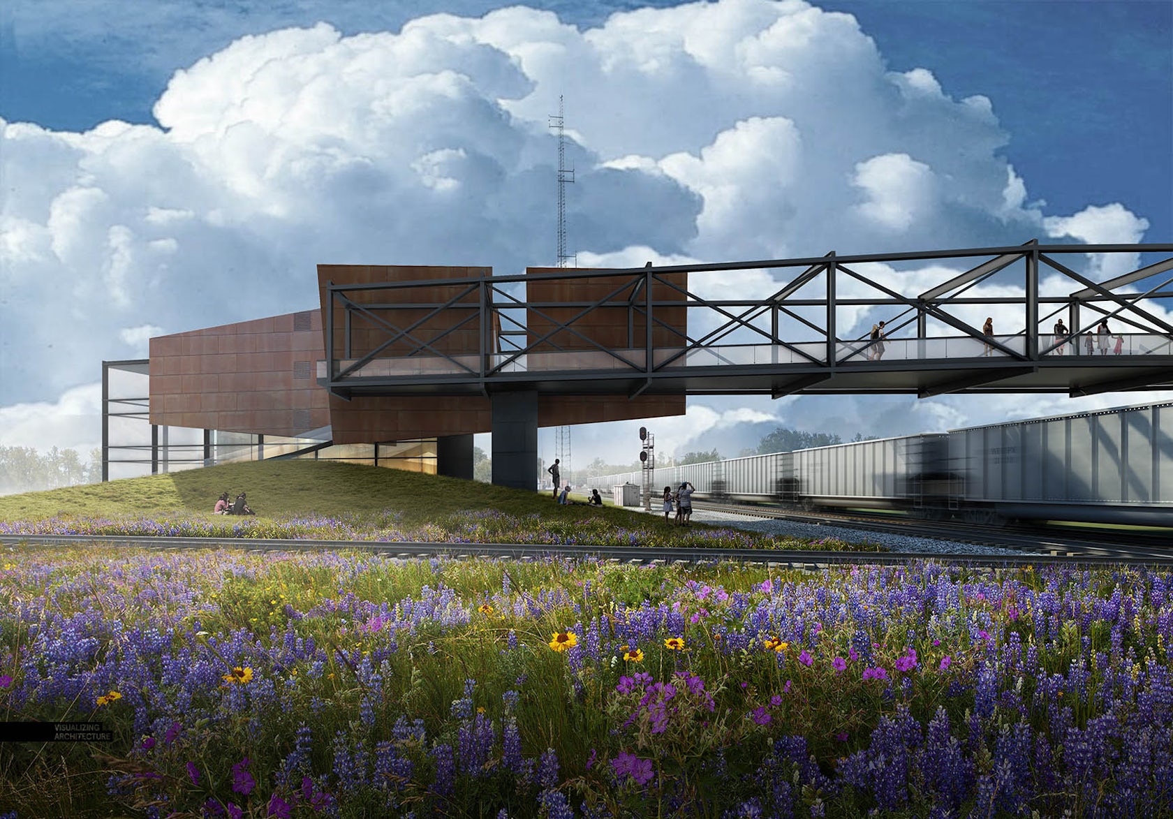
In most cases, a sky can make or break an architectural illustration. It’s also something that I see a lot of people overlook or only spend a few minutes on in their renderings. The thing is, a good sky sets the entire mood of an image. Because of this, it’s my first priority as soon as I get into Photoshop. I spend quite a bit of time combing through images online to find the perfect one for my scene. With the different images below, you will see how much the mood and tone shift from just changing out the sky.
I have put together some ideas to think about when looking for that perfect sky. It should be noted that these are guidelines. There are many of different scenarios and situations in architecture visualization in which these tips may not apply. However, I have found that to be rare, and I follow these ideas in almost every image that I create.

1. Avoid Oversaturated Color
Oversaturation is an issue I see often. Many of the sky images that I find online have this problem because the sky has been enhanced or amplified to be more dramatic and catch viewers’ attentions. However, too much color saturation in the sky will overpower the colors in the architecture and ground plane, ruining the hierarchy of the illustration. To fix this, I go into “Image>Adjustments>Hue Saturation” and I move the “Saturation” slider to the left to remove some of the color.

2. Avoid Awkward or Unnatural Colors
Unnatural color brings with it similar issues as oversaturation. Unnatural sky color can throw the whole image off from the start, making it difficult to pull off a successful composition. Not only that, it creates a “Photoshopped” look instead of looking harmonious with the architecture and ground plane. Due to the many gradients and color tones, I prefer just finding another sky versus trying to alter or fix the unnatural colors. However, if I really like the cloud forms or texture of the image, I sometimes will desaturate the color and then use the color of a different sky overlaid on top.

3. Minimize Overly Busy Skies
As much as you may like clouds, too many will hurt the reading of the image. Simply put, they take all of the attention away from the architecture. However, there is a fine line between distracting and dramatic. I tend to like cloudy skies, but I will dilute the image by desaturating the color and fading out the detail so that the texture is softer. An easy way to fade the detail is by finding a sky with no clouds, just color, and setting that as the base sky. Then take the cloudy sky, set that layer on top of the just-color sky and lower the opacity so that the clouds read much lighter.

4. Consider Sunlight Direction
This is one of those situations where you look at an image, and something seems off, but it is not clear what is wrong. However, once a light source issue gets corrected, the image reads dramatically better. This holds true for other Photoshopped elements such as entourage shadows and tree shadows. The more that the light source of all of the elements relates, then the better the entire image will read as a single cohesive illustration instead of a bunch of single Photoshopped elements.

5. Look for the Correct Perspective
This idea is more important or less important depending on the view. However, scenes showing a lot of depth will read much better with a sky that shows the correct perspective. In the example above, the clouds have almost no perspective, meaning the clouds don’t change in scale as they recede into the distance and get closer to the horizon, which causes the background to read much flatter.

6. Don’t Be Afraid to Go Simple
You don’t always need to show clouds. Sometimes, the perfect gradient is all that is needed to set the right tone for an image. This move creates a calmer scene and helps to highlight the architecture and ground plane.

The Final Image
The sky I ultimately chose for this image was a cloudy one with pockets of blue. This allowed me to play up the sunlight coming from the left and give the overall image a dramatic light-to-dark gradient. I combined two different cloud images using a similar process as described in tip No. 3. I found a sky with no clouds and great color and then combined that with a cloudy sky. By adjusting the opacity of the cloudy sky, I was able to zero in on a good balance of color and softness.

Once I had the sky, I amplified the warm and cool tones using color overlays and added more shadow at the base of the image. All these moves help to start the viewer’s eye on the left side of the image and slowly move it to the right over the bridge and to the train on the right, mimicking the path pedestrians take. In this way, I am using the light started by the sky to help tell the story of the project.
All images by Alex Hogrefe. This post first appeared on Visualizing Architecture. Enjoy this article? Check out the other features in our series on “The Art of Rendering”:
Turn Your Architectural Visualization From Day to Night Using Nothing but Photoshop
How to Bring Your SketchUp Model to Life Using Nothing but Photoshop
Create a Stunning Watercolor Visual Using SketchUp, AutoCAD and Photoshop
Methanoia Reveals the Story Behind Architecture’s Most Striking Visualizations
7 Magical Demonstrations of Hyper-Real Environments
When Architectural Visualization Gets It Right: Victor Enrich’s Surreal Art
A Photographic Approach to Architectural Visualization
Alex Hogrefe Creates Stunning Architectural Visualizations Using SketchUp and Photoshop
4 Unique Approaches to Architectural Visualization
Architizer is building tech tools to help power your practice: Click here to sign up now. Are you a manufacturer looking to connect with architects? Click here.


