Alex Hogrefe is the creator of Visualizing Architecture, a blog dedicated to educating people in the art of architectural visualization. He is also part of rendering studio Design Distill, generating unique and compelling illustrations for architects around the world.
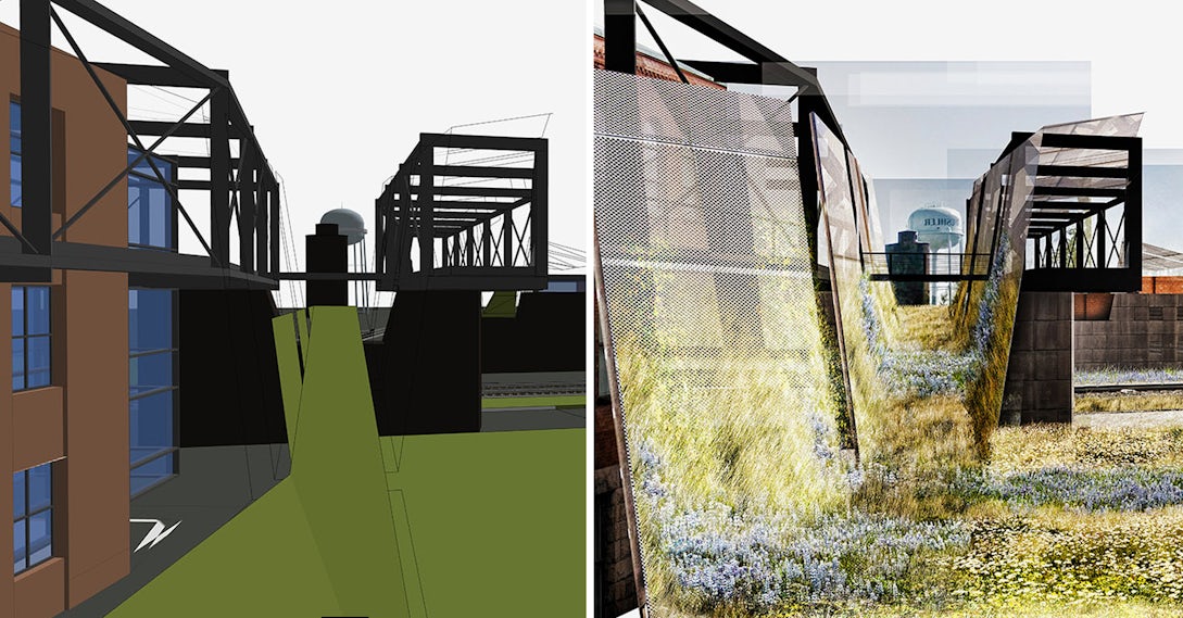
I was in need of some purely right-brain thinking, so I decided to skip modeling and V-Ray altogether and see what I could turn out with a half-baked SketchUp model and some Photoshop. This meant generating a collage-style illustration. These types of illustrations are great for speed but also for informal presentations where broad ideas and atmosphere are the focus and less about the details. Post-processing is typically much looser, and maintaining proper perspective is unnecessary.
Instead, compositions are more playful, and there are almost no rules. For this image, I saw it as a way to flesh out some ideas that I had about landscape and building materials. I didn’t have time to refine the 3D model, so a collage allowed me to quickly throw some ideas around and see what worked. You will notice that, in the end, very little of the original SketchUp model base image was still showing.

1. Base Image
The model was looking pretty rough, but in this case, it didn’t matter. I more or less used this image as a guide for laying down other textures and materials in Photoshop.

2. Background
Here, I threw in a quick background, which I didn’t bother cutting out. I also extracted the steel structure of the SketchUp base image and placed it on its own layer. Because it wasn’t rendered, I darkened the Steel to give it an abstract look.

3. Textures
I scoured the internet looking for textures and placed them in a folder so that I could grab them quickly once in Photoshop. These are some of the ones I used, though I found many other materials that I tested out but didn’t end up working for the design.

4. Screens and Landscape
I was going back and forth between metal mesh screens and wood slats but ended up going with the metal because of its industrial look. I also placed a base layer of wild grass to help define the ground plane.

5. Brick Architecture
The existing main street consists of many historical brick buildings, and I wanted to bring that language into the new design. Speed was the priority here, so I didn’t spend a lot of time meticulously adding the brick architecture. I did however add a shadow to help separate the brick façade from the screen and give the image some extra depth.

6. Tracks
Not only did I insert the railroad tracks, but I began carving out more white space to free up the different zones of the image.

7. More Vegetation
An important part of this design is to introduce local wild grasses and flowers to the site as well as use it as a tool to connect the site with the architecture. I therefore played this aspect up in the image by really saturating the colors and using many different textures in the landscape.

8. Detail
Using the Topaz Labs PS Plugin, I increased the detail and sharpened the image, which gives much more clarity to the vegetation. The final result actually ended up much less “collagey” than I expected but still served its purpose as a design tool. It also makes the point that you can get decent imagery fast without complicated models or rendering engines.
At the last second, I also tried out the image in black and white, which brings with it a whole new set of readings and hierarchies. The steel structures are much more dominant and take on the industrial feel that I was looking for.

This post first appeared on Alex Hogrefe’s blog Visualizing Architecture.
Architizer’s newest print publication is available for pre-order! How to Visualize Architecture is an educational guide designed to help you master the craft of architectural storytelling and visual communication. Secure your copy today.


